
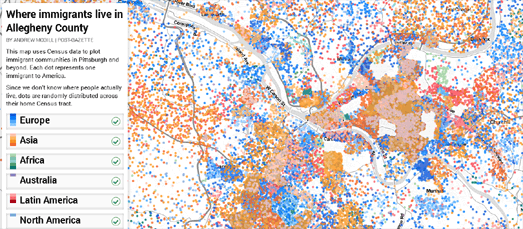
Where Immigrants Live in Allegheny County is a scatterplot map of where Pittsburgh's immigrant communities live in the city.
Each dot on the map represents one Pittsburgh resident. The dots are colored to show the area of the world where each citizen was born. The scatterplot points can be filtered by region of origin to reveal the areas of the city favored by different immigrant communities. For example, selecting just immigrants of Australian descent reveals that many Australian immigrants have chosen to live in the area to the west of Bird Park.
The map was created with Mapbox and Leaflet.js. The scatterplot layer was created in QGIS using census data. If you are interested in learning more about how the map was created Databurgh has published a helpful tutorial on Building a Scatterplot Map in QGIS and TileMill.
No comments:
Post a Comment