
So why is life expectancy suddenly falling for the first time in over a hundred years?
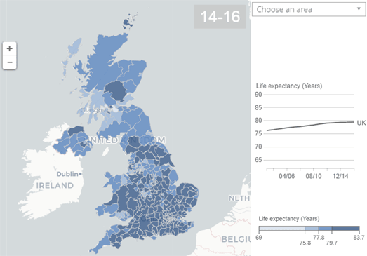
Creating choropleth maps of average life expectancy can show us where people are living shorter lives on average. For example, the UK's Office for National Statistics has released information on the Health State Life Expectancies 2014 to 2016, which examines life expectancy in each area of the UK. This ONS report includes two interactive maps; one visualizing life expectancy in each local area in the UK and the other showing the gain in life expectancy in each local area since 2001-2003.
The map reveals that the best places to live if you want a long healthy life in the UK is Richmond upon Thames if you are male (69.9 years) and the Orkney Islands if you are female (73.0 years). The worst places to live are Dundee City for males (54.3 years) and Manchester for females (54.6 years). So why are men in Richmond upon Thames expected to live longer than men in Dundee and why are females in the Orkney Isles expected to live longer than women in Manchester?
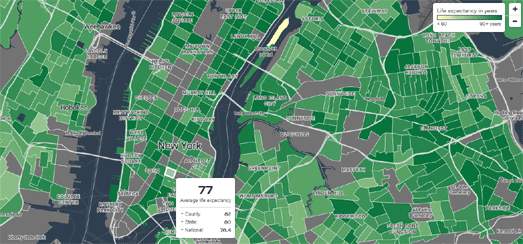
The answer isn't just geography or climate. Time and again maps of life expectancy show us that life expectancy can vary by huge amounts even between neighborhoods which are very close together geographically. Quartz's Life Expectancy Map reveals the average life expectancy in nearly every US neighborhood. According to the map people who live in New York's Chinatown have a life expectancy of 93.6 years, while people who live in nearby Roosevelt Island have a life expectancy of just 59 years. Obviously it is not the climate in Chinatown that is helping its residents live longer than people on Roosevelt Island.
You can view the life expectancy at birth for each county in the USA on the University of Washington's US Health Map. A choropleth layer shows the life expectancy for every county in the country. FiveThirtyEight has used the same data (life expectancy at birth 1980-2014) to compare the life expectancy in each state to the U.S. average. Life Expectancy in Each State vs. U.S. Average reveals which U.S. states have higher or lower life expectancy than the country average. It also shows which states are improving or falling behind over this time period compared to the country average.
Again these maps show that there can be huge differences in life expectancy even between neighboring counties. To find out why people in some areas are now expected to live significantly shorter lives than people living in other areas we need to look at the underlying demographics of these areas. We need to explore some of the economic and demographic data which might begin to explain why some people are living longer than other people who live close by.
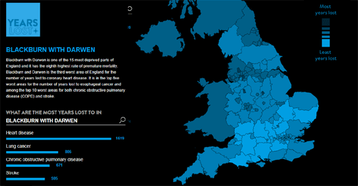
In the UK the University of East Anglia argues that health inequality is a major cause for the higher rates of premature mortality in some areas of the UK. The UEA's Year's Lost interactive map shows how many years of life are lost in each local authority area in the UK. The UEA's research shows that the rates of premature mortality are twice as high in the most deprived areas of England when compared to the rates in the most affluent areas. In other words wealth (or lack of wealth) is a major factor in how long you can expect to live.
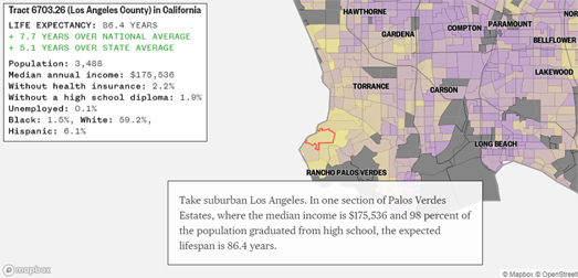
NBC News' map of How Long People in Your City Are Expected to Live reveals some of the underlying demographic and economic data which might begin to explain some of the huge differences in life expectancy between close neighbors. NBC's map colors each census tract by the average life expectancy. However if you click on a census tract on the map you can also view information on the median annual income, the percentage of the population without health insurance, the percentage without a high school diploma, the percentage of the population unemployed and the racial composition of the local population.
This extra economic and demographic data allows you to explore for yourself some of the possible causes of lower life expectancy. In fact NBC News have themselves provided a number of examples where census tracts in close proximity have vast differences in life expectancy. In Los Angeles they show how one tract in Palo Verdes has a life expectancy of 86.4 years, while a nearby tract in Long Beach has a life expectancy of 73.3 years. In the Palo Verdes census tract the average median income is $175.536, while in the Long Beach neighborhood the average income is $54,167.
Time and again the map reveals that areas with a high life expectancy are likely to have a high average income and areas with a lower life expectancy usually have a lower average income. In fact Associated Press' analysis of the National Center for Health Statistics' data on life expectancy found that on average life expectancy increased by six months with a $10,000 increase in median income. They also found a strong correlation between life expectancy and race. On average life expectancy decreased by eight months with a 10% increase in the black population.
What appears to be clear is that in both the USA and the UK average life expectancy is beginning to fall. None of these maps provide evidence that this falling life expectancy is a result of the middle-class squeeze in the USA and the UK. However it is apparent that those areas in both countries with the lowest life expectancy are on average the most deprived areas. In other words there is a high level of health inequality in both the USA and the UK.
1 comment:
i like your post because you always write about a Unique post
Post a Comment