Friday, January 31, 2020

Brexit and the Lying British Press


One hour ago, as the rest of the world shook its collective heads in incredulity, the UK finally left the European Union. If you are struggling to understand why the UK would voluntarily withdraw from one of the world's largest trading blocks then you should probably ignore the British press and read a German newspaper instead.

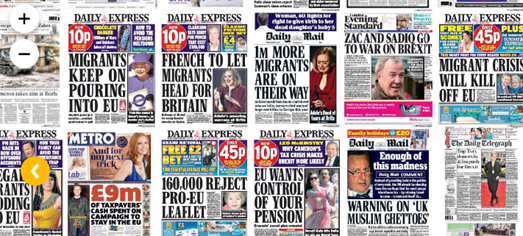
Zeit has published an interesting interactive map consisting of over 2,300 British newspaper front pages from the last three years. Brexit in British Newspapers provides an interesting insight into the relentless anti-Eu propaganda which constantly makes the headlines on the front pages of the British press. Zeit has only looked at newspapers from the last three years but the British media's campaign against the European Union has been running for at least the last twenty years.

Over this time British newspapers have presented the European Union as the enemy of Britain and have attempted to convey this in a series of lies about the European Union. In the past these lies have taken the form of ridiculous claims about the EU wanting to ban playgrounds, cut down British apple trees, ban straight cucumbers, ban curved bananas, ban church bells, ban British cheese ... ad infinitum ...

If you explore Zeit's map you can see that these obviously ridiculous stories have not been so popular over the last three years. In these more recent years the British press has been more keen to paint the European Union as a huge immigrant threat and a constant drain on the UK economy. Unfortunately over the next few years, as the UK tries to negotiate itself out of the European Union, the lies of the British media are very unlikely to stop.

Who Will Win the 2020 US Election?


To defeat Trump in the 2020 Presidential election the Democrats only have to flip Pennsylvania, Michigan and Wisconsin. To become President a candidate needs to win at least 270 electoral votes. In 2016 Trump won 306 electoral votes. This means that (if all else remains the same) the Democrats only need to flip Pennsylvania (which the Republicans won by 0.72%), Michigan (which the Republicans won by 0.23%) and Wisconsin (which the Republicans won by 0.77%).

This is of course just one of a number of possible scenarios which could play out in the 2020 U.S. election. You can explore other possible scenarios and create your own using NBC's new interactive map Road to 270.

The Road to 270 interactive map allows you to change the color of any state to the color of the party you think will win in 2020. As you flip states the electoral vote totals for each party automatically updates to show how many votes each party will have under your new scenario. Using the map you can explore any number of possible outcomes in this year's Presidential Election. NBC has created for themselves a number of possible scenarios, which you can explore on the map. These scenarios include a Republican landslide, a tie scenario, and a Democratic scenario.

The USA is Hell On Earth

For 37 years the French artist Auguste Rodin worked on creating a monumental sculpture called the Gates of Hell. The sculpture was inspired by Dante's Inferno and represents the entrance to his vision of hell.

A number of bronze casts have been made of Rodin's original Gates of Hell. Two of these bronze casts exist on opposite sides of the United States, one on the west coast at Stanford University and the other near the east coast in the Rodin Museum in Philadelphia. Now if these two gates to hell are on the perimeter of Dante's nine concentric circles of hell then ...


... well I think this map illustrates the idea pretty well. The Gates of Hell interactive map works on the premise that the Pennsylvania and California Gates of Hell exit on the perimeter of Dante's nine circles of Hell. To put it bluntly the United States is Hell.

The interactive map, the Gates of Hell, actually includes all nine concentric circles of Dante's inferno. Therefore if you live in the USA you can click on the map to see in which part of hell you are doomed to suffer in eternity. The nine circles of hell represent a gradual increase in wickedness, culminating at the center, where you will find Satan. Where you live in the USA is determined by your biggest sin. For example people living in Dallas are being punished for their wrath. If you do live in Dallas then you can at least comfort yourself that you will endure less torment than the people of Kansas, who are condemned to a lower Hell, in punishment for their sins of violence. 

I'm not sure who created the Gates of Hell. I discovered it via a Tweet by Matt Miller, so it could well be his diabolical creation.

Thursday, January 30, 2020

Mapping 70 Years of Global Protests


An analysis of civil protests around the world over the last 70 years has determined that non-violent protests have been much more effective in achieving their goals than protests which have involved violence. Harvard University has launched a new interactive map which plots where mass uprisings have taken place across the globe between 1945 and 2014. The map seems to prove that nonviolent campaigns have been much more successful in achieving their political aims than violent campaigns.

The Nonviolent and Violent Campaigns and Outcomes (NAVCO) map documents where both violent insurgencies and nonviolent protests have occurred over a 70 year period. The protests which have been mapped only include 'maximalist' campaigns. These are protests which seek "to overthrow an incumbent government, expel a foreign military occupation, or claim territorial independence".

The NAVCO map includes a number of filter controls which allow you to visualize protests around the world by location, date, by type of conflict, by outcome and by length. These filter controls allow the user to explore trends in mass protests over time and how successful different forms of protest have proved to be in achieving their political goals.

The Harvard Gazaette has interviewed Professor Erica Chenoweth, one of the authors of the NAVCO map and database, about why and how nonviolent civil resistance has been more effective in achieving change. In Why Nonviolent Resistance Beats Violent Force the professor uses examples of successful nonviolent campaigns which have achieved their political aims to explain how non-violent protest can sometimes overcome even very repressive regimes.

Wednesday, January 29, 2020

Making Election Maps with Mapbox


Mapbox Elections data being styled in Mapbox Studio to show 2016 Democratic vote percentage

Yesterday Mapbox released a new resource for mapping U.S. election data. Mapbox Elections is a set of tilesets for visualizing U.S. election data from 2004–2016.

The tilesets in Mapbox Elections include data for the 2004, 2008, 2012 and 2016 elections. A number of different datasets are available for each election, including the number of Democrat and Republican votes, the percentage of Democrat and Republican votes, margin of victories, voter turnout and population. All of this data is available at both the state and county level.


Mapbox Elections data being styled in Mapbox Studio to show 2016 Republican vote percentage

The new tilesets can be styled using Mapbox Studio. For example the two screenshots on this page show counties being colored to reflect the percentage of Democratic and Republican votes in the 2016 election. How you choose to style the data and which data you style is entirely up to you. You can see some more ways that the data can be visualized on this Mapbox storymap called Introducing the Historical Elections Tilesets.

Tuesday, January 28, 2020

The Geography of Employment


A new interactive map reveals the huge role that geography plays in the American economy. The map uses Bureau of Labor Statistics data to show which counties gained and lost jobs during 2019. One of the most surprising revelations from the map is how many neighboring counties on either side of state borders had vastly different fortunes last year in terms of employment.

The Daily Yonder's map Two-Thirds of Rural Counties Gain Jobs colors counties green or red depending on whether they gained or lost jobs from November 2018 to November 2019. The Daily Yonder's take away from the map is that the further a county is from an urban center then the more likely it is to have lost jobs. They note that the "largest metropolitan areas gained the most jobs. And rural counties located farthest from large urban centers had the slowest rate of job growth". The map and the data support this observation. In fact the 319 counties with the largest growth in jobs were all in metro areas.


The Daily Yonder's map also seems to reveal that state policies can also have a huge influence on employment rates. For example look at the border between Mississippi and Alabama. On one side, in Mississippi, nearly every single county lost jobs. Hop over the border into Alabama and nearly every single county gained jobs. This stark contrast in fortunes between neighboring states can be seen elsewhere. In Wisconsin nearly every county experienced a loss in jobs. However neighboring counties in Minnesota and Iowa all managed to gain jobs over the same period of time.

I don't know enough about American politics to know why state borders could have such an effect on employment rates. The rural and urban makeup of states may be playing some role in the contrast in employment fortunes between some neighboring states. However I wonder if individual state policies, such as state employment regulations, state taxes and state investment and state public spending also play a role in influencing county employment rates.

How Far Can You Travel?


The city of Amsterdam has created a useful tool which visualizes travel times around the city. MapItOut is an interactive isochrone map which shows you how far you can travel by foot, bike, public transport or car in Amsterdam, within 15, 30, 45 or 60 minutes.

To discover how far you can travel in Amsterdam you just need to click on your location on the map and select your mode of transport. Select from 15, 30, 45 or 60 minutes and the map will display a polygon showing you all the places you can reach in that time. MapItOut also allows you to view the locations of schools in Amsterdam, so it is possible to use the tool to find properties and locations within 30 minutes of any school.

MapItOut uses Travel Time, an isochrone platform for interactive maps. Because MapItOut uses Travel Time the map actually works for any location in the Netherlands and in most European countries. If MapItOut doesn't work for your location then you might want to explore some of the many other travel time / isochrone maps using the isochrone tag on Maps Mania.

Monday, January 27, 2020

Can you point to Ukraine on a map?


The big geopolitical question of the week is:

Can you point to Ukraine on a map?

On Friday Mike Pompeo was asked by NPR's Mary Louise Kelly, whether he, as Secretary of State, owed Marie Yovanovitch, the former U.S. ambassador to Ukraine, an apology. Marie Yovanovitch was the American ambassador to Ukraine who Trump ordered removed from her position because he believed she was hampering his efforts to force Ukraine to investigate his political rival, Joe Biden. Yovanovitch has also been the victim of a long running smear campaign by Trump and his supporters. Documents released in November in response to a Freedom of Information Act revealed that the State Department had deliberately deceived Congress about the rationale for Marie Yovanovitch's removal as Ambassador to Ukraine.

When Pompeo was asked on Friday whether he should apologize to Marie Yovanovitch he responded by screaming at the NPR reporter and asking her 'Do you think Americans care about Ukraine?' Pompeo then asked his aides to bring out a blank map with no map labels and asked Mary Louise Kelley if she could find Ukraine on a map.

Mary Louise Kelley says that she correctly pointed to Ukraine on the map. On Saturday Mark Pompeo released a statement implying that Kelley had not identified Ukraine and had instead pointed to Bangladesh, "It is worth noting that Bangladesh is NOT Ukraine." Mary Louise Kelley has a masters degree in European studies from Cambridge University, she has worked in Europe for the BBC and extensively reported on foreign policy issues from many parts of the world. Mark Pompeo's accusation that Kelley thinks that one of Europe's largest countries is actually in Asia has been met with almost universal derision and disbelief.

So can you point to Ukraine on a map?

The question is can you point to Ukraine on a map? Well can ya punk?

Let's find out. Chris Zubak-Skees has created an interactive blank map of the world. All you have to do is click on Ukraine on the map. After you have clicked on his Can you point to Ukraine on a map? interactive map you can view all the guesses made by everyone else. I'm pleased to see that so far only two people have identified Bangladesh as Ukraine, that's two less than the number of people who think that the United States is Ukraine.


This isn't the first time when the question of whether people can point to Ukraine on a map has arisen. Back in 2014, when Russia invaded the Crimean peninsula, the Washington Post asked 2,066 Americans if they could locate Ukraine on a map of the world. The experiment, carried out by political scientists from Dartmouth College, Harvard University and Princeton University, found that at the time only one in six Americans could correctly locate Ukraine on a map.

The Americans were also asked a number of questions about how the USA should respond to Russia's invasion of the Crimean peninsula. The further the respondents guess was from the correct location then the more likely they were to support military intervention by the USA.

Maps of Planned Cities Can Be Very Pretty


By far the most popular map of last week was City Roads, a new online tool which allows you to make road maps for any city in the world. City Roads uses OpenStreetMap data to create simple monochrome maps created just from a city's roads.

Road maps of planned cities can be very pretty. Which is perhaps why Mike Bostock has created a number of maps showing The Roads of Planned Cities (Mike's maps also seem to include railway lines as well as roads). Using his own Observable tool Mike has created road maps for Brasília, La Plata, Adelaide and New Cairo. These four locations all share the characteristic of having been carefully planned and laid out before being built. The design and planning which went into the layout of each city can be seen and appreciated in Mike's rather pretty road maps.


an edit of Planned Cities to show New York

Because Mike has used Observable to create these maps you can actually edit the notebook to create your own maps (even for unplanned cities). This is very easy to do. Just click on the left-hand margin next to one of the maps and select the edit option. This line of code will then appear below the map:
map({center: [31.4944, 30.0272], zoom: 20.5, zoomDelta: 1, visibility})
Now all you have to do is change the latitude and longitude to the city of your choice (although it is actually [longitude, latitude] because of one of the quirks of Mapbox). Change the 'center' location to your lon,lat co-ordinates and then press the 'run cell' button and the map will automatically update to your new location.

Saturday, January 25, 2020

The Global Sports Atlas


Zeit's Small Sport Atlas uses OpenStreetMap data to explore where different sports are played around the world. Sports pitches, courts and fields are tagged on OpenStreetMap to show which sports are played on them. This means that OpenStreetMap data can provide a rough guide to where different sports are played in which countries across the globe.

Looking at which countries play different sports can be a fascinating task. Cricket for example is a game which is almost exclusively played in countries that were once subject to British imperialism. The game is huge in India, Australia and South Africa. However at the same time it has never had much impact in the USA or Canada. Soccer on the other hand has spread from Britain to almost all corners of the globe. However association football is perhaps least popular in countries which were once part of the British Empire, including the USA, Canada, India and Australia.

In Europe handball is popular across much of northern Europe. Handball however has failed to take off in the rest of the world and for some reason has never made any impact in English speaking countries. Of the American sports of baseball and American football only baseball has really managed to gain any traction outside of the United States. Baseball is popular in much of central America and in Japan. American football on the other hand is popular almost nowhere outside of the United States, although there are a few American football fields in central Europe.


The Zeit article only maps out where a handful of sports are played around the world. You can explore the geographical distribution of other sports (for example basketball) on taginfo. You should be able to work out how to view maps for different sports for yourself but here are the links to taginfo's maps for the location of basketball courts, tennis courts and rugby.


The geography of golf raises some interesting socioeconomic questions. Being able to dedicate more than 100 acres of land to just one past-time can be an expensive business. The game of golf does then tend to be reserved largely for the idle rich. It shouldn't be that surprising then to discover that a map of the world's golf courses resembles a map of countries with the highest  GDPs.

Friday, January 24, 2020

Fun with Graph Theory & Maps


Mathigon has a neat introduction to graph theory which includes some fun interactive map problems. The Graphs and Networks lesson requires you to try coloring maps with as few colors as possible and to try to solve Euler's famous Bridges of Königsberg challenge.

What makes Graphs and Networks such a great introduction to graph theory is that it includes a number of interactive map based puzzles which you can try to solve. For example you can try to solve Euler's bridge challenge by tracing a route around the city of Königsberg, crossing each of the city's bridges only once.


The Seven Bridges of Königsberg is a notable problem in mathematics. The river Pregel divides Königsberg into four separate parts. These four parts are connected by seven Bridges. The challenge is to walk around the city, visiting all four parts but only crossing each bridge exactly once. Leonhard Euler's resolution of the problem laid the foundations of graph theory.

Another mathematical problem that involves maps is Map Coloring. For example how many colors do you need to use to color in all the states of the USA when adjacent states can't have the same color. Using the interactive map in Graphs and Networks you can attempt to find out how few colors you need by coloring in all the states in the USA. You can also test your math skills by coloring a number of other interactive maps of different countries.

How the EU Pays Farmers to Pollute


The New York Times has exposed how the European Union's farm subsidies are being used to create pollution. In Killer Slime, Dead Birds, an Expunged Map: The Dirty Secrets of European Farm Subsidies the Times reports on a map which the EU has tried to cover up. The EU's censored map shows how pollution in northern Italy relates very closely to the amount of European Union subsidies paid to farmers in the region.

The Times has used the European Union’s own economic models to recreate the map and reveal how "the most heavily subsidized areas (have) the worst pollution". Nearly 40% of the European Union's budget is spent on farm subsidies. The EU is propping up an agricultural industry in Europe which is responsible for numerous environmental crimes which are causing damage to the environment in many different ways. The Times article includes a number of different maps and satellite images to illustrate where and how the EU agricultural industry is damaging the environment.


For example every red line on the map above is a river which has been polluted by nearby farms. The Times article includes numerous other examples of the pollution caused by European farms. It shows how agricultural pollution is harming the environment, wildlife and even the seas and oceans around the continent.

This damage to Europe's environment is being supported by European Union policies and subsidies. In fact it appears that the European Union's agricultural policy has been written to expressly hide the environmental catastrophes which it is supporting across Europe.

Thursday, January 23, 2020

The First People's Map of B.C.


There are 203 First Nations communities in British Colombia and an amazing diversity of Indigenous languages. You can learn more about B.C.'s First Nations communities and languages on the First People's Map of B.C..

The new First People's Map of B.C. provides information about the Indigenous languages, cultures and places of British Columbia. The interactive map visualizes the regions where different First Nations languages are spoken. It also allows you to view First Nations place names and important landmarks.

If you select a language family from the map sidebar you can view where the individual First Nations languages in that family are spoken. You can also listen to recordings of each of the Indigenous languages being spoken by native speakers. The map also provides information on community landmarks, cultural sites and art spaces.

If you are interested in languages and Indigenous territories then you might also like Native-land.ca, an interactive map of Indigenous territories, languages and treaties around the world.

The Coronavirus Map


So far there have been 555 confirmed cases and 17 deaths from the Wuhan Coronavirus (2019-nCoV). Most of the confirmed cases have occurred in China, however there have also been a handful of cases in Japan and one confirmed case in the United States.

In Wuhan, China the government has shut down public transport in order to help stop the spread of the virus. The Chinese New Year is this Saturday. Traditionally during the New Year there is a lot of travel and movement as people visit family for the festivities. People in Wuhan have been advised not to travel and the airport, train stations, bus, subway and ferry have all been closed.

The Wuhan Coronavirus (2019-nCoV) Global Cases interactive map shows where there have been confirmed cases of the Wuhan Coronavirus around the world. The map uses data from the World Health Organization, the Center for Disease Control and the National Health Committee of the People's Republic of China. It is updated daily.

You can view news about the Coronavirus outbreak from around the world on HealthMap. HealthMap uses data from a number of different news sources and health organizations to monitor global disease outbreaks. If you select the search option you can filter the map to only show global news about the Coronavirus. It is important to note that HealthMap does not map confirmed cases of diseases but news about diseases. It can therefore be useful for discovering what measures and advice your government is currently providing about any global outbreaks.

Wednesday, January 22, 2020

A Bad Education Can Lead to an Early Death


In the United States educational opportunity is one of the best indicators of life expectancy. If you grow up in an area with low educational opportunities then you can expect to live a shorter life on average than someone who grew up in an area with higher educational opportunities.

Child Trends has mapped out The Link Between Life Expectancy and Educational Opportunity in cities across the United States. On the Child Trends interactive map neighborhoods are colored to show the average life expectancy (with black being the highest life expectancy) and school educational opportunity is visualized using colored circles (with blue being highest). If the assertion is true that areas with lower educational opportunities have lower life expectancy then you would expect to find lots of orange circles in grey colored neighborhoods and lots of blue circles in black colored neighborhoods (to show a higher life expectancy in areas with higher education opportunities).

Child Trends acknowledge that other factors, aside from educational opportunity, have a role to play in determining life expectancy. For example "the percentage of residents living in poverty and their racial and ethnic composition, contribute much more to life expectancy". In fact I'm sure that lots of economists would argue that both poor life expectancy and poor educational opportunity are often consequences of lower levels of wealth. You can explore the link between wealth and educational opportunity in Stanford University's Opportunity Explorer, an interactive map which allows you to explore how school districts compare in educational attainment. The map allows you to compare test scores and achievement in neighborhoods with different socioeconomic status.

The Mother Tongue of Every Canadian


Canadian company Anagraph has mapped the languages spoken by all 34,504,810 Canadians. In the company's Langues Maternelles 2016 interactive dot map you can see the mother tongue languages spoken in every neighborhood in Canada, according to the 2016 census.

The map reveals how in most Canadian cities people with the same languages often live in the same neighborhoods. For example in Montreal French speakers dominate in the northern districts. English speakers tend to live in southern and south-eastern neighborhoods. Chinese speakers can mostly be found in Brossard and there appears to be a fair number of Italian speakers in north-eastern Montreal.

It would be much easier to explore the spatial distribution of different language speakers if you could isolate different languages on the map. Unfortunately the Langues Maternelles map does not include any filter controls which allow you to just show you the speakers of individual languages on the map.

You can find out the proportion and numbers of Canadians who speak French and English on the Canadian census website. In Update of the 2016 Census Language Data you can view a table showing the percentage of mother tongue speakers of French and English and the total number of the population who speak the two languages. In 2016 there were 19,460,855 people with English as their mother tongue, 7,166,700 with French as their mother tongue and 7,321,060 whose mother tongue was neither French nor English.

Tuesday, January 21, 2020

Mapping Life Under the Ice


Last year Ariel Waldman led an expedition to Antarctica to film the extremophile microbes living under the ice. The expedition found microbes living in glaciers, under the sea ice, next to frozen lakes, and in subglacial ponds.

You can explore some of the microbes found in Antarctica on Life Under the Ice. Life Under the Ice uses the Leaflet mapping platform to present microscopic videos of the microbes discovered in Antarctica. If you click on the 'What's this' button you can discover more about the microbe in the current map view, including where the microbe was discovered, its size and its level of magnification on the map.


If you enjoy viewing microscopic images in Leaflet then you chould also have a look at Pathobin. Pathobin is an on-line repository where pathologists can publish and share their pathology images. Pathology images uploaded to Pathobin can be viewed by anyone using a Leaflet map powered viewing tool.

You can browse for pathology images on Pathobin using the 'Recent Images' gallery on the site's homepage or from the site index. When you select an image to view on Pathobin a Leaflet map of the pathogen opens. Using the usual Leaflet navigation controls you can pan and zoom the map to view the image in close-up detail.


More microscopic images can be explored at Microsculpture. British photographer Levon Biss has used the Leaflet mapping library to present close-up photographs of insects. His Microsculpture allows you to view high resolution photos of insect specimens from Oxford University Museum of Natural History in exquisitely fine detail using the Leaflet zooming and panning tools.

Each insect's completed image map consists of around 8,000 individual photographs (the large scale photographic prints are up to 3m high), captured using optical microscopes. The Leaflet mapping library really allows the user to fully explore these high resolution photos by zooming in close on the insects. The map scale in the top right-hand corner of the map provides a useful guide to the size of the insects as you zoom in & out on the images.

Internal Migration in the USA


US County-to-County Migration 2012-2016 is an interactive flow-map showing where people are moving to and from in the USA. The map uses data from the American Community Survey to show the migration levels between different counties.

If you hover over a county on the map you can highlight all the flow-lines showing migration to and from the county. The size of the lines represent the relative numbers of people moving in and out. A small information window also opens showing the total number of people who left or moved to the county during 2012 and 2016.

As you might expect a lot of migration traffic is between neighboring counties or between near-by large cities. For example in Texas there is a lot of migration traffic between Dallas and Houston. The map does also reveal some interesting patterns in longer distance migration. For example a significant number of people moved from New York to the sunnier and warmer weather of Florida.

US County-to-County Migration was created using flowmap.blue. flowmap.blue is a great tool for creating interactive flow-maps. To create a flow-map with flowmap.blue you just need to save your date to a Google Spreadsheet. flowmap.blue will then automatically create a flow-map from the data in the spreadsheet.

Make Your Own City Road Map


City Roads is a new online tool which you can use to create your very own road map for any city in the world. Enter a city name into City Roads and it will generate a map of the city using only the city's road network from OpenStreetMap.

City Road really is that easy to use. All you have to do is enter a location and City Roads will create your road map. Once finished you can customize the map a little by changing the background color and the color of the roads. You can even download the map as a PNG image or order it printed on a mug.


The Arun Valley in the South Downs National Park, England

If you like playing with City Roads then you might also like Peak Map, which is from the same developer. Peak Map is a fantastic interactive map which can create a joy-plot map for any location on Earth. To create your own joy-plot map you just need to center Peak Map on your chosen location.

Joy-plots (or ridgeline plots as they are sometimes called) are inspired by Joy Division's famous album cover for Unknown Pleasures. Peak Map includes a number of options which allow you to change the appearance of your generated joy-plot. The automatic setting draws black lines on a white background but you can choose your own background and line colors (my example above flips the default to show white lines on a black background). You can also change the height scale and smoothness of the elevation lines on your joy plot map and even reduce the joy plot map's opacity to reveal a labelled map beneath.

Monday, January 20, 2020

The American School Achievement Map


Stanford University's Opportunity Explorer is an interactive map which allows you to explore how your school, school district and county compare in educational attainment. The map uses data from over 350 million standardized test scores to show average test scores in areas across the United States and also school learning rates and trends in test scores.

If you click on a school district on the map you can view the district's average test scores and average learning rates and how these two scores compare to the national averages. You can also view in the map side panel the trend in school test performance in the district from 2009-2016 and the average socioeconomic status in the district and how that compares to the national average. An interactive chart also allows you to see how the district compares to national average test scores and the average socioeconomic status.

As well as allowing you to view school test scores at the district and county level the map can also show you learning rates and trends in test scores at the school district and county level. Learning rates show how much students learn each year relative to the national average and the trends in test scores show how students' average test scores changed in grade levels over time.

The Opportunity Explorer also allows you to see how test scores differ in schools, school districts and counties for different types of student. You can explore test scores in schools by race, sex and for poor and non-poor students. Being able to explore the data by race and socioeconomic status helps to reveal how minority students are concentrated more in high-poverty schools, which tend to perform less well than lower-poverty schools.

Collaborative Mapping with Ethermap


Ethermap is a very easy to use tool for creating and sharing simple interactive maps. You could use Ethermap to map your favourite coffee shops, bars & restaurants. You could it use it to show friends where and when you want to meet. You could even use it to map out places that you want to visit on your next vacation.

Creating a map with Ethermap is simplicity itself. Just drop a marker on any location you want to map and use the text editor to add any information that you want to be associated with that location. The text editor allows you to use simple html to format text and create hypertext links. You can also change the color of each marker added to the map and select from two different map styles.

When you have finished creating your map you can share it with your friends by simply cutting and pasting the map's URL. Anyone who accesses the map will have editing privileges so they can also add markers to the map. If you don't want everyone to have editing privileges then you can set a password so that only people with the password can edit the map. You can also add a password so that no one without the password can view the map.

Ethermap is free to use and your maps will not include adverts (and according to Ethermaps it never will).

Via: weeklyOSM

Germany's Rising Rents


Germany is a tripartite state when it comes to increasing rents. In southern Germany rents rise much faster than wages. In eastern Germany renting a property costs less and less relative to income. Only in parts of western Germany are wages and rents developing at almost the same pace.

The Berliner Morgenpost has mapped Where rents are rising faster than wages in Germany. German regions are colored on this interactive map to show how much rents rose between 2014 and 2018 compared to the rise in wages over the same period.

Between 2014 and 2018 gross wages rose by 9.4 percent. In the same period rents rose by 8.5 percent. So in Germany overall wages have outpaced rents and renting a property has become relatively cheaper. However there are large regional differences in rent increases. Southern Germany has seen rents mostly increasing faster than wages. For example in Munich rents rose by 19.7 percent and wages by only 10.9 percent over the mapped period.

In Eastern Germany renting is becoming relatively cheaper as wages have risen faster than rents. For example in Erzgebirgskreis wages rose by 17.4 percent while average rents only rose by 3.5 percent. In eastern Germany Berlin is the only exception to relatively cheaper rents. In Germany rent increases have actually outpaced rising wages.

Saturday, January 18, 2020

Number of UK Pubs Increases


For the first time in ten years the number of pubs and bars in the UK has grown. Since 2007 the number of pubs and bars fell every single year until last year. Between 2018 and 2019 the number of pubs and bars in the UK increased by 315, a 0.8% increase and the first increase for a decade.

The slight increase in pubs and bars last year isn't enough to reverse the years of decline in the sector. From 2001 to 2019 nearly every area of the UK saw an overall decrease in the number of pubs and bars. You can see the plus or minus percentage change in the number of pubs and bars in your local area on the Office for National Statistics interactive map Change in Pub Numbers 2001-2019.

The Office for National Statistics has released a report on the changes in the UK pubs and bars sector last year. Economies of Ale not only explores the increase in pubs and bars last year but also looks at the number of people employed in the sector. While the number of pubs and bars has been declining since 2011 the number of people employed in the sector has been increasing. Since 2016 the number of people employed to serve food has been higher than the number of people employed behind the bar. This reflects the fact that people in the UK are increasingly spending more on eating out and less on drinking out.

Friday, January 17, 2020

A Drive Back in Time


The Library of Congress has a huge archive of photographs from across the United States. The collection is a fantastic record of recent American history. The collection also provides a fantastic resource for exploring the United States through its photography.

Library of Places is an interactive map which allows you to explore the Library of Congress' photography collection using the analog of a road trip. Click on any two locations on the map and Library of Places will plot a route between your two chosen locations. Library of Places then finds photographs from the Library of Congress which were taken along that route and displays them beneath the map.

You can click on any of the displayed photographs to view its entry on the Library of Congress website. This entry will include details on the photographer, the year the photograph was taken and the locations assigned to the picture by the Library of Congress.

If you are a fan of vintage photography then you might also appreciate these other interactive maps of historical photographs:

Historypin - a huge collection of mapped vintage photos from across the world
The Collections of the Albert Khan Museum - a map of vintage photos from around the globe
OldSF - vintage photos of San Francisco (has Google Maps licencing issues but photos still work)
OldNYC - old photographs of New York
Old Toronto - historic photos of Toronto from the City of Toronto Archives
Wymer's DC - view images of D.C. from the John P. Wymer Photograph Collection
The Yangon Time Machine - a map of vintage photographs of Yangon, Myanmar
Smapshot - historical images of Switzerland
OldAms - thousands of vintage photographs of Amsterdam
Tids Maskinen - explore photos of Norway by location & date
Helsinki Ennen - historical maps and photographs of the Finnish capital
Our Town Stories - Edinburgh - vintage photos & maps of the Scottish capital
Vintage Greece - geo-located vintage photographs and historical maps of Greece
Ajapaik - vintage photos of Estonia

Pollution from the Notre Dame Fire


The fire of the Notre-Dame de Paris was one of the most shocking events of 2019. The fire burned for around 15 hours and the cathedral suffered serious damage. Most of the lead-covered wooden roof was destroyed by the fire. 460 tonnes of lead were burnt, which resulted in toxic dust being blown over Paris. Where this dust settled has raised surface lead levels in certain areas.

The local health authority in Paris (ARS) has released an interactive map which shows the results of sampling the lead dust surface levels following the Notre Dame fire. Sante Graphie's Notre-Dame de Paris interactive map uses colored markers to show the sampled surface lead levels. The average surface lead levels in Paris streets are normally around five times the indoor legal limit (1000 μg/m2). On the map green markers show readings that are below 5000 μg/m2. The other colored markers show readings which are above the average street surface lead levels for Paris.

The smoke plumb caused by the fire stretched as far as Mantes-la-Jolie in the Yvelines. However, as you can see from the map, the surface lead readings have been strongest in areas closest to the fire. As a result of the map it is now believed that most contamination was caused by falling debris rather than distributed by the smoke from the fire. Several cleaning operations have taken place around the Notre Dame and the reconstruction site is being continually monitored for lead levels. This monitoring includes blood tests for lead levels in the people working on the cathedral's reconstruction.

Thursday, January 16, 2020

Slap it on a Map!


There are lots of interactive map tools which allow you to compare the relative sizes of different countries around the world. For example the The True Size of ... and OverlayMaps both allow you to overlay the outline of one or more countries on top of another country on an interactive map. This results in a clear and dramatic illustration of the relative sizes of the selected countries in comparison to one another.


But why stop at comparing the size of different geographic entities? Slap it on a Map! is an interactive map which allows you to visualize the relative size of lots of different objects by overlaying them on a location of your choice. Using Slap it on a Map! is very easy. Just choose an object from the thousands of objects listed in the objects menu. Then slap that object on the map anywhere in the world.


There are over 1,600 objects to choose from in Slap it on a Map! These objects are organised into different folders, such as vehicles, celestial bodies and even countries. The screenshot at the top of the page shows the USS Enterprise next to the United States Capitol Building. The lower screenshot shows the planet Mercury overlaid on top of Europe and the tip of Northern Africa (Mercury is distorted to reflect the distortions of the Web Mercator map projection).

The Predicted Global Electricity Grid


Gridfinder is a new interactive map which visualizes the predicted global electricity grid network based on night-light satellite imagery. The map predicts the existence of electricity network lines using evidence from night-time views of the Earth from space.

10% of the world's population does not have access to a reliable electricity supply. It is hoped that Gridfinder can be used to identify populations with poor access to electricity networks in order to help improve essential infrastructure and provide affordable and reliable energy.

The Gridfinder map shows the locations of known electricity lines using data from OpenStreetMap. The map also shows predicted electricity supply lines based on where lights can be seen at night from  orbiting satellites. To predict the existence of these previously unmapped electricity supply lines the level of night-time light in satellite imagery is used to see where locations are most likely to be producing light from electricity. Where there is enough light to have been produced by an electricity network the map connects this to known electricity networks using an algorithm which follows roads and already known distribution lines.

You can read more about how night-time satellite imagery has been used to predict the world's electricity network on the research paper Predictive mapping of the global power system using open data.

Wednesday, January 15, 2020

Uber's New Bike Trip City Maps


Today Uber released "a new bike trip data tool that shows where and when cyclists are most active in our cities". Currently there are three interactive maps available showing bike trip data for:

San Francisco
Washington D.C.
Paris

All three maps purport to show where and when cyclists are most active using a heat map layer. The bluest lines on the map show the streets with the most cycle traffic. The maps include filter tools which allows you to view traffic density data for weekdays and weekends and for different times of the day.

Uber hasn't yet said where their mapped bike trip data comes from. However, judging by the reference to 'Jump' in each map's URL address and the fact that Uber's Jump operates in all three mapped cities, I'm guessing that the data is from journeys taken on Jump's dockless scooter and electric bicycles. In which case the maps don't show "where and when cyclists are most active in our cities", as Uber claims. These maps only show where Jump customers cycle. It is worth bearing in mind that this data could be completely different from data generated by private cyclists, journeying to and from work, to stores or for general leisure.

Although Uber's bike trip maps are only available today for San Francisco, Washington D.C. and Paris the company promises that more cities will be mapped in the future.

America's Abandoned Railways


According to Wikipedia there are 149,910 kilometers of rail track in the United States (although many other sources say it is much larger at 226,000 kilometers or 140,000 miles). At its peak the rail network in America was much larger than it is today and consisted of 409,000 kilometers of track. This means that there are a lot of abandoned railways in the USA.

Abandoned and Out of Service Railroad Lines is a website and blog dedicated to mapping all of those abandoned railroad lines in the USA. It also allows users to map abandoned railway lines in other countries around the world. Rail lines are colored on the map to show whether they are heritage railways, abandoned lines or lines which were never completed. If you click on a section of track on the map you can view information on its use, its ownership, when it was abandoned and its length.


You can also explore America's abandoned railways on Abandoned Rails. Abandoned Rails maintains separate interactive maps for every state in the USA. If you select a railway line on these state maps you can also view an individual map of the chosen line.

These individual maps include a history of the line, historical vintage photographs and user comments about the line. The user comments are often of particular interest as they can contain personal memories from people who once traveled on or even worked on the selected abandoned line.

How to Avoid Roads in London


London's roads are mostly responsible for the often dangerous levels of air pollution which can be found in the capital. If you want to escape that pollution then your best bet is to get as far away from road traffic as you can. A new interactive map, called Retreat From Streets - London, can help you find the locations in London which are the furthest from roads and from all that polluting road traffic.

Unfortunately the furthest distance that you can escape from roads in Greater London is slap bang in the middle of the Rainham Landfill Site. It is not the most attractive of destinations. However the neighbouring Rainham Marshes Nature Reserve could be a reasonable alternative place to visit. If you are in central London then the furthest that you can escape from roads is in one of the city's many parks. Visit Hyde Park and you can get 518 meters from the nearest London road traffic. The centre of Regent's Park is 395 meters from the nearest car.

The London edition of Retreat from Streets is the third map in the series. Retreats from Streets - Brussels and Retreats Away From Berlin's Streets can help you find locations in Brussels and Berlin which are not near any roads. All three maps use circular markers to show the point in every neighborhood which is furthest from a road. The larger the circle on the map then the furthest its centre is from the nearest road. You can learn more about how these furthest points from roads are calculated and how to make your own car free map on the Retreat from Streets GitHub page.

Tuesday, January 14, 2020

Toronto's Geography of Wealth


In Mapping Our Divisions The Local looks at how Toronto's income inequalities can be observed in the city's streets and polarized neighborhoods. Using an interactive map The Local reveals the income disparities between the rich neighborhoods along the Yonge Street corridor and the low-income suburbs of the city. It also explores the shrinking number of middle-income neighborhoods sandwiched in between the rich and poor areas of Toronto.

The map colors Toronto based on the individual household incomes compared to the city average. As you progress through the map The Local explains how the income inequalities between the rich and poor neighborhoods of the city are reflected in other areas. For example diabetes rates reflect this sharp income inequality with high rates in the poorest areas and the lowest rates in the wealthy, central neighborhoods.

While the poorest neighborhoods often have the highest levels of disease, such as diabetes, they are also often health care deserts, with poor access to health care services. On the other hand those living in the wealthiest neighborhoods often have the best access to health care services. Unsurprisingly the poorer, less healthy neighborhoods have greater levels of premature deaths than the wealthier neighborhoods.

The Chinese Conquest of the World


China has spent more than 25 billion dollars on its Belt and Road Initiative. This initiative is designed to create the infrastructure to secure China’s trade routes and energy supplies. It is also being used to increase China's influence in the rest of the world. Many western governments see China's Belt and Road investments as an attempt to dominate the global trading network and ensure the strength of China's influence in global affairs.

You can see the global reach of the Belt and Road initiative on AidData's new interactive map of China's investments in countries around the world. The China Project Locations map shows the locations of Chinese-funded development projects across the globe. It claims to be the "most comprehensive source of public information" on the locations of Chinese global development.


Countries in Africa and Asia have probably been the biggest recipients of Chinese aid. The map reveals that China has also made lots of investments in South and Central America. New Zealand stands out on the map as being one of the only countries in the so called 'First World' to have welcomed aid from China. This aid seems to consist largely of educational scholarships, educational aid and donations to the Christchurch earthquake relief fund.

AidData's interactive map allows you to visualize China's government funded projects by size, sector and type. If you click on individual projects on the map you can view details on the size of funding and what the money is being used for. For example if you zoom-in on Addis Ababa in Ethiopia you can see that China has invested in numerous transportation projects in the city. This includes money for roads, bridges and for the expansion of the city's airport.

American Town Planning in England


Most American cities have a very organized and structured street grid system. In these street grid systems roads run at right angles to each other. In most of these street plans Avenues and Streets are used to indicate which roads run in which direction within the grid system.

This grid street pattern is visualized beautifully in Data Stuff's Street Network Orientation by Road Type. In Street Network Orientations by Road Type small compass roses are used to show the orientation of different road types in 25 U.S. cities. In most cities you can see how Streets and Avenues run in different directions within a strict grid system.

In Europe most major cities have developed organically since medieval times without much central planning of the road network. Hence, unlike American cities, European cities usually don't have a regimented street grid system. One exception to this rule is the English city of Milton Keynes. This is mainly because Milton Keynes is a new city which was planned and built from the 1960s onward.


Because Milton Keynes was a planned city, unlike most UK towns, it actually does have a grid street pattern. The city's grin plan consists of 11 roads running roughly north–south and 10 roads running roughly east–west. These roads are designated as 'V roads' (vertical) and 'H roads' (horizontal). All the vertical (V) roads are named as 'Streets' and all the horizontal (H) roads are named as 'Ways'.

On the map above I've colored Streets blue and Ways red so that you can see the Milton Keynes street grid system more clearly. The dark blue road on the map is Watling Street. This street existed before Milton Keynes began to emerge in the 1960s. In fact this road is nearly 2000 years old. Watling Street was built by the Romans in around AD 47 or 48.

The existing Roman road of Watling Street is one reason why Milton Keynes' grid system doesn't run strictly north-south and west-east. Watling Street, the railway line and the M1 motorway all run on a north-west to south-east alignment. The Milton Keynes street grid system therefore uses this same alignment rather than a strict north-south alignment.

The Milton Keynes grid system is also what has been called a 'lazy grid system'. Unlike most American cities the roads in Miltin Keynes don't follow a strict orthogonal grid with strict straight line. This is because the roads in the grid system were built to follow more naturally the flow of the land (valleys and hills etc) where practical.

Monday, January 13, 2020

The Witcher Interactive Map


The Continent is a medieval fantasy world created by the Polish author Andrzej Sapkowski. It is the fictional realm where his Witcher series of novels take place. The Witcher is set on the 'Continent', mostly in the Northern Kingdoms region.

To accompany its new television series 'The Witcher' Netflix has released an interactive Map of the Continent. Netflix's map owes much in style to the fantasy maps developed for other fictional works, such as the Lord of the Rings and Game of Thrones. This includes the use of florid fonts and topographic features. The map itself should provide a useful guide for those who are following the television series. It allows you to search the Continent by major events in the television series and by place-name.


The Witcher website also features a lovingly crafted interactive map of the Continent. The Witcher fictional world map includes some wonderfully detailed animated elements. For example, if you zoom-in on Novigrad you can actually watch the smoke rising from the buildings' chimneys. Zoom-in on Kaer Morhen and you can see the waves rippling on the lake. Elsewhere on the map you can find birds flapping their wings, moving windmills and animated sea monsters.