Saturday, February 29, 2020

Mapping Cars in Bike Lanes


A few years ago Nathan Rosenquist released Cars in Bike Lanes, a mapping library which could be used by anyone to photograph traffic violations and add them to an interactive map. The mapping library was primarily used for reporting and photographing cars illegally blocking bike lanes but it can also be used for recording other types of traffic violation.

Nathan's code was used to create Cars in Bike Lanes Boston and Things in Bike Lanes Denver. It was also used by Nathan himself to make Cars in Bike Lanes New York. Unfortunately none of those three site are still active. However Nathan's Cars in Bike Lanes code lives on at GitHub.

You can now also use Safe Lanes to report illegally parked cars. Safe Lanes is a new interactive map which anyone can use to submit photographs of illegal parking in the United States. At the moment you can report illegal parking violations via the web map but iOS and Android apps are apparently coming soon.

Safe Lanes uses AI to process the photographs of all illegally parked vehicles which have been submitted to the map. Object character recognition is used to try to automatically detect the license plate number and the state where the plate was issued. Reports of traffic violations submitted to Safe Lanes in San Francisco are then automatically forwarded to the city's non-emergency 311 service. Safe Lanes is now in talks with other US cities about how best to integrate with their 311 services.

Friday, February 28, 2020

How to Make Interactive Map Jigsaws


Did you know that you can make and play online map jigsaws on the Jigsaw Explorer website. Jigsaw Explorer allows you to create interactive online jigsaws from any image - including images of maps.

If you want to dive straight in and try to complete a map jigsaw then you can try this jigsaw I created of a 17th Century Map of Oxfordshire.

If you want to create your own map jigsaws then just follow these helpful tips:

The biggest online collection of map images is probably the David Rumsey Map Collection. To create a map with the Jigsaw Explorer you need to get the map's JPEG image URL. Here's how to do that for a David Rumsey Collection map.

On a map's dedicated page on the David Rumsey Map Collection website is a 'Share' link. If you click on this 'Share' button you can see and copy the map's IIIF manifest URL.


If you copy and paste this IIIF URL into your browser's address bar you will see a page that looks like this.


Halfway down this page you should be able to see the web address of a JPEG image for your chosen map. If you copy this JPEG address you can paste it into the Jigsaw Explorer's Create Your Own Puzzle page to make a jigsaw from the David Rumsey map.

It is that simple.

The first ever jigsaw was believed to have been made by cartographer John Spilsbury. Spilsbury created his first puzzle in 1766 from a world map. The puzzle was designed as an educational tool to teach geography. I of course had to make an interactive jigsaw from the same world map.

Here are some links to jigsaws that I created from maps found in the David Rumsey Map Collection:

Thursday, February 27, 2020

The Map of American Food


You might not be surprised to learn that people in New Mexico like Latin American food. According to photo sharing site Trover people in New Mexico share photos of Latin American food more than people in any other state.

To find out what types of food are popular in different parts of America travel photo sharing website Trover has analysed a quarter of a million images of food and drinks, uploaded by its users in the USA.  In The Most Photographed Food in the USA you can explore the results of this analysis, including a number of choropleth maps showing what types of food are photographed the most in each state.

Trover used Google's Vision AI technology to detect what types of food and drink were being photographed by Trover users. Trover then calculated how often people in different states were taking pictures of all the different types of food to create state rankings for each category of food. The state where the photos in a category represented the highest percentage of all food photos in the state came top in the ranking for that type of food.

Some of Trover's findings were a little more surprising than the fact that people in New Mexico like Latin American food. For example California doesn't even make the top 10 list of states posting photos of healthy foods. Also the state that takes the second most photos of vegetarian food is BBQ-loving Kansas. You may or may not be surprised to learn that people in Mississippi and Ohio post the most pictures of fast food.

Wednesday, February 26, 2020

Here is Crowdsourced Texas


Yesterday I asked people to draw Texas on an interactive map of the United States (if you haven't drawn Texas yet then you can still do so on this Where is Texas? survey map).

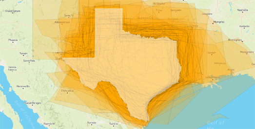
So far over 300 people have taken the time to complete my geographical survey by drawing the outline of Texas - or at least where they think it is. You can view all the polygons drawn so far on this Here's Texas? map. The map shows all the entries submitted so far to my Where is Texas map survey. The real Texas is shown as a white polygon on the map.

I'm very impressed with the entries so far. Most people seem to have a pretty good idea of the shape of Texas and where it is. I really doubt that the guesses would be so accurate for one of the smaller states, such as Connecticut or Delaware (I certainly wouldn't get their shapes or locations correct).

If you want to create your own geographical survey then you can remix my Where is Texas? map on Glitch. To do so just click on the fish icon and select the 'Remix on Glitch' button. I've had a number of suggestions about how to improve the survey on Twitter. These include revealing the border of Texas after a user has submitted a guess or by revealing how much bigger or smaller the area drawn was than the area of Texas. I haven't added either of these to my map because that would make the tool harder to remix and clone. If you want to use the 'Where is Texas' map for your own survey all you need to change is the text. Currently if you remix / clone this survey you just need to change the instructions to refer to the geographical area of your choice.

If you do remix the project then I'd love to see it. Just leave a link to the project in the comments to share your map survey. If you do clone the survey and want to make it better here are three suggestions for developing the map:

1. Add a GeoJSON shape after a user submits their drawn polygon. It would be relatively easy to add another function to the submit button so that the area surveyed is revealed on the map after a user's submission. This would allow users to compare their drawn area with the real area.

2. Tell the users how big in square miles / kilometres their drawn area is and how this compares to the real area they were meant to draw. You could do this using Turf.js. This example from the Mapbox documentation shows you how to use Turf.js to calculate the area of a drawn polygon.

3. Show all the drawn polygons by other users after a user submits their drawn polygon (so you would show a map similar to my 'Here is Texas' map showing all the submissions). I haven't managed to work out how to do this yet - so I would love to see your map if you do this!

Tuesday, February 25, 2020

Where is Texas?


Texas is the second biggest state in the United States.

But do you know where it is?

Let's find out. I want you to draw the outline of Texas on this Where is Texas interactive map.


The Where is Texas map is the latest in my series of easy to clone & copy map surveying tools. Earlier this month I created a little map survey tool which can be used to gather data on whether people can point to a named location on a map. You can see that application in action on my Where's Null Island map on Glitch.

Last week I created a second map surveying tool which is able to gather data from users drawing a linestring on an interactive map. My Hunting Wales map shows this linesting surveying tool in action. On this map users are asked to simply draw the border between England and Wales and then save those lines to a database.

The latest, Where is Texas, surveying tool collects user drawn polygons. Users are asked to draw a shape on an interactive map and then that shape is saved to a database in GeoJSON format. All three of these map surveying tools are available on Glitch. You are free to clone and adapt these maps for your own surveys. To do this just click on the Glitch fish icon (which is displayed on each map) and click on the 'Remix on Glitch' option. All you have to do then is to edit the text so that it asks users to point on or draw the location of your choice.

Mapping the Rise of the Ku Klux Klan


Between the First and Second World Wars the second Ku Klux Klan managed to open chapters in every state in the United States and become prominent in many major cities. The second KKK preached "One Hundred Percent Americanism" and opposed Jews, blacks, Catholics and immigrants. At its peak the organization claimed that about 15% of all white adult males in the USA were members of the KKK.

The Virginia Commonwealth University has created an interactive map which visualizes the rise of the second Ku Klux Klan between 1915 and 1940. Mapping the Second Ku Klux Klan shows how the second Klan spread from the Deep South across the whole United States. While the first Klan of Reconstruction and the third Klan of the Civil Rights era were both largely confined to the Deep South, the second Klan established chapters across the whole country.

If you press play on the VCU map you can watch how the second Klan branches out from Georgia & Alabama to spread across the whole of the U.S. between 1915 and 1940. Each dot on the map shows a local unit or 'klavern'. If you click on a dot on the map you can discover the klavern's name and the year it was established.


If you want an idea about where extreme far right organizations are operating today you can refer to the Southern Poverty Law Center's Hate Map. This interactive map shows the locations of hate groups operating in the United States according to the latest annual SPLC census of hate groups. The SPLC defines a hate group as an organization which "has beliefs or practices that attack or malign an entire class of people, typically for their immutable characteristics".

Coronavirus Maps in South Korea


South Korea has witnessed the most number of reported cases of Covid-19 outside of China. The total number of cases is 977 and there have been 10 deaths. In response to the huge increase of reported cases of Covid-19 in South Korea a number of interactive maps have been started which are trying to track the spread of the virus within the country.

In recent days many of the maps have been struggling to keep up with the huge increases in confirmed cases of Covid-19. At the time of writing Coronamap.live, one of the most popular maps, is showing an error message saying that the map is 'temporarily unavailable' and may be back working tomorrow. Coronamap.site is another popular interactive map tracking the number of cases across the country (and is still working at the time of writing). You can also keep track of the spread of Covid-19 on Wuhan Virus. The Wuhan Virus site includes choropleth maps showing the total number of cases both within the Republic of Korea and globally.

If you are interested in maps tracking Covid-19 across the world then refer to this round-up of global Covid-19 interactive maps.

If you are thinking of creating your own Coronavirus map then you might want to have a look at this Mapping Coronavirus post from Esri's Kenneth Field. In this post Kenneth outlines a number of things that you should consider if you want to map the virus effectively and responsibly.

Monday, February 24, 2020

The Origin of Crops


Despite his very many achievements and exploits Sir Walter Raleigh is perhaps most celebrated in the UK for introducing the potato to Europe. This celebration owes much to the British love of fried potatoes and perhaps to the poor standard of geography teaching (it is now believed that Raleigh never visited any locations where he could have discovered the potato).

According to the Origin of Crops the potato originally came from tropical South America and the Andes. This interactive map, created by the International Center for Tropical Agriculture, reveals the geographical origins of all of the world's major food crops. On the map agricultural crops are mapped to the region of the globe where they were first domesticated.

As well as the potato South America is the origin of pumpkins, chillies and sweet potatoes. Europe is responsible for crops as varied as apples, carrots and peas. We owe coffee, melons and olives to Africa, and Asia is the home of rice, ginger and wheat (some of these crops were of course domesticated in more than one region of the globe).


Every country in the world has its own favorite foods, regional dishes and local styles of cooking. You can explore these regional differences on the TasteAtlas. The TasteAtlas is an interactive map which allows you to explore the local foods, dishes, tastes and cuisine of any location in the world. Using the map you can search different locations to discover the kinds of things the locals like to eat and drink. It is a great way to discover the tastes of regions around the world and, at the same time, get a little inspiration about what to eat tonight.

A great feature of TasteAtlas is that you can search the map for individual foods. For example here is the cheese map of the world and here is the bread map of the world. Search for a particular type of food and you can zoom-in on the map to discover the local varieties available at different locations. For example, on the cheese map you can zoom-in on France to discover all the local varieties of cheese available in different regions of the country. Or, if you search for the pasta map of the world, you can find out which different types of pasta come from the different regions of Italy.

Burnt Australia


Australia's ABC has used historical and recent satellite imagery to explore the causes, the extent and the damage caused by this summer's bushfires, particularly in south-east Australia. How Heat and Drought Created a Tinderbox uses the scrollytelling format and satellite imagery to explore the huge effect of this season's wildfires on Australia's eastern seaboard.

ABC's account of the recent fires starts by slowly panning down a satellite image of south-eastern Australia. Infrared imagery is used to show the vast areas which have been burnt by the bushfires which have been raging across Australia since August of last year.

As you continue scrolling ABC uses historical satellite imagery to show the effect that years of drought have had on the Australian landscape, making it a potential tinderbox. Even more recent satellite imagery of the same area is then used to show it covered in smoke during this year's bushfires. The dramatic impact of the fires is further enhanced by switching to infrared satellite imagery, to show the extent of the fires.

Animated satellite imagery from Japan's Himawari weather satellite is also used by ABC to show the huge level of smoke caused by the fires in south-east Australia. The smoke and the resulting air pollution even hit this year's Australian Open, forcing some of the tennis players involved to complain about the conditions. The smoke even blew as far as New Zealand, where people were also hit by the resulting air pollution.

ABC's account of Australia's worst bush-fire season on record is expertly visualized through the use of satellite imagery. The story also includes some devastating statistics. 2019 was Australia's hottest ever year with a temperature 1.52 degrees centigrade above average. At the same time the country experienced its lowest ever rainfall. The worry is that due to global heating these extreme conditions could become the new normal.

A Bad Day for the Right in Hamburg


Germany's center-left Social Democratic party (SPD) and the Green party both had a good day in yesterday's state election in Hamburg. It was a very bad day for Angela Merkel's Christian Democrat party (CDU), who plummeted into third place with little more than 11% of the vote. It was also a very bad day for the extreme far-right AfD party, who only just managed to get over 5% of the vote.

You can explore the percentage of the vote won by each party in each electoral district on Hamburger Abendblatt's interactive map of the city state's 2020 election. The map allows you to view an overall map of the results (showing the winning party in each electoral district) and individual choropleth maps for each party. The individual party maps show the percentage of votes won by the party in each district. These individual maps are also annotated to show the three districts where each party gained the highest percentage of votes in the city.

The Hamburger Abendblatt's maps are great for showing the geographical support for each party. For example it is striking how support for the Green party is strongest in the city center and weaker in the city's suburbs. The left-wing Linke party, like the Greens, performed strongest in the center of Hamburg. The strong performance of the Green's and Linke in the center of Hamburg may be why the center-left SPD performed less well in the center than they did elsewhere in the city. The CDU's top three electoral districts are all in the south-east of the city.

If you select the drop-down menu under the vote share graph you can view each party's vote swing since the 2015 election. These swings tell a large part of the story in yesterday's election in Hamburg. The 11.9% increase in the Green vote and the minus 4.7% swing in the CDU vote explains how the Greens overtook the CDU to become the second biggest party in Hamburg. While the SPD remained Hamburg's biggest party overall their celebrations may be muted as the party actually saw a minus 6.6% drop in their vote.

Sunday, February 23, 2020

Covid-19 Maps

One month ago, on 23 January 2020, the John Hopkins' Wuhan Coronavirus (2019-nCoV) Global Cases interactive map was reporting 17 deaths from Covid-19 and 555 total known cases. One month later the John Hopkins map is reporting 2,462 deaths and 78,823 total known cases.

This week there appears to be the first major outbreak of Covid-19 outside of Asia. In the last few days more than 100 cases of Covid-19 have been confirmed in Italy and two people have died from the virus. Last night Italy imposed 'extraordinary measures' to try to halt the spread of Covid-19. Under these new measures the residents of a number of towns in Lombardy and Veneto, in northern Italy, have been asked to stay at home. People are now forbidden to leave or enter this outbreak area without special permission.


As the number of cases of Covid-19 has grown many other institutions across the world have begun mapping incidents of the disease around the globe. Here are some of the other interactive maps which are tracking Covid-19:

Covid 2019 Tracker - this map from the London School of Hygiene & Tropical Medicine shows the number of deaths and total number of cases of Covid-19 in countries around the world. The map also allows you to compare the rise of the Covid-19 outbreak with the 2003 SARS, 2014 Ebola and 2009 Swine Flu epidemics.

COVID-19 Dashboard - a dashboard showing cases of COVID-19 on a 3D globe. The dashboard also includes a graph showing the rise of the outbreak over time, the total number of cases, the number of recoveries and the number of deaths.

Coronavirus Infection Tracker - this map from Japan's Nikkei visualizes the number of Covid-19 cases over time. The map is available in both English and Japanese.

Tracking Coronavirus COVID-19 - an interactive tracking map from the mapping company HERE. It includes both a map and timeline of Covid-19.

COVID-19 Cases and Clusters Outside of Mainland China - this map from the University of Virginia is tracking the spread of the virus outside of China. It includes charts showing a breakdown of Covid-19 cases by age and by recorded symptoms.


How to Read Covid-19 Maps and Charts

All the above maps and charts provide a good general overview of the rise and spread of Covid-19 over time. However you should consider a number of factors when reading the data.

Non-normalized Data

None of the maps show the incident rates for Covid-19 in each country. All the maps linked above show the total numbers of cases and none of them normalize the number of confirmed cases by the country's population. Therefore these maps all show the total number of Covid-19 cases and not the incident rate of the virus in each country.

For example the John Hopkins map is currently showing three cases of Covid-19 in India and two cases in Spain. These numbers are shown on the map using scaled markers of a very similar size. However 2 cases in a population of 49 million constitutes a far higher incident rate of Covid-19 in Spain than the 3 reported cases in a population of 1.28 billion in India. Despite the markers for Spain and Italy being very similar in size the incident rate of Covid-19 (based on reported cases) is far higher in Spain than it is in India.

Data Collection Methods

Maps which show the spread of the virus in different countries are prone to errors from the way that Covid-19 is detected and reported in each country. There have also been changes to the way that the virus is being monitored and recorded since the outbreak was first detected. For example last week China's National Health Commission removed 108 deaths from the overall total, because of a previous double counting of fatalities. At the same time the overall number of deaths and the overall number of cases was also revised upwards as China also changed its methodology for registering Covid-19 cases.

Saturday, February 22, 2020

Airlines Hit in the Pocket by Coronavirus


The New York Times has created an impressive side-by-side animated map comparison which visualizes the huge drop in both domestic and international flights over China since the outbreak of coronavirus. In response to last month's outbreak of the virus airlines have canceled more than 200,000 flights - both domestically, within the country, and internationally, to & from China.

In 13,000 Missing Flights the NYT visualizes the scale of this reduction in air traffic by animating a day's flights over China on January 22nd (before the outbreak) and a day's flights on February 13th (after the outbreak). The NYT article goes on to show how flights have not only dropped significantly within China but also internationally as air travel from China has dropped to other Asian countries and to Europe & the USA.

The NYT says that Chinese tourists account for 20% of the world's tourism spending, more than any other country in the world. It argues that the loss of this spending will have an economic effect on many countries across the globe. The drop in air traffic will also obviously have an effect on airlines. The International Air Transport Association says that loss of air traffic could translate into a $27.8 billion revenue drop for airlines in 2020.

Wales Is Smaller Than You Think It Is

In the UK the country of Wales is often used as a unit of measurement. According to the BBC Wales has been used to describe things as varied as :-
  • the area an asteroid could wipe out 
  • how much damage a nuclear bomb could destroy
  • the levels of deforestation in the Amazon

Using Wales as a unit of measurement isn't new. According to Google Book's Ngram Viewer the phrase something is the '.... size of Wales' has been showing up in literature fairly consistently since 1842.


Despite this long history there is actually one very major problem with using Wales as a unit of measurement. That problem is that Wales is actually smaller than you think it is.

Yesterday I asked the readers of Maps Mania to draw where they think the border between England and Wales is on an interactive map. The results were (to me at least) a little surprising. You can explore all the border lines drawn by Maps Mania readers for yourself on this Hunting Wales interactive map.


As you can see from the screenshot above the majority of people think that the border between Wales & England is actually a lot further east than it really is (the real border is shown in green). The conclusion therefore has to be that most people think that Wales is actually much bigger than it really is.

What is even more surprising is that there is a very small part of Shropshire (in England) which every single person who responded to the survey thought was in Wales. The small hamlet of Anchor is in southwest Shropshire, England. In my survey not one person included Anchor in England. Everybody thought it was in Wales.


A corner of a native field which shall remain never England

Disclaimer

Obviously my map survey has no real validity. Only around 80 people responded to my map survey. This isn't a large enough sample to make any reasonable conclusions about where people think the border between Wales & England really is. The readership of Maps Mania is also very global. This means that a lot of the people who drew on the map were not British and may have a less thorough knowledge of UK geography than the majority of British people (although I suspect it is actually better). So if you are British person it is probably safe to continue using Wales (and football pitches) as your standard unit of measurement (particularly if you want to exaggerate the size of something).

Friday, February 21, 2020

Get Me Geodata!


Hans Hack is on a bit of a creative blitz. In the last couple of weeks he has released the impressive How Big size comparison map tool and the equally impressive shape comparison tool, Reprojector. Both of these tools can be used to get the GeoJSON data needed to compare different locations or sized objects on top of an interactive map.

Now Hans has released yet another interactive mapping tool. This new tool can be used to retrieve geographical data from OpenStreetMap. OpenStreetMap is the world's biggest source of geographical data which is available to use under an Open Database Licence. If you work with interactive maps in any way then you will want to be able to access OpenStreetMap data. My favorite tool for accessing OSM data is Overpass Turbo, which is a relatively easy to use web based interface for using the Overpass API.

Overpass Turbo uses the Overpass Query Language so it isn't completely straightforward to use without help (although the built-in wizard is very useful and there is a lot of support and examples on the internet for how to write Overpass Turbo queries).

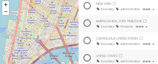
Hans Hack's new tool Gimme Geodata seems to be designed as an entry level tool for grabbing data from OpenStreetMap. The tool is a fantastic resource if you want to quickly grab the boundary of any country or administrative level in the world in GeoJSON format. Click on the Gimme Geodata interactive map and it will provide a list of all the available boundaries which you can download.

For example if you click on Chinatown in New York City you are presented with the option to download any or all of the following boundaries:
  • Chinatown
  • Manhattan Community Board
  • Manhattan Island
  • Manhattan
  • New York City
  • New York County
  • New York State
  • New York Timezone
  • Contiguous United States
  • United States
Select any combination of these borders and you can then download the selected borders in GeoJSON format.

Gimme Geodata is probably the simplest and easiest tool available for grabbing polygons of different administrative areas. The tool certainly doesn't have the range of Overpass Turbo but if all you need is country / regional borders or polygons of countries or regions then Gimme Geodata is fantastic. I already know I'm going to be using Gimme Geodata - a lot.

Where's the Border?


Earlier this month I created a little map survey tool which can be used to gather data on whether people can point to a named location on a map. That survey tool is intended to be used to collect geographical knowledge for stories such as Morning Consult's Can You Locate Iran? story.

You can see the application in action on my Where's Null Island map on Glitch. This map asks you to point to Null Island on an interactive map and then adds your answer to a database (this map shows all the answers given by Feb 8th). If you want to create your own map survey tool then just click on the Glitch icon on the Where's Null Island map and select the 'Remix' option..

This week I stumbled on Adam Pearce's map New York Neighborhoods Drawn by  New Yorkers. Back in 2015 DNAInfo asked New Yorkers to draw their neighborhood boundaries on an interactive map. Adam's map shows the neighborhood outlines drawn by more than 12,000 people in the DNAInfo survey. Inspired by this map I decided to create another map survey tool which could gather the data from linestrings drawn on a map.

My Hunting Wales map shows this new map surveying tool in action. On this map users are asked to simply draw the border between England and Wales. Each user's submission is then saved to a database.

At the heart of my application is this Mapbox.js Leaflet Draw example map, which uses Leaflet's drawing library to allow users to draw a linestring on top of a map. For my surveying tool I simply extended the 'draw:created' function to convert the linestring data into a GeoJSON format and save the result to a database:

If you want to clone the project on Glitch just click on the Glitch icon on my map and select the remix option (however please use your own Mapbox token number). The map is very easy to adapt to accept user drawn polygons rather than linestrings. To add a polygon button to the map just remove the 'polygon: false,' line in the map's JavaScript code. This will allow your users to draw shapes on the map, which is useful if you want them to draw neighborhood outlines, as in DNAInfo's New York neighborhoods survey.

Another inspiration for my new map surveying tool was a Berliner Morgenpost story from 2015. On the 25th anniversary of reunification the Berliner Morgenpost asked its readers if they could still remember where the border was between East and West Germany.

Using an interactive map readers were asked to draw the border between the former East and West Germany. Around 13,000 people responded by drawing on the map. The Webkid blog has the results of the survey. These results include a heat-map showing all of the 13,000+ guesses made and the real border between the two former countries.

Thursday, February 20, 2020

The Migratory Patterns of Birds


The Cornell Lab of Ornithology is running the largest citizen science project in the world. For fifteen years bird watchers across the globe have been reporting their observations to eBird. The result is a huge database of over 750 million observations, recording dated sightings of thousands of species of birds.

The eBird Science team has used the observations made in North America to create animated migration and seasonal abundance maps for 610 bird species. The maps visualize the abundance of each species across North America and allow you to observe their migratory patterns over the course of each year.

The abundance maps show where each bird species is most common across the continent. These maps use different colors to show the relative abundance of a bird species at different times of the year. The migratory maps allow you to view the migratory patterns of whole populations of bird species across the whole continent of North America. For example in the map above you can observe the abundance of waterfowl in different locations over the course of a year. Note how in the winter the Mississippi River Valley shows up on the map as thousands of waterfowl visit.

Wednesday, February 19, 2020

The Arctic is Melting


The rate of global warming in the Arctic is about twice as fast as the global average. You can see how this global heating is affecting sea ice extent on this impressive map visualization from Aftenposten. The article accompanying the map is in Norwegian but you don't need to speak Norwegian to appreciate the impressive interactive map.

As you scroll through The Arctic is Melting a map of the Arctic visualizes the level of sea ice extent over time for every year since 1985. The purple colored areas on the map show the thin ice that melts in summer. The white ice shows the thicker perennial ice, which has visibly shrunk in just the last decade. In recent years the ice in the Arctic has become younger and thinner. This means that the ice melts faster and earlier every year.

You can view many other mapped visualizations of the loss of sea ice in the Arctic on the Maps Mania Arctic tag.

Where in the World - Map Games

Map games can be a lot of fun to play. They can also be a lot of fun to make. The following three interactive map games are all fun to play. They are also all on GitHub. This means that each of these games is easy to clone and adapt if you want to create your own map based geography game.

Quizzity


Play the Game & Clone the GitHub

In this simple map game you are given six different cities to identify by clicking on their correct locations on an interactive map. You gain points based on how near you are to the correct location and by how quickly you answer.

City-Guesser


Play the Game & Clone the GitHub

In this Mapbox based game you are shown different cities around the world. All you have to do is select the correct name for the city from a choice of four. If you guess correctly then you progress to the next round. Each city shown is more difficult than the last. The object of the game is to name as many cities as you can. The game finishes as soon as you guess a city wrongly.

Map Quiz


Play the Game & Clone the GitHub

Map Quiz is actually a compendium of a number of different map games in one package. On Map Quiz you can choose to play map games which test your knowledge of countries, cities or even national flags. If you guess correctly in this game you are rewarded with a little information box containing the selected country's flag, population and area size.

How Big is Big?


1,500 square miles

Data visualization expert Hans Hack has developed two interactive mapping tools which are great if you need to explain the size of something by showing it on a map. His How Big tool uses scaled circles or squares to visualize simple area sizes and his Reprojector tool can be used to show the size of areas with more complex shapes.

Massive swarms of locusts are currently destroying crops in Kenya, Ethiopia, Somalia, Tanzania and Uganda. The food supply of tens of millions of people is threatened by swarms as big as 1,500 square miles. Each swarm can include up to 150 million locusts per sq km. A single swarm can cover 120 miles in a day devouring all crops encountered on the way.

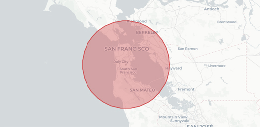
It can be hard to comprehend how large 1,500 square miles actually is. Which is why Hans Hack size comparison map tool can be very handy. How Big is an interactive map which allows you to show how large an area is by overlaying a circle or square of that size over any location. This allows you to make direct comparisons between the sized shape and places that you are familiar with.

Type in an area size into the How Big interactive map (in meters, hectares, kilometers or miles) and the map will display a circle or square of that size over the location of your choice. If you want to use the generated circle or square in your own maps you can even download a GeoJSON file of your sized shape.


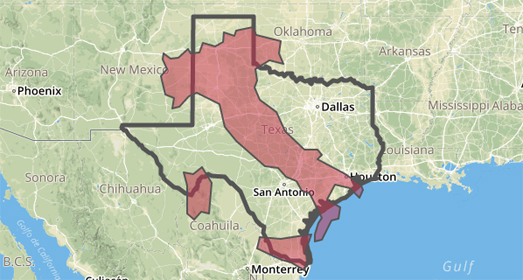
If you want to show the size of more complex shapes then Hans Hack can help you there as well. His Reprojector interactive mapping tool allows you to compare different areas with each other by moving GeoJSON shapes around. The tool is great for comparing two (or more) different geographic areas with each other.

The Reprojector tool allows you to upload any GeoJSON polygon onto an interactive map. This GeoJSON can be anything you want, including country or state borders. Once you have uploaded a polygon onto the Reprojector map you can move the shape around to overlay the polygon on any location in the world. When you are happy with the location of your polygon you can then download a GeoJSON file with the data to display your polygon in its new position.

You can see in the screenshot above an example where I positioned a GeoJSON polygon of Italy on top of the state of Texas. If you want to experiment with moving different country polygons around on the Reprojector map then you might find GeoJSON Maps of the Globe useful. This simple tool allows you to click on a country on an interactive map and then download it as a GeoJSON file (which you can then upload onto the Reprojector map).

Tuesday, February 18, 2020

Mapping Urban Sprawl


Urban planning around the world seems to have become obsessed with the idea of creating gated communities and disconnected street networks. This is extremely bad news for people who like to walk and for the environment. Urban sprawl and disconnected streets create barriers to and discourage walking. Cul de sacs and gated communities make it very difficult to make journeys without a car. They therefore lead to an increased use of vehicles and CO2 emissions. On the other hand connected street networks encourage walking and the use of public transport.

Researchers from the McGill University in Canada and the University of California have devised a way of measuring urban sprawl around the world. The Street-Network Disconnectedness index (SNDi) measures street connectivity. The SNDi uses OpenStreetMap data to work out an urban sprawl score for street networks across the world. This score is calculated by looking at such as factors as the number of routes possible between locations on a street network, the number of dead ends, and the distance of possible travel between locations.

The Sprawl Map allows you to explore the SNDi given to towns and cities around the globe. Zoom-in on any town in the world and you can see the SNDi scores given to individual roads. On the map streets are colored to show how well connected they are. Poorly connected streets, such as cul-de-sacs or loops, where people are forced to drive, are colored red. Well-connected streets, where walking is easy, are colored blue. Zoom out and the Sprawl Map provides a choropleth view, which shows how connected different countries, regions and cities are overall.

Where are New York's Hoods?


Back in 2015 DNAInfo asked New Yorkers to draw their neighborhood boundaries on an interactive map. More than 12,000 people drew outlines where they thought their neighborhood's borders existed. Unfortunately the map which DNAInfo created from the results no longer seems to exist.

Luckily Adam Pearce appears to have access to the data and has created his own map of New York Neighborhoods Drawn by  New Yorkers. The interactive map provides a great visualization of where New Yorker's think their neighborhoods begin and end. The map includes a link to an interesting article called Uncertainty Over Space, which briefly explores how AI might be used to explore and visualize the borders between different neighborhoods based on these crowdsourced outlines. The map also has its own GitHub page.


While it can be interesting to explore where people think they live it can be just as interesting to find out what they think about where they live. Hoodmaps can help you discover what people think about different neighborhoods with its crowdsourced city maps - annotated and labeled by locals.

Hoodmaps has two main ways to show you what the locals think about different parts of a city. One way is by coloring the map by its dominant characteristic. Different colors are used to paint neighborhoods  as being either Students, Hipsters, Tourists, Rich, Suits or Normies. The color that you see is the dominant color from all the user inputs. Users can also provide more individual assessments of specific locations by adding a custom label to the map. For example, in New York users have tagged neighborhoods as 'hipsters with rich parents', 'Hasidic' and 'Polish' (among other things).

Noise Pollution Maps


One in every four people in Europe live near a road which is responsible for noise levels in excess of 55 decibels. The NOISE Observation & Information Service for Europe map allows you to explore the levels of noise pollution across Europe. The interactive map provides an overview of the levels of noise pollution across the continent created by road traffic, railways, airports and industry.

The NOISE map allows you to explore noise pollution levels from four separate sources. Using the map sidebar you can navigate to explore noise levels across Europe from roads, rail, airports or industry. Each of these four separate noise pollution maps provide you with an overview of average noise levels for locations across Europe during the day or at night.

If you click on a location on the NOISE map you can discover the number of people exposed to average noise levels of 55 dB or higher for the selected source of noise pollution. The map will also tell you how many people in the selected country are exposed to noise levels of 55db or above.


The OSM Global Noise Pollution Map uses OpenStreetMap data to estimate the levels of noise pollution across the world. At the heart of the OSM Global Noise Pollution Map is the very clever but simple idea of assigning noise pollution levels based on OpenStreetMap tags.

Map features in OpenStreetMap are assigned a tag which describe what has been mapped. These tags can also be assigned a value. For example all roads are tagged 'highway' but are also assigned a value such as 'motorway', 'secondary' or 'residential'.

The OSM Global Noise Pollution Map use these tags and values to assign a noise pollution level based on general assumptions. For example highway, trunk, primary and secondary roads are deemed to be noisier than normal street or service roads. The OSM Global Noise Pollution Map also assumes that other mapped features, such as railways and retail & industrial zones, will also generate different levels of noise pollution.

Monday, February 17, 2020

Driving While Distracted


Bloomberg has created an animated map to visualize the number of cars driving on our roads controlled by drivers using mobile phones. In the USA around 3,000 people a year are killed as a result of drivers being distracted while using their phones. In How Bad is Distracted Driving? Bloomberg has managed to visualize the scale of the distracted driving problem in New York and Los Angeles using two animated maps.

The two separate maps display a large number of cars driving around New York and Los Angeles. Some of the cars on each map are colored red and some are colored black. The percentage of red cars on each map represents the average percentage of drivers who drive around that city while distracted by their mobile phones. The resulting map is a very original and effective visualization of the data and really helps to convey the scale of the distracted driving problem.

The Bloomberg article also includes two other maps of New York and Los Angeles. The second set of maps presents a heat map view of each city's roads. On these maps roads are colored to show the percentage of drivers recorded on those roads driving while using their phones. The maps therefore show which roads have the highest percentage of distracted drivers.

The data for all four maps comes from the smartphone driving platform TrueMotion. TrueMotion tracks the usage of phones while their owners are driving. The TrueMotion application is used by the customers of a number of insurance companies. These customers are given incentives by the insurance companies when they agree to have their phone usage tracked while they are driving.

Become a Virtual Pilot


The UK's air traffic control service, NATS, has released a fantastic visualization which allows you to experience a virtual plane journey from London to Manchester. During the take-off, flight and landing you can listen in on the conversations which take place between the pilot and ground & air control. The whole journey is designed to show you how NATS Air Traffic Controllers safely guide a real plane on a journey from London Heathrow to Manchester.

As you scroll through Plane Talking you can watch as your plane taxis on to the runway, takes-off and flies towards Manchester. Next to a mapped visualization of your plane's journey a map sidebar displays the text of the conversations which take place between air traffic control and your pilot. You can also listen to these conversations as they occur during the journey.

The map sidebar is also used to provide other interesting and important information regarding air travel. For example information is provided on how wind direction affects take-off and landing and also the direction of an airport's runways. You can also learn the International Radiotelephony Spelling Alphabet, the codewords which are used for letters by pilots and air traffic controllers when they are communicating with each other.

After you have successfully landed Plane Talking presents you with some data on your completed journey. During your 150 mile flight there were 73 messages passed back and forth between the pilot and ground & air traffic controllers. Nine separate air traffic controllers spoke to the pilot during the flight and the plane passed through five different airspace sectors.

Mapping Family Names


I am a big fan of the Inspector Montalbano television series. One reason why I like the show so much is because it is set and filmed in some beautiful locations in southwest Sicily. The television program is based on the series of detective novels written by Andrea Camilleri, who originated from the province of Agrigento, Sicily.

While growing up in southwest Sicily Camilleri may well have known some real Montalbanos. Of the 1101 families with the surname Montalbano in Italy 739 of them are in Sicily, and of those 739 families called Montalbano in Sicily more than half of them live in the province of Agrigento. It seems likely that while growing up in Agrigento the writer Camilleri was very familiar with the name Montalbano.

Another Italian family name which can be found in Sicily is Corleone. There are only 56 Corleone families in the whole of Italy, but of those 56 families 21 of them live in Sicily. The name, which Mario Puzo adopted for his mafia family in the novel The Godfather, presumably originates from the Sicilian town of Corleone.

You can explore the distribution of other Italian surnames on the Italian Last Names Map. Enter a family name into the Italian Last Names Map and you can view an interactive map which shows you where that name can be found in Italy.

If you are from Italy or have an Italian surname then you can also search for the geographical spread of your last name using the Heatmap of Italian Surnames. Just enter your name and you can view a heatmap showing the distribution of that name in Italy based on data from Pagine Bianche.


If your family originate from the UK then you can discover where they might be from using named. Named maps locations in the UK where surnames have an historically unusually high local population.

The map is very easy to use. All you do is enter a surname and named will create a heatmap showing you where there is an unusually high number of people with that name. My family now live all around Europe. However, two to three generations ago, most of my family lived in and around Northampton in England. The spatial distribution of the surname 'Clarke', as shown by named, reveals that this area of the UK is home to many families called Clarke.

In Germany you can use GeoGen to view a map showing the geographical distribution of German surnames.

If you have Irish forebears then you can use the Geo Genealogy Map of Irish Surnames. The Geo Genealogy Map of Irish Surnames uses data from the 1890 census to show which families were living where in Ireland at the end of the nineteenth century.

You can see the global distribution of your family name using Forebears. You can use Forebears to undertake a global search for your family surname. If you enter a surname into Forebears it will tell you the meaning of your name and show you a map of the global distribution of your name. Beneath this generated map you can view a list showing the number of incidences of your surname recorded in each country around the world. It also shows the ratio of people with your surname in each country and the rank of your name in comparison to the incidence of all over surnames in each country.

Friday, February 14, 2020

California's Slum Landlord King


Mike Nijjar's property empire is huge. Much of it is also dirty and dangerous to live in.

LAist has mapped out the extent of Mike Nijjar's property empire in Southern California and how it is built on the suffering of California's poorest citizens. An interactive map in Deceit, Disrepair and Death Inside a Southern California Rental Empire shows just how many properties Nijjar's PAMA company owns in California. The map shows the huge number of parcels of land which are owned by PAMA. It also colors each of these parcels of land by median household income to show how many of these properties are located in California's poorest neighborhoods.

The LAist article explore some of the dirty and lethal conditions which can be found in PAMA properties. It also reveals how regulators and cities across California are aware of the conditions in PAMA properties but how they rarely hold the company accountable. The LAist explores some of the reasons why regulators are so poor at holding slum landlords like Mike Nijjar accountable. These reasons include having different departments responsible for regulating different building codes, poor tenants being scared to report rich and powerful landlords, and regulators who receive little funding from cash-strapped cities.

Mike Nijjar, his family, and associates also own 170 different companies and corporations. This obviously makes it much more difficult for tenants and the authorities to know who ultimately owns and is responsible for a neglected property.

Comparing Coronavirus to SARS


A new interactive map from the London School of Hygiene & Tropical Medicine London School allows you to compare how Covid-19 compares to previous virulent epidemics. The Covid 2019 Tracker map visualizes the spread of Covid-19 around the world and allows you to compare this outbreak with the 2003 SARS, 2014 Ebola and 2009 Swine Flu epidemics.

The Covid-2019 Tracker map helps to visualize how virulent the Covid-19 really is. It shows how Coronavirus has already affected more countries than Ebola and has killed more people than SARS. However the map and the 'Summary' data also shows that so far Covid-19 has proved far less fatal than Ebola and has affected far fewer countries than Swine Flu.

The data on the Covid-2019 Tracker map is being updated daily based on information from the World Health Organisation.

Non-Normalized Data

Like every other Coronavirus tracking map that I have seen the Covid 2019 Tracker map does not normalize its data. This means that the circular markers on the map show the total number of Covid-19 cases and not the incidence rate of the virus in each country. This can be misleading. For example, at the moment the markers for Italy and India are the same size on the map because both Italy and India have had three cases of Covid-19. This is despite the fact that Italy is a far smaller geographical area than India and has a much smaller population. Italy has had 3 cases in a population of 62 million compared to India which has had 3 cases in a population of 1.28 billion. Obviously at the moment the incidence rate of Covid-19 is far lower in India than it is in Italy. However the Covid 2019 Tracker map uses the same sized markers for each country.

Data Collection Methods

The Covid 2019 Tracker, and the other maps which show the spread of the virus over time, are also prone to errors from changes to the way that the virus is being monitored and recorded. Just today China's National Health Commission removed 108 deaths from the overall total, because of a previous double counting of fatalities. At the same time the overall number of deaths and overall number of cases was also revised upwards as yesterday China changed its methodology for registering Covid-19 cases. You therefore need to take into account these methodological changes when trying to track the progression of the virus over time. None of the maps I have seen acknowledge these changes in how the virus is being recorded in their timelines or graphs showing the spread of the virus.

John Hopkins' Wuhan Coronavirus (2019-nCoV) Global Cases visualization was the first interactive map showing the spread of Covid-19. When I first reported on the map on the 23rd January the map reported 17 deaths and 555 total cases of the virus. Today the map is reporting 1,384 deaths and 64,447 total cases in 28 countries around the world.

Thursday, February 13, 2020

Viewing National Parks From Your Car

Millions of Americans make at least one visit to a National Park every year. According to an analysis of geotagged photographs submitted to Flickr very few of those visitors ever venture far from a road. Nick Underwood, Clare Sullivan and Peter Newman analyzed 800,000 Flickr photographs taken within America's National Parks and discovered that a large majority of park visitors never stray more than a mile from a road.

Roads and the National Parks presents a number of different data visualizations to show where 800,000 Flickr photos were taken within National Parks. If we assume that the locations of where photos are taken is a rough guide as to where visitors travel within those parks then we can say that more than three quarters of park visitors stay within a mile of a road during their visit.


The map above shows the locations where photographs were taken in Yellowstone National Park in 2018 (as submitted to Flickr). On this map the roads running through the park are clearly revealed, showing that most photographs are taken very close to the park's roads. 'Roads and the National Parks' includes an interactive visualization which allows you to view a similar map for any National Park.


You can explore where people take photographs around the whole world on the Geotaggers Atlas. The Geotaggers Atlas is a fascinating map showing the paths taken by Flickr photographers between separate photographs, based on the time stamps and locations of the photos. Using the map you can zoom in on any city in the world and discover not only the most popular places photographed by Flickr users but the paths the photographers have taken around those cities.

For years Eric Fischer of Mapbox has been extracting location data from Flickr photos and mapping not just where those photos are taken but the routes that the photographers have taken between pictures. Using the Flickr search API Eric is able to retrieve photo geo-tags and draw lines between all the photos in a sequence.

The red lines on the map show where a photographer traveled at a speed between 7 and 19 mph, based on the time stamps and locations of the pictures. As you can see on the map of Paris above the river Seine stands out, a result of ferry passengers happily traveling up & down the river snapping the sights of Paris.

Who is Happy?


Nigerians are the happiest people in the world. The Greeks are the most stressed. People in Mozambique worry more than the people of any other country. And the people of Paraguay get the most enjoyment out of life.

The polling company Gallup has carried out a global survey to discover the emotional state of people across the world. In What Is the World's Emotional Temperature? the company presents the results of a survey carried out in 140 countries designed to find out how people are feeling in countries around the globe. In the survey people were asked a range of questions to determine their emotional state on the previous day. These questions ranged from 'Did you experience anger yesterday?' to 'Did you smile or laugh a lot yesterday?' - taking in emotions such as sadness, stress, worry and enjoyment.

On the survey results page you can view how people in each country responded to each of these questions about their emotional state. The results of each question can be viewed on an interactive map which shows the percentage of people in each country who answered 'Yes' to each question.

On the whole people in the USA appear to be emotionally content. 80% of Americans said that they smiled or laughed a lot yesterday. 82% of them said that they experienced enjoyment. 90% said they were treated with respect all day. And only 20% said they experienced sadness yesterday.

Wednesday, February 12, 2020

Exploring the Beauty of Planet Earth


The premise of Earth View is very simple. Earth View wants to show you the beauty of planet Earth by introducing you to some of the most striking images found on Google Earth.

Google's Earth View application and website is a showcase of some of the most beautiful satellite / aerial views of planet Earth, all of which can be found on Google Maps and Google Earth. This showcase includes more than 2,500 of the most beautiful views of our astonishing planet.

There are a few ways to explore the aerial images in Earth View. The simplest way is to simply press the play button and sit back and relax as Earth View automatically presents a slideshow of some of Earth's greatest views. Another way to browse Earth View is to select the 'Show Map' option. This allows you to select images by location from an interactive map. This map includes an amazing color filter control which allows you to find landscapes by the view's dominant colors.


The beauty of planet Earth can also be explored using Google Maps' Street View imagery. If you want a little help in exploring some of the beautiful landscapes captured by Street View then you might like these Street View based applications. MapCrunchThe Secret Door, Globe Genie and Random Street View are four websites that showcase some of the beautiful locations around the globe with have been captured on Street View.

The New Hampshire Primary Results

The results are nearly all in from yesterday's Democratic primary in New Hampshire. Bernie Sanders has narrowly won the primary, just ahead of Pete Buttigieg.


CNN's Primaries & Caucuses interactive map allows you to view the results in each caucus already run (Iowa and New Hampshire so far). If you select a state from the map you can view a choropleth map of the selected state which shows the winning candidate in each electoral district. If you hover over a district on the map you can view the percentage of votes won by each candidate. The map sidebar shows the overall percentage of votes won by each candidate and the number of pledged delegates.

The New York Times' New Hampshire 2020 Primary Results includes a similar map. The Times map colors each electoral district to show the candidate with the highest share of the vote. The map also includes a view which uses scaled markers to show the size of lead the winning candidate achieved in an electoral district.


Politico has created a small multiples visualization which allows you to see at a glance the share of the vote that each candidate gained in each county in New Hampshire. The New Hampshire Primary Results provides a clear picture of the tight race between Sanders and Buttigieg in the state. It also clearly shows how far Elizabeth Warren and Joe Biden were behind in New Hampshire.

After the first two primaries things are looking good for Biden and Buttigieg. Things are not looking so good for Warren and Biden. However there is still a long way to go.

Tuesday, February 11, 2020

Where the World Wants to Holiday


Italy is the most popular holiday destination in the whole world. This sunny country full of history and art, surrounded by warm seas is, for some strange reason, the most popular country to visit for most people living in America, China, India and most of Europe. It appears that Italy has an almost universal appeal for people around the world when they start thinking about their next holiday destination.

You can view every country’s most searched for holiday destination on Travel Supermarket's new interactive map. Spain, Australia, Greece and France receptively make up the rest of the top 5 most popular holiday destinations in the world, according to price comparison website Travel Supermarket. The Where the World Wants To Go On Holiday map uses data from Google searches to determine the most popular holiday destination for people in different countries around the globe.

To create the map Travel Supermarket used Google's Keyword Planner to see the average monthly searches for the term ‘Holidays in X’ for 870 destinations. The map therefore shows the most searched for country for holidays. These search results are maybe not the same as the countries people actually end up visiting for their holidays. This might partly explain why Travel Supermarket's list of the most popular holiday destinations seems to be very different from most reports on the countries most visited by international tourists.


If you are more interested in the total number of tourists that really visit each country in the world then you can view the World Bank map of International Tourism. This World Bank map colors the countries of the world based on the actual number of tourists who visit each country every year.

According to the World Bank data Italy is in fact only the 5th most visited country in the world. Based on the number of international tourism arrivals France is the most popular holiday destination in the world. Spain, United States and China respectively make up the next four most visited countries by international tourists.

Travel Supermarket's differing results may partly be due to the fact that not everyone searches 'Holidays in X' before going on an international vacation. The very small search volumes that the map is based on may also mean that the Travel Supermarket map isn't particularly accurate. The minuscule sample size for each country used to make the map means that it is difficult to infer preferences for a country's entire population just on this data.

Trainspotting Trains Stopping


The biggest cause of delays on the Dutch railway is broken down trains. 18.5% of all train disruptions in the Netherlands, since 2011, have been caused by trains breaking down. The next biggest cause of disruption to rail services is signal failure. 10.4% of train disruptions are caused by signal failure, closely followed by people being hit by trains, which caused 9.27% of all disruptions.

You can explore all the causes of disruption to train services in the Netherlands and where those disruptions occurred on the wonderful Dutch Railways Disruptions. Dutch Railways Disruptions is a fantastic visualization of what delays trains in the Netherlands and where they are disrupted. The visualization connects an interactive map with an interactive timeline and interactive radial chart.

Select a cause of disruption from the radial chart and you can view on the map where those types of disruption occurred on the rail network. For example if you select 'Accidents' on the chart you can see that the Eindhoven to Venlo section of the Dutch railway is the section where the most people have been hit by trains since 2011 (81 people have been hit by trains on this section).

If you are interested in trains then you might also like Travic. You can view Dutch trains moving in real-time on the Travic Transit Visualization Client. Travic shows trains moving in real-time on rail networks around the world - including on the Dutch rail network.

Monday, February 10, 2020

Mapping Climate Change in Europe


Many coastal regions in Europe are in danger from rising sea levels - even under the most optimistic climate change models. It isn't just rising sea levels that Europe has to worry about. Climate change will also lead to longer and more frequent severe droughts in southern Europe, increasing and more severe forest fires in western-central Europe and southern Europe and an increase in the likelihood of flash floods across much of Europe.

The European Environment Agency has released a series of interactive maps visualizing how Europe could be affected by climate change. Climate Change Impacts in Europe includes a number of individual maps which show the impact of droughts, flooding, forest fires and rising sea levels under different climate change models.

In northern Europe many densely populated areas are in danger from rising sea levels. The EEA estimate that coastal flooding events will increase by more than a factor of 10 in many European locations. It isn't just the Netherlands, the eastern coast of the UK and the coastal regions of Denmark and Sweden which could be affected by rising sea levels. The coasts of southern & western France and north-east Italy are also under threat.

The EEA's Climate Change Impacts in Europe looks in more detail at the effects of climate change on  a small number of individual regions and cities in Europe. Venice is one city which is likely to witness increasing traumatic climate events in this century. In November 2019 more than 85 % of Venice was flooded. The EEA predicts that under a high emissions scenario the frequency of coastal flooding events in Venice will increase by more than 100.