Monday, August 31, 2020

Where Stores Are Recovering


In countries around the world lock-down and working from home has had a major impact on the already struggling retail sector. During lock-down many shops and stores were forced to close. As countries have begun to emerge from lock-down many shops have begun to reopen. However in some areas not all the stores are reopening and some now probably never will.

The Guardian has used research from the Local Data Company to explore How Britain's high streets are recovering after lockdown. Although The Guardian's analysis is based on shops in the UK the patterns of recovery and non-recovery it found in the retail sector probably apply to many other countries.

In a series of maps The Guardian shows stores in different locations closing during lock-down and then shows which stores have reopened since the easing of lock-down. The Guardian's analysis shows that stores are recovering best in locations near where people live. Conversely, in city center locations, in areas dominated by commercial offices and with few residential units, stores have struggled to reopen. Clearly while the number of people working from home remains high stores, restaurants and cafes in commercial districts will continue to struggle. I suspect this trend might be repeated in commercial districts around the world.

The Guardian's analysis also revealed that stores, cafes and restaurants in tourist towns have also struggled to reopen. In towns which rely on tourism to maintain the local economy many stores have remained closed. The Guardian reports however that an uptick in British tourists may provide some hope for shops in tourist areas.

Tour the World by Video


If you have not been able to go on vacation this year then why not take a virtual holiday and explore the world on video? Movies on Map is an interactive map which allows you to watch videos of locations around the world. To virtually explore the world simply zoom into a city on Movies on Map and select a video marker to watch a YouTube or Vimeo video shot at that location.

Over the years there have been a number of video maps similar to Movies on Map. None of these maps have ever managed to gain any transaction. I think this is because nobody has ever managed to automate the process of picking great quality videos. This means that someone has to actually curate the videos - to choose the locations to feature and find the best video of that location.

Movies on Map allows registered users to submit a video to the map. This might be one way to populate the map with reasonable quality videos. My cursory review of Movies on Map suggests that so far it is doing a pretty good job of showing only decent quality videos. I wonder if introducing a rating system for individual videos might be good idea in order to provide a crowd-sourced method of identifying poor quality or mis-located videos. 

If exploring the world by video doesn't appeal to you then you might prefer to explore some art galleries, museums and historical sites around the world on my pick of the 10 Best Museum & Gallery Virtual Tours.

Saturday, August 29, 2020

The Covid-19 Map of Europe


The World Health Organization has released a new interactive map which shows the latest Covid-19 outbreaks in Europe. Many countries in Europe are beginning to see rising numbers of coronavirus outbreaks. As schools across the continent are beginning to reopen for the new school year there are huge concerns that Europe may be beginning to experience a second deadly wave of Covid-19.

The new WHO European Region COVID-19 Explorer interactive map uses data collected from a number of international, national, and regional authorities to visualize the latest Covid-19 incidence rates at a subnational level.

The map sidebar lists the regions with the highest incidence rates (cases per 100 000 population) over the last week.Currently a number of regions in Spain are among the European regions with the highest incidence rates of Covid-19. The map sidebar can also be used to show the regions with the highest incidence rate over the last 14 days or over the entire pandemic.

On the map itself  you can also view the 7 day, 14 day and cumulative incidence rates in each European region. On the map incidence rates are shown by the color of the regions, with yellow indicating a low incidence rate and red a high rate of Covid-19. Case counts are represented by proportional blue dots (the size of the dots determined by the total number of cases in the region).


You can get an idea of the current Covid-19 situation in most countries around the world using the Covid-19 Risk Areas map.Covid-19 Risk Areas is an interactive map which gives a rough guide as to the relative safety of individual countries - based on the current assessments of the German government.

The Covid-19 Risk Areas map uses Germany's Robert Koch Institut's international Covid-19 risk assessments of individual countries. The Robert Koch Institut's assessments are used by the German government for determining whether travelers to the country need to be quarantined or not. People traveling from a country deemed at risk are subject to a mandatory Covid-19 test and may be subject to quarantine.

The map currently shows 127 countries deemed at risk (colored red on the map), including the United States and Spain. Seven countries, including France and the UK, are deemed a partial risk (colored yellow) and 67 countries are currently deemed not at risk (colored blue).

Friday, August 28, 2020

The World Wine Atlas


There are over 1,700 distinct wine regions in the world. You've probably heard of many of the famous European wine regions, such as Champagne and Bordeaux. You might not be so aware of some of the lesser known wine regions, like the Nashik wine region in India or the Changhua region in Taiwan.

If you want to learn more about where different wines are produced and which climates are best for growing the best vines you might want to refer to the World Wine Regions Atlas. The World Wine Regions Atlas is a new interactive map which shows the locations of the world's wine regions and also provides information about the different growing conditions for vines around the world. The interactive map includes 1,700 appellations alongside information on the climate, soil and geology of the world's different wine regions.

The World Wine Atlas consists of two main layers. One layer shows over 1,700 different wine regions around the world, including the 606 AOCs (Appellation d'origine contrôlée) & IGPs (indication geographique protegee) in France, the established wine regions of North America and Australia, the Nashik region in India and even some emerging, yet-to-be named regions in countries such as Bhutan and China. The other map layer shows climate zones around the world. This layer provides important information about the region's climate, land-forms and terrain.


If you need a little help deciding what to eat with which wine then you might also want to refer to the TasteAtlas. The TasteAtlas is an interactive map which allows you to explore the local foods, dishes, tastes and cuisine of any location in the world. Using the map you can search different locations to discover the kinds of things the locals like to eat and drink. It is a great way to discover the tastes of different regions of the world and, at the same time, get a little inspiration about what to have for dinner tonight.

A great feature of the TasteAtlas is that you can search the map for individual foods. For example here is the cheese map of the world and here is the bread map of the world. Search for a particular type of food and you can zoom-in on the map to discover the local varieties available at different locations. For example, on the cheese map you can zoom-in on France to discover all the local varieties of cheese available in different regions of the country. Or, if you search for the pasta map of the world, you can find out which different types of pasta come from the different regions of Italy.You can even search for where different wine varieties are produced around the world.

Thursday, August 27, 2020

A Million Australian Rivers


Australian Rivers and Streams is an interactive map of 1.3 million Australian watercourses.

One striking aspect of this map is that the Australian interior looks very wet. The deserts of the Australian outback appear to be very un-desert like on Australian Rivers and Streams. This is because the map shows both perennial and non perennial rivers. Australian Rivers and Streams includes a filter to turn off the non-perennial rivers. If you use this filter you can view the map without all the dryland rivers (the rivers which are dry for a lot of the year).

70% of Australia's rivers are ephemeral rivers. Some of these may only flow once every few years or even every few decades. If you select to view only the perennial rivers on the map then you get a very different (perhaps more accurate) picture of Australia.


There are many interactive maps visualizing rivers in the United States. Among my favorites is the Streamer interactive map. The USGS's Streamer map allows you to trace rivers or streams upstream to their source or downstream to their final destinations. The interactive map can create very dramatic visualizations of river watersheds, particularly when you trace a river upstream to show all of its tributaries.

Streamer is incredibly easy to use. Just click on a river on the map and select either the 'upstream' or 'downstream' buttons (for the best results click on the Mississippi and then the upstream button). You can also get a detailed trace report for your selected river. This report includes information on the river's origin, length and the number of states it flows through. It also provides details about the streamflow gauging (measuring) stations found along the selected river route.


Andrew Hill has created a map of all United States rivers in which the rivers are colored by the direction of flow. The U.S. Rivers Colored by the Direction they Flow map shows colored rivers on a black background to create a visually striking map of United States watercourses.

Hurricane Laura Interactive Map


This image shows Hurricane Laura making landfall in Louisana. The screenshot was captured from Windfinder, an interactive animated map which shows wind speed and wind direction in real-time and also provides a 5 day forecast.

To view Laura's forecast path you can select to view different hours on the Windfinder timeline. Windy, another real-time animated wind map, actually includes a play button which allows you to watch the forecast movement of Hurricane Laura animated on the map.

Hurricane Laura has intensified rapidly in the last 24 hours, quickly developing from a category three to a category four storm and gaining over 70% in power.


NASA's Deep Learning-based Hurricane Intensity Estimator uses artificial intelligence to assess the wind speed intensity of tropical storms. You can use the map at the moment to follow the progress of Hurricane Laura and to view the intensity assessments that the model has made for this huge tropical storm.

The model used by the map to assess the intensity of hurricanes is based on the Dvorak technique. The Dvorak technique looks at patterns in infrared satellite imagery to determine the intensity of tropical cyclones. When these patterns are assessed by humans the intensity estimate is based on a subjective judgement. By using deep-learning to recognize the patterns in infrared satellite imagery NASA hopes to develop a more objective way to measure the intensity of tropical storms.

If you click on Hurricane Laura on the interactive map you can view the latest intensity estimate of the storm. You can also view and download the deep learning predictions made by the model since Hurricane Laura began.


You can view Hurricane Laura's forecast cone and predicted track on NOAA's Hurricane Laura page. As well as the interactive map of Laura's forecast path NOAA includes the latest storm surge warnings, hurricane force wind warnings and flash flooding warnings for Hurricane Laura.

Wednesday, August 26, 2020

The Van Eyck Street View Tour


Jan van Eyck was a Flemish artist, who is perhaps most famous for the Ghent Alterpiece and The Arnolfini Portrait. You can learn more about Van Eyck and examine his paintings up close in the Ghent Museum of Fine Arts' Van Eyck virtual exhibition. The exhibition includes nine artworks by Van Eyck, several pieces from his studio and a hundred international masterpieces.

Exploring the gallery's Van Eyck Virtual Tour is almost as good as visiting the exhibition in real-life. In fact, because you can't currently attend the exhibition (the exhibition is presently closed to the public) in person, then this is as good as it gets. The virtual tour uses 'Street View' like 360 degree panoramic imagery which allow you to virtually walk around the different gallery rooms in the exhibition and zoom in on the individual paintings and exhibits.

In each of the rooms the paintings have interactive hotspots which allow you to read the associated wall notes or to listen to the audio guide created for the selected painting. You can walk around the different rooms in the exhibition in order or you can use the tour menu to select to visit any room in the exhibition.

If you want to explore more of the world's best museums and galleries during lock-down then here are a few more virtual tours that you might enjoy:

The Uffizi Galleries Virtual Tour - one of the greatest collections of Renaissance art in the world
The Metropolitan Museum of Art - includes a number of virtual exhibitions
The National Gallery - London's National Gallery has a number of virtual tours
The Rijksmuseum Masterpieces Up Close - a virtual tour of the museum's Gallery of Honour
The Sistine Chapel Virtual Tour - explore the Sistine Chapel and Michelangelo's astonishing ceiling
The Smithsonian National Museum of Natural Museum - has created a number of virtual tours
The Stonehenge Virtual Tour - places you in the center of this mysterious pre-historic monument
Beijing Palace Museum - the Palace Museum has created a number of virtual tours which allow you to explore some of the museum's galleries and also some of the amazing buildings of the Forbidden City
Buckingham Palace - take a virtual tour around the Queen's favorite pad

The Magical Neolithical Mystery Tour


The Orkney Islands are home to perhaps the greatest concentration of neolithical monuments and archaeological sites in the world. In just a very small area you can visit stone circles, tombs and stone villages which date back over 4,000 years.

You can learn more about the archaeological wonders of the Orkney Islands on Jim Richardson's fantastic story map the Neolithical Mystery Tour.The story map includes Jim's own fantastic photographs of the homes, ancestral tombs and temples of people who lived during the stone age.


Alongside his wonderful photography Jim Richardson's tour provides a wealth of information on when the different villages, houses, stone circles and other sites were first discovered and excavated. It also includes some educated speculation about the life of our neolithic ancestors and how they used these buildings, stone circles and ancestral tombs. 


Perhaps the only other location which has as great a concentration of neolithic archaeological sites is the area around Stonehenge. Stonehenge is one of the most iconic prehistoric monuments in the world. Every year it is visited by over 1.5 million people. I wonder how many of those visitors visit any of the other 300 odd Neolithic and Bronze Age barrows that are within walking distance of Stonehenge.

One way to appreciate the astonishing prehistoric landscape around Stonehenge is by exploring the Stonehenge Barrow Map. This interactive map shows the location of prehistoric barrows in the vicinity of Stonehenge. While it might not be the same as visiting the barrows in person the aerial view on this map does give a unique perspective on these prehistoric sites and reveals some features that aren't always apparent on the ground.

The barrow markers on the map are color-coded by how they are grouped by Richard Colt Hoare in his 'The Ancient History of Wiltshire'. The map also has a search facility which allows you to search for barrows by name and by other criteria, such as what artifacts were found in them. You can find out more about individual barrows by clicking on its marker on the map. This will open an information window containing descriptions from 19th-century and modern-day researchers. It also includes links to relevant research & websites and to photographs of the artifacts discovered in the selected barrow.


Historic England's 2002 National Mapping Project of Stonehenge added another 539 important archaeological sites around Stonehenge. About thirty percent of the newly discovered sites were prehistoric or Roman in date. These included ring ditches, field systems, round barrows and enclosures of various forms dating from prehistory.

You can explore and download research reports from the Stonehenge NMP for 46 of the most important new historic sites discovered around Stonehenge, The Stonehenge World Heritage Site Landscape Map allows you to view aerial imagery of these 46 NMP listed sites, learn more about each site and download each site's report.

All 46 sites can be navigated to from the map sidebar or by clicking on the numbered markers on the map. When you select a site from the sidebar or map, the map zooms to show the listed site and information for the site is displayed in the map side panel. A link to download the individual site's NMP report is also provided in the map side panel.

Tuesday, August 25, 2020

Urban Heat Islands & Redlining Maps


The New York Times has mapped out how racist housing segregation in the United States, dating back to the Home Owners' Loan Corporation's Redlining maps, is a major contributory factor to the location of urban heat islands in towns and cities across the country.

Urban heat islands are areas of towns and cities which on days of extreme heat become unbearably hot. These areas can often become 10-20 degrees warmer than other areas in the same city. Urban heat islands tend to occur in the areas with the densest built environment and the most roads. This is a result of un-shaded roads and buildings absorbing heat and then radiating it out to their surroundings. The coolest places are usually neighborhoods with parks and lots of tree cover. The dark surfaces of roads and built materials, such as bricks and concrete, absorb more heat than grass and vegetation. Which is why the densest built areas tend to be significantly warmer than areas with tree cover or parks.

In How Decades of Racist Housing Policy Left Neighborhoods Sweltering the New York Times has created a story map which shows how across the United States neighborhoods which were redlined are usually the hottest parts of towns and neighborhoods which weren't redlined tend to be the coolest. The reason for this is that redlined neighborhoods have largely remained areas of deprivation and tend to have few trees and also a dense built environment. Non-redlined neighborhoods have remained mostly more affluent and are therefore more likely to have lots parks and lots of tree cover.


Of course because the HOLC redlining maps have had such an enduring effect on housing segregation in the United States these urban heat islands are often in neighborhoods with the largest black populations. The coolest neighborhoods tend to have large white populations.

Under President Franklin D. Roosevelt's New Deal black homeowners were discriminated against through the creation of redlining maps. These maps identified areas with significant black populations and labeled them as too high risk for mortgage support. Black homeowners living in these areas were therefore very unlikely to be successful when trying to refinance home mortgages from the government sponsored Home Owners' Loan Corporation.

Wenfei Xu has created an interactive mapping tool which allows you to compare the historical redlining maps side-by-side with modern day census data. The Redlining Map tool allows you to explore for yourself if the HOLC redlining maps have had a lasting impact on segregation in your city. Using the modern census data you can view the neighborhoods with a high percentage of black, white or Hispanic people and see if these areas correlate with areas which were deemed at risk or safe for lending purposes in the 1930's.


The HOLC map from the National Community Reinvestment Coalition also allows you to explore the lasting legacy of the HOLC's redlining maps. This interactive map allows you to compare modern data about income status and the racial mix of the population with the HOLC's historical redlining security ratings.

Using the HOLC map you can see if neighborhoods in your city with 'good' HOLC redlining ratings have remained largely white and wealthy or whether your city has become a beacon of social and racial equality. You can also use the National Community Reinvestment Coalition map to see where gentrification has occurred in a city. These are the neighborhoods which received the lowest HOLC redlining ratings but now don't have the stripes from the 'Low to Moderate Income' layer. 

Below Amsterdam's Canals


During the construction of Amsterdam's North / South metro line archaeologists were given a unique opportunity to access the riverbed of the Amstel. The Amstel River was pumped dry during the construction of the metro, giving archaeologists a very rare opportunity to search the riverbed for finds. The search proved very fruitful. During the excavations 700,000 different objects were found, some of them dating back to before the formation of Amsterdam itself.
You can explore the archaeological finds for yourself on the Below the Surface interactive map. This map allows you to zoom-in and get a close-up view of individual finds from the excavations carried out along the Rokin canal. On the map the finds are divided into two columns 'display case south' and 'display case north'. The objects within each column are then ordered by type, so that similar objects appear near each other on the map. If you click on the plus sign marker on an individual object on the map you can learn more about this find.

As well as exploring the finds on the interactive map you can also explore a timeline of the excavated objects. On this timeline the objects are organized by date. This timeline allows you to explore the finds from the excavation by age. Among the oldest finds are fossils over 4,000 years old. If you click on individual objects on this timeline you can not only learn more about the individual object but you can also view an interactive map of where it was found on the bed of the Rokin canal.

Monday, August 24, 2020

Covid-19 Travel Risk


Covid-19 Risk Areas is an interactive map which shows the current Covid-19 risk level in different countries around the world. If you are planning on international travel you can use the map to get a rough guide as to the relative safety of individual countries - based on the current assessments of the German government.

The Covid-19 Risk Areas map uses Germany's Robert Koch Institut's international Covid-19 risk assessments of individual countries. The Robert Koch Institut's assessments are used by the German government for determining whether travelers to the country need to be quarantined or not. People traveling from a country deemed at risk are subject to a mandatory Covid-19 test and may be subject to quarantine.

The map currently shows 126 countries deemed at risk (colored red on the map), including the United States and Spain. Five countries, including France, are deemed a partial risk (colored yellow) and 70 countries are currently deemed not at risk (colored blue).


Germany is not the only country which places travel restrictions on international visitors. Because of Covid-19 many countries around the world have imposed restrictions on international travelers. These restrictions obviously differ from country to country. The International Air Travel Association has therefore released an interactive map to show the travel regulations which have been imposed by individual countries around the world.

On the IATA Travel Regulations map individual countries are colored to show how restrictive their travel regulations currently are. The darker blue the country then the more restrictive their current regulations are for international travelers. If you click on individual countries on the map you can view in detail their current international travel regulations (dated by date of publication). If you wish to travel to a country then you do need to click on the map as most countries apply different restrictions to people traveling from different countries.


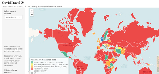
Because most countries have imposed travel restrictions which are more restrictive for some nationalities than for others international travel permissions will differ depending on the country you are traveling from. CovidTravel acknowledges this by showing the international travel restrictions for individual countries. If you select your country from the drop-down menu CovidTravel colors all the countries of the world to indicate the current travel restrictions imposed on people traveling from the selected country of departure.

If you click on individual countries on the map you can also see links to that country's official travel guidance for international travelers.

Global Forests & Tree Heights


A new interactive map shows the canopy height of forests across the world. The Global Forest Canopy Height map uses Google Earth Engine to visualize the height of forest canopies around the globe.

The Global Forest Canopy Height map includes a height control which allows you to filter the map to visualize only forest canopies of a specified minimum height. You can use this filter, for example, to show where the world's tallest trees are located by selecting to view only canopies over 19 meters in height. You can also click on the map to view the average forest height canopy at that location.


Since the year 2000 the world has lost more than 500 million acres of forest. The Global Forest Watch map visualizes current global forest coverage and where forests are being lost.

Global Forest Watch is an organization dedicated to monitoring and detecting deforestation around the world. The organization is attempting to establish a global forest monitoring network. The Global Forest Watch interactive map is part of an initiative to provide the tools for anyone to explore forest loss and forest gain across the globe.

The Global Forest Watch interactive map has a number of different map layers, including forest cover and loss since 2000, worldwide tree height data, tropical forest carbon stocks and data about global forest use. The map also includes links to forest-related stories. The links to these stories are embedded on the map at specific locations and the stories include photos, video, and explanatory text.

How Much of Your Town is Parking Lot?


A few years ago the housing charity Shelter claimed that just as much land was covered by golf courses in the UK as was used by housing. The claim wasn't meant as an attack on golfing but was made to illustrate the point that there was easily enough land for more housing to be built in the UK.

But was Shelter correct? Do golf courses use as much land as housing in the UK?

The Golfulator might have the answer. Draw around an area of Great Britain or Ireland on the Golfulator interactive map and it will tell you how much land in that area is used for golf and how much is used for housing.

My relative limited use of the map suggests that golf in the UK does not use as much land as housing. Even in St Andrews, 'the home of golf', there is a fairly even split between golf and housing. With so many local golf course St Andrews has to have one of the highest golf to housing ratios in the UK. Therefore in most areas of the UK housing is going to take up a higher percentage of land than golf. However the ratio will obviously depend on where you draw the map.


The Golfulator map uses data from OpenStreetMap on the location and areas of UK housing and golf courses. The Golfulator is on GitHhub. If you want you could therefore adapt the map for your own purposes - for example to find out how much land in Los Angeles is devoted to parking lots.

Although you don't have to do that. Because it has already been done. If you want to know how much of LA is dedicated to parking then you can use the Parkulator. Draw around your town on the Parkulator interactive map and you can find out what percentage of your town is defined as dedicated to car parking on OpenStreetMap.

Central Los Angeles is around 4% parking. That is enough space for nearly 19,000 more homes.

Saturday, August 22, 2020

California Wildfires & Air Pollution


In the last few days Northern California has been experiencing some of the worst air quality in the world. Smoke from the California wildfires has led to very unhealthy air quality in most of Northern California.

Clarity Movement, an environmental startup who specialize in air pollution, have released an interactive map which shows information on both the location of wildfires in California and on the latest air pollution data. Open Map uses data from NASA's Fire Information for Resource Management System (FIRMS) to show the latest information on active wildfires. Air quality is shown using data from AirNow (which monitors data from local air quality agencies across the country).

If you click on one of the colored air quality markers on the map you can see where the air quality monitor is located, the time when the air quality was last monitored and a graph of its readings over the last week and month. Open Map also includes a layer which allows you to view the number of Covid-19 cases (as reported by Johns Hopkins) across California.


Of course all that unhealthy air quality is the result of the wildfire smoke. You can see where smoke is likely to be a problem on NOAA's HRRR-Smoke Interactive Map Visualization. NOAA's map identifies locations with intense fires and then forecasts how smoke is likely to disperse based on the latest weather forecasts. The purple and red areas on the map are where smoke is likely to be the most concentrated.

The smoke forecast map is experimental. It is prone to errors from cloud cover preventing satellite detection of wildfires and to errors in weather forecasts.

Also See

The LA Times' California Wildfires Map
The University of California's Fire Activity interactive map
The ALERTWildfire interactive map (wildfire detection from live cameras)

Friday, August 21, 2020

Mapping a Plague of Locusts


This year the Horn of Africa has faced the worst locust plague in over 25 years. Parts of Pakistan and India have also experienced their worst locust plagues for over a quarter of a century. The food supplies of 20 million people in Ethiopia, Kenya and Somalia are now severely under threat and crops across parts of East Africa, the Middle East and Asia are being destroyed by swarms of Desert Locusts.

A swarm of Desert Locusts that is 1 square km in size can eat as much food in a day as 35,000 people. This year huge locust swarms emerged in January in east Africa. Since then Desert Locust swarms have devastated crops across large parts of East Africa, the Middle East and Asia.

The Food and Agriculture Organization of the United Nations (FAO) has established the Locust Hub to provide information, maps and resources about the the desert locust problem and on the UN's ongoing response to the problem. The hub includes an interactive map which provides the latest data on the location of locust swarms across Africa, the Middle East and Asia. The Locust Hub also includes a Locust Data Explorer, which allows you to explore the historical movements of the Desert Locust swarms since the beginning of this year.

The Locust Data Explorer uses on-the-ground data reported to the FAO. The FAO has also developed a mobile app version of its eLocust3 tool for recording and monitoring crop pests. The eLocust3m app is available on both Android and IoS, and can be used by anyone to report locust sightings.

Thursday, August 20, 2020

California Wildfire Maps


The University of California's Fire Activity interactive map provides information on the latest wildfire activity in the state of California. The map uses satellite detection systems to detect the latest wildfire hotspots. It also provides fire perimeter information from on-the-ground information and from aerial sensors.

The Fire Activity Map is designed to provide a general awareness of the latest wildfire activity. It is important that you also check with your local authorities for the latest information and updates of wildfire activity in your area. The Fire Activity Map does provide links to evacuation maps created by individual counties. If you click on these links you should be able to find the latest fire maps for your area.

If you want to keep up-to-date with the current wildfires burning in California then you can also refer to the LA Times' California Wildfires Map. The LA Times map uses data from National Oceanic and Atmospheric Administration satellites and from Calfire to show the locations of all the current wildfires in the state. The interactive map shows the best guess location of each fire's origin, the latest known fire extents and hotspots showing locations where fires are suspected according to satellite imagery analysis.


The ALERTWildfire system uses live cameras to detect, locate and confirm wildfires. The system can also be used to monitor fire behavior and help firefighters tackle fires on the ground. The ALERTWildfire system is being developed by a consortium of the University of Nevada, the University of California and the University of Oregon. The system is currently operational in a number of locations in California, Idaho, Nevada and Oregon.

If you select a region from the ALERTWildfire interactive map you can see the live views from every single fire camera in the area. A Leaflet.js map shows the location of all the live cameras in the system and the direction of each camera's point of view. If you select a camera on the map you can view its current live feed. All the other feeds from the other cameras in the area are shown beneath this interactive map.


Elderly people are most vulnerable during the California wildfire season.  During the 2018 Camp Fire the average age of those who died in Butte County was 72. Currently nearly 2 million older Californians live in wildfire prone areas.

KQED has mapped out where elderly Californians live in the state's high risk fire zones. Whether you are elderly or not you can enter your address into Older and Overlooked to find out if you also live in one of California's high risk fire zones.

Interactive Geological Maps


William Smith was the first geologist to create a nationwide geological map of the UK. A geologic map reveals the distribution of geological features such as different types of rocks. Smith's beautiful 1815 map visualized Britain's geological types using different colors for different types of geological feature.

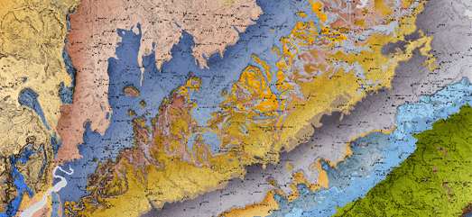
The British Geological Survey is upholding the tradition of beautiful geological maps with its own Geology of Britain interactive map. This interactive map follows the same methodology used by Smith in the 19th Century. On the map different colors are used to show different types of bedrock geology. If you click on the map you can learn more about the bedrock geology and superficial deposits at the selected location. The information provided includes details on when and how the displayed type of geology was originally formed.


You can view interactive versions of William Smith's Maps online. These interactive maps allow you to explore Smith's original geological maps of England, Scotland & Wales in very close detail. The interactive map interface allows you to view geo-rectified overlays of a number of William Smith's maps including his original 1815 geological map and his 1828 New Geological Map of England and Wales.


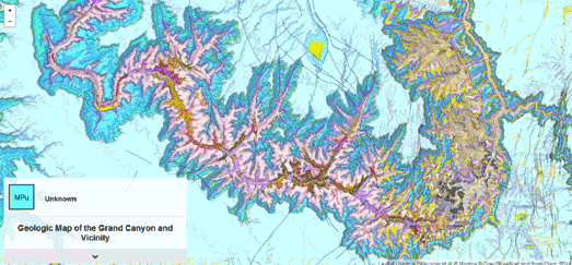
Digital geological maps can add a level of interactivity to the visualized geological strata. In other words online interactive maps can be used to reveal more information about the geology being mapped. A good example of this is the Geological Map of the Grand Canyon and Vicinity.

The Geologic Map of the Grand Canyon and Vicinity is a beautiful Leaflet.js based interactive map of the Grand Canyon. The map is based on data gathered by the U.S. Geological Survey. The map uses different colors to show the different rock units and geologic strata in the Grand Canyon and surrounding area. The map also includes contour lines. If you hover over the map the geologic strata at that location is revealed in the small information window. If you click on the map you can learn more about that geologic strata in the information dynamically loaded below the map.


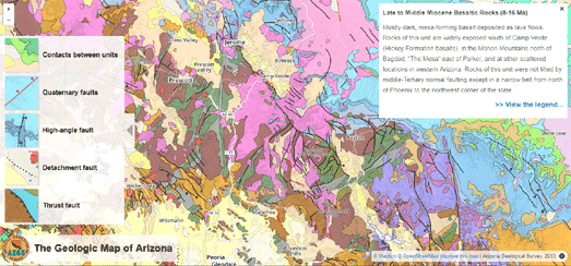
Another good example of an interactive geological map is the Geologic Map of Arizona. The Geologic Map of Arizona also includes interactive colored geological features. If you mouse over a feature on the map the geological information is revealed on top of the map. The Geologic Map of Arizona also visualizes the different types of geological faults which can be found in Arizona.


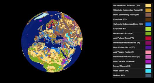
You can view a global interactive geological map on the Lithological Map Viewer. The Lithological Map Viewer is a 3D globe showing the types of rock which are present at the surface of the Earth across the whole planet.

Lithology is the classification of rocks based on their visible physical characteristics at outcrop. These classifications are normally based on the color, texture, grain size, and composition of the rock. Because lithology classifies rocks at outcrop it can play a key role in understanding processes occurring on the surface of the Earth, for example processes concerning soils, ecosystems, rivers, and oceans. The three main types of rock are sedimentary, igneous, metamorphic. The Lithological Map Viewer shows sixteen different classes of rock.

Wednesday, August 19, 2020

Where You Can Vote by Mail


NBC News has created a simple interactive map which explains the mail-in and early in-person voting rules in every state. The Plan Your Vote interactive map explains all you need to know about early and mail in voting across the United States.

The interactive map includes four questions:
  1. Can I vote by mail without an excuse?
  2. Can I register to vote and cast my ballot on the same day?
  3. Can I vote in person before Election Day?
  4. After I vote by mail, can I track my ballot?
Select one of these questions and all the states on the map will be colored to show if the answer is 'yes' or 'no' to that question.

If you select your state from the drop-down menu you can view in more detail the voting rules in your state. These details include the deadline to register to vote in the state, the deadline to request a mail-in ballot and when a mail-in ballot needs to be sent, whether you can vote in person before election day, and the first and last day you can vote early in person.

Racist Stop & Search Powers


Over the last few months there has been a number of high profile cases where the UK police have been accused of stopping prominent black Britons without proper justification. Among the individuals stopped have been a Member of Parliament, an ex-member of the British Athletics team, an ex-Premier League footballer and even a serving black police officer.

Under current UK law the police can stop a member of public at any time. If the incident is not a 'stop and search' then a stopped person is free to leave at any time. However if a police officer has 'reasonable grounds' to suspect the individual has been involved in a crime or that they are in possession of a prohibited item they can search them. Being able to stop anyone at will and to only have 'reasonable grounds' to search someone means that the police have no real burden of proof when stopping and searching individuals. A growing body of evidence suggests that many police officer use racial profiling when deciding who to stop & search. We can see evidence of that in a new interactive map of London stop and search incidents.

Metropolitan Police Stop and Search data for June 2020 is an interactive map of all stop and search incidents carried out in London in June of this year. Black people are 13.32% of the total London population. However 35.16% of June Stop and Search incidents involved black citizens. White people make up 59.79% of London's total population. 30.38% of stop and search incidents in June were of white people. Asian people make up 18.49% of the London population. Asian citizens make up 17.48% of June stop and search incidents. The evidence seems to be that black Londoner's are proportionally far more likely to be stopped and searched by the police than white or Asian Londoners.

Just this morning I heard someone on local radio in London arguing that the police are justified in stopping and search black citizens because black people are more involved in crime. One look at the Metropolitan Police Stop and Search data for June 2020 interactive map disproves that idea. The map shows that just 9.57% of white people were arrested after being searched and only 9.59% of black people searched were subsequently arrested. So although a black Londoner is far more likely to be stopped and searched than a white Londoner a black person is no more likely to be arrested for having carried out an actual crime than a white person.

Tuesday, August 18, 2020

Mapping USPS Mail Box Closures


There are over 150,000 post collection boxes in the United States. Or at least there used to be before they started to be closed and removed as what many believe is an attempt by Donald Trump to suppress mail-in-voting. Over the last week viral pictures of mail boxes being removed has fanned suspicions that the Trump administration is trying to hamper the operations of the United States Postal Service.

Spot the Box is a new interactive map which is being used to track and monitor the closure of USPS collection boxes across the country. Using the map you can identify collection boxes which have been closed or confirm where USPS collection boxes are still in operation. If you click on a mail box in the map you can then record whether the box has been removed or is still in operation.

On the map mail boxes which have been tagged as removed appear as red dots. Mail boxes recorded as still being in operation are shown as green dots. All the blue dots on the map are the mail boxes which have yet to be confirmed as either removed or still in operation.

The USPS has said that it will now suspend the removal of mail colllection boxes until after the election. However earlier this year Donald Trump appointed Louis DeJoy Postmaster General. Since then DeJoy has made a number of decisions which appear to be designed to suppress mail-in-voting, including the decommissioning of hundreds of mail-sorting machines.

Painting with Maps


For the last week I've been diving down the rabbit hole of trying to draw images on top of maps. Map Mercer (an interactive map which turns the face of Matthew Mercer into a map of a deserted island) got me wondering about how you could color a choropleth map layer to create a picture on top of a map. This led me to the wonderful Painting by Numbers, in which Elana Schtulberg has actually done this and created a number of map paitntings by coloring polygons on an interactive map.

This in turn finally led me to Polyraster.

Polyraster is a wonderful tool for creating your own map choropleth paintings (I created the map above with the image of Uncle Sam using Polyraster). The process of creating map paintings with Polyraster is very easy:

1. You need to upload a GeoJSON file containing your geographical data
2. You need to upload an image


For the finished map image to have enough resolution to be recognisable on your map your GeoJSON file needs to have a reasonable number of separate geographical areas. These areas are going to act as your image pixels so there needs to be a lot of them. For the examples shown on this page I used a GeoJSON file containing the counties of the United States. There are over 3,000 counties in the U.S. so that gives us enough resolution for images to emerge once the individual counties are colored to match the uploaded image.

Elana Schtulberg mentions lowering the resolution of her images before turning them into a choropleth layers. I didn't do this with my images. However I did place my images on a solid color background to help make them stand out a little from the map background. 

Under the bonnet Polyrater uses Leaflet.js for the interactive map controls and to display your GeoJSON layer. Fabric.js is used for scaling/panning the uploaded image. Paper.js is then used for computing the average color for each polygon in your choropleth layer, based on the colors in your uploaded image.

Polyraster is a lot of fun to play with. Once you have created your own personal map painting you can even use the download option to download a GeoJSON file of your completed map. This GeoJSON file can then be used with your favorite interactive map library.

Monday, August 17, 2020

Stealing Indigenous People's Land


The Invasion of America is an interactive map of Native American land cession between 1776 and 1887. During this period the United States seized over 1.5 billion acres from the indigenous people of the USA.

The Invasion of America map includes a powerful animated timeline feature which allows you to view how the United States grew westwards by seizing Native American land through treaties and executive orders. This animated map, showing how the United States managed in a little over one hundred years to take nearly all Native American land, is a very powerful visualization of what must count as one of the biggest injustices in human history.


Unfortunately it isn't the only injustice enforced on indigenous people by invading colonists. In New Zealand, between 1865 and 1909, the Crown took 18 million acres of New Zealand land from the native islanders.

New Zealand Made includes an animated map which shows the loss of Māori land from 1865 to 1909. In other words the map shows how an entire race was deprived of its land and culture. As well as this large animated map New Zealand Made includes 70 other maps which show each of the iwi (Māori tribes) lands held before 1865. Clicking on these smaller maps will lead to more information on the land lost by the selected iwi and how it was acquired by the crown.

Guess the Video Location


City Guesser is a fun location guessing game, which requires you to identify a location in a video and point to it on an interactive map.

The game shows you a random video of someone walking around a city or a famous monument. You have to pick up on the visual clues in the video (such as the languages & words used in street signs and the design of the street furniture) to identify where you think the video was shot. Once you have made your guess you just need to click on an interactive map and you are awarded points based on how close you got to the real location.

There are a number of different games that you can play. You can choose to view videos just from one country - or you can play either a Worldwide or Europe game - featuring videos from across the world or from just within Europe.

I'm not exactly well traveled so I was surprised at how many European cities I could identify from the videos. I didn't do so well on American cities. This may be partly to do with the fact that there are less cultural differences between different American cities than there are between different European cities. It is also obviously partly to do with my lack of knowledge of American cities.

There is also monuments quiz, which shows you videos of famous monuments around the world. I'm happy to report that I'm the world champion at identifying well known monuments.


City Guesser acknowledge its debt to GeoGuessr. In Geoguessr games you are shown a random Street View image and you must try to guess where in the world the Street View was taken.

In playing both Geoguessr and City Guesser you have to use the same sort of visual clues to identify the shown location. I think both games are so successful and fun to play because they somehow ask you to identify the sense of place of a location, to look for clues that identify a location's uniqueness, to find the qualities that make the place what it is.

 - Or you can just look for place-names in the street signs.

Saturday, August 15, 2020

Recovering from the Australian Bushfires


18.6 million hectares of land were destroyed in the Australian fires which raged from last Fall into the beginning of this year. It will take many, many years for nature to fully recover from the fires.

The Conversation has been examining the animal and plant species whose habitats have been destroyed and looking at some of the conservation efforts which have been started to help Australia's flora and fauna recover. Flora, Fauna, Fire is a scrollytelling account of the devastation caused by the fires, an account which also draws attention to the 119 species which scientists say now face the possibility of extinction without urgent human intervention.

Flora, Fauna, Fire includes maps showing the extent of the habitats destroyed in the fires. It also includes satellite analysis showing where the bush is growing back and where it is struggling to recover. Australia is used to natural wildfires. However because of climate change fires are becoming much more frequent and the worry is that wildlife and landscapes will not have time to recover between fires.

You can learn more about each of the 119 species in Australia which are in need of urgent intervention on The Conversation's The 119. This database includes pictures and details on all 119 species of animals and birds and how much of each species' habitat was burned. If you click on any of the 119 species you can learn more about the selected species' conservation status and the immediate actions which are needed to save the species. You can also view an interactive map of the species natural habitat in Australia and where that habitat was destroyed in the fires.

The Younger Dryas Glacial Map


Around 13,000 years ago the Earth experienced a period of rapid cooling, called the Younger Dryas. About 12,800 years ago temperatures suddenly returned to near glacial conditions and for the next 1,200 years temperatures were much cooler than they had been before the Younger Dryas.

In northern Britain glaciers formed during this period whose imprint can still be seen in the geology of the Scottish Highlands. The Younger Dryas Glacial Map is an interactive map which reconstructs the extent of the glaciers formed in Scotland and northern England during the Younger Dryas. The map includes a number of overlays which visualize the large ice field which ran the length of the Western Highlands in Scotland during the Younger Dryas. The map also includes a number of layers which show the glacial ice extent during the period, the moraines deposited at the end of glaciers, meltwater channels and ice dammed lakes.

If you click on a feature on the map an information window will open. This window will include a photograph of a typical example of the selected feature. It will also include the names of the original authors who first mapped the feature.