
Maps are just as much historical entities as they are geographical. Maps provide a representation of spatial relationships as they exist at a particular moment in time. In recent years a number of interactive mapping projects have sought to show how geography changes through history by plotting historical borders and movements by date. These interactive historical maps provide a great way to explore how countries and borders have developed through time.
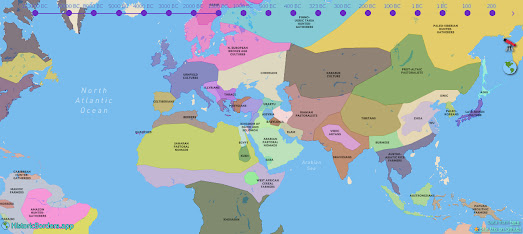
Historic Borders is a project which maps country borders over 4,000 years of history (2000 BC-1994). Using the Historic Borders' interactive timeline you can view a map of the world at specific periods within this 4,000 years of history.
Like all maps Historic Borders is only as good as its underlying data. When exploring the map it is worth remembering that historical borders and boundaries are unlikely to have a high degree of accuracy and are likely to be just as disputed or even more disputed as modern boundaries. Having said that Historic Boundaries is very useful in providing a general overview of historical movements. For example, it provides a great visualization of the rise and fall of the Roman Empire.
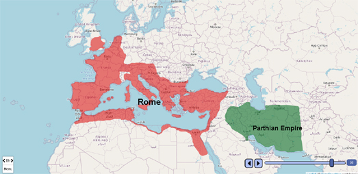
Histo Atlas is a free platform that can be used to create interactive maps which visualize the evolution of events over time. These interactive maps can therefore be used to show the development of historical events, and how country borders and areas of cultural influence have changed in response to these events.
You can observe some of the capabilities of Histo Atlas on this map of the Roman Empire. This interactive Histo Atlas created map shows the growth of the Roman Republic from 272 BC to 27 BC and the Roman Empire until 115 AD. Using the map's time slider you can see how Rome swept all before it to conquer vast areas of Europe and North Africa.
The Histo Atlas home page includes a number of links to other historical maps created by users, including maps visualizing the Spanish Civil War and the Unification of Italy.
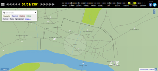
Running Reality is an interactive map which is trying to build a map of the world over time. Using Running Reality you can view a map of any location in the world at any time during its history. In this way you can see how towns and cities have grown and fallen over time. You can also learn more about the people who lived there and the buildings in which they lived and worked.
To see how Running Reality works you can zoom-in on an individual city and then use the timeline to see how the city has changed over time. For example if you zoom in on New York and set the timeline to 1600 you will see no roads or buildings. Adjust the timeline to 1700 and a few roads and buildings can be seen in Manhattan. Advance another 100 years (to 1800) and the city has spread north as far as Greenwich Village and small developments have also appeared in Brooklyn.

Chronas is another interactive map which aims to provide a view of historical events across the globe through time. This interactive map visualizes Wikipedia entries by date and by location and also shows country borders for different dates in history.
Chronas not only maps historical events but also provides a mapped overview of country boundaries for any given date. If you select a year from the time slider (running along the bottom of the map) the map will update to show how the world's borders existed at the chosen time. If you then click on a country or geographical area on the map a Wikipedia article on the selected historical region will open in the map sidebar. For example, if you select the year 573 AD from the time slider, you can select the Visigoths region on the map to learn more about these nomadic tribes during the first millennium.

The Ancient History Encyclopedia's Map of the Ancient World is an interactive map of the world from around 6,000 BCE to 270 BCE. The map plots historical civilizations and places by date. Change the date and the map changes to show the rough borders of the civilizations and people of your selected time
The map carries a disclaimer that it is "only complete in the Mediterranean until around 270 BCE". However the map isn't limited to this period and location. If you only use the back and forward arrows to navigate the map then you might not realize that the map actually does include data for the rest of the world. You can also move forward in time beyond 270 BCE (although the map doesn't continue past the time of the Roman Empire).
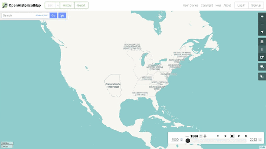
Where OpenHistoricalMap differs from many of the other maps linked to here is that it is an open source and crowdsourced project. This means that anyone can contribute to OpenHistoricalMap. If you are disappointed that OpenHistoricalMap appears to lack detailed data for a particular location at a specific point in history you can actually add the mapping data to the project yourself. Also because OpenHistoricalMap is built on open data you are free to download the data and reuse it in your own historical mapping projects.
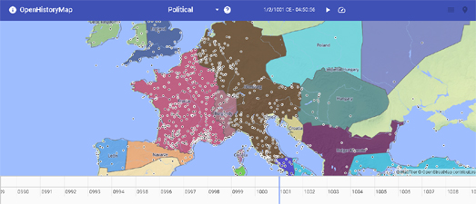
Open History Map is another example of an impressive interactive mapping platform which visualizes global spatial historical (and archaeological) data. The goal of Open History Map is to create an open interactive map of the past. One of the main differences between Open History Map and some of the other historical mapping platforms is that Open History Map is built on academic data and information.
The screenshot above shows the Open History Map map view of Europe in the year 1001 CE. This map view includes an interactive timeline control which allows you to view the map for other dates in world history. The small black dots on the map represent historical place-names, which appear as you zoom in on the map.
Because Open
History Map relies on academic data it relies on lots of different historical datasets. You can view and access all these datasets on the Open History Map Data Index. This allows you to view an index of the datasets used in Open History Map, a list of the sources for these datasets and the individual datasets (with links to the original sources).
No comments:
Post a Comment