
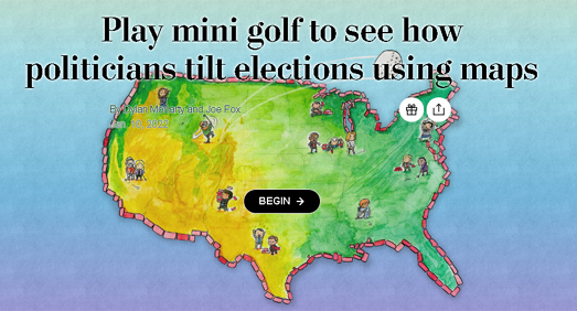
The Washington Post has devised an informative and fun way to teach its readers about gerrymandering. Across the United States politicians are currently attempting to redraw congressional district boundaries in order to give their parties an advantage in this year's elections for the House of Representatives. This redrawing of districts often involves clear attempts to make districts easier to win for one party or another.
In the Post's Gerrymandering Mini Golf game you get to play one hole of golf on each of nine different congressional district boundaries.Irregular shaped borders are one of the key indicators of a gerrymandered electoral district. It also makes an electoral district hard to play in a round of Gerrymandering Mini Golf.
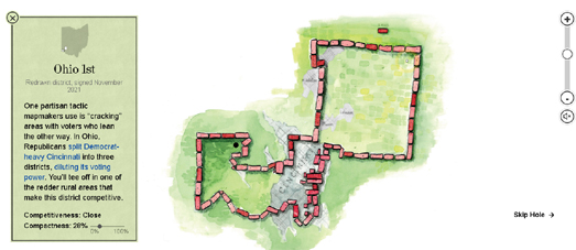
Take Ohio's 1st Congressional District. This electoral district has been so gerrymandered by the Republican Party that its boundary has been contorted into an extremely irregular shape. This means that it is a very difficult hole to play in the Post's Gerrymandering Mini Golf. The Post has given this hole a par 5, which is a strong indication of how gerrymandered the district now is.
As well as giving each congressional district a par score the Post has given each district a compactness score. As you progress through your round of Gerrymandering Mini Golf the Post's notes on each district do a good job of explaining the pros and cons of using compactness as a guide for determining how gerrymandered an electoral district has been.

You can explore how the compactness of a district's boundary can be a strong indicator of gerrymandering on Antimander. Antimander is an open-source interactive application which is designed to detect gerrymandering within congressional districts. Using Antimander you can
explore thousands of alternative congressional district maps to view how different electoral districts can radically alter the electoral results in different states.
Using the Antimander interactive map tool you can explore how Wisconsin's eight different districts can be redrawn to provide
different electoral outcomes. In the last U.S. election the votes were fairly evenly split between the Republicans and Democrats (Trump narrowly won the popular vote) however the Republicans won 5 out of the 8 electoral districts. In other words the current electoral map in Wisconsin gives the Republican party an unfair advantage.
Antimander allows you to adjust three different metrics and immediately see how these would effect the electoral outcomes in Wisconsin. The metrics you can adjust are compactness (more complex district boundaries are a good indicator of gerrymandering), competitive elections (close races in each district) and fairness (the number of elected representatives corresponding as closely as possible to the percent of voters for each party).

If you want to know how gerrymandered your state's districts are then you can refer to Planscore. PlanScore has mapped the level of gerrymandering in all 50 states in the USA.
PlanScore includes a comprehensive historical dataset of partisan gerrymandering, so you can examine the history of gerrymandering in each state and which political parties the districts have been gerrymandered to support.
The PlanScore choropleth map shows the level of gerrymandering in each state for both the House and State House elections. The darker the red or blue colors on the map then the more skewed the districts are towards the represented political party. If you select a state on the map you can view a more detailed report on the partisan bias in that state and how that compares to the level of gerrymandering in other states.
Also See
What's Your Vote Worth - an interactive story map which explores the history of America's voting system, the right to vote and how voter representation is skewed under the present system and map. The story map includes a choropleth view of how much one vote is worth in each state.
The Gerrymandering Project - FiveThirtyEight has had a go at redrawing America's voting districts for themselves. In the Atlas of Redistricting FiveThirtyEight has created a number of new congressional maps, each designed to show how districts can be redrawn to favor different political parties.
No comments:
Post a Comment