
Australia's conservative Coalition government has lost power for the first time in nearly a decade. The Labor Party is projected to win enough seats to form the new government and its leader, Anthony Albanese, will become the country's new Prime Minister. At the time of writing, while it is still not clear whether the Labor Party will reach the 76 seats it needs for an overall majority, it has won enough seats to ensure it will be the main party in any minority government.
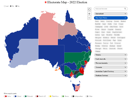
The Australian has published an interactive map of the Federal Election Results that is showing which party has won in each seat as the results are announced. One problem with visualizing the results of an election in Australia (as discussed by ABC's in The Australian election map has been lying to you) is the huge discrepancy in size between huge rural seats and more densely populated urban seats. This problem is clearly apparent in The Australian's map of the 2022 election (shown above).
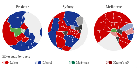
A cursory glance of The Australian election map would probably leave you with the impression that the Liberal Party (blue) was the biggest winners in Saturday's election. Blue covers a huge percentage of the map of Australia - because the Liberal Party has won many of the huge (least densely populated rural seats). The Australian has partly overcome this problem by creating a number of smaller inset maps showing the results in the major cities of Brisbane, Sydney and Melbourne.
The Guardian has used a form of gridded cartogram in its Australian Election Results 2022 - Live Results page. Normally a gridded cartogram uses geometric shapes to represent equal units. In The Guardian's Australian election map the units don't appear to represent anything in themselves but have just been used to make the smallest electoral seats bigger so that they can be seen on the map. So, for example, the geographically small seat of Grayndler in Sydney is represented on the map by four hexagon units. The result is that you can actually find it on the zoomed out map of Australia (in comparison - it is almost impossible to find without zooming in on The Australian's election map).
One result of smaller urban seats appearing larger on the map than their actual geographical areas is that Labor's success in many of Australia's largest cities is a little more apparent on The Guardian map than on The Australian map (where their smaller geographical size undermines their visual impact). Of course The Australian has partly compensated for this by providing three zoomed-in inset maps for Brisbane, Melbourne and Sydney.
 Sydney before and after the 2022 election
ABC News has created a story map, How the Election Result Has Changed Our Cities, which does a very good job of explaining how the Liberal Coalition lost the election by being very unpopular in the largest cities. By comparing election maps from 2019 with the new 2022 results in each of the state capitals ABC is able to show how the Labor Party beat the Liberals in the suburbs, while the independents and the Greens beat the Liberals’ in their inner-city heartlands.

Perth before and after the 2022 election
After comparing the 2019 and 2022 maps in each of the state capitals ABC zooms out to explore the rural vote. Outside of the big cities the Liberal vote held up very well. The Nationals and the LNP in fact managed to retain all their seats in the regions.
You can view another detailed analysis of How Labor Won in ABC news' cartogram story map, exploring the 2022 results in each state and major city.
No comments:
Post a Comment