
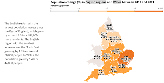
The UK's Office of National Statistics has released a wonderful data visualization of the UK's latest population change statistics. Earlier this week the latest population and household estimates for England and Wales was released based on the 2021 census. You can discover how the population has changed near you on the ONS's How the Polpulation Changed Where Your Lived.
One of the most impressive features of How the Population Changed Where Your Lived is that the visualization can be customized to each and every one of the 331 local authorities in England & Wales. If you pick your local authority area from the drop-down menu you can learn all about how the population has changed in your local area and how that compares to population changes across the whole country.As you scroll through the ONS' data story you can find out how much the population has increased (or decreased) both locally and nationally. You can discover which age groups have increased or decreased in both your local authority and in all of England & Wales. You can also view a visualization of how population density in your area compares to other areas of the UK.
No comments:
Post a Comment