Friday, January 31, 2014
Mapping the Boston Marathon
Boston.com has created an interactive Google Maps for this year's Boston Marathon, which is useful both for participants and those who want to watch.
Spectators can use the Boston Marathon Map to find the best places to watch the race anywhere along the course. If you select a mile marker on the map you can view suggested locations to watch the marathon nearby.
Participants in the race can use the map to explore the route. Each mile marker on the map includes details on the expected arrival times, the course elevation and the net change in elevation from the last marker. One really handy option is to enter your hoped for time for completing the marathon and then view the time you should aim to arrive at each mile marker.
The World is United by a Hatred of America
From Europe, to Central and South America and from Africa to the Middle East the world is united in a hatred for America. My latest auto-complete map What the World Hates shows the results suggested by Google auto-complete when you enter a country or state followed by the word 'hates'.
For example, if you type in the words 'Japan hates' into Google the top auto-complete suggestion is that 'Japan hates foreigners'. Elsewhere around the world we find that countries tend to hate their nearest neighbors. In Scandinavia, for example, Denmark and Norway hate Sweden, while Sweden hates Finland.
If it is not their nearest neighbors that a country hates then it is most likely that they hate America. According to Google auto-complete Cuba, Serbia, Turkey, Lebanon, Syria, Iceland, Brazil, France, Spain, Germany, Mexico, Iran, Libya, Iraq, North Korea, Nicaragua and Venezuela all hate America.
When we zoom in on America we find that states also tend to hate their near neighbors. New Mexico hates Texas, Nebraska hates Iowa, Michigan hates Ohio and New Hampshire hates Massachusetts. Where Google doesn't have any auto-complete search suggestion I have indicated this on the map by using ellipses, for example California seems to hate no-one and so it is shown on the map as 'California hates ...'
Thursday, January 30, 2014
Street View Arrives in Slovenia
Piran, Slovenia
Slovenia has become the 55th country to be captured by Street View on Google Maps. Today's update to Google Maps includes extensive Street View coverage throughout Slovenia and extended coverage in Russia, including Vladivostok, Magadan and Irkutsk.
Ljubljana, Slovenia
Via: Google Street View World
The Top 10 Uses of Street View
Over the last few weeks I've been rather critical of the Google Maps API. However with Street View Google has an image layer that is simply not available with other mapping API's. I think it is therefore time to celebrate the wonderful websites that developers have created with Google Maps Street View.
Here then are the top ten uses of Google Maps Street View:
1. GeoGuessr
The number one spot is claimed by GeoGuessr. GeoGuessr has proved to be the one of the most popular applications ever built with the Google Maps API. It therefore rightly belongs at the top of our list of the greatest ever uses of Street View
GeoGuessr is a Street View geography quiz that sets you the challenge of guessing the locations of a series of random Street View images. Using visual clues, such as the fauna, landscape and street furniture you have to place a pin on a global Google Map indicating where you think each Street View image was taken.
The closer your guess to the actual location then the more points you win.
2. Street View Hyperlapse
If there is one application that could challenge Geoguessr as the most popular Street View app it would be Hyperlapse.
There have been a few apps over the years that allow you to create animated drives using a series of Street View images. Street View Hyperlapse is the smoothest one yet.
Street View Hyperlapse uses Hyperlapse.js, Three.js, GSVPano.js, and the Google Maps API to create really smooth animated Street View movies. Users of Street View Hyperlapse can search for any location with Google Street View coverage. All you then need to do is drop two map markers for the start and end of your drive and then press 'create'.
The result is an amazing animated drive through a series of Street View images.
3. Hashima Island - The Forgotten World
Hashima Island is probably my personal favorite application built with Google Maps Street View.
The abandoned Japanese island of Hashima, in Nagasaki Prefecture is an eerie ghost town that was captured on Street View in 2013. Hashima Island - The Forgotten World is an amazing tour of Google's Street View imagery of the island, which includes the historical background of the featured locations and the desolate landscape.
The site is a great guide to the island, adding context and the back-story to Google's amazing imagery of the island. The Street Views in this tour have been enhanced with some CSS3 filters to create an even spookier atmosphere which is intensified further by the accompaniment of some suitably spectral background music and sound. The children's voices and school bells that play when you stand in Hashima Primary School playground made the hairs on the back of my neck stand-up.
4. Historypin
Over the years Street View has proved very popular with lovers of vintage photographs. It is always fascinating to be able to compare historical views with the current view shown on Google Maps Street View.
Historypin is the most accomplished of the many websites that have emerged that allow you to view vintage photographs superimposed on Street View.
5. Perfect Storms
Another popular use of Street View over the years has been to provide a personal touch to product promotions. These applications tend to use the Street Views of users' own homes with some added special effects. The History Channel's Perfect Storms is one of the best examples of the use of Street View in a promotion campaign.
To promote the last season of Perfect Storms the History Channel created this interactive that allows you to virtually destroy your house in a fire storm. The app uses a combination of Google Maps and Street View to show the likely effects of a perfect storm on your own home and neighborhood.
6. Place Pulse
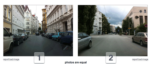
Street View has also been put to more serious use. MIT used Street View to carry out a survey measuring respondents' perceptions of locations based on how they look on Google Maps Street View.
MIT's Place Pulse project is a crowd-sourced experiment examining people's perceptions of different urban environments. The project aims to quantitatively recognize which areas of a city are perceived as wealthy, modern, safe, lively, active, unique, central, adaptable or family friendly based on how people respond to Street View images of the city.
The Place Pulse Rankings page looks at the results of the survey, which consist of 100,000 images from 56 cities. The rankings table shows the results for each evaluated perception for each of the 56 cities. Users can therefore see which cities are perceived as the most wealthy, safe, lively etc and also view all the rankings for each of the cities.
7. Nature Valley Trail View
The Google Maps API also provides the option for developers to create Street View tours using their own personal panoramic imagery. The best use of custom Street View has been by the Nature Valley Trail View.
Nature Valley Trail view provides beautiful Street View tours of the Grand Canyon, Yellowstone Park, the Great Smokies and Sequoia.
8. Floating Shiny Knot
Floating Shiny Knot is an impressive experiment that superimposes animation on top of Google Maps Street View. The application superimposes an animated shiny knot on top of any Street View image (you can choose a chrome or glass finish for the knot).
#rorschmap was one of my favorite Google Maps apps of 2011. The map lets you zoom in on any location on Earth and, using the same principle of multiple reflection that you find in kaleidoscopes, create an animated Rorschach satellite view.
The #rorschmap - Street View edition applies the same technique to Google Maps Street View. Just enter your address into the app and you can drop-down the rabbit-hole and create your own kaleidoscope home!
10. There and Then
There and Then is a collection of historic vintage movies superimposed on top of the same view as seen today in Google Maps Street View. This app lets you travel back in time and view some of the earliest recorded film, while at the same time allowing you to view the scene as it looks today.
If you like these Street View applications then you might also like 5 Fun Ways to Destroy Your House on Street View
.
Here then are the top ten uses of Google Maps Street View:
1. GeoGuessr
The number one spot is claimed by GeoGuessr. GeoGuessr has proved to be the one of the most popular applications ever built with the Google Maps API. It therefore rightly belongs at the top of our list of the greatest ever uses of Street View
GeoGuessr is a Street View geography quiz that sets you the challenge of guessing the locations of a series of random Street View images. Using visual clues, such as the fauna, landscape and street furniture you have to place a pin on a global Google Map indicating where you think each Street View image was taken.
The closer your guess to the actual location then the more points you win.
2. Street View Hyperlapse
If there is one application that could challenge Geoguessr as the most popular Street View app it would be Hyperlapse.
There have been a few apps over the years that allow you to create animated drives using a series of Street View images. Street View Hyperlapse is the smoothest one yet.
Street View Hyperlapse uses Hyperlapse.js, Three.js, GSVPano.js, and the Google Maps API to create really smooth animated Street View movies. Users of Street View Hyperlapse can search for any location with Google Street View coverage. All you then need to do is drop two map markers for the start and end of your drive and then press 'create'.
The result is an amazing animated drive through a series of Street View images.
3. Hashima Island - The Forgotten World
Hashima Island is probably my personal favorite application built with Google Maps Street View.
The abandoned Japanese island of Hashima, in Nagasaki Prefecture is an eerie ghost town that was captured on Street View in 2013. Hashima Island - The Forgotten World is an amazing tour of Google's Street View imagery of the island, which includes the historical background of the featured locations and the desolate landscape.
The site is a great guide to the island, adding context and the back-story to Google's amazing imagery of the island. The Street Views in this tour have been enhanced with some CSS3 filters to create an even spookier atmosphere which is intensified further by the accompaniment of some suitably spectral background music and sound. The children's voices and school bells that play when you stand in Hashima Primary School playground made the hairs on the back of my neck stand-up.
4. Historypin
Over the years Street View has proved very popular with lovers of vintage photographs. It is always fascinating to be able to compare historical views with the current view shown on Google Maps Street View.
Historypin is the most accomplished of the many websites that have emerged that allow you to view vintage photographs superimposed on Street View.
5. Perfect Storms
Another popular use of Street View over the years has been to provide a personal touch to product promotions. These applications tend to use the Street Views of users' own homes with some added special effects. The History Channel's Perfect Storms is one of the best examples of the use of Street View in a promotion campaign.
To promote the last season of Perfect Storms the History Channel created this interactive that allows you to virtually destroy your house in a fire storm. The app uses a combination of Google Maps and Street View to show the likely effects of a perfect storm on your own home and neighborhood.
6. Place Pulse
Street View has also been put to more serious use. MIT used Street View to carry out a survey measuring respondents' perceptions of locations based on how they look on Google Maps Street View.
MIT's Place Pulse project is a crowd-sourced experiment examining people's perceptions of different urban environments. The project aims to quantitatively recognize which areas of a city are perceived as wealthy, modern, safe, lively, active, unique, central, adaptable or family friendly based on how people respond to Street View images of the city.
The Place Pulse Rankings page looks at the results of the survey, which consist of 100,000 images from 56 cities. The rankings table shows the results for each evaluated perception for each of the 56 cities. Users can therefore see which cities are perceived as the most wealthy, safe, lively etc and also view all the rankings for each of the cities.
7. Nature Valley Trail View
The Google Maps API also provides the option for developers to create Street View tours using their own personal panoramic imagery. The best use of custom Street View has been by the Nature Valley Trail View.
Nature Valley Trail view provides beautiful Street View tours of the Grand Canyon, Yellowstone Park, the Great Smokies and Sequoia.
8. Floating Shiny Knot
Floating Shiny Knot is an impressive experiment that superimposes animation on top of Google Maps Street View. The application superimposes an animated shiny knot on top of any Street View image (you can choose a chrome or glass finish for the knot).
The
effect is very impressive and if you rotate and drag the Street View
around then the application soars to even higher levels of
impressiveness.
#rorschmap was one of my favorite Google Maps apps of 2011. The map lets you zoom in on any location on Earth and, using the same principle of multiple reflection that you find in kaleidoscopes, create an animated Rorschach satellite view.
The #rorschmap - Street View edition applies the same technique to Google Maps Street View. Just enter your address into the app and you can drop-down the rabbit-hole and create your own kaleidoscope home!
10. There and Then
There and Then is a collection of historic vintage movies superimposed on top of the same view as seen today in Google Maps Street View. This app lets you travel back in time and view some of the earliest recorded film, while at the same time allowing you to view the scene as it looks today.
If you like these Street View applications then you might also like 5 Fun Ways to Destroy Your House on Street View
Wednesday, January 29, 2014
The New York Subway Bent Out of Shape
Ben Schmidt has taken the MTA Subway Map of New York and then stretched, squeezed and rotated it so that it fits onto a Mercator map of New York.
The MTA Map of the Actual New York does help to highlight the geographical inaccuracies in the MTA map. The MTA map expands Manhattan, due to the higher proportion of lines and stations situated there. You have to admit that the map does lose some legibility when you squeeze all that information onto a more geographically accurate map.
Mapping Tax Havens Around the World
The International Consortium of Investigative Journalists partnered with news organizations around the world, including the BBC, The New York Times, The Guardian, Le Monde, CBC, Le Soir, El País and Süddeutsche Zeitung, to investigate the secret offshore money system that businesses, politicians and wealthy individuals use to avoid paying taxes.
One outcome of all this work is an interactive map, ICIJ Offshore Leaks, that links to over 60 stories around the globe that resulted from the investigation. Users of the map can click on locations around the world to read the journalists' stories associated with that location. Another map view provides an overview of tax havens around the world and their popularity with the global tax dodging elite.
Building the World with LEGO
Google has re-released it's popular LEGO and Google Maps application Build with Chrome. Build with Chrome lets you design and build your own creation with LEGO bricks and then place it on a Google Map of the world.
Build with Chrome has been around for a couple of years now. However until now your carefully constructed LEGO building was placed somewhere on a map of Australia. Build with Chrome has now gone worldwide.
If you just want to explore the creations already added to the map just click on the 'Explore All Builds' link on the home page and you will be taken to a Google Map, where you can browse all the LEGO buildings that have been created around the world.
The Random Beauty of Planet Earth
Somewhere can help transport you to random locations around the world. Although Somewhere can't actually physically teleport you to the the other side of the globe, with a little help from Instagram, it can help you discover and find out about some of the most wonderful locations on planet Earth.
Each random location shown is accompanied by an Instagram photo, information about the location and a small map showing you where it is. Each location shown also includes a link to its Wkipedia article and to view it on Google Maps.
You can also explore random locations around the world with the help of Google Maps satellite imagery. Chuchichechocha and Stratocam are two beautiful Google Maps powered slideshows that celebrate the beauty of planet Earth. Both applications allow you to just sit back and watch as satellite images of random locations around the world are displayed.
Another way to be transported to random locations around the world is through a number of Street View based slideshows. MapCrunch, The Secret Door, Globe Genie and Random Street View are four applications that show you a succession of random locations around the globe using Google Maps Street View.
Hat-tip: Google Street View World
Tuesday, January 28, 2014
How far can I travel?
Isochrone maps show travel times from a given location. Travel Time is a great example of an isochrone map created with the Google Maps API.
Travel Time allows users in four US cities to find out the travel times from any location in each of the cities. Click anywhere in Denver, San Francisco, Seattle or Boulder and you can view an isochrone map of the time it will take to travel anywhere in the city on the public transit system.
The map includes the option to include two points of origin, so that you can compare the travel times from both locations. It even includes an option to view the travel times for different days of the week and for different times of the day.
Mapnificent is a Google Maps based application that shows you how far you can travel on public transport for any given length of time, in a number of major cities around the world.
Mapnificent allows users to drop a marker anywhere in a city and adjust a slide control to define a commuting time. The map then displays the commutable area using an isochrone layer on the map. Users can adjust the slide control to show longer or shorter commute time zones.
The Oldest Google Map Known to Man
Over the weekend Mapperz asked me if I knew which was the oldest Google Maps mashup that still worked. So I dug out my Indiana Jones hat & whip and began searching through the dusty annals of the Google Maps Mania archives.
At first I thought it was a very easy question to answer. Paul Rademacher's HousingMaps is well known as the oldest Google Maps hack and the last time I had checked I'm pretty sure that HousingMaps still worked. However checking it again this week I found that it has sadly taken a dive into the dead pool. HousingMaps seems to have fallen prey to the discontinuation of the Google Maps API v2 back in November.
The second ever post on Google Maps Mania was about the popular Google Sightseeing website. Google Sightseeing is still very much alive and as popular as ever. But, if my memory serves me correct, in its early days Google Sightseeing was not a hack of Google Maps but used screenshots and links to Google Maps in its never ending quest to bring you the best satellite images from Google Maps. So sadly it doesn't qualify as the oldest Google Maps mashup.
One of the earliest clever Google Maps hacks was by the Malevolent Design blog. Soon after Google Maps was introduced to the world in 2005 Malevolent Design created a nifty web-form that allowed anyone to create a link to Google Maps driving directions. The form still works so it is probably the oldest Google Maps hack still in existence. However it isn't a map - so my quest continues.
In June 2005 Google officially released the Google Maps API. Soon after its release Google Maps Transparencies was created. Google Maps Transparencies used the API to create a clever map that allowed you to overlay a satellite view on top of a map layer. And it still does - because yes Google Maps Transparencies is still alive and well.
So I'm happy to pronounce Google Maps Transparencies as the oldest surviving Google Maps Mashup. Unless of course you know better ...
Mapping Tom Waits
The songs of Tom Waits contain many geographical references. Waits' narrative ballads are full of interesting characters living interesting lives in atmospheric locations.
Jonas Nordström has scoured the lyrics of all Tom Waits songs and created The Tom Waits Map, a Google Map that shows all the locations mentioned in the American singer-songwriter's back catalog. Click on a marker on the map and you can find out which song references the selected location and read the relevant lyric.
At the moment you can't actually listen to the songs but that might be coming. I discovered that the song 'Danny Says' (Idaho on the map) includes a link to listen to the song on Spotify. So hopefully Jonas is working on providing links to listen to all the songs.
Stompin' Tom Connors was a Canadian country/folk singer who wrote many songs about Canadian locations.
CBC News has created the Stompin' Tom's Musical Map of Canada which maps vidoes of Stompin' Toms songs to the locations that are featured in the songs. Users can search the map by location and play and listen to the song videos directly from the map.
American folk rock band The Mountain Goats have written a number of songs over the years with the words 'Going to ...' in the title, with a destination completing the song's name.
Going to Somewhere is a fun little Street View application that will take you to a random destination based on one of The Mountain Goats 'Going to ...' songs. Just press 'Go' and you will be transported to a new destination.
The only thing missing from this app is the actual music. It would be great if you could actually listen to the relevant song when a new location is shown.
Monday, January 27, 2014
Putin's Corrupt Games
The Anti-Corruption Foundation are celebrating the 2014 Sochi Winter Olympics with a Google Map identifying officials and businessmen who have turned the games into a handy source of income. The map allows users to discover the corruption behind the venues and infrastructure built for the games and the individuals who have profited.
The Champions of Corruption map categorizes the corruption into five 'different sports', 'Classic Embezzlement', 'Verbal Freestyle', 'Ecological Multi-Sport', 'Pair Contract' and 'Figure Lending'. The navigation buttons at the top of the map allow the user to navigate to and learn about the corruption behind the venues, view the overall corruption 'winners' and to view a breakdown of the overall cost of the 2014 Winter Olympics.
Building a Story Map
Earlier today I explained how I believe that one next big trend in online mapping will be Narrative or Story maps. Applications that move beyond being merely mapped visualizations of data but also attempt to tell the underlying stories behind the data.
Over the last few years we have seen some great mapped visualizations, maps that allow users to explore data by location. We are now also beginning to see some great maps that rely on narrative to explain important stories. Two very good recent examples of this are the Jamaican Slave Revolt Map and Hussain's Journey.
Last week Vizzuality received a $35,000 grant from the Knight Foundation to build an open source tool to help developers create just these kinds of Story Maps. Vizzuality already have the beginnings of this tool in place. You can view the progress so far on the Odyssey.js GitHub page.
The Odyssey tool is being designed to help developers combine narratives with maps to create compelling stories. If you have a look at the quick start example map on GitHub you can see that the current version of Odyssey includes two main elements, a map and a scrollable narrative element. When the user scrolls down on the page triggers in the narrative element fire actions on the map. The result is that as the user progresses through the story the map automatically updates to illustrate the narrative.
This is very similar to the approach I took in this narrative map about the Mary Celeste that I put together with the help of jQuery Waypoints and the Google Maps API. One day I might get around to creating my own Story Map library using this Mary Celeste map as a template. Until then anyone is free to use the code from the map to tell their own mapped stories with the Google Maps API.
The Google Maps API Rules the Waves
The Google Maps API team relaxing on their two year sabbatical
I was taken back by the reaction to my post on The Slow Death of the Google Maps API. That one post got twenty times as many hits as the second most popular post on Google Maps Mania last week.
I wasn't surprised that the post was popular in some quarters. After all, there is a pathological hatred of Google Maps in the military wing of the open mapping community. However I was surprised by the complete lack of disagreement with the post in the post's comments or in the discussions that followed on Twitter and Google+.
I was expecting many in the mapping community to defend the Google Maps API. After all it is still hugely popular and is still a brilliant mapping API. With no one defending the Google Maps API against my attack I guess I'll have to do so myself.
First off the headline of the post 'The Slow Death of the Google Maps API' was obvious click-bait, an attempt to lure in readers with a sensationalist post title. The Google Maps API still remains popular with many map developers and is obviously still very much alive.
Secondly, the main thrust of my argument was that the Google Maps API team has been completely inactive over the last two years. This is demonstrably untrue. Over the last few years Google has been busy developing the excellent Google Maps SDK for iOS and the Google Maps API v2 for Android.
It seems to me that Google see mobile platforms as the future of the web and the Google Maps API team therefore appear to be focusing their efforts in supporting mobile devices. It just so happens that this is an area that I'm not particularly interested in -but I expect Google know their business far better that I do.
Thirdly, despite the huge strides made by MapBox and LeafletJS, Google Maps still has some built in advantages over some of its newer competitors. Google's extensive Street View coverage offers map developers unique access to street level images in an ever growing number of countries around the world.
Google's satellite imagery also provides map imagery that is less developed in its newer competitors. However MapBox are making huge strides forward in providing aerial imagery and I'm sure that they will continue to improve in this area.
Google also obviously excels in search. The Google Places API provides map developers with unrivaled access to business locations and points of interest around the world. OpenStreetMaps Map Features provide developers with access to similar kinds of data however the Google Places API provides the most easy way for developers to simply plug-in a powerful search engine for businesses and points of interest into their maps.
My belief is that where MapBox and LeafletJS are overtaking the Google Maps API is in the area of control over map design and presentation. Mobile devices aside, I think that the big growth area in online mapping in the next few years will be in Map Storytelling. I hope that the kind of mapped narrative, demonstrated so wonderfully in The Guardian's In Flight – Interactive Map last week, will become more commonplace on the internet.
Maps are great tools in the visualization of data and I believe that developers will start incorporating these data visualizations more and more into powerful mapped narratives. Not simply using maps to explore data but using the data and mapping APIs to tell the stories behind that data.
For these kind of mapped narratives developers will want increasing control over the design of the underlying map features of a maps API. The Google Styled Maps feature is good but both MapBox and LeafletJS provide far greater control over the design features of the displayed map layers. This is one area where I believe Google needs to stop resting on its laurels.
There is one other possible reason why the Google Maps API team seem to have been so inactive. I've had my suspicions for a while that the lack of new features in the maps API may be because Google are busy working on the Google Maps API v4 (an API that ties in more tightly with the look and feel of the new look Google Maps). If that is true we might well have to wait for this year's Google I/O before we hear of any new developments in the Google Maps API.
Sunday, January 26, 2014
The Maps of the Week
The Guardian's In Flight – Interactive Map is an amazing mapped presentation looking at the history of commercial air travel.
The interactive story features an animated map visualizing 24 hours of plane flights around the world and a narrated documentary looking at the birth of commercial flights, the development of international air travel and a look at the potential future for the industry.
The In Flight map was developed for The Guardian by Kiln, a data visualization start-up based in London.
Skoda has used the popular Hyperlapse Street View animation tool to create a cool promotional website for the Rapid Spaceback.
The Rapid Spaceback website lets you view a number of animated journeys on Google Maps Street View. To spice up the action the site has added a number of filters that you can apply to the animated route, including a kaleidoscope or mirror view. You can also choose from a number of different soundtracks to accompany your drive.
The site includes a number of prepared routes from famous locations around the world. You can also create your own route by selecting a starting point and a destination on a Google Map.
From the insect chorus of the Borneo to the crooning baritone song of an Atlantic humpback whale, this map wants to serenade you with the sounds of nature. The Nature Soundmap is a map featuring the sounds of nature captured by professional nature recordists around the world.
Maps have always been a fascinating way to explore the globe. Satellite imagery and Street View imagery have made armchair exploring even more immersive. Add in the sounds of the monsoon in Borneo and the soundscape of the Brazilian rain-forest and you can almost imagine that you really have been transported to the other side of the world.
Mapping the Sound of Silence
The Museum of Modern Art, New York has created a sound map to accompany an exhibition celebrating John Cage’s 4’33” ( commonly known as Cage's 'silent' piece). The museum recently acquired the score for 4'33" and the exhibition will examine both the score and Cage's influence on 20th Century artists.
MoMa's Share Your Silence map is a sound map of user contributed recordings of 'silence' around the world. If you want to hear how silence sounds in different locations around the world you can simply click on the map markers and listen to the submitted recordings directly from the map.
Saturday, January 25, 2014
The Natural Sounds of Planet Earth
From the insect chorus of the Borneo to the crooning baritone song of an Atlantic humpback whale, this map wants to serenade you with the sounds of nature. The Nature Soundmap is a map featuring the sounds of nature captured by professional nature recordists around the world.
Maps have always been a fascinating way to explore the globe. Satellite imagery and Street View imagery have made armchair exploring even more immersive. Add in the sounds of the monsoon in Borneo and the soundscape of the Brazilian rain-forest and you can almost imagine that you really have been transported to the other side of the world.
Finland on Google Maps
Taksilaskuri.fi is a Google Maps based taxi fare calculator for Finland. Taxi rates are the same for the whole of Finland so Taksilaskuri.fi is able to provide a reasonably accurate estimate for any taxi journey in the country.
To calculate a fare users simply need to enter a starting point and destination for their journey, the number of passengers and the departure time. A route for the journey is then displayed on a Google Map. The estimated rate and cost for the journey is displayed. The user is also provided with an estimated time for the journey and a telephone number to order the taxi.
Cloud'N'Sci.fi has created a series of Google Map heatmaps to showcase their HeatMiner service. HeatMiner is a tool that can be used to create heatmaps with pure vector graphics that can be used with a number of mapping platforms.
The showcase includes Deer Crashes in Finland, Traffic Noise in Helsinki and Traffic Accidents in Helsinki.
Eat.fi is a comprehensive Google Maps based guide to restaurants in the biggest towns and cities in Finland.
It is possible to filter the restaurants shown on the map by type of restaurant, number of stars, cost of meals and by keyword (e.g. 'steak', fish' etc). Restaurants that are currently open are shown on the map by a green map marker.
If you mouse-over a restaurant's marker you can view quick ratings of the food, experience and value. The information window also reveals the type of food served and whether the restaurant is currently open. If you click on the marker you will be taken to full user reviews and ratings.
Eat.fi is available in Finnish, Swedish and English.
Friday, January 24, 2014
How Hint.fm Brought the World to Life
Hint.fm's beautiful Wind Map has proved a source of inspiration for a number of map developers. This real-time animated map of wind speed and direction is a gorgeous realization of live meteorological data.
Hint.fm's animated Wind Map has proved very popular and has inspired a number of developers to create similar maps that are bringing the elements to life.
The Ocean Currents Map visualizes daily-averaged ocean surface currents around the United States. It uses the same mapping techniques as the Hint.fm Wind Map to animate the currents streaming around the country.
The National Oceanic and Atmospheric Association were inspired by the Wind Map to create their own live currents map of the Great Lakes. The Great Lakes Surface Currents Map is an animated map simulating the flow patterns in the Great Lakes.
Tokyo also has its own real-time wind map. The Tokyo Wind Map is an animated map of real-time wind speeds and direction. The map also includes controls to view previous hours' wind data on the map.
Some Google Maps Friday Fun
Many Street View heads will already know that the Top Gear test track is on Google Maps Street View. The rest of the world woke up to this fact yesterday - largely because of the release of this video of the Stig racing the Street View car.
You can explore the track yourself on Google Maps Street View here.
It has been a long time since we featured a good map song in a Friday Fun post. We break that dry spell today with 'Polygon' by Segmentation Violation. Not only is Polygon about eveybody's favorite map feature type, not only does the song feature some great lyrics ('I'm not a route event, a node or a polyline') but it is also rather brilliantly performed as well.
Fans of the sci-fi movie Gravity might want to check out Ogle Earth's post on the film. Stefen Geens has identified every Earth view that is featured in the film and matched it to the same view on Google Earth.
The result is a stunning KML file that allows you to zoom in on shots from the film superimposed on top of Google Earth.
Thursday, January 23, 2014
The Homicide Report Drops Google Maps
The Los Angeles Times has relaunched its impressive Homicide Report. In the latest update the LA Times has decided to drop Google Maps and move to the LeafletJS platform.
Since 2007 The Homicide Report has been mapping and blogging about homicides in Los Angeles. The map allows readers to view a map of homicides in the city. It includes the option to filter the homicides by neighborhood, cause of death, race/ethnicity, age, gender and by day of the week.
The map includes a neat marker clustering system that not only shows the total number of homicides within each clustered marker but the markers are also sized to reflect the number of homicides in a city neighborhood.
The Slow Death of the Google Maps API
I have been planning a great April Fools joke for Google Maps Mania this year. On April 1st I was going to rename this blog 'MapBox Mania' for the day. I planned to explain this decision with a blog post. The post would explain that:
As developers increasingly turn to Google's competitors I have struggled to find my daily quota of great Google Maps based applications. This is one reason why I have been reviewing more and more maps built on other mapping platforms on Google Maps Mania.
For me the last major innovation of note from the Google Maps API team was back in June 2012 with the release of animated symbols. During that time MapBox and LeafletJS have emerged as a major players in online mapping and both seem to be continually innovating while the Google Maps API team seem to be happy just treading water.
Yesterday MapBox announced MapBox plugins, a collection of great libraries that developers can add to their maps by simply hotlinking to the source files. The libraries include a marker clustering solution, Leaflet Draw (a host of map drawing tools), Leaflet Fullscreen and a number of other useful libraries. You can check out the plugins in action on the MapBox Examples page.
The trend in online mapping at the moment seems to be towards both ever more powerful data visualizations and towards story maps. The Guardian's In Flight – Interactive Map is a great example of both trends, using maps to visualize a lot of flight data and to also tell the story of the history of commercial flight.
It was no surprise to me that The Guardian used LeafletJS to create this interactive. I have no doubt that just 24 months ago the paper would have used the Google Maps API for this kind of mapped interactive. Not any more.
The Google Maps API is dead, long live MapBox.
- there seems little sign of the Google Maps API team returning from their two year vacation
- that Google no longer seems interested in developing the Google Maps API
- at the same time the MapBox team has continued to innovate and has now become the maps API of choice for most developers.
As developers increasingly turn to Google's competitors I have struggled to find my daily quota of great Google Maps based applications. This is one reason why I have been reviewing more and more maps built on other mapping platforms on Google Maps Mania.
For me the last major innovation of note from the Google Maps API team was back in June 2012 with the release of animated symbols. During that time MapBox and LeafletJS have emerged as a major players in online mapping and both seem to be continually innovating while the Google Maps API team seem to be happy just treading water.
Yesterday MapBox announced MapBox plugins, a collection of great libraries that developers can add to their maps by simply hotlinking to the source files. The libraries include a marker clustering solution, Leaflet Draw (a host of map drawing tools), Leaflet Fullscreen and a number of other useful libraries. You can check out the plugins in action on the MapBox Examples page.
The trend in online mapping at the moment seems to be towards both ever more powerful data visualizations and towards story maps. The Guardian's In Flight – Interactive Map is a great example of both trends, using maps to visualize a lot of flight data and to also tell the story of the history of commercial flight.
It was no surprise to me that The Guardian used LeafletJS to create this interactive. I have no doubt that just 24 months ago the paper would have used the Google Maps API for this kind of mapped interactive. Not any more.
The Google Maps API is dead, long live MapBox.
Wednesday, January 22, 2014
Kaleidoscopic Hyperlapse
Skoda has used the popular Hyperlapse Street View animation tool to create a cool promotional website for the Rapid Spaceback.
The Rapid Spaceback website lets you view a number of animated journeys on Google Maps Street View. To spice up the action the site has added a number of filters that you can apply to the animated route, including a kaleidoscope or mirror view. You can also choose from a number of different soundtracks to accompany your drive.
The site includes a number of prepared routes from famous locations around the world. You can also create your own route by selecting a starting point and a destination on a Google Map.
Visit Maine on Google Maps
The official website for the Maine Office of Tourism is using Google Maps to highlight the activities and attractions that you can visit in the state. The Visit Maine interactive map allows you to discover the state's many attractions by location or by category of activity.
You can explore the map by a number of categories, for example, fishing, golfing or hiking. It is also possible to select a region on the map to learn more about specific areas of Maine and to view more detailed information about your selected region.
What's Popping in London
Popmap is a gorgeously designed Google Map of London events. The map shows upcoming local news and events in and around the UK capital.
What really makes Popmap pop is the design of the map markers. Each event is displayed on the map via a round photo marker that includes the date of the event. For visual variety the markers are a number of different sizes. Each marker also includes a mouse-over event that expands the marker a little on user interaction.
If you select one of the round markers on the map the full details (time and venue etc) of the event are displayed in the map side-panel.