Tuesday, June 30, 2015
Mapping LA's Broken Sidewalks
The Los Angeles Times has mapped LA's broken sidewalks. Over the last five years the city's 311 service request system has received 19,000 sidewalk complaints. The LA Times has mapped them all.
The Broken Sidewalks map colors the city's roads by the number of sidewalk complaints filed on each section of road. You can mouse-over the roads to view exactly how many sidewalk service requests were made for the selected block. If you zoom out you can view a choropleth map showing the number of complaints filed by neighborhood.
The LA Times reports that only about in about 60% of reported cases were repairs made to the broken sidewalks.
Follow Solar Impulse Live
The Solar Impulse is currently on the longest leg of its round the world flight. The Solar Impulse hopes to make the first circumnavigation of the globe by a piloted fixed-wing aircraft using only solar power.
The plane is now on the longest part of its journey from Nagoya, Japan to Hawaii. The journey is expected to take 120 hours, around five days and five nights. You can follow the flight live on the Solar Impulse website, which includes a live YouTube feed and a Google Map of the journey.
Unfortunately the map on the Solar Impulse website is a little obscured. I find it much easier to follow the plane live on FlightRadar24. Not only does FlightRadr24 have a larger map but you can also view the plane's current altitude and speed.
CSS Filters for Maps
This Japanese map is a nice example of both a dual map display and the use of CSS filters to change the hue and brightness of a map.
CSS Filter provides a side-by-side comparison of a satellite and street map. You can swipe between the two maps by using the slider control at the top of the map. CSS Filter also contains a number of controls which allow you to adjust the brightness, contrast, saturation and hue of the road map. You can also add a blur effect and invert the colors.
The map uses CSS filters to adjust the colors of the road map. CSS filters provide an easy way to adjust the colors of your map tiles if you can't be bothered with the sometime arduous task of creating your own map style.
The Gay History Map
Pride of Place is a new interactive map from Historic England and Leeds Beckett University which is attempting to map out the gay history of locations in the UK. The map aims to document and record the "huge range of places and spaces lived, loved, worked and played in by LGBTQ people through the centuries".
The initial Pride of Place interactive map is an attempt to crowd-source important 'queer buildings and places' in the UK. If you connect to the map with a Facebook account or with your e-mail you can add locations to the map.
You can search the map by location or by using the categories in the map sidebar. Some of the categories also allow you to search by date. So for example you can discover that in the 15th century Markby Priory was very popular with the local gay youth, 'secular youths do lie in the dorter among the canons, and some with the canons in the same beds, and especially John Alforde, who more often than others has such in bed with him'.
Exploring YouTube by Location
The YouTube Explorer is a way of finding and watching YouTube videos based on the location of where the videos were uploaded from. Why you would want to do that is another matter.
Every now and again someone uses the location data from the YouTube API to show videos on a map. The problem is that the location of YouTube videos never seems to have much bearing on the content of the video. The YouTube Explorer is therefore little more than a way of exploring random YouTube videos.
Click on the map and you will be shown a video uploaded from that location. Unfortunately the YouTube player always seems to show a screenshot from the previous video so you actually have to click on the video to discover it isn't something that you actually want to watch.
If you want to watch YouTube videos about different locations around the world you might do better to have a look at my old Video Map. This map is over five years old now but surprisingly a lot of the videos still seem to work.
The advantage of my old map is that the videos are hand-picked, so the content actually matches the location on the map. Therefore if you want to watch a video of Devil's Tower, Wyoming you can actually use the map to find a video shot at that location.
Monday, June 29, 2015
One Hundred Years of Earthquakes
Kenneth Davis has been busy Visualizing One Hundred Years of Earthquakes. He has created three different maps from the data to show earthquake activity through time, a heat-map of all quakes over the last one hundred years and a depth map of the quake data.
The animated Torque powered map shows a marked increase in earthquakes after the 1950's. This isn't a result of more earthquakes but due to the ever increasing improvements in measuring and recording seismic activity.
The heat-map provides a neat overview of the fault lines in the tectonic plates and where those faults have caused the most seismic activity. The depth map reveals the geometry of subduction zones, where two tectonic plates are colliding and one plunges beneath the other.
Mapping Population Trends in Europe
Last week the German Federal Institute for Research on Building, Urban Affairs, and Spatial Development released a map showing how population has changed in Europe between 2001 and 2011. The BBSR Map of European Population Change shows where populations have increased and decreased throughout Europe.
The Berliner Morgenpost has now created an interactive version of the map using the same data. The paper's Where the Population of Europe is Growing – and Where it’s Declining map shows population growth in 119,406 municipalities from 43 European countries (including Turkey).
The map includes a number of snapshot analyses of interesting trends in the data. You can access these snapshots using the links beneath the map. You can also zoom in on the map and click on any of the 119,406 municipalities to view the percentage population change between 2001 and 2011 at the selected location.
The Washington Post has also published an interesting analysis of the BBSR population data. Their article on Where Europe is Growing and Where it is Shrinking provides some useful insights into the European population data. For example, the paper points out how in Poland there is a clear pattern of population growth in the suburbs around large cities.
The Best European Bird Maps
Belgium's birds are a lot like New York cabs.
Actually Belgium's birds are nothing like New York cabs - but they do have one thing in common - people can't stop mapping them. In America Chris Wong's taxi data has proved irresistible to mappers, European mappers however apparently can't get enough of LiveWatch INBO's Belgium bird data.
At the beginning of the month I posted a round-up of the Top Five NYC Taxis Maps. Now it's time for the best European bird maps.
Two Gull Migrations, by Liz Scott, is an animated map showing the movements of two Lesser Black-backed Gulls (Gull 719 and Gull 623) over one year. Using the map you can follow the migratory patterns of both birds over the course of one year.
Gull 623 seems to have a wider migratory pattern, flying down to Guinea-Bissau for the winter, whereas Gull 719 prefers the milder climes of southern Spain in the winter months.
LifeWatch's own maps have looked at the movements of the tracked birds over shorter time periods.
These maps include an intensity map of Eric, a Lesser Black-backed Gull, breeding in the colony of Zeebrugge. The map shows Eric's movements over two months, revealing his most visited locations, including his frequent day-trips to Bruges.
Using the same data LifeWatch also created a map showing Eric's paths for every day. In this map Eric's daily flight paths are colored by day to show how his flight pattern changed over the two months in question.
Lifewatch has also used CartoDB's Torque to visualize bird migration patterns over the course of two nights. In a series of animated CartoDB Torque powered maps Lifewatch Inbo has visualized the flight migration of birds on the nights of April 7-8, 2013.
Using CartoDB to Visualize How Far Birds Migrate in a Single Night uses data from the ROBIN bird radar detection system to simulate the trajectory of individual birds from Belgium and the Netherlands. In each of the maps you can view an animated simulation of the birds' migration based on the birds' airspeed and the wind conditions on the nights in question.
The EuroBirdPortal (EBP) is establishing a European wide data repository of bird sightings in order to model the distribution of different species of birds over time and space and to establish the migratory patterns of those species.
The EBP has released a demonstration map to visualize the week by week distributional patterns of 15 species of birds over four years. The map uses CartoDB's Torque library to animate the European wide sightings of the 15 species during 2010 to 2013.
The bird sightings map is accompanied by another map which animates climatic variables, so that you can compare the distribution of the different bird species to the annual changes in temperature and precipitation. Press play on the map and you can view an animation of the bird sightings across Europe for the selected year in the left-hand map. At the same time you can view an animation of precipitation or temperature records for the same period on the right-hand map.
Sunday, June 28, 2015
The Magnificent Maps of the Week
If you want a little help deciding which map projection you should use for your current map project then you should use this map Projection Wizard. The Projection Wizard was a clear winner this week with readers of Maps Mania. It was both the most read post and the most shared on social media.
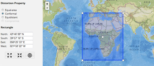
This Projection Wizard allows you to select the extent of the map view which you are working with by outlining the area on a Leaflet map. Once you've highlighted your map bounds you can choose a distortion property (Equal-area, Conformal, Equidistant or Compromise).
The Projection Wizard will then suggest which map projection you should use depending on the extent and the distortion property of the map. The suggested projections are based on 'A Guide to Selecting Map Projections' by the Cartography and Geovisualization Group at Oregon State University.
This week I was also impressed with CartoNerd's method for highlighting large socio-economic differences between geographical neighbors.
We are all used to choropleth maps being employed as a way to visualize the socio-economic performance of countries around the world. Choropleth maps are a great way to provide a global picture of different socio-economic indicators. They can effectively provide an overview of which countries are performing better and which countries are struggling within a particular socio-economic indicator.
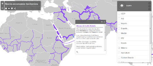
Socio-Economic Tectonics however employs a different method to visualize socio-economic indicators which, instead of providing an overview, highlights the areas of the world where there are glaring dissimilarities in socio-economic performance between neighboring countries. Country borders are used on the map to show socio-economic differences between adjoining countries. These differences are represented graphically on the map by the width of country borders. The wider the border between two countries then the bigger the difference in the selected socio-economic indicator.
I do like it when developers use online mapping libraries to create interactive image maps. One of the best non-cartographic uses of the Google Maps API is this Interactive Metabolic Pathways Map.
A metabolic pathway is a series of chemical reactions occurring within a cell. Each metabolic pathway consists of a series of biochemical reactions that are connected by their intermediates. The Interactive Metabolic Pathways Map allows you to explore all the metabolites, enzymes, and selected pathways.
What is particularly impressive about this image map of the metabolic pathways is that it is fully interactive and searchable. You can select any of the carbohydrates, amino acids, lipids or purines & pyrimidines on the pathways map to learn more about its role in the metabolic pathway. You can also search for any of the features by name to quickly locate them on the map.
24 Hours of Train Traffic in 60 Seconds
There has been a long tradition of using transit network timetables to create real-time transit map simulations. Vasile Coțovanu's Swiss Railways Network was probably the very first nationwide transit map which simulated train movements in real-time based on the network timetable.
Recently a new approach to mapping GTFS transit timetables has become popular. This new approach uses CartoDB's Torque library to provide a sped-up animated visualization of a tranist network. El Trafico de Trenes is a good example of this new trend.
Microsiervos has used Torque to visualize 24 hours of traffic on the Spanish rail network in just over one minute. Microsiervos has released two different maps. One shows an animated visualization of 24 hours of Spain's long distance trains. The other animates 24 hours of Spain's freight trains.
You can also view a simulation of one day of San Francisco's SFMTA bus network visualized on a map using CartoDB's Torque library. Danny Whalen's SFMTA Weekday Stop Times map animates all of San Francisco's buses over 24 hours in just 60 seconds.
If you want to create your own visualizations of a transit network then you might want to have a look at Vasile's Transit Map library. Vasile has also released the code for a GTFS (General Transit Feed Specification) plug-in as well. GTFS-viz converts a set of GTFS files into a SQLite database and the GeoJSONs needed by his Transit Map library.
If you want to create a sped-up version of a city's transit network then you should consider using the city's GTFS feed with CartoDB's Torque library.
Saturday, June 27, 2015
Mapping the Sale of Liquor
The sale of liquor in Vermont is controlled by the state’s Department of Liquor Control. There is obviously some debate as to whether the sale of liquor in Vermont should be privatized. However the fact that the industry is controlled by the state does mean that all the data surrounding the sale of liquor in Vermont is freely available.
Vermont's Seven Days has taken this data and created a map of Vermont's Best-Selling Liquor, Store by Store. Using the map you can click on any of Vermont's 80 liquor stores and discover the top 5 selling liquor brands.
The markers on the map seemed to be scaled by the volume of sales. So the larger the map marker the more liquor was sold in 2014. When you click on a marker you can also discover how the store ranks in the number of sales, the total volume of sales (in dollars) and the percentage of growth (from 2013).
I wish you could also query the map by liquor brand or by type of liquor. It would be nice for example, to see where vodka or whiskey was sold the most. The map could allow users to select a type of liquor and resize the map markers based on the volume of sales of the selected liquor type. However if you are interested in the top selling brands of liquor in Vermont Seven Days does have a chart of the top 10 selling brands in the state in this article.
Friday, June 26, 2015
Paint the Whole World with a Rainbow
Could there be a better way to celebrate Pride than to paint the whole world with a rainbow? Of course there could. The Supreme Court could legalize gay marriage in every state.
This weekend people across the globe will also be celebrating Gay Pride. The Pride rainbow colored flag will probably feature quite prominently in many of these Gay Pride events. In honor of these two events cartographers have also started painting the world with a rainbow.
Mapbox has started the party today with this Love Wins rainbow colored map. On this map the colors of the rainbow continuously scroll across the world. The map therefore not only celebrates the Supreme Court ruling but also acts as a neat little demonstration of how MapBox GL's vector map tiles can be updated in the browser on the fly.
If Mapbox's ever moving rainbow colors give you a headache then you can switch over to Amy Lee Walton's Love Wins map, which is a more serene rainbow styled map. Alternatively you could try Blake Thompson's Rainbow Roads map, which, as the name suggests, has rainbow colored roads.
If you don't like any of those rainbow maps then you might prefer my own Rainbow Map. This one has quite nice rainbow colored buildings.
Mapping the Transatlantic Slave Ships
Earlier this year Professor Adam Rothman and Matt Burdumy of Georgetown University created a series of heat-maps using data from the Transatlantic Slave Trade Database to visualize 35,000 slaving voyages (from 1500 to 1870).
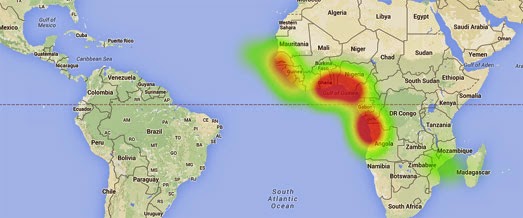
Their visualization of the Transatlantic Slave Trade Database consists of three animated heat-maps showing the cumulative frequency of slave ship points of departure, the principal ports where slaves were purchased and the principal ports where the slaves were sold.
During the animation on each map a cumulative heat-map appears, revealing the pattern of slave voyages over time. For example, the map of slave voyage departures reveals how Portugal and Spain's early dominance of the transatlantic slave trade was quickly overtaken by the emergence of British slave traders.
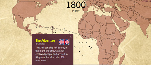
Slate has now also created a mapped visualization of the Transatlantic Slave Trade Database. Slate's Atlantic Slave Trade in Two Minutes animates the actual journeys of the slave ship journeys over 315 years.
The map visualizes the scale of the transatlantic slave trade over the centuries. It also reveals the patterns of the trade routes used and the destinations of the slave ships. The size of the ships on the map are scaled to represent the number of slaves on board. You can also click on each ship to find out which country's flag it sailed under and more about its role in the slave trade.
The Map Projection Wizard
If you want a little help deciding which map projection you should use for your current map project then you should use the Projection Wizard.
This map projection guide allows you to select the extent of the map view you are working with by outlining the area on a Leaflet map. Once you've highlighted your map bounds you can choose a distortion property (Equal-area, Conformal, Equidistant or Compromise).
The Projection Wizard will then suggest which map projection you should use depending on the extent and the distortion property of the map. The suggested projections are based on 'A Guide to Selecting Map Projections' by the Cartography and Geovisualization Group at Oregon State University.
A PROJ.4 link is provided next to each suggested projection, which opens a popup window with a PROJ.4 library. Once you've settled on your map projection you might want to check-out the Proj4Leaflet plugin for using projections supported by Proj4js with Leaflet powered maps.
Thursday, June 25, 2015
Mapping 40 Years of Global Terrorism
These two new interactive maps of global terrorism casualties (1970-2013), by David Johnson, provide insight into terrorism hot-spots around the world and the changing geography of terrorism over those 44 years.
The Global Terrorism Casualties map visualizes terrorism casualties around the world as a dot map. The concentration of dots in Northern Ireland, Pakistan, Afghanistan, Algeria, El Salvador and in other countries helps to emphasize some of the most political troubled locations in the last half-century. The dots on the map for each terrorist incident are sized by the number of causalities.
The same dataset is used in the Global Terrorism Heatmap. This map however adds a time element to the data. The CartoDB Torque library is used to animate the terrorism incidents by date, which provides a great visualization of terrorist hot-spots over time. For example, notice how in El Salvador terrorist casualties come to a halt in January 1992, after the end of the country's civil war.
Mapping Conference Tweets
The Collina Mediterranea Expo Twitter Trend map is an interesting experiment in mapping Tweets sent by location during an exhibition.
In truth the map is a bit of a mess. The Twitter labels in particular could do with a a little tweak to avoid all the overlapping labels. I also wonder whether indoor location tracking is precise enough to have confidence in the accuracy of the placement of the Twitter labels.
Despite these problems I think this kind of social media mapping could have some traction for large conference centers, shopping malls and sports stadiums. For example large shopping malls might be able to map Tweets to identify areas of a mall where shoppers are most & least happy.
Sentiment tracking using social media does have its critics. However if you want to see more examples of trying to map sentiment derived from Twitter messages have a look at the maps on this Sentiment Mapping post.
The London Buskers Map
Busk in London is a really well designed mapped guide to where street performers can busk in London. The map shows which boroughs have accepted the Busk in London code of conduct and the location of designated busking pitches throughout the city.
I really like the simple and elegant design of the Busk in London map. The brightly colored guitar picks, which are used to mark designated busking pitches, are a nice touch. The responsive page header is also a neat feature. Notice how when you open an information window near the top of the map the page header animates off the page, leaving more room for the map.
The only flaw in the design is that the header can obscure the zoom buttons on the map. This would be easy to overcome by switching the location of the zoom buttons to the right-hand side or the bottom of the map.
Wednesday, June 24, 2015
The Running Cartoon Map
For some reason CartoDB's animated Torque library has largely been overlooked as a method for animating cartoons on maps. Until now that is.
Map Labels Above a CartoDB Torque Layer uses CartoDB's animated heat map capabilities to create an animated running and jumping figure on top of a map. The map actually has a serious purpose to demonstrate how to layer labels on a map above the animated Torque layer. Notice how when the animation runs across Africa the body passes behind the country labels.
I just love the running man.
Introducing Precipice View
Apparently there is nowhere that the Google Street View guys won't go. They've already dived beneath the roaring seas, traversed the Liwa Desert and stared-down the polar bears of Churchill.
Now they have climbed the vertical face of El Capitan in Yosemite. To capture this new imagery Google cheated a little bit by employing the help of three experienced climbers: Lynn Hill, Alex Honnold and Tommy Caldwell.
The three dragged Google's heavy Street View cameras all the way to the top of El Capitan, capturing some extraordinary imagery on the journey.
The best way to explore this rock-climbing Street View is on this Behind the Scenes special. El Capitan, Yosemite: Behind the Scenes is a great presentation of this new Street View imagery. As you scroll up the page you can view the locations of the Street View panoramas, superimposed upon the face of El Capitan.
Click on the 'explore' buttons that appear on your screen and you can dive into the interactive imagery captured from the climb. The Street Views themselves contain points of information about the climb and the mountain. They also include sound-clips and video which explain more about El Capitan and its history.
The History of Segregation in DC
Mapping Segregation in Washington DC is a public history project exploring the historic segregation of DC’s housing. The map reveals how restrictive deed covenants were used in the early 20th century to exclude the city's black population from D.C.'s best housing.
Esri's Story Map template was used by the project to provide a narrative map which examines the use of racially restrictive covenants over the decades and the later legal attempts to overcome these restrictive practices.
The map concentrates on the north-west neighborhoods of Bloomingdale, Columbia Heights, Mount Pleasant, Park View, and Pleasant Plains. As you progress through the Story Map markers are added to the map to show the locations of properties whose covenants were challenged in court. These legal challenges and their verdicts are discussed in more detail in the map sidebar.
Google Maps - the Body Edition
A metabolic pathway is a series of chemical reactions occurring within a cell. Each metabolic pathway consists of a series of biochemical reactions that are connected by their intermediates: the products of one reaction are the substrates for subsequent reactions, and so on.
You can now explore these metabolic pathways on a new Interactive Metabolic Pathways Map. The map, created with the Google Maps API, allows you to explore all the metabolites, enzymes, and selected pathways.
What is particularly impressive about this image map of the metabolic pathways is that it is fully interactive and searchable. You can select any of the carbohydrates, amino acids, lipids or purines & pyrimidines on the pathways map to learn more about its role in the metabolic pathway. You can also search for any of the features by name to quickly locate them on the map.
There has been a long tradition of using the Google Maps API to map the human body. One of the first examples was the NYU School of Medicine Virtual Microscope.
Created by the NYU School of Medicine the Virtual Microscope uses the Google Maps API to display and navigate scanned slides of microscopic images. Students and faculty members who are logged into the school's Learning Management System can even add markers to the slides to annotate and comment on slide features.
The University of New South Wales is following in this tradition by using the Google Maps to create maps of human tissue down to the individual cell. You can already explore the first map of human hip tissue.
This Google Map allows you to explore images captured with a scanning electron microscope. Creating map tiles from the electron microscope images allows the university to create an interactive map of the hip tissue. The result is this Google Map which allows researchers to pan and zoom into details in the microscope images, just as you can with any interactive map.
The Genome Projector is a searchable database browser that uses the Google Maps API to provide a zoomable user interface for molecular biology. The Genome Projector currently contains four views, the Genome map, the Plasmid map, the Pathway map, and DNA walk.
The Genome Projector says that "In molecular biology, looking at reactions and behaviors of specific molecular components in microscopic levels is important. ... Therefore, researchers need a scalable point of view, having access to all of the microscopic, macroscopic, and mesoscopic levels of biological knowledge. Moreover, biological data is highly multi-dimensional by nature, and understanding of the data requires multiple views, layers, or projections ..."
Mapping the Robot Invasion
France, Spain and Portugal are ready to join Sarah Connor's Resistance against the rise of the robots. However Sweden and Finland are willing to welcome our new robot overlords with open arms.
The European Commission has polled people in 28 European countries to determine how people feel about robots. Rue89 has created three maps from the results of the poll to visualize how Europeans perceive the increased use of automation in the home and in the work place.
The three maps show the response by country to different questions in the survey. The first map shows the response by country to the question 'Do you love robots?' (although I suspect that wasn't the real question in the survey). The second map shows the response to the question 'Have You Ever Used a Robot?'. The last map shows which countries think robots will lead to the loss of jobs.
Tuesday, June 23, 2015
Mapping Compensation for Slavery
Today I visited the wonderful Museum of London Docklands. The museum's 'London, Sugar and Slavery' exhibition examines the dominant role of London in the transatlantic slave trade.
Of all the many shocking facts revealed by the exhibition one fact really stuck with me. When the British government abolished slave-ownership in 1833 it decided to award £20 million in compensation. That equates to about £16.5 billion in today's terms. It is impossible to argue that the British government were astonishingly generous in their compensation award.
The shocking fact is, however, that this £20 million was earmarked not for the individuals who were sold, abducted or forced into slavery but for those who profited from this immoral activity. In Victorian Britain many wealthy families owed their fortunes to the slave economy. Thanks to the British government these same families also profited when slavery was finally abolished.
The History Department of University College London has created two maps which really reveal how many Londoner's profited from their disgusting involvement in the slave trade. The UCL's Slaveowners in Fitzrovia and on the Portman Estate includes two maps showing the homes of individuals who received compensation from the abolition of slave-ownership.
Because of Britain's still rigid class system there are of course many wealthy families in Britain today still indirectly enjoying the proceeds of slavery as the wealth generated from the slave-trade and the government's compensation award has been passed down the generations.
Google Search Predicts the World Cup
Last week Google opened a new Google Trends Datastore. The datastore provides a great source of data for anyone interested in mapping search trends on Google.
Google has released their own map of recent search trends for soccer around the world. The Search Interest in Copa America vs. FIFA Women's World Cup map shows which countries searched the most for the Copa America and which countries searched more for the Women's World Cup on the 11th June. It also seems to have provided a pretty accurate prediction for which teams would do well in the World Cup.
Interestingly the countries which searched the most for the Womens' World Cup have turned out to be the strongest teams in the tournament. Of the nine teams still in the competition six of them (Japan, Germany, France, USA, Canada and Australia) are among the few countries which searched more for the Women's World Cup than for the Copa America.
The Copa America was searched for in far more countries. Searches for the Copa America, unsurprisingly, completely dominate in South and Central America.
A World with Wide Borders
We are all used to choropleth maps being employed as a way to visualize the socio-economic performance of countries around the world. Choropleth maps are a great way to provide a global picture of different socio-economic indicators. They can effectively provide an overview of which countries are performing better and which countries are struggling within a particular socio-economic indicator.
Socio-Economic Tectonics however employs a different method to visualize socio-economic indicators which, instead of providing an overview, highlights the areas of the world where there are glaring dissimilarities in socio-economic performance between neighboring countries.
Country borders are used on the map to show socio-economic differences between adjoining countries. These differences are represented graphically on the map by the width of country borders. The wider the border between two countries then the bigger the difference in the selected socio-economic indicator.
Twenty different indicators in all can be viewed on the map, organized into five categories: economy, disease and death, people and environment, technology and health. If you click on a country border you can discover the actual dissimilarity ratio between the two neighboring countries for the selected indicator.
Obviously if you want to provide a global overview of a geographical dataset you would probably decide to use a choropleth map. However socio-economic tectonics is a great way to visualize the differences between neighboring countries. Of course, there is no reason why you couldn't employ both visualization methods on the same map.
Monday, June 22, 2015
The Evolution of the Traveling Salesman
There are a few interactive maps that attempt to solve the perennial Traveling Salesman Problem (TSP). This is the challenge to find the shortest route possible given a number of predefined stops. Among the most interesting solutions has been the Forio Route Optimizer, which finds the quickest route (with a number of stops), while also factoring in real-time traffic conditions on the roads.
I also like this new TSP map which iterates through solutions live on a map. Which means you can watch as better and better solutions evolve over time. The Ann Arbor Yum Planner allows you to solve the Traveling Salesman Problem for a number of Ann Arbor businesses. You can select from the city's restaurants, cafes, bars, takeouts, deliveries or bakeries to evolve a quick route which takes in all of the businesses or any combination of the business categories.
The map starts with a route and then mutates the route. From these off-spring routes it selects the four best routes. It then repeats this iteration hundreds of times until settling on an acceptable route.
Catography - The Lost Art of Mapping Cats
Today I can't seem to get away from maps about cats. First thing this morning my Twitter feed was full of links to the Click-a-Cat map. This afternoon it is now full of links to the Basemaps for Cats map.
When you first open the Click-a-Cat there is one lonely cat on the map living somewhere up near Chicago. However our lonely cuddly feline friend doesn't have to remain alone for long. Click on the map and more cats are added to the map at random locations. Carry on clicking and you can help the cats conquer the world.
In the very early days of catography the only way to make a cat map was from the flayed hides of dead cats. Few catographers these days have the patience for the long process of skinning, drying and stretching cat hides. The endless wailing of the bleeding hearts at Peta on top of the caterwauling of skinless cats can be pretty off-putting. That means that in these more modern times catographers are increasingly turning to digital methods for creating their cat maps.
Now-a-days catographers content themselves with creating maps from photos of cat fur. Basemaps for Cats is a prime example of this more enlightened approach to cat mapping. I can assure you that no cats suffered in the making of this cat fur map.
Pictures of whole cats are really much cuter than cat fur maps. After all the Internet was invented so that lonely cat lovers would have a way to share their endless stupid pictures of cats with the rest of the world. If you you love maps and you also love photos of cats then you really should have a look at I Know Where Your Cat Lives.
I Know Where Your Cat Lives displays pictures of cats on a Google Map. The pictures of the cats come from popular photo sharing websites and the locations are based on the data hidden in cat photo metadata. The map is obviously intended as a necessary warning against sharing your cat's personal data online. You can never be too safe in protecting your cat from roaming catographers.
This Map Gives You Pluto Vision
Share your location with NASA and in return they will bestow upon you the gift of Pluto Vision.
On July 14th New Horizons will become the first spacecraft to have a close encounter with Pluto. To mark the occasion NASA wants to create a mosaic picture of Pluto and its moon composed of images submitted by the general public.
NASA will create the mosaic picture of Pluto from pictures of Earth taken during what they call Pluto Time. Pluto orbits the sun at the fringes of the solar system. Therefore sunlight on Pluto is much weaker than it is on Earth. However we do experience similar light conditions here on Earth twice a day near dawn and dusk each day.
Share your location with the Pluto Time map and NASA will tell you the exact time when the next 'Pluto Time' occurs where you are. NASA would like you to take a photograph at your Pluto Time and share it on Facebook, Twitter, Vine, Instagram, Flickr or YouTube with the tag #PlutoTime.
It will then create the mosaic picture of Pluto and the moon from photos taken on Earth under similar light conditions as can be found on the surface of Pluto.
Mapping Million Dollar Houses
Over the weekend I stumbled across a few maps concerned with the top end of the real estate market. In the UK there is the Million Pound map and the Two Million Pound map. While in the USA there is the Seattle Million Pound Houses map.
Both the UK maps show the locations of houses sold in England and Wales using data from Hamptons International and the Land Registry. The Million Pound map shows properties which sold for above £1m in 2013. The Two Million Pound map shows properties which sold for above £2 million since 1995.
Both maps show a high concentration of expensive properties in and around London. The highest concentration of expensive houses appears to be in west and south-west London. On both maps there is also a noticeable hole in the London commuter area. Heathrow Airport seems to sit right in the middle of that hole. This suggests that noise is one of the biggest deterrents to high property prices.
The Seattle Million Pound Houses map shows residences sold in the city for over $1 million in the last three years. On this map it is noticeable that the most expensive properties are not in the city center but in the surrounding suburbs.
It also appears to me that the south of Seattle has a very low concentration of expensive properties. I don't know Seattle well enough to be certain of the likely cause of this but I wonder if this is also caused by the proximity to noisy airports, with both the King County International Airport and Seattle-Tacoma International Airport effecting property prices in the area.
Sunday, June 21, 2015
Maps of the Week
Lifewatch Inbo has used CartoDB's Torque to visualize bird migration patterns. In a series of animated CartoDB Torque powered maps Lifewatch Inbo has visualized the flight migration of birds over the course of one night.
Using CartoDB to Visualize How Far Birds Migrate in a Single Night uses data from the ROBIN bird radar detection system to simulate the trajectory of individual birds from Belgium and the Netherlands on the night of April 7-8, 2013. In each of the maps you can view an animated simulation of the birds' migration based on the birds' airspeed and the wind conditions on the two nights in question.
Bearings of Baltimore is a beautiful bird's eye view map of Baltimore, showing how the city looked right after the attack by the British in 1815.
The map is actually an amazing 2.5 billion pixel image of the city in around 1815, which you can pan and zoom to view in incredibly detail. The thumbnail images running along the bottom of the map provide quick links to historically important locations on the map.
Click on one of the thumbnail pictures and the map automatically zooms in on the selected location. You can then click on the map to find out about the selected building or location's historical importance. The map also includes a '2014 View' which overlays modern Baltimore landmarks on the map so you can get a better idea of how this map of Baltimore in 1815 relates to the city of Baltimore today.
Atlasify is a new map based search engine which lets you map just about anything. Enter a search term into Atlasify and you can view a map visualizing how closely locations around the world are related to the term.
For example, search 'Mormonism' and the map shows that the USA is the most related country to 'Mormonism'. Zoom in on America and we see that the most closely related state to Mormonism is Utah, which is the state colored the darkest green on the map.