Friday, June 30, 2017
Fried Chicken Route Planners
A Fried Chicken Route Planner is a variation on the much loved Pub crawl route planning map. Instead of creating a pub crawl route around a number of pubs or bars the Fried Chicken Route Planner creates a mapped route taking in some of the best fried chicken restaurants.
A good example of a Fried Chicken Route Planner is the Post & Courier's Backroads Fried Chicken map (in fact it might be the only example of a Fried Chicken Route Planner). The Backroads Fried Chicken map can provide a route from any address in South Carolina to 17 of the best fried chicken restaurants in the state.
The 17 fried chicken restaurants on your route have all been chosen by the Post & Courier's food critic Hanna Raskin. As you progress through the route you can view the address and opening hours of each individual restaurant. If stopping and eating at 17 different fried chicken restaurants in one car journey strikes you as being a bit too self-indulgent then you might want to restrict yourself to eating at Hanna's pick of the top five restaurants. These are listed and reviewed below the map.
Being Healthy will Kill You
Living in a healthy environment is the best way to ensure that you die young. That may sound counter-intuitive but it seems to be borne out by the Geographic Data Lab's new Access to Healthy Assets and Hazards map.
The Access to Healthy Assets and Hazards map shows the least and most healthy places to live in Great Britain. The Access to Healthy Assets and Hazards (AHAH) is a new index for measuring how ‘healthy’ neighbourhoods are based on the quality of the environment, for example local air pollution. The index however also considers the ease of access to health services and the availability of 'unhealthy' retail outlets, such as fast food restaurants and pubs.
You can study the AHAH map in detail on the interactive map version at CDRC Maps.
The AHAH is an interesting new way to assess how healthy an environment actually is. For example, many people think of the countryside as being a healthy place to live. However the AHAH index rates many rural neighborhoods very poorly because of their relatively poor access to health care services.
The AHAH map on the left and the ONS life expectancy map on the right
There could however be a flaw in the AHAH methodology. If we compare the AHAH map with the Office for National Statistics life expectancy maps many areas which are shown to be healthy on the AHAH map have a very low life expectancy. On the life expectancy map you can see that the Scottish Central Belt, South Wales and the M62 corridor in the north of England all have areas with some of the lowest life expectancy in Great Britain. On the AHAH map these areas score among some of the most healthy places to live.
Correlation is not causation but the AHAH map does seem to suggest that living in a healthy area could kill you.
Thursday, June 29, 2017
The Movement of Refugees Around the World
The University of Zurich has created an interesting visualization of refugee movements around the world since the end of the cold war. The Refugee Movements interactive map allows you to see where refugees have come from and the countries that they have moved to.
If you click on a region on the world map you can view the inward and outward flow of refugees from the region for the selected year. Arrows show the main countries of origin for the refugees. The width of the arrows represent the relative number of refugees.
The bar chart on the left of the map shows the largest origin countries and the numbers of refugees from these countries. The pie chart to the right of the map shows the proportion of refugees moving within the region and the proportion from other world regions. The timeline below the map allows you to explore the global movement of refugees over time and investigate the effects of world events on refugee movements.
The Horn of Africa section provides a more detailed examination of how political and environmental events can effect refugee numbers and movements of refugees in one particular region. This section looks at individual countries in the Horn of Africa, the number of refugees from these countries over the years and the reasons why the numbers of refugees might suddenly increase or decrease because of local events.
The data for the Refugee Movements map comes from the United Nations Refugee Agency (UNHCR). CREATE Lab has mapped the movement of refugees around the world for every year since 2000 using the same data.
At first glance the animated flowing dots on the Global Refugee Flow map can be a little confusing. With all that movement it can be hard to pick out information from the map. As the timeline plays, however, patterns do emerge. For example you can see how neighboring countries most often receive the most refugees from countries in crisis and that western countries usually get off very lightly.
The countries listed along the bottom of the map are where a high proportion of peoples have been forced to flee their homes and become refugees. If you select one of these countries the map will zoom-in on the country and an information window will open explaining the crisis that led to people leaving the country.
Flight & Expulsion is a more explorable interactive mapped visualization of the same worldwide migration data from the annual UNHCR Refugee Report. This map allows you to explore the refugee data for any country to see how they have responded to crises around the world.
If you select a country on the map you can view the number of 'arrivals' and 'departures' for any year from 1988 to 2008. The countries where a high proportion of citizens have emigrated to are shown on the map in green. The countries where immigrants have come from are shown on the map in brown.
The UNHCR also teamed up with Google to create an immersive web documentary explaining the issues around the current Syrian refugee crisis. The documentary explores what is happening in Syria, where Syrian refugees are going and how you can help. Searching for Syria uses audio, video, 360 degree photospheres and before & after imagery to help explore the country, the effect of the war and the story of its people.
The 360 degree photospheres are used to help explain the rich history of Syria and showcase its amazing cultural legacy. These panoramic images allow you to explore Syria's six UNESCO World Heritage Sites. Every single one of which has been destroyed or damaged by the war.
While the loss of Syria's World Heritage Sites is heartbreaking the real tragedy is the human cost of the war and the huge numbers of Syrians who have lost their homes. Searching for Syria explores the plight of Syrian refugees and also explains what you can do to help.
Wednesday, June 28, 2017
Mapping Future Climate Change
The Climate Impact Lab's Climate Impact Map visualizes how global warming will effect temperatures around the world over the rest of this century.
Using the drop-down menu you can choose to view predicted global temperatures for each quarter of the year or for the whole year. You can also choose to view the number of days which will be below 32 degrees Fahrenheit or above 35 degrees Fahrenheit. The timeline below the map allows you to view a choropleth view of any of these selected temperature predictions for the years 2020-2039, 2040-2059 and 2080-2100.
The map includes two choropleth views. The 'absolute level' shows the predicted temperatures around the world for the year selected. The 'change from historical' view shows how much the temperature will increase above the 1986-2005 averages around the globe.
The University of Hawaii has released a similar interactive map which uses expected temperature increases to predict the number of deadly days we can expect from extreme heat around the world for each year up to 2100. Heatwaves: Number of deadly heat days provides a timeline control which allows you to select any year from 1950-2100. The blue dots on the map show historic extreme heat events that have occurred around the world before 2014.
If you click on the map you can view two charts for the selected location. One chart visualizes the number of annual deadly days over time and the other shows the humidity vs. temperature for the current year.
Thanks to NOAA's Sea Level Rise Viewer we can observe how these increases in temperature will effect sea levels.
By the end of this century the National Climate Assessment estimates that sea levels may rise by up to 6.6 feet. NOAA's interactive map uses the most accurate elevation data available to model how different extents of sea level rise will impact coastal areas in the USA. You can adjust the sea level displayed on the map by adjusting the water level tool from 0-6 feet.
You can also use the 'Local Scenarios' tab to view the potential impact of different sea level rise scenarios on different areas of the country. The Local Scenarios option allows you to adjust the map to view the impact of sea level rise of different orders of severity. It also allows you to see how this impacts the local area by decade (up to the year 2100).
Aerial Video Mapping
Leaflet version 1.1.0 has been released. The latest version of Leaflet's mapping library includes a new L.VideoOverlay class which allows you to add videos as an overlay to your maps.
To see what you can do with L.VideoOverlay you can view the Leaflet documentation demo map. To get started adding videos to your Leaflet maps then you should have a look at the L.VideoOverlay Tutorial.
Adding a video to a Leaflet map is now very simple. You just need your video and the geographical bounds of your video. If you know the geographical bounds of the video then it is a simple job to just add the video (as you world add an image overlay) in the correct position on the map.
Unfortunately L.VideoOverlay will only work if north is at the top in your video coverage. If your video doesn't have a 'north-up orientation' things get a lot more complicated. A number of plug-ins have been written which allow you to rotate images added using L.ImageOverlay. You could have a look at these image overlay plug-ins to get some ideas about how to rotate a video overlay in Leaflet.
Alternatively you could try MapboxGL to add a video to a map. As you can see in this Add a Video demo map you can rotate a video overlay in MapboxGL to ensure that north is always at the top.
If you want some inspiration for what you can achieve by adding a video overlay on a map then have a look at the amazing Interactive Map of A Year In The Life Of Earth's CO2. This wraps an HTML5 version of NASA's narrated video of a year's Carbon Monoxide and Carbon Dioxide concentrations around an interactive globe.
You could create something similar to the above map with Leaflet if you created your own narrated video. The new L.VideoOverlay class allows you to add video playback controls to your map. By adding video controls you can allow your users to pause, rewind and forward through a narrated video.
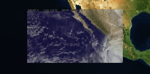
If you want to start playing with L.VideoOverlay you can download some aerial video footage from NASA's GOES Project.
Tuesday, June 27, 2017
Melbourne's Future City Skyline
Last year Miami's Downtown Development Authority began using the Cesium mapping platform to visualize in 3D how Miami's skyline could look in the future. The map includes 3D models of building projects in the city which are either proposed, under construction or recently completed.
The Miami DDA 3D Map used the Cesium mapping platform to present a 3D map of downtown Miami which allows you to explore the effect of the new buildings on the skyline from any angle. You can even click on the individual buildings on the map to learn more about the developer, status and building type.
It is now also possible to use Mapbox GL's extrude property to show building planning proposals in 3D. The City of Melbourne has done just that in its new visualization of Melbourne's skyline. The city's Development Activity Model is a map which gives you a good idea of what Melbourne's skyline will look like once all the building's currently under construction have been completed.
The map shows buildings which are under construction, which have been approved by the city and buildings which have submitted planning applications and are awaiting approval. You can use the menu to turn on or off any of the 3D buildings under construction, approved or applied. You can also click on individual buildings on the map to discover its planning application number and information about the number of planned floors, dwellings and car parking spaces etc.
Mapbox Cartogram
Mapbox has a fun new tool which allows you to create your own map style instantly using the color scheme from any picture or photograph. This means that you can instantly create a map style inspired by your favorite painting, your favorite photograph or even your favorite cartoon.
Cartogram couldn't be easier to use. Just drag & drop your image into Cartogram and it instantly creates a map style using selected colors from your image. If you aren't entirely satisfied with the color scheme automatically selected for your map you can adjust the style by custom picking different colors from your image for different map features.
When finished you can of course save your map style and open it in Mapbox Studio, where you can develop the style even further (perhaps with custom fonts).
Cartogram is a lot of fun. You don't need to be a cartographer to enjoy Cartogram. Go and play with it - I promise you'll enjoy it.
Free Eclipse Glasses
The STAR Library Education Network (STAR_Net) has developed this map as an addition to its Eclipse Resource Center. Credit: NASA@ My Library initiative and the Moore Foundation.
It is now less than 8 weeks to the solar eclipse. You can experience the total eclipse anywhere along a narrow band stretching from Oregon to South Carolina.
If you are planning to view the eclipse then you will need a pair of eclipse glasses. Thanks to the Space Science Institute (SSI) and the generous sponsorship of the Gordon and Betty Moore Foundation, Research Corporation and Google, two million pairs of free eclipse glasses are being given away by participating libraries across the United States.
There are over 2,000 participating libraries. You can find your closest on the Participating Eclipse Libraries interactive map. The participating libraries will also have eclipse background information for anybody who wants to learn more about the astronomy of solar eclipses.
If you are still planning where to view the eclipse on August 21st then you might want to consult NOAA's Cloudiness Map of the Eclipse. The map not only shows you where you can see a total eclipse (the umbral path) but also tells you the chance of clouds along the eclipse's path, based on historical weather data.
The map includes a number of circles which are colored based on the chance of cloud cover. If you click on these circles you can view the percentage chance of having an unobstructed view of the eclipse (based on the amount of cloud cover at that location on August 21st in previous years).
Judging by the map Nebraska, Wyoming and Idaho are the states where you will have the best chance of an unobstructed view. However these states are not the best places to view the eclipse in terms of duration. If you want to experience the eclipse with the longest duration you need to be near Carbondale in Illinois, where the sun will be completely obscured for two minutes and 40 seconds.
NASA's Total Solar Eclipse Interactive Map also shows the path of the eclipse across the United States. NASA's map doesn't include information about the likelihood of cloud cover but it does allow you to find out the duration of totality (how long the sun will be obscured) anywhere along the eclipse's path. Just click anywhere on the map to discover the time of the eclipse at that location, how much of the sun will be obscured and how long the eclipse will last.
Mapping the Jewish Occupation of Hebron
Mapping the Apartheid argue that the Jewish settlements in the Palestinian city of Hebron and the creeping Jewish occupation of the Old City restrict "freedom of movement and suffocate the social and economic life for Palestinians".
To help illustrate this situation Mapping the Apartheid has created an interactive map showing the current situation in the historical center of Hebron. The interactive map shows the locations of the Jewish settlements in Hebron. It also shows the locations of checkpoints, watch points, cameras and barriers and the location of those roads which have been closed to Palestinians and Palestinian vehicles. Mapping the Apartheid argue that the map shows "how the Old City of Hebron is gradually being sterilized to facilitate colonization and Judaization of the Old City".
The map also includes links to the stories of Palestinians living in Hebron and affected by the occupation. If you click on these links you can read first-hand personal experiences of life in Hebron under occupation.
You can read more about Hebron and its importance to Jewish history and culture on the Jewish Virtual Library, Hebron: History & Overview.
Monday, June 26, 2017
Great Journeys in Time
In 1768 it took Captain Cook 1 year and 8 months to sail from Plymouth to Botany Bay, Australia. Today he could complete the journey by car and plane in 26 hours and 7 minutes.
Travelbag has created a series of interactive maps of some of the world's most famous explorations and journeys. The maps plot these historical journeys over time and then allow you to see how these same journeys could be completed today. Each map of the equivalent modern journey also shows you how much quicker the journey could be completed today.
A Race of Discovery features such famous journeys as Christopher Columbus' first voyage to the New World and Lewis & Clark's Corps of Discovery Expedition. There are 13 famous journeys to explore in all, each featuring both past and present interactive maps.
How to Make an RPG Game with Google Maps
Badass Quest is a new RPG game engine built on top of the Google Maps API. The engine makes it relatively easy to create your own map based game featuring real world places, Street View images, sound effects and music.
You can see the type of map based game you can create with Badass Quest by playing the demo game, Badass for President. In this game you play the part of a very dodgy businessman who has to take over control over the city by extorting businessmen and buying up local businesses (any similarity to Donald Trump is intentional).
At the beginning of the game you can choose where in the world you want play. The game then features real world locations which you can interact with and try to take over in the game. The map also features local restaurants, which you need to visit periodically in order to maintain your health.
Insects in the City
There are over 560 species of insect living in Melbourne. The most common species is the Minute Brown Scavenger Beetle Cortinicara. All these insects play a very important role in maintaining the bio-diversity of Melbourne. They pollinate flowers, transform biomass, regulate pest populations, recycle nutrients, disperse seeds and provide food for other animals and birds.
Between January 6th and March 10th 2015 insect surveys were undertaken in parks and gardens throughout the City of Melbourne. Each insect survey recorded the number and types of insects that live in each habitat. You can explore the results of Melbourne's insect survey on Insects - The Little Things that Run Our City.
You can view which areas of the city were studied using the Insect Biodiversity in the City of Melbourne interactive map. If you select the individual survey sites displayed on the map you can view a scatter-plot, beneath the map, showing the number of insects and the number of different insect species found in the site's insect survey.
If you scroll down to the 'Interaction' section you can view more details of the individual surveys carried out at each park and garden. An interactive graph breaks down the survey results for each site to show the number of different insects of each species, the number found in each type of habitat and the number of insects in each function group.
Saturday, June 24, 2017
City Cycling Stress Scores
Moovel Lab's What the Street? provides an interesting analysis of how much space is dedicated to cars, to cycling and to trains in cities around the world. According to What the Street cyclists in most cities around the world can typically expect much less than ten percent of the physical space that is dedicated to cars.
The quality of a city's cycling network however is far more than just a reflection of the amount of physical space dedicated to bikes. It also relies on how well a cycling network connects people to the places that they want to go and to the levels of stress that they experience while on their bikes. PlacesForBikes has therefore carried out a detailed analysis of local bike networks across the United States and ranked its towns and cities on how good they are for cycling.
The PlacesForBikes Bicycle Network Analysis allows you to view the results of this cycling network census in 299 towns and cities. You can view an interactive map for each town and city. The maps show the selected city's street colored according to their cycling stress score. Each map also includes the town or city's overall Bicycle Network Analysis score and individual scores for how easy it is for the population to access different places (e.g. parks, stores and health services) by bike.
You can read more about how the Bicycle Network Analysis scores are calculated on the PlacesForBikes Methodology page. The methodology partly relies on how streets are tagged on OpenStreetMap in terms of the roadway characteristics important to bikes and cyclists.
Friday, June 23, 2017
Sonnets on the Streets of Seattle
Seattle is a city 'full of cannabis craving lovers ... and power hungry sharks'. It is also a city full of poets and bards. Some of whom can be found on this Seattle poetry map.
For two years Claudia Castro Luna has been Seattle's Civic Poet. To mark the end of her residency as Civic Poet Claudia has launched an interactive map of Seattle poetry. The Seattle Poetic Grid is a collection of poems by Seattle residents who took part in poetry writing sessions during Claudia's residence program at the Seattle Public Library.
The map features both established poets and those who are new to the art. Each of the featured poems on the map provides an insight into how Seattle locations can infuse and inspire. You can inspire yourself simply by clicking on the markers on the map and reading that location's featured poem.
If you don't live in Seattle you might still be able to find poems written about places nearby. The Representative Poetry Online (RPO) from the University of Toronto Libraries has created a Google Map called Places of Poems & Poets. This map allows you to search the RPO poetry collection by location
Alternatively you could search the Poetry Atlas. The Poetry Atlas is a Google Map that is trying to map poems that mention specific locations around the world.
The Rent in Spain Falls Mainly Down the Drain
Renting an apartment in Madrid or Barcelona is becoming very difficult for anyone who isn't already rich or a high earner. Like many other cites in the developed world a number of factors have combined to price many people out of being able to afford to rent an apartment in Spain's two most populous cities.
Tell Me How Much You Can Afford and I'll Tell You Where to Live explains the problems of renting in Madrid and Barcelona. It also explores the reasons behind the high rents and then suggests some possible solutions. The article includes an interactive map which allows you to explore how much salary you need to rent in different neighborhoods in both cities. The map allows you to enter your monthly salary and the size of the apartment that you want to rent. The city's neighborhoods are then colored on the map to show the percentage of your salary that you would need to be able to rent in that area of the city.
The map also includes a timeline control which allows you to compare the current situation to previous years. Therefore if you are depressed by the current situation you can depress yourself further by sliding the years back to see how far back in time you would have to travel before you could afford to rent in Barcelona or Madrid.
Thursday, June 22, 2017
Degradation of the Amazon Rainforests
Most people are aware of the devastating effect of deforestation on the Amazon Rainforest. Not so many people are aware of the equally worrying 'degradation' of forests. With deforestation the forest is completely cleared and left for pasture, monoculture or simply abandoned. Forest degradation is the thinning of tree density which leads to the removal of important biodiversity. It is often caused by logging, fire, drought or hunting.
The extensive forest clearance caused by deforestation can be relatively easy to spot using aerial surveys or even satellite imagery. Forest degradation on the other hand can be a lot harder to monitor from the air as the tree canopy can still exist above the thinning tree density.
The Silent Forest project has been started by a team of Brazilian and foreign scientists to assess the extent and impact of forest degradation in the Amazon Rainforest. As part of this monitoring the project has released an interactive map to show Contributing Factors to Degradation in the Brazilian Amazon Rainforest. The map shows the extent to which fire, logging, hunting and fragmentation are leading to forest degradation.
The Silent Forest website also includes a hexagon grid map of the Brazilian state of Pará. The grid map shows the percentage loss of biodiversity across the whole state.
Where Cars Rule the City Streets
Do you know how much physical space in your town or city is dedicated to cars, to bikes and to trains? Moovel Lab has been analyzing OpenStreetMap data to answer this question and to provide a Mobility Space Report for major cities around the world. What the Street? allows you to explore these Mobility Space Reports and to view the amount of space dedicated to the three different modes of transport in your favorite cities.
Before exploring a city on What the Street? you are asked to enter your own guess as to how much city space you think is allocated to cars, trains and bikes. After you have made your guess you can then explore the results.
The results for each mode of transport is presented in a long scrollable visualization of all the individual spaces dedicated to each form of transit. For example for cars you get to scroll through all of the city's streets and parking lots. As you scroll through the visualization a total is kept of the amount of space dedicated to cars. Don't worry - you don't have to scroll through the whole city and a link allows you to skip to the end of the visualization.
After you have finished scrolling through all the city's streets, rails and bike lanes you can see how good your initial guess was. Your guess is compared to the actual results and to the guesses made by other users. The results page also includes some useful information about the city, such as the longest street and street name.
The city is then compared to the other cities around the world. This comparison includes its ranking as a city for driving, biking or taking the train.
Wednesday, June 21, 2017
Name the City from its Bike Lanes
The Guardian has a fun map game which requires you to guess cities around the world based solely on maps of their bike lanes. The maps were created by Bike Citizens using their bike mapping data. Each city map consists of just protected bike lanes (blue lines) and painted lanes (grey lines).
There are twelve city maps in all in Can you guess the city from its bike lane maps. All you have to do is choose the correct answer for each city map from a choice of three possible answers.
I got 10 out of 12 of the questions correct. I won't tell you which cities I got wrong as that would give you the answer to two of the trickier cities. I was amazed by how many cities I could recognize just from their bike lanes. I obviously spend far too much time looking at maps.
The UK Election Dot Map
The Colours of the Election is a dot map which provides a view of the geographical distribution of votes cast in the 2017 UK election. Each dot on the map represents 250 votes for one of the political parties. The dots are randomly distributed within each electoral area.
At the electoral ward level a random distribution of colored dots is obviously not the best way to present the number of votes cast for each political party. This data would be much more legible visualized as a bar graph. In fact randomizing the numbers within each constituency could be confusing as it suggests that the data is shown geographically - when in fact the data is just randomly distributed.
When you view the data at a regional level the data does begin to make more sense and the geographical distribution of votes for each political party can begin to emerge from the map. For example the regional view of London shows the dominance of Labour in inner London. The Conservatives voters are more concentrated in a ring in the suburbs outside of the center. This ring is broken in the south-west where the Liberal Democrats have a small pocket of support.
The question remains about whether this dot map view shows a more detailed picture of the number of votes cast for each party than a traditional election map. Here's the Evening Standard's static map of the 2017 election results in London.
I would argue that the Evening Standard map is at least as good, if not better, at showing where the different parties have the most support in London. In fact you could easily add a more refined analysis to the Evening Standard map by adding pop-up bar charts showing the total number of votes cast for each party in each electoral district.
What I do like about the Colours of the Election map is the responsive bar chart. This graph shows the total number of votes cast for each party for the current map view. This means that you can zoom and pan the map to explore the number of votes cast for each of the political parties in different parts of the UK. The date control also allows you to make a useful comparison between the support for each of the parties in this election and in previous elections.
How to Make a Travel Time Map
Mapbox has released a new plugin which allows you to add an isochrone layer to your Mapbox powered maps. The Mapbox Isochrone plugin visualizes how far you can travel in different periods of time.
You can see how the ischrone plugin works on this demo map. You can adjust the starting position by dragging and dropping the car icon on the map. If you switch to the 'Quantized' view the map switches to display stepped isolines, showing how far you can travel in incremental steps of time.
The Mapbox Isochrone plugin works with three different modes of travel: driving, cycling and walking. You can discover a little more about how the plugin generates the travel times for the different modes of travel on the Mapbox blog, Add Isochrones to Your Next Application.
You can also use the Route360 API to add an isochrone layer to your maps. Route360's API provides developer access to their isochrone library. The API has been designed to provide simple access to the Route360 isochrone travel time library from the Leaflet.js mapping platform.
Using the Route360 JavaScript API you can add a travel time isochrone layer to a Leaflet map. The API allows for users to view bike, car or walking travel-time isochrone layers on a Leaflet map. The API includes options to add a time control, so that the transit isochrone travel times will adjust to a transit network's schedule of operations.
The GraphHopper Isochrone API also provides travel times for bike, car or walking. You can view the API in action on this demo map. You can get details on how much the API costs on the Pricing page.
Tuesday, June 20, 2017
Trump's Huge Conflict of Interest Map
So many people ask me this. They ask me where does the president have great conflict of interests. I tell them Donald Trump has the best conflicts of interest. The corruption is big. I never realized how big it was. I really just see the bigness of it all.
You know Obama worked on it for years, got zippo, zero. Me, the people just call me up, they say, ‘Donald, can we just give you the money?’ I say, ‘Absolutely, yes.’ But some people don't get it. They don't want to give you the money. In which case they're very, very stupid people. Sad.
Here, you can take this, that's the final map of the numbers. It's pretty good, right? It's called the Trump’s Conflicts of Interest map. The black is obviously us. There's some countries you can't break through, you can't. It's sad. You can't. There is a chance that we could end up having a major, major conflict with them. But forget them. Have you seen all the black countries on the map. That's a tremendous success ... That's another thing that nobody talks about. The success. So much success.
Take that Qaddafi. I dealt with Qaddafi. I rented him a piece of land. He paid me more for one night than the land was worth for two years, and then I didn't let him use the land. That's what we should be doing. I screwed him. But nobody wants to talk about that.
Mapping Death from Global Warming
In 2003 in Europe 70,000 people died during an extreme heatwave. As global warming increases countries around the world are likely to experience more and more periods of life threatening extreme heat. By the year 2100 it is estimated that 74% of the world's population will be exposed to deadly heatwaves.
The University of Hawaii has released an interactive map which predicts the number of deadly days we can expect from extreme heat around the world for each year up to 2100. Heatwaves: Number of deadly heat days provides a timeline control which allows you to select any year from 1950-2100. The blue dots on the map show historic extreme heat events that have occurred around the world before 2014.
If you click on the map you can view two charts for the selected location. One chart visualizes the number of yearly deadly days over time and the other shows the humidity vs. temperature for the current year.
Working Abroad in the EU
The free movement of workers is one of the basic principles of the European Union. It means that Europeans can move between countries in the European Union in order to work. In 2015 4% of the EU's population had made use of this right in order to live in an EU country in which they weren't born.
The United Kingdom yesterday began negotiating its withdrawal from the European Union. One issue that needs to be addressed is what happens to UK nationals presently living in other EU countries and what happens to the non-British EU nationals currently living in the UK.
The Pew Research Center has created an interactive map which allows you to see how many non-native Europeans live in each EU country. The Origins and Destinations of European Union Migrants within the EU allows you to select an individual EU country and discover where the EU immigrants living there have originated from. You can also discover where migrants from individual countries have moved to in order to work.
According to the map 1,220,000 people from the UK are currently living in other EU countries. 2,880,000 people currently living in the UK were born in other EU countries.
The map itself was made with the Highmaps JavaScript library. Highmaps is an extension of the Highcharts JavaScript API which allows you to build interactive maps which can be used with Highcharts or as standalone maps.
Monday, June 19, 2017
From the World to MIT
Students travel from countries across the world in order to study at MIT. This year nearly a quarter of MIT's overseas students come from China. India sends the next largest number of students to study at the university.
MIT World is a new interactive map from MIT Senseable City Lab that visualizes the countries MIT students have come from over the last twenty years. The map provides a choropleth layer which provides an overview of the numbers of students from each country. A bar graph beneath the map provides a breakdown of the number of students traveling from each country.
The map also uses (not entirely necessary) flow lines joining each country with MIT in the USA. If you want to create a flowmap yourself then you might find Sarah Bellum's Canvas Flowmap Layer for the ArcGIS JavaScript API library or the Leaflet.Canvas-Flowmap-Layer for Leaflet.js useful.
Pollution Free Walking Routes
Nitrogen dioxide emitted by motor vehicles has been above the legal limit in London for longer than most people care to remember. This means that pedestrians & cyclists can't really avoid pollution in the capital. However it is possible to cut your exposure to air pollution in half by avoiding the city's busiest roads.
The Cross River Partnership can help you find a healthier route for your walking and cycling journeys with a new interactive map, the Clean Air Route Finder. The map allows you to enter a starting point and a destination for your walk and then suggests routes that avoid the busiest roads.
The Clean Air Route Finder in fact suggests three different routes for each query. The red route shows the most polluted walk or ride. The green suggestion shows you the route with the lowest pollution. The amber route is somewhere in the middle. The map also tells you the distance and the estimated walking or biking time for each route.
Cycling and walking route finders depend to a large degree on the underlying routing data. The Clean Air Route Finder works really well in my neighborhood, fully utilizing road free bike paths and canal towpaths (you might be surprised how many other biking & walking direction maps ignore these routes). Judging by its choice of the cleanest routes it also seems to have a good understanding of the level of traffic on London's roads.
Friday, June 16, 2017
Make Your Own Map
If you're upset about seeing too many Maps without New Zealand then why not create your own map in which New Zealand is shown at the center of the world. The World Map Creator lets you create a map of the world centered on any location. You can even create your own map using your favorite map projection.
The World Map Creator includes the option to center your map on any location in the world. So if you are upset that maps always seem to be centered on the USA or Europe you can now choose your own map center. You can even ignore New Zealand and center the map on the Arctic or Antarctica if you want.
You probably also get upset a lot because Mercator maps show Africa as being the same size as Greenland. Don't lose your cool - use the World Map Creator to pick another map projection. There's also no need to lose sleep over the color of the sea. Just open up the 'Design Your World' tool and change the color of the oceans from blue to green.
Once you are happy that your map is centered on New Zealand, that Africa is the correct size and that the sea is an appropriate shade of green you can use the export tool to save your map as a PNG image.
Thursday, June 15, 2017
How Are You Helping Syria?
Syria has been at war for 6 years and 63 days. This war has lead to over 11 million people losing their homes. What have you done to help?
The United Nations Refugee Agency (UNHCR) and Google have teamed up to create an immersive web documentary explaining the issues around the Syrian refugee crisis, where Syrian refugees are going and how you can help. Searching for Syria uses audio, video, 360 degree photospheres and before & after imagery to help explore the country, the effect of the war and the story of its people.
The 360 degree photospheres are used to help explain the rich history of Syria and showcase its amazing cultural legacy. These panoramic images allow you to explore Syria's six UNESCO World Heritage Sites. Every single one of which has been destroyed or damaged by the war.
While the loss of Syria's World Heritage Sites is heartbreaking the real tragedy is the human cost of the war and the huge numbers of Syrians who have lost their homes. Searching for Syria explores the plight of Syrian refugees and also explains what you can do to help.
Deserted Islands - A Story Map
It is illegal to hunt or kill the rabbits on Okunoshima island in Japan. Not that many people want to kill them. In fact tourists from around the world flock to Okunoshima or 'Rabbit Island' primarily to visit the thousands of wild rabbits that inhabit the island.
However the rabbits of Okunoshima island weren't always so revered. In fact the island was once the location of Japan's secret poison gas factory. Guess which animals were used to test the effectiveness of that poison gas. That's right - the rabbits. However there is a happy ending to this story. After World War II the poison gas factory and the island were abandoned and the rabbits were set free.
Okunoshima island is just one of many deserted islands around the world which feature in a new Esri story map, Abandoned Islands. The story map explains why a number of islands around the world have been abandoned to nature. The map features locations such as Venice's quarantine island, Greece's leper colony island and Brazil's island of poisonous snakes.
Wednesday, June 14, 2017
Uber and Lyft in San Francisco
In the Fall of 2016, on an average Friday, Uber and Lyft made more than 200,000 journeys. A new data visualization, Uber and Lyft in San Francisco, allows you to explore the combined usage of Lyft and Uber in San Francisco during Fall 2016 on an interactive map.
The map shows in which areas of the city the two ride-share services are used the most. You can explore the data by day of the week and by hour of the day. You can also filter the data by pick-ups and drop-offs. The volume of pick-ups and drop-offs is shown on the map with a traditional choropleth view of the data. You can however switch to a 3D view in which the data is also extruded to show the volume of Uber and Lyft usage by height.
The choropleth layer is divided into Transportation Analysis Zones. In effect these are individual city blocks in the downtown area and slightly larger groups of blocks outside of the downtown area. You can click on these individual zones to view bar graphs of the hourly volume of pick-ups and drop-offs and the total for the whole day.
Street View Cars for Science
The Environmental Defense Fund (EDF) has teamed up with Google to use Google Maps Street View cars to measure air quality. Google's Street View cars were equipped with sensors to measure nitric oxide, nitrogen dioxide and black carbon as they drove the streets capturing the panoramic Street View imagery for Google Maps.
You can read more about the experiment on EDF's article, Mapping Air Pollution with New Sensors. The article includes a Google Map of the results from testing the air quality in Oakland, California. The map provides three heat map views of Oakland's streets showing where the Street View cars found the highest levels of nitric oxide, nitrogen dioxide and black carbon.
The map also includes a number of information markers to indicate spots around Oakland with pockets of high pollution. If you select these markers you can read the EDF researchers' explanation of what local causes contribute to the high pollution at this location.
This isn't the first time that Google has teamed up with EDF to use Street View cars as measuring tools. In 2014 Google teamed up with the Environmental Defense Fund to equip Street View cars with air-quality sensors to detect natural gas leaks from utility pipes under city streets. Using the data collected by the Street View cars Google and EDF then created detailed maps showing where gas leaks were found and where gas pipes need to be fixed or replaced.
In July 2014 the EDF released maps from the experiment in New York, Boston and Philadelphia. The maps revealed that Boston and New York's ageing utility pipes result in a large number of leaks, while Philadelphia's newer gas pipe network is responsible for far fewer leaks.
Google also used their specially equipped Street View cars to map out more than 1,000 miles of roads in Inglewood, Chino and Pasadena. You can see the results of these test drives in the EDF's Los Angeles Area: Snapshot of Natural Gas Leaks map. The data gathered revealed an average of about one leak for every four miles driven in Pasadena, one leak for every five miles in Inglewood and one leak for every five miles in Chino.
Hamburg's Live Transit Map
You can now follow all the vehicles in Hamburg’s public transport system in real-time on just one interactive map. The HVV Live Map shows the live real-time position of buses, rapid transit and regional trains. It even shows you where the city's ferries are and where they are going.
Vehicles are shown on the map using moving colored dots. The colors of the dots mirror the official colors of Hamburg’s public transport lines, so users can easily find the vehicles relevant to their journey. You can also click on individual dots on the map to view that vehicle's next destination and its route.
If you want to know how the map knows where all those vehicles are in Hamburg and how it is possible to animate so many vehicles on one map then you should read the developers write-up, The Moving City - Visualizing Public Transport.
Tuesday, June 13, 2017
New Google Map of Lynchings
Between 1877 and 1950 more than 4,000 African Americans were lynched in the United States. The Equal Justice Initiative has collaborated with Google to launch an in-depth examination of this terrible episode in American history. A Lynching in America includes interviews, audio recordings and reports into the history of lynchings in the United States. It also includes an interactive map documenting reported lynchings across the country.
Individual counties are colored on the map by the reported number of lynchings in the county. You can also hover over individual states on the map to view the total number of lynchings reported in the whole state. The white dots on the map provide links to harrowing narrated tales of lynchings against individual African Americans.
A Lynching in America uses data from the Equal Justice Initiative's report 'Lynching in America: Confronting the Legacy of Racial Terror', based on extensive research into the period between the Civil War and World War II.
During the 1890's mobs of white men killed around 9 people per month. Monroe Work Today also has an interactive map of lynchings in the United States. The Monroe Work Today map shows where lynchings took place from 1835 to 1964. The map plots the locations of incidents of white mob violence across the whole of the country. Different colored markers on the map indicate whether the victims of this violence were black, Chinese, Native American or other groups of Americans.
You can select individual markers on the map to learn more about each individual instance of white mob violence. Each instance also includes links to the sources for the mapped lynching. A timeline at the bottom of the map plots the number of lynchings over time. This timeline is interactive and can be used to filter the lynchings shown on the map by any date range.
The data for the map builds on the research of the black sociologist Monroe Nathan Work, who published biannual lynching reports at the beginning of the 20th century. His reports have been enhanced and referenced with more modern research. Alongside the interactive map Monroe Work Today provides a detailed look at the life and work of Monroe Work and the history of white mob violence in the United States.
New York in 3D
You can explore New York in glorious 3D on Cesium. In New York City Cesium uses NYC DoITT's 3D Building Massing Model of New York City to help to bring the city alive.
NYC DoITT's 3D building model was created from a 2014 aerial survey of the city. The building models include detailed pitched roofs and roof appendages such as chimneys, parapets and spindles. If you want to use the 3D buildings in your own maps you can download the building massing model in the CityGML format from the NYC.gov website.
NYC DoITT's 3D Building Massing Model was also used in the New York Times' Mapping the Shadows of New York City. This beautiful map shows the extent that the city's tall buildings block the sun throughout the year.
The Times says that most Manhattan neighborhoods remain in shadow for at least half of the day. They also claim that the amount of time a location spends in shadow during daylight hours can affect everything from apartment rental prices to the flow of foot traffic on the city's streets.
To calculate the extent of building shadows in winter, summer, spring and fall the NYT worked with the Tandon School of Engineering at New York University to calculate the total number of minutes that a given point spends in shadow over the course of a day, based on the height and location of nearby buildings.
The French Legislative Elections
Emmanuel Macron's En Marche! has had a huge amount of success in the first round of the elections for the French National Assembly. Macron's party are now being predicted to win between 400 and 450 seats (out of 577) in the National Assembly after the second round vote.
The first round of the 2017 French Legislative Election was held on Sunday. The elections are for the 577 members of the National Assembly. To be elected in the first round (which was held on Sunday) a candidate needed to have an absolute majority of votes cast. If no candidate has an absolute majority all candidates with the support of at least 12.5% of eligible voters go forward to the second round. If only one candidate meets this requirement the two candidates with the most votes go through to the next round (to be held this coming Sunday).
Législatives 2017 is an interactive Leaflet.js powered map of the first round results in the French Legislative election. Electoral wards are colored on the map to show the party of the candidate who received the most votes in the first round of the election. You can hover over each electoral area to view the number of votes cast for each candidate, the percentage of votes received by each candidate and the total number of votes cast in the electoral ward. Ticks also appear next to the names of the candidates who go through to the next round (where applicable).
As you can see from the map Emmanuel Macron's En Marche! received the most votes in a large number of areas in the first round of the election. If his party does as well in the second round of the election his party will dominate the next French Assembly.
Monday, June 12, 2017
The Oceans are our Garbage Cans
Around 8 million tonnes of plastic is dumped into the world's oceans every single year. This plastic is dangerous to marine life and, once it enters the food chain, ultimately dangerous to the health of the human race.
The Ocean Cleanup organisation believes that between 1.15 and 2.41 million metric tons of that plastic in the oceans originates from the world's river systems. Two thirds of it from the rivers of Asia. To help explain how and where plastic ends up in the world's oceans the Ocean Cleanup has released an interactive map, River Plastic Emissions to the World’s Oceans.
The map shows river systems around the globe. The predicted input from each river system is shown at the coast using scaled circular markers. These predicted inputs are based on a model which looks at population density, waste management, topography, hydrography, the locations of dams and the reported concentration of plastic in rivers around the world.
You can see where all that plastic goes on Sailing Seas of Plastic, an interactive mapped visualization of the concentration of plastic in the world's oceans. According to the map there are 5,250 billion pieces of plastic adrift on the seas of the world.
This dot density map shows the estimated concentration of floating plastic in the oceans. Each dot on the map represents 20 kg of floating plastic. The estimations are based on the results of 24 survey expeditions (2007-2013) and on wind and ocean drift models.
If you want you can also overlay the sailing tracks of the 24 survey expeditions on top of the dot map.