Thursday, April 30, 2020

How to Do Map Stuff


Yesterday cartographers from across the world took part in a series of live online mapping workshops. The How to Do Map Stuff workshops was the brainchild of Daniel Huffman of the Something About Maps blog. Cartographer Daniel Huffman had the idea to have a whole day during which different cartographers could present 30–60 minute live tutorials on making maps.

Yesterday 26 workshops were broadcast by cartographers such as Kenneth Field & John Nelson of Esri and by Daniel Huffman himself . The tutorials cover a wide range of subjects from the thoughtful placement of map labels to how to create beautiful looking hillshade effects. The tutorials also explore a range of digital map making tools including Illustrator, Google Earth Engine, Mapbox and ArcGIS (and even more analog tools such as embroidery and needlework).

If you missed the live tutorials you don't need to worry as they are all available on YouTube. You can find links to each tutorial's video on the How to Do Map Stuff Schedule. The schedule introduces each speaker, gives the title and a brief introduction to the tutorial and provides a link to view the tutorial on YouTube.

News from the Frontline


The true heroes of this global pandemic are the healthcare workers who are risking their lives around the world, often without adequate Personal Protective Equipment. In the United States a medical podcast called the Nocturnists has been collating the stories of healthcare workers who have been directly involved in the fight against the Covid-19 pandemic.

In March the Nocturnists asked for interested healthcare workers to keep an audio diary about their experiences with this pandemic. The Nocturnists: Stories From a Pandemic is an interactive map which features these audio diaries recorded by healthcare workers om the front line of the fight against Covid-19. These audio diaries recount the personal experiences of those who have been working in hospitals across the United States and who know the effect that coronavirus is having on people and families.

You can also listen to edited highlights from the audio diaries recorded by healthcare workers on the Nocturnists podcast series Stories From a Pandemic.

Wednesday, April 29, 2020

Explore Anne Frank's House


Now that you've spent a few weeks confined to a small enclosed space you might be able to imagine the life of Anne Frank with a little more empathy. Of course Anne Frank spent over two years during her confinement, while hiding from the Nazis in the Secret Annex above the Opekta offices on the Prinsengracht in Amsterdam.


The Anne Frank Museum in Amsterdam is currently closed to the public but you can still explore the Secret Annex on the museum's website. You can virtually walk through the revolving bookcase in the Opekta offices and explore a number of 360 degree panoramic images of the annex's rooms.

Once in the annex you can look around the small room which Anne Franck shared with Fritz Pfeffer. You can also view 360 panoramas of the living room (which at night served as the bedroom of her parents and sister), the shared bathroom and the attic of the Secret Annex.


Before the Frank family went into hiding in July 1942 they lived in a house in Merwedeplein in Amsterdam. You can explore Street View images of Anne Frank’s family home on Google Arts and Culture. The house is now home to a 'refugee writer'. Each year the Dutch Foundation for Literature invites a writer who cannot work freely in their own country to live and work in the Anne Frank house.

You can walk around the house's rooms on Street View. Each of the rooms are decorated and furnished in a style which are contemporaneous with the time when the Frank family lived there.


Here are some other museums which you can explore virtually from the confinement of your home:

The Palace of Versailles
The British Library's Maps and the 20th Century exhibition
National Heritage's Stonehenge Virtual Tour
The Smithsonian National Museum of Natural History
The Sistine Chapel Virtual Tour - the Sistine Chapel and Michelangelo's astonishing ceiling
Rijksmuseum Masterpieces Up Close -  a virtual tour of the Rijksmuseum's Gallery of Honour

Inception Folding City Maps


Inception Map by William Davis uses satellite imagery to create a bendy map of Manhattan in the style of some of the famous folding city scenes in the science fiction movie Inception. The map uses a number of separate Mapbox maps, each with a different map pitch view, seamlessly stitched together to recreate the folding city views seen in Inception.

Because the Inception Map was created in Observable you can adapt the map to show a different folding city view. To do this you will need to change the latitude and longitudes defined in the mapCenter array.


William's The Inception Map is just the latest attempt to create an Inception style map. A few years ago the London design company BERG created two horizonless maps of Manhattan. The Here & There maps show the nearest parts of Manhattan from a normal first person perspective but in the distance the Here & There map of the city begins to curve skywards so that distant parts of New York are shown in a plan view.

Janne Aukia was inspired by the Here & There maps and the film Inception to create a similar folding map view using OSM Buildings. The OSM Buildings GL Inception Map is a pretty amazing map. In the foreground you can view the 3d buildings of OSM Buildings as normal but rising beyond & above the foreground buildings is the rest of the city.


The Tangram Bendy Map also allows you to view this interesting Inception inspired perspective on an interactive map. The screenshot above shows Manhattan but in either the Tangram Bendy Map or the OSM Buildings map you can jump to a folding city view of any location in the world.

If this perspective inspires you to start creating your own Inception themed map then you might want to examine the code for the Tangram Bendy Map on GitHub.

Tuesday, April 28, 2020

Poems on the Subway


Queensbound is a collaborative audio project which features poetry by local writers from across the borough of Queens in New York City.

At the heart of Queensbound is an interactive subway map of Queens. All the green subway stations on the map indicate poems which you can listen to. Just click on a station marker to listen to the poem and read a short biography of the featured poet. The poems themselves seem to be roughly located to reflect the home locations of the featured poets.


Places of Poetry is a creative arts project which tried to inspire the English and Welsh to write poetry about the places that inspired them. In 2019 the project asked budding poets to pin their poems about English and Welsh locations onto the Places of Poetry interactive map.

The map is no longer accepting new poems but the map still allows you to read all the poems which were added during the project. The background map used for Places of Poetry is inspired by William Hole's engraved maps created for Michael Drayton epic poem Poly-Olbion (1612). The Places of Poetry map is an original work but is heavily inspired by Hole's highly decorative and iconographic map style.

Fans of the written word may also be inspired by the Poetry Atlas, which is an interactive map of poems written about locations around the globe.

Drive & Listen


I know that the one thing about 'normal life' that you're not missing is your daily commute to and from work. However you really do want to check-out Drive & Listen.

Drive & Listen allows you to virtually drive around different cities across the world while listening to songs playing on a local radio station. It is kind of like a virtual commute to work - but it is much more fun than that. Choose a city from the many on offer (including Paris, New York, London, Berlin, Tokyo, Los Angeles & many more) and you can sit back and watch a video of a car driving around the city. As you drive you can listen live to a local radio station from your chosen city. You even have the choice to turn on the street noise (which I assume is just the sound from the selected video).

Drive & Listen is a lot more fun than it sounds. It's an interesting way to randomly explore cities of the world. If nothing else it allows you to tune in to the sounds being played by local radio stations around the world.

Monday, April 27, 2020

The COVID-19 Testing Sites Locator


The COVID-19 Testing Sites Locator is an interactive map which can help you find Covid-19 Testing Sites in the United States. The map uses freely available data, taken from the websites of local governments and healthcare providers and has been compiled by volunteers from GISCorps and Coders Against COVID.

You can search for Covid-19 Testing sites near you by entering your address or zip-code. The map includes a distance control which allows you to search for facilities only within a defined distance of your home. This includes a slide control so you can easily adjust the distance to find testing facilities closer to home or to widen the search area if required.

If you select a testing site's marker on the map you can view operational details on the selected testing site. These include the site's address, whether a referral is required, the facility's opening hours, driving directions, the site's website address and the date the facility's details were last updated. If a facility's details are out-of-date or incorrect they can be updated by completing a short form.

Mapping the Habitats of the World


Nature Map Explorer is an interactive map which allows you to explore the biodiversity and ecosystems which can be found across the world. The map shows the natural habitats and biodiversity of animal and plant life around the globe and shows where these habitats are under threat. The map has been designed to help limit global biodiversity loss, support biodiversity conservation and to help mitigate against the impact of climate change.

The Nature Map Explorer includes a number of map layers which allow you to explore global biodiversity and ecosystems. For example the Terrestrial Habitat Types layer shows where forests, wetlands, deserts and other types of habitat can be found around the globe (the habitat types of North America is pictured above). If you want to see how the world might look without humans you can view the Potential Natural Vegetation layer, which visualizes what vegetation cover we could expect without human impact.

The Species Richness layer shows where in the world there is an abundance of mammals, birds, reptiles and amphibians and where there is little remaining biodiversity in animal and plant life. You can also view the negative impact of humans on biodiversity using the Threatened Species Richness layer which visualizes where plant and animal species are under threat across the world.


You can explore ecoregions around the world on the Ecoregions 2017 interactive map. This map provides a guide to 846 ecoregions around the globe. Using the map you can view the different ecoregions which can be found across the world and discover more about the distinct characteristics of each type of ecoregion.

Ecoregions are ecologically and geographically defined areas which have distinct natural characteristics, species and habitats. The ecoregions are colored on the map by the type of habitats that exist within them. If you hover over an area on the map you can view more details about the region's natural habitat and the biogeographic realm in which it exists.


The Ecoregions 2017 map also includes a number of other layers. These include a layer showing the global distribution of biomes, a layer showing the protected status of regions around the world and a 'realms' layer showing the Earth's eight biogeographic realms.


North America has a number of wildly different ecosystems. From the Arctic tundra of the extreme north to the tropical forests of southern Mexico there are many different ecoregions with very different climates and ecological systems within the continent of North America.

bplant.org divides North America into 15 distinct ecoregions, which are then divided into 50 level 2 ecoregions. These ecoregions are based on classifications from the US EPA, Canada's CEC, and Mexico's INEGI.

The Ecoregions of North America interactive map divides Canada, the USA and Mexico into these 15 different ecoregions. Each ecoregion is shown on the map using a distinct color. You can learn more about the characteristics of any of the ecoregions by clicking on it on the map. This will take you to information on the ecoregion's climate, vegetation and biodiversity characteristics. It will also provide information on the subregions which exist within a selected ecoregion.

Saturday, April 25, 2020

Guess the Location


The University of St Andrews Library has released a fun little game which requires you to guess the location depicted in random photographs from the university's photographic collection. There are around one million photographs in the university's collection, dating back to 1844.

Guess the Location shows you a random photograph from the University's photographic collection and asks you to identify the location shown in the picture by clicking on an interactive map. After you have submitted your answer the real location where the photograph was captured is revealed on the map. You also told how near your guess was to the correct location.

During my limited time playing the game around 98% of the photographs I was shown were of golfers and/or golf courses. It shouldn't be a surprise to learn that the University of St Andrews has a number of photography collections dedicated to golf and golf courses (the town of St Andrews is home to the Royal and Ancient Golf Club of St Andrews and is known worldwide as the "home of golf").


If you don't like golf then you might want to play the ever popular GeoGuessr instead. This game shows you a series of random Google Maps Street View images. You are required to guess where each image was captured by clicking on the location on a Google Map. You are then awarded points based on how near you guessed to the correct location.

Friday, April 24, 2020

Fantasy Map Generators


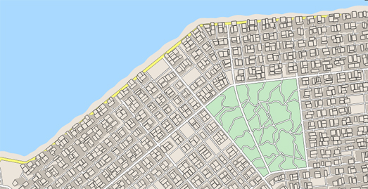
The Procedural City Generator is an impressive tool for creating random city maps in the style of American planned road-grid cities. All you have to do is press the 'generate' button and the wizard will automatically create for you a random city map.

The Procedural City Generator wizard does include a number of options which allow you to influence some of the features displayed on your generated random map. These include options to change the weightings for water (sea and rivers), the number of major and minor roads, the number of parks and the style of buildings displayed. The generator also includes the option to change the style of your random map. These style options include Google Maps, Apple Maps, a hand-drawn map style and a dark style.

If you like your generated city map you can download the finished map as an SVG or PNG image file.


If you want to create a random map of a less grid-like city then you could try the City Generator tool instead. Oskar Stalberg's City Generator is another fun application which can automatically create a map of a fictional town, complete with buildings, roads and trees.

Just click on the empty City Generator canvas to start generating your city map. You can then watch as urban sprawl starts to spread out from the location where you first clicked. If you don't like any of the gaps in your map you can click on the canvas again to add more buildings and roads to your randomly generated map.


The Medieval Fantasy City Generator is another fun tool for creating maps. This one creates random fictional maps of medieval towns. Just choose your size of town or city and the Wizard of Maps will magically create your very own fantasy medieval map.

All the maps created by the Medieval Fantasy City Generator include a number of similar features. Each town or city is centered around a central market place. Each town is surrounded by a city wall. The city wall has up to four gates, where up to four roads enter the city. All of these roads end at the central market. A castle is also placed somewhere along each city's wall.

The Passengers & Crew of the Titanic


When the Titanic sank on 15 April 1912 there were 908 crew members on board. 696 of those crew members died. The vast majority of the crew on board the Titanic were from Southampton in the south of England. Southampton was home to the White Star Dock. The White Star Line moved its main transatlantic service from Liverpool to Southampton in 1907 and many of its employees lived in the town. The ships moored in Southampton also relied heavily upon local men and women for their crews. This was also true for the Titanic

You can see how the sinking of the Titanic must have been a particularly tragic event for the people of Southampton on Historic Southampton's Titanic Crew map. This interactive map plots the Southampton addresses of Titanic crew members who either lived or lodged in Southampton immediately prior to the ship's fateful maiden voyage. The crew members plotted with a blue marker survived the sinking of the Titanic. Those shown with a red marker were lost when the ship sank.


Geography, Class and Fate: Passengers on the Titanic is an in-depth analysis of the passengers on the ill-fated Titanic.

The Passengers on the Titanic map shows the route taken by the White Star Line's flagship vessel and where it hit the iceberg that led to its sinking. The main focus of this map however is a forensic overview of where the Titanic's passengers hailed from. The map shows the home of every passenger on board the Titanic. It also allows you to explore and compare the survival rates of the passengers from the different passenger classes (survival rates were much higher for those in first class than they were for those in second class, which in turn were far higher than those in third class).

Clicking on an individual passenger on the map will reveal personal details including the passenger's age, where they boarded the Titanic, their intended destination and (if they were one of the lucky ones) what lifeboat they escaped on.

Thursday, April 23, 2020

The British Library's Virtual Map Room


In 2017 the British Library held an exhibition entitled Maps and the 20th Century. The exhibition explored some of the most famous maps of the 20th Century and the development of mapping technology over those 100 years.

The 20th Century was a golden age for cartography, a century when maps went digital and ended up becoming an important feature of our daily lives. The British Library exhibition ended in 2017 and even if it was still on you wouldn't be allowed to leave your house. But don't worry you can still visit the exhibition virtually with the Maps and the 20th Century virtual tour. This tour uses a series of 360 degree panoramic images to allow you to wander around the rooms of the exhibit and zoom in and out on individual maps featured in the exhibition.


Unfortunately you can't zoom in far enough to read the notes accompanying each map. However you can read the British Library's article The map of the world in the 20th century, which does discuss the importance of some of the maps featured in the exhibition.

For example, one of the first maps in the exhibition is the Navy League Map (pictured above), a world map created to celebrate and portray the reach of the British Empire and the role of the Royal Navy within it. The British Library essay describes the map as "an effective propaganda piece which enabled the Navy League to promote continuing investment in the Navy. It would also have been a prominent fixture in school classrooms and fixed the image of empire in the minds of impressionable schoolchildren."

Wednesday, April 22, 2020

The Facebook Covid-19 Symptoms Map


Facebook and Carnegie Mellon University have released an interactive map of where people in the United States are self-reporting having Covid-19 symptoms. The map is based on a Carnegie Mellon University survey of Facebook users in the United States.

The Facebook Covid-19 Symptom Map shows the percentage of people in each county who report having symptoms of Covid-19. If you hover over a county on the map you can view the actual percentage of people reporting having symptoms. It is also possible to switch the map to view the percentage of people reporting symptoms in each hospital referral region.

One problem with this map could be the accuracy of the data. Facebook argues that it is "uniquely suited" to carry out health surveys because it has billions of users and it can therefore carry out statistically accurate sampling. The survey, carried out by Carnegie Mellon University Delphi Research Center, had over a million responses within the first two weeks. This is a very large sample size. However I do wonder if Facebook users (or Facebook users who trust Facebook enough to give them data about their health) is in itself a non-representative demographic.


The image above shows the Facebook Covid-19 Symptom Map (top) compared to the fatality rate from Covid-19 on the Johns Hopkins Coronavirus Dashboard (bottom). Where people are dying from Covid-19 is probably the most accurate way we have measuring the prevalence of coronavirus. I think there is a weak correlation between the two maps, which makes me doubt the accuracy of Facebook's map. However it is possible that the Facebook map is ahead of the curve and could be highlighting  areas (not yet showing up on the Johns Hopkins map) which may be about to see a sharp rise in fatality rates.

Take a Virtual Tour of Europe


You can explore some of London's most iconic landmarks on the VisitLondon Virtual Tour. The tour consists of a number of 360 degree panoramic images which have been taken in some of London's most well known locations. Included on the tour are custom 'Street View' images of the Houses of Parliament, Buckingham Palace, Tower Bridge, the Tower of London and many, many more places of interest around the English capital.


Visit Paris is an even more immersive virtual tour. This virtual reality experience allows you to explore Paris from within a 360 degree panoramic movie.

The landing page on Visit Paris features a fully interactive 360 degree video which allows you to explore a number of famous Paris landmarks in panoramic moving images. Visit Paris also includes lots of more traditional static 'Street View' panoramas from locations across the whole of Paris, including the Eiffel Tower, the Louvre and the Notre Dame :(.


Visit Paris was created by You Visit, who have also created a virtual tour of Rome. You Visit Rome includes 360 degree panoramic images of the Colosseum, the Vatican, the Trevi Fountain and many other iconic landmarks in Rome. You might also enjoy You Visit's virtual tours of Berlin, Madrid and Amsterdam.

If you want to step inside and experience some virtual tours of some of the world's best museums then you can also explore this Maps Mania round-up of Cultural Virtual Tours.

Tuesday, April 21, 2020

The Social Distancing Sidewalk Map


The mayor of New York Bill de Blasio seems strangely opposed to making New York safer for its many pedestrians. During the current pandemic New Yorkers have been worried about the difficult of maintaining social distancing while walking to the grocery store or while out exercising. It has been suggested that the obvious answer is to give over some road space to pedestrians. Bill de Blasio has so far rejected this idea.

So, while pedestrians in New York are forced to stick to the sidewalks, the Sidewalks Widths map should be very useful. This interactive map colors New York City's sidewalks based on how wide they are. It uses New York City's Sidewalk dataset to show where it is possible to maintain social distancing while walking in the city and where social distancing is impossible.

Sidewalks on the map are colored to show whether social distancing is possible. Blue colored sidewalks are the widest and indicate a sidewalk where social distancing should be easy. Green sidewalks are less wide but still wide enough so that social distancing should be possible. Red sidewalks are narrower than 10 feet and show where a path is too narrow to practice social distancing. If you hover over a sidewalk on the map you can view its width in feet.

All the map needs now is a routing engine so that users can get walking directions with a safest route option (the one with the widest possible sidewalks).

Is it Still Open - Part Two


Earlier this month a French interactive map was released which showed which stores were open and which were closed during the lock-down in France. Ça reste ouvert is a crowdsourced interactive map which provides information on the operating status of stores across the whole of France. The map's creators also made the code for the map freely available on GiHub so that people in other countries could make their own store maps.

Inspired by Ça reste ouvert there are now interactive maps available for Germany, Switzerland and Austria. Bleibt Offen wants to help people avoid making unnecessary trips in German, Switzerland and Austria by showing which shops and stores are open and which are closed in all three countries. On the map stores marked green are open and red are closed. If the status of a business is unknown anyone can add or change the details by completing a short form. In addition to showing whether a location is open, it is also possible to optionally enter a store's opening hours and add details on whether the store delivers and / or has a take-away service.

All data added to the map is fed back into OpenStreetMap.

Bleibt offen Germany
Bleibt offen Switzerland
Bleibt offen Austria

Monday, April 20, 2020

Mapping the Loss of Jobs


The coronavirus pandemic has had a devastating impact on the U.S. economy. The glacial response of the government in responding to this economic crisis has in turn had a devastating impact on American jobs. Since March 14th 22.2 million Americans have filed for unemployment and the unemployment rate has risen to at least 17%.

The Urban Institute has used data from Washington State, which publishes weekly unemployment numbers by industry, to estimate the likely number of low income job losses across the United States. The Where Low-Income Jobs Are Being Lost to COVID-19 interactive map visualizes the neighborhoods most vulnerable to COVID-19 job losses. The map allows you to view the estimated total number of job losses in counties across the country. It also allows you to select individual industries to view the number of estimated jobs lost in each county by job sector.

You can drill down to census tract level on the map to view the estimated number of jobs lost in individual neighborhoods and even view details on the number of estimated jobs lost in a tract by industry sector.


The Mercury News has visualized the number of unemployment claims made in each state (last updated April 10th). The Which states have most workers making unemployment claims interactive map colors each U.S. state to show the percentage change in the number of people claiming unemployment in the state compared to one year ago.

If you select a state on the map you can view details on the percentage change in unemployment claims compared to one year ago and one week ago. You can also view the number of people who claimed unemployment last week (dated April 10th). Across the whole country unemployment claims are 2,800% higher than one year ago.

Mapping Where ICU Beds are Available


Last week the University of Konstanz released an interactive map which shows at a glance the availability of beds in German hospitals. The university's CoronaVis interactive map shows the levels of free and occupied hospital beds in every Intensive Care Unit in the country. The Berliner Morgenpost has now also created an interactive map to show which hospitals are reporting bed shortages and which hospitals still have free capacity.

The Berliner Morgenpost argues that the availability of ICU beds is one factor which will determine when stay-at-home policies can be relaxed. Its Corona crisis: where intensive care beds are still free map shows the current situation in 1,177 hospitals across Germany. On the map colored markers are used to show which hospitals currently have no free ICU beds (colored red), which have a bottleneck (colored orange) and which have spare capacity (colored blue).

In the map sidebar there is also a list showing how many Covid-19 patients there are in every state, how many intensive care beds there are in total in each state and the percentage of those beds which are currently occupied. Currently Berlin and Bavaria are the two states with the highest percentage of ICU beds being occupied.

Saturday, April 18, 2020

Where People Still Meet


For the last five weeks all my grocery shopping has taken place at 6 am. According to Google this is the time of day when my local supermarket is the least crowded. Google's 'Popular Times' chart (which appears when you search for a venue) shows the average popularity of a venue for every hour of the week. This popularity is determined using aggregated and anonymized data from mobile phone users who have opted in to Google Location History.

Advan Research are using a similar methodology in their latest interactive map. Advan's Global Hot Spots Map shows locations across the world where people are still meeting for prolonged periods of time. The map uses anonymized mobile phone data to highlight the non-residential locations around the globe where people are still congregating for more than 15 minutes at a time.

My limited search of the map shows that many of the hot-spots on the map are stores. This in itself could be useful if you want to identify and avoid the most busy stores. It would be quite useful, however, to also have an option to filter out stores on the map. This might help users and local authorities to identify locations where people are still gathering (outside of grocery shopping).

Friday, April 17, 2020

Mapping Deep Impact


In these difficult times it is important to take an occasional break from the worries of a devastating global pandemic. And if there is one thing that is guaranteed to stop you stressing about viral contagion it is the threat of a massive asteroid attack.

The Asteroid Damage Visualization Map allows you to explore the catastrophic damage that would be caused by a kilometre wide asteroid landing on your house. Just enter your address into the Asteroid Damage Visualization Map and choose an asteroid size which you would like to drop on your house.  You can then see the likely damage that the asteroid would cause overlaid on an interactive map.

Concentric colored circles are used to show the different levels of damage that an asteroid would cause. If you choose an asteroid of over 1,000 kilometres in size then you don't need to worry too much about the resulting damage as you've probably just caused the eventual extinction of the human race.


The Asteroid Damage Visualization Map has obviously been inspired by the many maps which allow you to view the likely impact of a nuclear bomb. These include NUKEMAP and Ground Zero, both of which allow you to view the potential damage that a wide choice of nuclear weapons would have when dropped on locations around the world.

You can also use Outrider - Bomb Blast - which comes with some realistic looking nuclear fallout effects. Outrider - Bomb Blast allows you to choose from a range of different types of nuclear weapon and select whether you want to detonate the bomb at ground level or as an air burst. The map shows the likely radius of the fireball, radiation, shock-wave and heat zones. It also provides an estimate of the number of fatalities and injuries your nuclear weapon would cause when dropped on your location.

Thursday, April 16, 2020

Make Your Own Covid-19 Map


Google has worked with Stanford University’s Big Local News and Pitch Interactive to create a new interactive tool which allows you to map Covid-19 in your local area.

If you enter a zip-code or county name into the Covid-19 Case Mapper you can create an interactive map showing the number of confirmed cases of Covid-19 across your county and state. Once you have created your map you can use the 'export and embed' button to add the map to your own website or blog.

The maps created with the tool visualize the number of confirmed coronavirus cases in relation to the local population. The choropleth map shows the number of cases per 100,000 people, which helps to reveal the severity of the outbreak across your local area. The maps also provides data on the number of fatalities in your county and state. Users of your created map can hover over counties to reveal the number of confirmed cases and fatalities and see how this compares to the number of cases and fatalities in the state and in the whole of the USA.

The data for the generated maps comes from the New York Times’ open COVID-19 county dataset. At the moment the Covid-19 Case Mapper only works in the USA but there are plans to create a global edition of the tool.

What's in a Name?


The End is Near is an interactive map which allows you to search and visualize German towns by the syllables that their names end with - which is a hell of a lot more interesting than it sounds.

The letters at the end of German place-names can tell you a lot about local history, culture and geography. For example there are many German place-names which are derived from foreign languages. A search for Slavic suffixes, such as -ow or -itz, will reveal a strong distribution of these place-name endings in eastern Germany. These names date back to when Slavic languages were spoken in the eastern parts of the Holy Roman Empire.

Other place-name endings probably derive from local geographical features. These geographical based suffixes include -berg (mountain), -furt (ford), -brück (bridge) or -feld (field).


If you are interested in carrying out your own toponym research in other countries across the world then you might like the Places! interactive map. Places! allows you to map the relative density of place-names in different countries around the globe. Using the application you can enter place-name prefixes or suffixes and view a map showing the geographic distribution of place-names containing those terms.

For example, in the USA we can enter the prefix of -Las to see where towns and cities have names starting with the Spanish word for 'the'. In the UK we can view where place-names include the suffixes -thorpe and -thwaite to see where the Vikings settled in Britain (the resulting map shows that these two place-name endings are popular throughout the area that was once known as the Danelaw, following the Viking invasions of the ninth century).

The Places! application uses OpenStreetMap for the place-name data. The application includes a number of options which allow you to adjust the size of map, circle points and an 'advanced' option which allows you to carry out 'regular expression' searches. You can have hours of fun with Places! For example in the USA if you are interested in where Spanish plays a large part in local place-names you could also search for the distribution of the San- or Santa- prefixes. On the other hand the suffix -ville might be a good indication of where French immigrants originally settled in the USA.


You can explore the distribution of US place-names further on Place Names in the United States. This interactive map visualizes the spatial distribution of town & city place names in America.

For example you can view the distribution of place names starting with the Spanish articles (El-, Los- & Las-) (mainly found in the Southwest). Alternatively you can search using suffixes. For example the distribution of towns with common British town endings, such as -chester, -wick, -wich, -pool, -ham, -ness, -port & -worth (mainly in the Northeast).

Place Names in the United States has a database of around thirty thousand towns and cities in the United States. The place name data used is from opengeocode.org and the application was built using Canvas, SVG and d3.js.

Wednesday, April 15, 2020

Virtual Cultural Tours


Louis XIV's Palace of Versailles has to be one of the most magnificent and opulent buildings in the world. This Google Arts and Culture tour of the palace allows you to explore the palace using Google Street View. You can explore each individual Street View by panning around and zooming in on the 360 degree panoramic images. Move around the palace by clicking on the navigation arrows within each of the Street View scenes.


National Heritage's Stonehenge Virtual Tour places you in the center of this mysterious pre-historic monument. Interactive markers on the 360 degree panoramic image allow you to learn more about some of the important features of Stonehenge. In addition a Stonehenge Skyscape image provides a second panoramic tour of Stonehenge on which has been overlaid astronomical information about the movements of the sun, moon and planets over Stonehenge.


The Smithsonian National Museum of Natural Museum has a number of virtual tours available. These tours allow you to explore the museum using custom 360 degree panoramic 'Street View' imagery.  As well as being able to explore the current museum you can also choose to undertake virtual tours of some of the museum's best exhibitions from its past.

You might also enjoy:

The Sistine Chapel Virtual Tour - explore the Sistine Chapel and Michelangelo's astonishing ceiling
Rijksmuseum Masterpieces Up Close - a virtual tour of the museum's Gallery of Honour

Your Future Climate Twin


The National Geographic has a new interactive feature which explains what you can expect from global heating. It does this by showing you a city which currently experiences average temperatures that your home town can expect to see in the year 2070.

If carbon emissions continue to rise at the current rate then by 2070 the world will experience devastating climate change. For example Boston, Massachusetts will experiences temperatures 5 degrees centigrade hotter than today and 49mm more rain will fall. This is similar to the climate that Bardwell, Kentucky has today. London will experience a climate similar to the current climate in northern Italy.

In Your Climate, Changed the National Geographic uses an interactive map to show the future climate analogs of 2,500 cities around the world. These analogs are based on worst-case climate change scenario assumptions. The map automatically detects your location to show you your nearest future global heating twin. The map also explains what kind of climate zone your city currently experiences and compares that to the likely climate it will have in 2070.


National Geographic are not the first to use future climate analogs as a way to explain the effects of climate change. 23 Degrees has also released a clever interactive map which allows you to find your climate analog for the year 2080. Using this climate change model Frankfurt in Germany will be as hot as Malawi today and living in Berlin will be like living in Lesotho in southern Africa.

You can find your 2080 climate twin using The Summer of 2080 Will Be This Warm interactive map. If you enter your location or click on your location on the map you can view the town or city in the world which has a climate today which is similar to the climate you can expect in your locationcity in the year 2080. The map uses two different climate models. This allows you to find your climate twin for a global heating scenario of 4.2 degrees or 1.8 degrees.


If you live in the USA then you can also use the University of Maryland's interactive map, What Will the Climate Feel Like in 60 Years, to discover your 2080 climate twin. The map is based on work by scientists Matt Fitzpatrick and Robert Dunn, who used different climate models to find the contemporary climatic analogs for the weather that 540 North American urban areas can expect in the late 21st century. The study behind the map revealed that the climate in U.S. cities will significantly change over this century, becoming similar to contemporary climates which are hundreds of kilometers away.

Using the interactive map you can click on a town or city to discover which current location has a climate which is similar to the climate you can expect in 2080. The map provides two different analogs for each urban area. One shows the climate analog based on a high emissions climate model and the other view provides a climate analog based on a future where countries have actually reduced emissions.


According to Future Cities in 2050 Madrid will have a climate similar to Marrakesh today. Seattle will resemble San Francisco and Washington D.C. will have a climate similar to that currently experienced by Nashville.

The Crowther Lab has explored how global heating will effect 520 cities around the world and matched those predictions with cities that experience those temperatures today. The result is a simple to understand example of the likely results of global heating. Click on your city on the Future Cities interactive map and you can find out which city's climate your city will resemble in 2050 as a result of climate change.

Tuesday, April 14, 2020

Literary Journeys

You could argue that all great literature involves a journey of some kind. The idea of a hero undertaking a personal odyssey is probably older than the written word itself. From Homer's epic Odyssey itself right up to and beyond the great American road trip novels of the Twentieth Century mythical journeys and quests have served as a metaphor for human life and existence. And as long as fictional journeys have existed I'm sure people have been attempting to map those journeys.


Back in 2008 Google Maps Mania first reported on the mapping journey undertaken by Tom Horn to plot all the journeys in the Aubrey–Maturin series of novels. The Aubrey–Maturin series is a sequence of historical novels by Patrick O'Brian, set during the Napoleonic Wars. The novels tell the adventures of Captain Jack Aubrey of the Royal Navy and his ship's surgeon Stephen Maturin. You might be more aware of the characters from the movie Master and Commander, starring Russell Crowe, which was adapted from three of the novels.

The Patrick O'Brian Mapping Project started in 2006. 14 years later Tom Horn's journey has now come to an end, as he has finally mapped all 21 novels in the Aubrey–Maturin series. Each of the novels has its own Google Map which plots the journeys undertaken by Captain Jack Aubrey in the service of the Royal Navy.

Of course Tom hasn't spent the whole of the last fourteen years entirely devoted to mapping Patrick O'Brian novels. No - in fact back in 2005 Tom took a little sojourn to create the first Google Map to track and plot a novel set on Mars. In the novel 'The Martian' NASA astronaut Mark Watney is abandoned by the rest of his crew on Mars. In order to survive Watney has to drive a Mars rover 2,000 miles across the planet to Schiaparelli Crater where he has a chance of being picked up by another NASA mission.

Tom's The Martian Map plots the course of Watney's journey to Schiaparelli Crater and marks some of the Martian landmarks passed during the journey and the locations of some of the incidents he encounters along the way.


Ludovico Ariosto's 'Orlando Furioso' is an epic 16th century poem. The poem is set in a time of war between the Christians and Saracens and involves journeys around the known world (and to the moon). As well as the eponymous hero Orlando the poem features a wide cast of colorful characters, including sorcerers, a gigantic sea monster and a flying horse.

The Orlando Furioso Atlas is busy mapping the journeys in each of the epic poem's forty-six cantos. The character journeys in each of the cantos are shown on top of Martin Waldseemüller’s Universalis Cosmographia map of 1507. The use of this contemporaneous map helps to evoke the world as it was conceived at the time when Orlando Furioso was written.

On the atlas each character's journey is plotted with a distinct colored line. If you click on any point on these journey lines you will be taken to the corresponding text of the poem in the sidebar. Conversely, if you click on the highlighted text in the poem, the corresponding location will be highlighted on the map.


The mythological power of the road-trip in American literature seems particularly strong. It is America's ur-story, springing from the pioneering journeys of the early Western settlers. It is in many ways the story of America itself.

The Obsessively Detailed Map of American Literature's Most Epic Road Trips sets out to map the great American journeys undertaken by some of America's greatest writers (and a few not so great). The map features every place-name referenced in twelve American non-fiction books. The celebrated writers featured on the map include Mark Twain, Jack Kerouac and Tom Wolfe.

You can select to view each journey's route on the map from the map side-panel. Click on individual markers and you can read excerpts describing the chosen location. The map therefore provides a handy accompaniment to any of the mapped texts. However to truly appreciate the map you need to read the book.


The LOTR Project is one of the most well established and best literary mapping projects on the internet. The project's interactive Map of Middle Earth is a beautifully drawn map of J.R.R. Tolkein's fantasy world, which allows you to follow The Fellowship's journey from The Shire all the way to Mordor.

The map includes information about important locations in the plot of The Lords of the Ring and allows you to explore important events and also follow the paths of the main characters. The map also includes a timeline, with which you can explore important events in the plot chronologically and view the locations mentioned in the timeline on the interactive map.


These literary journey maps are just a few of the many that have been featured on Maps Mania over the last 15 years. If you are interested in literature and books then you might want to explore a little further using the Maps Mania book maps tag.