Skip to main content
Search
Search This Blog
Maps Mania
Posts
Showing posts from May, 2024
Show all
May 31, 2024
Earth Nose Game Champion 2024
May 30, 2024
Map Disco 2000
May 30, 2024
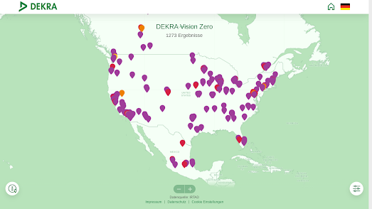
Are these are the safest streets in the world?
May 29, 2024
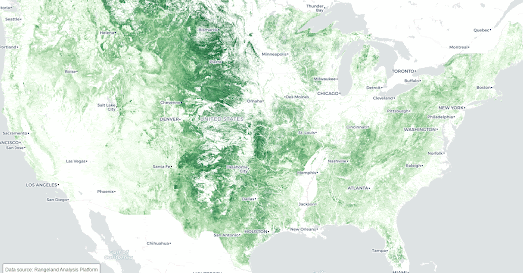
The Loss of the Great American Grasslands
May 28, 2024
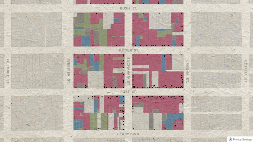
The Death of Japantown
May 27, 2024
The Journey of a Vampire
May 25, 2024
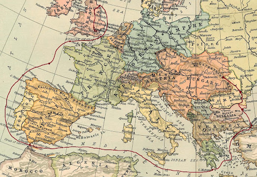
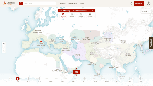
Old Maps Online
May 23, 2024
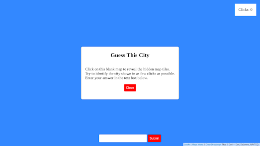
Guess This City - Daily Challenge
May 22, 2024
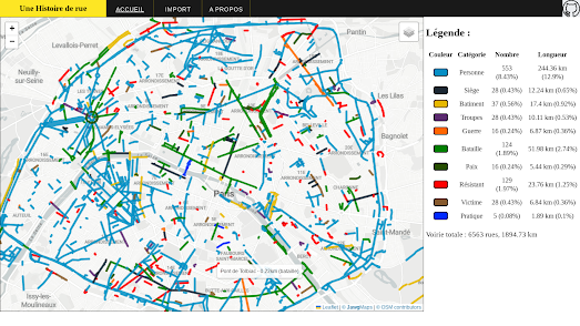
It's War on the Streets of Paris
May 21, 2024
99 Red Balloons Go By
May 20, 2024
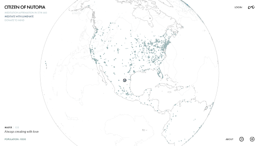
Spreading Love & Peace in Nutopia
May 18, 2024
Man Made Star Signs
May 17, 2024
Segregation in the U.S.
May 16, 2024
Warmer Stripes for 2023
May 15, 2024
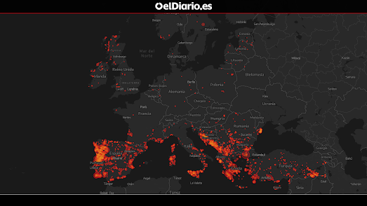
Is Europe Ready to Burn?
May 14, 2024
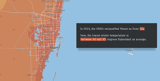
Welcome To Your New Gardening Zone
May 13, 2024
Can You Draw America?
May 11, 2024
Active Video
May 10, 2024
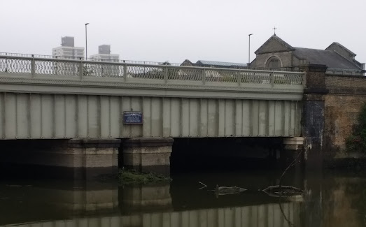
The Secret Life of Bridges
May 09, 2024
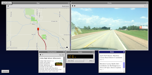
Virtual Road Trips
May 08, 2024
The Future of Street View
May 06, 2024
Hexagen World
May 04, 2024
540 Million Years of Planet Earth
May 03, 2024
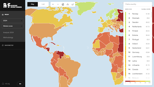
The 2024 World Press Freedom Rankings
May 02, 2024
Whose Plaque is it Anyway?
May 01, 2024
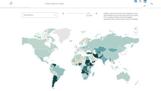
The Global Inflation Tracker
Newer Posts
Older Posts
Home