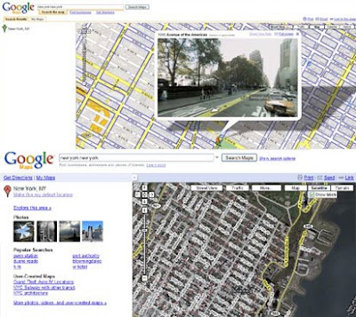
The screen-shots below aren't very clear but you can just about see that the yellow tabs in the old interface (top) have disappeared and that the accordion effect to hide the search results in the left-hand column is now controlled by an arrow at the top of the map (in the lower screen-shot).

According to the Google LatLong blog the map is a 'tad' bigger in the new user interface. This seems to be a result of deleting the 'Search the map', 'Find businesses' and 'Get directions' orange tabs directly under the search box (top image).
Update
It appears that Google Maps directions may have lost some functionality (as pointed out by Doug in the comments). Apparently when you use the directions feature, you can no longer reorder the directions as you could before nor can you see the leg time/distance values any more.
The Google Maps Help Group has been inundated with complaints which seem to be focusing on the same issue of a loss of previous functionality in the driving directions. From the replies to the complaints it seems that "you should still be able to drag destinations in the left panel. The only difference is you'll use the little green circles in the "launcher" area where you input each address."
California Earthquake
By some stroke of fortune (although I wouldn't want to say good fortune) Google's new user interface has put the Real-Time Earthquakes Maplet at the top of its 'Browse Popular maps' list. Which means that a lot of users will have viewed the map below, which shows the earthquake, measuring 5.4, that caused buildings to shake across a wide area of southern California in the US this evening.
________________

But when you use the directions feature, you can NOT reorder the directions as you could before(Drag and drop on the direction list) and you can not collapse/expand legs, nor can you see leg time/distance values. Very poor move to exlcude those things in the new UI.
ReplyDeleteI noticed this today as well. I kinda like it. They have also made some changes to the page it pops up when you print the map/directions. The full map is still turned off by default with a check box to display it. The 3 little maps on the side, which I always found to be a useless waste of ink, is gone. Instead, when you hover over the directions, it gives you an option to display a small map relevant to that line. I think this is a much more useful feature.
ReplyDelete