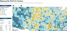
The New York Times has created a Google Map to visualise the changes in population in U.S. counties since 2000. Using data from the 2010 census the NYT has created a heat map that shows areas that have increased and decreased in population.
The areas shaded blue have shown an increase in population size and the yellow shaded areas have decreased. If you select the 'more maps' button you can also see visualisations of population density, racial / ethnic distribution and housing.
Washington Post: Explore the 2010 Census
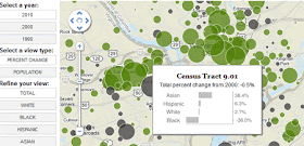
If you live in Washington D.C. you might want to check out this Google Map from the Washington Post instead. The map lets you see how demographics in D.C. neighborhoods have changed over time, using data from the 1990, 2000 and 2010 censuses.
You can search the map by zip code or address and you can also view data by race / ethnicity.
New Jersey, Maryland, Oregon Census Maps 2010
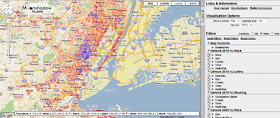
Moonshadow has released a great Google Maps application to visualise the 2010 New Jersey census data. The company has also released apps to visualise the census data for the states of Maryland and Oregon.
These Google Map based apps allow users to closely examine the census data returns in each state. Using the applications you can set filters, colors and generate heat maps. You can display census block lines, as well as County lines, Congressional, State House and State Senate districts. You can even zoom down to the census block level and download the actual census data for a block.
Moonshadow promise that more state maps will follow in the coming days and weeks as additional block level data becomes available from the US Census Bureau.
Chicago Tribune - 2010 Census: Illinois Population
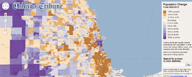
This Google Map from The Chicago Tribune uses data from the 2010 census to show population changes in Illinois.
The heat map shows areas that have grown and shrunk in population in the last ten years. The map seems to show a general trend of population growing in the centre of Chicago but people moving out of the outer neighborhoods.
If you zoom in you can view the exact population change figures for each census tract.
California 2010 Census
The LA Times has produced a Google Map to show the 2010 census counts by California’s congressional districts. The map shows how many residents the 53 congressional districts are above or below the target 702,905 population.

2010 Census Counts by California’s Congressional Districts
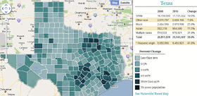
Texas - 2010 Census
The Texas Tribune, on the other hand, has created this Google Map to visualise the Texas population by race and Hispanic origin. The map displays the totals for each district, with darker colours representing higher rates of total population growth by race or Hispanic origin.
_____________

Hey you missed one! http://www.baycitizen.org/data/census-2010/
ReplyDeleteBay Citizen mapped all Bay Area counties, places, tracts, congressional, senate, and legislative districts!