Finding Your Goldilocks Zone
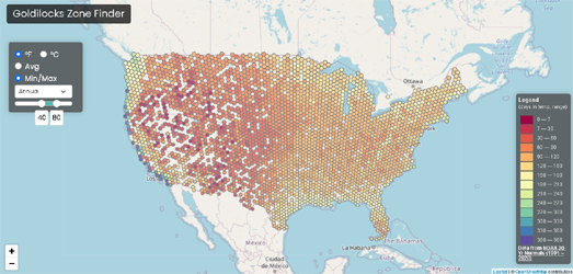
The Goldilocks Zone Finder is an interactive map which can help you find the location in the United States which has your perfect year-round temperatures. Just tell the map the hottest and coldest temperatures that you are happy to live with it and it will show you a map displaying the number of days per year which fall within your own personal Goldilocks temperature zone, for all locations across the United States.
The Goldilocks Zone Finder was created by Luke Champine who wanted to find a place to live which fell within his own personal temperature preferences. The map uses data from NOAA's 30 Year Climate Normals, which uses 30 years of weather measurements taken across the United States to calculate daily temperature averages. The NOAA Climate Normals also includes averages for precipitation and other climate variables but these are not included on the Goldilocks Zone Finder.
The Goldilocks Zone Finder currently only works for the United States but if you are interested in building a similar map for another country the code for the project is available on GitHub.
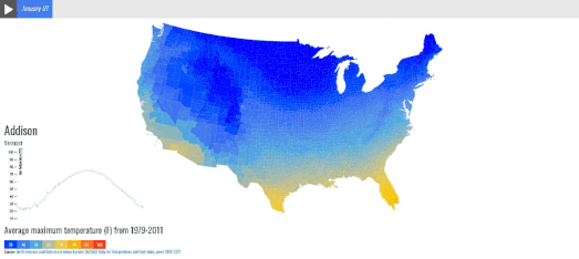
If you want to explore local average temperatures by day of the year in a little more detail then you might also like the County Climate interactive map. This map shows the average maximum temperature in every county for every day of the year.
If you select a date from the slider at the top of the map you can view the average temperatures on that day across the whole country. If you select a county on the map you can also view a graph showing the average maximum temperature in that county for each month of the year (based on temperature data from 1979-2011).

The temperature may not be the only data that you want to consider in your attempts to find a location which has your perfect weather. In that case you could use Peter Kerpedjiev's map of annual worldwide weather data. The map uses historical climate data from Wikipedia's city 'weather boxes' to visualize how weather changes during the year around the world.
Using the Sunshine Map
it is possible to view the number of hours of sunshine across the globe for every month of the year. The map also allows you to view the changing rates of precipitation, the highest & lowest temperatures, and the amount of snowfall.
The Sunshine Map uses Jason Davies' D3 voronoi library to divide the world up into regions based on the closest city with Wikipedia climate data. This does mean that where Wikipedia only has a few cities with climate data.the Voronoi areas can be quite large.


Comments