
The concept of the 15 Minute City was first developed by Professor Carlos Moreno of the Sorbonne. The idea of the 15 Minute City is to make urban living more liveable and sustainable by ensuring that all the essential needs of individuals can be accessed without having to get in a car or use public transport.
A 15 Minute City is an urban environment which promotes a sustainable future by ensuring that all the essential needs of individuals can be accessed within a short distance of travel. These essential needs include such things as grocery stores, health care facilities, cultural attractions, transit stops, educational facilities and leisure activities. Individuals living in a 15 Minute City should be able to access all these essential health, educational, retail and leisure needs within a short fifteen minute walk or bike ride.
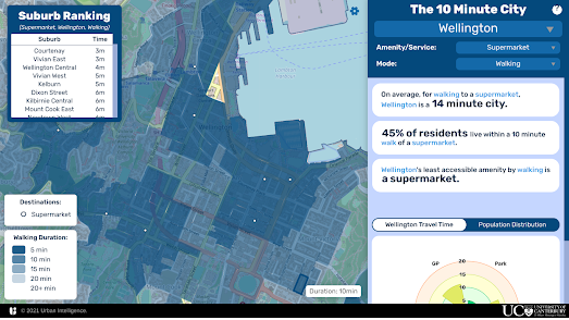
If you live in New Zealand you can now find out if you actually live in a 10 Minute City. Urban Intelligence's new X Minute City interactive map allows you to discover how far you have to travel in New Zealand's major cities in order to access education, healthcare, greenspace/recreation, food, and other essential services.
Select a city on the map and then choose one of the Amenities / Services from the drop-down menu and you can view a choropleth map of the city showing how long it takes to walk to that service from each city block. The map sidebar tells you on average how long it takes to walk to the chosen amenity / service in the whole city and a bar graph reveals the percentage of the population living within 5, 10, 15, 20 & 20+ minutes from the chosen amenity.
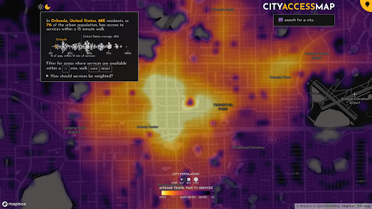
If you live elsewhere in the world then you can find out if you live in a 15 minute city using the CityAccessMap. This new interactive map from Delft University of Technology visualizes how accessible essential services are to the local population in cities around the world (the map should work for any city with a population over 100,000). The map uses OpenStreetMap data to assess the distribution of city infrastructure and population data from the European Commission's Global Human Settlement Layer to work out where people actually live.
If you zoom in on a city on the CityAccessMap a heatmap layer shows you where accessibility to services is high or low in the city. If you hover over a location on the map you can also view a graph showing the local levels of accessibility to a number of essential services and how this compares to the city average.
If you zoom out on the map a distribution graph will also appear on the map ordering the world's cities from least accessible to most accessible. According to CityAccessMap Orlando, Florida is one of the least accessible cities in the United States (and the world). In Orlando only 7% of residents have access to services within a 15 minute walk of their home. In comparison - in New York 76% of residents can access essential infrastructure within a 15 minute walk (in Paris it is 95%).
No comments:
Post a Comment