
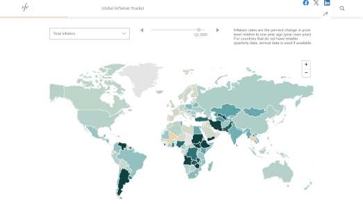
The Council on Foreign Relations new Global Inflation Tracker provides an intriguing guide to trends in prices across the world since the 1990s. On the map almost 200 countries around the world are colored to show their year-over-year rate of inflation (the darker the color the higher the rate of inflation).
If you animate through the data on the map it is striking how stable inflation rates in the Western economies were for a long twenty year period at the start of this century. During this period most western economies, including the US, achieved inflation rates consistently below 5%.
In 2020 the Covid pandemic started and in 2022 Russia invaded Ukraine. Both these factors have probably played a large part in ending this period of economic stability. Since 2021, inflation rates have risen globally, probably due to factors such as the supply chain disruptions caused by the pandemic and the escalating energy costs arising from Russia's invasion of Ukraine and the subsequent imposition of economic sanctions on Russia by Western nations.
The Global Inflation Tracker includes a drop-down menu which allows you to view the inflation rates for different sectors, eg for energy, food, clothing, housing etc. If you select to view the rate of inflation in energy you can view the huge rise in energy prices experienced since Russia's invasion of Ukraine. On a more optimistic note you can see how in recent quarters in most Western economies there has been a marked deflation in energy prices. This in turn seems to be contributing to an overall fall in inflation rates in many countries.
No comments:
Post a Comment