Showing posts with label 15minutecity. Show all posts

Wednesday, June 11, 2025

The Real-Time 15 City Map

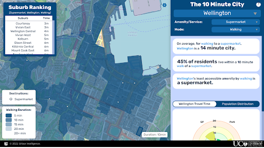
The concept of the '15 Minute City' aims to make urban living more livable and sustainable by ensuring that all essential individual needs can be met without reliance on a car or public transport. It's a very simple idea: ideally, an individual's essential needs should be accessible within a short travel distance.

Such a simple concept deserves a suitably simple-to-understand map. CThood Athens is precisely that - a map that both brings the 15 Minute City concept to life and visualizes which areas of Athens come closest to meeting its requirements.

At its core, CThood Athens uses open-source data and tools to illustrate how far you can walk from any given point in the city (within 5 or 15 minutes) and what types of essential destinations lie within that reach. As you hover over the map, it automatically and dynamically shows you how far you can walk in 15 minutes (or 5). Clicking on a location reveals how many amenities are accessible in that time. Further, clicking the 'Show Other' button breaks down these amenities into categories (e.g., the number of green spaces, supermarkets, pharmacies, etc.).

The interactivity of CThood is both engaging and informative. Users can toggle layers, filter by place type, and customize accessibility criteria. The inclusion of statistical indicators like the Gini Index and Lorenz Curve adds analytical depth, transforming the map into a dynamic research and planning tool.

CThood is a great example of how open data and thoughtful design can be combined to support more equitable, walkable cities. I assume the intention is to apply the same methodology to other cities and create interactive 15 Minute City maps for additional locations.

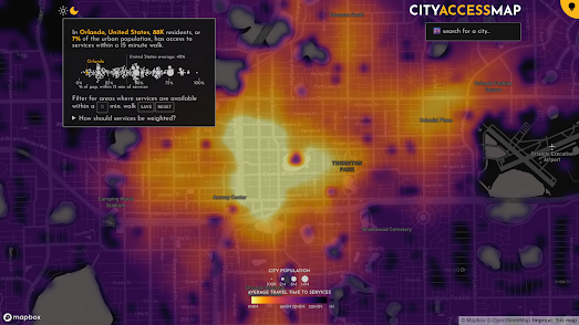
You can also find 15 Minute City visualizations for a number of other cities using the Maps Mania 15minutecity tag.

Via: quantum of sollazzo

Monday, December 09, 2024

Do You Live in 15 Minute City?

map of Dallas with neighborhoods colored to show how walkable they are

Imagine stepping out of your home and finding your favorite café, grocery store, and park just minutes away. For residents of New York or Seattle, this is a daily reality. But in sprawling cities like Houston or Indianapolis, such convenience remains a dream for many. Thanks to The Washington Post, you can now discover how walkable your city is compared to other U.S. cities.

The Washington Post has created an interactive map showing how long it takes "to walk to points of interest" in 200 metro areas across the United States. On the WaPo's How Walkable is Your Neighborhood? , neighborhoods are color-coded to indicate the time required to walk to locations in nine categories of amenities.

According to the research underlying the map, cities such as Atlanta, Nashville, Houston, and Indianapolis rank among the least walkable in the U.S. In contrast, Seattle, Washington D.C., New York, and Chicago are some of the most walkable cities.

The WaPo's map is based on a study conducted by Sony Computer Science Laboratories in Rome, titled A Universal Framework for Inclusive 15-Minute Cities. The "15-minute city" is an urban planning concept focused on ensuring that residents can access most of their daily needs - such as work, shopping, healthcare, education, and recreation - within a 15-minute walk or bike ride. This concept aims to create more livable, sustainable, and community-oriented environments where essential services are easily accessible to all residents.

A 'how walkable' map of San Francisco

For those outside the U.S. (or without access to the Washington Post's article), the study's own interactive map is an excellent alternative. By selecting a city on the Sony CSL 15min-City users can view a hexbin map that illustrates how accessible services are from each hexagonal area in the city. The color of each hexagon corresponds to the number of minutes it takes to reach essential services by foot or bike. Users can toggle between walking and cycling times and filter accessibility data by specific service categories, such as outdoor activities, education, shopping, dining, transportation, cultural activities, exercise, general services, and healthcare.

For U.S. residents, the Close is another valuable tool. It helps users identify walkable, bikeable, and transit-friendly neighborhoods across the country. Close allows users to prioritize specific amenities and destinations, generating a travel-time map for walking, biking, and public transit options. This feature makes it easy to discover ideal "15-minute neighborhoods" in towns and cities throughout the U.S.

Wednesday, September 18, 2024

15 Minutes Cities by Sony CSL

hexbin map of San Francisco and Oakland showing average travel times to essential services
Sony Computer Science Laboratories in Rome have released a new interactive map which provides 15 Minute City accessibility scores for nearly every city in the world. The '15-minute city' is an urban planning concept aimed at designing cities in a way that ensures residents can access most of their daily needs—such as work, shopping, healthcare, education, and recreation—within a 15-minute walk or bike ride from their homes. It seeks to create more livable, sustainable, and community-oriented environments where essential services are easily accessible to residents.

Select a city on the new 15min-City map and you can view a hexbin map of the city showing how accessible services are from each hexagonal area. The color of each hexagon on the city map corresponds to the number of minutes it takes to access a number of essential services by foot or bike. You can color the hexagons by either walking or cycling time and you can also select to view the accessibility times of individual category of service (outdoor activities, learning, supplies, eating, moving, cultural activities, physical exercise, services, healthcare).

If you live in the United States you can also refer to the Close interactive map which allows users to discover walkable, bikeable, and transit-friendly neighborhoods across the country. Close allows users to select the amenities & destinations which are important to them and then it creates a US travel-time map based on walking, biking and public transit travel times to those destinations. Which means you can quickly find your ideal 15 minute neighborhoods in towns and cities across the whole U.S..

Tuesday, April 09, 2024

15 Minute US Cities

map of Los Angeles showing 15 minute neighborhoods

The idea of the 15 Minute City is that urban living is much more enjoyable and sustainable when all our essential needs are close by. These essential needs include such things as grocery stores, health care facilities, cultural attractions, transit stops, educational facilities and leisure activities. Individuals living in a 15 Minute neighborhood should be able to access all these essential health, educational, retail and leisure needs within a short fifteen minute walk or bike ride.

Last week Nat Henry released a new interactive map which allows users to discover walkable, bikeable, and transit-friendly neighborhoods across the United States. Close allows users to select the amenities & destinations which are important to them and then it creates a US travel-time map based on walking, biking and public transit travel times to those destinations. Which means you can quickly find your ideal 15 minute neighborhoods in towns and cities across the US.

If you are moving home in the near future you can use Close to help identify the best places for you to live based on your own personal life choices. Using the Destinations menu you can select from 35 different amenities and destinations which are important to you. These include destinations such as shops, parks, schools, bars, transit stations, health care etc. 

You can then select a travel-time mode for each of your selected destinations (walking, biking, and walk & transit). When you have finished adding destinations Close will produce an ishochrone map which shows the travel time to the furthest of those amenities. The areas marked blue on this map are the areas where your essential needs will be met without you having to travel long distances.

Thursday, November 03, 2022

Do You Live in a 10 Minute City?

The concept of the 15 Minute City was first developed by Professor Carlos Moreno of the Sorbonne. The idea of the 15 Minute City is to make urban living more liveable and sustainable by ensuring that all the essential needs of individuals can be accessed without having to get in a car or use public transport. 

A 15 Minute City is an urban environment which promotes a sustainable future by ensuring that all the essential needs of individuals can be accessed within a short distance of travel. These essential needs include such things as grocery stores, health care facilities, cultural attractions, transit stops, educational facilities and leisure activities. Individuals living in a 15 Minute City should be able to access all these essential health, educational, retail and leisure needs within a short fifteen minute walk or bike ride.

If you live in New Zealand you can now find out if you actually live in a 10 Minute City. Urban Intelligence's new X Minute City interactive map allows you to discover how far you have to travel in New Zealand's major cities in order to access education, healthcare, greenspace/recreation, food, and other essential services.

Select a city on the map and then choose one of the Amenities / Services from the drop-down menu and you can view a choropleth map of the city showing how long it takes to walk to that service from each city block. The map sidebar tells you on average how long it takes to walk to the chosen amenity / service in the whole city and a bar graph reveals the percentage of the population living within 5, 10, 15, 20 & 20+ minutes from the chosen amenity.

If you live elsewhere in the world then you can find out if you live in a 15 minute city using the CityAccessMap. This new interactive map from Delft University of Technology visualizes how accessible essential services are to the local population in cities around the world (the map should work for any city with a population over 100,000). The map uses OpenStreetMap data to assess the distribution of city infrastructure and population data from the European Commission's Global Human Settlement Layer to work out where people actually live.

If you zoom in on a city on the CityAccessMap a heatmap layer shows you where accessibility to services is high or low in the city. If you hover over a location on the map you can also view a graph showing the local levels of accessibility to a number of essential services and how this compares to the city average. 

If you zoom out on the map a distribution graph will also appear on the map ordering the world's cities from least accessible to most accessible. According to CityAccessMap Orlando, Florida is one of the least accessible cities in the United States (and the world). In Orlando only 7% of residents have access to services within a 15 minute walk of their home. In comparison - in New York 76% of residents can access essential infrastructure within a 15 minute walk (in Paris it is 95%).