Thursday, February 28, 2019

The Language of Data Visualization


Last year the Financial Times released a poster designed to help people create data visualizations. The FT's poster provides a guide to lots of different methods of visualizing data (including different types of mapped visualization) and advice on when each method should be used. The Github page of the Visual Vocabulary poster includes external links to advice elsewhere on the internet on using each of the data visualization methods displayed on the poster.


Inspired by the FT's Visual Vocabulary poster Pratap Vardhan has released his own Visual Vocabulary - Vega Edition. This interactive version of Visual Vocabulary includes examples of each of the different visualization techniques created using the Vega visualization library.

The Visual Vocabulary - Vega Edition includes notes on a number of different methods for visualizing spatial data. Each of these is accompanied by an interactive Vega built map example. The data map visualizations include choropleth, flow-maps, dot density, proportional symbol, equalized cartograms, scaled cartograms, contour maps and heat maps. If you click on the edit buttons on these example maps you can open the map in the Vega Editor, where you can edit and change the actual visualization.

Both the FT's poster and the interactive Vega Edition of Visual Vocabulary provide a good introduction to how different types of spatial data can be visualized on maps. The FT's GitHub page also includes links to discussions about if and when maps should be used to visualize data.

The People's History Map of Paris


The history of the world is so often told through the stories of the rich and powerful. Libération has decided that it wants to tell the story of Paris' workers, peasants and insurgents. They have therefore released an historical map of Popular Paris from 1830 to 1980.

Paris has often been the center of popular movements and protests. From the French Revolution of 1830, through the student and workers protests of May 1968, right up to the recent gilets jaunes protests, the streets of Paris have often been the battleground of the disenfranchised and dispossessed. Libération's interactive map features many of the popular protests which have occurred in Paris over the years. The map also documents locations which have been important in other ways to the lives of the people in Paris since 1830.

The map allows you to filter the historical incidents and locations shown on the map by historical period. It is also possible to filter the popular historical events on the map by type of event. These include (but aren't restricted to) popular insurrections, social experiments, occupations, and organizations, meetings & events. The red dots on the map indicate locations which still exist. The white dots show places which no longer exist or which have been transformed since the mapped incident. If you select one of the dots on the map you can read about why the location is important to Paris' popular history.


If the workers of Paris have often been ignored by history then so have the works of Paris' female artists. The creators of Le Matrimoine Parisien have therefore decided to make the female artists of Paris more visible by showcasing their work on an interactive map.

Le Matrimoine Parisien plots culturally important locations in Paris which have been contributed by the city's female artists and architects. The map includes five different categories of female cultural contributions to the French capital. They are: architectural structures, paintings, sculptures, workshops, and places of art & culture. If you have a particular interest in one or more area of culture then you can filter the categories shown on the map from the menu. All of the mapped cultural locations shown on the map are free to access.

The map was created by students at the École du Louvre. However anyone can submit locations to the map of cultural contributions to Paris made by women. The only other requirement (besides being related to female artists) is that the locations must be free to visit. If you follow the Le Matrimoine Parisien Twitter account you can also receive daily updates and insights into the lives and works of female artists in Paris.

Mapping the World's Power Plants


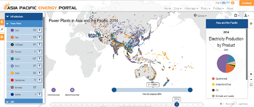
Over 50% of electricity in the Asia-Pacific region comes from coal fueled power plants. The next biggest source of electricity is natural gas, which produces 17.9% of the region's electricity. The renewable energy power sources of solar, wind and tide only contribute 3.99% of the region's electricity.

The Asia Pacific Energy Portal has released an interactive map which visualizes over 7,000 power plants in the Asia-Pacific region. The map allows you to filter the power plants shown on the map by type. It is therefore possible to see where different types of plant are located. You can also filter the power plants shown on the map by capacity. For example you can select to view only coal powered plants with a capacity over 4,000 MW. Do this and you will see that China has nearly all the huge coal fueled power plants in the region.


Coal is still the main source of energy for the USA. However, despite President Trump's campaign promises, the use of coal continues to fall. The consumption of coal during 2018 is expected to be the lowest in 39 years.

You can explore America's power supply on the U.S. Power Plants map. U.S. Power Plants is an interactive map showing the locations, size and type of America's electric power plants. The map is a great way to see where different types of power plant are located, how much each type of energy source contributes to the country's power supply and how much each source contributes to CO2 emissions.

The number of map filters on U.S. Power Plants means that the map can provide lots of different insights into American power supply. For example the individual fuel filters allow you to see where different power sources are concentrated in America. Select hydro power and you can see that hydro power plants are concentrated in the north-west and north-east of the country. While solar power plants are mainly located in California.

If you click on an electricity power plant marker on the map you can view details on the plant's capacity, net generation and CO2 output. The drop-down menu also allows you to re-scale the map markers by the amount of CO2 produced by each power plant.


Burning coal is the biggest single contributor to global warming. Instead of reducing our use of coal we have decided to double its use. According to Carbon Brief "since 2000, the world has doubled its coal-fired power capacity". Current plans for new coal power plants around the globe will double that capacity once again.

Carbon Brief has mapped all the coal power plants in the world. The World’s Coal Power Plants interactive map is an effective and shocking visualization of the increasing use of coal around the world. It shows all the coal power plants around the globe operating in each year between 2000 and 2017. It also shows all the locations of planned new coal plants.

The accompanying chart reveals the source of all this new coal power capacity. China is almost single-handedly responsible for the huge increases in coal power in recent years. However, according to Carbon Brief, in response to air pollution and climate concerns there is some evidence that China's coal power production may have peaked.

Carbon Brief has also mapped The World's Nuclear Power Plants. This interactive map shows the locations of the world's 667 nuclear power stations. The map shows the location, operating status and the generating capacity of every nuclear reactor in the world.


You can also use the Resource Watch interactive map to view all the power plants in the world. Resource Watch includes a Global Power Plant Database layer which is a comprehensive, open source database of power plants across the globe. The map layer includes around 28,500 power plants from 164 countries.

If you select individual power plants on the map you can view information on the plant's power capacity, ownership and fuel type. Unfortunately it isn't possible to filter the Resource Watch map by power plant type or capacity. However the database is open source. This means that there is every chance that someday soon someone will download the data and create an interactive map which  permits users to filter & query the power plant data by fuel type and by the capacity of power plants.

Wednesday, February 27, 2019

Living and Dying in Texas


The average Texan can expect to live until they are 78.5 years old. Of course life expectancy in the state can vary dependent on where you live and your sex and race. Life Expectancy in Texas is an interactive map which allows you to see where people can expect to live longer or shorter lives in Texas.

Enter your zip-code into the map and you can view details on life expectancy in your neighborhood. The map sidebar will show the average life expectancy in your zip-code area and the average life expectancy in your county. The interactive map provides a choropleth view of the life expectancy in your area and in the surrounding neighborhoods. This allows you to see at a glance if the life expectancy in your neighborhood is dramatically higher or lower than your surrounding neighborhoods.

Three maps are shown. One shows the average life expectancy for the population as a whole. The two smaller maps show the average life expectancy for men and for women. Buttons at the top of the map allow you to view the average life expectancy for the white, black or Hispanic populations.

If you don't live in Texas you might prefer Quartz's U.S. Life Expectancy Map.


Where you live can have a huge influence on how long you can expect to live. People who live in New York's Chinatown have a life expectancy of 93.6 years. However people who live in nearby Roosevelt Island have a life expectancy of just 59 years. You can discover the average life expectancy in your neighborhood on this interactive map from Quartz.

Quartz's Life Expectancy Map reveals the average life expectancy in nearly every U.S. neighborhood. The map uses data from the Center for Disease Control's U.S. Small-area Life Expectancy Estimates Project, which tracks life expectancy at the census tract level. If you hover over your neighborhood on Quartz's map you will discover the average life expectancy in your census tract and how that compares to the state and national average.

The average life expectancy in the USA is falling. Between 2016 and 2017, the average life expectancy in the US fell from 78.7 to 78.6 years. The CDC blames this fall on the large increase in drug overdoses and suicides.

Permafrost is Becoming Permanently Lost


New lakes have started to appear from nowhere on the Tibet Plateau. These new lakes are being formed from the melting of the plateau's permafrost. The world's permafrost is thawing. This is very bad news. The amount of carbon held in permafrost is four times that of the carbon already released into the atmosphere. Releasing all that compressed carbon and methane into the atmosphere will accelerate climate change and global warming.

The South China Post has mapped out the locations of the world's permafrost. In a series of maps and visualizations it explains what permafrost is and the effect its thawing will have on the environment and the world's climate. Permafrost seals in highly compressed carbon and methane gases created from decomposed organic and vegetal remains. When the permafrost layer thaws greenhouse gases are released into the atmosphere. This then contributes to global warming, which in turn leads to the loss of more permafrost.

The Tibet Plateau is the largest alpine permafrost region on the globe. In What is permafrost and why might it be the climate change time bomb? you can view how the thawing of the plateau's permafrost is effecting the size of many of Tibet's lakes. A series of satellite images of Tibet's lakes demonstrate how these lakes have becoming much larger in recent years. Each image includes a slider which allows you to directly compare the size of a lake now to its size in previous decades. The article also includes an astonishing video of permafrost flowing like lava down a Tibetan valley.

Observing Global NO2 Emissions from Space


This animated map uses data from the European Space Agency’s Sentinel-5P satellite to show NO2 emissions around the world. The Sentinel 5P satellite is dedicated to monitoring air pollution. The satellite is able to sense ultraviolet, visible, near and short-wavelength infrared to monitor the amount of ozone, methane, formaldehyde, aerosol, carbon monoxide, NO2 and SO2 in the atmosphere.

This global composite map of nitrogen dioxide uses images captured by Sentinel-5P in August and September of last year. The composite map was made by Descartes Lab and is one of a series of maps which can be viewed in their article What We Burn Creates an Eerily Navigable Map of Earth. In the article Descartes Labs uses their NO2 maps to show where the human population and activity around the world is polluting the Earth. It also shows where wildfires around the world also contribute to the amount of NO2 in the atmosphere.

Tuesday, February 26, 2019

Mapping Countries by Similarity


The Grand Prize winner in the World Data Visualization Prize 2019 was an interactive visualization which groups the world's countries using artificial intelligence. This interactive visualization, created by Interacta, shows the connections and similarities between different countries based on a number of different factors.

The Country t-SNE map rearranges the countries of the world so that instead of being geographically positioned they are grouped by similarity. It uses the t-SNE machine learning algorithm that groups similar objects closer together and dissimilar objects further away.

A good way to start exploring the map is to click on the speech bubble icon at the bottom of the map. This opens a short introductory tour and explanation of the groupings that you see on the map. The countries on the map are grouped by their similarity in a number of different social and economic factors. If you click on an individual country's marker on the map you can see a list of these factors and how the selected country scores in each of these areas.

If you click on the gear icon, on the right-hand side of the map, you can adjust the different variables by which the countries are grouped on the interactive map. Adjusting these settings will regroup the countries on the map to show their closeness using the factors that you have chosen.

Detroit Foreclosures on Street View


One in three homes in Detroit has been foreclosed in the last 15 years. The result of all those lost homes is physically evident on the city's streets. It is also very evident when exploring the city on Google Maps Street View.

GooBing Detroit uses the historical imagery function in Google Maps Street View to show how Detroit has changed over the years. By juxtaposing Street View images of the same location from different years GooBing Detroit is able to provide an insight into how the streetscapes of Detroit have changed in the first two decades of this century.

The historical Street Views used on GooBing Detroit can be accessed on Google Maps. If you open a Street View panorama on Google Maps a little clock icon in the top left-hand corner of the scene allows you to access the historical Street View captured by Google. If you click on the icon a timeline opens allowing you to view the available Street View imagery by year.


Back in 2014 the New York Times also used Google Maps Street View to take a closer look at foreclosures in Detroit. The Times created a really impressive montage of properties facing foreclosure using Google Maps Street View to show the 43,634 Properties in Detroit That Were on the Brink of Foreclosure in 2014.

The mosaic of 43,634 pictures of Detroit houses is a very effective method to convey the sheer scale of the problem facing many Detroit homeowners in 2014. If you click on the small thumbnail image of a property then a larger image of the home will appear. The good news for Detroit is that the number of foreclosures in the city fell for the third year running in 2018.

A Journey Through Famine in India


"All this day our noses were infested and our bodyes almost infected with a most noysome smell, which after search, wee found to come from a great pitt, wherein were throwne 30 or 40 persons, men, weomen and children, old and younge confuseldy tumbled in together without order or Coveringe" - 1630, Peter Munday, Itinerarium Mundii
In 1631 around 3 million people died of starvation & disease in the Indian state of Gujarat. This famine began in Gujarat after a long drought in 1630. In the following year, in 1631, crops were attacked by rats and locusts. 1631 also saw very heavy rains which led to an outbreak of many water borne diseases. It is reported that following these calamitous events the people were so desperate for food that human bones were ground with flour, cannibalism was frequent and people fed on corpses.

Peter Munday was an English merchant trader, traveler and writer. In 1630 in the employ of the East India Company Peter Munday traveled from Surat in Gujarat to Agra. On this journey Munday witnessed and wrote about the famine and its effect on the people. You can follow Peter Munday's journey and read the entries he made into his manuscript narrative Itinerarium Mundii on the interactive map Famine & Dearth in India and Britain.

You can follow Peter Munday's journey to Agra using the colored markers on the map. Each of these markers indicate an entry Munday made into his Itinerarium Mundii. The color of each marker indicates its score on the famine to plenty scale. If you select a marker on the map you can read Munday's first hand account of his journey through Gujarat and the famine.

You can learn more about the Gujarat famine and Peter Munday by clicking on the home button on the interactive map.

Monday, February 25, 2019

The Rise in American Hate Groups


Last year the number of hate groups operating in the United States reached another new record. According to the Southern Poverty Law Center there are now 1,020 hate groups in action across the country. Lat week the Southern Poverty Law Center released an updated version of its hate groups interactive map. This updated map provides users with more details, including which states have the most hate groups per capita.

The rise in the number of hate groups is mirrored by a rise in racist and antisemitic violence. According to the FBI the number of hate crimes increased by 30 percent in the three-year period ending in 2017 (the FBI has not released figures for 2018 yet).

The Hate Map shows the locations of all 1,020 hate groups now operating in the USA. The map includes tools which allows you to filter the hate groups shown on the map by ideology. If you click on a state on the map you can view a list of all the hate groups currently operating in that state. The color of each state on the map reflects the number of hate groups operating per capita.

Wheelchair Accessible New York


The New York Times has created a map of Where the Subway Limits New Yorkers with Disabilities. The map shows all the areas of the city that are within a ten minute walk from a wheelchair accessible subway station. It also shows where the most people with problems walking live in New York.

The map reveals that Manhattan is the most easily accessible area of New York for people with disabilities. This is mainly due to the fact that subway stations in Manhattan have elevators. At the other end of the accessibility scale is Co-op City, where 3,500 residents with walking difficulties live over one hour from the nearest accessible subway station. Parents with strollers may also struggle at subway stations with no elevators. The NYT has included a map showing the ten minute walksheds from wheelchair accessible subway stations and where the population under 5 years old live in New York.

To create the ten minute walksheds around subway stations the NYT used the Openrouteservice. The Openrouteservice API allows you to return isochrones around a location which show areas which can be reached in given times or distances.

Making Map Quiz Infographics


Earlier this month the Berliner Morgenpost posted an infographic of 12 Berlin location using OpenStreetMap building footprint data. It then asked its readers if they could name the 12 locations based purely on these small circular maps. Erkennen Sie die Gegend? includes 12 small circular maps and a clue to each location. If you need a little help then the answers are given (upside down) at the bottom of the infographic.

The Berliner Morgenpost infographic was created using Hans Hack's Figuregrounder. Figuregrounder is a very easy to use tool which allows you to make map posters for any location in the world from OSM data. The posters are simple circular building footprint maps. All the Berliner Morgenpost did was create 12 of these small circular maps and put them together to create one infographic of 12 different Berlin locations.


Inspired by the Berliner Morgenpost's quiz I made a similar quiz of 6 different London locations. Can you name these six locations based purely on their building footprints? If you are lost you can view the answers (upside down) at the bottom of my London Squares, Markets and Circuses infographic.

Sunday, February 24, 2019

Australia's First Language Maps


First Languages Australia is working with regional language centers across the country to build an interactive map of Australian languages. A map that uses the names and groupings favored by the speakers of each language.

The Gambay - First Languages Map shows first languages on the map using colored map labels. The first languages are also listed in alphabetical order in the map sidebar. If you select one of the yellow first language labels on the map then links are added to the map sidebar to community contacts & resources for the language and to further information on the language from Aiatsis ( Aboriginal and Torres Strait Islander cultures and histories).

The first languages listed in the map sidebar which have small circular images include recordings and / or videos with recordings. These recordings include examples of first languages being spoken and first language speakers discussing the importance of first languages to indigenous communities.


Back in 2015 Native-Land started mapping the territories and languages of the indigenous peoples of the United States and Canada. Native-Land now also shows the territories and languages of the indigenous peoples of Australia and New Zealand.

The map consists of two main layers, one showing the 'territory' of indigenous peoples and the other showing the geographical spread of indigenous languages. If you select a territory on the map you can view the name of the indigenous people whose territory is shown. You can learn more about these indigenous groups by clicking on the group's name. This commonly leads through to a Wikipedia article on the selected indigenous people or the indigenous language chosen from the map.

Saturday, February 23, 2019

Mapping Real-Time Road Traffic


This interactive map of Palo Alto shows the live status of traffic signals. The map also uses live data to show how many vehicles are waiting at different intersections and how many pedestrians are waiting to cross at each intersection. The live traffic data on the map comes from TrafficWare's streaming TidalWave API.

The colored traffic approach lanes on the Traffic map show the color of the traffic signal when approaching from that direction. If you click on a colored traffic approach lane you can actually view a countdown timer to when the traffic signal controlling that lane will change. Opaque approach lanes mean that at least one vehicle is currently being detected in that lane. Translucent approach lanes mean no vehicles are currently detected.

The purple intersection markers mean a pedestrian is currently waiting to cross at that intersection. Animated circular blue ripples emanate from intersection markers when new vehicles are detected. Purple circular ripples appear when new pedestrians arrive at an intersection. The dashboard counters (down the right-hand side of the map) show the numbers of flowing vehicles and the number of vehicles waiting at intersections. The purple counter shows the number of pedestrians in total waiting at intersections.

Dissecting Planet Earth


Earth Elevation provides an interesting view of the elevation of the Earth along circles of latitude. That sounds more complicated than it actually is. You can see Earth Elevation in action in the screenshot above, which shows the elevation & ocean depth around the world at 30° north of the Equator. This cross-section shows the relative height of the Rockies in America and the Himalayas in Asia. You can also see the depths of the Pacific and Atlantic Ocean.

Earth Elevation uses elevation and bathymetry data to provide cross-section views of the Earth. Using the right-hand slide control you can adjust the line of latitude shown in the visualization. The figures on the left-hand side of the visualization show the elevation height of the land around the world at the selected latitude and the depths of the oceans.

Friday, February 22, 2019

Searching for Slums with Machine Learning


Machine learning techniques are being increasingly used to detect features in satellite and aerial imagery. Artificial intelligence and machine learning can be used to train algorithms to search for familiar patterns in aerial imagery of the Earth. The reasons for searching satellite imagery can be varied and can be for commercial, environmental or social purposes.

One example of machine learning being used to identify common features in aerial imagery is OneSoil, which uses AI to detect where different types of crops are being grown around the world. Another example is Земляна проказа, which was created using machine learning to identify Ukraine's illegal amber mines. Another example, recently covered on Maps Mania, is Curio Canopy, which has used machine learning based techniques to identify tree canopy cover in European cities.

Another example is Dymaxion Labs Maps of Potential Slums and Informal Settlements. Dymaxion Labs used machine learning to search the satellite imagery of a number of South American cities in order to identify and find slums and informal settlements. The resulting maps are being used to help urban planners and local councils identify where vital utilities need to be directed.

To help identify the informal settlements Dymaxion Labs used the Random Forest machine learning technique. You can read more about the process on the Mapbox blog.

The Map of Science Fiction


In a parallel universe '100 Years of Sci Fi' is called '100 Years of Non-Fiction'. In a completely different parallel universe it is known as '100 Years of SYFY'. We don't live in either of those parallel universes so we shall call it by its given name.

100 Years of Sci Fi is an interactive map of science fiction novels listed on Good Reads. All the sci-fi novels on the map are organized by similarity. In other words novels which share common sci-fi themes are grouped closer together. Using the map you can search for your favorite novels and authors and find other works of science fiction which share common themes.

Novels on the map are linked when they share common keywords on Good Reads. The novels are placed in clusters of works which share similar keyword signatures. If you click on the 'Legend' button in the map sidebar you can filter the map to show all the works that share a common keyword theme. The map menu also allows you to filter the maps shown by theme, concepts and date of publication.

If you click on an individual novel on the map you can read a brief synopsis of its plot, view its list of keywords and its date of publication. 100 Years of Sci Fi was created using openmappr a visualization tool for mapping networks.

Exploring Britain's History from Above


You can now explore over 80,000 historical aerial photographs of Britain dating from 1945-2009. Cambridge University’s Collection of Aerial Photographs contains thousands of aerial photographs captured by the University’s Air Photography Unit since the end of World War II. There are nearly half a million aerial photos in the collection. 80,000 of them have now been digitized and can be found and viewed on the Cambridge Air Photos website.

You can search and browse the aerial photos of Britain by location and by category. If you want to search the collection by location then you can use the Cambridge Air Photos interactive map. When zoomed out the map only shows a selection of the available aerial photographs. You need to zoom in on the map before all the available photos will appear on the map.


Some of the best images in the collection have been organized into featured collections, such as Ancient Britain, Castles and Coasts. Around 1,500 of the aerial photos are also available as high resolution zooming images. These images are also being made available using International Image Interoperability Framework (IIIF) technology, so you can explore them in detail on any IIIF viewer.

Thursday, February 21, 2019

Satellite Remote Sensing Analytics


The Earth Observing System's LandViewer application is an online GIS-assistant which provides a set of advanced tools to perform real-time remote sensing data analytics. The site allows you to access and use a constantly updated satellite imagery catalog.

One of the coolest features of LandViewer is the ability to create your own time-lapse animations using satellite imagery captured over time. With this function you can easily create videos or animated GIF's which show changes to locations over time. For example, in the image above you can see the construction of the Bhadla Solar Park in India between 2016 and 2019 using Sentinel-2 satellite imagery. The time-lapse tools in LandViewer allow you to customize the quantity of frames per second, resize the video, create a GIF, show dates and download the results.

The imagery in LandViewer provides access to imagery from the world’s top providers of high-resolution satellite imagery, including Airbus Defense & Space, SI Imaging Services, and SpaceWill. It also allows you to browse, preview and purchase products from Pléiades 1a/1b, SPOT 5, SPOT 6 and SPOT 7, as well as KOMPSAT-2, 3, 3A and SuperView, Gaofen 1, 2, and Ziyuan-3.

LandViewer includes tools which allow you to perform time series analysis of satellite imagery. For example you can perform analysis of vegetation growth, crop identification, and land use change. Landviewer is therefore an important tool in a number of different fields. In agriculture monitoring it can be used to identify high/low crop yield and identify different types of vegetation areas for fertilizing, sowing/resting, and watering. In coastal monitoring LandViewer can be used to analyze coastal zones and to analyze water temperature, salinity, phytoplankton, and potential threats to shores. In forestry LandViewer can be used to identify identification of specific zones by vegetation density, vegetation type and monitor deforestation.

The World Map of Shipping Traffic


This map of global shipping density reveals the world's major shipping lanes and also the areas of the world that the major shipping companies avoid. The reasons why some areas of the world's seas and oceans don't see as much traffic as others can vary from geo-political reasons to the dangers of piracy and local sailing conditions.

The live ship tracking map MarineTraffic includes an option to view a density map of the world's shipping traffic. If you select the 'Density Maps' overlay on MarineTraffic you can view an overlay which shows the accumulated recorded data of all vessels on MarineTraffic over recent years.

If you zoom in on the coastline of North Korea on MarineTraffic you can see that there don't seem to be many ships breaking the international trading sanctions. The coastline of Somalia is another area which seems to have less dense marine traffic than other countries' coastlines. The reason that ships avoid Somalia however is presumably more to do with the dangers of piracy.

The Gulf of Sirte off the coast of Libya is another area with a low density of ship traffic. According to Wikipedia the dangers to boats in the gulf have been known for centuries, "Ancient writers frequently mention the sandbanks (in the gulf) and their vicinity as dangerous for shipping".  Elsewhere marine traffic might avoid coastlines because of Emission Control Areas. The EU, the US and Canada all have controls which force ships to use cleaner and more expensive fuel near coastlines.


The different types of routes and journeys taken by different types of marine vessel around the UK can be seen in a series of maps by Alasdair Rae. In Watching the Ships Go By Alasdair has created a number of static maps showing the vessel tracks of different types of vessel in the coastal waters around the UK. These include maps showing the different routes taken by cargo ships, passenger ships, fishing boats, high speed craft, military vessels, tankers and recreational craft.


You can also explore the different shipping routes of different types of vessel using Shipmap.org. Shipmap.org is an outstanding animated interactive map visualizing the movements of the global merchant shipping fleet over the course of one year. The map uses AIS shipping data from exactEarth to visualize the movements of different types of cargo ships over the course of 2012.

Shipmap.org allows you to filter the ships shown on the map by type of cargo vessel. The narrated tour provided with this map also explains some of the interesting patterns that emerge from mapping the worldwide merchant shipping trade.

The History of Settlements in Hungary


Partly inspired by the New York Times' popular Map of Every Building in America the Atlo data visualization team decided to undertake a detailed examination of the street patterns of urban settlements in Hungary. In Roads, Buildings, Networks Alto looks at the different types of settlement morphology and the history of urban growth and planning in the country.

Roads, Buildings, Networks includes an interactive map which shows only the outlines of building footprints and roads. The data for this map comes from OpenStreetMap. Unfortunately the building footprint data for Hungary on OSM can be a little patchy, however the Atlo map does provide an interesting view of the street patterns of Hungary's urban settlements.

Accompanying the interactive map is a very detailed explanation of how terrain, hydrography, history and other factors have helped shape Hungary's different urban environments. Through this exploration of settlement morphology Atlo identifies distinct forms. These include the spherical street patterns of the historic mining towns and the regular chessboard-like street patterns which resulted from the urban planning which began in the 17th century,

Wednesday, February 20, 2019

Navigating the Green Book


In the 1930's Victor H. Green started publishing an African-American travel guide (first published as 'The Negro Motorist Green Book' and later as 'The Negro Travelers' Green Book'). In the guides Green reviewed hotels and restaurants which welcomed Black customers during the time of Jim Crow laws and racial segregation.

Back in 2013 the University of South Carolina created an interactive Green Book Map which visualized over 1,500 listings from the Spring 1956 Green Book. Unfortunately the University of South Carolina's interactive Green Book Map has suffered the Google Maps API kiss of death and now all the map tiles are stamped with unsightly 'For development purposes only' warnings. However there is no need to worry as you can peruse the new NYPL Navigating the Green Book route planner instead.

Navigating the Green Book allows you to plan a route anywhere in the USA and find hotels, restaurants and bars which were welcoming to African Americans during the times of segregation. The map attempts to show a restaurant every 250 miles and a lodging every 750 miles. You can read more about the map, the Green Book and the New York Public Libraries attempts to map the entries in the Green Book at the NYPL Digital Collections.

Mapping the Carbon Costs of Flying


Flying is one of the worst things that you can you do for the environment. Aircraft are just about the worst forms of transport in terms of the CO2 cost per passenger kilometer. The UK's Department for Transport claim that flying is responsible for at least 6.3% of the UK's CO2 emissions. Many environmentalists say that this is an underestimation.

The Flight Emissions Map allows you to calculate the carbon cost of every single air flight that you have taken. Using the map you can enter flights that you have taken or plan to take simply by clicking on cities on the map. Once you have entered each flight the map shows you the amount of CO2 emission of that flight in kilograms. You can enter more than one flight on the map and receive a carbon cost for each flight and an overall total.

The map calculates the total emissions of a flight based on an estimation of the CO2 emitted for each kilometer of travel. The Flight Emissions Map uses an equidistant azimuthal projection. The red lines on the map follow a great circle and each red line shows the equal distances from your selected point of departure.

Mapping the Approaching Apocalypse


Magyarország Húszezer év Múlva (Hungary in 20,000 Years) is a collection of four interactive maps which imagine what a post-apocalyptic Hungary might look like. I have no idea why living under the rule of Viktor Orbán would make Hungarians think about the end of the world, but the pessimistic developers of these maps have imagined four different scenarios that could lead to the end of human existence and then mapped out how these scenarios might change the way the world will look.

The Mad Max scenario (pictured above) imagines a Hungary which has succumbed to desertification after global warming or a nuclear war. The Water World scenario maps Hungary after some really dramatic rising sea levels. The Holnaputan scenario pictures Hungary in a future ice age. Finally the Jurassic Park scenario imagines a world which has returned to nature after the disappearance of man.


Each of these four Hungarian maps were created using Mapbox Studio which makes it very easy to change the colors of different base-map layers. Another example of changing different map features is Hans Hack's Green Berlin. This map changes the roads of Berlin into canals and footpaths. Every single piece of concrete in the city seems to have been replaced with grass on the Green Berlin map.


Another glimpse into the post-apocalyptic future can be found on Frequency 2156. Frequency 2156 is a radio station and Google Map that has been transmitted back through time from the year 2156. In the year 2156 the world is suffering from a twenty year long nuclear war.

Frequency 2156 appears to be gathering data about survivors of this global nuclear war. The map allows you to listen to the messages sent into the station from survivors around the world. You can really mess with the heads of those survivors by recording your own message on the map. Your message will then be transmitted forward through time to this future dystopian world.

Tuesday, February 19, 2019

Exploring the Moon


The LROC Lunar QuickMap is an interactive map of our nearest neighbor. The Lunar Reconnaissance Orbiter Camera (LROC) is a system of three cameras mounted on the Lunar Reconnaissance Orbiter, a robotic spacescraft currently orbiting the Moon. The Lunar Quickmap interactive is created from the high resolution images of the lunar surface captured by the LROC.

The LROC QuickMap includes a number of different map projections which allow you to view both the nearside and the farside of the moon. It also includes north and south pole polar projections of the moon and even a full 3D globe view. Using the map layers menu you can add or remove place-names and the locations of geologic features, such as craters and mare boundaries. The layers menu also allows you to add or remove lots of different types of lunar imagery captured by the Lunar Reconnaissance Orbiter Camera.


Moon Trek is another interactive map of the moon, which was created by NASA's Jet Propulsion Lab and Caltech. The map allows you to explore the named features of the moon, learn about lunar exploration and access current research about our nearest neighbor. The map also includes a 3D globe of the moon and the ability to create your own fly-overs of the lunar surface.

Moon Trek has a number of different layers which can be added to the lunar map. These layers include imagery and observations from NASA's missions to the moon. Moon Trek also includes a number of different tools which allow you to measure distances on the map and create elevation plots. You can also use Moon Trek with VR headsets to take a virtual tour of the moon and even download data to 3D print selected areas of the moon's surface.

The Cheapest Flight to Every City in the World


Three researchers at MIT Senseable's Lab in Singapore have created an interactive map which shows the cheapest flight to every city in the world on any given date from your nearest airport. Using the Great Escape map you can search for any destination across the globe and find the cheapest flights for when you want to travel.

Enter a point of departure into the Great Escape and the interactive map will show you the live prices of the cheapest return flight to each and every city in the world from your nearest airport. To discover the cost of a return flight to any destination you just need to hover over its marker on the map. If you click on a city marker you can view the entire list of flights to that city. The map also includes options which allow you to filter the flights shown by weather, price, region, direct or indirect flights and whether you need a visa or not.

The flight price data shown on the map comes from the Skyscanner API and Kiwi API. The map itself was built using deck.gl and Mapbox GL. At the moment the map can't show you one way tickets prices but I understand that option is in the pipeline and should be added to the map soon.

If you want to try an alternative to Great Escape you could try Google Flights, Kiwi.com or skiplagged.

The 2019 Submarine Cable Map


Drum roll please ... the 2019 Telegeography Submarine Cable Map has arrived. Every year Telegeography releases a new updated version of its map of the global network of undersea telecommunication cables. This year's map highlights the huge recent building boom in submarine cables. This boom will see in the next few years around 107 new submarine cables being laid around the world, adding over 400,000 kilometers of new telecommunication cable to the global network.

A number of information insets along the bottom of the 2019 map help explain this new building boom. These include insets showing new countries which will soon be connected for the first time and the amount of new cables being laid in the different global regions. Content providers, such as Google, Amazon, Facebook and Microsoft, are investing and driving much of this new building boom in submarine cables. An inset for each of these companies shows where each company is driving the construction in new submarine cable infrastructure.

You can still view previous versions of Telegeography's Submarine Cable maps. Here is Telegrogaphy's 2018 Submarine Cable Map. If you want to view the maps from previous years you can just change the year in the URL. For example, one of my favorite Telegeography maps can be found at http://submarine-cable-map-2015.telegeography.com/. This 2015 map was inspired by medieval and renaissance cartography and features not only a vintage map style but sea monsters, cartouches and map border illustrations.

Monday, February 18, 2019

Should Your Maps Talk?


Back in 2014 I used the fairly new (at the time) Web Speech API to create a simple Speaking Map. That map used reverse geocoding to speak the address of a location every time someone clicked on the map.

What I neglected to add to my Speaking Map was jokes. Which is where Alex wins out. Alex is a talking map which can understand a number of different spoken commands. You can ask Alex to zoom in and out on the map or to switch between aerial and topographical map layers. You can even tell Alex a location and it will center the map on that area. Alex's best feature, however, is its ability to tell Dad jokes. Ask Alex to tell you a joke and you can hear a really bad cartographically themed joke.

In the Maps Mania post accompanying my 2014 Speaking Map I mentioned how the Web Speech API could be used with driving directions to provide a simple navigation application. You could also use the Web Speech API in data visualizations to narrate some of the important facts that you want to impart with your visualization.

The Flourish visualization tool recently added a new feature they call 'Talkies' which allows you to add sound recordings to data visualizations. You can read more about Talkies in the blog post Why data visualisation needs a play button. Of course instead of using sound recordings you could use the Web Speech API instead. At the moment the artificial voices of the Web Speech API might be too annoying to use for narrating stories with maps. As the voices become more natural sounding this will probably change and Web Speech narration could become another valuable tool to add to your story maps and map data visualizations.

Earth's Light Mountains


Last year Jacob Wasilkowski released an interactive map which visualized Nasa’s nighttime lights data as as elevation data. In other words the Earth at Night map shows light pollution around the world in 3D as mountains of light.

NASA's so called Black Marble map is made by combining the best cloud-free satellite images of every land mass area of the Earth. The result is a map which shows the distribution of artificial lights around the world. Jacob has used NASA's data on light pollution to create an interactive map of the world which shows the brightest areas as high peaks and the darkest regions as valleys and plains.

Jacob has now released a 'how to' guide explaining how he created the map. Obviously converting NASA's light pollution map into a 3D elevation map includes a number of steps. One of these steps was to use chroma.js to convert every light pixel on the Black Marble map into a number range, which could then be used to visualize the luminosity values as elevation heights.

Using the metaphor of elevation is becoming a popular method of visualizing data on 3D maps. We've seen this most recently on the Pudding's Human Terrain interactive map. The Pudding's map shows population density across the globe using 3D population pyramids. The taller a pyramid block on the Pudding map then the higher the population.

The UK Child Poverty Map


In some areas of the UK over half of all children are now living in poverty. The levels of child poverty are highest in some of the UK's largest cities, particularly in London, Birmingham and Manchester. For example, in London's Bethnal Green 54.18% of children are living in poverty and in Birmingham's Ladywood neighborhood 53.06% of children are growing up in poverty.

The End Child Poverty coalition has released a new Child Poverty map of the UK. The map shows the level of child poverty in every parliamentary constituency in the UK. The darkest colored areas on the map are those with the highest levels of child poverty. You can hover over individual constituencies to view the number of children in the area growing up in child poverty and what percentage that is of the local child population.

OpenDataCommunities has mapped England's Index of Income Deprivation 2015. This map includes an option to view the Income Deprivation Affecting Children Index (IDACI). This allows you to view the proportion of children under the age of 16 that live in low income households as calculated by the Office of the Deputy Prime Minister.

Saturday, February 16, 2019

I 💛💗💖 Maps


I saw a few Valentines Day themed maps this week. None of them were that interesting. I did end up writing about Esri's map of Britain's Most Romantic Roads but that was really only because I wanted to explore the toponym of the 168 Love Lanes on Esri's map - the original meaning of which is maybe not quite as romantic as Esri imagines (John Stow in 1598 said London's 'Love Lane' was "so called of Wantons". In other words Love Lane in London got its name from the prostitutes who worked there).

The only interesting Valentines Day maps released this week were the Cordiform Map Projections 💛💗💖 posted to Observable. This Observable Notebook shows you how to make heart-shaped or cordiform Stab-Werner map projections. These equal-area map projections are heart-shaped, so the perfect map projection for Valentines Day. The Cordiform Map Projections 💛💗💖 post on Observable includes links to two vintage maps which also use a Werner projection.

Amazon's Lord of the Rings Map


Amazon is busy creating a Lord of the Rings Prime Video series. Little is known about the television series, as of yet, but there is a Lord of Rings on Prime official Twitter account. On Wednesday that account made it's first Tweet, which was a short Tolkien quote,


Yesterday that Tweet was followed up with a link to an Amazon Prime interactive map of Middle Earth. The Amazon Prime map is a neat representation of Middle Earth, although it doesn't contain any place-name labels. The map does include a few fantasy map staples, such as a vintage looking compass rose, tattered edges and fold marks. There is also a download link which allows you to save the map as an image file.

This blank interactive map of Middle-Earth is an interesting marketing ploy, which is obviously little more than a teaser for the Amazon Prime television series. If you are a real fan of Tolkien's novels then you will probably have more fun exploring the interactive maps created by the LOTR Project. These include interactive maps of both Beleriand and Middle Earth.

The LOTR Project interactive maps include place-name labels and lots of optional layers which allow you to overlay time-lines, route and events from Tolkein's novels directly on top of the interactive maps.

Friday, February 15, 2019

Do You Speak the Queen's English?


The most popular interactive page on the New York Times website in 2013 was How Y’all, Youse and You Guys Talk. This interactive feature asked readers to answer questions about the words they use and how they pronounce them. From the answers given to these language questions the NYT was able to create an interactive map showing where the reader was from in the United States.

Now the New York Times has released a similar interactive feature which can tell Irish and British readers where they are from. If you answer 25 questions about the words you use and how you say them then the NYT will create a heat map identifying where it thinks you were raised. The newspaper will also show you a heat map after every single question you answer showing you where your answer is most and least common.

The British-Irish Dialect Quiz just about managed to identify where I was raised (pictured in the map above). I grew-up just within the southern tip of the NYT's heat map generated from my answers. However I have spent most of my adult life in London which could be why it thinks I'm from a little further north. than my childhood home.

America's 2018 Oil Spills


On average there were around 11 oils spills a month in the United States during 2018. The largest oil spill was in April in Superior, Wisconsin. 11 people were injured in the incident when a storage tank exploded.

You can view all the 137 oil spills that occurred in the United States during 2018 on Resource Watch's interactive map. The 2018 Oil Spills Map uses data from NOAA to plot the location of every one of the 137 oil spills reported in 2018. Louisiana was the state with the most oil spills last year. There were 52 spills in Louisiana (or close offshore) in 2018. Texas was the second highest with 13 spills and Alaska was third with 10 spills. The Resource Watch report into 2018's oil spills includes details on each of America's largest oil spills in 2018.


If you want to know where the US's oil wells are actually located then you can explore the Washington Post's United States of Oil and Gas map. The Washington Post map (shown above) shows oil wells in green and natural gas wells in pink.

In total there are more than 900,000 active oil and gas wells in the USA. The Washington Post article accompanying the map explores the boom in oil and gas production in the United States since 2010. The article includes a number of other maps and visualizations showing where this oil and gas boom has occurred.

The Resource Watch oil spill map shows a large cluster of spills in the Gulf of Mexico. The Washington Post reports that since 2003 "natural gas production in the gulf has declined more than 70 percent". Despite this decline the dangers of offshore drilling means the Gulf of Mexico is still a hot-spot on the oil spill map.