Monday, February 29, 2016
New York on TV
WNYC has mapped four years of shooting location permits submitted to the New York's Mayor's Office by television companies. The map allows you to explore where your favorite New York based television shows have been filmed in the city.
TV Shooting Locations in New York is a hexbin map showing the most popular shooting locations in the city for TV shows. It also allows you to view where individual New York based programs have been shot.
The most popular shooting locations appear to be Midtown and Lower Manhattan. However Greenpoint, Long Island City and Astoria are all popular locations as well. If you use the drop-down menu at the top of the map you can see where individual television shows like to shoot. For example, The Good Wife seems to like Green Point and Long Island City locations, while The Americans is very fond of South Brooklyn.
Riots in the Age of Cholera
I won't pretend that I undertook hundreds of hours of extensive research when I created my Maps in the Age of Cholera story map. However I did read some accounts about the cholera outbreaks in England during the nineteenth century.
One of the things that I found most interesting in this research was the historical reports of the cholera riots. After cholera reached Britain in the early nineteenth century there was a widespread belief, particularly among the worst hit working classes, that the response of the politicians and medical profession to the outbreak of cholera was woefully inadequate.
Distrust of doctors was fairly common in the UK at the time of the 1832 cholera outbreaks. Just four years earlier, in 1828, Burke and Hare had been arrested for the murders of 16 people. Burke and Hare had for ten months been killing people and selling the corpses so that they could be used in medical dissections.
Distrust of doctors, alongside the devastating affects of cholera on the poorest neighborhoods, contributed to a febrile atmosphere in many English cities. The result was the cholera riots which took place in a number of English towns and cities.
Dean Kirby's book 'Angel Meadow: Victorian Britain’s Most Savage Slum' has just been published. In part of this historical account of a Liverpool slum Kirby looks at the cholera riot which took place in the city in 1832. He has also created a story map examining the cholera outbreak and explaining the causes of the subsequent riot.
Angel Meadow: The 1832 Cholera Riot Revealed maps the first few cases of the cholera outbreak in Liverpool. It also explores the Liverpool cholera riot. One of the victims of the outbreak was a three year old boy called John Brogan. Before John's family could collect his body from the hospital a doctor removed and stole his head, putting a brick inside the coffin instead.
At John's funeral, when it was discovered that the corpse was missing its head, the family became a little upset. Thousands of residents in Angel Meadow were also a little upset and subsequently set upon the hospital and the local police.
You can read more about the riot, and find out what happened to John Brogan's head, in Dean Kirby's story map of the 1832 Liverpool Cholera Riot.
Labels:
history maps,
Manchester,
UK
North Greenwich in 3D
In London property developers are currently turning the Greenwich Peninsula into a large new residential neighborhood, largely through the construction of what are now ubiquitous riverside apartment buildings.
Recently we've seen newspapers using OSM Buildings to help visualize large construction projects within cities. Berlin's neue Skyline and Brest in 3D are two good examples of OSM Buildings being used to give readers a sense of the impact of large urban developments on the built environment.
The Greenwich Peninsula website has instead used WebGL to create its own 3D map of this planned development in South London. The 3D map is pretty stunning, if a little memory intensive. It does a very good job in turning what is an unoriginal and uninspiring project into an attractive looking riverside development.
Labels:
architecture,
London,
UK,
WebGL
Sunday, February 28, 2016
Maps of the Week
Named is a new website which allows people in the UK to find out where their surname is unusually common. The application is very easy to use. All you do is enter a surname and named shows you a heatmap highlighting where there is an unusually high number of people with that name.
Named also allows you to enter two surnames to find locations where both names are unusually common. The application uses data from an old UK electoral roll to work out the distribution of names. The application therefore only works for the UK.
Place Names in the United States visualizes the spatial distribution of town & city place names in America.
For example you can view the distribution of place names starting with Spanish articles (El, Los, Las) and San & Santa (mainly in the Southwest). Alternatively you can search using suffixes. For example the distribution of towns with common British town endings, such as chester, wick, wich, pool, ham, ness, port & worth (mainly in the Northeast).
Place Names in the United States has a database of around thirty thousand towns and cities in the United States. The place name data used is from opengeocode.org and the application was built using Canvas, SVG and d3.js.
Wikipedia has entries for 8,049 battles that have taken place across the world throughout the sorrowful history of the human race. Nodegoat's map, the Wikidata Geography of Violence, visualizes this warfare data throughout time and across the globe.
The map includes a date control which allows you to filter the results shown on the map for any period of time. The battle markers on the map are also color coded by date. If you select a battle's marker on the map you can click through to see its entry on Wikidata and read its Wikipedia entry.
Labels:
Sunday Best
Saturday, February 27, 2016
Distressed America
Over 50 million Americans now live in economically distressed communities. The Economic Innovation Group (EIG) has evaluated the economic prosperity of neighborhoods across the United States and has found that around 1 in 6 Americans live in areas of economic distress.
You can explore the EIG's data for yourself on the Distressed Communities Index interactive map. The map allows you to explore the data at zip code level. If you click on a zip code area on the map you can view the area's 'Distress Score' and 'Distress Rank'. You can also view a number of other economic performance indicators, such as the poverty rate and the number of adults in employment.
Zip code areas on the map are colored to indicate their Distress Score. The map shows that there is a large concentration of distressed communities in Southern states and Rust Belt cities. According to the EIG "Texas contains the largest number of people in distressed zip codes and Mississippi has the largest share of its population in distress".
Friday, February 26, 2016
Every Battle Ever - Mapped
Wikipedia has entries for 8,049 battles that have taken place across the world throughout the sorrowful history of the human race. Nodegoat thought that it would be useful to visualize all of those battles on a mapped timeline.
Unfortunately not all of those battles have been given a location and a start & end date in their Wikipedia entries. After downloading and checking all the Wikipedia data Nodegoat was left with 2,657 battles which it could both geo-code and date.
The result is the Wikidata Geography of Violence, an interactive map which allows you to visualize the history of warfare throughout time and across the globe.
The map includes a date control which allows you to filter the results shown on the map for any period of time. The battle markers on the map are also color coded by date. If you select a battle's marker on the map you can click through to see its entry on Wikidata and read its Wikipedia entry.
If you came here via MSM Japan you might like these maps from Japan - 日本からの地図
Labels:
history maps
Brest in 3D
OSM Buildings is a great way to report on architectural and major construction projects. The platform not only allows you to show the locations of new buildings and projects it also allows you to visualize building outlines in 3d
For example, last year the Berliner Morgenpost used the platform to help visualize the impact that new skyscapers are having on Berlin's skyline. In Berlin's neue Skyline the newspaper used OSM Buildings to explore each of the the major new skyscrapers built in the city since 1990.
Berlin isn't the only city to be affected by a construction boom. Since the turn of the century the city of Brest in France has been busy transforming its urban landscape with new industrial areas, ports, housing estates and stadium. This boom has led to the construction of thousands of new buildings in Brest over the last 15 years.
Le Telegramme has used OSM Building to create a new interactive map which visualizes some of the most important new buildings in Brest. La Métamorphose de la Ville en Trois Dimensions uses OSM Buildings to present Brest's new buildings in 3d on a map of the city. The use of 3d buildings on top of an OpenStreetMap map really helps to convey the scale of the change taking place in Brest
If you are interested in creating your own building or architectural tour using OSM Buildings then you should check out Webkid's excellent tutorial, Interactive 3D Maps With OSMBuildings.
Labels:
architecture,
France
Thursday, February 25, 2016
Map Your Surname
My family now live all around Europe. However, two to three generations ago, I think most of my family lived in and around Northampton in England. This seems to be borne out by the spatial distribution of the surname 'Clarke', as shown by named.
Named is a new website which generates a heat-map showing where your surname is unusually common in the UK. The application is very easy to use. All you do is enter a surname and named shows you a heatmap showing you where there is an unusually high number of people with that name.
'Clarke' is a fairly common surname in the UK but named shows that it is actually unusually common in the Midlands area of the UK, where my family were originally from.
Named also allows you to enter two surnames and then generates a heatmap showing mutual locations with the most people with either of the two surnames.
Named uses data from an old UK electoral roll to work out the distribution of names. The application therefore only works for the UK.
Labels:
UK
Wednesday, February 24, 2016
The Baltimore Life Expectancy Map
If you are unfortunate enough to live in West Baltimore then you can expect to live about as long as a North Korean. People living in Sandtown have a life expectancy of 70 years, which is similar to someone born in the impoverished dictatorship of North Korea.
Not all Baltimore residents are quite so unlucky. If you live in Roland Park. one of Baltimore's wealthiest neighborhoods you have a life expectancy of 84, which is similar to someone living in Japan.
Baltimore's Capital News Service has released an interactive map which shows the life expectancy in each of Baltimore's neighborhoods. The map colors each neighborhood based on the residents' average life expectancy and labels each neighborhood with a country which has a similar level of life expectancy.
The Baltimore Life Expectancy Map shows that for most Baltimore residents their life expectancy is similar to someone born in one of the world's poorest countries.
The New York Heatmap of Rock
The alternative music scene in London is centered around Camden. However, if Hip Hop is more your sort of thing, you should head over to Shoreditch or Islington.
Garage fans in New York need to get themselves to Brooklyn, while Jazz fans might want to have a wander around Hell's Kitchen.
If none of these music genres float your boat then you can always have a search for other musical genre hot-spots on these two live music heatmaps from Gigbloc.
The New York Live Music Heatmap and the London Live Music Heatmap both use data from Gigbloc's live music listings to highlight hot-spots for different live music genres. With both maps you just need to select your musical genre of choice (there's a huge list to choose from) and you can view heatmaps showing you where live music for your selected genre is most concentrated in your city.
If you actually want to find a live gig to attend then you can always use Gigbloc's live music events map. Using Gigbloc you can search for live music events in a number of cities around the world.
The maps include a calendar control which allows you to search for concerts by date. If you select a venue from the map you can find out which artist(s) are playing and you can even listen to a sample song from the artist(s) directly from the map. If the gig appeals to you then you just need to click-through to book tickets for the event.
World Flight Data
CartoDB's Carlos Matallín has created an interesting map of One Million Flight Routes to demonstrate the company's Deep Insights platform for mapping and analyzing big data.
CartoDB's Deep Insights is a tool which not only helps you to geocode and map huge amounts of data but also provides filtering and command controls which allow users to identify and visualize patterns and trends within the data.
The One Million Flight Routes map visualizes flight route data from OpenFlights.org. The map shows the world's flight routes and the route ratings from OpenFlights.org. The flight routes are displayed on the map with colored lines and the route ratings are shown using a 5 star scale (red for 1 and green for 5).
The map sidebar uses a number of Deep Insights' filter widgets. These allow you to explore the data for flight route ratings and the maximum & average flight delays for each route.
You can learn more about how Carlos captured and visualized the data on his blog post Visualizing 1M flight routes with CartoDB.
Tuesday, February 23, 2016
The Geography of US Place Names
A few weeks ago the Places! place name explorer was released. Places! is an application which allows you to map the spatial distribution of place-names in different countries around the world. Now there is a new United States specific place name application which you can use to explore the distribution of town & city place names in America.
Place Names in the United States has a database of around thirty thousand towns and cities in the United States. You can use the application to carry out some quite sophisticated searches to visualize the spatial distribution of different types of place names across the country.
For example you view the distribution of place names starting with Spanish articles (El, Los, Las) and San & Santa (mainly in the Southwest). Alternatively you can search using suffixes. For example you can view the distribution of towns with common British town endings, such as chester, wick, wich, pool, ham, ness, port & worth (mainly in the Northeast).
You can do these same kind of searches in Places!. However Place Names in the United States not only shows you the distribution of searched place names it also provides a choropleth map view of your results. When you carry out a search on Place Names in the United States you not only get a map showing the results of all your searched towns & cities but the states on the map are colored to show how many towns & cites with your search term are in each state.
In addition to this map view all the towns & cities resulting from a search are listed beneath the map, sorted by state.
Labels:
United States
PBS - Meet the Candidates
PBS has created an interactive map which provides a great introduction to the 2016 presidential candidates and to U.S. presidential elections. The map is tracking the movements of the 2016 presidential candidates. It also contains biographical portraits of each of the candidates, election events taking place across the country and a host of interesting election facts about every state.
The Meet the Candidates map shows the 'last seen' location of each of the candidates (although I don't know how often it is updated as Jeb Bush is still shown as a candidate). The candidates' current locations are shown on the map with little photo markers. If you click on a marker you can view a biographical portrait of the selected candidate.
Election events are also displayed on the map for every state. If you select a state on the map you can also learn about how many electoral votes it has and a little more about the state's history.
Exploring Israel & Palestine with the NYT
Roots of the Recent Violence Between Israelis and Palestinians is a New York Times interactive exploring the causes behind a series of recent attacks against Israel. The interactive is in the form of a story map, which provides a step-by-step guide to some of the historical and geo-political reasons for the conflict.
The map itself consists of a number of aerial views of Jerusalem and East Jerusalem. These maps are overlaid with colored polygons and map markers which attempt to explain the geo-political situation in the area.
The most impressive aspect of the interactive, from a technological point of view, is the amazing transitions between the different aerial views. As you progress through the narrative, and move from one view to the next, the images rotate, yaw and zoom to provide a seamless transition between each successive aerial view.
Via: Visualoop
Monday, February 22, 2016
Indigenous Dot Map of Australia
The City Science group at Monash University has created an Indigenous Dot Map of Australia.
Every dot on the map shows an indigenous person counted in the 2011 Australian census. The map shows the spatial distribution of the 699,990 indigenous Australians counted. Indigenous Australians make up 3% of the total Australian population.
Looking at the map indigenous Australians seem to make up a larger proportion of the population in the north of the country. Apparently the Northern Territory has the largest proportion (30%) of its population who are indigenous, which appears to be borne out by the map.
The City Science group has also created a Chinese Population Dot Map of Australia. This map shows the distribution of the 866,001 Australians who identified themselves as Chinese in the 2011 census.
Also See:
Toronto Visible Minorities
Mapping South Africa with Dot Distribution
The Racial Dot Map of the USA
The Racial Dot of Brazil
The 3D OpenStreetMap World of New York
CubicPower appear to be creating a 3d Doom type game world from OpenStreetMap data. CubicPower's New York Maze map is a series of thousands of small block size 3d maps of New York locations, which you can explore using your keyboard.
The CubicPower website doesn't appear to have any information about these 3d maps. They appear to be made with a WebGL powered 3d engine, with OpenStreetMap map tiles imported as textures. I assume the buildings in the maps are based on OpenStreetMap building footprints and building height tags.
The New York Maze also seems to have imported business location data from OpenStreetMap. The links to the thousands of small 3d maps created by CubicPower are listed like a business directory. This might give a clue as to what is being created here. Perhaps Cubic Power is in the process of building a large 3d mapped business directory of New York.
The Twitter Search Map
The Mapd Tweetmap allows you to search for the geographical and temporal distribution of words used in Twitter messages around the world.
Using the map you can search for any term used on Twitter and view where the word has been tweeted around the world. For example you can enter the word 'Trump' and view a dot map of all the locations where people have been tweeting the word Trump. You also have the option to switch from a dot map to a choropleth map view.
Running along the bottom of the map is a line graph which displays the volume of tweets for the searched word over time. The timeline is interactive and allows you to search within a specified set of dates.
If you click on the individual dots on the map you can read the Twitter message which contains your searched word. You can also select 'Tweets' in the map sidebar to view a stream of tweets containing the word. Underneath the map is a breakdown of the number of tweets made in different languages for your search term.
Labels:
Twitter
Mapping the Battle of Jutland
This year is the 100th anniversary of the Battle of Jutland. The battle was the largest naval battle of the First World War and was fought between the British Royal Navy's Grand Fleet and the Imperial German Navy's High Seas Fleet. As a result of the battle the British lost 6,784 lives and the German's lost 3,039 men.
36 Hours: Jutland 1916, The Battle that Won the War is an interactive map built to recognize the 100th anniversary of the battle and to commemorate the thousands of sailors who lost their lives. The map, created by the UK's National Museum of the Royal Navy, plots the locations of the Royal Navy's Battlecruisers, Destoyers and other ships involved in the battle.
The map also plots the home towns of the thousands of British sailors who fought in the Battle of Jutland. The map itself provides brief information on both the ships and the sailors involved in the battle. However there is a huge database of information behind the map and if you click-through on the pen portraits provided you can learn a lot more about the individual ships and the sailors involved in the battle.
You might also like The Battles of Narvik.
Labels:
history maps,
marine,
UK
Tilting at Windmills - The Life of Cervantes
Cervantes' novel Don Quixote is "the best book in the world". However the imagined chivalric adventures of Don Quixote are as nothing compared to the real-life adventures of the novel's author Miguel de Cervantes.
Cervantes was born in Spain. In his early twenties he moved to Rome to work in the house of a cardinal. He then enlisted as a Spanish soldier and was injured at the Battle of Lepanto. In 1575 Cervantes was captured by Barbary pirates. He tried, unsuccessfully, to escape four times. Eventually, after five long years of captivity. Cervantes's parents paid a ransom and our hero was released.
In 1581 Cervantes traveled to North Africa, possibly as a Spanish spy or diplomat. After this Cervantes settled down a little. He was sent to jail (for selling wheat without authorization). He got married (shortly after having an illicit child with the wife of another man). He was imprisoned again (because of the disappearance of some Crown money). He wrote Don Quixote. He died.
I know all of this thanks to a fascinating story map which recounts the life of Miguel de Cervantes. The IV Centenario de la Muerte de Cervantes celebrates the 400th anniversary of the death of Miguel de Cervantes by plotting the life and movements of the Spanish author on an interactive map.
The map also includes the dates and locations of a number of events, which are being held in Spain this year, to celebrate the life and work of this extraordinary author.
Sunday, February 21, 2016
Maps of the Week
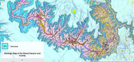
This week my clear favorite map was this wonderful looking map of the Grand Canyon. The Geologic Map of the Grand Canyon and Vicinity is a beautiful Leaflet.js based interactive map of the Grand Canyon. The map is based on data gathered by the U.S. Geological Survey.
The map uses different colors to show the different rock units and geologic strata in the Grand Canyon and surrounding area. The map also includes contour lines. If you hover over the map the geologic strata at the selected location is revealed in the small information window. If you click on the map you can learn more about the geologic strata (the information is displayed below the map).
Dublinia is a fantastic looking map and a great way to explore Viking & Medieval Dublin. The site shows how the city grew from a small Viking settlement into a large walled Medieval town.
Dublinia presents an oblique view of the capital, showing how the city developed from 800 AD to 1500 AD. A timeline control allows you to view a series of oblique views of the city for every decade from 800-1500 AD. Select a date from the timeline and the map updates to show you a view of the city for the chosen year.
The map includes a number of map markers which allow you to learn more about a number of Dublin's historical landmarks. If you click on a marker you can watch a video explaining the importance and development of the landmark. Each of the videos includes wonderful animated 3d models and an audio commentary about the chosen landmark's history.
PATTRN is a new open sourced conflict mapping platform developed by Goldsmiths University. The PATTRN platform allows anyone to create an interactive map which can be used to share and collate first-hand reports in conflict or crisis situations.
The platform was first used by Amnesty International in last year's Gaza Platform, to plot 2,700 attacks on Gaza by Israel during the 2014 Gaza conflict. You can also view the PATTRN platform in action in Fortress Europe, a mapped visualization of the Migrant Files data set, and Political Violence in Africa, a visualization of the ACLED data set.
The platform itself can be downloaded from its GitHub repository. Once set-up PATTRN acts as a data aggregator and mapped visualization platform. Users of your PATTRN project can then contribute data about events with space and time coordinates, and to add tags, media and content to those events.
Labels:
Sunday Best
Exploring the Solar System
Space: the final frontier. These are the voyages of the GIS specialists Esri. Its five-year mission: to explore strange new worlds, to map out new planets and new civilizations, to boldly go where no cartographer has gone before.
Esri has got a little bored with having to continually map the Earth, so they have now decided to turn their attention to the rest of the universe. The Solar System Atlas uses Esri's Story Map format to take you on a tour from the Sun, out past the inner planets, past the gas giants and out into the Kuiper Belt.
The Atlas includes interactive maps of Mercury, Venus, Earth and Mars. In fact the Solar System Atlas includes more than one interactive map for some of these planets, including geological and topographic maps of Mars and the Moon.
The gas planets Jupiter, Saturn, Uranus and Neptune don't have surfaces to map. However they do have moons. The Solar System Atlas therefore provides interactive maps for most of the moons of the gas planets. It also includes interactive maps for the moons of Earth and Mars.
Moving out beyond the furthest officially recognized planets the Solar System Atlas also includes interactive maps of the dwarf planets, Pluto and Ceres. The Solar System Atlas doesn't stop there. It also provides interactive maps for Minor Planet 4 Vesta and a number of asteroids and comets.
Labels:
astronomy
Saturday, February 20, 2016
Switching Map Labels in Leaflet
Over the last few days I've been experimenting with Map Panes in Leafet.js. There is a nice introduction to Map Panes in the Leaflet documentation if you want to learn more about how they work in the Leaflet interactive map library.
In a post yesterday I looked at how you could use Map Panes to fade map labels in and out on top of a base map. Today I started thinking about why you might want to use this feature on a map. One reason might be to switch between two different sets of map labels. Using this feature you could remove one set of map labels and then add a completely different set of map labels to a map.
By chance a few days ago I created a set of custom map labels for an Urban Dictionary Map of San Francisco. I have now added two buttons to this map to allow you to switch between real map labels and my custom map labels based on the Urban Dictionary definition of Bay Area locations.
The Urban Dictionary Map of San Francisco has three base map layers; CartoDB's Light (no labels) map style, a custom made Urban Dictionary labels map and CartoDB's Light - Only Labels map style.
Map Panes in Leaflet allows you to order map pane layers. In the Urban Dictionary map CartoDB's Light maps is on the bottom and the two label only map styles sit on top of this layer. I then adjust the opacity of the two label map layers to switch between the two sets of labels. All three map layers are therefore present at all times. It is just that the opacity of one of the two map labels layers is always set to '0', so at anyone time you can only see the map data layer and one of the two label layers.
You might notice that I've also used JQuery to add a fade effect when you switch between the two sets of map labels. When switching between labels the opacity of the active label layer fades from '100' to '0' before switching the opacity of the other label layer to '100'.
Friday, February 19, 2016
The Stonehenge History Map
Historic England's 2002 National Mapping Project of Stonehenge added another 539 important archaeological sites around Stonehenge. About thirty percent of the newly discovered sites were prehistoric or Roman in date. These included ring ditches, field systems, round barrows and enclosures of various forms dating from prehistory.
You can now explore and download research reports from the Stonehenge NMP for 39 of the most important new historic sites discovered around Stonehenge, The Stonehenge World Heritage Site Landscape Map allows you to view aerial imagery of these 39 NMP listed sites, learn more about each site and download each site's report.
All 39 sites can be navigated to from the map sidebar or by clicking on the numbered markers on the map. When you select a site from the sidebar or map, the map zooms to show the listed site and information for the site is displayed in the map side panel. A link to download the individual site's NMP report is also provided in the map side panel.
If you want to learn more about the National Mapping Project of Stonehenge you can download the Survey Report.
Labels:
history maps,
UK
Leaflet Map Panes
A new feature in the Leaflet mapping platform is custom map panes, which allow you to customize the order of map features such as: the base map, map labels, markers and pop-ups.
The Leaflet documentation has a great introduction into What Are Map Panes? and includes a demo map showing how you can use z-index to order your map panes. The demo map shows you how to ensure map labels appear on top of a GeoJSON layer, so that the labels are not hidden behind the GeoJSON data.
It occurred to me that you could also add a button to control the adding and / or removing of a custom map pane on your base map. For example, in the demo map, a button could be used to allow users to turn the map labels on or off.
You can also adjust the opacity of a custom map pane. Therefore not only can you turn a custom pane on or off you can also fade it in and out on the map. I've created my own demo map of custom map panes, which shows how you can fade custom map panes in and out on the map. In the demo map you can turn the map labels, map marker and red circle on and off using the buttons at the bottom of the map.
It's only a little map UX effect but I like it.
Thursday, February 18, 2016
Mapping Terrorism in the United States
The Oregonian has mapped all terrorist attacks in the United States from 1970-2014. The data for the map comes from the University of Maryland's Global Terrorism Database.
The Terrorism in the United States, 1970-2014 map uses circular markers to show the location of each terrorist attack. The color of the markers indicate where deaths, injuries or no injuries resulted from the attack. The size of the markers indicate the number of deaths or injuries.
If you select a marker on the map you can read more details about the attack, including the year of the attack and the group / individuals who carried out the attack.
This isn't the first time that The Oregonian has mapped terrorism data. Back in November The Oregonian used CartoDB's Torque library to create an animated map of terrorism deaths around the world from 2001-2014. Deaths by Terrorism, 2001-2014 shows worldwide fatal terrorist attacks by month.
On its own the animated map layer might have been a little crass, reducing thousands of deaths to little flashing dots on a map. However The Oregonian has also added a couple of other data layers to the map to provide some much needed context.
The 'Deaths by Country' option adds a choropleth layer to the map, showing the number of terrorism deaths by country around the world. The 'Narrative' option allows you to select each individual terrorist attack on the map to view a summary about the attack and the original news source for the data.
Urban Dictionary Map of San Francisco
Reddit user atrubetskoy has been making some popular Urban Dictionary maps lately. I particular liked his map of the Bay Area According to Urban Dictionary. In fact I liked it so much that I stole the idea.
Urban Dictionary is is a crowd-sourced online dictionary of slang words and phrases. It also seems to be a place where a lot of white middle-class kids go to describe their white, middle-class neighborhood as a 'gangsta ghetto'.
The methodology for atrubetskoy' maps is very simple. He just types in a city or a neighborhood name into Urban Dictionary and then adds the definition he finds to his Urban Dictionary map.
I decided to create my own version of atrubetskoy's map with Mapbox Studio Classic. Mapbox Studio Classic's CartoCSS allows you to change place-names, so it is a great way to re-label a map.
To change place-name labels in Mapbox Studio Classic you just need to find the CartoCSS for the administrative level that you wish to change (in my case this was level type 'city', 'town' and 'village'). Then all you need to do is type in the place-name you wish to change and its replacement. So to change 'San Francisco' to 'Tha City' I add,
[name_en='San Francisco'] {
text-name: '"Tha City"';
}
to the CartoCSS for city labels.
So - here is my Urban Dictionary Map of San Francisco.
Labels:
San Francisco,
USA
Mapping Medieval Dublin
Dublinia is a fantastic way to explore Viking & Medieval Dublin. The site shows how the city grew from a small Viking settlement into a large walled Medieval town.
Dublinia presents an oblique view of the capital, showing how the city developed from 800 AD to 1500 AD. A timeline control allows you to view a series of oblique views of the city for every decade from 800-1500 AD. Select a date from the timeline and the map updates to show you a view of the city for the chosen year.
The map includes a number of map markers which allow you to learn more about a number of Dublin's historical landmarks. If you click on a marker you can watch a video explaining the importance and development of the landmark. Each of the videos includes wonderful animated 3d models and an audio commentary about the chosen landmark's history.
Dublinia also includes a magnifying glass map control, which allows you to view a lens map view of modern Dublin, beneath the historical oblique view of the city.
Labels:
Dublin,
history maps,
Ireland
Wednesday, February 17, 2016
Interactive Geologic Map of the Grand Canyon
The Geologic Map of the Grand Canyon and Vicinity is a beautiful Leaflet.js based interactive map of the Grand Canyon. The map is based on data gathered by the U.S. Geological Survey.
The map uses different colors to show the different rock units and geologic strata in the Grand Canyon and surrounding area. The map also includes contour lines. If you hover over the map the geologic strata at that location is revealed in the small information window. If you click on the map you can learn more about the geologic strata selected (the information is displayed below the map).
Labels:
USA
Mapping the Other Mexican Border
Since 2014 the Mexican government's Southern Border Program has with, U.S. assistance, sought to lessen the numbers of 'illegal' migrants crossing the southern border of Mexico. The United States has helped Mexico in this effort with money, equipment and training. This U.S. assistance has mainly been funded through the Bureau for International Narcotics and Law Enforcement Affairs (INL).
The Washington Office on Latin America (WOLA) has created an interactive map to raise awareness of the conditions migrants are facing along Mexico's southern border. The Migration through Mexico map plots Mexican border checkpoints, detention centers and deportation sites. It also plots reported attacks on migrants and new migrant routes that have arisen since the Southern Border Program began,
WOLA reports that Mexico's migration crackdown has led many migrants to rely on more dangerous routes into Mexico. It also reports that excessive force has been used by border authorities and that significant numbers of Central Americans fleeing violence have been refused refugee status by Mexico. You can read more about the impact of mexico's Southern Border Program in WOLA's report, Increased Enforcement at Mexico’s Southern Border: An Update on Security, Migration, and U.S. Assistance.
Labels:
Mexico
The Water Risk Atlas
The World Resources Institute has released a new interactive map to visualize where and how water risks are emerging across the globe. Aqueduct allows you to explore 12 key indicators of water risk to highlight where water scarcity and water issues are, or could be, a problem in countries around the world.
The 12 key indicators can be accessed from the map side panel. You can select any of the indicators to view a choropleth map layer showing the risks around the world for each water risk indicator. The indicators include risks such as access to water, drought severity and groundwater stress.
You can learn more about the water risks facing a particluar area by clicking on the interactive map. Selecting a location on the map will open an information window containing a breakdown of the water risks faced by your chosen location. This information includes a rating of the overall water risk and the projected risks for the area selected.
Labels:
environment
Tuesday, February 16, 2016
Open Source Conflict Mapping
PATTRN is a new open sourced conflict mapping platform developed by Goldsmiths University. The PATTRN platform allows anyone to create an interactive map which can be used to share and collate first-hand reports in conflict or crisis situations.
The platform was first used by Amnesty International in last year's Gaza Platform. The platform was used by Amnesty International to plot 2,700 attacks on Gaza by Israel during the 2014 Gaza conflict. You can also view the PATTRN platform in action in Fortress Europe, a mapped visualization of the Migrant Files data set, and Political Violence in Africa, a visualization of the ACLED data set.
The platform itself can be downloaded from its GitHub repository. Once set-up PATTRN acts as a data aggregator and mapped visualization platform. Users of your PATTRN project can then contribute data about events with space and time coordinates, and to add tags, media and content to those events.
The submitted data is automatically visualized on an interactive map which provides access to all the data. The mapped visualization can also include interactive charts and filters which allow users to explore patterns within the data.
Also see: Ushahidi
Two Maps for the Price of One
The Mapbox GL JS documentation has a nice new example showing how you can synchronize two maps side-by-side. Swipe Between Maps creates two synchronized maps and allows you to swipe between the two different map instances.
Swipe Between Maps could be a a nice way to showcase all the beautiful map styles that I'm sure you have been creating with Mapbox Studio. Of course you aren't limited to just two maps. You could add a menu to one of the map instances in Swipe Between Maps which would allow users to change the base map layer (you could even add a menu to allow users to change the base maps of both map instances).
I've created a quick demo which adds a menu to Swipe Between Maps. Swipe Compare allows you to select a different base map style in the left map instance. I've added just four base map styles to my example. You could off course add as many map styles as you have created in Mapbox Studio.
Labels:
Mapbox GL
Monday, February 15, 2016
Mapping Car Ownersip in Melbourne
A recent map by CityMetric showed that in the UK people who live in city centers are far less likely to own cars than those who live in more rural areas. A map by Monash University suggests that a similar geographical distribution of car ownership exists in Australia. At least it does in Melbourne.
The Melbourne Car Ownership Map is a dot map visualizing where Melbourne's one, two, three and four car owning households are. It also shows those households who don't own a car. As you would expect the non-car owning households appear to be concentrated most in the center of Melbourne. Those households with three or fours cars tend to live in the suburbs.
The data for the map comes from the 2011 Australian census.
San Francisco's Maps of Sin
Revaluate thought that it would be rather romantic to release the Hot Beds of San Francisco Love Map for Valentine's Day. The map plots the locations of reported incidents of prostitution, lewd sexual acts, and public indecent exposure in the city.
The map provides a basic heat-map view of these reported crimes. If you zoom in on the map then the individual reported incidents appear on the map and you can click on the individual map markers to read details about each case.
I'm not entirely sure how the map relates to Valentine's Day, however it does follow a long tradition of mapping prostitution in San Francisco. For example this 1885 Official Map of Chinatown in San Francisco shows all the buildings in China Town that are housing 'white prostitution' (buildings colored blue) and 'Chinese Prostitution' (buildings colored red). The map also handily marks all the local Chinese opium dens and Chinese gambling houses.
Judging by the Hot Beds of San Francisco Love Map the major areas of prostitution have moved a little further west since 1885. It also appears that San Francisco was a lot more fun before all those boring tech companies moved in.
Revaluate has also created a similar map for Chicago, called Hot Beds of Chicago Love Map.
Labels:
crimemaps,
history maps,
San Francisco,
USA
India's Real-Time News Map
Rediff Labs create a lot of interactive maps of Indian data. Some of their more interesting recent maps include a map of rainfall during the 2015 Monsoon, a real-time map of Air Pollution in Delhi and a map of reported Crimes Against Women.
One of Rediff Labs' most popular maps is their real-time Breaking News Map. This map plots real-time news from all over India as it happens. The initial map view shows headlines in major Indian cities. If you zoom in on the map you can view more local news stories from the selected location.
If you select one of the small news windows which appear on the map you can view all the news stories from your chosen location, presented in reverse chronological order (the most recent news appearing first). The Breaking News Map also allows you to add your own local news to the map (with a 140 character limit). Users of the map can choose whether they want to view these user submitted stories or not.
The New Year's Eve Attacks in Cologne
Over 500 complaints of sexual assault have now been reported to the police in Cologne, all occurring during the city's New Year's Eve celebrations. This shocking number of attacks, the vast majority carried out by immigrants of Algerian, Tunisian and Moroccan origin, has caused a backlash against Angela Merkel's 'Open Door' policy on refugees (although only three of the 58 men arrested so far were actually refugees).
Die Welt has now released a CartoDB map visualizing the sexual assaults and other crimes which took place in Cologne on New Year's Eve. Übergriffen von Köln uses CartoDB's Torque library to animate through the course of the evening, showing where the sexual assaults and other crimes took place in the city.
The animated map provides a basic temporal view of the data. However the dots (representing the attacks) flash by really quickly on the map. This speed, coupled with the fact that the map offers no way to view all the attacks at once on the map means that the map certainly doesn't provide a clear spatial overview of where the attacks in Cologne took place. You might think that a spatial visualization was the point of using a map to visualize the data in the first place.
The result is that Die Welt's map of flashing dots seems to both sensationalize and trivialize the sexual attacks at the same time. CartoDB's Torque library has come in for a fair amount of criticism for what Andrew Hill dubbed burger cartography. This is a shame because the Torque library is such a powerful tool for adding a temporal analysis to time stamped spatial data. Perhaps CartoDB should create a few more Torque powered maps themselves to really show how a temporal analysis of spatial data can be done well with the library.
In defense of Die Welt the article which accompanies the map does provide a much better analysis of both the times and the locations of where the majority of the attacks took place in the city. It's just a shame that a little more analysis of the data wasn't present in their mapped visualization.
Sunday, February 14, 2016
Maps of the Week
I've had a lot of fun this week exploring the geographical distribution of place-names with Places!. Places! allows you to map the relative density of place-names in different countries around the world. Using the application you can enter place-name prefixes or suffixes and view a map showing the geographic distribution of place-names containing those terms.
For example, in the UK we can enter the place-name suffixes of -thorpe and -thwaite to see where the Vikings settled in Britain. The resulting map shows that these two place-name endings are popular throughout the area that was once known as the Danelaw, following the Viking invasions of the ninth century.
In the USA you could search for the distribution of the San- or Santa- prefixes to see where there might have been a strong Spanish influence in place-names. On the other hand the suffix -ville might be a good indication of where French immigrants originally settled in the USA.
This Paris building age map proved to be the most popular map on Maps Mania this week. BatiParis: Période de Construction des Immeubles Parisiens maps the age of buildings in central Paris. It is also a rather good example of the building age genre of interactive mapping.
Like other building age maps BatiParis uses a choropleth layer to show the age of buildings, with each building colored according to its year of construction. If you zoom in on the map important historical buildings are also shown on the map with interactive map markers.
Like other good building age maps BatiParis allows you to filter the buildings shown on the map by age of construction. For example, select the 1851-1914 range and you can view this major period of construction in the French capital, a result of Haussmann's renovation of Paris in the later half of the nineteenth century.
Twenty Years before John Snow famously mapped the locations of cholera victims in London's Broad Street Robert Baker plotted the deaths of cholera victims in Leeds.
Maps in the Age of Cholera is a story map based around Robert Baker's 'Sanitary Map of the Town of Leeds' exploring the 1832 cholera epidemic in this Yorkshire town. Baker never made the link between cholera and contaminated water. However, in his map and in the accompanying report to the Leeds Board of Health, Baker noted that "the disease was worst in those parts of the town where there is often an entire want of sewage, drainage and paving".
The map itself uses this Leaflet Story Map plug-in. The Leaflet Story Map library uses jQuery to create a scroll driven story map. The map tiles scheme for Robert Baker's 1832 'Sanitary Map of the Town of Leeds' comes from Wikimaps Warper.
Labels:
Sunday Best
Looking for Love? Try these Singles Maps
This week, with one eye on Valentines Day, a number of interactive maps were released that show where all the single men and women live.
The Map of French Singles visualizes the proportion of single men and women in every French department. If you are a young single French woman then the map is good news. It shows that in the 20-29 age group there are lots of single men across the whole of France. If you are a young French man then you need to be patient. There might not be many single women around when you are in your twenties, but if you wait until you are in your sixties you won't be able to move for single women.
In the United States the biggest problem in finding a date is that all the single men live on the west coast and all the single women live on the east coast. The next biggest problem is that all the single men are young and all the single women are of a more mature age.
The U.S. Singles Map reveals that single men far outnumber single women in nearly every city in America. Which means it should be fairly easy for single women to find a date. The situation does change however when you adjust the ages displayed on the map. It seems that there are far more mature single women than there are mature single men.
Over half of the adult population in England and Wales are single. Islington in London is the best place to go if you are on the look out for an unmarried date. In this London borough almost two out of three men and 57% of the women are single. If you are single in East Devon you should definitely catch the train up to London. In East Devon three quarters of all the men and more than 80% of women are married.
The UK's Office for National Statistics has produced a number of Google Maps visualizing data from the UK census. The Single People in England and Wales map displays the number of adult singles in each census tract in England and Wales. You can click on any census tract on the map to view the percentages of single men and women in the area and compare this figure to the national average.
If you've given up looking for a date locally then you could always widen your search to the rest of the world. Single Atlas can show you all the cities in the world that have the most favorably ratio of single men and women,
Single Atlas shows you the proportion of single men and women in cities around the world. You can search for either single men or women. You can also search by age, by race, education level and height.
Saturday, February 13, 2016
The World's Most Boring Roads
I have a new theory. The world's most interesting roads are in mountainous areas and the most boring roads are in areas which are very flat.
My theory is based on two interactive maps which show where the world's straightest and bendiest roads are. How Straight or Bendy are the Roads and tortuOSMity both use OpenStreetMap data to calculate the relative straightness of roads. Each map uses a different formula to calculate road straightness (the tortuOSMity formula), but seem to produce similar results.
Both maps also seem to show that elevation plays a big part in determining the straightness of roads. On both maps the most bendy roads seem to be mainly in mountainous areas. This makes sense as you would expect mountain roads to contain a lot of switchbacks and relatively few straight sections.
My boringness theory of roads obviously equates long, straight roads with tedious drives and curvy roads with excitement.
Subscribe to:
Posts (Atom)