Showing posts with label isochrone. Show all posts

Saturday, September 06, 2025

Isochrone Tokyo

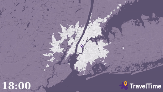
Tokyo has one of the most comprehensive public transit systems in the world. Curtis Fenner has built an isochrone map that allows you to see where you can travel in the city by train in a given time.

The purpose of the map is to help people make crucial decisions about where to live by visualizing real-world commute times. It effectively achieves this by not only showing the reach of the entire network but also highlighting areas that are surprisingly difficult to get to, revealing what Curtis calls "train deserts" -pockets in the city that are more than a ten-minute walk from a station.

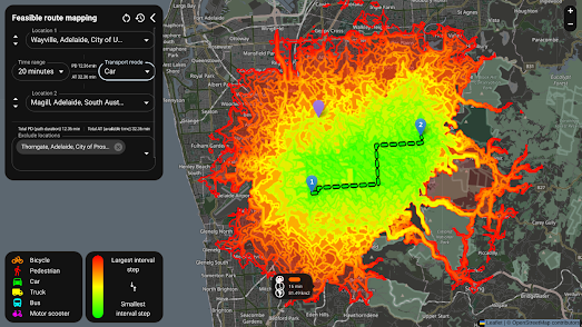
Users can input a single destination into the map How Far Can Trains Take Me in Tokyo? to see all the areas reachable within a specified commute time. The map also has a feature that allows for the addition of multiple destinations. When more than one destination is entered, the map blends the travel times, which can be useful for planning a meeting spot or finding a place to live that optimizes the commutes for multiple people. The settings panel also allows users to adjust the maximum door-to-door commute time and the maximum walk time to a station.

Tokyo has around 100 different transit lines and more than a dozen different train operators. These private operators typically do not publish their schedules in an easily usable format, which means most maps simply can't account for them. This map, however, tackles this challenge head-on by using a combination of web scraping and estimation to fill in the data gaps, resulting in a more complete travel time map of the city.

If you are interested in exploring an isochrone map of your city then you might find one under the Maps Mania isochrone tag.

Tuesday, March 18, 2025

Open Access, Open Source: OpenTimes

OpenTimes is an interactive travel-time map of the United States. Click on any location, and instantly view an isochrone map that shows how far you can travel from that spot within different time frames and via various modes of transport.

But OpenTimes is more than just an interactive isochrone map. It’s also an open-source platform offering free, pre-computed travel times between United States Census geographies.

What is OpenTimes?

OpenTimes is a comprehensive database of point-to-point travel times calculated between Census geographies across the United States. Unlike proprietary services that charge for access to similar data, OpenTimes is completely free and open-source. All the data is pre-computed and available for bulk download, making it an invaluable resource for anyone needing to analyze spatial accessibility.

The project leverages open-source software and publicly available data to calculate travel times. From the data pipelines to the infrastructure and even the website, every component of OpenTimes is open-source and hosted on GitHub

How OpenTimes Works

OpenTimes uses publicly available data and open-source tools to compute travel times between Census geographies. The data is pre-processed and made available for bulk download, allowing users to integrate it into their own analyses seamlessly. The project’s GitHub repository includes detailed documentation on how to access and use the data, making it accessible even to those with limited technical expertise.

OpenTimes was inspired by the OpenFreeMap project. Together, with mapping libraries such as Maplibre, these initiatives are helping to build a robust, free and open-source ecosystem for creating interactive mapping applications.

Tuesday, March 26, 2024

Mapping SpaceTime

I recently stumbled upon Time Map, an interactive map which attempts to show points of interest around a location by walking time. Enter a location into the Time Map and a venue category (eg pizza restaurants) and the map will display a series of concentric circles around your location, each of which represents a minute of walking time. 

All the nearby points of interest are overlaid on top of these circles showing you at a glance how long it will take you to walk to each location. If you click on any of the displayed venues a map is then displayed with detailed walking directions to the venue from your entered location.

Václav Volhejn has a problem with this kind of time radius map. The circles displayed actually show equal distances from a point and not equal travel times. Real world obstacles, such as buildings, rivers, and train lines mean that we can't always travel in a straight line between two points. So in reality it is going to take us different lengths of time to walk to different locations even if they are all on the same 5 minute walking time radius.

a map of Los Angeles distorting between showing distances and time.

Which is why Václav has invented Spacetime maps. Spacetime maps distort space to show travel times rather than distances. This might sound a little complicated (because it is) but you can get an idea of how the map works in the animated screenshot above, which is switching between showing distance between points to showing travel times between different locations.

Of course cartographers are used to using isochrones for visualizing time on maps. An isochrone is a line on a map that connects all the places you can get to within a certain amount of time. Because of the physical barriers to straight line travel isochrones are very rarely circles.

Václav Volhejn's YouTube video introducing his map has a neat explanation of what he is doing 'One way to think about it is we are going to bend the isochrone back into circles'. 

It is a neat explanation but unfortunately this distortion of the physical space means that Václav's Spacetime maps are not as easy to read as isochrone maps. Václav accuses iscochrones as being as 'boring af'. Which I think in a neat way brings us to the conclusion that Václav's Spacetime maps is a fun experiment. An experiment which is probably not going to replace the isochrone as the best way to visualize travel time.

Tuesday, September 19, 2023

Olympic Stadia Travel Times

Brisbane has been awarded the 2032 Olympic and Paralympic Games. One of Brisbane's goals in hosting the games is to be “more equal and accessible”. In order to analyze how accessible the Brisbane games will actually be the data consulting firm Smash Delta has been visualizing current travel times to two of the Brisbane games stadia and exploring how those travel times will be improved thanks to proposed public transport developments.

In Mobility and the Brisbane Olympics travel time data has been combined with the Mapbox storymap template to perfectly guide the reader through a presentation of the length of time it takes to travel to the Gabba and the Gold Coast Convention & Exhibition Centre (two of the main stadia in the 2032 Brisbane Olympics).

3D models of the Gabba and the Convention Centre provide the perfect starting point from which to add isochrone travel time data for each stadium. As you scroll through Mobility and the Brisbane Olympics you are guided through isochrone layers visualizing public transport, walking and cycling times to the two stadia. As each isochone layer is added to the map a bar chart also shows a breakdown of the population age groups living within different travel times to the stadium.

Overall Smash Delta's 'Mobility and the Brisbane Olympics' is a superb example of mapped data visualization and a very effective demonstration of the power of Smash Delta's StoryScaper interactive spatial storytelling template.

Tuesday, July 25, 2023

Isochrone Maps

time2reach is an interactive map that shows you see how far you travel within a set time period using public transit. The map can currently create isochrone visualizations for 6 global cities: New York, Paris, San Francisco, Toronto, Montreal and Vancouver. 

If you double-click on the map in any of these six cities an isochrone visualization will show you how far you can travel from that point on public transit. The map is color-coded to show how far you can travel from the selected point in minute intervals. If you hover over another location on the map you can see the quickest public transit route to that destination and the total journey time (and the duration of each stage (bus,train,walking etc) of the journey).

The map uses GTFS (published public transit schedule data) for calculating all travel times. Therefore if you have a GTFS feed for a city then you should be able to create your own time2reach isochrone map using the code provided on the time2reach GitHub repo.

You can find more examples of travel time maps using the Maps Mania isochrone label.

Tuesday, June 13, 2023

Chronotube

NYC Subwaysheds visualizes how far you can get in "40 minutes from each subway station in New York City". Hover over a subway station on this map and an isochrone layer shows the accessible areas around that station in ten minute intervals (traveling by subway and by foot).

Mapbox's Chris Whong was inspired to make the map by the ever popular Chronotrains map. Chronotrains visualizes the travel times between different cities in Europe by train. It shows how far you can travel by train in 8 hours from every European train station. 

You might also like Chronotrains 1911, which uses train travel-times from 1911 to show you how far you could travel by train in five hours from any French station in the second decade of the 20th Century. The data for the 1911 map comes from Cambridge University's Communes project, which has digitised the French rail network from 1832 to 2015.

You can find even more public transit travel time maps using the isochrone label on Maps Mania.

Tuesday, September 20, 2022

CSI Suspect Mapping

Feasible Route Mapping is an interactive map that can be used to find out all the possible routes that could be taken from one location to another. The map was designed to be used during criminal investigations to determine all the locations a suspect could have traveled to in a specific time. The map can therefore help investigators to quickly evaluate a suspect's possible movements in and around a crime. 

Enter a starting point and a destination into Feasible Route Mapping and it can calculate the areas that a suspect could have reached within a set time frame, taking into account the suspect's mode of transport. An isocrone map is then displayed which shows the reachable areas. This isochrone layer includes time interval steps which indicate the length of time it would have taken to reach each point in the possible travel areas. 

The map uses the Valhalla open-source routing engine to calculate possible routes and the isochrone layer. The map was created by Mario Širić as part of his master's thesis. You can learn more about the application and view its code on the project's GitHub page.

You can find more examples of visualizing travel time under the Maps Mania isochrone tag.

Thursday, August 25, 2022

How Far Can You Commute in One Hour?

If you have ever wondered how far you can commute using public transport then you will love the commutometer interactive map. Just click on your home on the commutometer interactive map and it will show you how far you can travel in 5 minute intervals by subway, train, bus, tram or ferry.

Drag the green marker to your home address on commutometer and you can view an isochrone map visualizing how far you can travel on public transport in incremental journey times. Obviously how far you can travel by public transport in one hour can depend on the time when you wish to travel. Commutometer accounts for changes in the public transport timetable by allowing you to enter the day and time of when you want to travel.

As well as providing an overall isochrone layer commutometer also allows you to query the journey times for individual destinations. After the isochrone layer has loaded you can click on any address within the isochrone layer to view the exact journey time from your defined origin. 

Commutometer doesn't work everywhere in the world. If you zoom out the areas where the map doesn't work are shown using an opaque mask. These areas are also labeled 'no data' to show that the map can't access public transportation data at these locations.   

You can explore more journey travel time maps using the Maps Mania isochrone label. This includes the very popular How Far Can You Go By Train in 5h?, an interactive map which shows you how far you can travel from any European rail station in less than five hours.

Saturday, July 30, 2022

How Far Can You Travel in 5 Hours?

How Far Can You Go By Train in 5h? is an interactive map which shows you how far you can travel from any European rail station in less than five hours.

Hover over any location on this map (within the highlighted area in Europe) and you can view an isochrome layer which shows you how far you can travel by train in hourly increments. The nearest train station (from which travel times are calculated) is highlighted on the map in black. 

The travel time data used to power the isochrone layers comes from direkt.bahn.guru. The map assumes that any interchange between two different trains is a blanket 20 minutes and that travel between two interchange stations will be undertaken at a little over walking speed.

You can find more travel time maps listed under the label isochrone.

Tuesday, February 15, 2022

How Far Can I Walk in 10 Minutes?

I try to complete a 1 hour walk every day. While I enjoy walking I do also get bored with walking the same old routes around my neighborhood. Which is why I've been using Mirumi's Walking Distance Map to find whereas I can walk within 1 hour of my home. 

The Walking Distance Map is an isochrone map which was designed to help Japanese house hunters to define a property search area within a 30 minute walk of a work location. Luckily for the rest of the world the Walking Distance Map isn't restricted to only Japanese locations. It can be used anywhere in the world and it can also be used by cyclists and car drivers as well as pedestrians.

If you enter a location into the Walking Distance Map you can view a map showing how far you can travel within a set number of minutes (max 30 mins). The map supports walking, cycling or driving. You can use the drop-down menu to select how many minutes you want for your own isochrone visualization. 

One problem with many isochrone maps is that they assume everybody walks, cycles or drives at the same speed. The Walking Distance Map has addressed this problem by allowing you to adjust your travel speed. If you click on the slide-out menu you can then enter a meters per second speed which the map will then use to calculate how far you can travel within your defined period of time.

If for some reason the Walking Distance Map doesn't work for you then you can find many more interactive travel time maps using the isochrone label on Maps Mania.

Wednesday, February 09, 2022

Isochrone Maps by Time of Travel

An isochrone map shows the area that you can travel to from one point within a certain time. For example it can show you how far you can drive from your home in one hour. Ironically, despite being a visualization of time, most isochrone maps actually completely ignore the actual time of day when you wish to travel. For example they mostly ignore the fact that the distance you can drive during rush hour is likely to be a tiny fraction of the distance that you could drive at 2am in the morning. 

TravelTime has being working on visualizing how the time of day can affect how far you can travel within a set period of time. In Visualising How Far You Can Travel from New York’s Grand Central Station by Time of Day TravelTime has created an animated isochrone map which shows the distance you can travel by train in one hour throughout a 24 hour period. The map uses the TravelTime API to calculate travel times based on the scheduled timetable. 

The animated map shown at the top of this post concentrates just on the evening rush hour period between 6pm and 7pm. You can view the YouTube video of this map here. Both of the animated maps assume that the traveler must first walk into Grand Central station and walk to the train platform, wait for a scheduled connection and have enough time to exit the station on the other side. You can check the routes shown on the map yourself using the TravelTime interactive travel time map. 

You can view many more travel time maps by checking out the isochrone label on Maps Mania.

Monday, November 15, 2021

How Big is Your CO2 Footprint?

CO2 is one of the biggest causes of global heating. Calculating our own individual CO2 output is very difficult, chiefly because a lot of our personal contributions to climate change come from our purchasing and consumption decisions - where the CO2 costs are largely hidden. However it is much easier to calculate our personal CO2 output from our transportation decisions.

Cars (and other motorized road traffic) are one of the major contributors to CO2 output. In Europe 30% of CO2 emissions are caused by transportation. 70% of that is caused by road traffic. If you live in Germany you can use Vislab's How far can I get with my CO₂ budget? interactive map to work out your own personal CO2 travel emissions. 

If you enter a German zip-code, the distance you travel each day and a mode of transport into Vislab's map you can then discover your personal CO2 emissions (in kg) from your personal travel decisions. The interactive map isn't entirely essential to the calculation but it does give you a visual guide as to how far you can travel in the distance that you entered into the map. 

If you don't live in Germany you can still estimate your personal CO2 output by just entering the distance you travel and using a random German zip-code address (the map has a button which will automatically randomize the address). The resulting map will not show your location but the CO2 emissions given should give you a rough idea as to your own personal daily CO2 output.

How far can I get with my CO₂ budget? also includes a calculator tool which can work out the CO2 cost of your last flight. For example my last flight was London to Amsterdam (taken over 30 years ago). This round-trip has a CO2 cost of 447.3 kg. The calculator informs me that if I had driven a similar distance as that flight my CO2 output would have been around 150 kg.

Thursday, August 05, 2021

Moving Away From Work

Lock-down and the rise of home-working is having a big impact on the property market as home-owners begin to change their property expectations and priorities. Online real estate company Zillow has been looking at where house prices are rising fastest, in order to determine where it is that people now want to live.

The simple assumption that many people have been making is that the flexibility of working from home means that people are less interested in inner city properties close to job centers. This is certainly true in many expensive metro areas where property prices have been rising the least. However it isn't true of less expensive metro areas where property prices are rising at an increased rate. Zillow's analysis of property prices is that people have been inspired by lock-down to move to more affordable places - which could be outside city centers or in some case close to city centers. 

Zillow's The Great Reshuffling Is Changing How Far Americans Are Willing to Commute includes an interactive map which allows you to compare the median home value by commute time in major U.S. cities. Choose a city and the map uses you an isochrone layer to show traveling times and median house price values. The different polygons represent ten minute steps in commuting time from the downtown core. The colors of these polygons reflect the median home price in that area. 

According to Zillow affordability is the key driver of recent increases in property prices. Commuting time is no longer such a big a factor in deciding where to live.

Friday, July 23, 2021

Driving Times from Paris

Time Distance to Paris by Road 2021 in an interactive isochrone map which shows how long it takes to travel by car from Paris to any other location in France. 

An isochrone map uses lines on a map to connect points which can be reached in the same travel time. On Nicholas Lambert's Time Distance to Paris by Road 2021 different colors are also used to visualize areas which can be reached in the same time steps.Because this is an interactive isochrone map you can also select a time period on the map key to view all the areas in France which can be driven to in that time highlighted on the map. For example if you select 60 minutes on the map key then you can see all the areas that you could to travel to in an hour highlighted in blue.

Because Time Distance to Paris by Road 2021 is an Observable notebook it can be forked to work with other locations. For example, Laurent Jégou has forked the map to create his own isochrone map visualizing the Time Distance to Toulouse 2021. Tristram Gräbener has also forked Nicholas Lambert's original map to create a Time Distance to Paris by Train isochrone map.

You can view other examples of interactive travel time maps using the Maps Mania iscohrone tag.

Monday, February 08, 2021

The Commuting Time Map

The CommuteTimeMap can show you how far you can live from your workplace in order to be able to commute to work within the time you would like to spend commuting. Enter your work (or place of study) address into this interactive map, submit your commuting travel time and an isochrone layer will show you all the areas which you can travel to and from within your commuting time. 

The CommuteTimeMap works for different methods of commuting. You can change your mode of transport for your commuting isochrone between public transport, car, cycling or walking. The isochrone layer showing how far you can travel will change depending on your chosen mode of transport.

At the present time a lot of people might not be in need of a map which shows how far you can commute within a certain time. However the map is still useful for those of us working for home. The CommuteTimeMap includes an option which allows you to view an isochrone layer for more than one address. So, for example, if you want to meet up with a friend outside you can enter both your addresses and see the areas which are within a 15 minute walk of both your homes. You can even ask the map to highlight just the areas which intersects both of your travel areas. 

You can view many more travel time maps by checking out the Maps Mania isochrone label.

Via: WeeklyOSM

Monday, June 15, 2020

How Far Can Your Drive in Two Hours?


Sweden's Public Health Authority is advising Swedes not to travel. However if traveling is essential it says that short trips of up to a two hour drive from your place of residence are permitted. To help people visualize how far they can drive in two hours the national public television broadcaster SVT has released an interactive isochrone map.

Så långt kommer du på två timmar (So how far can you get in two hours) uses OpenStreetMap data to work out how far Swedes can drive from any postcode address in the country. If you click on the map of Sweden a beautiful iscohrone visualization snakes out from your selected location showing how far you can drive in two hours time. Different colors are used to show the driving time to each location. The map also includes a driving time slider which allows you to adjust the driving time from a 10 minute drive to the full two hours.

Thursday, May 21, 2020

The Scottish Isochrone Map


I was talking to a friend of mine yesterday who teaches in a school which is re-opening for students in two weeks time. She is very keen for her students to be able to go back to school. However she really doesn't want to start travelling again on the London Underground twice a day during the morning and evening rush hour. And I really don't blame her.

My friend knows that I cycle a lot in London so she was eager to find out how long it would take her to bike to work everyday and which would be the quickest and safest routes. I was surprised that my friend had very little understanding of the distance she could cycle in 30 minutes. Which obviously got me thinking about isochrone maps.

The fact that I had also just been playing with the Scottish Travel Isochrones map might also be why I immediately thought about travel time maps. The Scottish Travel Isochrones interactive map allows you to view cycling, walking and public transport isochrone layers for workplace zones in Scotland. The map allows you to quickly see how far you can travel in different amounts of time using different modes of transport within Scottish towns and cities. The map is particularly useful if you want to compare the effectiveness of public transport systems in different cities.

Obviously a Scottish travel time map isn't much use to my friend in London. Luckily my encyclopedic knowledge of interactive maps allowed me to point her towards Parallel's Schools in England & Wales map instead. This interactive map provides, walking, cycling and driving times for every school in England and Wales. Zoom in on any school and you can view isochrone layers showing the areas that you can walk, bike or drive to (from the school) in six minute increments.

If you want to view other interactive isochrone maps then you can explore the isochrone label on Maps Mania, which includes many examples of travel time maps from around the world.

Tuesday, January 28, 2020

How Far Can You Travel?


The city of Amsterdam has created a useful tool which visualizes travel times around the city. MapItOut is an interactive isochrone map which shows you how far you can travel by foot, bike, public transport or car in Amsterdam, within 15, 30, 45 or 60 minutes.

To discover how far you can travel in Amsterdam you just need to click on your location on the map and select your mode of transport. Select from 15, 30, 45 or 60 minutes and the map will display a polygon showing you all the places you can reach in that time. MapItOut also allows you to view the locations of schools in Amsterdam, so it is possible to use the tool to find properties and locations within 30 minutes of any school.

MapItOut uses Travel Time, an isochrone platform for interactive maps. Because MapItOut uses Travel Time the map actually works for any location in the Netherlands and in most European countries. If MapItOut doesn't work for your location then you might want to explore some of the many other travel time / isochrone maps using the isochrone tag on Maps Mania.

Thursday, October 04, 2018

The Leaflet Travel Time Plug-in


Trafford Data Lab has released an isochrone plug-in for Leaflet.js, which allows you to show travel time reachability on your interactive maps. leaflet.reachability uses the openrouteservice Isochrones API to visualize how far you can walk, cycle or drive in different periods of time on a Leaflet.js powered interactive map.

You can explore the potential of the leaflet.reachability plug-in on the demo map. If you open the menu on the map you can select from the three different modes of transport (walking, cycling or driving) and select a period of time. If you then click on a location on the map you can view how far you can travel, using your selected mode of transport, in your chosen period of time.

At the moment the plug-in doesn't have any documentation (although "Detailed step-by-step instructions and a full implementation guide will follow here shortly"). For now if use the demo map as a guide the plug-in looks like it should be relatively easy to implement. Just remember that the plug-in uses the openrouteservice API so you will need to register with openrouteservice and then use your own API key with the leaflet.reachability plug-in..

Friday, September 21, 2018

The UK Isotim Travel Map


There are lots of interactive isochrone maps, which can show you how far you can travel within a set amount of time. But there aren't many interactive isotim maps, maps which show you how far you can travel for different amounts of money.

In the UK you can now use faremap to see how far you can travel on public transit for the change you currently have in your pocket. Enter a destination into faremap and it colours the whole of the UK based on the cost of train travel to the destination from your current location. Just as an isochrone map shows lines of equal time this isotim map shows lines of equal transport cost. Each color on the map shows an area of equal travel cost.

As well as showing you how far you can travel for different amounts of money faremap is also a really useful split fare map. One of the many crazy and ridiculous barriers to train travel in the UK is that for many train journeys it costs more to buy one ticket to your destination rather than buying multiple tickets for different stages of the journey.

If you enter a starting station and a destination station into faremap it will show you the cheapest split fare tickets, tell you what stations you must travel through and the cost of each ticket that you need to buy.