Showing posts with label Germany. Show all posts

Tuesday, March 04, 2025

Rebuilding the Berlin Wall

a choropleth map of the German election showing the CDU dominant in the west and the AfD winning in the east of the country
choropleth election map showing the CDU dominant in the west and the AfD winning in the east

In my round-up of 2025 German Election Maps, I commented on the "stark contrast between the results in former East Germany and the rest of the country." It was immediately apparent to most observers of last week's German election that there was a clear voting split along the old East-West German border. In the west, the Christian Democratic (CDU/CSU) party was triumphant, while in the eastern part of Germany, the far-right Alternative for Germany (AfD) was dominant.

However, according to Data Journalism Studio, this split is not as clear-cut as it first appears on German election maps. In German Elections: Did the Eastern Bloc Vote Radically? Not Exactly, the Data Journalism Studio uses a scrollytelling story map to illustrate how the actual results were more nuanced than the simple east-west divide suggests.

a cartogram map of the German election revealing an urban-rural political divide
cartogram map of the German election revealing an urban-rural political divide

By switching from a traditional choropleth map to a cartogram view, the Data Journalism Studio demonstrates that German voting patterns were influenced as much by population density as by the former East-West divide. A cartogram, which represents each electoral district as a single hexagon, reveals this different perspective. This visualization shows that in major eastern cities like Berlin and Leipzig, voters actually supported Die Linke rather than the AfD.

Further cartogram views, displaying party support across Germany, reveal that while the AfD performed well in the rural areas of the east, they did not perform well in the largest cities. Additionally, a cartogram map highlighting where the AfD gained votes since the previous election suggests that the AfD gained new voters quite evenly across all of Germany.

Monday, February 24, 2025

2025 German Election Maps

The conservative CDU party emerged as the biggest winner in yesterday's German election. Another clear winner from Sunday's vote was the far-right AfD party, which doubled its vote share to 20.8%. Meanwhile, the center-left SPD (the party of incumbent Chancellor Olaf Scholz) suffered its worst-ever results, securing just 16.4% of the national vote.

The Berliner Morgenpost's Federal Election 2025 Results includes an interactive map visualizing the winning party in each electoral district. This "winner-takes-all" view highlights a stark contrast between the results in former East Germany and the rest of the country. In nearly all West German regions, the CDU emerged as the most popular party. However, in almost all of former East Germany, the extreme far-right AfD was the dominant party.

Zeit's 2025 Election Results map uses a similar shaded margin layer to illustrate the election results. Both maps employ party colors to represent the winning candidates in each electoral district, while also using varying shades to indicate the strength of each party's winning margin.

On both maps, users can click on individual electoral districts to view the percentage of votes won by each political party in that area. Additionally, the Berliner Morgenpost map allows filtering by individual party. For example, selecting the far-right AfD reveals how well they performed across Germany—confirming that the party fared significantly worse in former West German regions compared to areas of former East Germany.

Tagesspiegel's Federal Election 2025 map also includes options to view both 'first' and 'second' votes and to view maps of all German elections dating back to 1990. The first vote is used to determine the candidate who will represent the constituency. The second vote is used for each party's state list. 

About half of the Bundestag consists of directly elected candidates (determined by the first votes). The rest of the seats in the Bundestag are determined by the proportion of second votes won by each party. The total number of seats a party gets is determined by the share of the second vote it receives (as long as it surpasses the 5% threshold or wins at least three direct mandates). Each party then fills these seats using candidates from its state party lists.

Thursday, November 16, 2023

The Rise & Fall of National Rail Networks

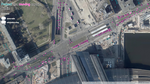
The Berliner-Morgenpost has visualized the rise and fall of the German rail network from its rapid growth in the 19th Century right up to its 21st Century post-privatization contraction. The German Rail Network from 1835 Until Today uses an interactive map to show all the active rail lines in Germany for every single year from 1835 until 2022.

On December the 7th 1835 a six-kilometer rail line from Nuremberg to Fürth was opened. On which a steam locomotive, the Adler, would carry passengers at the dizzying speed of 28 kph. Things then sped-up rather quickly and by 1870 Germany had constructed around 14,000 kilometers of railway lines. In fact the German railway became so large that in the 1920s the nationalized German rail company, the Deutsche Reichsbahn was the largest employer in the world.

In West Germany the national rail network began to suffer from the 1950s as a consequence of the rise in car ownership. However the biggest contraction in the German rail network began in the 1990s. After the reunification of Germany the newly privatized rail lines in the former East Germany were forced to close unprofitable lines and stations. The result is that the German rail network now has around 39,900 km of lines, down from the 52,900 km of rail-lines it had from 1940-1970.

Irish Railway Stations 1834-2000 is a simple interactive map which plots every active Irish train station in operation for every year from 1834 to 2000. By scrolling through all 166 years on the map you get a great overview of the rise and fall of the railway in Ireland since 1834.

The first railway line opened in Ireland was the Dublin and Kingstown Railway (D&KR), which ran between Westland Row in Dublin and Kingstown (Dún Laoghaire), a distance of 10 km (6 mi). It was opened on 17 December 1834. In 1839 a second railway line, the Ulster Railway, opened between Belfast Great Victoria Street and Lisburn. 

If you use the map's timeline to progress through the years from 1834 you can see how the railway spread across Ireland, largely emanating out from the initial lines built in Dublin and Belfast. For almost a century after 1834 the railway in Ireland continued to grow, reaching out to all parts of the island of Ireland. 

When you reach the late 1930's on the map you can begin to see railway stations disappearing off the map. The Great Depression and the rise of the motor car obviously had an effect of freight and passenger traffic resulting in the closure of a number of stations. In the 1950s and 1960s you can begin to see the closure of many branch lines on the map. This significant reduction in the rail network in Ireland means that even in the 21st Century the Irish rail network consists of only around 1,698 miles, or around half of the 3,480 miles of line that existed in the early 20th Century.

In August 1847 a railway line was opened connecting the Swiss cities of Baden and Zurich. 175 years later Switzerland's rail network is over 5,000 kilometers long. Back in 2022 the Swiss broadcaster SRF celebrated the 175th anniversary of the country's railway network by creating a Journey Through the History of Swiss Railways.  

SRF's history of the Swiss railway includes a map which shows the opening of new railway lines by year of construction. This map is accompanied by a graph which shows the length (in km) of railway lines opened in each year. From the animation of this map above you can see that the golden era of the Swiss railway was in its first one hundred years. Since the 1920s further extensions to the railway in Switzerland have been fairly sporadic. 

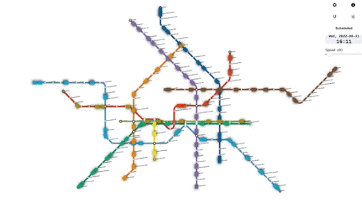
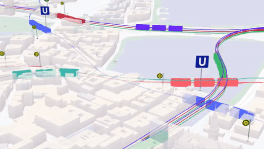
If you are interested in the history of your city's transit network then you should have a look at Citylines. Citylines is a collaborative platform which is busy mapping the public transit systems of the world. Using Citylines you can explore interactive maps visualizing the local transit systems of hundreds of cities around the globe. You can also use Citylines to explore how each city's public transport network has grown and contracted over time. 

Each city's transit system map includes a date control, which allows you to view the extent of the local transit network for any year in history. Press the play button on the map and you can view an animated map showing how the city's transit system has developed through history. 

All the data used on Citylines is open sourced under the Open Database License (ODbL). This means that if you want to create your own city public transit map then you can download the data for your map from Citylines (in json or CSV formats).

Monday, September 25, 2023

A Cool, Shady Spot with a Breeze

One result of global heating is that nearly every summer most of us spend some time thinking about places we can go to avoid the oppressive heat. In recent years a number of interactive maps have been released which can help you find shady places to relax and escape the direct sun. These include popular shade maps such as JveuxDuSoleil, ShadeMap and Shadowmap.

Now a new interactive map goes a few steps further and allows you to find shady spots which are also cool & breezy, and which in addition have refreshing amenities nearby. The erfrischungskarte is an interactive map which identifies cool, windy and shady areas in Berlin. It allows you to quickly find areas of the German capital where you can relax in summer based on the level of shade, temperature or breeze, and which have refreshing infrastructure nearby, such as drinking fountains, swimming holes, or green parks.

The erfrischungskarte includes a useful clock-face menu which allows you to choose any time of day. Select a time on this clock and the map will update to show where building shadows will fall at the chosen time. The color of locations on the map relate to estimated temperatures at different times of the day (4 a.m., 2 p.m. and 10 p.m., modeled for a typical summer day, with a resolution of 10 meters). In the 'filter' menu you can change the colors shown on the map to indicate the levels of the wind across the city (cold air volume data for 4 a.m. and 10 p.m., modeled for a typical summer day, at a resolution of 10 meters).

The markers on the map show the locations of drinking fountains & other water sources (blue), parks & other green areas (green) and benches (yellow).

Monday, August 14, 2023

Neighborhood Colors

Kiezcolors is an interactive map which shows the distribution of land use in Berlin neighborhoods. On the map areas are colored to show whether they are used for business, housing, roads, nature etc. Alongside the street map a tree-map is also used to show the percentage of land used by each category within the highlighted area (the circle of 'undefined' radius).

You can use the map's search facility to center the map on any Berlin address, or you can simply pan the map to your desired location. The tree-map updates automatically to always show the distribution of land use in the circle at the center of the map.

When you have centered the map on the desired location you can then download a postcard shaped version of the resulting tree-map, visualizing the distribution of land use in your Berlin neighborhood. You can even download an SVG image of the reverse side of the postcard.

Thursday, June 08, 2023

The Privatisation of East Germany

After the reunification of Germany in 1990 the German Democratic Republic established an agency in order to privatise East German enterprises. The Treuhandanstalt (Trust Institution) was tasked with overseeing the sale of over 8,500 state-owned companies.

Under communism nearly half of all East Germans worked for the state or for state-run companies. Privatising all East German enterprises would obviously have huge consequences not only for the enterprises themselves but for the whole population of the former East Germany. 

The Federal Foundation for the Reappraisal of the SED Dictatorship is tasked by the German government to help assess the history of the German Democratic Republic and its impact on the now reunified Germany. Die Treuhand und die Folgen is an interactive created by the foundation which tells the story of the Trust Institution and the consequences of the rapid privatisation of East German enterprises on those enterprises and their employees.

An interactive map plays a large role in Die Treuhand und die Folgen. The map shows the locations of GDR enterprises pre-reunification. If you click on a company's marker on the map you can view the number of people it employed in 1990, and its current status. 

According to the foundation some of the consequences of the Treuhandstalt were "Mass unemployment, insecurity and a lack of prospects (for) several generations". The foundation claims that many East Germans view the mass privatisation of East German enterprises as a 'negative' experience which was badly managed by West Germany. 

Sunday, January 29, 2023

The Distribution of Surnames

The superbly named Namensverbreitungskarte is an interactive map which can show the distribution of surnames in Germany. Enter a family name into the map and you can see where people with that name lived in 1996 and in 1890. The distribution is based on German casualty lists of the 1st World War and the German phone directory from 1996.

One neat feature of Namensverbreitngskarte is that you can visualize more than one name at once. Search for a new name and its distribution will be added to the map using a different color. For example the map above shows the 1880 distribution of the names Kruse, Kraus and Krause. The Benrath Line (a line which roughly divides German northern and southern dialects) can be seen in the distribution of the name's variations across Germany. If you click on the 'About Name distribution map' link you can view a few more interesting examples of the distribution of various German surnames. 
 

The German Surname Map is another fascinating tool for visualizing the geographical distribution of surnames in Germany. Enter a surname into the tool and you can view a map showing where people with that name are distributed throughout the country. 

If you enter the name Merkel into the map (the name of the ex-German Chancellor) you will discover that it is a common surname in Germany, with quite an even distribution throughout the country. Angela Merkle was born in Hamburg. There appear to be quite a few Merkles in Hamburg, although the biggest concentration of the surname appears to be in some of the southern states.

In Germany you can also use GeoGen to view the geographical distribution of German surnames. The use of three dimensional stacks on this map helps to make it a little more clear where a particular surname has its highest concentration in the country.

Searching Merkel on GeoGen and the German Surname Map seems to suggest that the highest concentration of Merkels in Germany can be found in Baden-Baden. However as neither map uses place-name labels it isn't always easy to determine individual towns on either map (the highest concentration of Merkels may therefore be in one of Baden-Baden's closest neighboring towns). 

If you want to research the geographical distribution of surnames in other countries then you can use:

You can also explore the global distribution of your family name using Forebears. You can use Forebears to undertake a global search for your surname. If you enter a surname into Forebears it will tell you both the meaning of your name and show you a map of the global distribution of your name. Beneath this generated map you can view a list showing the number of incidences of your surname recorded in each country around the world. It also shows the ratio of people with your surname in each country and the rank of your name in comparison to the incidence of all over surnames in each country.

Saturday, January 14, 2023

The Gendered Streets of Leipzig

The Leipzig Gender Map is an interactive map which visualizes how many streets are named for men and women in the German city. The map clearly reveals the disparity in the number of street names which commemorate women compared to the number of streets which commemorate men.

On the map streets named for women are colored yellow and streets named for men are colored red (streets colored green are not named after people). In total only 119 streets in Leipzig have been named for women. In comparison 1,201 streets are named after men. Over half of the 119 streets named for women are not named after real women. For example a number of streets have been named after fairytale characters and Nordic deities. In total only 56 streets are named in honor of real historically prominent women.

All the colored streets on the Leipzig Gender Map are interactive. This means that you can click on a street to learn more about the derivation of its name. The city of Leipzig also maintains data on when streets were named (or renamed). The Leipzig Gender Map allows you to filter the map to show only streets named during different dates. You can therefore use these filters to analyze during which periods of the city's history streets were more likely to be named for women.

If you are interested in exploring the disparity of representation in street names in other major cities then you might like the maps created by Geochicas and EqualStreetNames. You can also find more examples under the toponym tag on Maps Mania.

Wednesday, November 02, 2022

Mapping Car Parking Spaces in Berlin

There are 1.24 million cars in Berlin. If the average size of a car is 8.74 square meters then cars take up roughly 10,837,600 square meters of Berlin. In order to facilitate all those cars Berlin's streets need a lot of designated parking spaces. 

Tagesspiegel has mapped out the percentage of parking spaces on Berlin's streets by neighborhood. Their Berlin Parking Lots map colors each of the city's neighborhoods to show what percentage of road space in the neighborhood is dedicated to car parking spaces. If you hover over a neighborhood on the map you can also find out what percentage of the whole neighborhood is taken up by car lots and how that compares to the percentage of land taken up by playgrounds and green spaces. 

For example 26.8% of street space in the Wissmannstrasse neighborhood in south-east Berlin is dedicated to car parking. 2.8% of the whole area is dedicated to parked cars, while only 1.7% of the neighborhood is dedicated to playgrounds. 

If you don't live in Berlin you can find out how much of your neighborhood is dedicated to parking lots using the Parkulator interactive map. Parkulator is an interactive mapping tool which allows you to discover how much of your town is dedicated to parking lots, golf courses, brownfield sites, solar generators or parks.

If you draw an area on the Parkulator map you can choose to find out how much of that area's real-estate is claimed by parking lots (or golf courses, brownfield sites, solar generators or parks). Parkulator will also tell you how much housing or how many parks could be built instead on that same sized area of land.

Wednesday, September 21, 2022

The Number of Cars in Berlin

How Many Cars is an interactive map which shows the number of cars in Berlin in April 2019. On the map you can see every single moving car in the city (highlighted in pink) and every parked car (colored blue).

Last year more than 40 volunteers used a custom made map tagging tool to identify all the cars on an aerial image of Berlin. The composite aerial image was captured on the 1st and 6th of April 2019. How Many Cars shows the result of this analysis. At the time of writing the tagging of cars in most of the city center is complete. 

You can access the data itself on the Car Tagging Data page on GitHub.  This repository also includes a number of suggestions for how the data might be used, e.g. for analyzing how much space cars take up, for analyzing informal parking (the number of cars not parked in official parking zones), or the number of parking spaces without parked cars.

Wednesday, August 31, 2022

The Animated Map of the Berlin Subway

Ubähnchen is a fantastic new transit map which simulates the movement of trains on the Berlin subway network based on the scheduled timetable.

There have been a number of very impressive 3D animated transit maps released in the last few years. These include Moving Hamburg, an impressive 3D animated public transport map of Hamburg and Mini Tokyo 3D, the live real-time map of Tokyo's public transit system.

The Hamburg and Tokyo 3D maps are fantastic toys for anybody who's ever dreamed of owning a virtual train set. However my inner Fat Controller loves the transit map style used by Ubähnchen. Ubähnchen also comes with an option to switch to a more geographically accurate map. This map also allows you to view S-Bahn trains in real-time.

Trainspotters may also be interested in the Ubähnchen Statistics section, which includes lots of data from the Berlin subway network, including the avarage daily train activity per line and the number of daily stops at each station on the network.

Tuesday, August 30, 2022

Mapping the Safest Route to School

With the school year about to start many parents are beginning to worry about the dangers their children face traveling to and from school. For many the biggest potential danger is the one posed by cars and other road traffic.

If you live in Germany you can now use a new routing service to help discover the safest route to school. Gefahrenstellen.de is an interactive map which can help you find the route to school with the least traffic and risk. Enter your home address and the address of your school into Gefahrenstellen.de and it will calculate and suggest the fastest and safest route for the journey.

In calculating the safest routes the map takes into consideration a number of different factors. These include traffic volumes and police accident data. Calculated safe routes also take into account the locations of user submitted reports on dangerous hot-spots. By clicking on the 'Gefahrenstelle melden' button users of the map can report a possible dangerous location, which may be related to bad road conditions or misconduct by car drivers or other road users.

Via: Heidelberg Institute for Geoinformation Technology

Monday, July 04, 2022

Small Multiples of Global Heating


Germany is heating up. Mean hot days per year in the districts

In response to the recent extreme heat which has been experienced in much of the northern hemisphere a number of data visualization practitioners have turned to small multiple maps in order to show how climate change is leading to hotter temperatures over time.

A small multiple is a series of maps (or graphs or charts) using the same scale, which allows a series of data to be easily compared. Like climate stripe visualizations small multiple visualizations of average annual recorded temperatures can be very effective in showing the effect of global heating over time. 


More and more extremely hot days

For example Spiegel (paywalled) recently published this small multiple visualization to show where weather stations across Germany have recorded temperatures over 35 degrees centigrade since 1971. The series of maps clearly shows that extreme temperatures are becoming much more common in Germany, particularly over the last decade. 

The small multiple visualization at the top of this post was published by Zeit (paywalled) last week. This data visualization shows the number of hot days (over 30 degrees) recorded since 1951. Again this small multiple provides a very clear and very easy to understand visualization of how global warming is leading to ever more days with extreme temperatures in Germany.


Germany's Heating Up. Number of Days above 30 Degrees

The same data has been used by Marco Sciani in his visualization Germany's Heating Up. His GitHub page Germany's Heating Up uses R to create a small multiple visualization of the effect of climate change on German temperatures. 

Back in 2020 Zeit also released Too Warm Here, a tool which allows you to generate the climate stripes for any German town. Zeit's Too Warm Here included a small multiple maps visualization of how temperatures have changed in the whole of Germany over the last 137 years.


In this small multiple maps visualization Germany is colored for every year since 1881 to show the average annual temperature for that year. The map visualizes very clearly how in the last 22 years Germany has experienced temperatures which are far hotter than the previous average annual temperatures.

Wednesday, December 15, 2021

Mapping Future Construction Plans

The Charité university hospital in Berlin has ambitious expansion plans. Over the next few years, under its 'Rethinking Health' strategy, the hospital plans to develop its four campuses in order to further support health care in Berlin and to provide the hospital with cutting edge research facilities. These construction plans for the hospital can be viewed on an impressive new interactive map.

The interactive map in Building the future. The new Charité includes four map insets, showing the building footprints of each of the hospital's four Berlin campuses. The map also includes a timeline control which allows you to view how each campus will be developed over the next thirty years. Move the timeline forward and blue building outlines are added to the map to show where the hospital plans to erect new buildings. 

If you click on one of the four inset maps you can view the chosen campus in full-screen mode. In this full-screen mode you can click on any of the blue 3D building outlines to learn more about that individual construction plan. It is also possible to rotate the map and to change the map's pitch by clicking and dragging on the 3D map.

The hospital was able to visualize its Rethinking Health vision with the help of the location intelligence company Ubilabs. You can learn more about how Ubilabs used three.js and WebGL to turn the hospital's architectural plans into a fully interactive 3D map on their blog post, Interactive 3D architecture models bring Charité's building plans to life.

Saturday, December 04, 2021

The Refugee Map

The Wiener Holocaust Library in London has released a new interactive map highlighting the stories of refugees escaping antisemitism and persecution in Europe. The map uses historical records, including photographs, identity papers and diaries, to help reveal the journeys of refugees forced to flee their homes because of Nazi persecution and antisemitism in the years before, during and after the Second World War. 

The Refugee Map includes the harrowing stories of hundreds of refugees who were forced from their homes by the rise of fascism in the 20th Century. If you select a marker on the map you can read the personal stories of individual refugees. These accounts are often accompanied by video interviews, family photographs, diary entries or copies of personal documents. 

The 'Overlay' section of the map also includes the option to overlay a number of routes taken by individual refugees while attempting to evade capture by the Nazis. One of these routes shows the journey taken by Alfred Wiener - the founder of the Wiener Holocaust Library. 

Alfred and his family fled Berlin for Amsterdam in 1933. Then in 1938, after the events of Kristallnacht, Alfred moved to London. His wife and three daughters were to follow Alfred to London but became trapped in Holland due to the German invasion in May 1940. During his journey Alfred Weiner did manage to move the Library of the Jewish Central Information Office from Amsterdam to London. 

During World War II, the organization became known as Dr Wiener’s Library. The Wiener Holocaust Library is now Britain’s leading center of Holocaust and Genocide studies and has one of the world's largest collections of material relating to the Nazi era. 

You can listen to audio recordings made by Jewish survivors of the Holocaust on the British Library's Jewish Survivors of the Holocaust.

If you want to learn more about the history of the Nazi persecution of Jews in European cities then you might also be interested in:

  • Jewish Warsaw - a mapped account of the Jewish ghetto in Warsaw
  • Walk Among Memories - a virtual tour of the Riga Ghetto by the Riga Ghetto and Holocaust in Latvia Museum (unfortunately because of Google's extortionate map fees this map is now plastered with ugly error messages)

Monday, November 15, 2021

How Big is Your CO2 Footprint?

CO2 is one of the biggest causes of global heating. Calculating our own individual CO2 output is very difficult, chiefly because a lot of our personal contributions to climate change come from our purchasing and consumption decisions - where the CO2 costs are largely hidden. However it is much easier to calculate our personal CO2 output from our transportation decisions.

Cars (and other motorized road traffic) are one of the major contributors to CO2 output. In Europe 30% of CO2 emissions are caused by transportation. 70% of that is caused by road traffic. If you live in Germany you can use Vislab's How far can I get with my CO₂ budget? interactive map to work out your own personal CO2 travel emissions. 

If you enter a German zip-code, the distance you travel each day and a mode of transport into Vislab's map you can then discover your personal CO2 emissions (in kg) from your personal travel decisions. The interactive map isn't entirely essential to the calculation but it does give you a visual guide as to how far you can travel in the distance that you entered into the map. 

If you don't live in Germany you can still estimate your personal CO2 output by just entering the distance you travel and using a random German zip-code address (the map has a button which will automatically randomize the address). The resulting map will not show your location but the CO2 emissions given should give you a rough idea as to your own personal daily CO2 output.

How far can I get with my CO₂ budget? also includes a calculator tool which can work out the CO2 cost of your last flight. For example my last flight was London to Amsterdam (taken over 30 years ago). This round-trip has a CO2 cost of 447.3 kg. The calculator informs me that if I had driven a similar distance as that flight my CO2 output would have been around 150 kg.

Thursday, October 14, 2021

Real World Model Train Sets

Moving Hamburg is an impressive 3D animated public transport map for the city of Hamburg. The map was created using the latest WebGL features of the Google Maps API together with a little Three.js magic. 

If you zoom in on the Moving Hamburg map and tilt the angle of view you can watch the trains actually moving around the city's rail network in glorious 3D. The result is a little like having your very own model train set of Hamburg - only on an interactive Google Map.


Moving Hamburg reminds me a lot of Mini Tokyo 3D, the live real-time map of Tokyo's public transit system. This fun map shows the live position of Tokyo's trains in 3D moving around the capital of Japan.

Mini Tokyo has two different map views. If you press the eye icon button you can switch between the 'underground' (pictured above) and 'overground' layers. The underground mode highlights the city's subway system with colored subway lines on top of a dark base map. In this mode the overground trains are shown faded out on the map. The overground mode shows all the city's buildings in 3D. In this mode all the subway trains are shown faded out as they move around under the city and all of Tokyo's overground trains are shown in full color. 

You can have even more locomotive fun with Mapbox with Trains. Mapbox with Trains is a very impressive interactive map which allows you to watch a 3D train moving around on top of a map of Oakland, California. This interactive virtual train set includes a number of user options which allow you to control the number of carriages on the train and the camera's point of view.

In essence Mapbox with Trains animates a 3D model of a train on top of a Mapbox map, following the Bart train tracks in Oakland. The map is presented as an Observable Notebook which means that if you want you can fork the project to create your own interactive train set for the town or city of your choice.

Monday, September 27, 2021

German Election Results

The Social Democrats (SPD) narrowly beat Angela Merkel's CDU party in yesterday's federal elections in Germany. Although the Christian Democratic Union (CDU) appear to have come a close second, the rise in popularity of some of the other political parties means that the CDU achieved their worst ever election return.

You can explore the election results across Germany on the Berliner Morgenpost's Bundestagwahl 2021 interactive map. This map colors each electoral district to show the party with the highest votes. You can also select each individual political party individually to view how the party performed in every single electoral district. The Berliner Morgenpost's map shows a clear geographical north-south divide with the SPD proving the most popular party in the north and the CDU performing best in the south of the country.

The extreme right-wing German Nationalist party AfD was the most popular party in a number of electoral districts in the former East Germany. The Green party was the most popular party in a few electoral districts in some of the larger cities, such as Berlin, Hamburg and Frankfurt.

The Berliner Morgenpost has also created a very detailed map of the results in every one of Berlin's 1507 electoral wards. The Bundestagwahl Berlin 2021 map provides an extremely detailed view of how each party performed at the neighborhood level in the capital. The Berliner Morgenpost maps were created by the Funke Interaktiv data visualization team of the the Funke Media Group. They have also created very detailed interactive maps for their local newspapers in Hamburg and Thuringia

The German newspaper Zeit has also published an interactive map which shows the national German election results. Zeit's Bundestagwahl 2021 map colors each electoral district to show the level of support of the leading political party. The newspaper has also published small multiples maps to show how each of the six political parties performed across every district. These individual maps allow you to explore how each party performed across the whole of the country. For example the AfD and Linke both performed best in electoral districts in the former East Germany. Conversely the CDU appears to have achieved its least number of votes in districts in the former East Germany.

Hat-tip: Lisa Muth has been compiling links to some of the best data visualizations of the German election results on this Twitter thread (I have written only about some of the maps mentioned in this thread)

Friday, July 16, 2021

European Flood Maps

Over recent days high levels of precipitation across parts of Central and Northern Europe have led to devastating levels of flooding. This has resulted in a number of deaths in Germany and Belgium, while parts of Luxembourg, the Netherlands and Switzerland have also been effected by dangerous floods. Since Monday a persistent area of low pressure has caused heavy rainfall across Germany, Belgium, Switzerland and the Netherlands. This has caused many rivers to burst their banks and dozens of people have been killed in the floods.

Germany's Flood Portal shows the current state of flooding in the entire country. The site includes a national river gauge map which visualizes river levels across the country. This map currently shows high water levels in western parts of North Rhine-Westphalia. The Flood Portal website also provides links to the German Weather Service's weather warning maps and to a German Flood risk map.

Switzerland's national mapping service includes a flood alert map layer which allows you to see where lakes and rivers in the country currently have a flood alert. This layer colors rivers and lakes to show the current flood hazard. There are currently flood alerts on many lakes and rivers in Switzerland, including Lake Geneva and Lake Neuchatel. 

In Belgium the government's flood service Waterinfo Belge includes a current situation map. This map shows the current measurements for river gauges and a short term and longer term forecast of flood levels. If you navigate to the home page of Waterinfo you can view all the latest flood warnings for the country, as well as the current warning levels for tides and rainfall.Water levels in South-Eastern Belgium remain dangerously high.

Tuesday, July 06, 2021

Your Future Climate Change Risks

Germany, like every other country in the world, is facing a future of increasing temperatures, rising sea levels and more extreme weather events.The risks from climate change are heavily dependent on where you live.If you live in Germany you can now find out how global heating will effect your region on a new interactive map which explains the increased risks from climate change at the local level. 

If you enter a postcode into Climate Change Risks in Germany you can discover your local risks of increased flooding and discover how global heating will effect precipitation levels, the amount of snowfall, and  local temperatures. The Climate Change Risks in Germany visualization also includes an animated map which shows how average temperatures in Germany have increased across the country over the last 120 years.


If you live in the USA you can discover how climate change will effect you on a ProPublica interactive map.In New Climate Maps Show a Transformed United States ProPublica show how different parts of the U.S. are likely to be affected by global heating. Their map shows where extreme heat will become commonplace, where growing food will become very difficult and where dangerous 'wet bulb' conditions will become the norm.

The New York Times has also released an interactive map which attempts to explain how global heating will effect the climate where you live. If you enter your county into Every Place Has Its Own Climate Risk. What Is It Where You Live? you can find out which climate risks will become most extreme in your area.

The NYT's interactive map colors areas of the United States to show the climate risks which will be most extreme in different part of the USA. For example most of the East Coast will face increased risks from severe hurricanes, much of the Midwest will experience extreme heat, the Western states will face extreme droughts and the Western states will see higher risk from wildfire. If you hover over your county on the map you can see the risks that your county will face in six different categories; hurricane risk, extreme rainfall risk, water stress risk, sea level rise risk, heat stress risk and wildfire risk.


Of course as a result of global heating most countries will experience higher average temperatures. A National Geographic interactive feature can show you how hot your region will become by comparing it to a city which currently experiences average temperatures that your home town can expect in the year 2070.

If carbon emissions continue to rise at the current rate then by 2070 the world will experience devastating climate change. For example Boston, Massachusetts will experience temperatures 5 degrees centigrade hotter than today and 49 mm more rain will fall. This is similar to the climate that Bardwell, Kentucky has today.

In Your Climate, Changed the National Geographic uses an interactive map to show the future climate analogs of 2,500 cities around the world. These analogs are based on worst-case climate change scenario assumptions. The map automatically detects your location to show you your nearest future global heating twin. The map also explains what kind of climate zone your city currently experiences and compares that to the likely climate it will have in 2070.