Wednesday, October 31, 2018

Halloween Monsters & Ghostly Haunts


The world is full of frightening ghosts, monsters and mythical creatures. For example Russians are haunted by the skeletal form of Koschei the Deathless, the legendary kidnapper of young women. In Guatemala you need to keep a wary eye out for Jaguar, the God of Fire, with his pointy fangs and catlike ears. In Denmark you don't want to accidentally bump into the Huldufolk, a race of elves who are responsible for local landslides and crop failures.

You can find all these monsters of the world and many more on this Fantastic Folklore and Magical Myths map. Just click on all the monster shaped map markers on this map to learn more about the fantastical creatures of the world.

If you are looking for a spooky sounding location to spend this Halloween then you should consult the 13 Spooky Halloween Haunts interactive map. This map plots the locations of some of America's most frightening place-names. It also explains how these scary places earned their spooky names.

For example there is Dead Women Crossing in Oklahoma, which was named for the headless corpse of a young schoolteacher which was found there in 1904. If that isn't scary enough for you then why not spend the night at Murder Creek, Alabama, named for the party of loyalists robbed and murdered here during the Revolutionary War.

Don't worry if you don't live anywhere near any of these 13 spooky Halloween haunts. These aren't the only locations with scary place names in the USA. Batchgeo has created an interactive map featuring many more. The Scary Place Names for Halloween map shows the locations of places throughout the country which feature the words 'Ghost', 'Jack-o-lantern', 'Witch', 'Dracula', 'Murderer' or 'Demon' somewhere in their name.

Global Warming of the Seas


Global warming has led to rising water temperatures around the world. Reuters has released an interactive globe which visualizes how the sea temperature is rising and how this is affecting marine life around the world.

Reuters' Ocean Shock report includes a 3D globe which visualizes ocean temperatures around the world from 1970-2017. Press play on the globe and you can clearly see how ocean temperatures have dramatically increased over time, compared to their long-term averages, in many locations around the world. The globe is interactive so if you want to view the recent history of ocean temperatures for a different location you can just rotate the virtual globe.

As you scroll through Ocean Shock the globe updates with information about how rising sea temperatures are affecting marine life around the world. The globe shows that many marine species in the northern hemisphere are shifting ever northwards as they seek the even temperatures which they need to breed and live. Many of these same marine species are also moving deeper in the oceans to find the temperatures which they need in order to thrive.

Time Travel in Venice


I'd like to transport you back to Venice in the age of the Renaissance. However my TARDIS is temporarily out of action. I therefore suggest you explore the TimeMachine Atlas instead.

The TimeMachine Atlas is a fantastic map of Venice through the ages. Using the atlas you can view a 2D or 3D map of Venice at any point in its long history. Select a date from the atlas' timeline and you can view a street map of the city as it would have existed at that time. The map even includes building footprints so you can really get a sense of the size of Venice at different points in its history.

If you switch the map to the 3D view and then press play you can actually view an animation of Venice growing as the timeline progresses. Turn on the building names (from the map layers menu) and you can view the names of some of the city's most important buildings. If you are interested in the history of an individual building you can use the timeline to explore when it first appears on the TimeLine Atlas of Venice.

A lot of work has obviously gone into creating these historically accurate maps of Venice. I haven't yet seen any information on how the TimeMachine Atlas was developed. The map was created by Klokan Technologies. Considering Klokan Technologies involvement in Georeferencer and OldMapsOnline I assume that they have access to enough vintage maps of Venice and also the technology to georeference the street and building footprint data from those historical old maps.

Tuesday, October 30, 2018

Where Not to Cycle in San Francisco


If you are cycling in San Francisco you should take extra care in navigating Union Square. It is the area of the city responsible for the most traffic accidents involving bikes. There were 225 crashes involving cyclists in Union Square from 2013-2017. The next highest location for the number of bike accidents in the city was the Hayes Valley – Market St intersection, with a total of 135 bike accidents.

The Most Dangerous Areas for San Francisco Bicyclists interactive map shows where the most bike accidents occur in San Francisco. The map uses five years worth of crash data, from 2013-2017, to show the number of bike accidents at every intersection.

The map doesn't necessarily visualize the most dangerous intersections. While the map does show the total number of accidents at each intersection it is important to note that the data isn't normalized to take into account the amount of bike traffic. Therefore the map really only reveals the intersections where the most bike collisions occurred. It doesn't automatically follow that these are the most dangerous intersections for cyclists. They might simply be the intersections with the most bike traffic.

However a map of total bike accidents can still be helpful to city planners. If planners want to reduce the overall number of traffic accidents involving cyclists then this map shows where introducing safer cycling measures would have the most effect. For example along the whole of Market Street in downtown San Francisco.

The Red Dead Redemption 2 Interactive Map


If you are the outlaw Arthur Morgan then you might want to pack this map of New Austin and West Elizabeth in your saddlebags and head for the hills. The Pinkerton Detective Agency are hot on your trail.

To help you stay one step ahead of Pinkerton's agents the RDR2 Map includes categorized markers of all the important locations in the game Red Dead Redemption 2. This includes all the locations of collectibles, pickups, events, amenities and mini-games. The map even knows the locations of some of the game's hidden Easter eggs.

In the near future the RDR2 Map promises to have progress tracking features which will allow you to mark off locations you have found in the game, track your collectibles and mark custom locations on the map.

If you are a serious Red Dead Redemption 2 player then you will want to download the official companion app on Android or iOS. Alongside many other features the official app has an interactive map which shows your location in the game in real-time. The map is invaluable in helping you to successfully navigate around the wild west of RDR2.

Vintage Maps in 3D


Old Map Brought to Life is an interesting experiment in creating a relief map from an old paper map. The map uses three.js to overlay a vintage map of the Korean peninsula on top of a digital elevation model.

Just click on the 'Help' button on the map to view the full list of controls which allow you to zoom in and out, pan around and rotate & tilt this 3D vintage map of the Korean peninsula.


This isn't the first time I've seen vintage maps geo-referenced on top of a DEM. The Mapire website also allows you to view historical and vintage maps in 3D overlaid on top of a digital elevation model.

Mapire has a large collection of geo-referenced vintage maps, mainly from 18th and 19th century Europe. When you select a vintage map to view on Mapire you just need to click on the '3D' button to browse the map in 3D. The navigation controls for browsing the 3D maps in Mapire are shown below the '3D' button. 

Monday, October 29, 2018

The World's Worst Air Pollution Hotspots


A cluster of coal fired power plants in Mpumalanga in South Africa are responsible for the world's worst air pollution hotspot. Europe's largest hotspot is around the Niederaussem coal plant in Germany. This is closely followed by London's air pollution hotspot caused by car emissions.

Greenpeace has used satellite imagery from 1 June and 31 August 2018 to determine NO2 levels around the world. The worst NO2 levels can be found almost exclusively around coal fired power plants and locations with heavy car traffic or other transport.

Greenpeace's NO2 Hotspots interactive map shows you where the worst levels of NO2 air pollution can be found around the world. The map also includes a layer which allows you to view the locations of coal, oil and gas fired power plants. This allows you to see for yourself where pollution hotspots correlate to the location of power plants.

Counter Surveillance of the Police


Earlier this year the police in the Bavarian region of Germany were given controversial new powers. The Bavarian Police Task Act (PAG) gives the police increased surveillance powers, including the right to read the mail of private citizens.

The Peng-Kollektiv's new Cop Map is an attempt to turn the tables on the Bavarian police by allowing the public to provide real-time surveillance of the police. The Cop Map allows citizens to report the location of police officers on duty. In particular it wants to record police checks and actions against people of color, homeless people and those with an unresolved residence status.

The Peng-Kollectiv believe that it isn't only the German police who might be guilty of racial profiling and the excessive surveillance of private citizens. They are therefore happy for people around the world to use the map to map local instances of suspect police actions. You can also use Cop Map to show the locations of CCTV cameras in your local area.

The Map of Ancient Trees


The Woodland Trust has released an interactive map which shows the locations of the UK's oldest trees. The Ancient Tree Index can help you find the UK's oldest trees by location, by tree species and by status.

On the map each tree's marker includes an 'A', 'V' or 'N' to indicate if the tree is of ancient, veteran or notable status. Ancient trees are those that are in the third and final stages of their life. The age of this final stage varies for different species of trees, as some species live longer than others. Oaks, yews and sweet chestnuts can live to over a 1,000 years old. Veteran trees are old trees which haven't quite reached ancient status. Notable trees are usually mature large trees which for some reason stand out in their local environment.

Anyone can add ancient, veteran or notable trees to the Ancient Tree Index. The Woodland Trust has a recording guide which provides instructions on how to measure a tree and how to record different tree forms.

Saturday, October 27, 2018

Mapping the Zip Code


The zip code system designates postal delivery points within the United States. A zip code is a five digit number that relates to a specific postal district. Each of the digits in that number provides an increasingly more precise delivery point. The first digit in a zip code number designates a specific group of U.S. states. The second and third digits together represent a region or a large city within that group. The fourth and fifth digits indicate a specific group of delivery addresses within that region.

You can get a great idea of how the zip code system works using Zip De-Code. Zip De-Code is an interesting mapped visualization of every single zip-code area in the USA. Every dot on the Zip De-Code map is one zip code delivery area. If you type in the individual digits of a zip code number, one by one, into Zip De-Code then the map automatically updates to show only the dots representing the zip code delivery points indicated by the digits you have entered.


For example, if you type in the first digit of the zip code '90210', then you can view a dot map of all the zip code delivery points in the USA which start with a '9'. If you then type in '0' the dots on the map reduce to show only the delivery points starting with '90'. As you continue to type in the whole five digit number, '90210' the map continues to zoom in until it eventually shows only one dot representing the delivery point for Beverley Hills in California.

Friday, October 26, 2018

Mapping Midterm Political Donations


With less than two weeks to go before the midterm elections CNN has published an interactive map which allows you to see how much money the Democrats and the Republicans have received in political donations in each zip code area.

The CNN interactive map, How much money is your zip code giving to Republicans and Democrats?, shows that the Republicans are loved in Texas. Four of the top ten zip code areas which have donated the most money to the Republicans are in Texas. Support for the Democrats also seems to have a strong geographical element. Twelve out of the top 25 zip code areas donating money to the Democrats are in California. 

If you click on a zip code area's marker on the map you can view the total amount of political donations given to both the political parties in that area.

The World's Most Powerful Company


The East India Company: Data Visualisation allows you to explore the import & export trade routes of the East India Company between 1760 and 1834. At its peak the East India Company controlled over a quarter of the world's trade, essentially ruled over millions of people and had a private army over twice the size of the British army.

The East India Company: Data Visualization provides an interactive tool for exploring the import and export trade of the East India Company across the globe over time and for different commodities. Using the tool you can explore the rise and fall of the company's trade in products such as tea, textiles and metals. Select a commodity and you can view which countries the commodity was exported & imported from and how the trade in that commodity rose & fell over time.

The visualization provides a detailed explanation about the history of the East India Company's trade in each individual commodity. You can also animate the year-by-year values of imports and exports for these individual commodities. During this animation the scaled markers on the map update to show the value of this trade over the time of the animation.

Mapping Health Inequality


Life expectancy in the UK has begun to fall for the first time in over 100 years. The main cause for this surprising rise in premature death is the Conservative Party.

Of course I jest. The Conservative government's morbid austerity programme isn't responsible for the UK's falling life expectancy. Neither is it responsible for the glaring health inequality which the University of East Anglia argues is a major cause for the higher rates of premature mortality in the UK's most deprived areas.

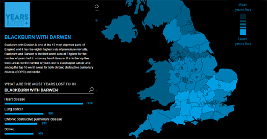
The UEA's Year's Lost interactive map shows how many years of life are lost in each local authority area in the UK. Regions on the map are colored to show the number of years lost to premature mortality. If you select a region on the map you can view how many years are lost in that area to each of the main causes of premature death. The map also includes the option to view where individual causes of death are responsible for the most years of premature mortality. Select an individual cause of death and you can view a choropleth map showing how many years were lost to that cause in each UK local authority area.

The UEA's research shows that the rates of premature mortality are twice as high in the most deprived areas of England when compared to the rates in the most affluent areas. However the Conservative Party is not listed as a cause of premature mortality. It would therefore be malicious to suggest that they are in any way responsible for the UK's shocking health inequality or the UK's sudden drop in life expectancy.

Thursday, October 25, 2018

Native American Archaeology


Native America is a four part series from PBS exploring 15,000-years of American history. It is accompanied by an interactive map which explores what archaeological artifacts found across the Americas can teach us about the lives of the American peoples.

The map take us on a tour of Native American archaeological finds. Artifacts that teach us about how goods and ideas were transported across North, Central and South America over thousands of years. For example there are the 1,000 year old chocolate pots found in Chaco, Mexico, where cacoa doesn't grow, proving that goods were traded over thousands of miles.

Other artifacts show how maize was quickly adopted throughout the Americas soon after it was first domesticated in Mexico. The map also shows the locations of cultural objects which can teach us more about the cultures and spiritual beliefs of Native Americans. These include masks found in the Pacific Northwest and in Tennessee.

Native America airs Tuesdays evening from Oct. 23. The first episode is available to watch on the Native America website.

Also See

Native Land an interactive map revealing the territories and languages of the indigenous peoples of the United States and Canada.

Global Population Pyramids


The Pudding has released a really interesting mapped visualization of the world's population. Their Human Terrain interactive map shows population density across the globe using 3D population pyramids. The taller a pyramid block on The Pudding map then the more people are living there.

The use of population pyramids is a well used and visually dramatic way to show population density. Foe example The Pudding's map is very similar to a WebGL powered map that Topi Tjukanov released earlier this year to show the density of Europe's population.


While being visually dramatic population pyramids do have some problems. Duncan Smith's interactive of World Population Density map might not be as visually dramatic as The Pudding's map but it is a lot clearer to read. If you compare the two map screenshots used in this post the bottom map is much easier to read both as a map and as a data visualization. The tilted oblique view in The Pudding Map distorts the geography of the map, foreshortening distances the further you move north. While the tall 3D towers on the map for densely populated cities obscure the data for the locations immediately to their north.

The Pudding's Map is still a very interesting map. In particular the ability to compare historical and present day population density side-by-side provides a fascinating view into population change across the globe.

Another interactive map which shows worldwide population data is the SEDAC Population Estimator (GPWv4). This interactive map uses NASA's Earth Observing System Data and Information System (EOSDIS) data to show where the world's population lives. The SEDAC Population Estimator map includes a really useful tool which allows you to draw a custom area on the map to see an estimate of the population that lives in your selected area.

Street View of Hawaii's Sunken Island


East Island, one of the Northwestern Hawaiian Islands, has disappeared. The island, the second-largest in the French Frigate Shoals, was the most important nesting place for green sea turtles. It has now been washed away by Hurricane Walaka.

Despite having been wiped off the map you can still visit East Island on Google Maps. Back in 2013 Google captured Street View imagery of the island, which means you can take a virtual walk around a now sunken island using Google's 360 degree panoramic imagery.


A map of the island can also still be seen on Google Maps. Presumably in the near future Google will remove East Island from Google Maps. Google will then have to make the decision about whether to remove the Street View imagery of the island as well. This is an interesting problem for Google. If they leave the Street View imagery of East Island on Google Maps then the map is in effect out of date. However this imagery is now an important historical record of a place that no longer exists, imagery which Google have a duty to preserve.

For the record, at the time of writing, East Island is also still on OpenStreetMap. If you are worried about rising sea levels then you can always use Flood Maps to check the effect of different levels of sea level rise on your home.

Wednesday, October 24, 2018

Mapping International Trade


Flows & Tolls is an interactive map visualizing the flow of international trade around the world. The map allows you to view the export and import of 99 different commodities around the world. It also allows you to see which commodities different countries import and export and which countries trade with which countries across the globe.

Using the 'Exports' and 'Imports' buttons you can select to view the total amount of money earned or spent by each country on exporting or importing goods. If you select the marker for a country you can see the exact figure and also the top countries who the selected country trades with. Using the drop-down menus you can select to view the global trade flows of any 1 of 99 different commodities or the import & export trades of any country.

The Flows & Tolls map also includes a number of stories. These stories pick out different variables on the map to help explain the threat to the UK's trade from Brexit, China's dominance in the global trade in toys and which countries have the largest surpluses and deficits in global trade.

Mapping Where Your Food is Grown


OneSoil is an interactive map which provides insights into European and US crop production. The map shows which crops are being grown where, revealing local and global trends in crop production. In total the maps shows what crops have been grown on over 57 million fields in the EU and the US over the last three years.

The OneSoil map was created using AI algorithms to detect the types of crops being grown around the world from satellite imagery. The algorithms are able to recognize 19 different crops with a 92 percent accuracy. OneSoil is also able to analyze from this same imagery the development stage of the crops being grown.

Using the interactive map you can view the top crops being grown in each country or region. Select a country on the map and you can see how many hectares of farmland are given over to each type of crop and the average field size for each type of crop. You can also filter the map by individual crops to show where different crops are being grown in the USA and the EU. Using the date filter you can then view the crop distribution for the last three years. This enables you to see how crop distributions have changed over the last three years, at both the local and global level.

If you are interested in which crops are grown in the USA then you might also like Bloomberg's The Consolidation of the American Harvest which maps where different crops are grown in America.

At the global level Esri's The Living Land explores how much land is given over to different crops around the world and RTBMaps shows where different root, tuber and banana crops are grown across the globe.

Satellite Evidence of China's Re-education Camps


The BBC has today released an investigation into China's re-edudcation camps, which are being used to persecute Muslims in the Xinjiang Uighur Autonomous Region (XUAR). Up to one million people in China have been detained by the government because of their religion. Uighurs, Kazakhs and other Muslims in XUAR have been arrested and imprisoned in re-education camps.

Many of the reasons for the arrest of people in XUAR have been farcical. Muslims have been arrested and imprisoned for having 'abnormal' beards, for wearing veils or for avoiding alcohol. In fact people have been arrested for any sign of religious belief or cultural affiliation.

The BBC's report China's Hidden Camps includes interviews, photographs, and expert testimony. It also includes evidence of China's re-education camps which has been gathered from satellite imagery. GMV, a multinational aerospace company, has examined 101 facilities located across Xinjiang, which could be involved in the detention of the Uighurs. By measuring the growth of these facilities over recent years on satellite imagery of XUAR and by looking for direct evidence of security fencing, watchtowers and other security features they have identified 44 of these facilities which they believe are being used as re-education camps.

China's Hidden Camps includes before and after satellite imagery of what they believe is a re-education camp at Dabancheng. Using this satellite imagery the BBC shows how the facility has grown and identifies some of the features of the camp. When the BBC attempted to visit the camp on the ground it was quickly stopped by the police and told to stop filming.

More evidence of China's re-education camps can be viewed on Amnesty International's interactive map. Amnesty International has mapped reports given to them by relatives of imprisoned Muslims in China. The map tells the stories of many Uighur citizens, most of them who live abroad, who have relatives that have been arrested and detained by the Chinese. You can view and explore the interactive map in Amnesty's Up To One Million Detained in China's Mass Re-education Drive.

Tuesday, October 23, 2018

How to Create Locator Maps


Locator maps are simple maps which show where something is located. They are used extensively, in particluar by newspapers and television news to provide an easy to understand geographical context to a news story.

You can now create your own locator map in a matter of minutes using Datawrapper's new Locator Maps tool. The tool is very easy to use. Just click on the map to add markers to the locations you want to highlight. You can then add labels to your markers. You can choose from different map styles, you can add an inset map and you can even annotate your map.


The map includes a number of other customization options which allow you to change the shape and color of your markers and customize the look of your added text labels and annotations. If you want to publish your finished Locator Map you just need to register with Datawrapper.

Locking Them Up


The state of Florida likes to lock people up. In fact if you live in Florida you have over twice as much chance of being thrown in jail or prison as someone who lives in North Dakota. You can double your chances again by being black. Florida loves locking-up African Americans.

Vera's Incarceration Rates interactive map visualizes the jail and prison populations for every U.S. county. The map allows you to explore how local incarceration rates have changed over time by providing data about jail and prison incarceration rates for every year since 1970.

The map provides bivariate choropleth views of incarceration rates at both state and county level. You can explore the prison and jail incarceration rates for individual states and counties in much more detail by selecting them on the map and and then clicking the 'full profile' option. After selecting a country or state you can view the demographics of the prison and jail population over time. This allows you to explore in more detail the racial and gender mix of incarceration rates for the selected state or county and how this has changed over time since 1970.


You might have noticed in the Incarceration Rates map that the southern states have very high rates of incarceration. We've already touched on the main reason for that - they like to lock-up African Americans. Last year The Pudding explored the legacy of slavery on modern incarceration rates in the United States. The Pudding's The Shape of Slavery allows you to view the 1860 distribution of slaves in the southern states alongside present day incarceration rates in each state.

The NAACP reports that 21% of the entire world's prison population is living in American jails. This propensity to lock up its citizens affects African Americans more than most other Americans. The NAACP says that African Americans are incarcerated at nearly five times the rate of white Americans.

There is a geographical factor at play in these incarceration rates. The Prison Policy Initiative states that "the South has consistently had a higher rate of incarceration than the other regions of the United States". The Pudding decided to explore if there was any connection between the high rate of incarceration in southern states and the legacy of slavery. By mapping 150 years of census and incarceration data they wanted to see if historic incarceration rates differ between the former slave states and the non-slave states of the north.

They do. The Pudding concludes that "we still see the shadow of the undeniable, institutionalized, strategic racism of the 100 years after the Civil War".

The TARDIS Constellation


There are 21 new constellations of stars in the night sky. These new constellations have been given names such as the TARDIS, the Albert Einstein and the Black Widow Spider. But you will need a very powerful gamma-ray telescope to view these new constellations - or NASA's powerful new interactive map.

Since the beginning of human history people have stared up at the night sky and searched for patterns in the stars. In these patterns we imagine we see animals, mythical creatures and familiar objects such as crabs, bulls, centaurs and scales. By naming recognizable configurations of stars for the patterns they resemble we have invented a classification system for the heavens.

We call each of these patterns of stars a constellation. The International Astronomical Union recognizes 88 constellations. The IAU has yet to recognize NASA's 21 new gamma-ray constellations. However you can judge the new constellations for yourself on NASA's interactive map of Fermi's Gamma-ray Constellations.

Fermi’s Large Area Telescope has been searching the universe for gamma rays, the highest-energy light in the universe, since 2008. These gamma-ray emission emanate from such things as pulsars, nova outbursts or supermassive black holes. The number of gamma-ray sources that the telescope has identified so far is about equal to the number of bright stars. Therefore NASA has decided to classify these new gamma-ray sources with a new set of unofficial classifications of constellations.

Check-out NASA's interactive map to view the Starship Enterprise, Godzilla, Schrödinger’s Cat and all the other new unofficial constellations.

Monday, October 22, 2018

Planning for Nuclear Armageddon


There is nothing that Vladimir Putin would like more than to rip up the Intermediate-Range Nuclear Forces Treaty (INF), which was signed by the Soviet Union and the United States in 1987. Actually there is one thing he would like more. He would love for the USA to unilaterally tear-up the treaty instead and let them face the diplomatic fallout from all the other countries in the world.

If you are worried about Trump's decision to restart the nuclear arms race then you might want to avoid these interactive maps which can show you the effects of a nuclear bomb falling on your house. Both NUKEMAP and Ground Zero allow you to view the potential damage that a wide choice of nuclear weapons would have when dropped on locations around the world. You can also use Outrider - Bomb Blast - which comes with far more realistic looking nuclear fallout effects.

Outrider - Bomb Blast allows you to choose from a range of different types of nuclear weapon and whether you want to detonate it at ground level or as an air burst. You can then view the likely damage on an interactive map. The map shows the likely radius of the fireball, radiation, shock-wave and heat. It also provides an estimate of the number of fatalities and injuries your nuclear weapon would cause.

If viewing these maps makes you depressed then make sure you don't look at Outrider's Nuclear Weapons section, which includes a series of articles exploring the history & human cost of nuclear weapons.


In 1945 the USA dropped two nuclear bombs on Japan, at Nagasaki and Hiroshima. To date they are the only nuclear weapons to have been used in combat. However there have been many other nuclear detonations since the end of World War II. You can view the locations of these nuclear weapons tests on Esri UK's Nuclear Detonations Since 1945 interactive map, showing every nuclear detonation since 1945.

In 1963 the Partial Test Ban Treaty came into force, which prohibited all test detonations of nuclear weapons except underground. Blast Map is an interactive map showing underground nuclear tests carried out by countries across the globe since 1963. Using data from the Northern California Earthquake Data Center the map shows all seismic events which have been determined to be not geological in nature but were instead caused by either quarry blasting or nuclear testing.

Blast Map shows the location of these quarry blasts and nuclear test sites around the world. The chart beneath the map shows the magnitude and date of each of the blasts. The chart and map are synchronized together so that the chart automatically updates to reflect the data in the current map view. You can also use the chart to refine the data shown on the map by range of magnitude and date.

The map sidebar provides links to significant nuclear testing events. For example, if you click on the 'Soviet Nuclear Archipelago' link you can view a map and chart view of soviet nuclear testing from 1964-1991. You can read a little more about the significance of these highlighted testing events and how the map was made on this Adventures in Mapping blog post.


One of the places where the most nuclear bombs have been tested is the Nevada Test Site. America's Nuclear Moonscape combines satellite views of the Nevada Test Site with a history of its use for nuclear weapon testing.

The Nevada Test Site was used between 1950 and 1992 to test over 1,000 nuclear explosions. The crater filled satellite imagery on this ESRI Story Map shows the effect of these nuclear tests on the landscape. The imagery is accompanied by a timeline explaining the history of testing at the site and showing the locations of some of the more important nuclear tests carried out here over the later part of the Twentieth Century.

The Lynching Dot Map


Charles Seguin, an assistant professor of sociology at Penn State University, has created an interactive map which shows every lynching victim in the USA from 1883-1930. Every dot on the Lynching Dot Map shows one victim of lynching by mobs of white men.

Charles Seguin is currently researching and writing a book about the history and politics of lynching in America. The Lynching Dot Map was made in collaboration with David Rigby, Alison Appling. The dots on the map are colored by the race of the victim. You can click on the individual dots on the map to view the name of the mapped victim.

You can also view the same data as a choropleth map on Lynching in the USA 1883-1930. On this interactive map individual counties are colored based on the number of lynching victims. You can click on the counties to read the names of the lynching victims in that county between 1883-1930.


You can learn more about this disgusting episode in America's history on Lynching in America. Between 1877 and 1950 more than 4,000 African Americans were lynched in the United States. The Equal Justice Initiative collaborated with Google to publish an in-depth examination of this terrible episode in American history. A Lynching in America includes interviews, audio recordings and reports into the history of lynchings in the United States. It also includes an interactive map documenting reported lynchings across the country.

Individual counties are colored on the interactive map by the reported number of lynchings in the county. You can also hover over individual states on the map to view the total number of lynchings reported in the whole state. The white dots on the map provide links to harrowing narrated tales of lynchings against individual African Americans.

A Lynching in America uses data from the Equal Justice Initiative's report 'Lynching in America: Confronting the Legacy of Racial Terror', based on extensive research into the period between the Civil War and World War II.


During the 1890's mobs of white men killed around 9 people per month. Monroe Work Today also has an interactive map of lynchings in the United States. The Monroe Work Today map shows where lynchings took place from 1835 to 1964. The map plots the locations of incidents of white mob violence across the whole of the country. Different colored markers on the map indicate whether the victims of this violence were black, Chinese, Native American or other groups of Americans.

You can select individual markers on the map to learn more about each individual instance of white mob violence. Each instance also includes links to the sources for the mapped lynching. A timeline at the bottom of the map plots the number of lynchings over time. This timeline is interactive and can be used to filter the lynchings shown on the map by any date range.

The data for the map builds on the research of the black sociologist Monroe Nathan Work, who published biannual lynching reports at the beginning of the 20th century. His reports have been enhanced and referenced with more modern research. Alongside the interactive map Monroe Work Today provides a detailed look at the life and work of Monroe Work and the history of white mob violence in the United States.

Mapping Ukraine's Displaced People


Since Russia invaded the Crimean region of Ukraine in 2014 more than one million people have been forced from their homes. The continuing fighting in eastern Ukraine and the impact of the conflict on people's livelihoods has forced hundreds of thousands of people to leave their homes and move elsewhere in Ukraine.

Reach has released an interactive map which visualizes the geography and effect of internally displaced people in Ukraine. REACH is a non-profit organization which helps aid agencies by providing assessments and mapping services in countries which are in crisis. For its Ukraine: Internally Displaced People map it used displacement data provided by the Ministry of Social Policy of Ukraine. This data only records internally displaced people who have registered to receive benefits. It doesn't show people who have moved abroad or the internally displaced who have not registered for benefits.

The map provides a choropleth view of the number of internally displaced people in each Ukrainian district. If you select a district on the map you can view the total number of displaced people since 2014, while a graph in the map sidebar shows the number of internally displaced people over time. If you select the 'Proportion of IDP's' you can view a choropleth view which has been normalized to show the number of people displaced as a percentage of the region's population.

Saturday, October 20, 2018

The China Strike Map


The ever growing manufacturing and construction industries in China have worked wonders for the Chinese economy and for the large number of Chinese billionaires who have struck it rich on the back of this industrial strength.

Unfortunately the average Chinese worker has not substantially benefited from the thriving economy. In fact they are often forced to work in what can only be described as inhuman conditions. Workers in Chinese factories often work 11 hour days, six days a week and can be paid a lot less than a dollar an hour. To do this they often live in dormitory conditions and very rarely get to see their families.

China does have labour laws but these labour laws are widely ignored. One response to the harsh working conditions, poor pay and ignored labour laws has been the growing number of wildcat strikes by workers in China. These strikes are most often not reported by the Chinese media. Which is why the China Labour Bulletin's Strike Map is so important.

The CLB Strike Map plots strikes across China. The map's default view shows the location of labour strikes over the previous six months. However you can change the dates of the strikes on the map, which is particularly useful in tracking the number of strikes reported to the China Labour Bulletin over time. You can also filter the results shown on the map by industry and by the number of strikers participating in a strike.

The China Labour Bulletin also produce an interactive China Work Accident Map, which tracks injuries and deaths which occur in Chinese factories and other places of work.

Friday, October 19, 2018

Mapping Latino Voters


California has the largest number of eligible Latino voters of any state. 7,698,000 Latino voters can vote in California. In total 30% of the state's voters are Hispanic. In West Virginia on the other hand less than 1% of voters are Hispanic. Only 13,000 Latino voters are eligible to vote in the state.

In the 2018 midterm elections there will be more than 29 million Latino registered voters across the whole of the United States. Pew Research has released an interactive map which shows you how many Latino voters there are in each state and in each congressional district.

Mapping the Latino Electorate is a choropleth map which shows the percentage of the voting public who are Hispanic in every state and congressional district. The darker the shade of green a state is colored on the map then the higher the percentage of eligible voters are Hispanic. You can hover over individual states and congressional districts to view the exact percentage of eligible voters who are Hispanic. You can also view more details on each state's Hispanic population in the table below the map.

Shipwrecks of the First World War


The Forgotten Wrecks of the First World War is an interactive map plotting the locations of historical wrecks from the Great War. It shows the known locations of wreck sites in and around the seas, coasts and rivers of the UK.

The wrecks included on the map include merchant & naval ships, passenger, troop & hospital ships and submarines. It also shows the locations of ports, wharfs and coastal buildings which were wrecked during the war. You can search the map for individual wrecks by the name of the vessel. You can also refine the wrecks shown on the map by vessel type, use at time of loss or by year.

If you select an individual wreck on the map then you can view details about the type of vessel and the year it was wrecked. You can also learn more about the vessel's size, cargo, destination and the name of the captain. The details for each wreck also include any information that is known about the vessel's loss and, where available, images of the wrecked vessel.

Americans don't know their Alsace from their Bilboa


Holiday Cottages asked Europeans and Americans to identify the locations of countries around the world on a map. They then compared the results to see whether Americans or Europeans have a better understanding of world geography. The results were not good for the Americans.

Where in the World? A Global Look at Geographic Recognition presents the results of a test involving over 1,000 people being asked to point out countries on a map of the world. The results are very interesting. Holiday Cottages has created an interactive map which allows you to view all the individual guesses made for each country. The map also tells you the percentage of people who guessed the location of the country correctly. In addition it lists the countries which were most often incorrectly identified instead.

Holiday Cottages went on to compare the accuracy of American and European answers. It discovered "that Europeans were universally more apt at identifying world countries than Americans". When asked to identify a country on the map in Asia, Africa, the Middle East and South America Europeans were always better at correctly pointing out the country on a map.

However the results are not as clear cut as Holiday Cottages suggests. Holiday Cottages are keen to argue that Americans have a poorer understanding of world geography than their European cousins. They therefore forget to point out that Americans are far better at identifying European countries than Europeans are at identifying US states. Holiday Cottages has created tables showing how well different generations of Americans can identify European countries and how well the different generations of Europeans were at identifying US states. All generation of Americans are better at identifying European countries than all European generations are at identifying US states.

Thursday, October 18, 2018

New York's Fast Food Hot Spots


Last year the London mayor Sadiq Khan announced he wanted to introduce fast food exclusion zone around London schools. The purpose of these exclusion zones are to help fight the rise of child obesity. The zones don't apply to existing fast food outlets but would apply to anyone planning to open a fast food restaurant in the future.

You can see where these fast food exclusion zones will exist on Dan Cookson's interactive map London Schools 400m Exclusion Zones. Dan's map places a 400m circle around every school in London to show all the areas where new fast food outlets will be banned under the new policy.

New York has yet to follow suit with its own fast food exclusion policy for schools. However if you are a parent of a child in the Big Apple you can refer to the New York Fast Food Map. This hexbin map visualizes the concentration of fast food restaurants in New York. The colors of the hexagonal areas on the map relate to the total number of fast food eateries within each area. The map also shows the location of all the city's middle and high schools.

You can read more about the map and the data behind it on A Walk to Fast Food.

Flying Over Trump's Wall


The Washington Post has created an impressive fly-over of the USA - Mexico border. The map takes you on a tour of the entire border, from the west coast to the Gulf of Mexico. The Post's Borderline interactive gives you a complete overview of the invisible and physical barriers which already separate the two countries and the huge job that Trump has ahead of him if he wants to build his wall.

The map provides an oblique bird's eye aerial view of the border. As you scroll down on the page you get to fly along the entire route of the border. As you progress along this border information windows appear which tell you about the existing use of fences or walls along the border. The information windows include quick links which allow you to jump ahead, along the border, to the next annotated part of the Post's interactive.

The Washington Post's interactive map is just the latest in a long line of attempts to map and document the huge job that Donald Trump has set himself. For example the Berliner Morgenpost's Trump Wall Comparison Map allows you to overlay an outline of Trump's proposed border wall between the USA and Mexico on any other location on Earth.

You can also get a good sense of the scale of construction needed to build Trump's wall in a video from the Intercept. The Intercept downloaded and stitched together 200,000 satellite images to create a huge strip map of the U.S.-Mexican border. You can view this strip map in Visualizing the U.S.-Mexico Border, a short video which pans along the whole border.

KPBS submitted a number of Freedom of Information requests to U.S. Customs and Border Protection in order to learn more about the 653 miles of the wall that already exist. You can explore what they discovered on their interactive map America's Wall. The Reveal has also investigated where the border is already fenced. You can explore Reveal's work on their The Wall interactive map. The map shows the current fence and shows where it is a 'vehicular' and where it is a 'pedestrian' fence. The map also shows where no fence currently exists.

USA Today has also completed a whole series on the US - Mexico border. USA Today's The Wall - an in-depth examination of Donald Trump's border wall includes interviews, podcasts, virtual reality and an interactive map of the border.

Unequal Neighbors


This interactive map is an interesting Visualization of Differences in GDP per Capita of Neighboring Countries. Essentially the map makes obvious where countries around the world have under-performing economies in comparison to their immediate neighbors.

On the map the reddest countries are those with the lowest relative GDP compared to their immediate neighbors. In other words the reddest countries have the poorest performing economies when they are directly compared to the economies of neighboring countries. For example Mexico has a relativity low GDP per capita when compared to the USA. If Mexico's immediate neighbors were in South America it wouldn't appear so red on the map.


Another way to assess the health of a country's economy is to examine its level of debt as a percentage of GDP. Japan has the highest level of government debt in the world using this metric. The Japanese government currently owes 214% of Japan's GDP. The PIG's (Portugal, Italy and Greece) all still owe over 100% of their GDP. The United States just misses out on being a member of the plus 100% club with a government debt of 98%.

McKinsey & Company has created an interactive map that visualizes the debt of 51 different countries around the world. The Visualizing Global Debt map provides a choropleth view of how much debt is held by each of the 51 different countries and how that debt has progressed since the global financial crisis of 2008.

The map doesn't just look at government debt. You can also visualize household debt in each of the 51 featured countries. Switzerland is the country with the highest household debt, with an average household debt of 127%. Household debt includes such things as mortgages, student loans and consumer credit. Household debt in the USA is currently 78% of GDP.

Those who like their GDP served straight up can always refer to the World Bank's map of GDP per Capita. This interactive map provides a simple choropleth view of every country's GDP per person. In 2017 the five countries with the highest GDP per capita were Luxembourg, Macao, Switzerland, Norway and Iceland.

Wednesday, October 17, 2018

Mapping the Impact of Agriculture


Esri has released the second installment in its Living in the Age of Humans series. This new story map, entitled The Living Land, explores how humans use the Earth's limited land space.

This installment of Living in the Age of Humans focuses on the impact of agriculture, which accounts for the vast majority of the Earth's surface which has been modified by humans. Just half a percent of the total land area on Earth is used by humans as urban areas. However twenty one percent of the land area of Earth is used by us for agriculture, including cropland and intensively used pastureland.

As you progress through The Living Land you can view where this cropland and pastureland exists around the world. You will also learn more about which crops are grown in different areas of the world and in which quantities. You will also discover what effects these crops have on the land where they are grown.

Unequal Education in the USA


ProPublica's Miseduction map shows where black and Hispanic students are missing out on educational opportunities compared with white students. The map uses data from the U.S. Department of Education to show which schools and districts have the best and worst racial disparities in educational opportunities and school discipline.

The map allows you to view racial disparities between either educational opportunities, school discipline, segregation or achievement. You can also switch between viewing the racial disparities for either black or Hispanic students.

ProPublica has also created a table which lists how much more likely white students are likely to be in an advanced placement class than black or Hispanic students in every state. The table also shows how much more likely black or Hispanic students are likely to be suspended compared to white students. The columns in this table can be switched to show the results in ascending or descending order so you can quickly view which states have the best and worst records.


Earlier this year Vox looked at how American schools could become less segregated. They argue that the segregation of students in the country's schools is a political decision. There is no good reason why schools are segregated and this segregation can be easily overcome if there is the political will to give all Americans equal educational opportunities.

In We can draw school zones to make classrooms less segregated Vox looks at how school districts can be gerrymandered to make them less segregated. The article includes a map tool which allows you to visualize how segregated schools currently are in your town. If you enter your school district into this tool you can view a choropleth map showing the percentage of students in each elementary school zone who were black or Hispanic in the 2013 school year.

The map allows you to view the current situation in your district using the current zoning regulations and compare this with how it would look if students were just assigned to their nearest school. Beneath the map you can see a graph which reveals if your local zoning regulations are lessening school segregation or making segregation worse

Tuesday, October 16, 2018

Every House of Representatives Election


Electing the House of Electives is a new interactive data visualization of every House of Representatives election since before the Civil War. The map allows you to explore the historical swings of political power at both the national level and, closer to home, at the regional level.

The interactive map is easy to navigate. You can view the election results for any year simply by selecting a year from the timeline beneath the map. This timeline also acts as a chart showing the number of Republican and Democrat representatives elected in each election. The map itself is colored to show which party won in each district. If you click on a district on the map you can view the name of the winning representative and the percentage of their vote.

The map allows you to switch between a choropleth and a cartogram view. The cartogram view provides a better picture of the political balance across the population as it more accurately visualizes the urban vote which is under-represented in the choropleth view.

Electing the House of Electives was created by the Digital Scholarship Lab at the University of Richmond and the Department of History at Virginia Tech. The data for the maps comes from a number of sources. This data can be downloaded from Virginia Tech.

Fly Me to the Moon


The movie First Man, about the first ever manned landing on the moon, has reignited interest in our lunar neighbor. If you are interested in following Neil Armstrong and Buzz Aldrin to the surface of the moon then you could take your first tentative footsteps by exploring NASA's Moon Trek.

Moon Trek is an interactive map of the moon created by NASA's Jet Propulsion Lab and Caltech. The map allows you to explore the named features of the moon, learn about lunar exploration and access current research about our nearest neighbor. The map also includes a 3D globe of the moon and the ability to create your own fly-overs of the lunar surface.

Moon Trek has a number of different layers which can be added to the lunar map. These layers include imagery and observations from NASA's missions to the moon. Moon Trek also includes a number of different tools which allow you to measure distances on the map and create elevation plots. You can also use Moon Trek with VR headsets to take a virtual tour of the moon and download data to 3D print selected areas of the moon's surface.

Monday, October 15, 2018

The Charles Darwin Map Projection


Benjamin Schmidt has created a map projection which has been optimized to show the track of the route of the Beagle during Charles Darwin's 1831-1836 famous survey voyage. Data-driven projections: Darwin's world is an Observable Notebook which visualizes the track of the Beagle on a map that preserves continuity near the areas where the Beagle sailed, at the expense of areas of the world that are distant from the path of Darwin's voyage.

Because the map is created in Observable you can change the data to create your own data driven map projections. If you click on the arrow next to the 'path' section of the notebook then you can edit and change the polyline co-ordinates for the Beagle's voyage to any polyline that you want. The notebook will then create a map projection based on your data.


The 'Data-driven projections: Darwin's world' notebook is a fork of the Voronoi Projection. This Observable Notebook creates a map projection based on the centroids of the 43 largest countries in the world.