Showing posts with label San Francisco. Show all posts

Saturday, August 09, 2025

Ghost Signs: Phantoms of the Past

Ghost signs are the fading painted advertisements that you often see on old brick walls and buildings. They're a window into a city's history, hinting at businesses that have long since disappeared. You can find these signs on the sides of buildings, above doorways, and in alleys - silent reminders of a past that still peeks through into our modern lives.

The HK Ghost Signs map is an historical archive of Hong Kong's ghost signs. The map itself has a striking visual style, with a black-and-white base map hinting at a vintage aesthetic - punctuated by bright pink markers highlighting the city's surviving ghost signs. Clicking on a marker on the map reveals a photograph and often some background information about the selected ghost sign’s origins.

Many of the mapped signs on HK Ghost Signs once belonged to shops and businesses that closed decades ago - their painted names and slogans surviving only as faint traces on stucco and brick. Collectively, these points form an alternative tour of the city, one that winds not along the main tourist routes, but through backstreets and forgotten facades. The map even includes 'star' and 'check-in' options for each mapped ghost sign, that make it very easy to create an itinery of signs you might want to visit and also the means to tick-off the signs once visited.

At the other end of the stylistic spectrum is the San Francisco Ghost Sign Mapping Project, which uses a straightforward Google My Map to plot nearly a thousand ghost signs across the Californian city. 

While its visual presentation is less polished than HK Ghost Signs, the project makes up for it with functionality. A handy menu lets you filter the map to show only certain types of signs, such as Building/Business signs or Ad/Brand signs. This makes it easy to focus on just one particular slice of the city’s painted history at a time.

Unrelated to ghost signs (but lovely nonetheless) - M+, Hong Kong’s museum for visual culture, has an interactive map of Neon Signs that are also dotted around the Chinese city. Bookmark both Hong Kong maps, and you may be able to find faded ghost signs sharing the same walls with neon - providing a striking clash of past and present in the same city space.

Thursday, April 24, 2025

Find Your Birthday Tree

Every year, the city of San Francisco plants a tree to celebrate my birth. Well, not just one - each year, it plants several. So far, the city has planted 455 trees on my birthday. And now, thanks to the thoughtful residents of San Francisco, there’s an interactive map that shows the exact locations of all my birthday trees.

If you’re curious, you can view the locations of all my birthday trees on the Birthday Trees map. Just enter the date of my birth, and the map will highlight every tree in the city planted on that date (if you're more interested in your own birthday trees, simply enter your own birth date instead). 

The Birthday Trees interactive map is a creative celebration of San Francisco's evolving urban forest. Designed to connect people more personally with their city's greenery, the map allows residents and visitors to discover which trees were planted on their birthday. By transforming a vast municipal database of the city's trees into a playful, personalized experience, the project hopes to create a closer connection for residents with the living, growing city around them.

Beyond its novelty, the map underscores a deeper message about environmental stewardship and community. Trees are vital for clean air, cooler neighborhoods, and climate resilience. By connecting the city's trees with our personal birthdays, the map brings those trees into our personal narratives - making it easier to see the urban forestry not just as a pretty background, but as a shared story worth celebrating.

Friday, February 21, 2025

Zoom, Pan, and Explore: Sutro Tower in 3D

Vincent Woo has released an astounding 3D model of Sutro Tower in San Francisco. Sutro Tower in 3D is a fully interactive representation of the city's 977-foot (298-meter) tall radio and television transmission tower. The model was created using thousands of aerial images of the tower, all captured by drone. These images were then processed into a fully interactive 3D model, thanks largely to Gaussian splatting

Because the model is interactive, you can fly around the tower and zoom in and out to examine any detail of the 977-foot-tall structure. It even includes interactive markers that, when clicked, provide information on various features of the tower.

If you want to experience the views from the top of Sutro Tower, you can explore three gigapixel images taken from the tower by Explore Sutro Tower. These annotated images offer a panoramic view of San Francisco as seen from the tower’s peak. Explore Sutro Tower also provides a guided tour featuring its own detailed 3D model of the transmission tower.

For those interested in exploring 3D models of other locations around the world, check out SuperSplat. SuperSplat is a free, open-source, browser-based tool designed for inspecting, editing, optimizing, and publishing 3D Gaussian Splats. Its homepage showcases hundreds of 3D models uploaded by its community of users.

Monday, September 09, 2024

AI Search of San Francisco

AI and machine learning are revolutionizing the field of remote sensing. The ability of machine learning algorithms to automatically detect and identify objects in satellite images has enhanced our abilities to monitor deforestation, identify illegal fishing, track wildlife, and more quickly implement disaster response.

Thanks to AI it is now also possible to see who owns a Tesla car in San Francisco. Bluesight.ai has released a new interactive map to demonstrate how objects can be identified in aerial imagery of San Francisco. Using natural language searches it is possible to explore the Blue Explorer map for things like Tesla cars, dry patches, boats, and tennis courts. Just type your search criteria into the Blue Explorer search box and the AI will automatically search the aerial imagery of San Francisco and show the results highlighted on the interactive map.

Some other recent examples of machine learning being used to search aerial imagery include OneSoil (which uses AI to detect where different the types of crops are being grown), Земляна проказа (identifying illegal amber mines) and Curio Canopy (identifying tree canopy cover in European cities).

Robin Wilson also recently  released an impressive Aerial Image Search Demo which allows you to explore an AI image search of aerial imagery in the UK port town of Southampton. Clay Explore is another impressive interactive AI map demo, allowing you to search aerial imagery of Southern California, Seoul and Puerto Rico using machine learning.

Wednesday, June 12, 2024

The Treats of San Francisco

Illustrated map of San Francisco's immigrant inspired food spots. A sidebar lists the places shown on the map

The California Migration Museum is celebrating one of the wonderful benefits of living in a multi-cultural city with a new interactive map of San Francisco’s food scene. Melting Spots: An Immigrant Map of San Francisco Food showcases some of the many immigrant-inspired dishes in the city which have added richer flavors to the city's food scene.

Did you know, for example, that the Mai Tai, the Tiki inspired classic cocktail, was originally invented by Bay Area bartenders in the 1940s? The Mai Tai is just one of the many immigrant inspired dishes to feature on the Melting Spots map. The map actually features 38 'bite-sized' stories celebrating the immigrant chefs, restaurants, and dishes of San Francisco. Select one of the markers on the map or in the map side-panel and you can watch a short video exploring that dish, chef or restaurant's history.

Map of North America from TasteAtlas showing popular regional foods, with images of burgers, sandwiches, seafood, traditional dishes, and desserts placed over their respective geographic locations.

If the Melting Spots map has whetted your appetite to learn more about the geography of your favorite foods then you might also enjoy the TasteAtlas. The TasteAtlas is an interactive map which allows you to explore the local foods, dishes, tastes and cuisine of any location in the world. By using this map you can discover the foods and dishes that people enjoy eating and drinking at different places around the globe. 

A great feature of TasteAtlas is that you can search the map for individual foods. For example here is the cheese map of the world and here is the bread map of the world. Search for a particular type of food and you can zoom-in on the map to discover the local varieties available at different locations. For example, on the cheese map you can zoom-in on France to discover all the local varieties of cheese available in different regions of the country. Or, if you search for the pasta map of the world, you can find out which types of pasta can be found in the different regions of Italy.

If you need a little help washing down all those amazing dishes then you can explore the TasteAtlas wine map of the world, or enjoy a tipple or two from the global beer map.

Friday, February 10, 2023

24 Hours of Ship Traffic in the Bay

Every day hundreds of container ships, high speed ferries, and pleasure boats navigate the San Francisco Bay. The job of orchestrating much of this marine traffic falls to the Coast Guard’s vessel traffic service, based on Yerba Buena Island. You can get a great idea of what this job entails on Mapbox's interactive map Ships in the San Francisco Bay.

Ships in the San Francisco Bay animates 24 hours of marine traffic in the Bay, as recorded by the Coast Guard on September 1st, 2014. On this map you can watch as container ships and other large vessels actually navigate in and out of the Bay and its various shipping ports. The map also includes a guided tour which explains some of the nuances of ship navigation and traffic in the Bay. This tour explains the role of harbor pilots, anchorages for explosives (designated anchorages for oil & gas tankers waiting to unload), and the use of turning basins in the Oakland estuary.

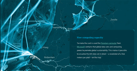
Like San Francisco Bay the North Sea also sees enormous amounts of shipping traffic. Delft University of Technology has mapped the section of North Sea marine traffic which travels past the Netherlands. 

As you scroll through Crowds on the North Sea the map zooms and pans to highlight and explore the different types of shipping traffic active off the coast of the Netherlands. This includes large ferries (used for shipping passengers to and from the Netherlands) and the container ships constantly (sailing in and out of the huge Dutch commercial ports). The AIS tracks of dredging ships can also be seen as they work to keep the main shipping routes open for all other shipping traffic.

The area of the North Sea off the Belgium coast is also one of the busiest seas in the world. In fact Belgian territorial waters are so busy that the North Sea off the Belgian coast sees more marine traffic than both the Panama Canal and the Suez Canal.

To help illustrate the huge amount of marine activity which takes place off the coast of Belgium the financial newspaper De Tijd created an animated map which visualizes 24 hours of marine traffic, using data from marinetraffic. On this animated map different colors are used to show four distinct types of marine vessel. In the story The North Sea is Teeming container ships are shown in yellow, the blue vessels are fishing boats, dredgers are shown in red and other types of ship are shown in gray.

Thursday, May 26, 2022

Polluting the Poor in San Francisco


If you are on a low income in San Francisco then you are probably breathing polluted air. On average the poorest San Franciscans have a 30% higher exposure to nitrogen dioxide than other residents in the city. If you are poor and black then you are probably breathing in even more polluted air. Neighborhoods with high densities of Black, Latino and Asian residents have on average 55 percent more nitrogen dioxide than neighborhoods with mostly White residents.

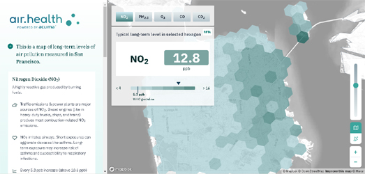
The Bay Area Air Quality Management District (Air District) and the company Aclima have joined forces to map the air pollution levels in all nine counties of the Bay Area. To achieve this Aclima drove specialized sensor-equipped cars around the Bay Area, measuring the air quality on every public street. The result is air pollution data on more than 5,000 square miles in 101 cities. Providing air pollution data for nearly eight million people.

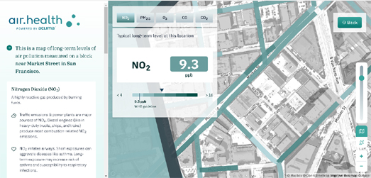
You can explore the results of Aclima and Air District's survey of air pollution levels on Air.Health, an interactive map which shows air pollution levels at the block level. Enter an address into Air.Health and you can view the individual air pollution levels for Nitrogen Dioxide (NO2), Fine Particulate Matter (PM2.5), Ozone (O3), Carbon Monoxide (CO) and Carbon Dioxide (CO2).

Thursday, May 19, 2022

The Deadly Streets of San Francisco

Six times a day, every day of the week someone is injured by a car in San Francisco. A car injures someone approximately every four hours on the city's streets. Around every 13.19 days a person is killed by a car in the city.

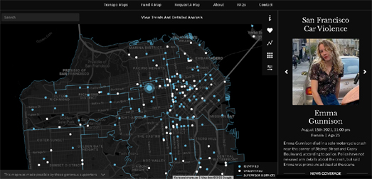
The San Francisco Traffic Fatality Map hopes to shame the city's elected officials into action by identifying and memorializing all the victims of car violence in San Francisco. The map shows the locations of every fatal motor vehicle crash on the streets of San Francisco, it identifies the victims of these crashes and attempts to explain the circumstances surrounding each crash.

On the map each identified victim of a motor crash is indicated using a blue circle (the white circle are fatalities where the victims haven't yet been identified). If you click on one of these blue circles you can read more about the victim and how they were killed. The use of names and photos has a huge emotional impact and is incredibly effective in humanizing what might otherwise have appeared as just faceless data. 

However the San Francisco Fatality Map isn't merely a memorial to the city's victims of car accidents. The map also provides data which could be helpful to the city in achieving its Vision Zero objectives. If you click on the map's 'analysis' button you can view a breakdown of San Francisco car fatalities data by date and by location. You can also explore a detailed breakdown of the data by the age and gender of the victims and of the victim's mode of transport. For example this analysis reveals that pedestrians are by far the highest number of people to be killed by cars in San Francisco.

Tuesday, October 19, 2021

San Francisco Before Colonization

Hidden San Francisco is an interactive map which reveals how San Francisco looked before it was colonized by Spanish missionaries in the late 18th century. The map displays the city's historical creeks and natural habitats which have long been destroyed or hidden by the development of one of America's most densely built urban environments.

In order to determine the location of San Francisco's historical creeks and natural habitats Hidden San Francisco used a number of different sources. This historical and ecological detective work included scouring the city's earliest surveys and oldest geological maps. Early written descriptions made by the Spanish missionaries who arrived in the area in the 18th Century were also consulted for their accounts of the natural landscape. Early photographs also proved useful in revealing details about the vegetation and natural habitats which existed in parts of the city before its urban development. 

Hidden San Francisco reminds me a lot of the Welikia Project's Beyond Manhatta map. This interactive map displays Manhattan Island and its native wildlife, as it would have looked in 1609. The map allows you to explore New York's original natural landscape of hills, valleys, forests, wetlands, salt marshes, beaches, springs, ponds and streams.

Like the Hidden San Francisco map Beyond Manhatta was developed by consulting the earliest historical maps which described the original features of Manhattan Island. Historical environmental conditions were also determined by taking soil surveys and examining tree rings. These surveys were reinforced by early historical accounts of New York, that were consulted for descriptions of the natural environment which existed before the city's development.

Unfortunately the Beyond Manhatta map is another project which has fallen foul of the increase in Google Maps API charges and the interactive map is now peppered with and partly obscured by ugly 'For Development Purposes Only' labels.

Wednesday, August 11, 2021

The San Francisco Covid Burglary Map

Here/Say Media has been inspired by claims that burglary is on the rise in San Francisco to map out the change in the number of burglaries in San Francisco since the start of the Covid epidemic. Here / Say's Interactive Map of SF COVID Burglaries shows which census tracts have seen a rise in burglaries and which tracts have seen a fall (comparing the period March 16 2020 to June 1 2021 with Jan 1 2019 to March 15 2020).

The map reveals that the experience has been very different in different San Francisco neighborhoods. Some neighborhoods, such as Sunset, Richmond & Marina, have seen large increases in the number of burglaries. Conversely other neighborhoods, particularly in the south east of the city, have seen a decrease in the number of burglaries during the Covid epidemic. 

Here / Say's accompanying article San Francisco’s Uneven Burglary Spikes by Neighborhood points out that overall crime is down in San Francisco. In particular car break-ins have fallen, possibly as a result of the fall in tourists. Burglaries have however increased by 56% overall in San Francisco. This may be one reason why many San Franciscans have the mistaken impression that crime has increased in the city.

Monday, August 02, 2021

Google & Facebook Under Water

satellite image of San Francisco Bay showing planned new builds by Google and Facebook

Both Google and Facebook are spending millions of dollars expanding their shiny campuses along the waterfront of San Francisco Bay. Campuses which thanks to climate change could be underwater within a few decades. 

Now you might be struggling to find a downside in this scenario but both Google and Facebook could be saved by hugely expensive anti-flooding measures. The costs of which are likely to be borne by the tax-payer. 

In a very impressive scrollytelling presentation NPR asks Who Will Pay To Protect Tech Giants From Rising Seas?. The presentation uses drone footage and satellite maps to visualize where Google and Facebook are building along the San Francisco Bay and how these areas are threatened by rising sea levels. Alongside these impressive visuals NPR asks some important questions about what infrastructure measures can be taken to mitigate against flooding, how much these will cost and who will pay for them. 

Google and Facebook will be the major beneficiaries of the building of anti-flooding infrastructure along this section of the San Francisco Bay. The question therefore arises as to how much these tech giants will pay towards ensuring their own protection.Surely neither company would allow the public to pick up the bill.

Thursday, December 17, 2020

19th Century San Francisco in 3D

One really fun thing that you can do with the new 3D terrain option in Mapbox GL is to view historic vintage maps in 3D. This is particularly fun in places which have very interesting terrain - such as San Francisco. San Francisco, 1857 in 3D is an interactive map which allows you to view a mid-19th Century map of San Francisco overlaid on top of the city's hilly terrain.

The vintage map is entitled the 'City of San Francisco and it's vicinity, California' and was originally published in 1857. Elevation is shown on the map using contour lines and spot heights. The map also shows the locations and names of a number of important public buildings in the city. The map reveals San Francisco during a period of massive growth caused by the California Gold Rush. 

If you like this map then you might also enjoy my Vintage Mapper demo, which shows an 1833 map of Mount Vesuvius draped over the terrain of the volcano in Italy. This 1833 map, entitled, 'Vesuvius Showing the Direction of the Streams of Lava in the Eruptions from 1631 AD. to 1831 A.D.', visualizes lava flows. These colorful flows are particularly interesting when viewed on top of Mapbox GL's new 3D terrain layer.

Monday, November 16, 2020

The Karl the Fog Tracker

San Francisco is well known for its frequent fog. In fact San Franciscans are so familiar with this weather phenomenon that they are on first name terms with their local atmospheric weather anomaly.

The reason that San Francisco sees so much fog, especially in the summer, is that big expanse of water called the Pacific. The cold ocean waters of the Pacific cools the warm air above. When this warm air cools the moisture condenses - creating fog. In the mornings the sun begins to heat the land. This hot air rises and the cooled foggy air over the Pacific is sucked inland. As the day progresses the sun heats the air and San Francisco's fog is (usually) burned off during the course of the morning and afternoon.

You can view the latest fog conditions using the Bay Area Fog Tracker. The San Francisco Chronicle's Bay Area Fog Tracker is an interactive map which visualizes the current fog and cloud conditions in San Francisco. The interactive map allows you to view a 12 hour loop of cloud and fog conditions in the Bay Area. It also includes details on the current amount of cloud cover, the height of the cloud ceiling and the current visibility (in miles).


You can see the daily pattern of San Francisco's fog very clearly on Fogust, an interactive map visualizing San Francisco's fog by time of day (and by month). The map uses historical data from NOAA's GOES-15 to provide a visual guide to the historical levels of fog experienced during different months and over the course of a typical day.

The map has three buttons for each month of the year. According to the map July and August are the foggiest months. If you switch between the 10 am, 12 pm and 4 pm buttons in July then you can observe the process described above, as the the fog forms over the Pacific, rolls inland and then gets burned off in the afternoon.

Friday, September 04, 2020

Views of the San Francisco Earthquake


The OpenSFHistory Map allows you to explore over 100,000 vintage photos of San Francisco. The historical photographs of the city feature on the map were donated to the Western Neighborhoods Project (WNP) by a private collector and provide a fascinating glimpse into San Francisco's past.

The Galleries section of OpenSFHistory includes an interactive map of photographs taken soon after the 1906 Earthquake and Fire. The 1906 earthquake and resulting fire destroyed over 80% of the city. It also killed more than 3,000 people. The photographs on the 1906 Earthquake and Fire interactive map allow you to explore this destruction block-by-block.

The map uses the Google Maps API. Which means the user has access to Google's Street View imagery. This means you can drop pegman on a photo's location to compare the historical view with how it looks today. In fact it is a bit of a shame that the map doesn't automatically display the corresponding Street View next to each vintage photo.

If you like viewing vintage photographs of San Francisco then you might also enjoy OldSF. OldSF is an interactive map of historical photos of San Francisco from the San Francisco Public Library collection.  The map itself no longer works properly (presumably Google's exorbitant API fees became too expensive) but you can still use it to explore all the vintage photographs.

The OldSF map includes a slide control which enables you to filter the vintage photos shown on the map by the date that they were published.

Tuesday, March 31, 2020

Sounds of Life in the Bay


The San Francisco Bay Area Sound Map is an interactive map which allows you to listen to over 150 different sound recordings captured in locations all around the San Francisco Bay Area.

The original recordings on the map were captured by students from the Santa Clara University's Department of Music. In these days of lock-downs, empty streets and shuttered businesses the San Francisco Bay Area Sound Map provides an eerie reminder of life before coronavirus. Using the map you can listen to the sounds of the crowd watching a baseball match, the chatter of customers in a packed pizza restaurant and the street-life of a busy Half Moon Bay. These are all sounds which have now faded into silence.

Let's hope that it isn't too long before we can hear some unrecorded sounds of normal life again. Until then you might like to explore some other sound maps using the Maps Mania Sound Maps tag.

Friday, March 13, 2020

Real-Time Bart Trains Map


If you are working from home in San Francisco and starting to miss your daily commute then you might want to play with the Track Live Bart Trains interactive map.

Select a line from the drop-down menu and you can view the live real-time position of all the operating trains on that line. Select one of the moving train markers on the map and you can view its next scheduled stop, its final destination and the number of cars.

Once you select a train's marker on the map you can follow its journey in real-time, as it moves on the map. Therefore, if you really want, you can undertake a virtual commute to work by selecting a train on the map and then following it live on the map until it reaches your chosen destination. Once you've finished your virtual commute you really should get back to doing some work.

If you normally get the streetcar to work in San Francisco then you can also follow your normal commute virtually and in real-time on NextBus. Select your route on NextBus and you can view a live map showing the location of all the current streetcars on the line.

Friday, March 06, 2020

The California Primaries


Nationwide maps of the Super Tuesday primary results are great for visualizing how the main Democratic presidential hopefuls performed across the the United States. However more detailed maps can help pick out some of the more local trends and inform you about how your local neighborhoods voted. Here are two interactive maps which can tell you how neighborhoods voted in California.

Chris Arvin has mapped out the results of the Democratic Primary in San Francisco. His SF Election Map reveals that Warren was the most popular candidate in the Castro and in District 8. Biden proved to be the most voted for candidate in much of Twin Peaks and the Marina District. Bernie Sanders appeared to be very popular across most of the city. If you select a neighborhood on the map you can view the percentage of votes won by each candidate.


You can also view the Democratic Primary results in San Francisco and the rest of California on the Los Angeles Times' California Primaries interactive map. The LA Times map reveals that much of central Los Angeles voted for Bernie Sanders. If you hover over a neighborhood on the map you can see how many votes were cast for each of the candidates.

Bernie Sanders has clearly won the California primary but the LA Times reports that the final tally will take weeks to complete.

Wednesday, January 15, 2020

Uber's New Bike Trip City Maps


Today Uber released "a new bike trip data tool that shows where and when cyclists are most active in our cities". Currently there are three interactive maps available showing bike trip data for:

San Francisco
Washington D.C.
Paris

All three maps purport to show where and when cyclists are most active using a heat map layer. The bluest lines on the map show the streets with the most cycle traffic. The maps include filter tools which allows you to view traffic density data for weekdays and weekends and for different times of the day.

Uber hasn't yet said where their mapped bike trip data comes from. However, judging by the reference to 'Jump' in each map's URL address and the fact that Uber's Jump operates in all three mapped cities, I'm guessing that the data is from journeys taken on Jump's dockless scooter and electric bicycles. In which case the maps don't show "where and when cyclists are most active in our cities", as Uber claims. These maps only show where Jump customers cycle. It is worth bearing in mind that this data could be completely different from data generated by private cyclists, journeying to and from work, to stores or for general leisure.

Although Uber's bike trip maps are only available today for San Francisco, Washington D.C. and Paris the company promises that more cities will be mapped in the future.

Saturday, December 21, 2019

The Bay Area Housing Calculator


The Mercury News has created an interactive map which shows you where you can afford to rent or buy a property in the Bay Area based on your annual income. The Housing Calculator uses data from Zillow to map the median rental and mortgage costs in each zip code area. The map reveals that unless you earn more than the median wage it is almost impossible to afford to live in the Bay Area.

If you earn less than $66,000 a year then you can forget about renting affordable property anywhere in the Bay Area. If you earn $66,000 a year then you can just about afford the median rent in Fairfield in Solano County. The cheapest place to buy a property is in Rio Vista, also in Solano County. In Rio Vista you will need to earn at least $57,200 to afford the median mortgage payment in the area.

For the purposes of this map properties are deemed affordable if the homeowner or renter is able to spend 30% or less of their gross monthly income on the mortgage or rent.


The Housing Calculator has been created as part of Mercury News' ongoing investigation of rising housing costs in the Bay Area, The Price we Pay. This three part series examines how the housing crisis is turning the Bay Area into an unaffordable area to live for all but those who earn significantly more than the median wage.

Tuesday, September 17, 2019

Segregating San Francisco


According to the Haas Institute the San Francisco Bay area is more segregated now than it was 50 years ago. The Haas Institute for a Fair and Inclusive Society at UC Berkeley has analysed levels of racial residential segregation in the Bay Area since 1980 and concluded that seven of the Bay Area’s nine counties have become more racially segregated.

You can explore the results of the Haas Institute's research on the Racial Segregation in the San Francisco Bay Area interactive map. Census tracts on the map are colored to show whether they have a low, moderate, or high level of segregation. The map includes a simple timeline control which makes it very easy to see which neighborhoods in the Bay Area have become more or less segregated over time. The map also includes filters which allows you to view how 'isolated' a specific racial group is in each county.

The interactive map is just one tool released as part of the Institute's three part investigation into Racial Segregation in the San Francisco Bay Area. This investigation explored US Census data to see how residential racial segregation has changed in each decade since 1980. While most counties in the Bay Area have become more segregated, counties, such as Napa, Sonoma, and Marin, are now dramatically more segregated than they were in 1980.