Showing posts with label census. Show all posts

Saturday, September 13, 2025

The 3D Dot Map

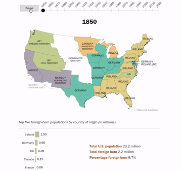
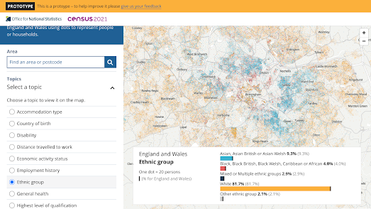
Everybody loves a good dot map, such as:

However the Toronto Dot Density Map is not just your average, run-of-the-mill dot map of census data. Yes, the map uses 2021 Canadian Census data to create dot map layers of gender, age, income, ethnicity, immigration, commute modes and commute time in Toronto - but it is also much more.

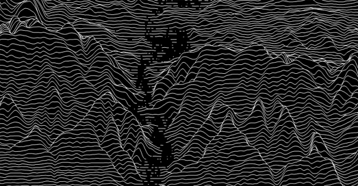
Press the 3D View button on the map and the hundreds of thousands of dots become a shimmering point cloud, forming a landscape of population density across the city. Peaks reveal Toronto’s most crowded neighbourhoods, while valleys trace the less densely populated areas of the city. The colours of the dots still represent the chosen demographic variable, letting you see not only where people live, but also how age, income, or cultural background shape the city.

The Toronto Dot Density Map is the work of the School of Cities at the University of Toronto. 

Friday, March 07, 2025

The Dot Map of America

One of my all-time favorite interactive maps was created by Dustin Cable at the University of Virginia. Unfortunately, the Racial Dot Map of America was removed in 2022. This map used data from the 2010 Census to place a colored dot on a map for every American - all 308,745,538 of them. As the name suggests, the color of each dot was determined by race.

The UVA map, based on 2010 Census data, was taken down after the 2020 Census because it was no longer considered to provide an accurate depiction of the nation's population distribution and changing racial composition.

Saddened by the loss of the Racial Dot Map of America, Luke Loreti took it upon himself to create a new version using data from the 2020 Census. His Census Dots follows the exact same methodology as the original, using colored dots to visualize the racial composition of the USA.

By using over 330 million colored dots, the map effectively illustrates the often stark racial divides in many communities. For example, in St. Louis, MO, a clear north-south divide emerges, with a dense white population in the south and a strong Black American presence in the north. The so-called Delmar Divide -named after Delmar Boulevard - is particularly evident on the Census Dots map.

Another great feature of the map is its dynamic URL, allowing users to link directly to specific locations, such as the Delmar Divide. This also makes it easy to share direct links to other interesting places discovered on the map.

Other U.S. racial dot map are also available. These include CNN's Race and ethnicity across the nation and All of US, which incorporates data from both the 2010 & 2020 Censuses.

Friday, December 06, 2024

US Segregation Maps

Visualizing U.S. Segregation Through Interactive Maps

Census Dots is an interactive map of 2020 U.S. census data. On the map, millions of colored dots each represent one individual. The colors indicate the race or ethnicity that individuals identified with in the 2020 Census. Although the map does not mention this explicitly, most census dot maps randomize the locations of dots within each census area for privacy.

Using this map, you can zoom in on any city to observe how segregated many American communities remain. To understand the historical context of this segregation, you can compare cities on the Census Dots map with historical redlining maps from the University of Richmond's Mapping Inequality:

Oakland California
side by side comparison of the redlining map of Oakland and the racial dot map of Oakland

In the image above, the redlining map of Oakland appears side by side with its Census Dot map. The red areas on the redlining map represent neighborhoods classified as "Hazardous" or "Type D." These were deemed the riskiest neighborhoods for investment and were effectively "redlined." Historically, the "Hazardous" category was often assigned to areas predominantly inhabited by Black or other "non-white" populations.

In the 2020 Census, these same neighborhoods show high densities of Black residents, according to the Census Dots map. By contrast, the green areas on the redlining maps represent neighborhoods deemed "Best" or "Type A" by redlining inspectors in the 1930s. These neighborhoods were primarily reserved for White residents. Today, according to the census, these "best" neighborhoods remain predominantly White.

Greater Seattle

The blue areas on redlining maps indicate "Still Desirable" or "Type B" neighborhoods. These areas were typically assigned to middle-class or upper-middle-class White residents.

Meanwhile, areas marked as yellow on the redlining maps - classified as "Definitely Declining" or "Type C" - represented working-class neighborhoods. These areas were often viewed as likely to "deteriorate" further and were generally excluded from favorable mortgage lending practices.

Dallas, Texas
The 1930s redlining map of Dallas shows that the "Best" (green) neighborhoods were primarily located in the northern part of the city. According to the 2020 Census Dots map, these northern neighborhoods are now predominantly White.

Redlining maps, officially known as Residential Security Maps, were created by the Home Owners' Loan Corporation (HOLC) in the 1930s in the United States. These maps were used to assess the risk of mortgage lending in different neighborhoods. The colors assigned to areas indicated their "security" for investment, which was influenced by racial, ethnic, and economic factors, leading to systemic discrimination.

In this post I have compared three cities at random. You can use the Census Dots map and the Mapping Inequality: Redlining in New Deal America to make your own comparisons.

Friday, October 25, 2024

The History of New York

Mapping Historical New York: A Digital Atlas is an amazing resource that offers an unprecedented look at how Manhattan and Brooklyn were transformed at the end of nineteenth century and the beginning of the twentieth century. The interactive map visualizes New York census data from 1850, 1880, and 1910, to reveal how migration, residential, and occupational patterns evolved over the course of 60 years. Using the atlas takes users directly to the doorsteps of historical New Yorkers, locating each individual counted in the census at their home address - sometimes even before the city’s street grid was fully in place.

Using preserved historical maps, city directories, and census records, the Digital Atlas recreates the lived geographies of New Yorkers by race, gender, birthplace, and occupation. This interactive platform invites users to explore both big-picture trends and local stories, down to individual buildings and blocks. With plans to expand to all five boroughs and up to the 1940 census, the Atlas allows you to uncover countless narratives embedded within the city’s rich past. Whether you’re exploring case studies or creating your own visual stories, this is a unique tool for diving deep into the urban history of New York.

If you live in Manhattan or Broadway the map also provides you with a unique insight into the history of your own home. If your home existed in 1850 ( or 1880 or 1910) you can find your building on the map and discover who was actually living there over 150 years ago, including information on their race, gender, place of birth and their occupations. 

For a deeper look at the design and technical enhancements behind Mapping Historical New York, the Stamen team offers a comprehensive overview in their article, Telling the Story of Changing Populations With Mapping Historical New York: A Digital Atlas. This post details Stamen's collaboration with Columbia University’s Center for Spatial Research, outlining how they used advanced cartographic techniques and interactive features to make the historical census data accessible and visually engaging for the map's users.

Thursday, August 29, 2024

The Money Mountains of Los Angeles

Map of L.A. with average household income represented by height

Nick Underwood has visualized the average median household income in each Los Angeles neighborhood using the analogy of elevation. On his The Topography of Wealth in L.A. map city each neighborhood is displaced 'vertically based on median annual household income'. 

The map uses census data to show the average household income in each Los Angeles neighborhood as a 3D tower. Sea level on the map is set at the median US income of $59,000 per year. The map reveals that a number of L.A. neighborhoods, particularly in Beverley Hills and East Pasadena, soar above the median US income. However many of these wealthy neighborhoods ' lie immediately adjacent to others with income well below the poverty line.'

According to Nick the map actually underestimates the huge disparities in income between many neighborhoods in Los Angeles. The U.S. census caps household income at $250,000+ so it is probable that some L.A. neighborhood towers should actually be a lot taller.

map of L.A. using 3d towers to show the popolation levels in each neighborhood

Using the analogy of elevation to visualize economic and demographic data can be an effective way to present a dataset geographically. For example The Pudding's Human Terrain interactive map shows the world's population density using 3D population towers. On this map the taller a block then the larger the population. 

As you might expect the Human Terrain map shows that some of the most densely populated neighborhoods in LA are in Central Los Angeles, such as Pico-Union and Angeling Heights. These areas seem to be among the 'valleys' of the Topography of Wealth map, suggesting that the most densely populated areas of Los Angeles are also among some of the poorest neighborhoods in the city.

Thursday, August 01, 2024

170 Years of American Immigration

animated map of America showing top country of birth among U.S. immigrants, by state since 1850

The Pew Research Center has analysed census data to map the changes in the immigrant population over the last 170 years. An animated map in How America’s source of immigrants has changed over time shows the top country of birth of immigrants in each state from every census since 1850 (except 1890 - the census data for this year was destroyed in a fire).

The animated map clearly illustrates the shifting waves of immigration to America over time. In the 19th Century most immigrants were from northern Europe. According to Pew from 1840 to 1889 "Germany, Ireland and the United Kingdom alone accounted for 70% of the new arrivals." Since 1990 the top country of birth of immigrants to the U.S. has been Mexico. In the last census in 2022 Mexico was the largest country of birth for immigrants in 29 different states.

According to the last census 10.6 million people in the United States were born in Mexico. The second top country for U.S. immigrants is India. 2.8 million Americans were born in India. The total U.S. population (in 2022) was 333.3 million. In terms of regions of the world, 50% of U.S. immigrants are from Latin America (Mexico alone accounting for 23%). 28% of immigrants are from Asia. While Europe, Canada and other North America countries combined contribute 12% to the U.S. population.

Thursday, June 13, 2024

Mapping the Census

mapping showing percentage of 0-14 year olds in Toronto, revealing that ther are fewer families with young children in Toronto's city center than in the suburbs
percentage of 0-14 year olds

Jacob Weinbren has released an interactive map which allows you to explore data from the 2021 Canadian census by location. Using the map you can view the demographic and economic make-up of towns and cities across the whole of the country using over 2,500 different census variables. 

The Canadian Census map colors individual building footprints based on the results of the 2021 census, providing you with an incredibly detailed breakdown of the make-up of local communities. Just select a census variable from the drop-down menu to see that data overlaid on the map.

map of Toronto showing a higher percentage of people walking to work in the city center
percentage of the workforce walking to work

For example the screenshot above shows the population of the workforce who walk to work. The results suggest that people who live in the center of Toronto live far closer to their workplace than those who live in the city's suburbs. The screenshot at the top of this post shows the percentage of the population who are aged 0-14. As you can see there are fewer 0-14 year olds in the city center than elsewhere, suggesting that many people tend to move out of the city center to the suburbs once they have kids. 

You can explore the data for yourself in other Canadian towns and cities by simply changing the location on the Canadian Census map. You can also read more about the map and how it was made in the blog post Oh Canada - Census 2021.

Monday, November 27, 2023

The World as 1000 People

If the world's population was proportionally represented as 1,000 people then 591 of those people would live in Asia, 185 would live in Africa, 91 in Europe, 75 would live in North America, 55 in South America and the remaining 5 people would live in Oceania. 

The Visual Capitalist has mapped The World's Population as 1,000 People. On the map each marker (shaped as a human figure) represents just over 8 million people. For example the USA's population of 339,996,563 is represented as 42 markers. The most populated country in the world is India with 1,428,627,663 people (represented as 178 on the map). Neighboring China is the second most populated country with 1,425,671,352 people (represented as 177).

The map uses population estimates from the United Nations Population Division.
You can also explore where people live around the world on the Pudding's Human Terrain interactive map. This map shows population density across the globe using 3D population pyramids. The taller a pyramid block on The Pudding map then the more people live there. 

The data for the Human Terrain map comes from the Global Human Settlement Layer. This data from the European Commission looks at the population living within 1 km² areas, 'regardless of administrative boundaries'. 

The use of population pyramids is a well used and visually dramatic way to show population density. For example The Pudding's map is very similar to a WebGL powered map created by Topi Tjukanov to show the density of Europe's population.

Thursday, September 21, 2023

The Global Migration Explorer

In both American and European politics immigration has become one of the most centrally contested issues. However, according to the authors of World’s human migration patterns in 2000–2019 "a global-scale, high-resolution quantification of migration and its major drivers for the recent decades (has) remained missing" from this political debate. They have therefore created their own global dataset of annual net migration for the years 2000 to 2019.

The Net Migration Explorer is an interactive map which visualizes this global net migration data at three administrative levels. The map also allows you to view population change, and birth & death levels at three different admin levels around the world.

Using the map you can explore which locations around the world have experienced net migration loss and gain for every year from 2000-2019. Many patterns of migration are clearly apparent on the map but I think the data is crying out for someone to create a guided story-map of some of the migration stories revealed by this data (although you can obviously read the authors' paper to learn more about their interpretation of the data). 

If you do want to create your own data visualization of global migration then you can download the data from Zenodo. The code for the interactive map (a Shiny R app) is available on GitHub. Both the data and the map are available under Creative Commons licences. 

Friday, September 15, 2023

The Unknown Pleasures of Population Density

This ridgeline plot map visualizes the population density of Germany. The map was made using Baryon's Population Density Ridgeline Plots for Every Country in the World. Type your county name into this app and you can see your country's population density visualized as a ridgeline plot.

The most famous Ridgeline plot (or joy-plot - as they are sometimes called) appears on Joy Division's famous album cover for Unknown Pleasures. Peter Saville's cover for Unknown Pleasures was inspired by a visualization of the radio waves emitted by a pulsar, which was published in the Cambridge Encyclopaedia of Astronomy. 

Baryon's population density ridgeline plots use NASA's Gridded Population of the World data to show the density of population along lines of latitude. The result is that areas with high density in a country appear as peaks on the map. 

You can also create ridgeline plots for any location on Earth using Peak Map. Peak Map is a fantastic interactive map which can create an elevation ridgeline plot map for anywhere in the world. To create your own joy-plot map you just need to center Peak Map on your chosen location and a very artistic elevation profile will be generated automatically.

Peak Map includes a number of options which allow you to change the appearance of your generated joy-plot. The automatic setting draws black lines on a white background but you can choose your own background and line colors (my example above flips the default to show white lines on a black background). You can also change the height scale and smoothness of the elevation lines on your joy plot map and even reduce the joy plot map's opacity to reveal a labelled map beneath.

Saturday, July 08, 2023

Divorced, Befriended, Married or Died

Madrid's Almendra Central is an island of bachelors surrounded by a sea of married couples.

Spanish newspaper El Confidencial has used 2021 census data to map out whether there are more single people or married couples in every census tract in Spain. An interactive map in the paper's Singles in Your Area, Street by Street colors every neighborhood in the country depending on whether the majority of adult occupants are married, single, divorced or widowed. 

When zoomed out on the map it appears that marriage reigns supreme in most of Spain. However if you zoom in on Spain's biggest cities, such as Madrid, Barcelona and Valencia, you find that many central areas are dominated by singles. El Confidencial notes this trend but hasn't attempted to explain the pattern. It would be interesting if the map included the average age in each census tract because I suspect that city center neighborhoods might be dominated by younger age groups (who are less likely to be married). I also suspect that when people marry in these central neighborhoods they often look to move out to the suburbs to raise their children.

The map does include options to look at the total population over 15 and the average income in each census block. If you hover over a tract on the map you can also view the percentage of the population in the census tract who voted 'left', 'right' or 'other' in the 2019 election. 

Also See

Interactive Singles Map of USA (using 2012 data)
UK Legal Partnership Map (2021 census)
Single Population of Ireland (2016 Census)

Friday, June 09, 2023

America's Pink Migration Banana

The San Francisco Chronicle has published a fascinating map which visualizes net migration in US counties. On this map counties which have seen a net loss in migration are shown in pink and those that have seen a net gain are shown in blue. The map therefore provides a great overview of where Americans are moving to and from.

The Where People are Moving map reveals a pink banana running down the center of the United States. The majority of counties in North and South Dakota, in Nebraska, Kansas, western Oklahoma, and western Texas have seen a net loss in migration. Which means that more people are leaving these areas than are moving in (this isn't true in eastern Oklahoma and eastern Texas, where the majority of counties have seen a net gain in migration). 

Maine appears to be one of the states in America where residents have no desire to leave. Only one county in the state on the Chronicle's map shows a net loss in migration. Every other county in the state showed a net gain in migration. Florida is another state which has a large majority of counties showing a net gain in migration. It is the only state where I would take a stab at guessing the reasons behind its current migration trend - namely it is a popular place for retirement for the baby boomer generation.

The Chronicle's accompanying article is concerned mainly with the 'urban exodus' (particularly from San Francisco). They see the map as showing that people are migrating out of cities to the suburbs in response to the Covid panademic. The Chronicle's map isn't a great visualization of this pattern as it shows migration loss and gains at the county level. The Chronicle could have added city boundaries to the map to more clearly reveal the migration gains and losses in cities.

The data for the map comes from the Internal Revenue Service, which records changes of addresses on people's tax returns. The "data is based on the reported mailing address on tax returns filed to the IRS for the 2020-21 tax year" and the map shows net migration loss and gains between 2020 and 2021.

Friday, April 14, 2023

Population Stripes

Julien Gaffuri, a cartographer at Eurostat, has created an interactive map which allows you to place stripes of any size and orientation on a map of Europe and discover the percentage of the continent's population living within the area covered by the stripe.

Julien's Population Stripe map uses population data from the statistical office of the European Union, and provides some very iinteresting ways to explore and visualize population density across Europe. For example the animation above shows the percentage of the population in Europe in horizontal stripes from north to south. It shows how little of the EU's population live in the north of the continent. 

This can be visualized even more clearly by changing the size of the stripes:

We can adjust the orientation of the stripe to also explore the proportion of the EU population which lives in the eastern and western half of the continent. This reveals that the east-west split is a little more even than the north-west split. 
Julien Gaffuri has also created an interactive map which allows you to use circles to explore the EU's population, instead of stripes. His Population Circle map allows you to place a circle of any size anywhere on a map of Europe to discover the percentage of the population who live within the area of the circle.

Saturday, March 04, 2023

Racial Dot Density Maps

In the United States there are a number of interactive maps which use census data to visualize the population density and racial mix of local populations. For example CNN's Race & Ethnicity map uses colored dots to show the racial diversity within every census tract in the country.

In the UK the Office for National Statistics has now released a Dot Density Prototype map for the 2021 UK census. This map allows you to visualize a whole range of household data in dot density format. The data available includes ethnic groups. Which means you can explore for yourself the racial density of different ethnic groups in any neighborhood in the country (the screenshot above looks at the density of ethnic groups in the city of Birmingham).

What is really impressive about the ONS map is the range of household data that you can explore. For example if I look at my census tract in East London I can see that 55% of the local houses are occupied by just 1 person, over 38% of the local population were born overseas, 42% don't own a car, and only 7.8% don't own a passprt. 

Also See

The Racial Dot of Brazil - 190 million dots colored by race 
Dot Map of South Africa - a racial dot map, with options to also view first languages and household income

Saturday, February 11, 2023

The Population Density of West Coast Cities

A couple of days ago Maps Mania featured Nat Henry's 15-Minute Map of Seattle. Nat has also created interactive maps which visualize the population density of the West Coast’s six largest cities. These Population Density maps color census tracts in each city based on the local population density (population per square mile). 

Nat's population density maps use data from the 2020 census to show which census tracts in each city have the highest and lowest population density. You can hover over individual tracts on each map to view the exact population/square mile and to see how the tract ranks (in terms of population density) compared to all the other census tracts in the city and all the census tracts in the West Coast's six largest cities. According to Nat's analysis "San Francisco contains eight of the top 10 densest census tracts" in all of the six largest West Coast cities.

Nat has also used 2020 census data to map the most populous racial / ethnic group (and second most populous group) in each census tract in the six featured cities. He has also used the Simpson Diversity Index to map the racial diversity in each tract in all six cities. On these racial diversity maps census tracts colored red score low on the diversity index (meaning a lot of the population are of the same racial / ethnic group) and census tracts colored blue score high on the diversity index (the population is evenly divided among racial / ethnic groups). 

Thursday, January 19, 2023

Explore Your Neighborhood Profile

The UK's Office for National Statistics has released a fantastic new tool which allows you to explore the results of the 2021 census for any custom area in England and Wales. This means that you can explore the demographics of your local neighborhood simply by drawing its outline on an interactive map.

Build a custom area profile allows you to select an area by name or postcode. It also allows you to draw your own custom area on top of an interactive map. Once you have defined your area the tool displays the number of people living there based on the 2021 census. If you click on the 'Build Profile' link you can then explore other data gathered from the census.

Select 'Age Profile' and you can view a breakdown of the age groups in your selected area. Select 'Ethnic Group' and you can explore the percentage of different ethnicities in your area. In total there are 31 different census topics which you can explore, including data related to housing, work, and education.

You can also explore the 2021 census results for your area on the Census Maps tool. This tool allows you to explore the same census data. However this map only shows the data for predefined census output areas and doesn't allow you to draw your own areas of interest. 

Thursday, January 05, 2023

The Land of Generation X

Modal Age by Neighbourhood is an interactive map which visualizes the median age of the population in English and Welsh neghborhoods (middle-layer super output areas), using data from the 2021 census. The map provides a fascinating insight into the average ages of the countries' towns and cities (a Median Age map is also available).

By area of land (but not necessarily by population) England and Wales belongs to Generation X. According to this map in most rural areas of England and Wales the average year of birth comes between 1965 and 1980. However in most of the large towns and cities of England and Wales the largest generational group is Millennials (1981-1996). 

Boomers born 1946-1964 appear to like to retire the coast. The coastlines of Somerset, Devon and Norfolk all contain neighborhoods where the average age is over 56. At the other end of the scale, if you want to find neighborhoods dominated by Gen Z (born 1997-2021) you need to look in University towns.

Alasdair Rae has also been publishing a number of visualizations of census age data to his Twitter stream, including this impressive animated map showing the percentage of people of every age (0-100).

Wednesday, November 30, 2022

England is No Longer a Christian Country

New data from the 2021 UK census shows that for the first time less than half of the people of England & Wales identify as Christians. In last year's census 5.5 million fewer people described themselves as Christian than in 2011.

The Church of England plays an integral role in UK life. 27 bishops are automatically given seats in the House of Lords (the upper house of the UK parliament) and schools in the country are required to teach and worship the Christian religion. The new census data has led to renewed calls for the disestablishment of the Church of England, to end its status as the official church of the UK.

You can explore support for the Christian religion and the support for other religions on the Office for National Statistics Census Mapper. This interactive choropleth map allows you to view the percentage of people who identify with the Christian, Muslim, Jewish, Buddhist, Hindu, or Sikh religions, or who identify as non-religious. 

One interesting pattern revealed by the map is that inner-city census tracts seem to have fewer Christians than suburban and rural areas. This doesn't mean that these areas necessarily have more people identifying as non-religious. The drop in the percentage of people identifying as 'Christian' in inner-city areas appears to be because these areas are more ethnically diverse. In other words more people in these areas identify with non-Christian religions.

Across England & Wales 37.2% of the population said they had no religion. 46.2% of people said that they were Christian. On current trends by the time of the next census in a decade's time there will be more non-religious people than Christians in England & Wales. 

If you select 'No religion' on the ONS map you can view the areas of England & Wales where the majority of the population already identifies as non-religious. South Wales in particular has a cluster of census tracts where the majority of the people have no religion. Norwich and Brighton and Hove also stand out as cities where over half the population identify as non-religious. Interestingly both Norwich and Brighton & Hove have a relatively high percentage of White residents, compared to other cities in England & Wales. This may suggest that there is a higher percentage of people identifying as non-religious in the White population than there is in other ethnic groups.

Monday, November 28, 2022

Do You Live in A Disadvantaged Neighborhood?

A new interactive map identifies neighborhoods in the USA which are "considered disadvantaged communities". The Climate and Economic Justice Tool was developed by the Council on Environmental Quality in order to help the government meet the Justice40 initiative, under which federal funds should be targeted at communities which are "overburdened by pollution and historic underinvestment."

If you enter your address or zip-code into the map you can discover if your census tract is designated disadvantaged or not. You can also view a host of data which reveal how your census tract ranks in comparison to other areas using a number of socio-economic and environmental metrics. 

The map identifies 27,251 census tracts in the U.S. as disadvantaged or partially disadvantaged. A tract can be identified as disadvantaged if it is seen to have a 'burden' related to climate change, poor transportation, legacy pollution AND where average household income is less than or equal to twice the federal poverty level.

Saturday, November 05, 2022

Find Your Neighborhood Twins

If you live in California you can find out which other neighborhoods in California are most similar to your neighborhood using the new MixMap tool. MixMap is a 'place-based semantic similarity platform'. Or, in more simple terms, it is an interactive map that can help you find census tracts which have very similar census data results. 

To use the map simply click on any census tract in California. The map will then color all other census tracts based on their socio-economic and demographic similarities to your selected tract. A table beneath the map will list the top 5 census tracts in California most similar to the tract you have chosen (you can click on any of these listed tracts to see their locations highlighted on the map). 

The socio-economic & demographic census data being used to calculate the tract similarity are age, race, income, education, commute and proximity. In the map sidebar you can adjust the weighting given to each of these individual metrics when calculating the similarities. For example if you just want to find the census tracts with the most similar age range distributions you can adjust the age mixer to 100 and set all the other metric mixers to zero.

You can also adjust the 'map type' in the map sidebar. The default view is a choropleth map which colors each tract based on similarity. You can adjust this to the 'Most/Least' view which changes the map to show just the most and least similar tracts - colored blue and red on the map.