Skip to main content
Search
Search This Blog
Maps Mania
Posts
Showing posts from October, 2023
Show all
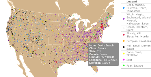
October 31, 2023
The Spookiest Places in the USA
October 30, 2023
Halloween's Most Haunted Places
October 30, 2023
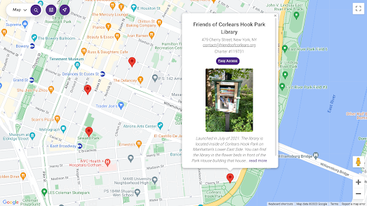
The Little Free Library World Map
October 28, 2023
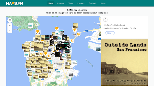
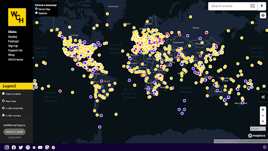
The World Map of Podcasts
October 27, 2023
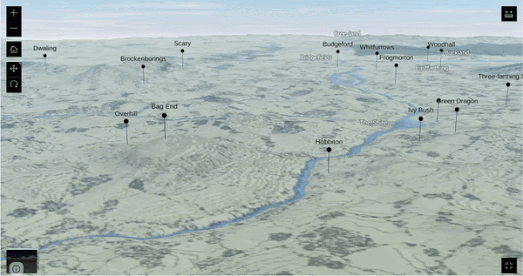
3D Middle-earth
October 26, 2023
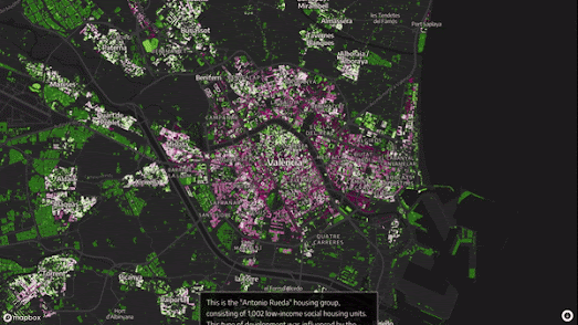
Why the Spanish Like Vertical Living
October 25, 2023
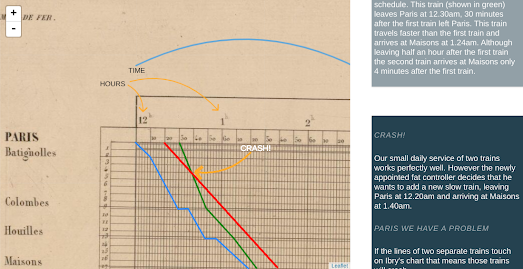
How to Avoid a Train Wreck
October 23, 2023
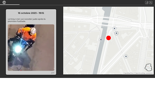
Mapping the Brussels Terrorist Attack
October 21, 2023
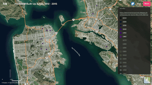
Mapping the Growth of America
October 20, 2023
Ephemeral Tweets
October 19, 2023
The Rising Risks of Wildfire
October 18, 2023
The 2023 Polish Election
October 17, 2023
The Working Class History Map
October 16, 2023
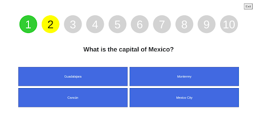
AI Geography Quizzes
October 14, 2023
Tokyo Live
October 13, 2023
Intelligent Directions
October 12, 2023
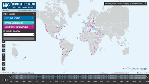
The Hezbollah Map
October 11, 2023
Mapping the Causes of Haze
October 09, 2023
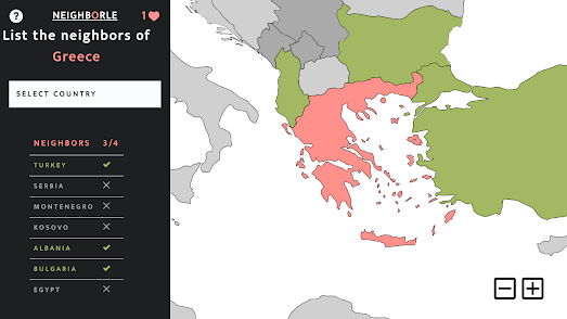
Guess Thy Neighbor
October 09, 2023
Light, Shadows & Fog
October 08, 2023
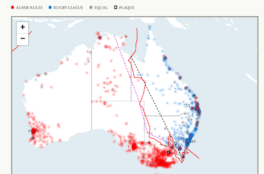
Mapping the Barassi Line
October 07, 2023
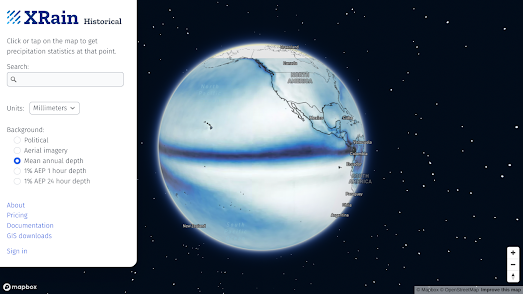
The Ring of Rain
October 06, 2023
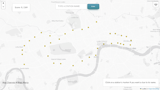
The London Underground Map Quiz
October 05, 2023
Your Perfect Weather Map
October 04, 2023
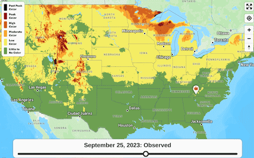
The 10 Day Fall Color Forecast
October 03, 2023
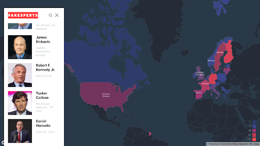
Shilling for Putin
October 02, 2023
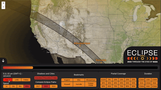
The October Solar Eclipse Map
October 01, 2023
Inside the Tombs & Pyramids of Egypt
Newer Posts
Older Posts
Home