Thursday, February 29, 2024

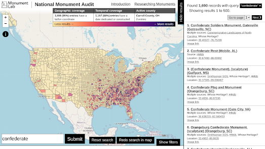
Who Deserves a Monument Anyway?

map showing the distribution of Confederate mounuments in the USA
Distribution of Confederate monuments

Thanks to Geochicas and the Mapping Diversity project there has been quite a lot of data analysis undertaken over the last few years into the lack of diversity in the street names of cities around the world. According to Mapping Diversity in the 32 cities which they have analyzed "More than 90% of the streets named after individuals are dedicated to white men."

Of course naming streets after white men isn't the only way that we ignore the contributions to society by the majority of the population. We also like to raise monuments to white men. According to the National Monument Audit in the United States public monuments are predominantly representations of wealthy white males. In the top 50 represented individuals in US monuments only three women (Joan of Arc, Harriet Tubman, and Sacagawea) feature and only five black or indigenous individuals are recognized (Martin Luther King Jr., Harriet Tubman, Tecumseh, Sacagawea, and Frederick Douglass).

You can explore the geographical distribution of US monuments on the National Monument Audit interactive map. The map shows the number of monuments in every county in the United States and allows you to search and visualize the 48,178 data records that make up the National Monument Audit database of monuments. 

Using the map you can search by keyword and/or by geographical region. For example the screenshot at the top of this post shows the distribution of 'Confederate' monuments across the United States. More analysis of the National Monument Audit can be found in the Audit Report.

If you are particularly interested in monuments to the Confederacy you might also like Whose Heritage? Public Symbols of the Confederacy. The Southern Poverty Law Center has mapped over 1,500 public symbols of the Confederacy across the United States. These public symbols include not only statues but schools, parks and roads which have been named for Confederate leaders or battles.

The SPLC has created its own map Whose Heritage? Public Symbols of the Confederacy showing the location of these Confederate symbols and memorials. The SPLC map uses color coded markers to show which are monuments, which are schools and which are roads. 

If you select a marker on the SPLC map you can also see the year that the selected memorial to the Confederacy was dedicated. Another interactive map, Axios's Confederate monuments in the U.S. over time, reveals that the majority of these Confederate monuments aren't even a century old. In other words most Confederate monuments actually have very little heritage or historical value.

Tuesday, February 27, 2024

Online GeoJSON Editors

  1. Placemark Play
  2. geojson.io
  3. Vector GeoJSON
  4. Geoman Geojson Editor
I use online geojson editors very regularly to create and edit geographical data. I find online editors particularly useful for tidying up and minimizing third-party data which I have downloaded from elsewhere. For example an editor can be very useful for previewing data exported from overpass turbo, and then manipulating that data into a format that you can then use with any of the popular javascript mapping libraries.

Placemark Play

a screenshot of the Placemark Play geodata editor
Placemark Play is an open source online geodata editor which can be used to import and manipulate geographical data and then export the data in a number of different formats. The editor features a number of drawing tools which allow you to draw points, lines and polygons directly onto a map. 

Unlike many of the other online geodata editors Placemark Play includes a number of editing tools, which allow algorithmic operations on your data, like buffering. When you have finished manipulating geodata with Placemark Play you can export your data in geojson, KML, CSV, topojson and shapefile formats. You can also export a snapshot of your completed data as an SVG image.

geojson.io

screenshot of the geojson.io geodata editor
I definitely use geojson.io more than any other geographical data editor. Using geojson.io's drawing tools you can create points, lines, and polygons directly on a map.I particularly like geojson.io's table view, which makes it very easy to delete surplus features in your data. Geojson.io also has a number of options for exporting your data. As well as saving your finished data as geojson you can save spatial data in shapefile, topojosn, CSV or KML formats.

Vecor GeoJSON


Vector GeoJSON is another popular and useful online GeoJSON editor. Like geojson.io this online editor can be used to create or edit GeoJSON data directly from your browser. Using Vector GeoJSON you can import data which you have saved from elsewhere. Alternatively you can create data from scratch by adding points or polygons to the Vector GeoJSON map. When you have finished creating or editing your spatial data you can save it as a GeoJSON file. Vector GeoJSON also has an option to covert your GeoJSON to a shapefile (via the ogr2ogr web client).

Geoman Geojson Editor


Geoman's Geojson Editor is another option for editing geojson data online. Using the Geojson Editor you can create, view, edit and share geospatial data in your browser. Where the Geojson Editor excels is in its excellent drawing tools.

The GeoJSON editor uses Geoman's own Leaflet-Geoman drawing tools to help you create your spatial data. These drawing tools allow you to add squares, circles and lines to an interactive map and then grab the geojson data to export the data to your mapping projects. I particular like the 'cut layers' tool which allows you to create holes in your polygons (sometimes known as canvas masking).

When you have finished manipulating your geographical data with Geojson Editor you can download the data you've created as a geojson file or in KML, CSV, TopoJSON, WKT and shapefile formats.

The Supply Chain of Deforestation

a map and graph showing how Proctor and Gamble contribute to palm oil production and deforestation

Palm oil production is a major contributor to deforestation, particularly in Southeast Asia. To meet the growing demand for palm oil, every year vast areas of rainforests and other ecosystems are cleared and converted into large-scale oil palm plantations. 

Palm oil is the most widely used vegetable oil globally and it is found in around half of the products in your local supermarket, including a huge number of processed food products, cosmetics, cleaning products and biofuels. This means that most of your favorite supermarket brands directly contribute to deforestation and global heating.

Personally, both for health and for ethical reasons, I try to avoid buying processed foods. Avoiding processed foods is probably one of the most effective ways you can help reduce your consumption of palm oil. As an ethical shopper you may also want to learn a little more about which major brands are involved in the production, processing and consumption of palm oil.

The new PalmWatch interactive map allows you to explore where the production of palm oil is leading to deforestation and the role that some of the world's leading brands play in that deforestation. The map itself visualizes deforestation caused by individual palm oil mills around the world but PalmWatch can also be used to explore the involvement of individual major brands to this deforestation.

Using PalmWatch you can explore the impact of 15 major consumer brands, including Mars, Proctor and Gamble, NestlĂ©, and Unilever, to the production and distribution of palm oil. You can select 'brand impact' to learn more about the levels of deforestation a brand is historically responsible for. You can also use PalmWatch to explore the supply chains of palm oil production to learn more about the link between major brands, the main palm oil mill company groups, and their impact on deforestation.

a map showing the satellite detected fires in Borneo in September 2019

85% of the world's palm oil comes from Southeast Asia. This palm oil is produced by destroying the rainforests and the habitats of endangered species like the orangutan, the Sumatran rhino and the pygmy elephant. You can learn more about how palm oil production is effecting just one Southeast Asian island in CNN's Borneo is Burning.  

In this special report CNN uses a story map format to explain how the consumption of palm oil is causing the destruction of Indonesia's rainforests. In order to clear land to grow oil palms farmers light illegal fires. And it isn't just the rainforests which are burning. This is a double whammy of an environmental crisis, because these fires are also destroying the peatlands that lie beneath the forests. Peatlands which are the world’s largest natural terrestrial carbon sink.

The illegal fires started by palm oil farmers produces smoke which spreads across Southeast Asia affecting the health of people living in Indonesia, Java, Singapore and Malaysia. In 2019, in Indonesia alone, 920,000 people were treated for acute respiratory problems caused by the smoke from the burning of rainforests.

The negative impacts of palm oil production don't stop there. By destroying the rainforests palm oil farmers are also destroying the natural habitats of orangutans and many other animal and plant species. In fact the scale of deforestation in Borneo means that the orangutan is now one of the most endangered species on the planet. 

Monday, February 26, 2024

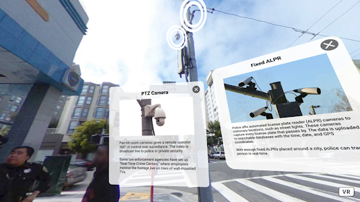
Street View Surveillance

A street in San Francisco with CCTV, licence plate readers and other surveillance equipment on view

The Electronic Frontier Foundation's Spot the Surveillance game is a virtual reality game which requires players to identify surveillance equipment in a panoramic image of a San Francisco street scene. Panning around this 360 degree view players are required to detect the every day surveillance equipment which is now routinely used on America's streets, such as body-worn cameras, automated license plate readers, drones, and pan-tilt-zoom cameras.

Spot the Surveillance is best played with a virtual reality headset but can be played using a standard computer browser as well. In the standard browser version of the game you simply need to click on any surveillance tech that you can spot and an information window will open confirming your guess and explaining how that tech is used.

a US Border Patrol aerostat ballon on Google Street View

I believe that Spot the Surveillance was originally released in 2020 but I only discovered it today via The Markup's report on A Virtual Reality Tour of Surveillance Tech at the Border. In this article Dave Maass of the Electronic Frontier Foundation takes Monique O. Madan of The Markup on a virtual reality tour of the U.S.–Mexico border. 

The article includes a list of links to Google Maps Street View panoramas from a number of locations along the border, all of which contain examples of US Border Patrol surveillance technology in action.

a side-by-side comparison of London and Los Angeles maps, showing the density of CCTV cameras in each city

Of course the U.S. isn't the only country in the world where surveillance technology has become ubiquitous. Surfshank's Surveillance Cities examines the density of surveillance cameras in cities around the world. By calculating the number of CCTV cameras per km2 in the world's 130 most populous cities Surveillance Cities is able to make direct comparisons between different global cities. 

The article includes an interesting mapped visualization which allows you to directly compare the density of CCTV cameras in any two of the 130 cities surveyed by Surfshark. For example the screenshot above shows a comparison of the density of surveillance cameras in Los Angeles and London.

Saturday, February 24, 2024

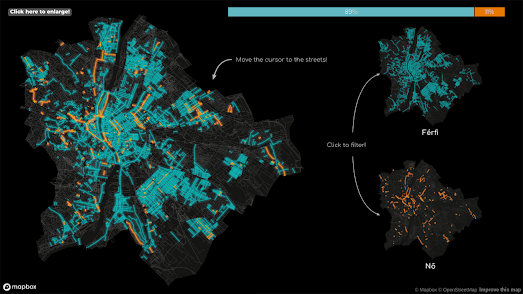
The Street Names of Budapest

map of Budapest with streets colored to show which are named for men and which were named for women

Over 2,600 locations in Budapest have place-names which derive from people. Names and Spaces - Budapest is a fantastic mapped analysis of who Budapest's streets and public spaces were named after and what this reveals about the city's history.

The map is in Hungarian but works fairly seamlessly with Google Translate in Chrome. If you don't have access to Google Translate then you can still enjoy Atlatszo's recent article about the map on the European Data Network. The article, Poets, Politicians and Saints: Budapest's Changing Street Names, takes a detailed dive into the history and politics of the 8,598 streets and squares which have been renamed at least once in Budapest's history.

The interactive map actually allows you to explore the names of Budapest's streets for yourself. Click on a colored street on the map and you can read a short biography of the person who the street was named for. The map also provides a guided tour of some of the data behind the map. For example, like nearly every other city in the world Budapest doesn't like women very much. In fact 93% of streets named after people in the city are named for men.

Further analysis in the map explores the number of statesmen, politicians, writers, scientists etc who have roads named after them; how many Hungarian streets are named for real as opposed to fictitious people; and the political periods in which place-names have been most altered.

If you are interested in the derivation of place-names then you will love the many other maps listed under the toponym tag on Maps Mania. If you are interested in the sexist street naming histories of other cities then you can explore the many maps produced by Geochicas on Las Calles de las Mujeres and by contributors to the Mapping Diversity project. Both of these projects have created a number of maps which visualize the inequality of streets named for men and women in cities around the world.

Friday, February 23, 2024

Four Seasons in One Map

a timelapse photograph of the San Francisco peaks over the course of a year

Chronolog is an interactive map of timelapse photographs designed to help monitor the environment. It is a citizen science project which encourages organizations and individuals to engage with nature while recording and monitoring the changing environment.

The Chronolog map allows you to explore timelapse photos of nature which have been captured around the USA (and one or two in other countries). These timelapses can be explored by location via the map or by category (wetlands, national park, forests, rivers etc) via the timelapse tags.

When an organization signs up to Chronlog they receive a camera bracket which can be used to ensure that all the timelapse photographs taken of a location are aligned with each other. Registered users also receive a sign which can be posted up next to the camera bracket. This sign explains the bracket's purpose and provides instructions on how to use it to contribute to the timelapse images from that location.

a timelapse of satellite images showing mining in Alberta, Canada

Changes to the environment over time can also be captured from space. This animated timelapse image shows the environmental impact of mining in Alberta, Canada from 1984 to 2022. The animation was created using Google Earth Timelapse.

Google's Timelapse site includes many other examples of timelapse images showing how the Earth has changed over time. It also gives you access to a global interactive map featuring historical satellite imagery from the past 37 years. It is therefore possible to use Google Earth Timelapse to create your own animated timelapse image for any location in the world.

Thursday, February 22, 2024

The Cyclotron

The West Midlands Cyclotron uses cycle counters installed on the roads in the West Midlands to provide a near real-time data visualization of the number of cyclists using individual roads in areas of Birmingham, Coventry and Wolverhampton (and many roads in between).

the LED inspired Cyclotron data dashboard

The most striking aspect of the Cyclotron is the design of the LED themed data dashboard. This dashboard takes its cue from the real-world digital cycle counters on the Bristol Road in Edgbaston. The actual data visualized on both the physical and Cyclotron displays comes from machine learning vision sensors placed on a number of roads by West Midlands and Birmingham City Councils. The Cyclotron uses this data to show the number of cyclists using each road by month, by day of the week and by hour of the day.

The Cyclotron map showing the location of cycle counters in the West Midlands

The Cyclotron also has an interactive mapped display. This map shows the location of the cycle counters around the West Midlands and also visualizes the number of cyclists counted by each counter over the last month. Clicking on a counter's marker on the map will enable you to view that road's near real-time (and historical) data on the Cyclotron LED data dashboard.

Via: the Quantum of Sollazzo newsletter

Wednesday, February 21, 2024

The World's First OpenStreetMap

a zommed detail of Fra Mauro's 1450 World Map

The only thing I love more than exploring historical vintage maps of the world is exploring annotated, interactive versions of ancient world maps. Now thanks to the Museo Galileo I can browse an annotated version of the world's greatest medieval map - the Fra Mauro World Map.

The Annotated Fra Mauro World Map is an interactive zoomable version of the famous 1450 Venetian map of the world. The map includes interactive annotations which allow you view translations of the map's nearly 3,000 cartouches, over 1,000 named cities, and the place-names of thousands of rivers, mountains, seas and islands.

If you enjoy exploring annotated vintage maps then you will probably also love Historia Cartarum Annotated Claudius Map. Historia Cartarum's annotated version of Matthew Paris' 13th Century map of Britain includes interactive annotations of every place-name and transcription on the Claudius Map. The result is a fantastic tool for studying one of the earliest geographical representations of Britain.

A detail from Matthew Paris's Map of Britain

Fra Mauro's world map was created around 1450 by the Italian monk and cartographer Fra Mauro. His map is a circular planisphere with south orientated to the top of the map. Fra Mauro's map is one of the first European world maps to break from the tradition of Bible based cartography. In other words Fra Mauro's map favors geographical accuracy rather than religious beliefs and mythological stories.

Fra Mauro lived in the Republic of Venice. Venice had for centuries been an important center of trade between Europe and the Middle East and Africa. Before becoming a monk Fra Mauro had himself traveled as a merchant and a soldier. As a cartographer he was therefore able to draw from his own experience and from the many Arab traders and other world travelers passing through Venice. Instead of relying purely on traditional religious maps Fra Mauro could actually get first hand accounts from sailors, merchants and other travelers.

One area where Fra Mauro's break from the religious tradition of map making is apparent is in having south at the top. Placing south at the top was common in Arab maps of the time. In contrast, most European world maps had east at the top, mainly because east was the direction of the biblical Garden of Eden. Many European maps of the time also placed Jerusalem in the exact center of the map (and therefore the world). Fra Mauro's map also breaks with this tradition.

One result of Fra Mauro's more scientific approach to map making is that his map is the first European map to show Japan as an island and to show that it was possible to sail all the way around Africa.

Matthew Paris' Map of Britain is one of the first ever geographical maps of the British Isles. It was made by a 13th Century monk called (you guessed it) Matthew Paris. Paris' map was one of the first medieval maps to move away from a schematic plan (e.g. a strip map or route map) to instead attempt an accurate geographical representation (compare the Paris Map of Britain with Mathew Paris' own route itinerary maps outlining the journey from London to Palestine).

Tuesday, February 20, 2024

The Chain Restaurants of America

map showing the locations of McDonald's outlets in the USA
Map of McDonald's outlets in the USA

The Georgia Institute of Technology's Friendly Cities Lab has released a new interactive map which reveals which chain restaurants dominate which areas of the United States. The U.S. Chain and Independent Restaurants map shows the locations of over 700,000 restaurants across the country, organized by restaurant chain and by frequency. 

The map reveals that independent restaurants are more prevalent in areas "associated with dense pedestrian-friendly environments, highly educated populations, wealthy populations, racially diverse neighborhoods, and tourist areas." For example many East and West Coast cities have a high percentage of independent restaurants. 

According to the Institute's analysis of the map a number of different factors are associated with high rates of chain restaurants. In Restaurant Chainess the Lab states that " car-dependency, low walkability, high percentage voters for Donald Trump (2016), concentrations of college-age students, and nearness to highways were associated with high rates of chainness".

Using the map's drop-down menu you can filter the restaurants shown on the map by chain. For example the screenshot at the top of this post shows the distribution of McDonald's outlets across the US. According to Friendly Cities Lab McCities (cities with a high percentage of chain restaurants) "are prevalent in the Midwestern and the Southeastern United States."

map showing the share of commuters who commute by car in the U.S.

You may have noticed that the Lab suggests that a high percentage of chain restaurants is associated with a 'high percentage of voters for Donald Trump".  Last year The Washington Post's Department of Data also reported on this curious correlation between the number of chain restaurants in a state and the number of Trump voters. According to the Post the states with the highest percentage of Trump voters also have the most franchise foods.

The Department of Data obviously knows that correlation isn't causation and that a tendency to vote for delusional wannabe dictators is not a direct result of poor nutritional choices. They therefore went looking for correlations between chain restaurants and other data. 

In the article Places in America with the most chain restaurants the Washington Post has published a number of interactive maps. One of the most interesting of these is a map showing the percentage of workers who commute by motor vehicle in each U.S. county. This map shows that there is a strong correlation between the number of chain restaurants in a state and the number of people who commute by motor vehicle. 

The Post therefore concludes that Trump won more counties with a high number of chain restaurants because he 'won more of the places with the most car commuters' -  although ''We still aren’t sure why Trump won areas with more car commuters". 

Monday, February 19, 2024

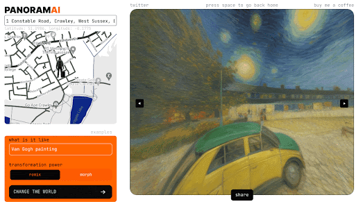
AI Your Home on Street View

A Google Street View panorama altered by AI

Have you ever wanted to radically alter the ambiance of your neighborhood? Perhaps you've always dreamed of turning your sleepy suburban road into a bustling inner-city street. Or maybe you've always wanted to dig up your nearby traffic heavy roads and replace them with green fields and trees. Well now you can - at least virtually.

Panoramai is a new fun tool which allows you to grab Google Maps Street View panoramas from any location in the world and change their appearance based on your own AI prompts. For example the animated GIF above shows my childhood home re-imagined as a Vincent van Gogh painting, as a sc-fi landscape, a post-zombie apocalypse and under 3 feet of water.

The Street View of a London Street altered by AI to look more Dutch

You can also change the appearance of your home on Street View using the Netherlands Board of Tourism's Dutch Cycling Lifestyle map.

It is a matter of great sadness to the Dutch people that people in the rest of the world are not able to live in cycle-friendly environments. Therefore the Netherlands Board of Tourism decided to help the great car-worshiping unwashed picture the beauty of a car free environment. Enter your address into the Dutch Cycling Lifestyle and you can see how your street might look without that noisy road and those dirty cars.

Like Panoramia Dutch Cycling Lifestyle uses an AI to alter the Google Maps Street View image of your street - only in this case to make it a little more Dutch. The result is an imagined view of your road, looking a little greener and probably a lot more attractive.

A Street View panorama decorated with virtual works of art

Wait! There is even more fun to be had with Google Maps Street View. Thanks to Street Galleries, you can also create your own virtual outdoors art gallery with Street View. Street Galleries is a Google Arts & Culture project which allows you to decorate cities around the world on Google Maps Street View with works of art from some of the world's leading museums.

You can choose from one of ten locations in a number of the world's major cities. Once you have chosen a location, you can begin adding paintings to the Street View of that location. Pick a painting from the Google Arts & Culture digital collections and you can hang it anywhere within your Street View panorama. You can move the painting around in the Street View, allowing you to hang the picture on a building, on the road or even just leave it hanging in mid-air.

Hat-tip: Webcurios

Saturday, February 17, 2024

The Right-Wing Terrorism Map

The RTV Map Tool is an interactive map showing incidents of right-wing terrorism and violence in Western Europe since 1990. It documents and shows the locations of 1,214 violent right-wing attacks in Europe. This includes acts of violence which led to 32 fatalities.

The map was created by the Center for Research on Extremism, at Oslo University, which studies right-wing extremism, hate crime and political violence.  The Center's RTV Trend Report 2023 (PDF) reveals that in 2022 (the year the 2023 report covers) there were less right-wing terrorism attacks in Western Europe than in any year since 2015. The report also states that in 2022 most "attacks targeted ethnic and religious minorities ... (however) 2022 also saw a small uptick in attacks against state institutions, particularly in Germany".

The RTV Map Tool allows you to explore the Center for Research on Extremism's data by location. The map includes a number of filter tools which also allow you to explore the data by date, number of people killed, number of people injured, weapon type, perpetrator type, and target groups.

In the United States you can explore the proliferation of 1,225 hate and anti-government extremist groups on the Southern Poverty Law Center's Hate Map. The map is updated annually and is based on research conducted by the SPLC into hate crimes and other forms of intolerance in the United States.

The Hate Map allows users to filter groups by ideology, such as white nationalist, neo-Nazi, anti-LGBTQ, or anti-immigrant. It also provides information about individual hate groups operating in the United States, including data on each group's location, activities, and leaders.

Friday, February 16, 2024

The Best Price Comparison Maps

 The Aldi Price Map

The Aldi Price Map shows the store price ticket of a range of products in US outlets of the popular budget supermarket (apparently the price data from European Aldi stores is not so readily accessible). 

The German supermarket chain Aldi is known for its low prices. The company now has over 2,000 stores in the United States, and in a recent poll was ranked the most popular grocery store in the country. Using the Aldi Price Map's drop-down menu you can select from a range of popular grocery products to view the current price of the product in Aldi stores across the United States. "Store pricing may change without notice and may differ from the information provided on this site".

The Big Mac Index

The Economist's Big Mac Index compares the purchasing power parity (PPP) between the currencies of different countries by examining the price of a Big Mac hamburger sold at McDonalds' restaurants in each country. The Index "is based on the theory of purchasing-power parity (PPP), the notion that in the long run exchange rates should move towards the rate that would equalise the prices of an identical basket of goods and services (in this case, a burger) in any two countries". 

It can also be used to find out the price of a Big Mac in countries around the world. 

The McCheapest Map by Pantry & Larder tracks and maps the cost of a Big Mac at every McDonalds in the United States. On this map every McDonalds' outlet is represented by a dot which is colored to show the cost of a Big Mac (green=cheaper and red=more expensive). The map can therefore be used to explore the purchasing power parity of the dollar in different areas of the United States. It can also show you where you can buy the cheapest Big Mac.
Pantry and Larder have also created a number of other popular price comparison maps. For example in the UK their How Cheap's Your Local 'Spoons map allows you to compare the prices of a huge number of alcoholic drinks in Wetherspoon pubs through the United Kingdom.

Another popular price comparison map from Pantry and Larder is Eggspensive, which compares the cost of a dozen eggs at every US Walmart.

Gas

Maps showing the price of a gallon of gas at local gas stations were once very popular. Now they are much harder to find. Sites such as GasBuddy and AAA do provide aggregated price maps which show the average price of a gallon of gas at the county or state level.

GasBuddy also allows you to search for the price of a gallon of gas at individual gas stations in different cities across the United States. It just takes a little work to select a state and your city. You then have the option to view the results of gas prices on a map by selecting the 'show map' option.

Thursday, February 15, 2024

Alien Arrivals Nosedive in 2023!

Map of UFO Sightings in the US

Where have all the interstellar tourists gone? That's the question gripping the world after a bombshell report revealed a staggering 19% drop in alien visitation in 2023! Is this a sign of a permanent shift in galactic travel? Or can the Earth win back alien vacationers?

According to the National UFO Reporting Center sightings of little green tourists were down 19% in 2023 compared to 2022. Could it be that humanity's warmongering and environmental pillaging have finally driven the aliens away in disgust? Or maybe this sudden drop in alien tourism is a prelude to something far more sinister. Are the aliens simply regrouping, preparing for a full-scale invasion?

Side by side comparison of UFO sightings with a US population density map
US UFO Sightings map compared to a population density map from Visual Capitalist

Perhaps it is time someone took a deep-dive into the data to discover the real reasons for the alarming drop in alien probing in 2023. One common comment on the National UFO Reporting Center's map of UFO Sightings is that it closely resembles a population map of the United States. The implication of this criticism is that the National UFO Reporting Center map is much better at showing where people live in the US than it is at showing where aliens are actually visiting.

Thankfully Axios has gone to the trouble of normalizing the National UFO Reporting Center's data for 2000-2023 to create a Reported UFO sightings per 100k residents map at the county level. Now we can see where in the United States more UFO sightings are being made per person than in other areas of the country.

The Axios map reveals that the further west you travel in the United States then the more likely you are to be visited by aliens. Axios claims that their map 'roughly correlates to dark sky locations'. Unfortunately the Axios map also leaves us in the dark as to why alien sightings fell so dramatically last year compared to 2022.

(Someone at Axios also forgot to add the locations of all the airbases in the United States to the UFO sightings map. Not that I'm in any way suggesting that anyone is likely to mistake an aircraft for a flying saucer in the middle of the night).

Wednesday, February 14, 2024

The Sad State of Local News 2023

Northwestern University's The State of Local News Outlook is an interactive map which visualizes the number of surviving local newspapers in every county in the United States. On this local news map individual counties are clored to show whether the county has 0, 1 or 2 or more news outlets. The data shown on the map can also be filtered to show the number of local number of newspapers, the number of digital sites, ethnic outlets or public broadcasters.

The map is based on Northwestern University's latest annual census and report on the local news ecosystem, The State of Local News 2023. The report and the resulting map reveal that in 2023 there are now 204 counties in the US which have no newspapers, local digital sites, public radio newsrooms or ethnic publications. Another 228 counties are on the “Watch List”. These are counties that the report suggests are in danger of losing their one remaining local news source. The report also warns that "On the current trajectory, by the end of next year, the country will have lost a third of its newspapers since 2005".

According to the report geography appears to play a large role in determining where local news is thriving and where it is dying. In 'affluent cities and suburban areas' alternative news sources are emerging to fill some of the gaps left by closing local newspapers. Whereas those living in poorer, rural communities are more and more living in local news deserts. 

Wikipedia's List of Defunct Newspapers of the United States includes the names of over 1,000 newspapers which are no longer in print. Many of these papers collapsed decades ago. However a large proportion of these newspapers are victims of the accelerating loss of print newspapers over the last 20 years. The list only contains the most "notable names" of the thousands of newspapers that have closed in the US.

If you are interested in discovering which local newspapers are still active in your area then you can refer to the Newspaper Map. The map provides links to the websites of thousands of local newspapers around the world (although I'm not sure how well maintained the map is as some of the links appear to be broken). 

Tuesday, February 13, 2024

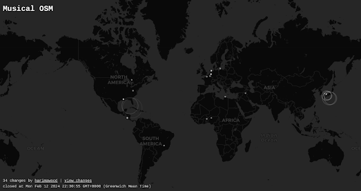
OpenStreetMap Edits in Real Time

OpenStreetMap (OSM) is a free, editable map of the whole world, built and maintained by a community of volunteers. It is often described as the Wikipedia of maps, to which anyone can contribute and update information. Very importantly all of the map data contributed to OpenStreetMap is open data, which anyone and everyone is free to use.

In a way maps have always been produced through collaboration. The cartographers of early Mappae Mundi created their world maps from geographical knowledge gained from the Bible, early explorers and the writings of even earlier cartographers such as Ptolemy. Early Portolan charts might also be said to be crowd-sourced, relying on the accumulated experience and shared knowledge of routes, landmarks, and hazards, acquired by generations of Mediterranean sailors.

What makes OpenStreetMap truly unique is both the global scale and immediacy of its underlying map data. It is a map which is constantly being updated in real-time all around the world by millions of volunteers with knowledge of their local areas. If you want to get an idea of the scale of OpenStreetMap's crowd-sourced reach then you can view these map edits happening in real-time on these two interactive maps:

Screenshot of Musical OSM showing real time edits of OpenStreetMap on a world map

Musical OSM allows you to not only view edits being made to OpenStreetMap but also allows you to listen to them being made in real-time. Whenever a new Open Street Map edit is committed then Musical OSM plays a relaxing chime sound and the location where the edit is being made is circled on the map. 

I don't think that the notes played by the map are affected by the actual geography of the edit, which is a bit of a shame. It would be fairly easy to equate specific notes to specific latitudes and different octaves to specific longitudes (or vice versa). This would obviously require a lot more recorded chime sounds but it would result in a real auralization of the edited map data. 

Screen recording showing real time edits of OpenStreetMap on a satellite map
OSMlab's Show Me The Way is another real-time visualization of OpenStreetMap's contributors in action. Using satellite imagery 'Show Me The Way' provides a captivating visualization of the ever improving OSM project, as it actually happens.

The OpenStreetMap Wiki lists two other real-time maps of OSM edits. But neither OpenStreetMap Live Edits or OSM in Realtime appear to be working at the time of writing.

Monday, February 12, 2024

The Classic Map Arcade
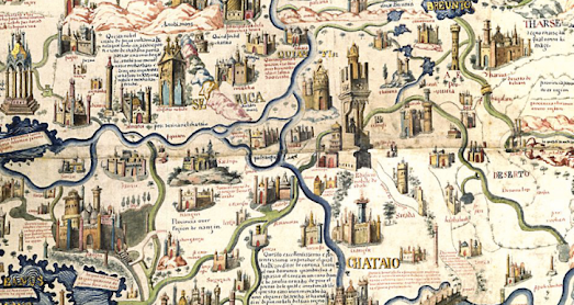
Mapbox Tetris

Tetris is an iconic puzzle game that has captivated players for decades. Originally released in 1985 by Alexey Pajitnov, the game challenges you to fit differently shaped blocks, called tetriminos, into a rectangular playing field. By rotating and maneuvering these falling pieces, you aim to complete horizontal lines, which then disappear and earn you points.

While Tetris has had an enduring appeal for nearly 40 years it has also always had one major drawback - it has had no maps. Now thanks to Darren Weins we can now finally play a game of Tetris superimposed on top of a map of New Jersey.

To rotate the shapes just use the arrow keys on your keyboard. You can also make the Tetris game-board 
bigger or smaller by zooming in and out on the map.


Mappy Races

During my wildly misspent childhood I was a huge fan of Whittaker's horse racing arcade games. The Whittaker brothers were pioneers of the British arcade scene. For decades their iconic horse racing machines introduced small children to the delights of a life-long gambling addiction. 

The Whittaker mechanical horse racing machines involved a number of small model horses racing over a short distance. Before the beginning of each race players could insert money into the machine to bet on individual horses.

My Mappy Races horse race simulation was largely inspired by the Whittaker horse racing arcade games.  It is a very simple horse race simulator which uses Leafletjs to animate two colored map markers racing around the course of the Epsom Derby. The player starts with a purse of $100. The player can bet any amount on either the blue or red horse. When a race begins the two horse map markers follow the track of the Epsom Derby, traveling at random speeds. At the end of a race if you bet on the winning horse then the purse is increased by the amount you bet. Lose and the money is taken from your purse.

Driving Simulator on Google Maps

Out Run was one of the great arcade driving games of the 1980's. Now we can't offer you an online version of Out Run but we can point you towards the fantastic Driving Simulator on Google Maps.

This driving simulator allows you to drive a car (or bus) around on top of a Google Map. We have to warn you that Driving Simulator on Google Maps is a fairly simplistic driving game. The game does not have any crash detection physics. You can therefore drive through buildings and on top of rivers and oceans. 

I find the fun of this driving simulator comes from desperately trying to stick to the roads and in driving around the maps of famous cities (especially in the satellite mode).

OSM Map Asteroids


Readers of a certain age may remember the Atari video game Asteroids. Asteroids was one of the most successfully computer games of the 1980's, the golden age of the arcade. The object of Asteroids was to control a spaceship while avoiding and destroying asteroids. If (and inevitably when) an asteroid managed to hit your ship you lost a life. 

Asteroids is of course a classic game which deserves a permanent place in the arcade Hall of Fame. However how much better would Asteroids be if you could shoot maps rather than asteroids? Well now you can find out with OSM Map Asteroids.

Sliding Puzzle Map

Sliding image games, also known as 15-puzzles or tile puzzles, are classic brain teasers with very simple rules. The objective of each game is to rearrange the scrambled tiles to form the complete unmixed-up image by sliding tiles into the one empty space on the puzzle. Only one tile at a time can be moved into the vacant spot. Only tiles adjacent to the empty space can move.

Darren Wein's Sliding Puzzle Map allows you to play a sliding image game using the map of any location in the world. To create a game you just need to click on the location that you wish to play. A sliding puzzle map will then be automatically created using the map of that location. Press the 'New Game' button and the map tiles will be mixed-up. All you have to do is slide the map tiles back into the correct order.

Under Maintenance

The following section of the Classic Map Arcade is currently Under Maintenance. At the moment Map Breakout and Geo Guns both appear to be out of order. Hopefully they will be fixed in the near future.

Map Breakout

The classic Breakout arcade game, first released in 1976, is probably one of the most addictive computer games ever created. In fact all that was missing from the original Breakout game was a map. That has now been rectified with the release of Map Breakout. 

The purpose of the original Breakout game was to destroy rows of colored bricks by deflecting a ball with a player controlled paddle. In Map Breakout the rows of colored bricks have been replaced with a map of the world. Your objective in the game is to keep the ball in play using your paddle and knock out as many countries as you can. Use the 'a' and 'd' keys on your keyboard to move the paddle left and right. I can't find a 'start' button so I've just been refreshing the page to start a new game.

Geo Guns

Geo Guns is an impressive tank fighting game that takes full advantage of Google Maps' 45°(Bird's Eye) satellite view. 

With Geo Guns you can engage in a tank battle anywhere on Earth. You can choose from a number of pre-set battlefield locations for your tank fight or simply enter a location into the map. After you have selected your location the four tanks in your army are displayed at the bottom of a Google Map. The enemy tanks attack in waves from the top of the screen. 

To defeat the enemy tanks select one of your own tanks from the map and click on the tank that you wish to attack, or click anywhere on the map to move to that location.

Saturday, February 10, 2024

The Most Controversial Interactive Map

One of the earliest popular uses of the Google Maps API was Gawker Stalker. The now defunct Gawker Stalker interactive map tracked the movements of famous celebrities thanks to the detailed stalking carried out by Gawker and their readers. Now similar concerns are being raised regarding potential privacy infringements related to Jack Sweeney's TheAirTraffic, particularly involving the tracking of certain well-known individuals.

TheAirTraffic is a global flight tracking website which collects and displays real-time data on aircraft positions and their flight paths on an interactive map. One thing that makes TheAirTraffic different from other real-time flight tracking maps, such as FlightAware and Flightradar24 is its use of crowd-sourced data from publicly owned ADS-B Receivers.

The other big difference is that TheAirTraffic data is also used by Ground Control to track the movements of the executive jets owned by Elon Musk and Taylor Swift. Elon Musk for one seems very unhappy that Ground Control has published details of his extraordinarily excessive contribution to global heating.

According to Ground Control's data in 2022 alone Elon Musk's private jet N628TS spent a total of 14.65 days in the air. During that time Musk's plane consumed 1,195,500 lbs (557,711 kg) of jet fuel resulting in 1,895 tons of CO2 emissions (in comparison - the average person produces about four tons of carbon dioxide every year). 

Elon Musk and Taylor Swift are both keen to stop any public knowledge of their excessive contributions to global heating. According to Jack Sweeney's Wikipedia entry the self proclaimed free speech advocate Elon Musk has in the past suspended Sweeney's Twitter account and threatened to sue Sweeney. There is even some speculation that it was Elon's fury at Ground Control's ElonJet Twitter account that led him to decide to buy Twitter in the first place. 

In December 2023 Taylor Swift sent a cease and desist letter to Sweeney asking that he stop tracking her private jet. Taylor Swift has now apparently sold her private jet.

Friday, February 09, 2024

Mappy Races

Every year since the 18th Century the Epsom Derby has attracted thousands of spectators. Like many Londoners I have often taken a trip to Surrey in late May or early June to attend the Derby horse race. These horse racing trips may be what inspired me to create my horse race simulator Mappy Races. 

Mappy Races is a very simple horse race simulator which uses Leafletjs to animate two colored map markers racing around the course of the Epsom Derby. Before the races start the player has a purse of $100. The player can bet any amount on either the blue or red horse. When a race begins the two map markers follow the track of the Derby, traveling at random speeds. At the end of a race if the horse that wins matches the player's choice then the purse is increased by the amount bet. Lose and the money is taken from your purse.

Mappy Races was an idea I threw together very quickly yesterday. I actually think it could be developed to make an interesting game. I actually worked out that I could use a distanceTo function to determine which marker was closest to the end of its polyline and therefore provide a running commentary of the race (in text format). However at the moment the two polylines are not of the exact same length. This means that on occasion the commentary would say one marker is leading (because it was closest to the end of its polyline) while on the map it looked like it was behind the other marker. 

This problem could be overcome very easily by making both polylines of equal length. However I have neither the time or inclination to develop Mappy Races further. If you would like to copy the game and develop it then feel free to clone the game on its Glitch page. One simple thing you could do to improve the game would be to add more horses (or colored markers). You could also introduce different random speeds for the different markers and introduce odds for each horse. 

Thursday, February 08, 2024

Where to Watch April's Solar Eclipse

On April 8, 2024 people across large parts of the USA will be able to see a total solar eclipse. If it isn't cloudy.

In 1999 I traveled to France to experience a total solar eclipse. Unfortunately the experience was ruined slightly by overcast skies. What made it even more galling was to discover that a friend of mine had traveled independently from me and had a cloudless view of the eclipse just 100 miles from my final eclipse viewing location. 

This year you can lessen your chances of experiencing the total eclipse obscured by clouds by using NOAA's new U.S. Climate Normals Solar Eclipse map. On this map colored bands show the passage of the solar eclipse across the United States (with the darkest band showing the path of totality). However the map also provides an estimate of the likely climate conditions at different viewing locations based on average weather conditions at that location. Including information about how likely a location is to experience clouds on April 8th.

If you zoom on an area where you are interested in viewing the solar eclipse from and click on the black button at the bottom of the map you can view an attribute table showing detailed information about the climate at your chosen location. These details include information on the type of cloud cover in that area based on historical averages.

On April 8 the path of totality will cross Mexico, the United States, and Canada, and will be about 115 miles wide. If you are within the path of totality, you will see the Sun completely blocked out by the Moon for about two minutes. If you want to preview what the solar eclipse might look like for different locations then you can use the 2024 Solar Eclipse Simulator.

The 2024 Solar Eclipse Simulator allows you to preview how the solar eclipse will appear at any location. It is therefore another fantastic tool for planning where best to view the eclipse. Obviously it is best to view an eclipse from a location within the path of totality (the locations where the Moon's shadow will completely cover the Sun during the solar eclipse). The simulator will be particularly useful for anyone who can't travel to a location within the path of totality and is curious as to what a partial eclipse might look like from a particular location.

Just click anywhere on the provided interactive map to view a simulation from that location. Once the simulation loads you can then use the playback controls to watch your solar eclipse simulation. These controls allow you to adjust the speed of the simulation and to choose whether to view the position of the stars and Baily's Beads (beads of sunlight that appear around the edge of the moon during an eclipse) during the simulation of the eclipse.

Wednesday, February 07, 2024

A Year of CO2

The Washington Post has visualized how carbon dioxide builds up in the Earth's atmosphere over the course of one year. Using an interactive globe the Post has animated 12 months worth of atmospheric CO2 around the world.

The interactive globe in Watch the Earth breathe for one year uses data from NASA satellites and ground measuring stations to show how CO2 accumulated around the world over the course of 2021. The globe identifies four different types of contributor to atmospheric CO2: the burning of fossil fuels, fires, land ecosystems and the ocean.

As you scroll through the Post's article the globe rotates to highlight significant areas of atmospheric CO2. For example the Post highlights how the burning of fossil fuels in China contributes massive amounts of CO2 to the atmosphere. In Africa fires are a large contributor to atmospheric CO2. The globe is interactive which means you can explore the visualization for yourself to see where and when atmospheric CO2 pollution was worst during 2021.

The amount of carbon dioxide in the atmosphere is higher now than it has been at any time in the last 2.6 million years. However some CO2 is absorbed by plants, especially when they grow in spring and summer. The European Space Agency's Climate from Space visualization explains what is called the Fast Carbon Cycle.

The ESA visualization of the fast carbon cycle helps to explain why the Washington Post's visualization shows a huge peak in atmospheric CO2 at the end of the northern winter, 'before rapidly-growing plants start absorbing carbon dioxide again in the spring.' However despite this seasonal cycle the ESA is keen to point out that 'there is a clear increase in atmospheric carbon dioxide from year to year.'

Tuesday, February 06, 2024

Mapping the Spread of War in the Middle East

The Hamas attacks in Israel on 7 October 2023 have led to increasing violence across much of the Middle East. 

In response to the Hamas attacks Israel launched a devastating and destructive campaign against Gaza. In Yemen the Houthi responded to Israel's attacks on Gaza by targeting ships in the Red Sea. The US & UK replied by targeting Houthi locations in Yemen. Israel and the US have both bombed Syria. The US has bombed targets in Iran and Iraq, and Pakistan and Iran have begun launching tit-for-tat strikes against each other.

If you are struggling to keep track of who is attacking who and where then you can refer to The Guardian's interactive map How Gaza war led to violence spreading around the Middle East. The Guardian's story map starts with the 7 October Hamas attack on Israel, which led to the death of 1,200 Israelis. The map then chronologically maps the escalating crisis across much of the Middle East.

A very large proportion of the violence in the Middle East is of course funded by American tax payers. According to the US Campaign for Palestinian Rights every year the U.S. government gives Israel $3.8 billion. The Campaign's U.S. Military Funding to Israel Map, can show you what your tax dollars could buy you if the money sent to Israel was spent at home.

Enter the name of your state or city into the interactive map and it will tell you how many local tax dollars are being sent to Israel every year and how much public housing, child healthcare, school teachers, or respirator masks that money could buy.

The campaign's map obviously only takes into account the $3.8 billion given to Israel by the government. It doesn't include the money spent by America on its own military presence in the Middle East and the escalating costs of U.S. military strikes against targets in Yemen, Iraq and Syria.