Showing posts with label Bike Routes. Show all posts

Thursday, February 22, 2024

The Cyclotron

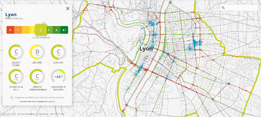
The West Midlands Cyclotron uses cycle counters installed on the roads in the West Midlands to provide a near real-time data visualization of the number of cyclists using individual roads in areas of Birmingham, Coventry and Wolverhampton (and many roads in between).

the LED inspired Cyclotron data dashboard

The most striking aspect of the Cyclotron is the design of the LED themed data dashboard. This dashboard takes its cue from the real-world digital cycle counters on the Bristol Road in Edgbaston. The actual data visualized on both the physical and Cyclotron displays comes from machine learning vision sensors placed on a number of roads by West Midlands and Birmingham City Councils. The Cyclotron uses this data to show the number of cyclists using each road by month, by day of the week and by hour of the day.

The Cyclotron map showing the location of cycle counters in the West Midlands

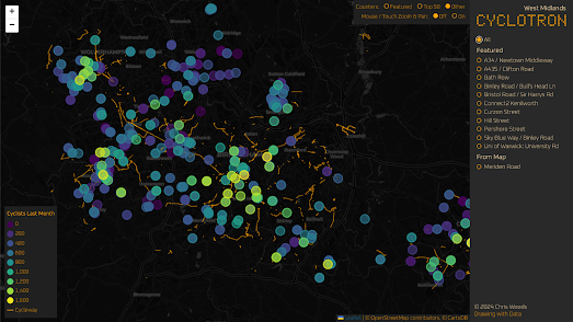
The Cyclotron also has an interactive mapped display. This map shows the location of the cycle counters around the West Midlands and also visualizes the number of cyclists counted by each counter over the last month. Clicking on a counter's marker on the map will enable you to view that road's near real-time (and historical) data on the Cyclotron LED data dashboard.

Via: the Quantum of Sollazzo newsletter

Saturday, January 06, 2024

The Bike Map

Biking directions are very difficult. There are a few factors which are important to cyclists which most route planners tend to avoid. When I'm planning a bike route I usually consider the amount of road traffic (e.g. are there bike lanes available), elevation, and road surface (e.g. avoiding cobbles). 

I actually have a little test route which I use for previewing route planning maps for cyclists. I ask for directions from my home to my favorite large supermarket. It is a route I cycle at least twice a week and the best route requires a good knowledge of the locations of dedicated cycle lanes and shared pedestrian-cycling paths.

Sherpa, a new cycling route planner, is the first map which actually recommends my preferred cycling route to my nearest supermarket. When planning a new cycle route Sherpa includes options to prioritize elevation, road types or leisure/race. I think the leisure/race option has something to do with prioritizing dedicated bike lanes or roads as I found that when I select the 'leisure' option Sherpa actually provides a route that follows the dedicated bike lanes and shared pedestrian-cycling paths that I prefer.

The 'Choose Route Profile' option (located on the right-hand edge of the map) allows you to select the factors which are most important to you in your bike journeys. It allows you to prioritize the type of road surfaces you prefer, whether you want a flat of hilly route and whether you want a leisure or race route.

You can also color the line of any returned cycle route on the map by elevation, surface, or grade. This will, for example, allow you to easily see where the major hills are along your route. You can also preview an elevation profile of your entire route at the bottom of the map. The road surface along the route is also shown on this elevation profile using different colors.

You might have your own preferred options when you consider new cycling routes. For me however Sherpa seems to cover the main three - elevation, road-type, and the availability of bike lanes. The only thing missing for me at the moment is that I'd like to be able to color the route 'line type' by type of road (e.g. road, physically separated bike lane, painted bike lane, bike path, shared pedestrian-bike path).

Wednesday, June 28, 2023

The 2023 Best Cities for Cycling

According to PeopleForBikes Minneapolis is the best large U.S. for cycling. 

Every year PeopleForBikes ranks the best places to cycle in the United States. This year, using its own 'Bicycle Network Analysis' (BNA) PeopleForBikes rated the quality of the cycling networks in 1,484 U.S. cities. This year Minneapolis made significant improvements to its cycling infrastructure becoming the best large city overall for cyclists.

PeopleForBikes' 2023 Best Places to Bike provides an overview of this year’s Bicycle Network Analysis ratings, highlighting the top ranked U.S. cities and the U.S. cities which made the biggest improvements to their biking networks.

San Francisco and Seattle, respectively, were the 2nd and 3rd ranked best cities for cycling. However Provincetown, Massachusetts ranked as the best city overall for cycling, with a BNA score of 88 (compared to Minneapolis's score of 68).

You can read more about how the Bicycle Network Analysis scores are calculated on the PlacesForBikes Methodology page. This methodology assesses how well a cycling network connects people to the places that they want to go and to the levels of stress that they experience while on their bikes.

You can explore your city's BNA ratings on the PeopleForBikes Place Search map. This allows you to view an interactive map of your own city, with city streets colored to show how stressful they are for cycling. As well as the 1,484 U.S. cities you can also find interactive maps ranking the cycling networks of 249 international cities, including Amsterdam (82 BNA score), Paris (83 BNA score) and Barcelona (74 BNA score).

Monday, March 21, 2022

The National Cycling Barometer

Last year the French Federation of Bicycle Users (FUB) surveyed a quarter of a million bike riders about the cycling climate in their town or city. In FUB's Cycling Cities Barometer cyclists were asked to rate their municipality based on five different categories:

• general feeling
• safety
• comfort
• efforts of the municipality
• parking and bicycle services

Based on the answers given to the cycling survey an overall 'cycling climate' score has been given to each town and city in France (as long as the town received a minimum of 50 responses in the survey). 

You can explore the results of the Cycling Cities Barometer survey on FUB's Survey Results interactive map. On this interactive map you can view the overall cycling climate rating given to each French town. On the map individual towns and cities are colored to show their overall rating (with green being good and red being bad). If you click on an individual city on the map you can view the ratings given to the municipality in each of the different five categories.

If you zoom in on a town or city on the map or open the FUB Priority map you can then view the local locations in the area which were identified by the survey respondents as needing improvements. This map uses red colored dots to show locations identified by cyclists as needing improvement. Locations shown with green dots are those which were identified by cyclists as having seen improvement in the last two years. The blue dots indicate locations where respondents said there was a need for parking for bikes.

Via: weeklyOSM

Thursday, January 20, 2022

The Cycling Stress Map

Earlier this month I reviewed the City of Boston's Bicycle Level of Traffic Stress interactive map. A map which rates every road in the American city based on the stress caused to cyclists from road traffic, the lack of bike lanes and other conflict factors. The Bici Stressat ed al Traffico interactive map is a little more ambitious, in that it has mapped the cycling stress levels on every single road in Italy.

The Bici Stressat ed al Traffico is an interactive map which rates and colors every Italian road based on the stress caused to cyclists from other road traffic and from the availability of cycling infrastructure. Every road on the map is given one of four ratings: 'Safe for Children', 'Low Stress', 'Moderate Stress' or 'High Stress'. Cyclists can use the interactive map legend to turn on or off the roads of different stress levels. So, for example, if you wanted to plan a pleasant bike ride you could just select to view all the roads rated Safe for Children or Low Stress.

The four different cycling stress ratings given to individual roads are based on both the levels of road traffic and the presence / absence of separated bike lanes. You can learn more about how each of the four ratings are defined on the BikeItaly GitHub page (in Italian). These ratings are apparently based on ratings defined by Bike Ottawa.

Tuesday, January 04, 2022

The Cycling Stress Map

 heavy motor traffic + steep inclines + headwinds = cycling stress

I cycle a lot. However I am still a fair weather cyclist. I don't take my bike out in the rain. I avoid roads. And I try not to cycle anywhere that involves climbing steep hills. 

The City of Boston recognizes that a lot of other cyclists are discouraged from cycling by the stress caused from road traffic, the lack of bike lanes and other conflict factors. They have therefore decided to rate every street in Boston based on its Bicycle Level of Traffic Stress (BLTS). The resulting map provides a fantastic overview of where it is most and least stressful to cycle in Boston.

The City of Boston's new Bicycle Level of Traffic Stress interactive map colors every road based on its BLTS rating. The BLTS rating is based on a road segment's traffic speed, traffic volume, presence of bike lanes & parking lanes and other conflict factors (such as bus lanes and school zones).

The map can be used by cyclists to find routes around the city which are likely to be the least stressful to ride. It is also being used by the City of Boston to highlight gaps in the city's cycling infrastructure and to identify those road segments in the city with unacceptably high levels of cycling stress.

Monday, August 09, 2021

Bike Collisions in London

Every week the Makeover Monday community works on creating data visualizations of a different data set. This week the community is working on visualizing London's Bike Collisions in London (2005-2019). This means that if you explore the Twitter hashtag #MakeoverMonday over the next few days you will find lots if links to interactive maps which show where and when bike accidents occurred on London's roads from 2005-2019.

Most of the visualizations, like Michelle Frayman's Cycle Danger in London, use interactive maps to visualize London's bike collisions. Many of these maps breakdown the bike collisions by borough to reveal that Westminster is the most dangerous borough (in terms of the total number of bike collisions 2005-2019). I like Michelle's visualization because she also looks at when bike accidents occur. Her analysis of the data by time reveals that 8 am is when the most accidents happen and July is the most 'dangerous' month (although the data isn't normalized by the amount of bike traffic and I suspect these trends reflect the number of bikes on the road during rush hour and during the summer months). 

Takafumi Shukuya's Bike Collisions in London orders the top ten boroughs in terms of severity, allowing you to explore which ten boroughs had the most fatalities (Westminster & Hackney), the most 'serious' accidents (Westminster) and the most 'slight' accidents (Westminster).Takafumi's visualization also allows you to view a zoomed in map of each of the most dangerous boroughs, allowing you see which roads in each borough had the most bike accidents.

You can already find many more interactive map visualizations of the London bike collisions data under the Twitter hashtag #MakeoverMonday. As the day progresses I suspect even more will be created and linked to on Twitter using the #MakeoverMonday hashtag.

Monday, March 22, 2021

New York Bike Maps

If you want to cycle in New York then you might find the NYC Bike Map a useful guide to where it is safest to cycle and where you can find places to park your bike.

The NYC Bile Map uses data from NYC OpenData, Citi Bike and elsewhere to map the location of bike lanes, bike racks, bike shelters and biking hazards. Protected bike lanes, which are separated from motor vehicles, are shown on the map with dark green lines. The lighter green lines show on street bike lanes, which are mixed with vehicular traffic. The yellow lines indicate routes which are entirely mixed with vehicular traffic.

Black arrows on bike lanes indicate the direction of travel. Steep hills are shown with red triangles and stairs are indicated with a red stepped symbol. The location of bike racks and bike shelters are shown on the map with their own bike symbols.


Cycling in New York can be dangerous. Especially between 6-7 pm and during the month of September. You can see how precarious it can be to bike in New York on the NYC Cycling Incidents Map.

Each dot on the map shows the location of a cycling accident. The map shows that there aren't many sections of the city's roads where cyclists haven't been injured. The charts and graphs accompanying the map reveal the number of cycling accidents by time of day and by month. You can also click on these charts to filter the accidents shown on the map by time of day and the month of the year.


NYC Bike Maps is another useful resource for New York cyclists. This site includes a number of Google Maps of the city's boroughs, displaying bike lanes, bike paths and other information useful for cyclists.The separate and individual borough maps on NYC Bike Maps are a useful guide to navigating different neighborghoods of the city by bike. There is a also a map of the city's cobble-stoned streets and a handy Five Boro Bike Tour Map. 

Monday, November 30, 2020

Mapping Missing Bike Paths


Over the last few years many towns and cities in the UK have worked hard on improving their cycling infrastructure. However, despite these improvements, the UK has a long way to go before it is a fully cycling friendly country. 

Cycling UK has a plan to help councils across Britain improve their cycling provision and make life safer for all cyclists. Cycling UK wants to know the location of paths and tracks which could easily be adapted or changed into cycle paths. They have therefore released an interactive map which anyone can use to suggest improvements which could be made to help councils improve their cycling infrastructure.

Missing Paths is an interactive map which anyone in the UK can use to suggest improvements to their local bike network. The map can be uses to suggest any missing links in the local cycling network which could easily be adapted for bike use. These 'missing links' could be a footpath that currently doesn't allow cyclists, a disused railway line that could easily be adapted for bike use, or even a boggy track which could be resurfaced to become a bike path.

Users who add a missing link to the map are encouraged to also complete a short form, which will be sent to their local council in the form of an e-mail. This e-mail will include a link to their suggested improvement on the Missing Links map.

Tuesday, June 16, 2020

Widen My Sidewalk


Many local councils in the UK are exploring how they can best facilitate safe social distancing in the urban environment. Creating new bike paths and widening pavements are two of the most effective measures which can be undertaken to help people avoid public transit while still allowing pedestrians to maintain a two metre distance from other members of the public.

To support this effort Cyclestreets.net has created a new interactive map to enable individuals and local groups to identify locations where they know action is needed. The map, Widen My Path, allows anyone to show where new cycle paths and wider pavements are needed.

The interface for Widen My Path is very simple. To add a suggestion you just need to click on the interactive map and choose from one of the three types of interventions – cycling, walking and point closures. You can also up-vote suggestions which have been made by other users by clicking on a marker and clicking on the 'agree' button. The marker size for each suggestion grows in proportion to the number of people who agree with it.

If you are interested in creating a similar crowdsourcing map for your own country then the code for Widen My Path is available on GitHub.


Local councils in the UK who are considering where they might need to widen pavements might also want to have a look at Esri's GB Pavement Width Indicator. This vector tile layer for Esri maps colors Great British pavements by width. The map uses three colors. The red pavements show paths which are narrower than 2 meters - to visualize where social distancing is impossible. Orange pavements are between 2 & 3 meters in width and the blue pavements are 3 meters wide or greater.

Sidewalk width maps have also been developed in other countries around the world. The Sidewalks Widths map uses New York City's Sidewalk dataset to show where it is possible to maintain social distancing while walking in NYC. Similarly the Florence Sidewalks Map visualizes the widths of sidewalks in the Italian city of Florence.

Saturday, February 29, 2020

Mapping Cars in Bike Lanes


A few years ago Nathan Rosenquist released Cars in Bike Lanes, a mapping library which could be used by anyone to photograph traffic violations and add them to an interactive map. The mapping library was primarily used for reporting and photographing cars illegally blocking bike lanes but it can also be used for recording other types of traffic violation.

Nathan's code was used to create Cars in Bike Lanes Boston and Things in Bike Lanes Denver. It was also used by Nathan himself to make Cars in Bike Lanes New York. Unfortunately none of those three site are still active. However Nathan's Cars in Bike Lanes code lives on at GitHub.

You can now also use Safe Lanes to report illegally parked cars. Safe Lanes is a new interactive map which anyone can use to submit photographs of illegal parking in the United States. At the moment you can report illegal parking violations via the web map but iOS and Android apps are apparently coming soon.

Safe Lanes uses AI to process the photographs of all illegally parked vehicles which have been submitted to the map. Object character recognition is used to try to automatically detect the license plate number and the state where the plate was issued. Reports of traffic violations submitted to Safe Lanes in San Francisco are then automatically forwarded to the city's non-emergency 311 service. Safe Lanes is now in talks with other US cities about how best to integrate with their 311 services.

Wednesday, January 15, 2020

Uber's New Bike Trip City Maps


Today Uber released "a new bike trip data tool that shows where and when cyclists are most active in our cities". Currently there are three interactive maps available showing bike trip data for:

San Francisco
Washington D.C.
Paris

All three maps purport to show where and when cyclists are most active using a heat map layer. The bluest lines on the map show the streets with the most cycle traffic. The maps include filter tools which allows you to view traffic density data for weekdays and weekends and for different times of the day.

Uber hasn't yet said where their mapped bike trip data comes from. However, judging by the reference to 'Jump' in each map's URL address and the fact that Uber's Jump operates in all three mapped cities, I'm guessing that the data is from journeys taken on Jump's dockless scooter and electric bicycles. In which case the maps don't show "where and when cyclists are most active in our cities", as Uber claims. These maps only show where Jump customers cycle. It is worth bearing in mind that this data could be completely different from data generated by private cyclists, journeying to and from work, to stores or for general leisure.

Although Uber's bike trip maps are only available today for San Francisco, Washington D.C. and Paris the company promises that more cities will be mapped in the future.

Monday, June 17, 2019

America's Most Bike Friendly Cities


Provincetown in Massachusetts is the most bike friendly city in the USA. Alma, Michigan is the second best city for cyclists. Davis, California comes third. You can find out how bike friendly your city is on PeopleforBikes. PeopleforBikes BNA has ranked cities across the United States and Canada based on how easy they are to travel around by bike.

The PeopleforBikes Bike Network Analysis (BNA) ranks towns and cities based on traffic stress, destination access and score aggregation. Traffic stress is calculated by looking at the type of cycling infrastructure available (e.g. the availability of bike lanes, bake paths etc). Destination access is determined by looking at how easy (unstressful) it is to travel across a city by bike. Score aggregation looks at how friendly every census block is for cyclists across the whole city.

PeopleforBikes BNA has created interactive maps for 571 different U.S. and Canadian cities. Each of these individual maps shows the city's overall BNA score. The map also colors all the city's roads to show whether they are high (red) or low (blue) stress for cyclists. The map sidebar includes information on how easy it is to access different services by bike. It also shows how easy it is to access recreational and transportation facilities by bike.

Friday, May 10, 2019

Berlin's Bike Plans


Berlin's 'Vision Zero' mission plans to eradicate all fatalities on the city's streets. As part of this mission it is planning to greatly extend Berlin's cycling infrastructure. Tagesspiegel has
looked at Berlin's current provision for cyclists and where it plans to build new bike paths and protected bike lanes. The paper has also looked at where in the city drivers overtake cyclists too closely.

In Radmesser the German newspaper has mapped out where Berlin will build new cycling infrastructure. You can click on individual roads on the paper's new new cycle paths map to learn more about what is planned and what already exists in terms of protected bike lanes on each of Berlin's roads.

As part of its Radmesser series Tagesspiegel is also exploring the distance that car drivers give cyclists when they overtake. The police recommend that drivers leave at least 1.5-2 metres space when overtaking someone on a bicycle. Tagesspiegel has fitted one hundred bikes with sensors to find out how much space car drivers really give bike riders and where in the city cars give the most and least space to cyclists when overtaking. The cyclists chosen for the experiment live in 99 different zip-code areas in the city.

The 100 sensors have been on Berlin's roads since October and the data they record is collected everyday. So far these bikes have measured over 16,000 cars overtaking bikes. On over half of these occasions (9,402) the cars did not leave the legal 1.5-2 meter space. On 3,019 occasions cars left less than 1 meter when passing cyclists. Radmesser not only maps out where drivers in Berlin are not leaving the prescribed space when overtaking cyclists it has also looked at the time of day (between 10-12 am) when drivers pass the closest.

Friday, February 08, 2019

The Bike Paths of Europe


Roman Kyrychenko has used OpenStreetMap data to create a map showing all of Europe's cycle paths. The map provides an interesting overview of Europe's cycling infrastructure and a reasonable guide to which countries in Europe have the most developed bike path networks.

The European Map of Cycle Paths is only a static map but the Random Forest blog has posted it as a large image so you can get a reasonable picture of the bike networks in every European country. The Netherlands and Belgium really stand out on the map as having extensive cycle networks. The populated areas of Scandinavia also seem to have lots of biking infrastructure as do many of Europe's largest cities. As the Random Forest blog points out Eastern Europe doesn't have as many bike paths as Western Europe. In fact the further you move east in Europe the less bike paths there seem to be.

I'm not aware of any similar map of bike paths for the USA. But if you are interested in cycling levels in America then you should read the League of American Bicyclist's Analysis of Bicycle Commuting in American Cities (PDF). This annual report explores the levels of cycling in the USA based on data from the American Community Survey.

New York City, Portland and Chicago are the top three cities with the most numbers of people cycling to works. In terms of the percentage of the workforce who cycle then Portland and Washington, DC are the top cities (in the 70 largest US cities). Of course this doesn't really tell us much about the infrastructure for safe biking in these cities.

Monday, January 21, 2019

London's Bike Sharing Network


London Bicycle Hires 2017 is an interactive map of around 1.5 million trips made on the city's Santander Cycle Hire network. The map visualizes the number of trips started from individual docking stations on the network and the most popular journeys taken between different stations.

As you might expect the most busy individual docking stations in London's bike sharing network are the city's mainline train termini. In particular King Cross and Waterloo stations stand out on the map as being very popular docking stations. It appears that cycling is a popular way for visitors to the center of the city to get around once they arrive by train.

It is also very apparent that hire bikes are also a very popular way of exploring some of London's larger parks. On the map Hyde Park in central London and the Olympic Park in the East End stand out as almost separate networks within the larger citywide network. I suspect that many users find the parks safe and attractive places to cycle and also find the bikes a great way to explore the respective parks.

You can explore the journeys for yourself by hovering over individual docking stations on the map. If you hover over a station you can see all the trips made to and from that station to other stations on the network. The size of the flow-lines on the map show the number of journeys made between each station.

Thursday, December 06, 2018

Dangerous Biking in LA


An interactive map by the LAist reveals that there is almost no section of road in Los Angeles where a cyclist hasn't been injured. The L.A.-Long Beach Bike Crashes interactive map shows the location of every collision within Los Angeles and Long Beach involving bicycles from 2010-2015.

The LAist argues that with its wide, flat roads and sunny weather LA should be a wonderful place to cycle. However Bicycling Magazine has named Los Angeles America's worst city for bikes. Looking at the LAist interactive map it isn't hard to see why. The map shows that from 2010-2015 70 bicyclists were killed and 13,606 were injured while cycling on the city's roads.

The LAist point out that the city's Three Feet for Safety Act is very rarely enforced. This law requires drivers to leave at least a three foot gap when passing a cyclist. However the police have issued only 13 citations in the four years since the act became law. The LAist's conclusion is that the city needs to invest in cycling infrastructure. The best way to ensure the safety of cyclists is to create separated bike lanes so that car drivers actually are incapable of driving within three feet of a cyclist.

Saturday, November 24, 2018

Building a Bike Friendly Berlin


Earlier this year Berlin passed a mobility law designed to encourage safe cycling in the city. The law requires that all major and minor roads should have separated bike lanes, the creation of 100,000 parking spaces for bikes and the redesign of 30 accident hotspots every year.

In order to help facilitate safer cycling in Berlin the city has released FixMyBerlin. This interactive map is designed to inform the public about the planned cycling improvements in Berlin and to help show where it is already safe to bike in the city.

The map includes a Happy Bike Index layer which shows which roads are currently the least and most safe to cycle on. You can view the bike friendly rating of all Berlin's roads by selecting the Happy Bike Level layer on the map.

If you switch the map to the Planung view then you can view Berlin's planned cycling improvements. Different map icons are used on the map to show what stage each improvement has reached. These indicate whether the project is just in the conception stage, in the planning stage, currently being built or if the project has been completed. Users of FixMyBerlin can sign up to receive updates on any of the mapped cycling improvements. If you sign up for a project you will be kept informed every time the project is updated.

Tuesday, October 30, 2018

Where Not to Cycle in San Francisco


If you are cycling in San Francisco you should take extra care in navigating Union Square. It is the area of the city responsible for the most traffic accidents involving bikes. There were 225 crashes involving cyclists in Union Square from 2013-2017. The next highest location for the number of bike accidents in the city was the Hayes Valley – Market St intersection, with a total of 135 bike accidents.

The Most Dangerous Areas for San Francisco Bicyclists interactive map shows where the most bike accidents occur in San Francisco. The map uses five years worth of crash data, from 2013-2017, to show the number of bike accidents at every intersection.

The map doesn't necessarily visualize the most dangerous intersections. While the map does show the total number of accidents at each intersection it is important to note that the data isn't normalized to take into account the amount of bike traffic. Therefore the map really only reveals the intersections where the most bike collisions occurred. It doesn't automatically follow that these are the most dangerous intersections for cyclists. They might simply be the intersections with the most bike traffic.

However a map of total bike accidents can still be helpful to city planners. If planners want to reduce the overall number of traffic accidents involving cyclists then this map shows where introducing safer cycling measures would have the most effect. For example along the whole of Market Street in downtown San Francisco.

Monday, September 17, 2018

How to Find an Electric Citi Bike


New York has a new bike hire system which allows people to rent pedal-assisted electric bicycles. The problem for anyone who want to use one of Citi Bike's electric bikes is that there are only 200 of them dotted around the city and they can be very difficult to find. Unless you consult I Want to Ride an Electric Citi Bike.

I Want to Ride an Electric Citi Bike is an interactive map which shows you which bike docking stations have electric bikes right now. The stations with electric bikes are indicated on the map with a pink circle. The map can also alert you when electric bikes are available near you. Just select from a list of bike stations and you can receive a browser alert within ten seconds whenever an electric bike is docked in one of your stations.


You can explore all the data behind how Citi Bike's non-electric bikes are used on the NYC City Bike App. The NYC Citi Bike App is a Leaflet based interactive map which allows you to explore the number of bikes borrowed and docked from each Citi Bike station. The interactive map visualizes the most popular stations and journeys for any time of day and day of the week.

Bike stations on the map are colored to show which of the docking stations have the most bikes borrowed from them during the selected times and days. Stations colored red have more bikes borrowed from them than are docked at them. This means that they lose bikes during the selected time. The green stations are stations where more bikes are docked than borrowed. These stations therefore end up with more bikes than they start with for the selected time period.

The orange lines show the most popular routes. If you follow the orange lines from any bike station you can see the most popular journeys between that station and other New York bike stations. The data behind the map only shows where and when a bike was borrowed and docked. Therefore these orange lines don't show the actual routes between two bike stations.

The map includes the option to filter the data by time of day. Notice how the orange and green stations change during the morning and evening rush hours. In the morning the red stations (the ones losing bikes) tend to be on the outskirts of the Citi Bike network. In the evening commuting hours the red stations are concentrated in the city center. This pattern obviously reflects the movement of people into the city in the morning for work and then traveling out of the city after work.