Showing posts with label Paris. Show all posts

Wednesday, May 22, 2024

It's War on the Streets of Paris

map of Paris with streets with military related names highlighted

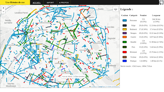
Une Histoire de Rue is a new interactive map which explores the connections between Paris street names and military history. Around 15% of Paris' streets have names which are related to battles, soldiers and/or resistance fighters. This new interactive map allows you to quickly see the extent to which military history is reflected and commemorated in the names of Paris' roads.

On the map streets which have a name with a military focus are shown as colored lines. Streets which are named for important battles are colored green. The streets colored blue are named after generals and other important military figures. Heroes of the French resistance are commemorated in the streets colored red on the map.

As you explore the map you will find that certain districts of Paris have more militaristic sounding streets than others. For example the areas around the Arc de Triomphe (commissioned by Napoleon Bonaparte in 1806 after his victory at the Battle of Austerlitz) and the Bastille-Arsenal (the area around the former site of the Bastille fortress) both have a large concentration of streets bearing military related names.

Une Histoire de Rue (Street History) is also a website which allows you to create your own categories of street names. For example you can use Une Histoire de Rue to create your own map of Paris (or any other city) showing all the streets named for artists and writers. If you click on the 'Import' button you can load street data onto the map from a CSV file. You can then create your own categories of color-coded streets on the interactive map. The open-source code for the map is also available on GitHub.

map of Paris with streets named for people highlighted

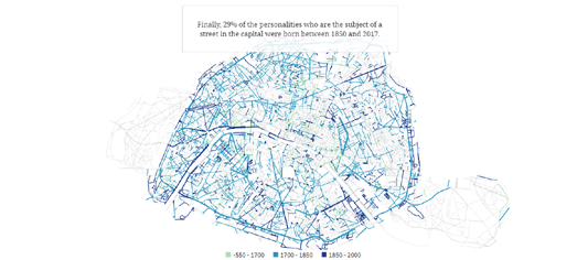
Le Figaro has also created a map of Parisienne street names. In particular it has examined how many Parisian roads were named for people and which historical periods those people are from. It then colored those roads on a map of Paris to show which historical period is most commemorated in Paris' roads.

In What Paris Street Names Reveal the newspaper says that a total of 2,500 streets in Paris are named for people. Only 15% of these roads are named for people born before 1700. One reason for this is that after the French revolution street names referring to the monarchy or Catholicism were banned. 1700-1850 is the most represented period in French history in the street names of Paris. 56% of streets in Paris named for people are named after figures from this historical period.

Le Figaro discovered that political figures were most likely to be commemorated by having a Paris street named for them. The next most commemorated group are writers, followed by military leaders.

Thursday, July 21, 2022

The Paris Noise Pollution Map

The Bruitparif Paris Transport Noise Map visualizes noise pollution within the Île-de-France region. The map shows the estimated level of noise pollution generated by cars, trains and planes across all of Paris.

Essentially the Paris Transport Noise Map provides a heat map view of the levels of transport noise in the capital. The map allows you to view noise pollution generated by cars, trains, planes, or a cumulative noise pollution visualization of all three combined. The noise pollution levels are determined by computer modeling and not from actual measurements. 

The main criticism of computer modeled maps of noise pollution is that they are little more than maps of transport infrastructure. However when done well, like the Paris Transport Noise Map, they take into account the effect of buildings, noise screens, traffic levels, average speeds and road surfaces on the amount of noise pollution generated.

Bruitparif actually has deployed sound radars which capture noise pollution levels across the French capital in real-time. You can view the noise pollution levels recorded by these sound radars on its Rumeur interactive map. 

The Rumeur map allows you to view the sound levels recorded by any of the sound measuring stations in Paris. Click on a sound radar's marker on the map and you can view its current 'real-time' noise pollution reading and its measurement history. An interactive chart allows you to observe the selected station's entire history of decibel level measurements. 


If you don't live in Paris you can view noise pollution levels where you live on the OSM Global Noise Pollution Map. The OSM Global Noise Pollution Map uses OpenStreetMap data to estimate the levels of noise pollution across the world. 
At the heart of the OSM Global Noise Pollution Map is the simple idea of assigning noise pollution levels based on OpenStreetMap tags. Map features in OpenStreetMap are assigned a tag which describe what has been mapped. These tags can also be assigned a value. For example all roads that are tagged 'highway' are also assigned a value such as 'motorway', 'secondary' or 'residential'. 

The OSM Global Noise Pollution Map uses these tags and values to assign a noise pollution level based on general assumptions. For example highway, trunk, primary and secondary roads are deemed to be noisier than normal street or service roads. The OSM Global Noise Pollution Map also assumes that other mapped features, such as railways and retail & industrial zones, will also generate different levels of noise pollution. 

The OSM Global Noise Pollution Map isn't refined enough to take into account factors such as traffic levels & average speeds. 

Thursday, October 07, 2021

Mapping the Last Tati Department Store

Last week the last ever Tati clothing store closed in France, bringing to an end the company's 78 year history. The first Tati store was opened by Jules Ouaki in the Barbès-Rochechouart district in Paris in 1948. Over the next 78 years the company expanded its operations, until it had established stores in many French cities. Last week's closure of the Tati store on Boulevard Barbès ends Tati's presence on French streets, however the brand still exists as an online only store.

To mark the closure of one of Paris' most iconic stores Le Parisien has managed to retrieve the original plans of Jules Ouaki's original Paris store. In How Tati made her mark in Barbès Le Parisien uses these plans to create a 3D interactive tour. This 3D tour visualizes the original store and shows how it expanded over its 78 year history into a number of its neighboring buildings. The tour also includes vintage photographs of the store and the accompanying text explains how the store and the Tati brand managed to grow and expand during its 78 year history. 

Animated 3D tours are becoming a popular method of engaging readers in a story. For example last month The Straits Times released a very impressive scrollytelling map visualizing how the city-state plans to develop over the next decade.

As you scroll through Singapore 2030 an interactive 3D map flies over the island of Singapore taking you on a tour of some of the country's planned developments. A combination of this 3D map and artists' impressions of the planned projects provide the reader with a detailed view of how the planned developments will change the landscape of Singapore for ever.

Friday, July 23, 2021

Driving Times from Paris

Time Distance to Paris by Road 2021 in an interactive isochrone map which shows how long it takes to travel by car from Paris to any other location in France. 

An isochrone map uses lines on a map to connect points which can be reached in the same travel time. On Nicholas Lambert's Time Distance to Paris by Road 2021 different colors are also used to visualize areas which can be reached in the same time steps.Because this is an interactive isochrone map you can also select a time period on the map key to view all the areas in France which can be driven to in that time highlighted on the map. For example if you select 60 minutes on the map key then you can see all the areas that you could to travel to in an hour highlighted in blue.

Because Time Distance to Paris by Road 2021 is an Observable notebook it can be forked to work with other locations. For example, Laurent Jégou has forked the map to create his own isochrone map visualizing the Time Distance to Toulouse 2021. Tristram Gräbener has also forked Nicholas Lambert's original map to create a Time Distance to Paris by Train isochrone map.

You can view other examples of interactive travel time maps using the Maps Mania iscohrone tag.

Friday, April 09, 2021

Mapping the Louvre

The Louvre has digitized over 480,000 works of art, including the Mona Lisa and the Venus de Milo. It has also created an interactive map of the gallery. This means that although you might not be able to visit the Louvre in person during lockdown you can spend a pleasant hour or two exploring the Louvre online. 

The Louvre interactive map provides an easy to use plan to the museum's eight departments and hundreds of galleries. Using the plan you can explore the galleries room by room. Click on a gallery on the map and an information window will open providing thumbnail images of all the artworks on display in the selected room. Click through on any of these thumbnail images and you can view the chosen work of art in closer detail. 

Each of the over 480,000 individual artworks digitized by the Louvre can be viewed on its own interactive map interface. If you haven't got time to explore the whole gallery then why not jump straight to the interactive digitized images of the Mona Lisa and the Venus de Milo

If you want to explore more virtual tours of the world's most famous museums and galleries during lock-down then try these links:

The Uffizi Galleries Virtual Tour - one of the greatest collections of Renaissance art in the world
The Metropolitan Museum of Art - includes a number of virtual exhibitions
The National Gallery - London's National Gallery has a number of virtual tours
The Rijksmuseum Masterpieces Up Close - a virtual tour of the museum's Gallery of Honour
The Smithsonian National Museum of Natural Museum - has created a number of virtual tours
The Stonehenge Virtual Tour - places you in the center of this mysterious pre-historic monument
Beijing Palace Museum - virtual tours of the galleries and amazing buildings of the Forbidden City
Buckingham Palace - take a virtual tour around the Queen's favorite crib
Van Eyck Virtual Tour - the Ghent Museum of Fine Arts' impressive Van Eyck virtual exhibition 
Explore the Raphael Cartoons - interactive maps of the V&A's astounding cartoons by Raphael 

Monday, September 14, 2020

Paris in the Nineteenth Century


Vergue is a fantastic interactive map which features hundreds of amazing early vintage photographs taken around Paris. The map showcases in particular the work of the famous Nineteenth Century photographers Charles Marville and Gustave Le Gray.

You can explore the vintage photography of Nineteenth Century Paris on top of the 1840 Plan de Paris vintage map. On this map the location of all the historic photographs in the Vergue collection are shown as red map markers. Click on these map markers and you can view the selected vintage photograph in the map sidebar.

Each photograph on the map comes with detailed information, which includes the date of the photograph and the name of the photographer. Each photo is also accompanied by a detailed account (in French) of the location depicted in the selected picture. This means that the Vergue map not only allows you a glimpse into the Paris of the Nineteenth Century it also provides you with a neat history of how locations around the city have changed in the last 150 odd years.

If you are a fan of vintage photographs and the unrivaled view that they provide of our cities' histories then you might also like Picturing the Past - a round-up of 18 other vintage photo maps.

Thursday, July 16, 2020

Mapping the City of Light


Cassini - Grand Paris provides a wonderful history of the cartography of Paris. The site gives you access to some beautiful historical vintage maps of the French capital from 1731 right up to the modern day.

To explore the vintage maps of Paris on Cassini - Grand Paris you just need to click on the links in the timeline running along the bottom of the interactive map. If you click on one of the small circles in this timeline the selected vintage map will be overlain on the modern day map of Paris.

Cassini- Grand Paris not only allows you to explore some wonderful vintage maps of Paris it also provides a chronology of the city's development since the 18th Century. When you choose a vintage map the sidebar also updates to provide a chronology of significant urban planning and building developments in Paris at the time that your selected map depicts.


You can explore the rest of France as depicted in historical vintage maps on Remonter le Temps. At the heart of this historical mapping site are the maps of the Cassini family of cartographers. The Carte de France or the Cassini Maps were created by four generations of the Cassini family in the 18th and 19th centuries. The Cassini Maps were the first truly accurate national survey based on geodetic triangulation.

Remonter le Temps (go back in time) allows you to view the Carte de Cassini overlain on top of a modern interactive map of France. This historical maps interface presents a number of French vintage maps, which also includes the Carte de l'etat major, a 1950 map of France and historical aerial imagery of France from the 1950's & 60's.

Remonter le Temps provides a number of ways to view the vintage maps. You can view an historical map side-by-side with the modern map of France, you can also select to switch between the modern and vintage maps or you can use an interesting 'lens' view which shows a small circular selection of the historical map overlain on top of the modern map of France.

Friday, January 17, 2020

Pollution from the Notre Dame Fire


The fire of the Notre-Dame de Paris was one of the most shocking events of 2019. The fire burned for around 15 hours and the cathedral suffered serious damage. Most of the lead-covered wooden roof was destroyed by the fire. 460 tonnes of lead were burnt, which resulted in toxic dust being blown over Paris. Where this dust settled has raised surface lead levels in certain areas.

The local health authority in Paris (ARS) has released an interactive map which shows the results of sampling the lead dust surface levels following the Notre Dame fire. Sante Graphie's Notre-Dame de Paris interactive map uses colored markers to show the sampled surface lead levels. The average surface lead levels in Paris streets are normally around five times the indoor legal limit (1000 μg/m2). On the map green markers show readings that are below 5000 μg/m2. The other colored markers show readings which are above the average street surface lead levels for Paris.

The smoke plumb caused by the fire stretched as far as Mantes-la-Jolie in the Yvelines. However, as you can see from the map, the surface lead readings have been strongest in areas closest to the fire. As a result of the map it is now believed that most contamination was caused by falling debris rather than distributed by the smoke from the fire. Several cleaning operations have taken place around the Notre Dame and the reconstruction site is being continually monitored for lead levels. This monitoring includes blood tests for lead levels in the people working on the cathedral's reconstruction.

Wednesday, January 15, 2020

Uber's New Bike Trip City Maps


Today Uber released "a new bike trip data tool that shows where and when cyclists are most active in our cities". Currently there are three interactive maps available showing bike trip data for:

San Francisco
Washington D.C.
Paris

All three maps purport to show where and when cyclists are most active using a heat map layer. The bluest lines on the map show the streets with the most cycle traffic. The maps include filter tools which allows you to view traffic density data for weekdays and weekends and for different times of the day.

Uber hasn't yet said where their mapped bike trip data comes from. However, judging by the reference to 'Jump' in each map's URL address and the fact that Uber's Jump operates in all three mapped cities, I'm guessing that the data is from journeys taken on Jump's dockless scooter and electric bicycles. In which case the maps don't show "where and when cyclists are most active in our cities", as Uber claims. These maps only show where Jump customers cycle. It is worth bearing in mind that this data could be completely different from data generated by private cyclists, journeying to and from work, to stores or for general leisure.

Although Uber's bike trip maps are only available today for San Francisco, Washington D.C. and Paris the company promises that more cities will be mapped in the future.

Tuesday, September 10, 2019

The Beating Heart of Paris


data.pour.paris is a new collection of interactive mapped visualizations of Parisienne open data. The project visualizes data made available by the city of Paris and its transport networks (Ile de France Mobilités, RATP, etc.).

So far data.pour.paris consists of five mapped visualizations. These include an interactive map of all public streetlights in the capital (pictured above), the location and types of complaints filed to In My Street and an animated map which visualizes 41,700 runners competing in the 2018 Paris marathon.


One of my favorite maps in the collection visualizes traffic counts from June 2019. This map includes an animated option which allows you to view the traffic in Paris fall and rise every day during June. As the map plays through the data you can see the traffic get busier during the morning and evening rush hour and falling away at other times of the day, particularly around Paris' Périphérique ring road. In this mapped visualization Paris resembles a beating heart, with its roads delivering the city's lifeblood. Even though this map of Paris traffic visualizes different data it reminds me a little of Mark Evan's Commute Map, which animates commuters flowing in and out of U.S. cities.

I also really like data.pour.paris' real-time map of the Paris Metro. This map shows all the subway trains moving in real-time on a map of the Paris Metro. If you want to know more about how all these maps were made then you might want to explore the code behind the different maps on the project's GitHub page.

Thursday, September 05, 2019

The 45 Types of Road in Paris


There are 45 different types of road in Paris. Les types de voies à Paris is an interactive map which allows you to view the distribution and location of all 45 different types of road in the French capital.

By far the most popular type of road in Paris is the simple 'rue' or road. 3,422 or 57% of all roads in Paris are 'rues'. The second most popular type of road is 'place' (549). The third most popular type of road is 'voie' (433). If you select a road type from the map menu you can view every instance of this type of road on the interactive map. On the map all the public roads of this type are colored pink and the private roads are colored red.

When you select a road type from the map menu you also have the option to read a definition of the chosen type of road and an analysis of how that road type is distributed in the French capital (in French). For example if you select 'place' from the map menu you will learn that 'places' are one of the earliest examples of town planning. They were particular popular in the time of Henry IV, in the sixteenth century, when they were constructed to highlight a statue or monument and provide a public space for meeting and strolling.

Many 'places' in Paris are connected to 'avenues'. For example the Place Charles de Gaulle, where you will find the Arc de Triomphe, is the starting point of 12 different avenues. Many of Paris's avenues are in the west of the city where prestigious districts developed in the second half of the 18th century.

Wednesday, March 13, 2019

The Record Shops of the World


Record Shops are an endangered species. It didn't always used to be this way. Once upon a time record shops were everywhere and the streets of the world were filled with the glorious sounds of phonographic music and the pitter-patter of dancing feet.

Take Paris as an example. In days of yore on nearly every rue and avenue, in every arrondissement of the capital you could find a disquaire or magasin de disques. Or you could at least find one nearby. You can see this for yourself on Disquaires de Paris, an interactive map of Paris' record shops of the 20th Century.

The Disquaires de Paris interactive map shows the locations of the many dealers and vendors of phonographic records in Paris from the end of the 19th century up to the modern day. You can filter the record shops shown on the map by date using the provided timeline control. At the moment the map only shows record shops up to the 1960's. If you select a disquaire on the map you can view the shop's address and, where available, view the artwork used by the store on record sleeves.


Of course record shops haven't completely disappeared from the face of the Earth. There are even a few left in Paris. You can find your nearest surviving record shop on recordstores.love, an interactive map of record shops around the world. Using the map you can search for record shops by location or use the record shops near me option to find the closest stores to your current location.

Vinylhub is a similar project map which is attempting to map all the remaining record shops around the world. Alongside the interactive map of record shops Vinylhub also maintains an Events section which lists record related events and special events being held in record shops across the globe.

Thursday, February 28, 2019

The People's History Map of Paris


The history of the world is so often told through the stories of the rich and powerful. Libération has decided that it wants to tell the story of Paris' workers, peasants and insurgents. They have therefore released an historical map of Popular Paris from 1830 to 1980.

Paris has often been the center of popular movements and protests. From the French Revolution of 1830, through the student and workers protests of May 1968, right up to the recent gilets jaunes protests, the streets of Paris have often been the battleground of the disenfranchised and dispossessed. Libération's interactive map features many of the popular protests which have occurred in Paris over the years. The map also documents locations which have been important in other ways to the lives of the people in Paris since 1830.

The map allows you to filter the historical incidents and locations shown on the map by historical period. It is also possible to filter the popular historical events on the map by type of event. These include (but aren't restricted to) popular insurrections, social experiments, occupations, and organizations, meetings & events. The red dots on the map indicate locations which still exist. The white dots show places which no longer exist or which have been transformed since the mapped incident. If you select one of the dots on the map you can read about why the location is important to Paris' popular history.


If the workers of Paris have often been ignored by history then so have the works of Paris' female artists. The creators of Le Matrimoine Parisien have therefore decided to make the female artists of Paris more visible by showcasing their work on an interactive map.

Le Matrimoine Parisien plots culturally important locations in Paris which have been contributed by the city's female artists and architects. The map includes five different categories of female cultural contributions to the French capital. They are: architectural structures, paintings, sculptures, workshops, and places of art & culture. If you have a particular interest in one or more area of culture then you can filter the categories shown on the map from the menu. All of the mapped cultural locations shown on the map are free to access.

The map was created by students at the École du Louvre. However anyone can submit locations to the map of cultural contributions to Paris made by women. The only other requirement (besides being related to female artists) is that the locations must be free to visit. If you follow the Le Matrimoine Parisien Twitter account you can also receive daily updates and insights into the lives and works of female artists in Paris.

Tuesday, February 05, 2019

Women's Cultural Contributions to Paris


In 1971 Linda Nochlin published an article in ArtNews called "Why Have There Been No Great Women Artists?". In the essay she addressed some of the reasons why female artists are so often overlooked. The creators of Le Matrimoine Parisien also believe that women artists have been ignored and rendered invisible by society. They have therefore decided to make the female artists of Paris more visible by showcasing their work on an interactive map.

Le Matrimoine Parisien plots culturally important locations in Paris which have been contributed by the city's female artists and architects. The map includes five different categories of female cultural contributions to the French capital. They are: architectural structures, paintings, sculptures, workshops, and places of art & culture. If you have a particular interest in one or more area of culture then you can filter the categories shown on the map from the menu. All of the mapped cultural locations shown on the map are free to access.

The map was created by students at the École du Louvre. However anyone can submit locations to the map of cultural contributions to Paris made by women. The only other requirement (besides being related to female artists) is that the locations must be free to visit. If you follow the Le Matrimoine Parisien Twitter account you can also receive daily updates and insights into the lives and works of female artists in Paris.

Monday, August 06, 2018

The Street Names of Paris


Le Figaro has been researching the history of street names in Paris. In particular it has examined how many Parisian roads were named for people and which historical periods those people are from. It then colored those roads on a map of Paris to show which historical period is most commemorated in Paris' roads.

In What Paris Street Names Reveal the newspaper says that a total of 2,500 streets in Paris are named for people. Only 15% of these roads are named for people born before 1700. One reason for this is that after the French revolution street names referring to the monarchy or Catholicism were banned. 1700-1850 is the most represented period in French history in the street names of Paris. 56% of streets in Paris named for people are named after figures from this historical period.

Le Figaro discovered that political figures were most likely to be commemorated by having a Paris street named for them. The next most commemorated group are writers, followed by military leaders.


A few years ago Strassenkrieg mapped out all the roads in Berlin named for battles, important military leaders or German army regiments. On this map all the military connected roads are highlighted on the map with colored lines. The colors of the streets indicate the historical period associated with the road's name, e.g. Prussian, the Weimar Republic, National Socialism or post-WWII.

In January of this year Zeit Online released a fascinating analysis of the most popular German street names. They then extended their examination to explore what the names given to roads reveal about the past and how German attitudes have changed over the centuries. In Streetscapes: Mozart, Marx and a Dictator Zeit Online explores how there is a distinct east-west split to many German street names, which owes a lot to the differing politics of the former East and West Germany, before reunification.


The History of San Francisco Place Names was the original place name etymological map. The History of San Francisco Place Names is a fascinating insight into the history of the names behind the California city's landmarks and streets. Click on any of the streets or landmarks, marked in blue on the map, and you can find out who it was named for or where the name originally came from.

Street Names in Vienna visualizes all the streets named for men and women in the Austrian capital. On the map streets named for men are colored blue and streets named for women are colored red. You can click on the individual streets to learn a little more about each individual memorialized in Vienna's street names.

It isn't only in Vienna where a patriarchal view of the world is reflected in the names of the streets. Mapbox has analysed the number of street names named after men and women throughout the world and determined that far more streets are named for men than women. According to Mapping Female versus Male Street Names if you add up all the streets in Bengaluru, Chennai, London, Mumbai, New Delhi, Paris, and San Francisco only 27.5% are named after women.

Geochicas have also been investigating the under-representation of women in street names. They have looked at a number of Latin American and Spanish cities to explore the number of streets named for men compared to the number of streets named for women. Las Calles de las Mujeres is an interactive map which shows all streets named for men and women in Asuncion, Barcelona, Buenos Aires, Cochabamba, Lima and Montevideo.

Monday, July 23, 2018

Average Income by Metro Station


DataParis is a data visualization of Paris census data centered around the individual stations of the Paris Metro. The visualization allows you to explore information on the average wages, taxes paid, the unemployment rate (and lots of other social and economic data) by individual Parisians in neighborhoods around each Metro station.

DataParis is actually a few years old now and uses data from the 2009 census. Despite the slightly dated data the map is effective in visualizing some overall trends about the economic divide in Paris. For example for many of the metrics visualized there is a clear east-west split - with the west side of Paris being far wealthier than the east side.

In London the city's docks were sited in the East End. The Thames also flows eastwards, which means that sewage (and the associated smell) were also far worse in the East End than up river. It is therefore fairly obvious why London's East End became where the poor were able to afford to live. However, in Paris, the Seine flows in the opposite direction. Therefore the river presumably has had little impact on the economic divide in Paris.

I don't know the history of Paris well enough to know where and how its economic divisions developed geographically. Perhaps the economic divide in Paris was caused by the predominantly westerly wind, which would have blown smoke and pollution eastwards in the city, making it a less attractive place to live.

Tuesday, December 19, 2017

Finding the Artistic Heart of Paris


Certain areas of Paris, such as the Left Bank and Montmartre, are synonymous with art and artists. However the artistic center of Paris is as fluid as fashion and the cost of studio and living space. Over the years Paris' artistic center has moved around the city, as artists have discovered new places to live and work

To analyze the evolution of Paris's artistic geography the Geography of the Parisian Art Market has mapped the addresses of art merchants in the city since 1815. The map shows the location of every 'picture merchant' listed in the Directory of Commerce between 1815 and 1954. Each marker on the map corresponds to a single merchant, an address and the date of the entry.

You can use the time line above the map to select a date range to view on the map. If you drag the timeline you can view how the addresses of art merchants have moved around Paris over the years. The map allows you to switch between the marker view and a heat-map view. If you switch to the heat-map view you can get a real sense of where art merchants have been most concentrated in Paris during different periods in the city's history.

Friday, June 03, 2016

The Paris Flood Map


You may have heard that the Louvre museum in Paris has been shut so that staff can save valuable works of art from potential flooding. If you want to know why these works of art are in danger then you should check out the Paris Flood Map.

In Paris the Seine has already burst its banks in several locations and the river is expected to peak today at about 20 feet above its normal levels. The problem for the Louvre is that not only is it next to the Seine but it is also in an area with a high potential risk of flooding.

The Paris Flood Map shows floodplain areas and areas most at risk from flooding. In the screenshot above the Louvre is the area marked in blue (indicating a high flood risk) just north of the Seine. You can use the interactive map to view other high flood risk areas in the Île-de-France. The map also allows you to view which important transport and other facilities are most at risk from flooding in each arrondissement.

Paris's Department of Urban Planning (IAU) has also created a video depicting a 3d mapped simulation of a flooded Paris after the Seine has burst its banks. You can view the video, Simulation 3D d'une inondation centennale à Paris, on YouTube.

Tuesday, February 09, 2016

The Paris Building Age Map


Paris is the latest city to be added to Maps Mania's ever growing directory of building age maps. BatiParis: Période de Construction des Immeubles Parisiens maps the age of buildings in central Paris. It is also a rather good example of the building age genre of interactive mapping.

Like other building age maps BatiParis uses a choropleth layer to show the age of buildings, with each building colored according to its year of construction. If you zoom in on the map important historical buildings are also shown on the map with interactive map markers.

Like other good building age maps BatiParis allows you to filter the buildings shown on the map by age of construction. This allows you to visualize the major stages of construction in the Paris capital over the centuries. What I particularly like about the Paris building age map is that each of the building periods in the map menu is also represented by a proportional square.

These colored squares in the menu allow you to tell at a glance the times when Paris undertook major building construction. For example, the 1851-1914 range has the largest square showing that this was a major period of construction in the French capital. Presumably this is a result of Haussmann's renovation of Paris in the later half of the nineteenth century.

Here are a few other building age maps from around the world:

Tuesday, January 19, 2016

Mapping the Metro & Grand Paris Express


Le Grand Paris en Cartes is a series of interactive maps exploring aspects of the Paris Metro system and the impact of the Grand Paris Express, which is currently under construction.

The series includes a map of Metro Station Traffic (pictured), showing incoming traffic at each Metro station in 2013. It also includes a CartoDB animated map visualizing 24 Hours of Traffic on the Metro.

The Trajets Domicile-Travail map shows the commuting patterns of passengers on the Metro. Each dot on this map represents a Parisienne commune or arrondissement. The size of the dots show the numbers of people who commute (in and out) of the area. You can also hover over each area's dot to view how many commuting journeys are made in and out of the area.


The main map exploring the Grand Paris Express is the Density and Accessibility of the Grand Paris 2015-2030. This map shows the route of the rapid transit lines and stations for the new network.

The map also includes a wealth of demographic and economic data for each of the communes and arrondissements served by the Gramd Paris Express. The menu on the left of the map allows you to view data on the map related to employment, residential density and household income.