Tuesday, March 31, 2015
Pacman on Google Maps (April Fool)
Fire-up Google Maps today and you can play Pacman!
If you go to Google Maps today you will see a button in the bottom left of the map. Click the Pacman button and Google Maps turns into a fully functioning Pacman game. If you don't see the button then zoom in on an area with lots of roads.
In the game dots are added to the roads and that famous yellow pill and colored ghosts appear. All you have to do is to collect all the dots and avoid those chasing ghosts. Make sure to turn on the sound if you want to wacca, wacca, wacca across the map in style.
If you want to play on a different map then simply click on the 'return to Google Maps' link, pan to a different location, and click on the Pacman button again.
If you're using the classic Google Maps you will have to update to the new look Google Maps.
I know it sounds impossible but when you do get bored of playing Pacman on Google Maps might I suggest that you then try playing MapsTD.
MapsTD is an amazing tower defense game built using the Google Maps API . In the game you can choose from a number of location around the world. When you have selected a location you then have to defend it from attackers by strategically placing your defense towers.
If you've ever played a Tower Defense game you should know what to expect. If you haven't then where have you been for the last few years?
You might also want to have a look at:
The Top 6 Google Maps Games
5 Amazing Google Maps Driving Games
Labels:
April Fool
The Cleverest Map of the Day
This Google Map from Japan Registry Services is very, very clever.
When the map first loads you are presented with an interactive 'about' page which I presume was created with the Image Map Types function within the Google Maps API. You can explore the image overlay using the Google Maps usual panning and zooming controls. You can also use the numbered menu to quickly navigate to different sections of the image map.
More surprises await you when you zoom out on the map. One zoom level (pictured above) appears to have a video embedded actually within the map tile layers. I have no idea how that was achieved. After the video finishes playing you can mouse-over the numbers on the map and the people in the map magically move and interact with the numbers.
When you zoom right out the map changes to Google Maps satellite view and shows you the offices of Japan Registry Services in Tokyo.
Labels:
Japan
Book Maps of Edinburgh
The Lit Long - Location Visualiser is new map of literary Edinburgh which allows you to explore place-names mentioned in books that use Edinburgh as a setting.. Zoom in on Edinburgh on the map and you can discover books which mention the selected location and even read an excerpt from the relevant texts.
In truth the map is a little frustrating to use. At the moment there is a very noticeable lag as you pan and zoom the map as it loads the relevant data. This is especially annoying as you really have to drill down to get past the numbered markers. Once you do manage to get to the individual quill shaped markers you can then read the excerpts from the texts that mention your selected location.
The time-line below the map shows the distribution of texts (related to the current map view) over time. The map side-panel also updates as you explore the map to show the texts which mention locations in the current map view.
The Lit Long - Location Visualizer is the work of Edinburgh University's Palimpsest Project. The project has also created another (older?) map application, Literary Edinburgh on Palimpsest. Interestingly this map is easier to use and much more fun.
All you have to do with this map is just pan around to different locations and excerpts from texts mentioning locations in the current map view instantly appear beneath the map. This is a great little application to use to explore the literary history of Edinburgh.
I imagine this map would be a lot of fun to use on a mobile device as you travel around the city. Share your location with the map and you instantly get to read excerpts from books which mention nearby locations.
The Armenian Genocide
This year marks the centenary of the start of the Armenian Genocide. One hundred years ago the Ottoman government attempted to remove the Armenian population from their historic homeland (within what is now the Republic of Turkey) by mass deportation. During this deportation over a million Armenians lost their lives.
American-Armenian rock band System of a Down have created a Google Map and social campaign to raise international awareness of the Armenian Genocide. The Google Map includes a number of markers, which in the main highlight countries around the world that have officially recognized the Armenian Genocide.
Monday, March 30, 2015
Mapping the Age of St. Louis' Buildings
One of the biggest mapping trends last year was the building age map. The rush to map the age of all the world's buildings seems to have died down a little this year and it has taken nearly three whole months for the first building age map of 2015 to emerge.
So, without further ado, may we introduce to you the St. Louis City Building Age Map. Building footprints on the map are colored to show the age of construction. You can also mouse-over individual building plots on the map to view the building's year of construction.
Here are just a few other building age maps from around the world:
Labels:
USA
Rocking the Tippecanoe
Tippecanoe is a tool for building vector tilesets from large collections of GeoJSON features. Input GeoJSON into Tippecanoe and it will give you back a vector mbtiles file. It is a very efficient way to visualize very large data-sets on an interactive map with minimal impact on performance.
You can see the results of using Tippecanoe in this map of ADS-B pings in and around Los Angeles International Airport. Automatic Dependent Surveillance-Broadcast (ADS-B) is one of the ways that aircraft report their in-flight positions. It is one of the technologies that make aircraft tracking maps like Flightradar24 possible.
I'm not sure how many ADS-B pings the Planes Over LA.2 map is showing but it's definitely enough to be able to clearly make out the flight paths in and out of Los Angeles International Airport.
Tippecanoe was originally developed by Eric Fischer at Mapbox to map 6 billion geo-tagged Twitter messages. The 6 Billion Tweets Map is a great visualization of Twitter's global appeal, showing where Twitter is popular and also where in the world the social network has yet to gain traction.
The Tippecanoe tool was also used by Mapbox to create the Superpowered 1.5 Million Walks, Runs, and Bike Rides map. This map overlays Runkeeper routes on top of a Mapbox powered map of the world.
The map includes some quick links to jump to the maps of a few major cities around the world and you can also pan and zoom the map to view the popular running routes at any location in the world. If you zoom in on the map you can view the recorded tracks right down to sidewalk level.
Tippecanoe was also used to help create A Month of Lightning, an interactive map of all 80,305,421 lightning strikes that occurred across the globe in May 2013.
Jordan Rousseau was able to use Tippecanoe to process the May 2013 lightning data from Weather Decision Technologies. The result is this impressive Mapbox map which allows you to view over 80 million global lightning strikes from just one month. You can read more about how the map was made in Jordan's blog post, Visualizing a Month of Lightning.
Labels:
Tippecanoe
The Blueprint to a Better Map
Blueprinted is an attractive map style designed to resemble cyanotype reproductions of technical drawings. Cyanotype is a photographic printing process, which was at one time particular popular with engineers, that produces a cyan-blue print - commonly known as blueprints.
This attractive Blueprinted map stlye was created by Lauren Ancona using Mapbox Studio. If you like the style you can fork the repository for the Mapbox Studio files on Github.
If you don't have the time to create your own map style in Mapbox Studio you can always use one of the map styles demonstrated in this Map Tiles for Leaflet collection. All of which (to the best of my knowledge) are available under a Creative Commons license.
Labels:
Mapbox Studio
Creating Seamless Street View Transitions
Perspective Scaling is a demonstration of how to create seamless transitions between adjacent 360 degree panoramas.
You have probably noticed the jumps that occur when you walk along a street in Street View on Google Maps. Google tries to lessen this jump-cut by fading out the current panorama and fading in the next panorama. However there is still a noticeable jump as you move from one Street View to another.
Perspective Scaling uses the depth maps of the panoramas to apply a more seamless transformation as you move from one panorama to the next. The result in the demonstration is very impressive.
I have no idea if the Perspective Scaling process could actually be applied to Google Maps Street View. I do know that you can retrieve the depth map from Google Maps Street View using the GSVPanoDepth Street View depth library. You can see the GSVPanoDepth library in action in Callum Prentice's Street Cloud and Street Cloud Flow.
The closest I've seen of a seamless journey along a street is 360 Langstrasse. 360 Langstrasse is a truly impressive website which allows you to move up and down Langstrasse by simply scrolling up & down the page. However 360 Langstrasse doesn't use panoramas. The effect in this case is actually achieved by using a video. As you scroll up and down the page you are in fact just moving between the different video stills.
Labels:
Street View
Industrial Accidents & Strikes in China
The China Labour Bulletin has launched an interactive map to monitor work-related accidents & deaths in China.
The new Work Accident Map is regularly updated and the data recorded can be used to analyse work-related accident trends over time, in different industries and in different regions of China. The map includes a number of options to filter the results shown on the map by date, industry, type of accident and province.
The China Labour Bulletin also monitors industrial action in China. The Strike Map shows the location of industrial disputes across the country. The map can be filtered by industry, location and by the number of participants involved.
Labels:
China
Sunday, March 29, 2015
Magnificent Maps of the Week
Our Tam is an amazing WebGL powered 3d map of Mount Tamalpais in Marin County, California. Using the map you can rotate around the mountain and zoom in and out on features with incredible speed. If you view the site in a non-WebGL browser the map degrades gracefully to a 2d Google Map.
The map features a number of markers which allow you to explore stories, photos and videos of the mountain left by other users. You can add your own stories, photos or videos about Mount Tamalpais by clicking on the map and selecting the 'Leave s Story' button.
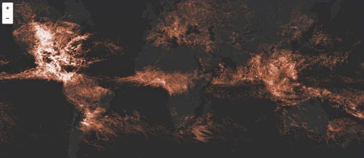
A Month of Lightning is an interactive map of all 80,305,421 lightning strikes that occurred across the globe in May 2013.
Mapping 80 million data points on a digital map is not an easy task. However when Mapbox's Eric Fischer created the Most Detailed Tweet Map Ever he also built & released an open sourced tool called Tippecanoe for making vector tiles from large data sets.
Jordan Rousseau was able to use Tippecanoe to process the May 2013 lightning data from Weather Decision Technologies. The result is this impressive Mapbox map which allows you to view over 80 million global lightning strikes from just one month. You can read more about how the map was made in Jordan's blog post, Visualizing a Month of Lightning.
There are many ways to decorate your house on Street View. By far the most beautiful is Sakura.
Sakura allows you to visualize how your house would look if you could transport it to Japan in the springtime, just at the moment when the cherry blossom is in full bloom. If you have a WebGL capable browser you can share your location with Sakura and see a Street View of your own home covered in pink cherry blossom.
If you're a fan of Street View then you should also have a look at Teleporter, a fun application which will transport you to random locations around the world on Google Maps Street View.
This week I was also very impressed with two map tools. Street Patterns
is an ingenious tool for creating SVG images from OpenStreetMap data.
In truth Street Patterns is actually a very detailed tutorial about how
you can use Overpass and Turf
to develop your own SVG map graphics. However the tutorial includes a
number of map wizards which automate every stage of the process.
Turf,jsParty consists of two main sections, an editor and a Leaflet map. The editor allows you to choose from a number of common turf operations. You can edit and play around with the examples in the editor and view your edits directly on the Leaflet map. Of course you don't have to use the provided examples and can test your own turf operations by entering them directly into the editor.
Labels:
Sunday Best
Saturday, March 28, 2015
Mapping the Ocean Floor
NOAA has created an Esri map of Gloucester Harbor which allows you to explore the ocean floor. Peer Beneath the Waves uses the Esri Story Map Spyglass feature to allow you to peak beneath NOAA's nautical chart of the harbor and view the seabed beneath the waves.
You can drag the Spyglass around on the map to explore NOAA's hydrographic survey data from Gloucester Harbor. The map also includes a number of markers to help you learn more about the seabed in the harbor.
Canvas Masking in Leaflet
Democracy Street is a really interesting map which reveals the etymology of UK streets that have been named after UK politicians. One clever design feature of the map is the use of a masking effect to highlight interactive areas on the map.
All of the featured roads & streets on the map are colored yellow. However the yellow roads on the map don't show up so well when the map is zoomed out. To overcome this Democracy Street has used the leaflet.maskcanvas plug-in to highlight the areas around each featured road, ensuring that the interactive roads & streets can be easily spotted, even when zoomed out on the map.
The leaflet.maskcanvas plug-in is designed to show large data-sets on a Leaflet map. The plug-in effectively masks areas on the map except for the data points which you have added to the map. The leaflet.maskcanvas plug-in on Github includes an example map which uses the masking effect to show the radius around Berlin stations. The demo allows you to adjust the radius of the mask by any number of meters.
You can create a similar effect on Google Maps by using Vasile Cotovanu's polygon masking library. Geomask allows you to simply draw around an area on Google Maps and generate any shaped polygon to create a neat masking effect. You aren't restricted to one area and you can highlight as many areas as you want on the map.
Labels:
Leaflet
The Democratic Road Map
Democracy Street is a new UK map, partly sponsored by the UK parliament, which is attempting to map the influence of democratic history on the country's place-names. Using the map you can discover which streets in your neighbourhood have been named after a politician or someone else who has been important in some way to the country's democratic history.
Streets and roads named after an individual important to UK democracy are shown on the map in yellow. These streets are further highlighted on the map by a larger white circle lighting up the underlying Stamen toner map tiles. If you select a yellow marked road on the map you can learn a little more about the person whom the road was named after.
Democracy Street owes more than a passing debt to the German map, Straßenkrieg. Straßenkrieg is a fascinating map revealing the history behind the many Berlin street names which have a military connection. The map highlights Berlin streets which have been named after battles, important military leaders or German army regiments.
All the military connected roads are highlighted on the map with colored lines. The colors indicate the historical period associated with the road's name, e.g. Prussian, the Weimar Republic, National Socialism or post-WWII. If you select a road on the map you can read a brief explanation of the military relevance of the road's name and click-through to read a more detailed account of the person or battle memorialized.
In turn Straßenkrieg was more than likely inspired by the awesome History of San Francisco Place Names. The History of San Francisco Place Names is a fascinating insight into the history of the names behind the city's landmarks and streets.
Click on any of the streets or landmarks, marked in blue on the map, and you can find out who it was named after or where its name originally came from.
Labels:
UK
Friday, March 27, 2015
There Are 3D Maps - Then There's Our Tam
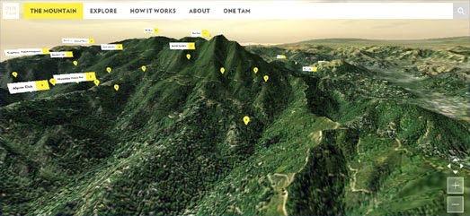
Our Tam is an amazing WebGL powered 3d map of Mount Tamalpais in Marin County, California. Using the map you can rotate around the mountain and zoom in and out on features with incredible speed. If you view the site in a non-WebGL browser the map degrades gracefully to a 2d Google Map.
The map features a number of markers which allow you to explore stories, photos and videos of the mountain left by other users. You can add your own stories, photos or videos about Mount Tamalpais by clicking on the map and selecting the 'Leave s Story' button.
Visit the New York of 1609
It's been a while since I last traveled back to the New York City of 1609. In the past I've always enjoyed my little trips to the forests and creeks of Mannahatta.
The last time I visited the Mannahatta Project you could view a map providing an imagined satellite view of how Manhattan Island might have looked back in 1609. Since that last trip to 1609 New York the project has been renamed the Welikia Project. The project also now lets you explore the natural landscape of New York's valleys, forests, fields, freshwater wetlands and salt marshes in more detail.
You can now click on any New York neighborhood on the Welikia Google Map to find out a little more about the area's ecology back in 1609. When you select a neighborhood on the map an information window opens providing information of the area's 1609 landscape, wildlife and indigenous population.
Labels:
history maps,
New York,
USA
Berlin Development Plans in 3D
Last year Berliners had the chance to vote on plans to develop Tempelhofer Feld, the site of the old Templehof Airport. Before the vote the Berliner Morgenpost created a very nice 3d map of the development plans (the development plans were defeated so this visualization is a little out of date now but it still well worth a look).
The Berliner Morgenpost used ViziCities to create 3d map of Tempelhofer Feld and how the site might be developed. Was Wo Gebaut Werden Sol mapped the planned areas of development within Templehofer Feld. The map menu allows you to view the various sites with the park. When you select a site from the menu the map provides a really neat 3d pan from your current viewpoint to the selected location.
The map uses WebGL for the 3d fly overs of the park. However the map also degrades well on non-WebGL enabled browsers. If you view the map on a non-WebGL enabled browser you miss out on the 3d flyovers of the park but you still get to see each location on the map.
Mapping Independent Film Events
Screening Film is a Google Map of independent film events in the UK. The map can be used by organizers to list independent film screenings & events and by film fans to find independent films showing at venues nearby.
Users can filter the events on the map by date (this week, next week, this month & next month) and by genre of film. If you select a venue on the map the details of the upcoming independent film event are listed in the map side-panel. These include a short description of the film or event, the address of the venue and the screening times.
Thursday, March 26, 2015
Your Invite to the Turf Party
If you haven't started playing with Turf.js yet I can only assume that it's because your invitation somehow got lost in the post. Let's remedy that now:
This is your formal invitation to the Turf Party. No RSVP necessary.
Turf is an incredibly powerful JavaScript library for performing many common GIS operations in the browser. Turf.jsParty is a great online editor which allows you to play around and learn turf in your browser without having to set up the boilerplate code.
Turf,jsParty consists of two main sections, an editor and a Leaflet map. The editor allows you to choose from a number of common turf operations. You can edit and play around with the examples in the editor and view your edits directly on the Leaflet map. Of course you don't have to use the provided examples and can test your own turf operations by entering them directly into the editor.
While attending the Turf Party you might find it handy to also have a look at the Turf API Documentation.
Update: turf,jsparty now includes the option to view the Turf API Documentation directly from the editor. While exploring the many examples in the editor you can now highlight a line containing a Turf function and press the 'Quick Docs' button. This will open the relevant API documentation for the selected function right next to the editor.
Labels:
turf.js
Rising Rents in Boston Mapped.
Ungentry has released a nice visualization of rising rents in Boston. Ungentry are a volunteer group using creative technology to solve civic and social problems. One of their main concerns is examining the negative effects of gentrification.
By using three synchronized Leaflet maps side-by-side Ungentry has created an effective tool for comparing Boston housing, income and demographic data from the last three US censuses. The initial map view shows the average cost of renting in Boston neighborhoods. You can explore visualizations of other census data-sets on the maps by selecting an option from the three categorized drop-down menus.
Labels:
Boston,
census,
real estate
Tracking Shell in the Arctic
The oil company Shell have neither drilling permits nor any other regulatory approvals to drill in the Chukchi Sea, north of Alaska. Despite this Shell is sailing the drillship Noble Discoverer and the Polar Pioneer, a Transocean semi-submersible drilling rig, towards the Alaskan Arctic.
Greenpeace are doing everything they can to highlight the actions of Shell. This includes tailing Shell's drilling fleet on its journey to the Arctic. You can follow the Greenpeace ship Esperanza in near real-time as it tails Shell's drilling ships on its website Save the Arctic - The Crossing.
The Save the Arctic's Google Map shows the live position of the Esperanza (currently in the Pacific Ocean). The map includes a live stream of Twitter updates from the Esperanza's crew of six. It also includes a track of the Greenpeace Ship's journey so far and photos and videos from its mission.
Labels:
Arctic,
environment
Wednesday, March 25, 2015
The Maps of Saturday Night Live
SNL40 is possibly not the most useful map of the week but it is kind of fun. Inspired By Saturday Night Live's 'Weekend Update' SNL40 allows you to view a number of different TileMill created map styles behind your favorite Saturday Night Live comedians.
Change the channel on the TV to flick through the different map styles and presenters. There are six maps in total. If this format of map presentation really grabs you then you can also fork the project on Github.
Labels:
TVMaps
Mapping Vancouver Energy
The Energy Explorer is a set of tools for exploring community energy use in Vancouver. The site aims to encourage a vision of a more sustainable city through the use of renewable energy resources. As part of this aim the Energy Explorer includes two interactive maps visualizing the city's current energy use and its potential for renewable energy resources.
The Home Energy Map provides a visualization of current energy use by Vancouver households. Building footprints on the map are colored to show their estimated energy usage based on the age of the building and its size. Vancouver citizens can therefore use the map to see how much energy they use and compare it to the estimated energy usage of their neighbors.
The Renewable Energy Map provides a visualization of the potential of different types of renewable energy resources in Metro Vancouver. The map includes layers to explore the potential for solar power, wind energy, hydro power and heat recovery.
Each of the map layers also allows you to select individual districts on the map to view the current energy demand in each area.
Labels:
Canada,
environment,
Vancouver
80 Million Bolts of Lightning
A Month of Lightning is an interactive map of all 80,305,421 lightning strikes that occurred across the globe in May 2013.
Mapping 80 million data points on a digital map is not an easy task. However when Mapbox's Eric Fischer created the Most Detailed Tweet Map Ever he also built & released an open sourced tool called Tippercanoe for making vector tiles from large data sets.
Jordan Rousseau was able to use Tippercanoe to process the May 2013 lightning data from Weather Decision Technologies. The result is this impressive Mapbox map which allows you to view over 80 million global lightning strikes from just one month.
You can read more about how the map was made in Jordan's blog post, Visualizing a Month of Lightning.
If you want to see where lightning is striking right now then you can also check out these two real-time lightning maps.
LighteningMaps is a live Google Map of lightning strikes across the globe. Animated flashing circles light-up on the map to record each lightning strike so it is easy to see where in the world electrical storms are occurring right now.
Blitzortung.org works with a community of users, who have built their own lightning receivers, to automatically display live lightning data on a Google Map.
Blitzortung.org includes instructions on how you can build your own lightning monitor and also includes instructions on how you can build your own Google Map based on the data received from a lightning monitor.
If you can't be bothered to build your own lightning box you can always just check out Blitzortung's live Google Map of lightning strikes.
Mapping Road Noise in Paris
The Map of Road Noise in Paris is an Esri map of 2015 road noise levels in the French capital. The map includes four different map layers visualizing road noise levels during a 24 hour period, the noise level at night (22h-6h), all roads exceeding 68 dB in 24 hours and all roads exceeding an average noise level of at least 62 dB at night.
Paris has managed to reduce its overall road noise levels by introducing a number of measures. These include reducing the speed on the Boulevard Périphérique (the ring road) and by reducing overall road traffic in the capital.
When the German courts decided that Berlin Airport could operate flights between 5 am and midnight German newspaper Taz created Fluglärm-Karte BBI-Airport Berlin, a Google Map showing the noise pollution caused by aircraft at Berlin Airport.
Residents who live close to the airport claimed that this new directive would give them only a 5 hour window in which it was possible to sleep. The map shows the number of decibels along the flight paths to and from the airport and in the immediate vicinity.
Labels:
environment,
Paris
Tuesday, March 24, 2015
Cherry Bomb Your House on Street View
There are many ways to decorate your house on Street View. By far the most beautiful is Sakura.
Sakura allows you to visualize how your house would look if you could transport it to Japan in the springtime, just at the moment when the cherry blossom is in full bloom. The effect is so amazing that it can even transform my grey London street into a road which I might actually be happy living in.
If you have a WebGL capable browser you can share your location with Sakura and see a Street View of your own home covered in pink cherry blossom.
Hat-tip: Google Street View World
Labels:
game,
Street View
OpenStreetMap to SVG
This morning I created a little visualization of the cartographic centers of a number of global cities. In truth my City Centers visualization is of only marginal interest. What is really interesting is how it was made.
Street Patterns is an ingenious tool for creating SVG images from OpenStreetMap data. In truth Street Patterns is actually a very detailed tutorial about how you can use Overpass and Turf to develop your own SVG map graphics. However the tutorial includes a number of map wizards which automate each stage of the process.
So, if you are happy with the circular SVG map template which the wizards produce, you can create your own SVG maps in a matter of minutes. If you don't want a circular map then you can just use the tutorial to create your own SVG maps from OpenStreetMap data.
Labels:
OpenStreetMap
Take a Virtual Tour of Hobbiton
Mapillary, the crowdsourced alternative to Street View, now includes photos of Hobbiton in the Shire. This means that you can now take a virtual tour of Hobbiton, stroll along Bagshot Row and visit Bag End (the legendary home of Bilbo Baggins, Frodo Baggins, and later Samwise Gamgee and his wife Rosie Cotton).
Except of course the Hobbiton in question is really the Hobbiton movie set in New Zealand. Even so I'm sure the new Mapillary imagery will appeal to fans of Tolkein's novels and Peter Jackson's movies.
Mapillary provides crowdsourced imagery of locations around the world. Users of the Mapillary Android and iOS app can take photographs which are added to the Mapillary photo map of the world. The Mapillary map can then be browsed by anyone wishing to view photographs by location.
All of the street view imagery on Mapillary is available under the Creative Commons Attribution-ShareAlike 4.0 International License. Mapillary also provides a developer API which is free for non-commercial and small scale use.
Labels:
New Zealand,
Street View
Monday, March 23, 2015
Mapping US Temperature Anomalies
U.S. Daily Temperature Anomalies 2010-2013 is an animated map of unusually high and low recorded temperatures in the United States. The map uses CartoDB's Torque library to animate through the four years of temperature data.
The animated weather patterns which emerge on the map seem to reflect the influence of the Westerlies on the United States. As the animation plays out there appears to be a general west to east movement of these temperature anomalies from 2010-2013.
The U.S. Daily Temperature Anomalies 2010-2013 map uses data from the U.S. Daily Temperature Anomalies 1964-2013 map. This timeline and map plots temperature anomalies from 2,716 weather stations in the US, which have data going back 50 years.
Each station's daily temperature recordings have been compared to the corresponding monthly distribution. If the temperature at the station fell in the bottom or top 2% on a given day it is labelled an anomaly.
The map animates through the 50 years of temperature anomalies at all 2,716 weather stations. Warm anomalies are show on the map in red and cold anomalies are displayed with blue dots. Beneath the map a graph plots the yearly proportion of warm anomalies to cold anomalies. The graph shows a clear trend towards ever increasing warm anomalies in the United States.
The Street View Teleportation Device
The first time I saw Teleporter my heart sank a little and I couldn't help wondering why anybody would bother creating yet another random Street View browser. Random Street View explorers already have an extensive choice of random street generators, including MapCrunch, Robot Flâneur, The Secret Door, Globe Genie and Random Street View.
However, after clicking on the big 'T' teleport button, I quickly became impressed with Teleporter's ability to find beautiful Street Views around the world. I soon began to suspect that Teleporter must have a big database of impressive Street Views and was randomly displaying Street Views from this list.
I therefore decided to have a little look at the JavaScript behind Teleporter. It turns out that Teleporter is powered by a library called gGrid. The library divides the world into a grid and then randomly selects a point on this grid and requests a nearby Street View panorama from the Google Maps API. So there is no list of beautiful Street Views.
I imagine that Teleporter is so successful at discovering attractive Street Views because much of the world is actually very beautiful. Despite mankind's attempts to find paradise and put up a parking lot, when you choose a random location on the Earth the chances are that you will pick a spot outside of major urban conurbations. The result of this is that gGrid has the uncanny knack of finding some truly beautiful Street View images from Google's extensive coverage around the world.
Labels:
Street View
Subscribe to:
Posts (Atom)