Showing posts with label energy. Show all posts

Wednesday, December 18, 2024

An Earth Powered by the Sun

spinning Earth globe showing solar farms around the world

Australia's ABC has used data from TransitionZero to map out the astonishing growth in solar energy around the world. Using machine learning to analyze global satellite imagery, TransitionZero has discovered that solar farms now cover approximately 19,000 square kilometers of the Earth. And the number of solar installations is doubling every three years.

Using a 3D globe of the Earth, ABC has mapped out the world's solar farms to visualize where and how solar power is reshaping energy systems worldwide. In A Survey of the World's Solar Energy Boom you can explore for yourself the regions driving this revolution. 

China is leading the charge in solar power, installing more solar capacity in 2023 than the rest of the world combined, with vast arrays in the sparsely populated west and north. India follows closely, leveraging government subsidies to build mega-projects like the Khavda Renewable Energy Park, which will power over 16 million homes. Meanwhile, countries, such as Pakistan and Namibia, are rapidly embracing solar through grassroots initiatives and affordable imports from China.

Solar power’s meteoric rise can be attributed to a combination of technological innovation, economic scalability, and urgent climate goals. Advances like UNSW’s PERC technology have revolutionized solar efficiency, while mass production in China has driven down costs, making solar the cheapest form of electricity. 

Global solar capacity is now projected to provide 12% of all electricity in just three years time. By 2034, experts predict solar could account for nearly half of the world's power generation, underscoring its central role in the transition to a sustainable energy future.

Tuesday, November 12, 2024

The Reemergence of Nuclear Power

world map showing the locations of nuclear power stations

When I reviewed the Nuclear Stations Map in August, I was surprised to see that, a little over a decade after the Fukushima disaster, Japan appears to be building at least three new nuclear power plants on its coastline. The Nuclear Stations Map shows all the nuclear plants in the world, whether decommissioned, in operation, or under construction. Currently, the map highlights over 60 new nuclear reactors being built around the globe.

After the Fukushima disaster, Germany decided to phase out nuclear power, a process completed in 2023. At the time, the environmental and human cost of the Fukushima nuclear accident in 2011 seemed to signal the decline of nuclear power as a viable energy option for most countries. However, the war in Ukraine and the subsequent surge in energy prices appear to have sparked a renewed interest in nuclear energy.

The Straits Times directly addresses this resurgence in its scrollytelling story map On the nuclear trail: The dawn of a global renaissance in nuclear energy. Poignantly, this guided tour of the world’s renewed interest in nuclear power starts with just three locations highlighted on the world map: Three Mile Island, Chernobyl, and Fukushima - the sites of the world’s three worst nuclear disasters.

cartogram showing how much of each country’s electricity generation is from fossil fuels, renewables or nuclear energy.

The recent announcement that Microsoft had signed a deal to purchase nuclear power from Three Mile Island is emblematic of how energy security now seems to outweigh lingering fears of nuclear accidents. The Straits Times story map goes on to show the large number of nuclear power stations currently under construction across many countries. According to the accompanying article, “25 countries – including France, Japan, and the United States – have pledged to triple global nuclear energy capacity by 2050.”

The article is also illustrated with an interesting gridded cartogram that visualizes how much of each country’s electricity generation comes from fossil fuels, renewables, or nuclear energy. As you scroll through the article, individual countries are highlighted on the cartogram to explain the reasons behind their energy mix. For example, “In France, nuclear energy powers up to 70 percent of the country’s electricity needs. However, it has not built a new reactor since 1999 and is now planning to construct 14 more reactors by 2050.”

The reemergence of nuclear power signals a pivotal moment in the global energy landscape. Faced with the dual crises of climate change and energy insecurity, countries are increasingly turning back to a power source many had once sworn off. However, while the promise of clean, reliable energy is alluring, we shouldn't forget that past nuclear disasters have left parts of Chernobyl and Fukushima uninhabitable.

Friday, August 16, 2024

How the World Powers Itself

map of coal power station locations around the world

You can learn a lot about how the world powers itself from the Global Energy Monitor's Power Tracker. This interactive map shows the locations of nearly 18,000 power stations in 200 countries around the world, categorized by power sector.

Using the map's filter controls it is possible to explore where different types of power stations are distributed around the world. This allows you, for example, to investigate which countries are still most reliant on thermal power (coal, oil, gas, nuclear, geothermal, bioenergy) and which have shifted most successfully to renewables (solar, wind, hydro).

If you use the filter controls to view the locations of operational and planned coal power stations, you can see how western Europe has almost completely moved away from dirty coal power - except for Germany which is still hugely reliant on its coal fired power stations. Change the filters to view nuclear power stations and you can see one of the reasons why Germany is still so reliant on coal (the last three nuclear power plants in Germany were shut down last year).

map of wind power stations in Europe
Wind power stations in Europe

The distribution of wind power stations in Europe also reveals an interesting picture. For some reason the Alps and the Pyrenees are almost completely empty of wind power. My guess is that valley locations are not great for wind power stations because wind conditions are too variable and that placing wind power stations at the highest altitudes is too costly (in terms of construction and connecting to power grids). 

There may also be some aesthetic considerations why wind turbines are not stuck on the top of mountains. Wind turbines may be seen as anathema to the natural beauty of mountain regions. There may also be some zoning difficulties in that the Alps and Pyrenees have a lot of environmentally protected areas and national parks. Although these considerations don't seem to affect the construction of hydro-power stations. Check out the location of hydro-power on the Power Tracker map and you can see that a number of hydro-power stations have been built in both the Alps and the Pyrenees.

I am also intrigued by the locations of nuclear power stations around the world. Despite having large coastlines France and the United States place a lot of their nuclear power stations inland. In much of the rest of the world, where countries have large coastlines (for example China and Japan) nuclear power stations tend to be sited almost exclusively next to the sea (oceans offer a reliable and abundant source of cooling water to dissipate the heat generated during the nuclear fission process).

Monday, August 12, 2024

Real-Time Radiation Maps

map of Gieiger counter readings in Eatern Europe

Yesterday a fire broke out at the Zaporizhzhia nuclear power plant in Russian occupied southern Ukraine. On hearing the news of the fire I almost immediately rushed to the Real-Time Radiation World Map in search of any detected spikes in radiation in the area.

The Real-Time Radiation World Map visualizes radioactivity levels from Geiger counters around the world. Luckily, as you can see from the screenshot above, there don't seem to be any high levels of radioactivity showing up on the map anywhere in this region of eastern Europe. Unfortunately the map does not currently have many Geiger counters in Russia or any that are particularly near the Zaporizhzhia nuclear power plant in Ukraine.

graph of gamma dose rates at the Zaporizhzhia nuclear power plant

The Zaporizhzhia nuclear power plant does feature on the European Commission's Radioactivity Environmental Monitoring map. The map shows the current gamma radiation readings from automatic surveillance systems in 39 countries. Thankfully the graph of the gamma dose rate at the Zaporizhzhia plant currently shows a very low level of gamma radiation, a level well within the range of natural background radiation.

Russia is reporting today that the fire at the Zaporizhzhia nuclear power plant has been completely extinguished.

map of European power plants

While on the subject of nuclear power plants I also recently stumbled upon the Nuclear Stations Map, which is a new interactive map of all the nuclear plants in the world, both decommissioned, in operation or in construction.

On the map the power plant markers are scaled by their capacity and the colors indicate their status (green = in operation, black = decommissioned and orange = in construction. On viewing the Nuclear Stations Map I was struck by two things. One (as you can see in the screenshot of the map) is the clear abandonment of nuclear power in Germany (the last three nuclear power plants in Germany were shut down last year). The other is that a little over a decade after the disaster of Fukishima, Japan appears to be building at least three new nuclear power plants on its coastline.

Thursday, February 01, 2024

Mapping Oil and Gas Emissions

The Oil Climate Index plus Gas (OCI⁺) is an open-source tool that estimates and compares the life-cycle greenhouse gas (GHG) emissions of individual oil and gas resources around the world. In estimating the total emissions of individual oil and gas assets OCI⁺ calculates emissions across the entire life cycle of oil and gas, from production and processing to transportation and end-use. 

The OCI⁺ interactive map of Oil & Gas Emissions allows you to compare the emissions of the world's oil and gas resources, helping you to identify those with the highest and lowest climate impact. On the map individual oil and gas assets are shown using circular map markers. The size of each circle shows the asset's total estimated climate footprint. You can also click on the individual markers to view each asset’s emissions intensity.

The map includes two overlays (methane inventory and flared gas volume) which allow you to view satellite-detected gas flaring and methane emissions in the vicinity of each resource.

If you are interested in learning more about gas flaring then you can also refer to the SkyTruth Flaring Map. The SkyTruth Flaring Map visualizes daily infrared detections of oil wells around the world burning off excess gas. 

Flaring from natural oil wells is a huge contributor to global heating. For example in 2018 145 billion cubic meters of natural gas was burned during flaring. That is the equivalent of the entire gas consumption of Central and South America combined. 

The SkyTruth Flaring Map uses data detected by NOAA’s Suomi NPP satellite. The map is updated daily to show all infrared detections hot enough to be gas flares. The map animates through these nightly detections of global flaring. The animation can be controlled using the timeline tool in the map sidebar.

SkyTruth has also released an Annual Flaring Volume Map. This map shows the annual volume estimates of gas flaring maintained by the Earth Observation Group.

On this map oil refineries around the world are shown using a red marker. You can click on the individual markers to view the estimated volume of gas flared and the detection frequency. The map includes drawing tools which allow you to create your own areas of interest on the map to view (and download) the flaring data for only the refineries in your defined area.

Saturday, July 22, 2023

Electrical Japan

Electrical Japan is an interactive map that visualizes electricity supply and demand in Japan. It was created by the National Institute of Informatics (NII) in the wake of the 2011 Fukushima Daiichi nuclear disaster, in order to better understand Japan's energy problems after the 2011 tsunami and to help promote energy conservation.

The map shows the location of all of Japan's power plants, as well as the amount of electricity that each generates. The map also includes a satellite layer showing nightlights in Japan, which can be used to estimate the levels of electricity consumption across the country.

The information shown on the map can be filtered by type of power plant, by region, or by year. The map also includes a timeline of some of Japan's major energy events. These events include the Fukushima Daiichi nuclear disaster, the rising costs of natural gas following the 2022 Russian invasion of Ukraine, and the decline of commercial energy demand during the Covid-19 epidemic.
Another major feature of Electrical Japan is an historical timeline of power plant construction. This animated map layer allows you to view the locations and types of power plants installed in Japan every year since 1893. This animated timeline perfectly visualizes some of the trends in power generation in Japan, for example the growth of nuclear power after 1970, the growth of wind power after 2000, and the growth in solar power plants since 2010.

Also See

The Energy and Industry Geography Lab - the European Commission map provides an overview of Europe's energy infrastructure. It shows the location of the various types of power plants and their capacity. 

U.S. Power Plants - an interactive map showing the locations, size and type of America's electric power plants. The map shows where different types of power plant are located, how much each type of energy source contributes to the country's power supply, and how much each source contributes to CO2 emissions.

Wednesday, May 24, 2023

Germany - the Dirty Man of Europe

A new interactive map shows how CO2 emissions in Germany are once again on the increase. In the first two decades of this century Germany has produced the most carbon dioxide emissions of any country in the European Union. The main reason for this is that Germany is heavily reliant on coal for electricity generation. Germany aims to become carbon-neutral by 2045 however the war in Ukraine has had a significant impact on Germany's continuing reliance on coal power plants.

The EU Power Plant Emissions map uses the latest EU Emissions Trading System data to visualize the amount of carbon dioxide emitted by countries in the European Union (and also Switzerland, Norway, Iceland & Liechtenstein). The map shows that the highest levels of CO2 from power plants originate in Eastern European countries and Germany - with coal power plants being the major culprits.

If you hover over any of the power plants on the map you can view the levels of CO2 emitted by the plant in each year. If you hover over any of the coal power plants in Germany then you are likely to see a reduction in CO2 between 2017 and 2020. One reason for this increase is Russia's invasion of Ukraine. In an effort to reduce its dependence on Russian gas, Germany has temporarily reopened decommissioned and soon-to-be decommissioned coal power plants. This has resulted in the country once again increasing its CO2 emissions from coal-fired power plants.

Last year coal power plants were responsible for 60% of power sector emissions in the EU-ETS. Germany and Poland accounted for two thirds of all the CO2 emissions from coal power plants. 

Beyond Fossil Fuels has an interactive map showing the locations of coal power plants in Europe. On the map you can see that there are far more coal power plants in Eastern Europe (including Germany) than in the west of the continent. Beyond Fossil Fuels has also created an animated map which shows the amount of carbon dioxide from coal power plants produced by European countries since 2005.

From the animated map (shown above) you can see that most countries in Europe have actually significantly reduced the amount of carbon dioxide emitted by coal power plants. The major exceptions being Poland and Germany.

Tuesday, March 28, 2023

The Real-Time Wind Power Map

Right now around a third of the UK's current electricity is being generated by offshore wind power. In fact more than 20% of global offshore wind capacity is generated in the UK.

You can explore for yourself the current operating status of UK wind farms on the UK Renewables Map. This map shows the live generating output of all the major wind farms in Great Britain, revealing the amount of power currently being generated by each farm and where that generation is happening.

The current MW output of each wind farm is represented on the map by scaled yellow circles. If you click on these circles you view the selected farm's name and graphs showing the historical generating output of the farm. The UK Renewables Map also includes a real-time animated wind layer which shows the current wind conditions around the UK.

The UK Renewables Map is a personal project of Robin Hawkes. The wind data for the map is from Elexon BSC and the animated wind layer is from WeatherLayers.

You can also view the estimated amount of electricity being generated by offshore wind sites across the UK on the Crown Estate's Offshore Wind Electricity Map. On this map each wind farm is represented by a scaled animated wind turbine marker. The size of each marker represents the scale of its current output. If you select one of these markers you can view the name of the wind farm and its current output in megawatts.

The map sidebar shows a dashboard reading of the share of the UK's electricity currently being generated by offshore wind. If you select a marker on the map the dashboard updates to show the name of the selected wind farm and its current output in MW.

Wednesday, July 06, 2022

The Energy Industry Map

The European Commission's interactive map The Energy and Industry Geography Lab provides an overview of Europe's energy infrastructure and the potential for developing cleaner energy.

The inital map view of The Energy and Industry Geography Map shows the location of the various types of power plants and their individual capacity. This layer provides a wonderful overview of how individual countries generate electricity. For example, the number of red dots (indicating coal fired power stations) in Germany and much of Eastern Europe shows that the continent still has a long way to go in eradicating greenhouse gas emissions.

The number of large green dots in France shows its reliance on nuclear energy (in 2021 69% of France's electricity production was generated by nuclear power). Norway is dominated by hydro-electric power plants (hydropower plants generate around 90 % of Norway's electricity). A large number of hydro plants are also located in north Italy, in the Italian Alps.

The Energy and Industry Geography Map includes a number of other map layers. These include a layer displaying energy infrastructure networks - showing the location of the continent's gas pipelines. The map also includes layers which show the locations of planned future energy projects in Europe and assessments of the continent's renewable energy potential. 


You can explore how America generates power on the U.S. Power Plants map. U.S. Power Plants is an interactive map showing the locations, size and type of America's electric power plants. The map shows where different types of power plant are located, how much each type of energy source contributes to the country's power supply and how much each source contributes to CO2 emissions. 

The number of map filters on U.S. Power Plants means that the map can provide lots of different insights into American power supply. For example the individual fuel filters allow you to see where different power sources are concentrated in America. Select hydro power and you can see that hydro power plants are concentrated in the north-west and north-east of the country. While solar power plants are mainly located in California. 


Esri's Atlas of Electricity is another great way to explore where the USA gets its electricity from and how it distributes power across the country. At the heart of an Atlas of Electricity is an interactive map plotting the location and size of the grid's power plants and transmission cables. This map allows you to explore the location and capacity of the country's electricity producing power plants and how they connect to the national grid. 

As well as mapping the physical infrastructure of the electricity grid Esri's story map examines the primary energy sources used to generate electricity in the USA. It maps the size and capacity of coal-fired power plants, natural gas power plants and petroleum power plants. Alongside these fossil-fuel sources of power An Atlas of Electricity plots the size and capacity of the U.S.'s nuclear power plants, hydroelectric power plants and solar & wind power plants.

Friday, January 21, 2022

Mapping the World's Infrastructure

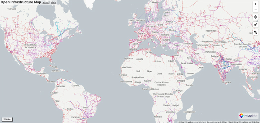
The Open Infrastructure Map is an interactive map of the world's power, telecoms, gas, and oil infrastructure. The map uses data from OpenStreetMap to plot electricity power plants & power lines, oil, gas & petroleum pipelines, water pipelines, and telecom cables.

The Open Infrastructure Map includes five different layers. These layers allow you to turn on or off map data relating to 'Power', 'Solar Generation', 'Telecoms', 'Oil & Gas' and 'Water'. The electricity power lines shown are also color coded to show their levels of voltage. 

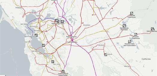
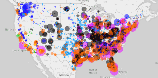
As you zoom in on the Open Infrastructure Map more detail is added to the map to show the locations of individual power stations. Different map symbols are used to indicate the different types of power plant (nuclear, oil, coal, gas, wind, solar etc). 

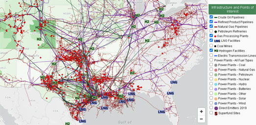
The Open Infrastructure Map also includes an interesting statistics facility. This allows you to view the amount of infrastructure mapped in different countries. For example Open Infrastructure Map has mapped 6,230 different power plants in the United States. Of these 763 are gas powered, 247 are coal powered and there are 62 nuclear power plants. The statistics given reflect only the infrastructure which has been mapped on OpenStreetMap. This data may be incomplete and the accuracy is only as good as the mapped data.


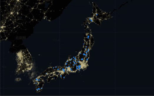
Gridfinder is an interactive map which visualizes the global electricity grid network based on night-light satellite imagery. The map predicts the existence of electricity network lines using evidence from night-time views of the Earth from space.

10% of the world's population does not have access to a reliable electricity supply. It is hoped that Gridfinder can be used to identify populations with poor access to electricity networks in order to help improve essential infrastructure and provide affordable and reliable energy.

The Gridfinder map shows the locations of known electricity lines using data from OpenStreetMap. The map also shows predicted electricity supply lines based on where lights can be seen at night from orbiting satellites. To predict the existence of these previously unmapped electricity supply lines the level of night-time light in satellite imagery is used to see where locations are most likely to be producing light from electricity. Where there is enough light to have been produced by an electricity network the map connects this to known electricity networks using an algorithm which follows roads and already known distribution lines.

You can read more about how night-time satellite imagery has been used to predict the world's electricity network on the research paper Predictive mapping of the global power system using open data.  

Every year Telegeography releases a map of the huge global network of undersea telecommunication cables which carry all our data around the world. Subsea cables carry telecommunication signals under the oceans, communicating information between different countries and regions of the world. In the 19th Century the first submarine cables were laid to carry telegraphy traffic. In the 21st Century submarine cables carry digital data, which includes telephone and Internet data.

The 2021 Submarine Cable Map from Telegeography shows 464 cables and 1,245 landing stations. The map also features lots of textual information, featuring both cable trivia and answers to FAQ's about cable suppliers, content providers, fiber etc. For example - did you know that there are now over 1.3 kilometers of underwater cables around the world (if they were laid end-to-end they could wrap around the world 30 times).

Friday, January 07, 2022

Mapping the American Power Grid

Last month Rice University's Baker Institute for Public Policy released a new interactive map which provides America's energy infrastructure. The Energy, Environment and Policy map shows the locations of the country's critical energy facilities.

The 'Infrastructure and Points of Interest' menu on the map allows users to add or remove different types of energy infrastructure from the map. These map layers include gas pipelines, and the different types of power plants used to power America. A second menu, 'Census Data and Raster Layers' allows you to add demographic and election data to the map. This menu includes layers which visualize population density, household income and the results of the 2020 election. Under this menu you can also find a map layer which shows the location of all active oil and gas wells.


You can also explore how America generates power on the U.S. Power Plants map. U.S. Power Plants is an interactive map showing the locations, size and type of America's electric power plants. The map is a great way to see where different types of power plant are located, how much each type of energy source contributes to the country's power supply and how much each source contributes to CO2 emissions.

The number of map filters on U.S. Power Plants means that the map can provide lots of different insights into American power supply. For example the individual fuel filters allow you to see where different power sources are concentrated in America. Select hydro power and you can see that hydro power plants are concentrated in the north-west and north-east of the country. While solar power plants are mainly located in California.


Esri's Atlas of Electricity is another great way to explore where the USA gets its electricity from and how it distributes this power across the country. At the heart of an Atlas of Electricity is an interactive map plotting the location and size of the grid's power plants and transmission cables. This map allows you to explore the location and capacity of the country's electricity producing power plants and how they connect to the national grid.

As well as mapping the physical infrastructure of the electricity grid this story map examines the primary energy sources used to generate electricity in the USA. It maps the size and capacity of coal-fired power plants, natural gas power plants and petroleum power plants. Alongside these fossil-fuel sources of power An Atlas of Electricity plots the size and capacity of the U.S.'s nuclear power plants, hydroelectric power plants and solar & wind power plants. 

Friday, November 05, 2021

Why Europe's Gas Prices are Rising

In the last year gas prices in Europe have risen more than 500%. This has led to the collapse of a number of energy suppliers and, more importantly, to huge increases to household energy bills. Gas supplies across Europe are also at such low levels that a cold winter could see governments having to cut supplies to both industry and households. 

In How Does Europe Get its Gas the Financial Times explores Europe's gas pipeline infrastructure and explains some of the reasons behind the current supply crisis. One of the main problems is that Europe has a huge demand for natural gas and relies on importing most of it from outside of the European Union. 

Much of Europe's gas is supplied from Russia, which makes it very susceptible to the political maneuvers of Vladimir Putin. Currently it is believed that Putin is limiting the supply of gas to Europe in order to pressure the EU into approving a new gas pipeline into the continent. Russia has built a pipeline, Nord Stream 2, which runs at the bottom of the Baltic Sea from Russia to Germany. However Germany has yet to approve its use. Many believe that Putin is restricting gas supplies to Europe in an attempt to force Germany to approve the operation of the new Baltic Sea pipeline. 

Elsewhere Europe's gas supplies are facing challenges both from dwindling domestic supplies and from political problems in North Africa. All of these gas supply problems have left European politicians praying for a mild winter.

The Financial Times uses a Mapbox Storymap to visualize Europe's gas supply infrastructure and to highlight why this infrastructure is facing a huge supply problem. The Mapbox Storymap template is a popular method for individuals and organizations to create interactive mapped narratives. It is a relatively easy and quick way to create visualizations and stories which involve geographical elements.

Saturday, August 21, 2021

Who Owns the North Sea?

Over the last three years Who Owns England has been diligently trying to map who owns what land in England (and also to a lesser extent in Scotland and Wales). Another really important question, especially considering the current climate crisis, is 'Who owns the sea?'.

Who Owns the North Sea is an interactive map and database documenting the owners of oil and gas licenses in the North Sea. The oil reserves in the North Sea ensure that the UK is the second largest oil and gas producer in Europe. The UK government sells licenses to these fossil fuel assets to the private sector. These licenses grant companies the exclusive rights to extract oil and gas in a defined area.

If you click on any of the red markers on the Who Owns the North Sea interactive map you can view details on all the equity holders of that license. You can also see who is the ultimate parent company. If you click on a parent company's name in the map sidebar then all the licenses owned by that company in the North Sea will be shown in black.

In recent years the major oil and gas companies (such as Exxon Mobil, BP, and Shell) have been divesting their holdings in the North Sea. Private equity-backed and state-owned companies have begun to move in and control more and more fossil-fuel licenses in the North Sea. 

As we hopefully begin to move to a more carbon free future the ability to control and regulate the license holders in the North Sea will become increasingly important. While the big oil and gas companies have appalling records in terms of protecting the environment and halting climate change the new private equity and state-owned companies may prove even worse. Many environmentalists are worried that these private-equity companies and companies controlled by undemocratic countries may prove even harder to hold accountable and regulate.

Tuesday, January 12, 2021

The End of American Fossil Fuels


The incoming Biden administration has set a goal to decarbonize the U.S. power sector by 2035. Currently over 60% of electricity in the United States is generated from fossil fuels. Therefore if the new administration wants to meet its ambitious 2035 goal the government clearly has a lot to do.

Decarbonizing the U.S. energy sector will require the construction of new renewable power plants and the decommissioning of existing fossil fuel plants. This does sound like a huge task. However most fossil fuel power plants will complete their natural life-spans before 2035 and will need replacing regardless of the Biden decarbonizing goal.

You can observe the timeline of when fossil fuel power plants will reach the end of their planned lifespans on The future of United States fossil fuel-fired electricity interactive map. If you adjust the timeline on this map you can see how the total output of fossil fuel power plants will naturally drop from 820GW in 2018 to 200GW in 2035. Just by replacing these fossil fuel plants with renewable energy sources will go a long way to decarbonizing the U.S. power sector. 

On the interactive map the location of power plants are shown using colored dots. These dots disappear from the map based on the date when the power plant will come to the planned end of its lifespan.If you hover over a county on the map you can view the total number of jobs in the plant, coal and gas sectors for the selected year.

You can learn more about the natural obsolescence of the current fossil fueled power plants in the U.S. on a Georgia Tech School of Civil and Environmental Engineering research paper, Shuttering Fossil Fuel Power Plants May Cost Less Than Expected.

Monday, September 07, 2020

Your House's Solar Power Potential


The Mayor of London has released a new interactive map which shows the solar energy potential for every building in London. The map can be used to see how much energy your house could produce with solar panels.

The London Solar Opportunity Map provides an estimate of the potential for both photovoltaic solar panels and solar thermal installations on buildings and land in London. On the map buildings are colored by their solar energy potential (red buildings have the most potential and blue buildings the least). If you click on an individual building on the map you can view the estimated annual output of the building if solar panels were installed, the estimated installed potential and the average annual potential per square metre. You can also use the map side-panel to view the solar potential of a building when using different solar technologies.

The solar potential of individual buildings is based on a number of different factors, including the surface area, the direction of roofs and how much sunlight is blocked by surrounding buildings, trees etc.

In the United States you can use Google's Project Sunroof to view an estimate of how many hours of sunlight your roof receives per year, the square feet you have available for solar panels and the estimated net savings you could make by installing solar panels.


Homeowners and businesses in Switzerland can find out the solar power potential of their buildings using the Swiss Federal Office of Energy interactive map How much electricity or heat can my roof produce?.

In Australia you can use the SunSPoT Solar Potential Map map to work out how much energy a home might be able to generate by installing rooftop solar panels.

Thursday, January 16, 2020

The Predicted Global Electricity Grid


Gridfinder is a new interactive map which visualizes the predicted global electricity grid network based on night-light satellite imagery. The map predicts the existence of electricity network lines using evidence from night-time views of the Earth from space.

10% of the world's population does not have access to a reliable electricity supply. It is hoped that Gridfinder can be used to identify populations with poor access to electricity networks in order to help improve essential infrastructure and provide affordable and reliable energy.

The Gridfinder map shows the locations of known electricity lines using data from OpenStreetMap. The map also shows predicted electricity supply lines based on where lights can be seen at night from  orbiting satellites. To predict the existence of these previously unmapped electricity supply lines the level of night-time light in satellite imagery is used to see where locations are most likely to be producing light from electricity. Where there is enough light to have been produced by an electricity network the map connects this to known electricity networks using an algorithm which follows roads and already known distribution lines.

You can read more about how night-time satellite imagery has been used to predict the world's electricity network on the research paper Predictive mapping of the global power system using open data.

Thursday, October 31, 2019

Mapping Global Wind Power Potential


Despite growing by 30% in the last nine years offshore wind power still only provides 0.3% of electricity around the globe. Some countries, such as the UK, Germany and Denmark have recently added a lot of offshore wind power capacity. However there is still huge potential for offshore wind power around the world. In fact wind power has the potential to provide more than 18 times the global electricity demand today.

The IEA in collaboration with Imperial College London has assessed the potential for offshore wind development across the world. Alongside its report into the potential of wind power IEA has created an interactive map which shows where offshore wind has the highest technical potential and where the latest offshore wind projects are being built. The map in Offshore Wind Outlook 2019 uses four colors to show the areas of highest potential. These colors show areas in deep & shallow water and in regions far & near from shore.

The potential for offshore wind power generation is modeled using a number of variables, including wind speed and weather data from global reanalysis models.

Monday, September 02, 2019

Europe's Renewable Energy Potential


According to the Paris Agreement all signatory countries should increase the market share of renewable energy to at least 20% of the total energy market. According to a new interactive map this is potentially achievable by all European countries. The Possibility for Electricity Autarky map shows the potential that every country in Europe has for producing all its electricity demands from renewable energy.

Countries on the map are colored based on their potential for generating all their electricity needs from renewable energy sources. Therefore, according to the map, every European country is capable of meeting 100% of electricity demand with renewable electricity, generated locally from wind and solar power. If you hover over a country on the map you can view the country's population, electricity demand and how much electricity potential there is from local wind and solar power.

If you zoom in on the map you can view the potential for renewable energy within individual administrative areas within European countries. At this zoom level you can begin to see areas where renewable energy doesn't have the potential to meet demand. Many of these areas appear to be urban areas which are densely populated. I'm guessing this is due to the higher numbers of electricity consumers combined with less room for wind and solar power generation.

The data used to create the map comes from the peer-reviewed article, Home-made or imported: on the possibility for renewable electricity autarky on all scales in Europe.

Friday, July 05, 2019

The Integrated European Energy Network


Energy infrastructure in Europe is becoming increasingly integrated. The European Union is supporting the development of this integrated infrastructure with 173 projects of common interest (PCI). These projects are designed to support and develop the integration of the electricity, gas and oil markets in Europe.

The Projects of Common Interest interactive map visualizes the 173 PCI projects supported by the European Union. On the map these energy infrastructure projects are color-coded by type of energy. The blue lines indicate where high voltage lines have been developed to enable electricity supply between different European countries. The red lines on the map show the development of cross border gas pipelines.

If you select the 'Network' tab on the map legend then you can select to view either the electricity, gas or oil networks on the map. This is useful if you just want to highlight and view the European infrastructure projects being developed in one of these specific energy markets.


The PCI projects are of course only a very small part of a much larger network of electricity, gas and oil supply in Europe. The ENTSO-E Transmission System Map provides a neat visualization of the scale of Europe'e electricity transmission network.

On this map you can see all European transmission lines which are designed for 220kV voltage and higher and all the generation stations which have a net generation capacity of more than 100MW. On the map the transmission lines are color-coded to show their level of voltage. All undersea transmission lines are colored purple.

You can see how individual country electricity networks are connected to the networks of neighboring countries by selecting to view only cross border transmission lines. This will filter out all the lines on the map except for those which are used to transport electricity between two or more countries.

Saturday, June 01, 2019

The Cheapest Energy by County


The Energy Institute's Levelized Cost of Electricity interactive map shows the cheapest electricity generation technology in every US county. The map allows you to see where it is cheapest to use coal, natural gas, nuclear, wind or solar power to generate electricity.

The costs for each power source are based on a number of different factors. However users can edit the cost of each power source from the map sidebar. Users can also edit the value assigned to CO2 emissions in calculating the energy costs. Based on the Energy Institute's calculations the cheapest form of generation technology in much of the central states is wind power. In most of the south of the country solar power is the cheapest electricity technology.


You can explore how America actually generates power on the U.S. Power Plants map. U.S. Power Plants is an interactive map showing the locations, size and type of America's electric power plants. The map is a great way to see where different types of power plant are located, how much each type of energy source contributes to the country's power supply and how much each source contributes to CO2 emissions.

The number of map filters on U.S. Power Plants means that the map can provide lots of different insights into American power supply. For example the individual fuel filters allow you to see where different power sources are concentrated in America. Select hydro power and you can see that hydro power plants are concentrated in the north-west and north-east of the country. While solar power plants are mainly located in California.


Esri's Atlas of Electricity is another great way to explore where the USA gets its electricity from and how it distributes this power across the country. At the heart of an Atlas of Electricity is an interactive map plotting the location and size of the grid's power plants and transmission cables. This map allows you to explore the location and capacity of the country's electricity producing power plants and how they connect to the national grid.

As well as mapping the physical infrastructure of the electricity grid this story map examines the primary energy sources used to generate electricity in the USA. It maps the size and capacity of coal-fired power plants, natural gas power plants and petroleum power plants. Alongside these fossil-fuel sources of power An Atlas of Electricity plots the size and capacity of the U.S.'s nuclear power plants, hydroelectric power plants and solar & wind power plants.