Sunday, January 31, 2016
Maps of the Week
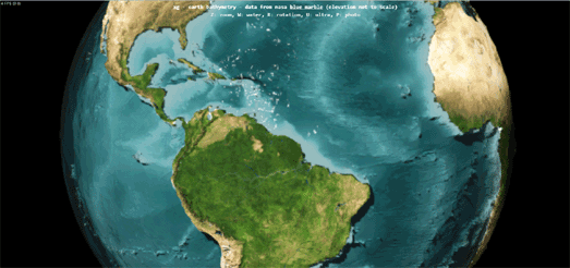
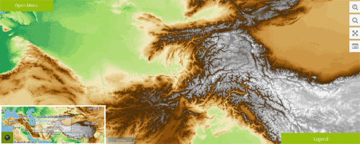
Elevation data played an important role in two of my favorite maps this week. Mundialis is a beautiful new interactive topographical map of the world and XG - Earth Bathymetry is a WebGL globe showing planet Earth without all its water.
The Earth Bathymetry globe uses data from NASA's Blue Marble to provide a view of the undersea land surface and water depth. The shading of the sea floor indicates changes in slope or depth.
Mundialis uses SRTM DEM 450m elevation data, and bathymetry sea & lake data (from Natural Earth & NGDC respectively) to provide a relief map of the world. The map also includes the option to view an OpenStreetMap road map layer on top of the topographical map or on its own as the base map.
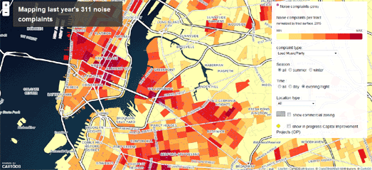
This week CartoDB released a really interesting mapped visualization of 311 noise complaints in New York. The map allows you to explore the number of complaints made to New York's non-emergency service hotline by location, time of day, type of noise complaint and by season of the year.
The Noise in New York map starts with a very useful introduction which guides you through some of the filtering options that you can make on the map. The introduction not only shows you how to explore the data it also provides some interesting insights abut noise complaints in New York. For example it reveals that Manhattan is the loudest place in the city.
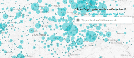
The Berliner Morgenpost's also created a really nice mapped visualization this week, Zugezogenen Atlas, allows you to explore where non-native Berliners were originally born. The map shows locations around the world where at least 100 Berliners were born, based on the population register of June 2015.
Hamburg, Dresen and Leipzieg are the top three German cities where non-native Berliners were born. When you rank cities around the world by the number of people now living in Berlin who were born there, then the top foreign city is Szczecin (Poland), followed by Wroclaw (Poland) and Moscow. Paris is ranked 82nd, London is 96th and New York is 123rd.
Labels:
Sunday Best
Transcribing Tithe Maps
You can help the Cynefin Project digitize around 1,200 tithe maps by transcribing and geo-referencing a collection of 19th century maps of Wales. By contributing to this crowdsourcing effort you will help to create an online resource which will enable anyone to access and research Welsh tithe maps.
The Welsh tithe maps were created between 1838 and 1850 to show where land users were responsible for paying tithes. Tithes were a form of taxation imposed on land users, which were often paid in commodities, such as crops, wool, milk and stock.
The Cynefin Project consists of two main crowdsourcing tasks; one to geo-reference the maps and one to transcribe important information on the maps. The geo-referencing task consists of matching up recognizable features in the vintage tithe maps with the sames locations in a modern map. The transcribing task involves matching up the tithe registration field numbers on the map with the correct entries in the tithe apportionment document records.
Once all the tithe maps have been geo-referenced and transcribed the Cynefin Project will be able to provide an online resource which will enable researchers to easily access a fully indexed record of tithe field numbers, landowners, land occupiers, field names, land uses and payable tithes.
Labels:
Wales
Saturday, January 30, 2016
The Washing Machine Capital of the World
Atlas Obscura had a lot of success last year with their Punny Businesses in America map. The map was a crowd-sourced map of local businesses which use a little word play in their titles (such as the Slim Chickens restaurant in Fayetteville, AR).
Atlas Obscura's latest map is an attempt to locate towns and cities around the world which try to claim a little notoriety through the use of a 'World Capital of ...' subtitle. Lots of places claim to be the capital of a product, a variety of food or even a state of mind. Atlas Obscura has rewarded them for this temerity with a special place on the Map of 90 of the World's Most Surprising Capitals.
To be fair some of the 'World Capital of' titles are probably not actually claimed by the locations so named on this map. I'm fairly sure that Nuuk in Greenland doesn't send out publicity material bearing a 'World Capital of Suicide' slogan. I'm also not entirely convinced that Clinton, Montana calls itself 'The Testicle Capital of the World', despite their obvious pride in holding the annual Testicle Festival.
Friday, January 29, 2016
Mapping Boston Bus Speed
This Leaflet powered map visualizes Boston bus speeds over the last three hours. The map uses the real-time GPS data from MBTA buses to plot the routes and speeds of the city's buses.
The MBTA Bus Speeds map actually takes the discreet location reports provided by the MBTA, which are sent at regular intervals. Therefore the map works out the speeds based on the time taken to travel between consecutive GPS signals.
The map includes two views. One view shows the last three hours of data. The other view shows the full 24 hours from yesterday. When comparing the two they do seem very similar. Which makes sense as you would expect faster and slower sections of roads to be fairly consistent.
However the 'about' section for the map says that there are actually noticeable differences in the speed patterns during the day and on different days of the week. For example, there are different speed patterns at rush hour than at other times of the day and different routes appearing at weekends than on weekdays.
Explore the World from Above
The View from Above is a very beautifully realized promotional website from the Emirates airline. The website consists of a number of aerial videos of locations around the world, which you access from a 3D interactive globe.
The aerial videos are themselves pretty wonderful but what I really like about this site is the map markers and the transition between the markers and the actual videos. The markers on the map actually include small animated GIF's to give the impression of the video playing within the markers.
If you select a marker on the map the small animated GIF's expand to fill the full screen and then are replaced by the actual videos. Therefore, when you click on a marker, the videos actually appear to fly out of the markers.
I have a strong feeling I might be stealing this effect very soon.
Thursday, January 28, 2016
Mapping the Zika Virus
The World Health Organization has established an emergency committee in response to the explosive spread of the Zika virus in the Americas. The virus has now affected people in 23 countries in the Americas. You can view a static map of the countries with active Zika virus transmission on the Centers for Disease Control and Prevention website.
The Zika virus causes an illness similar to dengue fever and it cannot be prevented by drugs or vaccines. The link between Zika fever and microcephaly in newborn babies of infected mothers has not yet been established - but is strongly believed to exist.
HealthMap, which provides interactive maps of infectious diseases, has now released a map of the Zika virus. The Zika Virus HealthMap is not a map of confirmed cases of the Zika virus but plots news from disparate data sources, including "online news aggregators, eyewitness reports, expert-curated discussions and validated official reports".
As well as providing an overview of the current Zika virus outbreak the map includes an overlay showing the predicted global distribution of Aedes aegypti, the mosquito that spreads the virus.
Also see Mapping the Zika Virus - Part Two.
Labels:
health
The Belarus History Map
The Map of Belarus aims to tell the story of Belarus since the 13th century. It provides a general overview of the country's history and its various rulers and leaders. It also shows how the country's border has changed over the centuries.
As you scroll down on the Map of Belarus you move through its historical timeline. The timeline provides the dates of the reigns of Belarus' leaders and important events in the country's history. To the left of the timeline a short summary provides context about some of these events in the country's history.
As the timeline progresses the map updates to show locations mentioned in the timeline and the border updates to reflect the changes to Belarus' borders over the centuries.
The nature of the timeline does mean that only a short summary of events is provided by the Map of Belarus. Hopefully the map is just a starting point for a more extensive account of the country's history. At the very least the events mentioned in the timeline could include links to relevant Wikipedia entries.
Labels:
Belarus,
history maps
Mapping Culture Under Threat
In the Middle East and North Africa ISIS is not only attempting to destroy lives and communities it is also targeting many cultural and historical artifacts in an attempt to destroy cultural histories which fail to conform to their narrow interpretation of the Koran. These attacks have targeted important historical sites and artifacts of Muslims, Christians and many other ethnic groups.
Mapping Culture Under Threat is an attempt by the Antiquities Coalition to map the hundreds of cultural and historical sites destroyed by ISIS in its campaign of cultural cleansing. The Antiquities Collection has identified over 230 sites that have been deliberately targeted or destroyed by ISIS and other extremist groups, including significant monuments from the ancient, Greco-Roman, Islamic, and modern periods.
The map shows heritage sites which have been attacked, targeted or destroyed, using red circular markers. The map also shows the locations of UNESCO Worlds Heritage & Tentative List sites. The heat map layer shows areas which are under the direct control of terrorist groups or which are threatened by areas they have been occupied between January and October 2015.
Labels:
history maps,
News Maps
Wednesday, January 27, 2016
Mapping Creationism in Schools
Apparently in the USA the state actively funds the teaching of creationism. Slate's Publicly Funded Schools That Are Allowed to Teach Creationism map shows where public schools are receiving tax payers' money for teaching alternatives to the scientific truth.
The map uses three different colored map markers to indicate different types of schools. These are: public schools in states which permit creationist teaching, private schools that accept tax-funded vouchers or scholarships & teach creationism and Responsive Educational Charter schools using a creationist curriculum.
I must sincerely apologize to any creationists visiting Maps Mania for the previous post which links to a map of planet Earth before it actually existed.
Mapping the Ice Age
The last Ice Age occurred 110,000 to 12,000 years ago. The Last Glacial Maximum (LGM) was the last period in this Ice Age when the ice sheets were at their greatest extension. This was around 26,500 years ago.
Thanks to the Swiss federal mapping agency you can now view a 2.5D map of how Switzerland looked during the Last Glacial Maximum. You can view the Swiss LGM map in 2.5D, on a WebGL enabled browser, on the Swiss Geoportal.
Ralph Straumann has noticed that the Swiss Geoportal map overlays the LGM layer on top of the normal Digital Elevation Model used by the Swiss mapping agency. Therefore the elevation data is not actually correct for the Last Glacial Maximum. Ralph has therefore created his own WebGL 2.5D map of Switzerland using the correct elevation data for the Last Glacial Maximum.
You can view Ralph's map and a number of screenshots comparing the differences in elevation data in his LGM map with that of the Swiss Geoportal at Spatialists.
Labels:
history maps,
Switzerland
Noisy New York
CartoDB has released a really great mapped visualization of 311 noise complaints in New York. The map allows you to explore the number of complaints made to New York's non-emergency service hotline by location, time of day, type of noise complaint and by season of the year.
The Noise in New York map starts with a very useful introduction which guides you through some of the filtering options that you can make on the map. The introduction not only guides you through how to explore the data it also provides some interesting insights abut noise complaints in New York. For example it reveals that Manhattan is the loudest place in the city.
When you have finished the introduction you can explore the noise complaint data yourself. You can filter the results shown on the map by complaint type, season and time of day, For example, if you are looking for the city's liveliest night-life locations, then you could select to just view complaints made in the evening about loud music and parties (Harlem and Inwood look particularly lively).
Migrant Routes in Europe & South East Asia
MOAS is a charity dedicated to saving the lives of refugees at sea. The charity was established after the October 2013 disaster when 400 men, women and children drowned off the Italian island of Lampedusa,
The MOAS website includes a number of interactive maps designed to explain the migration routes into Europe & in the Bay of Bengal, and the work MOAS is doing along those routes to rescue refugees. From the website's homepage you can navigate to learn more about MOAS's work in the Mediterranean Sea, in the Aegean Sea or in the Andaman Sea. Each of these sections is illustrated by an interactive map.
For example the Aegean Sea section includes an interactive map showing migrant routes through Turkey to the Greek Islands. In 2015 over 700,000 people used these routes to try to reach Europe. Almost 600 people died trying to cross the Aeagean Sea.
The MOAS in the Mediterranean Sea section includes an interactive map of MOAS rescue missions in the Mediterranean. It includes a heat-map of where those rescues took place and details about the number of refugees saved during each rescue mission.
The MOAS in the Andaman Sea section of the website looks at MOAS's work in the Bay of Bengal. The interactive map here shows the migrant routes from Bangladesh and Myanmar and the number of migrants living in refugee camps.
Tuesday, January 26, 2016
A World Without Water
XG - Earth Bathymetry is a WebGL globe showing planet Earth after someone has pulled out the plug and drained the world of all its water.
The globe uses data from NASA's Blue Marble to provide a view of the undersea land surface and water depth. The shading of the sea floor indicates changes in slope or depth. If the blue coloring of the oceans' floors confuses you then you can click your keyboard's 'w' key to change the color to a more earth like brown color range.
The 3d globe includes keys to zoom in and to rotate the map. You can also rotate the globe simply by clicking on it and dragging the map around.
Via: Ubilabs: Top 5 of the Week
Labels:
WebGL
What a Relief
Mundialis is a beautiful new interactive topographical map of the world.
The map uses SRTM DEM 450m elevation data, and bathymetry sea & lake data (from Natural Earth & NGDC respectively). The map also includes the option to view an OpenStreetMap road map layer on top of the topographical map or on its own as the base map.
Currently the map includes a small inset map showing the global position of the current map view. It also includes a map layers menu, which allows you to select the topography map, a grey scale topography layer, topography with OSM or OpenStreetMap on its own. As yet the map does not offer a search feature.
You can read more about the data sources for Mundialis, how the raw data was styled and information about the Web Map Service for the Mundialis web client in this Making of: Topography Layer with OSM Overlay article.
Monday, January 25, 2016
The Glittering Red, White & Blue
Japan's Himawari-8 satellite is in stationary orbit over New Guinea where it captures some truly amazing imagery of the Earth. Every day the satellite captures imagery of the western Pacific, Australia, and parts of Asia, Antarctica & Alaska
Glittering Blue is a time-lapse video of Himawari 8's imagery from just one day. The video shows 24 hours of imagery from August 3rd 2015 in 12 seconds. Since the launch of Himawari-8 I've seen a number of time-lapse GIF's that people have created from its satellite imagery. What makes Glittering Blue stand out is its sheer size, which really showcases the amazing quality of Himawari-8's imagery.
In the center of the video you can see the whirling Typhoon Soudelor, a category 5 super-typhoon.
Labels:
Video
The Top 10,000 Academic Texts
The Open Syllabus Explorer is an interactive map of the top 10,000 texts used in academic syllabi. It shows the most used texts in different university subject areas based on an analysis of over one million syllabi collected from university websites.
The map consists of 10,000 texts subdivided into academic subject categories. I think the size of each text's circle on the map is related to its ‘Teaching Score’ - "a numerical indicator based on the frequency with which a particular text is taught". The placement of each text on the map is presumably based on the academic subjects in which the texts were mentioned in the analysed syllabi.
The map itself is basically a static image made interactive by creating map tiles from the image and then using the Leaflet.js mapping library to create an interactive map from the image.
The map uses the Leaflet-Hash plug-in, this means it is possible to zoom in on an area on the map and cut & paste the URL to share a link to the current map view. A useful next step in the map's development might be to create a custom search feature, to allow users to search the map by the name of a text. This could be achieved using the Leaflet-Search plug-in.
You can learn more about the project on the Open Syllabus Project's website.
Labels:
bookmaps
Vision Zero Boston
Boston has initiated a project to eliminate all fatal and serious traffic accidents in the city by 2030. Vision Zero Boston aims to examine the causes of traffic accidents and implement policies to make Boston’s streets more walkable, bikeable, and transit-friendly.
Part of the Vision Zero initiative is to canvas the opinions of people in the city and to identify safety issues on Boston's street. The Vision Zero: Safety Issues map allows anyone to identify a location in Boston where they think there is a safety concern.
Users can click on the map to identify a location with problems and complete a short form to describe the transportation safety concern. You can also use the map to view the safety issues submitted by other Bostonians.
The Vision Zero: Traffic Crashes map also allows you to explore a map of pedestrian, cycling and motor vehicle accidents in the city.
Boston's Vision Zero initiative is closely modeled on New York's Vision Zero project. New York also released a crowd-sourced consultation map which allowed New Yorkers to share their knowledge of the city streets.
New York's Vision Zero View map also shows detailed information on traffic injury and fatality crashes within New York.
The map has two main layers; a visualization of New York's traffic accidents and a visualization of the city's attempts to make streets safer. The 'Crashes' view allows users to visualize the locations of pedestrian,cycling and car injuries and fatalities. This map view includes a timeline which allows you to filter the results shown on the map by year.
The 'Street Design' view allows users to explore some of the Vision Zero initiatives, such as arterial slow zones, speed humps and other major safety projects designed to increase traffic safety in the city of New York.
Ich Bin Kein Berliner
The majority of Berliners were not originally born in the city. The Berliner Morgenpost's new interactive map, Zugezogenen Atlas, allows you to explore where these newcomers to Berlin were originally from.
The map shows locations around the world where at least 100 Berliners were born, based on the population register of June 2015.
Hamburg, Dresen and Leipzieg are the top three German cities where non-native Berliners were born. When you rank cities around the world by the number of people now living in Berlin who were born there, then the top foreign city is Szczecin (Poland), followed by Wroclaw (Poland) and Moscow. Paris is ranked 82nd, London is 96th and New York is 123rd.
Sunday, January 24, 2016
Maps of the Week
On an average day the Moscow Metro wi-fi network can see up to 70 TB of internet traffic. The Moscow Metro Wi-fi Map is a beautiful mapped visualization of all those wi-fi users as they travel around the city.
By tracking wi-fi users Moscow Metro are able to observe how passengers navigate the Moscow metro system. They can see how passengers travel around the system from the time that they connect to the wi-fi network until they disconnect. Maxima Telecom's animated map shows the movements of passengers connected to Moscow Metro's wi-fi network, over the course of one day.
The Interactive 1811 Plan allows you to explore a vintage map of New York's 1811 grid plan overlaid on top of a modern map of the city. In 1807 the New York state legislature appointed Gouverneur Morris, John Rutherfurd, and Simeon De Witt to devise an orderly street plan for Manhattan. So began the formation of New York's regulated grid street plan.
What I really like about this interactive version of the map is the option to learn about many of the features of New York's original grid plan. If you click on the 'Key Features' button at the top of the map you can explore some of the decisions made in devising the 1811 plan. For example, decisions made about the width of New York's streets, the length and width of blocks, the limited provision of parks and the numbering system of New York's roads.
11.3% of Indians live without electricity. Luckily we have twenty years of night-time satellite imagery to help identify those rural areas of India which don't appear to have electricity, The World Bank and the University of Michigan have collaborated to analyse this satellite data for 600,000 villages across India.
India Lights is an interactive map which shows the results of that analysis. Each yellow dot on the map represents the light output of an Indian village on the date shown in the map timeline. If you zoom in on an Indian district on the map you can also view data on the district's population and its median light output.
At the district level it is possible to filter the map to highlight those villages which have participated in India’s flagship electrification program. If you select one or more of these villages you can then view the village's median light output over time compared to the district's average on the line graph at the bottom of the map.
Labels:
Sunday Best
Snow Plow Maps
If you want to know how long ago the roads around you have been cleared of snow then you can check out these snowplow maps.
Both the PlowNYC and Washington DC Snowplow map color city streets based on when they were last cleared. The PlowNYC map includes a legend about what the different colors indicate. Showing how many hours ago individual streets were cleared. On the Washington DC Snowplow map the brighter colors indicate the most recently cleared streets.
If you live in Maryland you can view a list of country snowplow maps here. In Pennsylvania you can use the 511pa map to view the live position of the state's snowplows. Select 'Plow Trucks' from the menu. You can then check on an individual truck to view its route for the last two hours.
Saturday, January 23, 2016
Snow Totals on the Map
If you want to know how much snow has fallen on the Eastern United States then the simple answer is a lot. According to the New York Times' How Much Snow Has Fallen map parts of West Virginia have received 40 inches of snow.
The NYT's map uses data from the National Weather Service and shows snow fall totals when they were last recorded at each weather station.
The National Weather Service has its own Leaflet based map which also shows observed snowfall. The NWS Weather Event Display allows you to view a number of weather layers on top of an interactive map. To view snowfall totals you need to select 'Snowfall' from the 'Observed Reports' menu.
If you want to know what the outlook is you can also select 'Snowfall' from the 'NDFD Forecast Overlay' menu.
You can also check out what this blizzard of snow looks like on this impressive animated Mapbox map of water equivalent accumulated snow depth data from NOAA’s High Resolution Rapid Refresh Model.
If you want information on the latest traffic alerts you could try Google's Crisis Map. The map shows areas with severe weather warnings in orange. It also provides traffic alerts for Baltimore, Virginia and Washington DC (information provided by Waze).
The London Building Heights Map
The Building Heights in London map is a great advertisement for vector maps. Up until a few days ago this map was incredibly taxing on the browser and almost impossible to navigate. Now all the building height data has been added to the base map as vector tiles and it works like a dream.
The map uses data from the Environment Agency's open LIDAR data. As you might expect the map shows that the tallest buildings in London are in the centre and tend to get shorter as your move out from the centre. The City of London and Canary Wharf are where you find the tallest buildings in London. If you zoom in on Stratford in east London you can also clearly see the growth of taller apartment buildings which are springing up around the Olympic Park.
Friday, January 22, 2016
Here Comes the Snow
Mapbox has mapped the winter storm spreading across the east coast of the USA. The map animates water equivalent accumulated snow depth data from NOAA’s High Resolution Rapid Refresh Model.
If the snow keeps you housebound this weekend then you might want to try and replicate this map yourself with Mapbox GL. The map uses the Mapbox GL video overlay capabilities to create an animated map of NOAA's predictive weather models. Mapbox GL video overlays allow you to quickly create really impressive animated weather maps (as long as you have access to really impressive weather videos).
If you like Mapbox's snow storm map then you might also like their other weather maps of Hurricane Patricia and Animated Atmosperic Water map.
Mapping Missing Airplanes
Vanished Aeroplanes is a CartoDB created map of aircraft which have gone missing around the world. The map says that 'all positions are approximate' so my guess is that the panes have been mapped to their last known locations.
Looking at the map my immediate thought was that there appears to be a cluster of planes which have gone missing around the 'Bermuda Triangle', the Carribean and Central America. I can't help wondering how much the Gulf Stream and hurricane winds may have contributed to the disappearance of some of the planes in this area.
All the planes on the map are labelled to show the year that they went missing. A timeline, or an option to filter the planes by month of disappearance, might have been useful. For example, in that Bermuda Triangle cluster I'd like to be able to filter the map to show how many of the planes disappeared during the hurricane season. However, if you mouse-over the markers you can find out the month each plane disappeared and more information about each individual plane and its number of passengers.
There is also a little cluster of missing planes over and around Vietnam. From the year labels it appears that all these planes seem to have disappeared during the Vietnam War.
Labels:
flight
India Night Lights
11.3% of Indians live without electricity. Luckily we have twenty years of night-time satellite imagery to help identify those rural areas of India which don't appear to have electricity, The World Bank and the University of Michigan have collaborated to analyse this satellite data for 600,000 villages across India.
India Lights is an interactive map which shows the results of that analysis. Each yellow dot on the map represents the light output of an Indian village on the date shown in the map timeline. If you zoom in on an Indian district on the map you can also view data on the district's population and its median light output.
At the district level it is also possible to filter the map to highlight those villages which have participated in India’s flagship electrification program. If you select one or more of these villages you can then view the village's median light output over time compared to the district's average on the line graph at the bottom of the map.
Labels:
India
Thursday, January 21, 2016
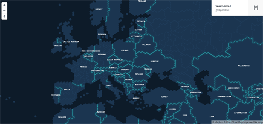
How to Make a Hexagonal WarGames Map
If you liked the WarGames Dashboard, that was featured on Maps Mania last week, then you might be interested in creating your own WarGames map style.
Here's a quick tutorial on making a WarGames map using Mapbox Studio. Before getting started you can check out the finished map here.
1. The Base Map
The base map for the WarGames map comes from Project Linework. Project Linework have made a number of unique map styles, all of which can be downloaded in the GeoJSON format. The WarGames map style has hexagonal coast lines and borders which is perfect for our map.
Download the WarGames map style from Project Linework in the GeoJSON format.
In Mapbox Studio select 'New Style' and then choose the 'Empty' option from the list of templates.
Once Mapbox Studio opens you first need to import the WarGames GeoJSON data that you downloaded from Project Linework. Select the 'data' icon from the menu on the left-hand side of the screen.
Click on 'New Dataset' and then 'Select a File'.
I decided to just upload the admin0_lines.json & admin0_polygons.json files for country borders and country shapefiles and the admin1_lines.json for state and first admin level boundaries. If you want you can add more detail to your map by also uploading the lakes.json as well.
Once you have uploaded the data to Mapbox Studio you need to add each json file to your map. Select the file you want to add to your file from your list of 'Datasets' and then select 'Add to Style'. Do this for each of the json files you want to add to your map.
Each time you add a dataset to your map you need to click on 'Create Layer' to make it an active layer in your Mapbox Studio map style.
2. Styling Your Basemap
Lets style the water on our map. We actually haven't added any water features to our map. However the 'background' layer will suffice as it is now basically the world's seas and oceans. Click on the 'background' layer in your list of layers. Click on the color and enter #0d1b29.
Now style the land. Click on your 'admin0_polygons' layer in the layers menu. Click on the color and enter #246.
3. Make Your Borders Glow
You can make neon glowing borders for your map by duplicating the country borders layer and styling each layer a little differently.
Select the original country border layer and set the width to 1px and the color to #32d9d9.
Click on your country border layer. Then select the 'Duplicate Layer' icon to copy that layer. Now select your duplicate layer and set the width to 9px and the blur to 10px.
Now duplicate this layer as well and select the new layer and set the width to 15px.
You might need to make sure your country border layer and two duplicate layers are in the correct stacking order. In the layers menu your original should be at the top and the two duplicate underneath in descending order. If they aren't in this order you can rearrange them simply by dragging the layers into the correct order.
4. Add Country Labels
Lets add the names of countries to our map. Select '+ New Layer' and then 'Select a Database'. Now select 'country-label' from the list.
After you have added country labels select the country-label layer from the layers menu. From 'select data' make sure you have chosen the 'Symbol' option.
From the style menu select '{name_en}' in the 'text field'. Change the 'Font' by selecting 'Magda Clean Mono Offc Pro Black' from the list of fonts. I also set the 'Size' to 11px.
That's it! If you are happy with your new WarGames map style just click on the 'Publish' button to complete your map.
Where Can I Fly?
WhereFor is a useful online application for finding out where you can travel to on a budget. Just tell WhereFor how much money you have to spend and it will show you a map of destinations that you can afford to fly to and book an hotel within your budget.
Using WhereFor is very simple. You simply need to enter the airport you wish to travel from, the dates you want to travel and how much money you have for your vacation. You will then be shown a Google Map of all your possible destinations.
Select a destination from the map and you will be taken to details of the chosen trip. You can even book your flight and hotel directly from the WhereFor website.
Labels:
flight
Climb Mont Blanc on Street View
You can now climb the highest mountain in the Alps from the comfort of your own home using Street View. Google has teamed up with a group of alpine photographers, climbers and skiers to bring you some stunning panoramic imagery from Mont Blanc.
climbing a serac
Google's latest Alpine Street View includes vertiginous imagery from the actual climb and some stunning panoramic views from the summit of Mont Blanc. You can explore Google's new Street View imagery directly on Google Maps (click on the pictures above) or you can find links to some of the highlights in the new Mont Blanc imagery on this special Google Street View Mont Blanc page.
If this new Street View imagery has got you in the mood for more virtual mountain climbing then you might also enjoy Google's Street View climb of El Capitan in Yosemite National Park.
Labels:
Street View
Wednesday, January 20, 2016
The Curious Case of Typhoid Mary
Mary Mallon was the first identified carrier of typhoid in the United States. From 1900 to 1907 Mary worked as a cook for seven different families in New York and Long Island. While Mary was employed as a cook in these different households, members of the families would develop typhoid fever. It is believed that she infected at least 51 people during her cooking career.
George Soper, a typhoid researcher, was eventually hired by one of the families to investigate the cause of typhoid within their household. Soper investigated the families that employed Mary Mallon and discovered this common pattern of family members developing typhoid. He went on to publish his results in the Journal of the American Medical Association.
The Curious Career of Typhoid Mary is a story map of Soper's entire paper for the American Medical Association. All the locations mentioned in the paper have been annotated to link to the accompanying map. This means that as you read the paper you can track Typhoid Mary's career as she moved from family to unfortunate family.
The map includes vintage map overlays taken from the New York Public Library's Digital Collections. It also includes historical images from the NYPL Digital Collection. The map itself was created using the Neatline story map template from the Scholars' Lab at the University of Virginia Library.
Labels:
history maps,
New York,
USA
Submarine Cable Maps
Every year Telegeography creates an updated undersea cable map of the world. The 2015 Submarine Cable map was inspired by medieval and renaissance cartography and features not only a vintage map style but sea monsters, map border illustrations and images showing some of the common causes of cable faults.
The map shows 299 submarine cable systems across the globe, that are active or are under construction. The border illustrations provide information on the capacity data of some of the major cable routes. Other inset illustrations provide information on how submarine cables are laid.
A number of images on the map explain some of the common causes of cable faults. Some fictional causes of cable faults are also included in the map in the form of mythical sea monsters. The text provided with each monster includes a reference to which historical map it first appeared on.
Esri has used Telegeography's cable data to create their own 3d map of Submarine Cables. This 3d globe of submarine cables allows you to search the world's undersea cables by location and by date of construction.
If you select a cable on the map you can find out more about the cable's owner, date of construction and the cable's length,
Messages in the Deep is another fascinating undersea cable map which allows you to explore the history of the growth of the undersea fibre optic network around the world since 1989.
The map allows you to view the undersea cable network for any year, or you can animate the map to view how this global network has grown since 1989. The map also allows you to refine the cables shown by cable owner.
You can click on any of the cables displayed on the map to view it's length, it's first year of operation and the cable's owners.
Labels:
marine
Tuesday, January 19, 2016
The History of New York's Grid Map
In 1807 the New York state legislature appointed Gouverneur Morris, John Rutherfurd, and Simeon De Witt to devise an orderly street plan for Manhattan. So began the formation of New York's grid street plan.
Part of the purpose of the new map of New York, as the New York City Council stated, was "laying out Streets... in such a manner as to unite regularity and order". This is how New York became the orderly and restrained city that we love today.
The Interactive 1811 Plan allows you to explore an original map of the 1811 plan overlaid on top of a modern map of New York. One of the delightful features of this interactive version of the map is the option to learn about key features of the map.
If you click on the 'Key Features' button at the top of the map you can explore some of the decisions made in devising the 1911 plan. For example, decisions made about the width of New York's streets, the length and width of blocks, the limited provision of parks and the numbering system of New York's roads.
You might also like: The History of New York in 50 Maps
Labels:
history maps,
New York,
USA
Mapping the Metro & Grand Paris Express
Le Grand Paris en Cartes is a series of interactive maps exploring aspects of the Paris Metro system and the impact of the Grand Paris Express, which is currently under construction.
The series includes a map of Metro Station Traffic (pictured), showing incoming traffic at each Metro station in 2013. It also includes a CartoDB animated map visualizing 24 Hours of Traffic on the Metro.
The Trajets Domicile-Travail map shows the commuting patterns of passengers on the Metro. Each dot on this map represents a Parisienne commune or arrondissement. The size of the dots show the numbers of people who commute (in and out) of the area. You can also hover over each area's dot to view how many commuting journeys are made in and out of the area.
The main map exploring the Grand Paris Express is the Density and Accessibility of the Grand Paris 2015-2030. This map shows the route of the rapid transit lines and stations for the new network.
The map also includes a wealth of demographic and economic data for each of the communes and arrondissements served by the Gramd Paris Express. The menu on the left of the map allows you to view data on the map related to employment, residential density and household income.
The Easter Rising Street View Tour
This year marks the centenary of the Easter Rising in Dublin, Ireland. In Easter week in 1916 a group of Irish Republicans rose against British rule in Ireland and seized key locations in Dublin and proclaimed an Irish Republic.
To mark the 100 year anniversary of the Easter Rising Google and Ireland 2016 have released an interactive Google Street View tour of Dublin, exploring the historical events that took place during the uprising at different locations around the city. The Dublin Rising 1916-2016 tour provides an audio and visual guide to the Dublin Rising.
The tour features prominent Street View images of key locations in the uprising, accompanied by an audio guide (voiced by actor Colin Farrell) to the events that occurred during Easter week in 1916. Each of the Street View scenes includes map markers which allow you to view historical photographs and listen to modern recordings of statements made by witnesses to the Easter Rising.
Labels:
Dublin,
history maps,
Ireland,
Street View
Monday, January 18, 2016
Ebola & Chocolate are Monkey Killers
Two of the biggest threats facing great apes are Ebola and chocolate. Since the 1990's Ebola has killed 33% of the world’s gorilla and chimpanzee populations. The other major threat to great ape populations is the loss of their natural habitat. In Africa the chimpanzee has lost half of its original range. Part of this loss is due to illegal cocoa farms.
The African Wildlife Foundation explores the major threats to Africa's great apes species in a new story map, called A Conservation Initiative to Save Africa's Great Apes. The Esri Story map plots out the loss of the great apes' natural habitat in Africa and where their remaining habitat remains under threat.
The map also outlines how the African Wildlife Foundation are working to address the threats faced by great apes. In particluar the map explores the specific initiatives the Foundation are working on in the Dja Faunal Reserve in Cameroon,
Labels:
environment
Mapping New York's Greenhouse Emissions
New York City wants a 30% reduction in greenhouse gas emissions in the city by 2030. To meet this target the Greener, Greater Buildings Plan requires the benchmarking of energy and water consumption for tax lots with single properties that have over 50,000 square feet of floor space, and tax lots with multiple properties where there is over 100,000 square feet of floor area. These buildings account for nearly half of NYC's energy use.
The New York City Greenhouse Gas Emissions map visualizes the energy disclosure data of these single properties. The buildings are color coded on the map by the total amount of greenhouse gas emissions they produce. You can also hover over the buildings on the map to view the exact figure relating to the greenhouse gas emissions emitted. Hovering over a building also reveals the owner and age of the building.
The creator of the map, Jill Hubley, points out that a cluster of buildings in Midtown Manhattan are generating high greenhouse gas emissions. She also points to a number of buildings owned by the New York City Housing Authority (NYCHA) which are producing high emissions.
Labels:
environment,
New York
Subscribe to:
Posts (Atom)