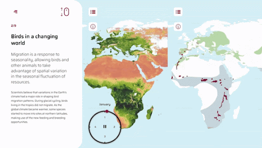
The Copernicus Earth Observation Programme has been examining how climate change is affecting the migratory habits of a number of different species of birds. Human created climate change is having a huge effect on wildlife and the ecosystems on which we and they depend. Around 50% of bird species migrate, traveling huge distances between breeding and wintering grounds. These migratory patterns are influenced by environmental triggers, such as the length of the day and changing temperatures.
In Birds in a Changing World the Copernicus Earth Observation Programme uses a number of animated interactive maps to show how global warming is affecting the migratory patterns of a number of specific bird species. In particular maps are used to show how the migration dates of Barn Swallows, Black Kites, European Bee Eaters and White Storks have changed over the last 40 years in repsonse to changes in the climate.
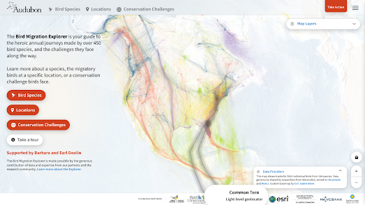
You can learn more about the migration patterns of American bird species on the impressive Bird Migration Explorer.
The Bird Migration Explorer is a new interactive map that visualizes the migratory patterns of 458 bird species that breed in the United States and Canada. Using the map you can explore the journeys of individual bird species and discover when different species of birds are likely to migrate through your town or city.
The Bird Migration Explorer allows you to view animated maps showing the full migration of these 458 species of birds. Enter a location into the interactive map and you can also discover which bird species migrate to or through that location and what time of year that they are most likely to be seen.
The Bird Migration Explorer uses data from the Cornell Lab of Ornithology’s eBird Status models and from other data sources. eBird Status and Trends collects and documents data on bird distribution, abundance, habitat use, and trends. It has detailed information on more than 1,000 bird species around the world.
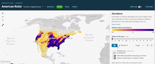
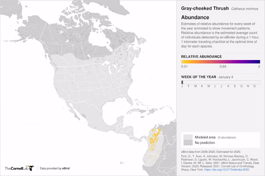
In July eBird updated its own Bird Status maps so that they can also be used to view the migratory journeys of individual bird species. Select a species of bird on the eBird Status and Trends webpage and you can view an interactive map which shows the species' 'Abundance', 'Range' and 'Habitat'. If you select the 'Weekly' option you can actually watch an animated map showing the species' relative abundance for every week of the year, revealing each individual species' annual migratory patterns.
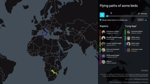
Benjamin Becquet has used data from the
Global Biodiversity Information Facility to create a mesmerizing animated map visualizing the annual migration patterns of ten different bird species. His
Bird Tracking Map uses time-stamped GPS data to reveal the annual migratory journeys of ten different species traveling between Africa and Europe.
Press the play button on Benjamin's map and you can watch how these different bird species journey back and forth between northern Europe and southern Europe/Africa over the course of a single year. As the map animates through the year the Spring and Autumn migratory patterns of each species of bird becomes apparent on the map.