Monday, July 31, 2023

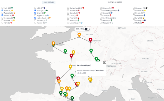
Visit Barcelona Without Going Abroad

Earlier this year Axios created 50 travel itineraries which allow Americans to travel the world without ever leaving their home state. In Visit Paris Without Leaving Home you can enter the name of any state and retrieve an interactive map which shows an optimal route around the towns and cities in your state which share a name with a foreign location.

Of course if you are French then you really don't have to leave the country to visit Paris. You also don't need to leave France to visit Barcelona, Milan, Venice, Dallas or Rome - because towns with these names can all be found within the borders of France.

Le Monde has mapped out the locations of 35,000 French municipalities which share a name with a foreign town or city. Using the interactive map in Go On Vacation Abroad Without Leaving France you can plan optimal journeys around France visiting all the locations with place-names which correspond to places abroad. 

The markers on this map can be filtered by individual countries. So, for example, if you want to visit Verona, Venice, Milan and Rome you just need to select the 'Italy' option. If you also want to visit Boston and Dallas then you just need to check the 'USA' as well. 

It must be noted that in order to establish a list of 35,000 towns with foreign names Le Monde has stretched the definition of 'homophone' a little. For example the French town of Domblain (Haute-Marne) is said to be a homophone of Dublin and Fontcouverte (Aude) is said to sound the same as Vancouver.

Sunday, July 30, 2023

The Map of National Animals

Two weeks ago I used Map Channels V9 and AI to create a National Stereotypes map. It turns out that I am not the only one who has been inspired by the power of AI to generate geographically themed images. In fact the latest demo map on Map Channels is this International Map of Mascots.

The idea behind this map was to create a map of individual country's national animals. According to the notes beneath the map it was also decided to dress up each animal "in their smartest national dress". Not every country has a national animal or national dress. Therefore sometimes the AI was a little loose in its interpretation. For example the animated jaguar above (Brazil's national animal) appears to be dressed for Ipanema Beach rather than in a national costume.

All the images for the map were created by Bing Image Creator. The prompt used for each image was "A pixar model of {animal} dressed in {country}’s flag and traditional clothing | 3D | clothes cinematic lighting | colourful hues | octane rendering | full body shot | white background".

The national animals map is hosted by Map Channels v9, a new simple-to-use mapping tool. Map Channels v9 is aimed at users who want to quickly create an interactive map displaying a collection of placemarks. The International Map of Mascots simply places a marker of a national animal on its relevant country. For more advanced mapping tools you can use one of the many mapping features and tools listed on the Map Channels Overview page.

Saturday, July 29, 2023

Scrolling the Appalachian Trail

The Washington Post has published an article which explores the reasons why the world famous Appalachian Trail keeps getting longer. Apparently less than half the original trail remains where it was first laid. It also now 150 miles longer than it was in 1937. 

You can see all the changes made to the trail over the last 86 years in Why the famed Appalachian Trail keeps getting longer — and harder. Using an animated scrollytelling map the Post has mapped out all the changes to the trail made since the original route was established in the 1930s. As you scroll through the Post's article an animated polyline begins to trace the route of the Appalachian Trail on an interactive map.

On this map the current route is traced out using a dark purple line. The previous route (where the old route diverges) is shown on the map with a lighter purple polyline. Map annotations and information windows are used to explain the reason why and how these changes have been made to the original route of the trail. The major changes are then explored in more detail in the article beneath the scrollytelling map.

Friday, July 28, 2023

Aurorasaurus

Aurorasaurus is an interactive map of aurora borealis sightings. The website uses crowd-sourced data from Twitter users reporting aurora sightings and NOAA forecasts to show where there are confirmed aurora sightings and to alert people nearby that an aurora is happening.

The map provides "view-lines" which show the predicted areas for an aurora according to the National Oceanic and Atmospheric Administration's aurora forecast model OVATION Prime. The map also displays the location of any tweets that mention auroras and have geolocation data. Other users can then verify if the tweets indicate an actual sighting. When enough map users report a sighting in an area or around the view-line, a notification is sent to registered users of Aurorasautus in the local area.

Aurorasaurus was created by Liz MacDonald, a space physicist at NASA Goddard Space Flight Center, after she noticed a large number of tweets about auroras during a 2011 solar storm. Liz realized that she could harness social media reports of aurora borealis sightings to help record auroras and to alert the public of when a sighting is possible.

Thursday, July 27, 2023

New Worldwide Open Map Data

The Overture Maps Foundation has announced its first release of open map data.

This initial release of data includes four 'themes':

  • Places - Point of Interest (POI) Data on approximately 59 million places worldwide
  • Buildings - building footprint and height data for 785 million buildings worldwide
  • Transportation - road network data
  • Administrative Boundaries - administrative boundaries for Level 2 (country-level) and Level 4 (first-level subdivisions under the country) worldwide.
Who is the Overture Maps Foundation?

The Overture Maps Foundation was founded in 2022 by Microsoft, Facebook (Meta), Amazon and TomTom. Its aim is to develop reliable, easy-to-use, and interoperable open map data.

For me the key word here is 'reliable'. In OpenStreetMap we already have one of the largest geographic databases, which is also free and open. However because OSM data can be edited by anyone it is open to vandalism. This may be why large corporations (such as Microsoft, Facebook, Amazon and TomTom) want more stable geographic data, which is less likely to cause them embarrassment or lead to difficult legal problems with individual country mapping laws.

How Open is this Open Map Data?

Two of the four Overture Maps Foundation 'themes' are available under a ODbL license and two of the themes are available to use under a CDLA Permissive v 2.0 license.

The type of license to access an Overture Maps Foundation theme I think hints as to where the data was sourced from. The Places and Administrative Boundaries themes are both available under a permissive licence. This suggests that at least some of the geographic data in these themes was sourced from OSM (who require users to in turn offer a permissive license). The Buildings and Transportation themes have a ODbL license and I suspect the data in these themes were sourced from Microsoft, Facebook, Amazon and TomTom (for example Microsoft's AI derived building footprints) and not from OpenStreetMap.

Downloading the Data

The two different types of license will probably not matter too much to most end users. What might be more pertinent to end users at the moment is how open the Overture Map Foundation data is in terms of access. At the moment if you want to access the data you need to use Amazon Athena, Microsoft Synapse, DuckDB or download the database.

Instructions to access the data are available on the Overture Maps Data Repo. It seems like the easiest way to access the data at the moment is to set up an Amazon AWS or Microsoft Azure account (something which I'm personally not too keen on doing). 

Obviously this is a first release. I'm hopeful that in the future the Overture Maps Foundation will develop more user-friendly methods of accessing the data. If not then I'm sure someone else will create a more user friendly interface for accessing the data (for example by providing links to individual country boundary data as individual GeoJSON files). 

Also See

Natural Earth - free vector and raster map data
All The Places - business POI data sourced by scraping company store locators
MapIt - an easy way to download admin boundary data from OpenStreetMap in a variety of formats
Gimme Geodata - a simple to use tool for easily downloading OpenStreetMap boundary data

Wednesday, July 26, 2023

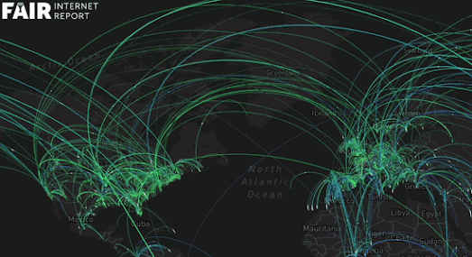
The Heartbeat of the Internet

The Fair Internet Report has created an interactive map which visualizes where and when in the world internet users ran speed tests over a 24 hour period (data from June 21, 2023). Mapping 24 Hours of Internet Speed Tests shows a total of 3.6 million speed tests being carried out across the world, all over the course of one day in June.

Each line on the map represents a speed test carried out by an internet user. The line connects the individual's location to the location of the server where their download speed is being tested from. As the map plays out over the course of June 21st you can observe the diurnal patterns of global human activity as the internet usage in individual countries rises and falls during the night and day. 

This daily pattern of internet activity is probably more apparent if you select to view an individual country from the map's drop-down menu. You can then use the map's timeline control to see how the number of people running speed tests increases during the hours of daylight and falls during the night-time hours. 

Tuesday, July 25, 2023

Isochrone Maps

time2reach is an interactive map that shows you see how far you travel within a set time period using public transit. The map can currently create isochrone visualizations for 6 global cities: New York, Paris, San Francisco, Toronto, Montreal and Vancouver. 

If you double-click on the map in any of these six cities an isochrone visualization will show you how far you can travel from that point on public transit. The map is color-coded to show how far you can travel from the selected point in minute intervals. If you hover over another location on the map you can see the quickest public transit route to that destination and the total journey time (and the duration of each stage (bus,train,walking etc) of the journey).

The map uses GTFS (published public transit schedule data) for calculating all travel times. Therefore if you have a GTFS feed for a city then you should be able to create your own time2reach isochrone map using the code provided on the time2reach GitHub repo.

You can find more examples of travel time maps using the Maps Mania isochrone label.

Monday, July 24, 2023

2023 Spanish Election

Yesterday's election in Spain has resulted in no clear winner. Going into the election the opinion polls had suggested that the conservative People’s party (PP) would secure a comfortable win and would likely form a coalition government with the far-right Vox party.

After all the votes were counted however PP had won only 136 seats to the ruling left-wing PSOE’s 122 seats. The far-right Vox party actually saw a large reduction in its number of seats, down to 33 (from the 52 won in the last election). This means that it is likely that PP will struggle to form a working coalition (176 seats are needed to form an effective majority).

El Diaro has published an interactive map of the results. This map includes a choropleth view which colors each electoral area to show the party who won the most votes in the province. A cartogram view shows the actual number of seats won by each party in each electoral district. 

El Pais has also created an interactive map of the 2023 Spanish election. If you click on an electoral area on this map you can view a more detailed breakdown of the vote at the province and municipality levels. This allows you to view the number of seats won by each party in a province and also the percentage of votes cast for each party in each municipality area in the province. 

My favorite map so far of the 2023 election has been published by El Mundo. El Mundo's map shows the winning party in each municipality, which means it provides the best view of how each party performed across the country. The map includes an option to view a choropleth map for each individual party. The map also has an option to compare the 2023 Spanish election results with the results from 2019.

Saturday, July 22, 2023

Electrical Japan

Electrical Japan is an interactive map that visualizes electricity supply and demand in Japan. It was created by the National Institute of Informatics (NII) in the wake of the 2011 Fukushima Daiichi nuclear disaster, in order to better understand Japan's energy problems after the 2011 tsunami and to help promote energy conservation.

The map shows the location of all of Japan's power plants, as well as the amount of electricity that each generates. The map also includes a satellite layer showing nightlights in Japan, which can be used to estimate the levels of electricity consumption across the country.

The information shown on the map can be filtered by type of power plant, by region, or by year. The map also includes a timeline of some of Japan's major energy events. These events include the Fukushima Daiichi nuclear disaster, the rising costs of natural gas following the 2022 Russian invasion of Ukraine, and the decline of commercial energy demand during the Covid-19 epidemic.
Another major feature of Electrical Japan is an historical timeline of power plant construction. This animated map layer allows you to view the locations and types of power plants installed in Japan every year since 1893. This animated timeline perfectly visualizes some of the trends in power generation in Japan, for example the growth of nuclear power after 1970, the growth of wind power after 2000, and the growth in solar power plants since 2010.

Also See

The Energy and Industry Geography Lab - the European Commission map provides an overview of Europe's energy infrastructure. It shows the location of the various types of power plants and their capacity. 

U.S. Power Plants - an interactive map showing the locations, size and type of America's electric power plants. The map shows where different types of power plant are located, how much each type of energy source contributes to the country's power supply, and how much each source contributes to CO2 emissions.

Friday, July 21, 2023

The Best Real-Time Subway Maps

Ubähnchen is a wonderfully smooth animated map of Berlin's subway trains. The map shows all the U-Bahn's trains travelling around Berlin based on the network's timetable.

The neat design of colored blocks for the trains with simple shadows moving on top of a schematic transit map really adds to the captivating appeal of Ubähnchen. You can also click on the 'U' button (top-right) to switch to a map which also shows Berlin's overground trains. Switching between these two modes is also a captivating experience as the transit map tweens into a geographical map (and vice versa).


Mini Tokyo 3D is probably my all time favorite animated transit map. Like Ubähnchen this real-time transit map allows you to switch between an underground and overground view of a city's transit network. The underground mode highlights the city's subway system with colored subway lines shown on top of a dark base map. In this underground mode the overground trains are shown faded out on the map.

On this animated map of Tokyo's huge public-transport network trains are also shown as colored blocks, only this time in 3D. This amazing 3D element is one reason why Mini Tokyo 3D ranks as one of my favorite interactive maps of all time. The amazing attention to detail also really helps. For example, try hovering over a train on the map to reveal details about its next scheduled stop. 

The Live London Underground Map was one of the very first animated transit maps. For that reason alone it deserves to appear in this short round-up of the best real-time subway maps. The Live London Underground Map is at least 13 years old now, which is probably why the visual design of this live transit map is not quite as visually appealing as its Berlin and Tokyo counterparts. 

That isn't to say that Matthew Somerville's map isn't well designed. For example the Live London Underground Map allows you to switch between three different map views: a geographic map, a Harry Beck inspired schematic map view, and a James Bond inspired Skyfall map view.

Thursday, July 20, 2023

The National Stereotypes Maps - Part Two

Buzzfeed has started a new mapping trend with their AI generated images of state stereotypes. Last week Buzzfeed asked a generative AI image model to create a photograph of a person from each U.S. state, as typically perceived by a European. You can view the results in the post This is What Europeans Think of Us.

I was inspired by the Buzzfeed post to create my own National Stereotypes Map. To create my map I asked Bing Image Creator to create caricature portraits of stereotypical people from individual countries wearing their national dress.

Unbeknownst to me (I swear) Andrei Kashcha (@anvaka) had already posted a map of stereotypes on the MapPorn subreddit. 

To create his Imaginary Faces map Andrei gave Midjourney the prompt "Most stereotypical person in X". He then took the first image created, cropped it to the bounds of the country, and inserted it as the country background. On the interactive map you can click on individual countries to see all 4 variations produced by Midjourney.

On Twitter @Barsee has also been posting AI generated images of the MOST stereotypical person in *country*. The image at the top of this post showing a bearded man riding a moose represents the stereotypical Canadian (as seen by Midjourney. Barsee's Twitter thread contains 15 stereotypical images of 15 countries, including the US and the UK.

Wednesday, July 19, 2023

Map Race

There is no reason that anyone outside of Philadelphia should be interested in a newspaper article exploring the best way from the city to the Jersey Shore. Unless, of course, that article includes a scrollytelling map race. Luckily that is exactly what the Philadelphia Inquirer's Race to the Shore contains. 

on Friday, July 7 five employees of the Philadelphia Inquirer set off at the same time from the newspaper's newsroom to travel to a pizza restaurant on the Ocean City boardwalk. One of the employees set off on a bike, one took the train, one set off to drive the expressway, and two employees were determined to drive the route using only back roads.

You can discover what happened next on the Inquirer's wonderful scrollytelling map race interactive. Using five animated colored polylines the Inquirer has mapped the route of each of the five employees' journeys to the Jersey Shore. The map includes a time stamp which means that as you scroll through the map you get to see how each of the employees' journeys are progressing in comparison to the journeys of their colleagues. In other words the map allows you to experience the Race to the Shore as it happened.

I won't tell you who won the race to the Jersey Shore. You'll have to scroll to the bottom of the Inquirer's map race to discover that for yourself.

Tuesday, July 18, 2023

The National Stereotypes Map

Last week Buzzfeed asked a generative AI image model to create a photograph of a person from each U.S. state, as typically perceived by a European. You can view the mildly amusing results in the post I Asked AI What Europeans Think Americans From Every Single State Look Like, And The Results Are Just Plain Mean

Anyway, I liked the idea enough to steal it. I spent a few hours asking Bing Image Creator to create caricature portraits of stereotypical people from individual countries wearing their national dress. I then created a map, National Stereotypes, which visualizes the result for each country. I haven't completed the whole world, so I apologize if I haven't gotten around to insulting your nationality yet.

I made my map using Map Channels v9, a new simple-to-use mapping tool.The initial release of Map Channels v9 is aimed at users who want to quickly create a simple map to display a collection of placemarks. To create my map I simply created a KML file with links to each of the AI generated stereotype images. Once I had created the KML file it then only took a few seconds to create the map with Map Channels v9. 

More features will be added to Map Channels V9 in future updates. For more advanced mapping tools you can use one of the many mapping features and tools listed on the Map Channels Overview page. You can view another example of a Map Channels v9 map on this demo page of New York Landmarks.

Monday, July 17, 2023

The World in Hong Kong

You can walk from Zurich to Rome in just over 1 hour. That is 'Zurich Avenue' and 'Crescendo Roma Viale' in Hong Kong (according to Google Maps it will take you 195 hours to walk from Zurich, Switzerland to Rome, Italy).

Rome and Zurich are not the only world locations which feature in the street names of Hong Kong. According to Asia’s World City: Around the World in One Day through Hong Kong's Street Names there are hundreds of locations in Hong Kong named for overseas locations. In this exploration of Hong Kong's street names designer Diana Pang has taken a deep dive into the history of Hong Kong's streets.

As a former British colony you will probably not be surprised to learn that lots of locations in Hong Kong are named after places in the UK. Hong Kong's historical importance as a major trading hub has also had an impact on many of the city's street names. Hong Kong's close trading ties in the 19th century with Indochina, can still be observed in street names which reference towns in Vietnam, Malaysia, Taiwan and Japan.

You can explore the influence of world geography on Hong Kong's streets in two interactive maps in Diana's article. One map uses polylines to connect Hong Streets to their namesake origins around the world. The other map uses colored dots to show all of the Hong Streets named for overseas locations, with the color of the dots representing different countries. Click on a marker on the map and you can learn a little more about that individual street's etymology.

Saturday, July 15, 2023

Which Country Most Resembles Your Country?

The political scientist Anders Sundell has posted a Twitter thread which reveals "the countries that look the most like each other". For example (according to Anders)  the country which most resembles the United States is Saudi Arabia. 

According to the text on each country comparison an "algorithm checked the shapes of all countries in order to find the most similar shapes. All countries were rescaled to have the same area. Rotation, but not flipping, was permitted in order to find the best match. The match percent refers to the percentage of each country's area that is shared with the other".
Using his algorithm Anders has determined that the UK most resembles Finland, Brazil looks like Lithuania, Australia is the mirror image of Rwanda and Italy is the twin of Armenia. There are a number of other country comparisons in Ander's Twitter thread and Anders also posts data & map visualizations to his YouTube channel.

Friday, July 14, 2023

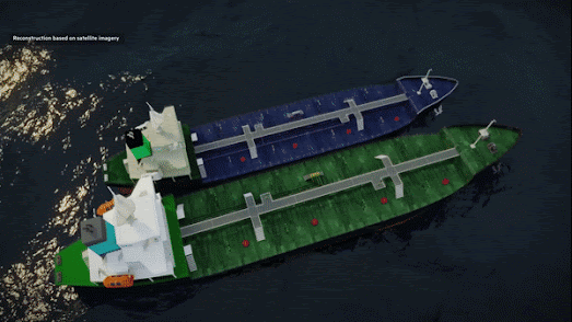
Mapping Oil Exports to North Korea

The Financial Time's investigation Inside North Korea's Oil Smuggling Triad begins with an amazing cinematic pan out from a 3D model of two oil tankers, up through some animated clouds, to a map of East Asia. The whole sequence begins with a 3D reconstruction of an illegal ship-to-ship transfer from the oil tanker Unica to a North Korean ship. This reconstruction then zooms out to a map of East Asia in order to highlight the scale of the East Asian crime syndicate who have managed to break UN sanctions against selling oil to North Korea.

Later in the FT's article a more traditional Mapbox Storymap is used to plot AIS tracks of 'clean' vessels from Taiwan to the Taiwan Strait where it transfers its oil cargo to an intermediary vessel. This ship then rendezvous with the Unica where a second transfer of the oil cargo takes place. The map then tracks the Unica to North Korean territorial waters where the oil is transferred once again - this time to a North Korean tanker ship. 

Thanks to some incredible digital teams we are beginning to see a growing number of online news articles illustrated with amazing cinematic 3D reconstructions or simulations. You can find a number of other examples of how 3D modeling has been used to recreate real-world events in the Maps Mania post Cinematic 3D Space Simulations.

Thursday, July 13, 2023

Mapping Things

I am a cartophile. Which means I love maps. But then who doesn't.

My cartophilia however manifests itself in a specific way. I like mapping collections of 'things'. And I'm not the only one. There are in fact lots of people who seem obsessed with mapping specific categories of thing.

Here are some individual 'things' that I've recently seen mapped:

Skyscrapers - Highrises is a project by a four man team to photograph and map early 20th century American skyscrapers. This is obviously a labor of love and the drone captured photographs of the tops of these iconic buildings are absolutely gorgeous. 

Airports - Random Airport View - The tagline of Random Airport View is it 'Does what it says! It certainly does. Press the 'next' button on Random Airport View and you will be shown a mapped location and a photograph of a random airport. And why not?

Park Benches - Open Benches is an interactive map of 28,592 memorial benches located around the world. After all we all need to sit down and rest our feet occasionally.

Neon Signs - Neon Signs is an interactive map which shows photographs of gas filled tubes of shaped glass. When I first discovered Neon Signs in 2014 it was only interested in the neon signs of Hong Kong. Since then it seems to have found a few examples of neon signs elsewhere in the world.

Pinball Machines - Pinball Map has been mapping the locations of pinball machines around the world since 2008. From Soho down to Brighton the Pinball Map must have mapped them all. It currently shows the location of over 36,000 machines.

Memorial Plaques - The Historical Marker Database records the locations of permanent outdoor historical markers and commemorative plaques. The database allows you to explore the locations of markers and plaques around the world which are used to mark sites of historical importance. 

Lighthouses - Lights at Sea is an interesting map that not only shows the locations of individual lighthouses but also shows the unique flash patterns and light colors which lighthouses use so that mariners can identify them and tell them apart from other lighthouses. Let's be honest - Lights at Sea is really just an excuse to make a fun map of colored flashing circles.


Obviously I am not the only person who is obsessed with mapping a specific category of thing. This list is only a short collection of some of the thousands of unique maps which have been linked to on Maps Mania over the years. If your favorite 'thing' isn't featured in this list try using the search option on Maps Mania. There is a very good chance that at sometime, someone, somewhere has made a map of your favorite 'thing'.

Wednesday, July 12, 2023

A Map of the World's Deadliest Epidemics

During the spread of the Bubonic plague in the 14th Century ships arriving in Venice from infected ports would be required to wait 40 days before landing. This practice led to the origin of the word 'quarantine', from the Italian quaranta giorni, meaning 40 days.

This is just one of the many interesting facts in the Bulletin of the Atomic Scientists interactive map An Illustrated History of the World's Deadliest Epidemics. Using Mapbox's popular scrollytelling template this map takes you on an historical tour of some of the world's most lethal viral outbreaks. Starting with the Antonine plague (165–180 C.E.), which was the earliest known major smallpox epidemic, and ending with the COVID-19 epidemic of 2019, this map takes you on both a chronological and geographical tour of deadly epidemics. 

It is estimated that COVID-19 has killed close to 21 million people worldwide. This means that COVID-19 has been one of the world's most lethal viruses in terms of the total number of people killed. However thanks to vaccinations the percentage of people killed by the virus pales into insignificance compared to other major epidemics. For example the Japanese Smallpox Epidemic (735–737 C.E.) killed a third of that country's population; the 1918 Flu pandemic is believed to have killed more people than the First World War; and, in Mexico, the Cocoliztli epidemics are believed to have killed around 80% of the entire Aztec population.

Tuesday, July 11, 2023

Mapping Tree Shadows

Ted Piotowski of ShadeMap fame has been experimenting with using LiDAR data to map tree shadows. Ted's ShadeMap currently simulates shadows caused by buildings and elevated land during the course of the day for any day of the year. However like most interactive shade maps his map doesn't show the shadows cast by trees.

Shadow maps tend to use elevation and building height data to simulate how shadows are cast by land and buildings depending on the angle of sunlight. Ted has now begun investigating how tree height and canopy cover can be extracted from LiDAR data. In this demo map you can see how trees cast shadows in the Seattle metropolitan area over the course of a single day.

You can read more about how this demo map was created in Ted's blog post Using LiDAR to Map Tree Shadows. You can also view links to other interactive shadow maps in the Maps Mania post Mapping in the Shadows.

Monday, July 10, 2023

Who Speaks Your Language?

Enter the name of a language into The Language World Map and it will show you all the countries in the world where that language is spoken.

You can enter more than one language into the map, which means that you can create some nice comparison maps of different languages. For example the map below shows where Spanish and Portuguese are spoken. This map is a neat visualization of the effect of the 1494 Treaty of Tordesillas on the spread of Spanish and Portuguese.  

In the Treaty of Tordesillas Spain and Portugal basically divided the 'new' world in two along a meridian 370 leagues west of the Cape Verde islands. The effect was that Portugal ended up with Brazil and colonies in Africa, while Spain got most of the Americas (bar Brazil). The result is that Spanish is spoken in most of South and Central America, while Portuguese remains the official language of Brazil.

The map doesn't include any notes on the taxonomy used for the languages or the criteria used for choosing which languages are spoken in a country. For example the map only shows two languages spoken in China (Chinese and Macau). It would be interesting to know why these two languages were chosen for China as opposed to say Mandarin and Cantonese (Mandarin and Cantonese appear to have been subsumed into one language (Chinese) rather than being classified as two separate languages). 

This isn't particularly a criticism of the map. I think it would be hard to avoid debates about which are the main languages spoken in a particular country and how you define separate languages (as opposed to say dialects). However it would be nice to know the criteria that are actually used by the Language World Map to determine which languages are spoken in a country. 

Also See

The Map of World Languages - an interactive map of 6924 living languages, 105 historic languages, 220 extinct languages, and 5 constructed languages
Living Languages - an interactive map showing where 7,168 living languages are spoken around the world.

Saturday, July 08, 2023

Divorced, Befriended, Married or Died

Madrid's Almendra Central is an island of bachelors surrounded by a sea of married couples.

Spanish newspaper El Confidencial has used 2021 census data to map out whether there are more single people or married couples in every census tract in Spain. An interactive map in the paper's Singles in Your Area, Street by Street colors every neighborhood in the country depending on whether the majority of adult occupants are married, single, divorced or widowed. 

When zoomed out on the map it appears that marriage reigns supreme in most of Spain. However if you zoom in on Spain's biggest cities, such as Madrid, Barcelona and Valencia, you find that many central areas are dominated by singles. El Confidencial notes this trend but hasn't attempted to explain the pattern. It would be interesting if the map included the average age in each census tract because I suspect that city center neighborhoods might be dominated by younger age groups (who are less likely to be married). I also suspect that when people marry in these central neighborhoods they often look to move out to the suburbs to raise their children.

The map does include options to look at the total population over 15 and the average income in each census block. If you hover over a tract on the map you can also view the percentage of the population in the census tract who voted 'left', 'right' or 'other' in the 2019 election. 

Also See

Interactive Singles Map of USA (using 2012 data)
UK Legal Partnership Map (2021 census)
Single Population of Ireland (2016 Census)

Friday, July 07, 2023

Poetry Walks

Walk along Church Street as if you were a silent observer watching the world go by.
Turn right onto Brick Land like a mermaid swimming in the depths of the sea.
Let your worries fade away and turn left onto the High Street.

This is a short extract from a poem which was generated for me by the wonderful A Walking Poem. A Walking Poem generates short poems based on your current location. Share your location with A Walking Poem and it will provide you with a walking poem, in the form of poetic walking directions (to a random nearby location).

When you share your location with A Walking Poem it looks at the Google Maps directions from your current location to another nearby random location. It then turns those walking directions into a psychogeographical poem using (I guess) a long list of similes and descriptive phrases.

If you like A Walking Poem then you will probably also like OpenStreetMap Haiku. OpenStreetMap Haiku is a clever map that can write a short poem about any location in the world based on the OpenStreetMap data for that location. 

Share your location with OpenStreetMap Haiku and it will generate a unique haiku using data gleaned from OpenStreetMap using Overpass Turbo. To do this OpenStreetMap Haiku matches random verses with OpenStreetMap tags. For example if a supermarket is near your location OpenStreetMap Haiku will randomly select a related line, such as "Salad cabbage and carrots", "The cashier’s bored" or "A lonely aisle".

Thursday, July 06, 2023

Mapping the Route of the Adriana Disaster

In the very early hours of June 14th the Adriana, a fishing boat overcrowded with migrants, capsized in international waters off the coast of Pylos, Messenia, Greece. It is believed that the boat was carrying 400 to 750 migrants. 104 people were rescued by the Greek coastguard but hundreds died.

The Washington Post has created an animated map which tracks the last journey of the Adriana and its interactions with other vessels and the Greek coastguard before it sank killing over 600 people. As you scroll through the Post's story Tracing a Tragedy: How Hundreds of Migrants Died on Greece's Watch you follow the Adriana's journey from Libya across the Mediterranean to its sinking off the coast of Greece. 

The Post has used satellite imagery, ship tracking data, and the coordinates recorded in distress calls and official reports & testimony to reconstruct the route of the Adriana and the events that led up to its sinking on the 14th June. The Post claims that its reconstruction of the Adriana's last hours "casts doubt on the .., main claims by Greek officials and suggests that the deadliest Mediterranean shipwreck in years was a preventable tragedy". After the reconstructed timeline of the Adriana's last hours the Post deconstructs four of these claims in some detail.

Wednesday, July 05, 2023

Mapping Loch Ness Monster Sightings

The best place to spot the Loch Ness Monster is on or around Loch Ness in Scotland. 

In When, where and how to see the Loch Ness Monster – based on 1,500 years worth of data! the Press and Journal has mapped the locations of Loch Ness monster sightings over the last 83 years in order to determine the best location where you are most likely to spot Nessie. After hours of analysis the newspaper has discovered that the best place to spot the Loch Ness Monster is on or around Loch Ness in Scotland. 

Of course I'm being facetious. The Scottish newspaper Press and Journal wouldn't waste its time producing such a vague location for spotting a mythical monster. It has obviously analyzed a much more precise location of where people have painstakingly imagined seeing a fictional creature. And that location is ... Urquhart Bay, Loch Ness.

According to the Press and Journal's analysis of the Official Loch Ness Monster Sightings Register (yes - it really exists) there have been 32 sightings of Nessie from Urquhart Castle and 27 sightings from Urquhart Bay itself.

If you are interested in seeing an imaginary creature but can't get to Scotland you could use my Mythical Creatures of the World map. This interactive map plots the locations of strange & wonderful monsters (and entirely mythical) creatures around the world, including such legendary creatures as the Yeti, Bigfoot, Werewolves and Yowies.

Via: Data Vis Dispatch

Tuesday, July 04, 2023

Maps with New Zealand

New Zealand is often omitted from maps of the world. A fact which has inspired the subreddit Maps Without New Zealand and the Tumblr page World Maps Without New Zealand, both of which collect examples of maps that don't include New Zealand.

One reason that New Zealand is often omitted from world maps is that lots of them are centered on or near the Greenwich meridian, which means in most map projections New Zealand is shown as a small landmass in the bottom right-hand corner of the map. New Zealand can therefore be very easily cropped off the map by careless editors. 

The best way to ensure that New Zealand is not cropped off the world map is to ensure that it is used as the center point of all map projections. This is very easy to achieve using Engaging Data's Country Centered Map Projections tool.

World maps centered on New Zealand

Using Engaging Data's tool you can simply click on New Zealand to place it at the center of the world map. You can even select from a number of different map projections (Orthographic, Mercator, Mollweide, Equirectangular or Gall Peters) to see how that affects New Zealand's prominence in the world.

Another way to place New Zealand at the center of the world map is by using Mercator: Extreme. Mercator: Extreme is an interactive map which can create a Mercator projection of the Earth using any selected location as the North Pole. Mercator: Extreme even allows you to view your new New Zealand 'north pole' map using a number of different map layers, including a satellite view layer. 

Of course both Mercator: Extreme and Country Centered Map Projections are not restricted to maps centered on New Zealand. You can center either tool on any location in the world. Both map tools can therefore be used to explore how maps distort our view of the Earth, depending on where they are centered and depending on which map projection they use. 

Saturday, July 01, 2023

Is it too hot for the Tour de France?

Broadcaster RTBF has published a detailed examination of how global heating is affecting the Tour de France. In Blowing Hot on the Big Loop RTBF uses vintage photographs, historical climate data and rider accounts to explore the effect of climate change on the world's greatest cycle race.

In last year's Tour de France the rider Alexis Vuillermoz collapsed from heat stroke at the end of the ninth stage. The rider was taken to hospital for treatment and later had to retire from the race. His compatriot Romain Bardet later said that the sweltering heat in the 2022 Tour de France was like nothing he had ever experienced before.

Using vintage images of the Tour de France placed side-by-side with more recent images of the same mountain stage locations RTBF provides some compelling visual evidence of the changed conditions now facing the riders in the Big Loop. In all the vintage photos shown by RTBF snow is clearly visible by the roadside. Snow which is largely absent from the corresponding modern images. 

Of course RTBF could well have cherry picked which images to show, choosing only vintage pictures showing snow and modern photos without snow. What is harder to argue against is the climate data itself. Using historical temperature records RTBF chart how the temperatures have significantly increased in recent years throughout France. For example the map above shows the change in average temperatures at the end of June across France since 1971.

RTBF concludes its examination by pointing out that climate change predictions suggest that the conditions in the Tour de France are only going to become more extreme in the coming years. This obviously poses the question of whether it is becoming too hot to continue holding such an extreme endurance event as the Tour de France in the extreme heat of July.