Showing posts with label Moscow. Show all posts

Tuesday, June 22, 2021

The Moscow Building Age Map

The Central Moscow Buildings Age map is a beautiful looking visualization of the age of all the buildings inside Moscow's Garden Ring. On this interactive map individual buildings are colored to show the historical period when they were constructed. 

The building ages shown on the map are divided into five historical periods: Old Moscow (pre-1813), Russian Empire (1813-1917), Soviet Moscow (1917-1958), Post-Stalin's Moscow (1959-1982) and Russian Federation (1991-present).


You can also explore the age of Moscow's buildings on The History of Moscow Housing interactive map. The History of Moscow Housing is an exploration of how housing has developed in the Russian capital over the last few centuries. On this map individual buildings are also colored to show their year of construction.

This map is not quite as beautiful as  the Central Moscow Buildings Age map but it does have more features. The History of Moscow Housing includes a handy date control at the bottom of the map which allows you to view houses built during different time periods. It is also possible to select individual buildings on this map to view the year that they were built. 


How Old is this House is also a building age map of Moscow.How Old is This House uses a sequential color scheme - ranging from red for the oldest buildings to blue for the most recent. This is very effective in providing an historical overview of the age of Moscow's buildings

How Old is This House also provides extensive information about many of Moscow's buildings. If you click on an individual building footprint on the map you can view its year of construction and, where available, pictures of the building & links to its Wikipedia page.

Friday, September 18, 2020

The Moscow Building Age Map


How Old is This House is an interactive map which shows the age of all Moscow's buildings. The map uses a sequential color scheme - ranging from red for the oldest buildings to blue for the most recent. This is very effective in providing an historical overview of the age of Moscow's buildings

One feature that I like building age maps to include is an interactive map legend or a date control. An interactive legend or date control allows users to filter the buildings shown on the map by age. So, for example, you should be able to view on the map only the buildings built before 1900. Unfortunately How Old is This House doesn't have an interactive map legend so it is impossible to filter the buildings shown on the map by the age of their construction.

However How Old is This House does include extensive information about many of Moscow's buildings. If you click on an individual building footprint on the map you can view its year of construction and, where available, pictures of the building & links to its Wikipedia page.


The Moscow building age map is the second city covered by How Old is This House. How Old is this House - St Petersburg is a similar interactive map which colors every building in St Petersburg by its age of construction. St Petersburg has a long and colorful history. The city was founded by Tsar Peter the Great in 1703. For much of its history it was the capital of the imperial Russian Empire (after the Russian Revolution Lenin moved the capital to Moscow).

Unlike the Moscow map the St Petersburg building age map does includes a filter control which allows you to select a range of dates. Using this filter you can select to view only the city's oldest buildings. These include the Peter and Paul Fortress (the original citadel of St. Petersburg, which was founded by Peter the Great in 1703) and the Menshikov Palace (St Petersburg's first stone building, which was founded in 1710).


You can explore the age of Moscow's buildings on The History of Moscow Housing interactive map. The History of Moscow Housing is an exploration of how housing has developed in the Russian capital over the last few centuries. On this map individual buildings are colored to show their year of construction.

The History of Moscow Housing does include a date control at the bottom of the map which allows you to view houses built during different time periods. It is also possible to select individual buildings on the map to view the year that they were built.

Friday, November 15, 2019

The Moscow Building Age Map


While there have been lots and lots of interactive building age maps released over the last few years very few of these maps have been used to explain the history of construction within individual cities. This is a real shame because these maps obviously have important stories to tell about how towns and cities have developed over time.

That is why I really like the History of Moscow Housing on an Interactive Map. The History of Moscow Housing on an Interactive Map is an exploration of how housing has developed in the Russian capital over the last few centuries. On the map individual buildings are colored to show their year of construction. It is also possible to select individual buildings on the map to view the year that they were built. The time slider at the bottom of the map allows you to view houses built during different time periods.

As well as the interactive map the article includes a graph showing the number of residential houses built in Moscow by year of construction. This graph reveals that the post-war years of 1950-1980 were the most active years for residential development in the capital. Under Khrushchev there was a big drive to construct new homes in Moscow. Under Brezhnev, the pace of construction declined and continued to decrease until the mid-1990s.

The History of Moscow Housing on an Interactive Map was built with the help of Yandex Real Estate. The real estate company says that the age of a home has a big influence on a property's popularity with buyers and/or tenants.

This isn't the first time that Moscow's building ages has been mapped. Mercator's Houses of Moscow also maps the ages of all of Moscow's buildings.

Wednesday, June 27, 2018

Creating Moscow's Super-Park


Dvorulitsa Moscow is a project to transform Moscow's periphery into a superpark by transforming the yardstreets (dvorulitsa). Yardstreets are the spaces between the apartment blocks that dominate the periphery in Moscow. They are areas that are often dirty, unkempt and uninviting. Dvorulista wants to help local residents transform these communal spaces into places which people will enjoy and where they will be happy to spend time.

To achieve this aim Dvorulista wants to help locals identify yardstreets for improvement. It will then help them explore how the space is currently used and how this can be improved. These improvements could include many different things, including communal gardens, parks, cafes, cycle paths, better lighting or play areas. By supporting many organic local projects in this way it is believed that the periphery can eventually be transformed into a superpark which completely surrounds the city center.

Urbica has worked with the Dvorulitsa project to create an interactive map which shows the location of all Moscow's yardstreets and which residents can use to start and / or comment on local yardstreet projects. Yardstreets on the interactive map are colored yellow. Users can click on an individual yardstreet on the map to leave suggestions on how it could be improved or to propose a local project. The map was designed using Mapbox Studio to provide a distinctive looking map which complements the design and color-scheme of the Dvorulitsa project website.

Tuesday, October 03, 2017

Moscow Noise Pollution


Urbica built their own cheap noise meters using the OrangePi platform with a microphone attached. They then placed their meters on Velobike stations around Moscow. With this data the team were then able to build a noise pollution model for the whole of Moscow.

The Noise Map of Moscow is the resulting interactive map of noise pollution in the Russian capital. At first glance the map appears to be little more than a road map of the city but if you zoom in you can see how certain roads, pubic spaces and areas around train stations are noisier than other roads and locations across the city.

Urbica's noise generation model includes factors such as building density and recognizes four different kinds of noise pollution sources; construction sites, roads, railways and public spaces. You can read more the model and how the map was made on the Urbica blog.

Monday, January 18, 2016

Moscow's Animated Metro Passenger Map


The Moscow Metro wi-fi network is available to passengers both in station and on journey while aboard the city's metro trains. This means that Maxima Telecom, the operators of the wi-fi network, are able to track individual users as they move about the metro system.

Many metro networks around the world have adopted electronic ticketing systems. This means transit authorities now have the ability to analyse passenger movements around metro systems to an unprecedented degree. Most electronic ticketing systems however only allow transit authorities to monitor the start and end points of passenger journeys, when passengers use their electronic tickets to enter and leave the metro transit system. They don't show how passengers have navigated and traveled from point A to point B through the metro system.

By tracking wi-fi users Moscow Metro and Maxima Telecom are able to actually observe how these passengers actually navigate the Moscow metro system. They can observe how passengers travel around the system from the time they connect to the wi-fi network to the time that they disconnect.

Maxima Telecom has released an animated map which shows the movements of passengers connected to Moscow Metro's wi-fi network, over the the course of one day. On an average day the network sees up to 70 TB of internet traffic. The purpose of this map is obviously to promote the success of Moscow Metro's free wi-fi system. Therefore the map makes no attempt to analyse the data being presented.

However the Moscow Metro Wi-fi Map is still a beautiful mapped visualization of Moscow Metro's wi-fi users as they travel around the city.

Tuesday, November 03, 2015

Bike Sharing in Moscow


The Moscow design company Urbica has analyzed the performance statistics of the city's bike-sharing scheme, Velobike. The analysis looks at the data from 812,000 rides from 300 rental stations across the city.

The results of Urbica's study can be viewed on an impressive mapped visualization of the data. Moscow Bike Share Stats allows you to examine the use of Moscow's bike sharing scheme in a number of ways. The initial map view shows the number of bikes hired at each of the docking stations. You can also view the number of departures & arrivals, the number of round-trips made and the number of unique users recorded at each station.

The map also allows you to view visualizations of the traffic made between Moscow's different districts and data on the fares paid and the length of rides made by the bikes' users.

Urbica has also written a blog post explaining some of the conclusions that they have arrived at from mapping Velobike's data. For example, the data reveals that bikes are most actively used in the center of the city. The analysis also looks at the patterns of traffic between different docking stations and between Moscow districts and at the frequency and types of fares paid by the scheme's users.

Monday, July 13, 2015

A Good Walk in Moscow


The Moscow design company Urbica has been carrying out research into what makes a city attractive to pedestrians. From a survey of walkers they discovered that among the top considerations of pedestrians are:
  • streets with 'green areas & trees'
  • wide & smooth sidewalks
  • minimal road traffic
  • points of interest (landmarks, architecture etc)
Using the survey results as a starting point Urbica has set out to build a better map for pedestrians. Walking Streets is an early prototype of a Moscow map for pedestrians which includes information on sidewalk conditions, street noise, accessibility and points of interest.

The 'Sidewalks' section of the map colors roads on the map by the width of the sidewalks. Click on a road on the map and you can discover the width of the sidewalk. You can also view images of the street from Mapillary.

The 'Accessibility' section of the map provides very useful information for wheelchair users and other walkers who might struggle with steps. The map rates public buildings and businesses by their accessibility. The buildings are given one of three ratings, 'accessible', 'limited' or 'not accessible'.

The 'Street Noise' section of the map colors the roads on the map based on noise levels. The map also includes a number of markers where noise levels have been recorded. Click on these markers and you can find out the number of decibels reported at that location.

The last section 'Popular Places' shows points of interest in Moscow. These points of interest on the map are sized by their popularity on Wikipedia.

Tuesday, July 07, 2015

Mapping Hate Crimes in Moscow


The Civic Assistance Committee and the SOVA Center for Information and Analysis have released an interactive map to record instances of hate crime in Moscow. The map shows the locations of attacks against ethnic, religious, or other vulnerable groups in the city.

The red markers on the Hate Crimes map indicate hate crimes which resulted in the death of the victim and the green markers indicate crimes which resulted in non-fatal injuries. The map includes the option to filter the results shown on the map by time and by the age & gender of the victim.

If you select a hate crime victim's marker on the map you can read more details about the nature of the attack, the victim and the result (or, more commonly, the lack of a result) in any resulting criminal case.

Via: Meduza

Wednesday, March 04, 2015

Mapping Moscow's Bike Share Network


Andrey Karmatsky has created some great mapped visualizations of Moscow's Velobike bike sharing network.

The Velo map uses the Yandex Map API to visualize user routes, user activity and a timeline of usage data by day of the week and time of day. The Routes view allows you to click on individual bike stations and visualize the total number of bikes hired and the station usage by day and hour. You can also view the most popular destinations of bikes borrowed from each selected bike station.

The Activity view provides an animated heat map view of usage across the whole Velobike network. You can play the animation to view activity over time or slice the data by hour or by day of the week. The Timeline view provides graphs visualizing the networks' activity by day and shows how weather conditions influence activity on the bike share system.

Velobikes is another mapped visualization by Andrey, which animates user activity across the whole Velobikes network for a few days in August.

Friday, January 09, 2015

The Moscow Property Price Map


The Moscow Real Estate Prices Map allows you to view the cost of property across Moscow and compare how prices have changed over a three year period.

Individual properties are displayed on the map by dots which are colored according to the amount they were sold for. If you select a neighborhood on the map you can find out the average price per square metre that properties have sold for in that area.

Selecting an area on the map will also load a neighborhood review in the map sidebar. The review includes information on transit links, things to see & do in the neighborhood and local attractions. The map sidebar also includes quick links to reviews of the most expensive and cheapest neighborhoods in Moscow,

Monday, June 16, 2014

Gradient Elevation Mapping


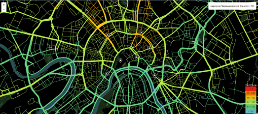
Moscow Hills is a very pretty map of Moscow, using gradient colored roads to show elevation levels throughout the city. As well as using the color of the roads as a guide you can mouse-over any point on a road to view the elevation at that point.

The colors of the roads don't seem to be generated dynamically on the map. I think the colors are actually present in the map tiles. Theoretically you could create a similar map using the Google Maps API and the Elevation Service. In fact it should be fairly simple to draw a gradient polyline along a road using the Stroke Style feature with the Google Maps SDK for iOS.

It's kind of indicative of Google's current neglect for the Google Maps JavaScript API that gradient polylines have been introduced in the Google Maps SDK for iOS but aren't available in the Maps JavaScript API

Tuesday, November 12, 2013

The Age of the World's Buildings Mapped


Russia's Mercator has joined in this year's trend to map the ages of all the world's buildings. Mercator's Houses of Moscow maps the ages of all Moscow's buildings.

The map shows a distinct pattern in Moscow's development. The center of the city retains many of its pre-revolution historical buildings and remains mainly largely untouched by later developments. Modern developments from the 20th and 21st centuries seem to be fairly evenly distributed across the rest of the city.

The Age of Greater Reykjavík is a map that shows the age of the Icelandic capital's buildings. The darker the color of the building on the map the older it is.

You can mouse-over any of the buildings on the map to view its age of construction and address.


The Five Boroughs: Building Age NYC uses NYC's Pluto data to map the age of all buildings in the five boroughs of New York City. That is an incredible 1,053,713 buildings in total. The map is a great resource to help you find New York's hidden historical buildings.

Block by Block, Brooklyn’s Past and Present uses the same data to show the age of Booklyn's buildings.

CitySDK's map shows the age of nearly 10 million buildings in the Netherlands. It is a great mapped visualization of a very large data set, which provides a great tool for exploring different patterns of urban development in Dutch towns.

The iBag Viewer is an interactive map of the same Dutch building age data set. In my opinion the choice of colors in the CitySDK map make it a much nicer map to look at, however the iBag Viewer includes two really handy controls; a date slide control and a map opacity control.

The date slider allows you to filter the results shown on the map by building age. You can therefore use the control to find out where all the oldest buildings are in any Dutch town. The map opacity control also allows you to adjust the opacity of the OpenStreetMap map tiles.


Ljubljana Building Ages is a map of building ages in Ljubljana, Slovenia. Buildings on the map are colored by age and a line graph provides a quick visual overview of the ages of the city's buildings.

The Ljubljana map was inspired by the Portland, Oregon: The Age of a City. This MapBox map colors 544,033 buildings in Portland by age.

If you live in Chicago then you can check out Wired's MapLab map of Chicago's Building Ages.

Wednesday, February 22, 2012

Street View Launched in Russia


Red Square

Google Maps now has Street View imagery in Moscow and St. Petersburg, Russia. There is also a little pocket of Street View around the Qolsharif Mosque in Kazan. Street View Fun also discovered that one street in Lodz, in Poland has also been given Street View.

In Moscow you can now take a virtual stroll on Google Maps around Red Square and the Kremlin. In St.Petersburg you can stroll around the whole UNESCO Heritage site of the centre of St. Petersburg. This includes the Winter Palace and The Peter and Paul Fortress.


The Peterhof Palace, St.Petersburg

Some more Russian landmarks that can now be viewed in Street View are:

The Cathedral of Christ the Saviour, Moscow
The Peterhof Palace, St.Petersburg (and all the Palace gardens)
The Old St.Petersburg Stock Exchange
The Church of the Saviour on Blood, St Petersburg

Via: Google Lat Long

Monday, November 28, 2011

Historical Moscow on Google Maps


Old Maps of Moscow has a very large collection of historical maps of the Russian capital.

The site uses Google Maps to help users navigate the historical collection. Users need to click on the Google Map of Moscow to show the location they are interested in viewing. Then they can select from the many historical maps to view the chosen location on their chosen map.

The map collection goes back to 1739 and includes plans, topographic maps, historical aerial photography and much more.

Thursday, July 28, 2011

Russian Greenpeace on Google Maps


Greenpeace has released a Google Map of recycling stations in Moscow.

The map shows the locations of recycling stations for paper, glass, plastic bottles, old electronics and clothing in the Russian capital. The map includes custom made markers that are colour coordinated to indicate the type of recycling possible at each station.

It is also possible for users to add the location of missing recycling locations to the map.

Greenpeace - Moscow Recycling Map

________________

Monday, May 31, 2010

Historical Moscow on Google Maps

Oldmos

Oldmos is a Russian website of historical photographs of Moscow. The home page of Oldmos features a prominent Google Map that shows the location of the historical photographs submitted to the site.

You can pan and zoom the map to view the photographs from different locations. You can also use the slider below the map to select to view only photographs from a specific date range. As well as browsing the historical photographs by map you can also browse them by those recently added and those that are top rated.

Via: Google Maps Mania.ru (no relation) and Andrei's Blog

_____________

Saturday, September 12, 2009

More Russian 'Street View'

NORC

Yesterday I linked to Russian search engine Yandex's online map service, which has a street view type service for Moscow. In the comments to that post someone pointed out that NORC also has a map with panoramic imagery for Moscow.

NORC uses Google Maps as the means to navigate around the 'street view' type panoramas. Unfortunately NORC does not have links within each panorama, so you can't use arrows to jump to the adjacent image. Instead you have to drag the map marker to the location you want.

NORC also doesn't seem to have quite as much coverage in Moscow as Yandex. However it does have some stunning panoramas of Russia's capital.

_____________