Showing posts with label Russia. Show all posts

Saturday, April 19, 2025

Russia's Disinformation Network Mapped

The Pravda Dashboard

The Pravda Network is a coordinated Russian disinformation campaign designed to disseminate pro-Kremlin content across the globe. At its core, the network launders news from sanctioned Russian media outlets and questionable Telegram channels, distributing it through a constellation of country-specific websites. In each country the news is recycled to fit local narratives and most likely distributed through AI-driven systems: 

In the last two years this disinformation network has published over 3.7 million articles, with an alarming focus on influencing audiences in countries like France, Germany, Ukraine, Moldova, and Serbia. To help researchers, journalists, and open-source investigators make sense of this complex ecosystem, the DFRLab has released a public interactive map. This map is part of a broader Pravda Dashboard, designed to provide near-real-time visibility into how specific countries are being targeted.

The map allows users to click or search for any country and immediately see how it is being influenced: the volume of articles, the most commonly cited sources, and notable surges in activity over time. The map is a powerful reminder of how Russian propaganda is not just local - it’s multilingual, multi-platform, and meticulously engineered for impact. The map reveals a sprawling operation pushing coordinated disinformation across over 80 countries, fueled by bots & AI.

Monday, March 24, 2025

The Russian Sabotage Map

During 2024, a number of undersea cables around Europe were sabotaged by Russia. These attacks were only a small part of a larger Russian campaign to disrupt European democracy and undermine its support for Ukraine. Alongside the destruction of undersea cables, Russia has been involved in cyberattacks, social media misinformation, attempted murders, arson, sabotage, and coordinated espionage against countries across Europe.

In Western officials say Russia is behind a campaign of sabotage across Europe the Associated Press has mapped out 59 acts of Russian espionage against European countries since the invasion of Ukraine. These attacks include plots to plant bombs on cargo planes, explosions at shipping facilities, and an attempt to assassinate a major German arms manufacturer. Only incidents with "a clear link to Russia, pro-Russian groups, or ally Belarus" have been included in the map.

GPS jamming is another form of active sabotage against the West, orchestrated by Russia. In 2022, Space reported that Russia was jamming GPS signals during its invasion of Ukraine. In addition to GPS jamming in Ukraine, the Baltic region has experienced a marked increase in GPS interference since Finland and Norway joined NATO - an escalation widely attributed to Russian activity.

SkAI Data Services' Live GPS Spoofing and Jamming Tracker Map is an interactive map that uses live ADS-B data from the OpenSky Network to detect spoofed aircraft positions and GPS jamming in real-time across the globe. As shown in the screenshot above, the map consistently displays high levels of GPS spoofing and jamming activity in the Eastern Mediterranean, Eastern Europe, and the Baltics.

Friday, August 30, 2024

245 Russian Military Targets at Risk

map showing possible military targets inside Russian

The Institute for the Study of War (ISW) and Critical Threats have identified hundreds of Russian military sites that are in range of Ukrainian ATACMS. Currently the United States will not allow Ukraine to use US supplied tactical ballistic missiles for long-range deep strikes into Russia. According to the ISW its new map shows "the extent to which US restrictions on Ukraine's use of ATACMS constrain Ukraine's ability to strike important military infrastructure."

The map Known Russian Military and Paramilitary Objects in Range of Ukrainian ATACMS plots the locations of 245 different military sites, including Russian military installations, and regimental, brigade & division headquarters. The map also visualizes the ranges of Ukraine's ATACMS and HIMARS missiles inside Russian territory.

According to CNN this week Ukraine will present the US government with a list of Russian military targets which they believe are important in trying to stop Russia's continuing invasion of Ukraine. They hope that this list of targets will help to persuade the US to lift its current restrictions on Ukraine using American supplied missiles for long-range attacks on Russia.

The ISW also provides daily campaign assessments of the ongoing war in Ukraine. The Ukraine Conflict Updates includes daily static control-of-terrain maps and a regularly updated interactive map, Russia's Invasion of Ukraine, showing the extent of territory currently controlled by Ukraine and Russia. 

Tuesday, August 13, 2024

Russia's Secret Nuclear Targets in China

The Financial Times has obtained secret Russian military files which detail how Russian forces train to use tactical nuclear weapons against both NATO and China.

A story-map in the article Russian navy trained to target sites inside Europe with nuclear-capable missiles (paywalled) shows a number of target locations in Europe and the Pacific for Russian conventional and nuclear missiles. In the Pacific these targets include cities in both China and North Korea, who are normally seen as allies of Russia.

Targets in Europe include cities in France, Germany, Norway and the UK. The FT claims that the Russian military files "describe a threshold for using tactical nuclear weapons that is lower than Russia has ever publicly admitted".

According to Sweden's SVT Russia currently has 5,580 nuclear warheads. SVT's recent investigation into World Nuclear Forces includes a quote from the Swedish government that the "Russian population is being primed for a scenario in which it will be considered legitimate for Russia to use nuclear weapons".

The World Nuclear Forces article includes an interactive nuclear warhead simulator which allows you to explore the likely impact of different types of nuclear warhead on different locations around the world. For example in the screenshot above I have used the simulator to explore the effect of a 100 kiloton Russian warhead dropped on Shenyang (one of the Russian targets in China identified by the Russian military files).

Tuesday, October 03, 2023

Shilling for Putin

The Insider ('fully committed to investigative journalism and to debunking fake news') has created a new interactive map which exposes the 'fake experts' around the world that are spreading pro-Kremlin fake narratives and Russian propaganda. The Insider claims that what "unites the individuals featured on this map is their attempt to portray Putin's policies positively while disseminating outright misinformation."

If you click on a country on the Fakesperts map you can view a list of the individuals in that country who are used by Russia to spread fake news. In the United States one of the pro-Kremlin fake experts exposed by the map is the disgraced Tucker Carlson. Carlson is a well-known Putin fanboy, who frequently espouses lies about Ukraine and has bent over backwards to support the Russian invasion of Ukraine. 

In the UK ex-goalkeeper and self-proclaimed 'son of God' David Icke appears on the map. Although seen as a figure of ridicule in the UK he often appears on Russian television venting anti-Semitic conspiracy theories centered on George Soros.

Often the individuals identified by the map are little known in their own countries. For example the map identifies Daniel Patrick Welch in the United States as a 'fakespert'. Welch is the manager of a small daycare center in Boston, who is often used by Russian television as a political analyst. This is probably because he will say anything he is paymasters wish, for example that Ukraine sold weapons to ISIS and that the war in Ukraine will lead to the end of the European Union and NATO.

Friday, September 08, 2023

Geolocating General Surovikin

The investigative journalists at Bellingcat have been developing some important tools and methodologies for geolocating images. On Wednesday they applied their investigative geolocating powers to identify the location of General Sergey Surovikin.

On September 4th a photograph of Surovikin was posted online, accompanied by the message "General Surovikin has emerged. He’s alive and well, home with his family in Moscow". Surovikin, who had been a close associate of the Wagner boss Yevgeny Prigozhin, had not been seen in public since the beginning of the Wagner mutiny in June. His disappearance had led to speculation that he had either been arrested or 'disposed of' by Russian authorities.

In order to determine the fate of Surovikin it is necessary to authenticate the date of the photograph, where it was taken, and who is actually in the picture. The BBC's Verify team determined that there was a 'high probability' that the people in the photo were Surovikin and his wife and that the picture had not appeared before. All that remained therefore was to determine where the photo was taken.

In Geolocating Russia’s Disgraced General Surovikin Bellingcat explains how the 'crowd' was able to geolocate the photograph based on the visual clues in the published picture. Thanks to a number of investigators and Twitter users the correct location in the photograph was narrowed down to the Terrazza restaurant in an elite neighborhood of Moscow, close to where Surovikin has a home.

Thanks to the work of the BBC and a number of independent investigators it appears that Surovikin is indeed still alive in Moscow. However, as Bellingcat reports, "key questions as to his fate and current standing remain unanswered".

Friday, February 24, 2023

A Year of War in Ukraine

On February 24th last year Russia lauched a full-scale invasion of Ukraine. As a result of Putin's illegal war at least 200,000 people have been killed or injured. In Ukraine over 13 million people have been forced to abandon their homes, and many buildings, cultural artifacts and important infrastructure have been destroyed by the invading Russian army. 

Most media outlets today are marking the anniversery of Russia's invasion with some kind of summary of Ukraine's heroic year long resistance to Russian aggession. Among the best of these is the Grid's Ukraine, One Year at War: An Interactive Timeline of the Conflict

Using an interactive timelined map the Grid has mapped the progress of Russia's invasion so far. This interactive map features a calendar control which allows you to recount the war in Ukraine day-by-day in chronological order. As you scroll through the article the map updates to show the areas which were under Russian or Ukrainian control by date. Significant dates in the conflict are highlighted in grey on the calendar control. When you scroll to these important dates information windows on the map are used to provide background context to the unfolding invasion and to Ukraine's resistance. 

Over the past twelve months news organizations have published many interactive maps to document the progress of the war and to monitor the war crimes being committed by the Russian army. Links to some of these maps can be found by exploring the Ukraine tag on Maps Mania.

Thursday, November 17, 2022

Mapping Mariupol's Destruction

A Timeline of Mariupol's Destruction is an animated map which visualizes the damage caused to buildings by the Russian attacks on the Ukrainian city of Mariupol. The map shows damage caused by Russian bombing between March 5th and July 29th of this year.

The city of Mariupol was under siege from Russia from 25th February until 17th May 2022. In March the Red Cross declared the siege a humanitarian crisis. In May Ukarainian authorities reported that 90% of buildings in the city had been damaged or destroyed. Around 25,000 civilians are believed to have been killed in the Russian attacks on the city.

The map was created by analysing satellite imagery of the city by PlanetScope. This analysis "found that 2,664 structures sustained significant damage in the city".
360war wants to ensure that images of the damage caused by the occupying Russian army in Ukraine are seen by people around the world. 360war is documenting the destruction of Ukrainian towns and villages, showing the aftermath of Russian air strikes and artillery fire on the infrastructure and buildings of Ukraine. Using panoramic 'Street View' imagery 360war allows you to explore in close detail some of the devastating destruction left behind by the Russian army.

An interactive map shows the location of all the available 'Street View' images (Mariupol is still under Russian occupation so is not featured). On this map aerial panoramic images are indicated using a drone shaped marker, while ground based panoramic images are shown with black dots. Many of the interactive panoramas include a 'learn more' link which provide more information on the location depicted and the damage caused by the invading Russian army.. 

Friday, October 07, 2022

Maps Sans Frontieres

Russia's interactive maps no longer have country borders. If you visit Russia's online map service Yandex you may notice something a little odd, especially if you are trying to find the international border between two neighboring countries. This is because Yandex no longer displays country borders on its map. 

The Moscow Times quotes a Yandex spokeperson as saying that the decision has been taken to drop international borders in order to "focus on natural features rather than on state boundaries. Our task is to display the world around us. So the map will show mountains, rivers, and other data usually found on such maps".

It isn't uncommon for interactive map companies to have issues with international borders. Google Maps for example may show you different international boundaries depending on which country you are accessing the map from. For example, according to The Guardian, if you

"Look at the Crimean peninsula on Google Maps UK – it’s separated from Ukraine by a dark-grey dotted line to mark a disputed border. Look at it on Ukrainian Google Maps and the dotted line is light-grey, of the sort used to demarcate states. On Google Maps Russia? A solid black country border, showing Crimea as part of the country."

What is unusual however is for an interactive map provider to remove international borders completely. As the Moscow Times reports Yandex's decision to drop international borders from its map coincided with the decision by pro-Kremlin officials to hold fake referendums in Russian-occupied areas of Ukraine in order to try and illegally annex these territories.

The removal of all international borders by Yandex does suggest that there is no limit to Putin's ambition. If Russia's neighbors were not already worried about Putin's future plans they probably are now. The only people who are probably sleeping a little easier after this decision by Yandex are Russian cartographers.

Friday, August 19, 2022

Ukraine Under Attack

The Map of the Russian Shelling of Ukraine is a new interactive map which shows where and when Russia has bombed the people of Ukraine. 

The map uses different colored markers to indicate the different types of shelling attacks (rocket, air or artillery). If you click on any of the markers you can view the date of the Russian attack and click-through to read any media reports about the selected shelling. The map includes a timeline feature which allows you to select to view attacks by date-range. You can adjust the end-date on this timeline to view the cumulative amount of shelling from the beginning of the Russian invasion until the selected date.

The Map of the Russian Shelling of Ukraine also features selected satellite images from Planet.com. If you zoom in on any of these satellite images you can see for yourself some of the damage caused by Russian missiles fired on Ukraine. At the moment the map is only available in Ukrainian. An option to view the map in English should be available from early next week. 

You can also explore evidence of Russia's war crimes in Ukraine on Bellingcat's Civilian Harm in Ukraine, an interactive map which locates and records evidence of Russia's attacks on civilians during its invasion of Ukraine. The Ukrainian Civilian Objects Attacks and Casualties Interactive Map is another attempt to track and map Russian attacks on civilian targets in Ukraine.The map consists predominantly of geo-tagged photographs of civilian buildings which have been damaged by Russian bombs. This map also includes a running total of the number of civilians who have been killed and injured by the Russians in Ukraine.

Friday, June 10, 2022

Wheat, War & Famine

The Guardian has published an informative story map which illustrates how the Russian invasion of Ukraine is disrupting the world's food supply and contributing to rising food prices across the world. In the Black Sea Blockade the newspaper uses a story map to illustrate and explain how the war in Ukraine is affecting the global supply of wheat and sunflower oil.

Russia and Ukraine provide around 30% of the world's exported wheat. Russia's blockade of Ukrainian ports in the Black Sea is causing major disruption, particularly to north Africa and the Middle East. Using a choropleth layer The Guardian visualizes Ukraine's major wheat growing regions and shows how they are being disrupted by Russia's military action in the south east of the country. 

Thanks to the Russian blockade of Black Sea ports wheat silos in Ukraine are still full from last year's wheat harvest. The Guardian shows how in normal times shipping routes are used to transport that wheat from the Black Sea to the Middle East and north Africa, two regions which are hugely reliant on wheat from Russia and Ukraine. Those shipping routes have now been blocked by Russian military action in the Black Sea.

The Guardian goes on to map those countries which are most at risk from food insecurity and rising food prices. This includes those countries in eastern Africa which are already suffering from extreme drought. For example in Sudan wheat prices are now 180% higher than last year. There is now a huge concern about how the combination of drought and food insecurity could combine to cause widespread famine in eastern Africa.

Friday, April 01, 2022

Minard's Map of the Russian Campaign


Charles Minard's 'Flow Map of the Russian President's Shrinking Sanity' is one of the famous engineer's most overlooked and under-appreciated information graphics.This cartographic depiction of the Russian President;s dwindling sanity during the Russian army's failed attempts to subjugate Ukraine provides a stark visualization of the effect of a failing military campaign on the mental health of an already deranged Russian leader.  

Minard's famous illustration shows the Russian army's attempted advance west across Ukraine. A thick band illustrates the level of the Russian President's sanity at specific geographic points during this attempted advance.It displays five types of data in two dimensions: the distance traveled; latitude and longitude; direction of travel; and the level of the president's remaining sanity. 

This type of band graph for illustration of flows was to be later called a Sankey diagram.

The description accompanying the map is in Minard's native French.However (uniquely among Minard's information graphics) the work has been given a Russian title - 'Пу́тин хуйло́'. There is some debate as to the correct translation of Пу́тин хуйло́ into English. You can explore some of the etymological discussions around the transliteration of Пу́тин хуйло́ in this Wikipedia article.

Tuesday, March 22, 2022

Mapping Russia's Attacks on Civilians

The NGO Human Rights Watch has investigated Russia's attacks on Ukraine’s second largest city, Kharkiv, between February 28 and March 5. The results of this investigation have led Human Rights Watch to conclude that Russia has attacked civilian buildings, "including apartment blocks, schools, places of worship, and shops, impeding access to food and medicines. They also damaged infrastructure in the city causing civilians to lose vital services such as electricity, heat, and water".

Under the rule of law armies must take "all feasible precautions" to avoid attacks on civilians and civilian targets. The law prohibits attacks aimed at civilians or civilian targets, the use of indiscriminate attacks and attacks that have disproportionate effects on civilians. In Ukraine: Deadly Attacks Kill, Injure Civilians, Destroy Homes Human Rights Watch presents evidence that Russia's attacks on Kharkiv have used indiscriminate cluster munitions to intentionally target civilian areas. 

The Human Rights Watch report into the attacks on Kharkiv includes an interactive map which plots detailed findings of Russia's illegal bombing campaign in the city. In gathering this evidence Human Rights Watch interviewed eye witnesses, including residents, medical workers, and municipal workers. The organization also analyzed and verified 29 videos and photographs of the attacks to corroborate witness testimony and to identify locations bombed and the damage caused. 

You can explore the evidence on the map by clicking on the numbered map markers or you can simply scroll through the map sidebar. This evidence includes photographs and videos of bombed civilian buildings. 

You can explore evidence of Russia's war crimes elsewhere in Ukraine on Bellingcat's Civilian Harm in Ukraine, an interactive map which locates and records evidence of Russia's attacks on civilians during its invasion of Ukraine. The Ukrainian Civilian Objects Attacks and Casualties Interactive Map is another attempt to track and map Russian attacks on civilian targets in Ukraine.The map consists predominantly of geo-tagged photographs of civilian buildings which have been damaged by Russian bombs. The map also includes a running total of the number of civilians who have been killed and injured by the Russian army in Ukraine.

Saturday, March 19, 2022

Russia's Failed Invasion of Ukraine


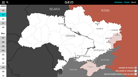
Russia believed that it could just march into Ukraine with very little resistance. However what was meant to be a quick war has quickly turned into a slow attritional battle for territory. The poor planning, logistics and tactics of the Russian army has met with fierce resistance from the Ukrainian people and Russia's invasion has clearly not gone to Moscow's plan.

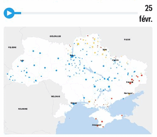
The Financial Times has released a new story map which attempts to explain how Russia's attempts at regime change has faltered on Ukrainian ground. In How Russia’s mistakes and Ukrainian resistance altered Putin’s war the FT uses an interactive map to show how Russia's war in Ukraine has not gone to plan and has forced the Russian army to change its plans.

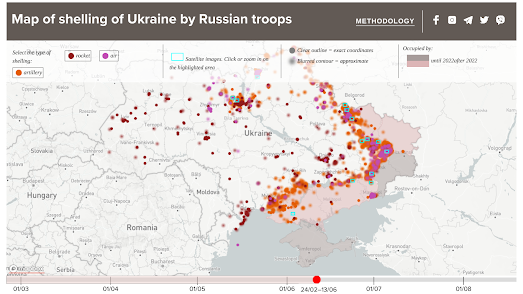
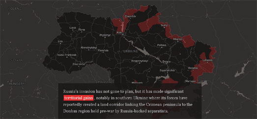
The Russian invasion has floundered because of brave Ukrainian resistance and the shortcomings of the Russian army. As you scroll through the FT's story map it explains how Russia is now relying more and more on the terrorist activities its army developed in Chechnya & Syria, relying more and more on the indiscriminate bombing of heavily populated civilian areas. 

What was meant to be a quick regime change has turned into a direct attack on the Ukrainian people. The FT map shows how in the early stages of the invasion Russia believed it could quickly take control of major Ukrainian towns and cities. However the invasion army units quickly outran their supply lines and forward units quickly ran out of fuel and ammunition. Russia's failure to secure supply lines to support its invading forward units prove that it expected to meet with very little resistance and hadn't planned for a war that world last more than a few days.

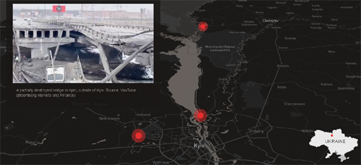
Conversely the Ukrainian resistance has been effective in disrupting the Russian advance. Using light infantry units the Ukrainian army has been able to pick off Russian units which have been cut-off from their supply lines. The Ukrainian army has been helped by an international supply of weapons which are particularly useful against isolated advancing units, such as NLAW and Javelin anti-tank missiles. Ukraine has also been able to slow the Russian advance by destroying key bridges and dams.

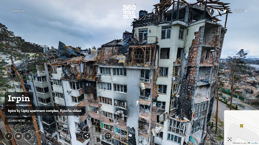
The failure of a quick Russian invasion of Ukraine is leading Russia to switch to the terrorist activities developed in Chechnya and Syria. They are now indiscriminately bombing civilian targets and trying to batter and starve cities into surrender. Unfortunately, because Russian is led by a megalomaniacal psychopath many people believe Russia's tactics in Ukraine may soon get a lot uglier.

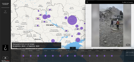
Story Maps are an excellent way to not only visualize geographical data but to pick out the stories and patterns in your mapped data. The Financial Times Ukraine map uses Mapbox's Scrollytelling Template. The features of the Mapbox Scxrollytelling library can also be explored on this Mapbox demo map. The demo map not only introduces the Scrollytelling Template it shows you what you can do with the Mapbox story map library.

Friday, March 18, 2022

Mapping Russia's Civilian Attacks

Last week Russia attacked a maternity hospital in the Ukrainian port city of Mariupol. At least four civilians were killed and sixteen others were injured. The Russian army's terrorist tactics of attacking civilians and civilian targets are well established. For years the Russian army has been been targeting civilian infrastructure and civilians in Syria, in attempts to subjugate the people and destroy morale.Russia is now using the same indiscriminate cluster bombing of civilian targets in Ukraine.

Bellingcat's Civilian Harm in Ukraine interactive map locates and records evidence of Russia's attacks on civilians in Ukraine. This includes attacks on civilian areas and infrastructure leading to damage or destruction, and attacks resulting in civilian injuries and visible civilian deaths. Bellingcat began collecting evidence for the map on February 24, 2022.

The Civilian Harm in Ukraine map includes a timeline which allows you to explore the recorded incident both by location and by date.If you select an incident on the map evidence of the attack is shown in the map side panel. 

In order to make this map Bellingcat has assembled a Global Authentication Project team, consisting of a number of open source researchers. This team examines open source evidence of potential civilian harm in Ukraine in order to clarify where and when the incidents took place. Only incidents which have been captured on camera or posted to social media are added to the map. It is likely that there are many other incidents of Russian attacks on civilians and civilian buildings which have not been identified by the Global Authentication Project team. 

The Ukrainian Civilian Objects Attacks and Casualties Interactive Map is another attempt to track and map Russian attacks on civilian targets in Ukraine.The map consists predominantly of geo-tagged photographs of civilian buildings which have been damaged by Russian bombs. The map also includes a running total of the number of civilians who have been killed and injured by Russia's illegal war against Ukraine.

The map includes a timeline which means that you can browse the civilian casualties of Russian bombs by both date and location. If you click on a date or on a map marker then photographs of the damage caused by Russian bombs will be shown in the map sidebar. If you click on one of these photographs a slideshow will open so you can browse all the submitted photos from that location.

The map doesn't have an 'about' page but it does link to the Ukrainian government website. The map however doesn't appear to have a Ukrainian government URL so it is more likely to have been created by developers in support of the Ukrainian people (if you know more about the map's origins please let me know in the comments below).

Wednesday, March 16, 2022

The Russian Roundabout

In response to Russia's invasion of Ukraine many countries around the world (including the EU and the USA) have closed their airspace to Russian aircraft. Russia has responded in turn by introducing tit-for-tat restrictions, closing its airspace to airlines from 36 different countries around the world. 

Enrico Spinielli has published a couple of maps which visualize the disruptions caused to airlines by the introductions of these no-fly zones. How flights between Europe and Eastern Asia got disrupted plots a selection of flight paths from Europe to Japan from before & after the start of the war in Ukraine. On the right-hand map above you can see how flights from Europe to Asia are now having to make big detours in order to avoid flying over Russia, adding 3.5 hours to a flight from London to Tokyo and 1.63 hours to a flight from Frankfurt to Tokyo.The left-hand map shows the flight paths of planes taken by planes flying from Europe to Asia before the start of the war.

Russian planes have also been forced to make changes to their usual flight plans. In Flying to Kaliningrad during the Russian flight ban Spinielli has mapped out the flight paths that Russian planes have been having to make in order to fly to the Russian enclave of Kaliningrad. Since February 27 commercial flights between mainland Russia and Kaliningrad have had to follow the Baltic Sea avoiding Finland, Sweden and the other Baltic states.

In a third installment in his series visualizing the impact of the Ukrainian invasion on commercial airlines Spinielli has also mapped out evidence of GPS jamming around Kaliningrad.

Tuesday, March 15, 2022

Mapping the Russian Advance

One thing that has surprised most people about Russia's illegal attempt to occupy Ukraine is how ill equipped the Russian army has been. A combination of poor logistics, poor planning, poor equipment and poor morale all appear to have helped hinder the Russian advance. At the same time the incredible bravery and resistance of the Ukrainian people has proved an amazing counterpoint to the shame and disgrace of Putin and the Russian government.

The French newspaper Le Parisien has created an animated map which provides a great illustration of how Russia's attack on Ukraine hasn't gone to plan.The War in Ukraine: The Daily Map Which Shows the Situation Town by Town includes an interactive map which shows which towns in Ukraine have been under Russian or Ukrainian control for every day of the war.

The animated map (shown above) clearly shows how badly the war has gone for Russia, so far. Over the last week you can see that Russia has started to consolidate its control in the South East of Ukraine, connecting the Donbas region to Crimea.However even here the Russians have met with incredible resistance. For example, the heroic citizens of Mariupol have held out for over a week without food supplies, water, power or heat; while the Russian army illegally bombs civilian targets, such as the city's hospital.

Le Parisien's daily updated map uses data from Wikipedia's Russo-Ukrainian War Detailed Map. This is a crowd-sourced map which shows the current status of towns and cities in Ukraine in terms of whether they are under Ukrainian or Russian control. Cities marked blue on the Wikipedia & Le Parisien maps are currently under Ukrainian control and cities shown with a red circle are under Russian control. 

The map data is taken from the Wikipedia article Cities and Towns during the Russo-Ukrainian War. According to Wikipedia the status of each town is determined by a creditable source.

Tuesday, March 08, 2022

Ukrainian & Russian Casualties

The Ukrainian Civilian Objects Attacks and Casualties Interactive Map is an attempt to track and map Russian attacks on civilian targets in Ukraine.The map consists predominantly of geo-tagged photographs of civilian buildings which have been damaged by Russian bombs. The map also includes a running total of the number of civilians who have been killed and injured by Russia's illegal war against Ukraine.

The map includes a timeline which means that you can browse the civilian casualties of Russian bombs by both date and location. If you click on a date or on a map marker then photographs of the damage caused by Russian bombs will be shown in the map sidebar. If you click on one of these photographs a slideshow will open so you can browse all the submitted photos from that location.

The map doesn't have an 'about' page but it does link to the Ukrainian government website. The map however doesn't appear to have a Ukrainian government URL so it is more likely to have been created by developers in support of the Ukrainian people (if you know more about the map's origins please let me know in the comments below).

Карта Мира is another interactive map which includes no 'about' page.This map claims to provide reliable information about Russian soldiers who have gone missing in the Russian attack on Ukraine. 

The map consists of map markers which purport to show the origins of soldiers captured or who have gone missing in Ukraine.If you click on these markers you can view photographs of the missing soldiers or of their documentation and an indication if they are in captivity or if they have died.

Because neither of these two maps have an 'about' page nor an explanation of their data collection methodologies it is impossible to verify their authenticity. The information on the map of Russian soldiers captured and killed in the Ukraine is particularly hard to verify because it is widely believed that Russia is intentionally under-reporting the number of soldiers killed and captured in the war in Ukraine.

Friday, October 22, 2021

Spotting Methane Polluters from Space

In June the European Space Agency's Copernicus Sentinel-5Pdetected large amounts of methane being emitted in Russia. The ESA satellite orbits the Earth 14 times a day detecting different types of gas emissions around the world. On June 4th it spotted a methane leak in a Gazprom gas pipeline near Kazan in southwest Russia.

In recent years there has been a large increase in the amount of methane detected in the Earth's atmosphere. Methane is one of the major contributors to global heating so it is vital that we lower methane emissions. Methane is the chief component of natural gas. It is therefore thought that gas leaks, such as the one detected in Russia, may be one of the main causes of the rising levels of methane in the atmosphere. 

In Russia Allows Methane Leaks at Planet's Peril the Washington Post  has published an impressive animated globe which explains how ESA's Copernicus Sentinel-5P satellite detected methane emissions from the Gazprom pipeline. The Post's article, accompanying the globe visualization, explains how Russia and other countries have been misreporting the levels of their methane emissions and how satellites dedicated to locating greenhouse gases are making it much harder for countries to hide their true levels of polluting.

The Post article goes on show how methane emissions in Russia have risen sharply in recent years, while at the same time the Russian government has tried to claim a reduction in their annual output of methane. Based on an analysis of satellite detected emissions The Post believes that the true levels of Russia's methane emissions per year are at least twice as high as Russia's self-reported levels.

Monday, September 20, 2021

The Russian Election Map

Russia has just held a parliamentary election. However, when the main opposition leader has been thrown in prison and most opposition candidates have been banned from standing, there really isn't much point in creating an election map of the Russian election results. What is far more interesting is Karta Narusheniy (Violation Map), an interactive map of voting irregularities reported in the 2021 Russian parliamentary election.

The Russian election is so rigged that I haven't even bothered to check the results this morning to see how large Putin's election victory is. I suspect Putin's United Russia party will be decided to have won over 100% of the vote in most areas of the country. 

Election observers from the Organization for Security and Cooperation in Europe (OSCE) didn't even bother to oversee this year's election in Russia because of the proposed limitations that the Russian government had tried to impose on them.Russia's Violation Map is currently reporting nearly 5,000 reported voting irregularities across the whole of Russia and even reports violations in overseas voting booths in Russian embassies around the world. These irregularities include reports of ballot stuffing and of forced voting.

The Violation Map was created by Golos, an independent vote monitoring group. The violations shown on the map are crowdsourced by voters across Russia. Voters can report violations that they have witnessed either by completing a form on the Violation Map website or by calling a phone hotline. Reports of voting violations sent to Golos are also passed on to election commissions and, where necessary, to law enforcement agencies and the media.