Showing posts with label elections. Show all posts

Wednesday, June 04, 2025

Poland's Political Partition Persists

Here are two maps of Poland. The map on the left shows the partitioned Poland of 1815–1918 (from Lessons from the Partitions of Poland). The map on the right is Polish newspaper Gazeta Wyborcza's interactive map of this week's 2025 Polish Election.

It has long been a tradition, after every Polish election, for observers to note that current voting patterns in the country still seem to follow the country's old imperial borders. Back in 2013, Irena Grosfeld and Ekaterina Zhuravskaya wrote that the spatial pattern of the 2007 Polish election was “determined, to a large extent, by the Partitions of Poland (1772–1918).” In The Past in the Polish Present, the two professors argue that the very different economic and social policies pursued by Russia, Prussia, and Austria during their control of Polish territories for over a century have left a persistent legacy. This legacy once again appears to have been evident in this week’s Polish election.

In Do Poland’s 19th-century partitions still influence elections today?, Katarzyna Skiba takes a closer look at this apparent connection between modern Polish political beliefs and “the ongoing legacies of empire.” Her examination of Polish politics includes several critiques of what some consider an overly simplistic comparison.

Via: Datawrapper's Data Viz Dispatch


Saturday, May 03, 2025

Kangaroos Don't Vote - People Do

If ever an election needed a cartogram map, it was the 2025 Australian federal election.

If you were to view The Australian’s Electorate Map - 2025, you could be forgiven for thinking the Liberals had cruised to a landslide victory. This traditional cartogram election map is visually dominated by the blue of the Liberal Party. It also appears as if the Labor Party (shown using salmon pink) made only a few modest gains in the Northern Territory, Tasmania, and a handful of electorates in the southeast of the country.

It just goes to confirm the well-worn cliché: "kangaroos don't vote — people do."

The Guardian’s "Exaggerated" view does a slightly better job of visually representing the large number of urban seats won by Labor in this election. Their Australian election results 2025 map map allows users to toggle between a traditional geographical view and an exaggerated one, in which "smaller electorates are increased in size for visibility."

However, even The Guardian’s exaggerated view still falls short of clearly conveying the full story of the 2025 election - with 82% of the results called, Labor holds 82 seats compared to just 32 for the L/NP Coalition.

ABC News’ Live: Maps show swing to Labor, crash in Coalition vote does an excellent job of illustrating the massive swing to Labor in this election compared to 2022. Using a series of swing arrow maps, ABC visualizes the changes in vote share since the previous election in both the two-party-preferred vote and the primary vote. The screenshot above shows "the change in the two-candidate-preferred vote in each electorate." As you can see, there are far more red arrows — representing a swing towards Labor — than blue arrows — which indicate a swing towards the Coalition.

Friday, May 02, 2025

The Democracy Sausage Map

The 2025 Australian federal election will be held tomorrow, 3 May 2025. One of the most iconic and uniquely Australian traditions on election day is the “democracy sausage.” As voters head to the polls to cast their ballots, many are greeted by the smell of sizzling sausages at local polling places, where community groups and schools run sausage sizzles as fundraisers.

The Democracy Sausage Map is a crowd-powered tool that helps hungry voters find out exactly where they can score a snag (and sometimes cake!) while casting their vote. The map is powered by self-described “crowdsauce” data collected from social media, polling booths, and tip-offs from the great Aussie public.

The map uses different icons to show what’s on offer at each sausage sizzle stall. These include markers for sausages, cakes, vegetarian options, coffee, bacon and egg rolls, and halal choices. When zoomed out, a polling booth may not display the full range of available fare — but zooming in on your local neighbourhood should reveal the full menu.

Tuesday, April 29, 2025

2025 Canadian Election Maps

The Liberal Party, led by Mark Carney, has won the Canadian election but may fall just short of securing enough seats to form a majority government. Even if it falls short, it will still be seen as a massive victory for the incumbent party.

Just a few months ago, Pierre Poilievre’s Conservatives were riding high in the polls and seemed poised to return to power. That momentum shifted dramatically after U.S. President Donald Trump launched a new trade war and called for Canada to become an American state. The remarks appeared to have an immediate impact on Canadian voters, many of whom turned away from the Conservatives, whose policies are most closely aligned with Trump's Republican Party.

The Toronto Star's Live Federal Election Map provides real-time results from all 343 ridings. Readers can click on any riding or use the search box to view detailed voting breakdowns, including the number and percentage of votes cast for each candidate and the winner in each seat.

The Globe and Mail's 2025 Election Map is very similar, allowing readers to search for ridings by name or click directly on the map to view the votes cast for each candidate. French speakers can view a very similar election map on TVA Nouvelles Fédérales 2025.

Friday, March 28, 2025

The 2025 Australian Election Map

Yesterday, the Prime Minister of Australia, Anthony Albanese, announced that the next Australian federal election will be held on May 3. The leader of the center-left Labor Party currently holds a very slim majority in Parliament. To achieve a majority government in the next Parliament, a party must win at least 76 seats out of 150 in the House of Representatives. If no party reaches this number, a hung parliament occurs, requiring parties to negotiate to form a minority government.

Following Albanese's announcement, The Guardian was quick off the mark, immediately publishing an Interactive guide to electorates in the 2025 Australian election: from safe to marginal. This interactive map allows voters to select any of the 150 electorates to learn more about the seat, including its recent political history (with a timeline of past election winners) and demographic data from the latest census.

The map itself features two main visualization views. A traditional 'geographical' view displays all 150 electorates on a standard map of Australia. Meanwhile, the 'exaggerated' view uses a gridded cartogram to show all electorates as equal-sized areas, making it easier to compare electorates visually. Additionally, users can switch between two color-coded seat views: a 'winning party' view, which displays electorates based on the current controlling party, and a 'by margin' view, which highlights the competitiveness of each seat.

If you are interested in how the results of the 2022 Australian federal election were visualized by the media then you might like Map Mania's round-up of Australian Election Maps 2022

Tuesday, March 04, 2025

Rebuilding the Berlin Wall

a choropleth map of the German election showing the CDU dominant in the west and the AfD winning in the east of the country
choropleth election map showing the CDU dominant in the west and the AfD winning in the east

In my round-up of 2025 German Election Maps, I commented on the "stark contrast between the results in former East Germany and the rest of the country." It was immediately apparent to most observers of last week's German election that there was a clear voting split along the old East-West German border. In the west, the Christian Democratic (CDU/CSU) party was triumphant, while in the eastern part of Germany, the far-right Alternative for Germany (AfD) was dominant.

However, according to Data Journalism Studio, this split is not as clear-cut as it first appears on German election maps. In German Elections: Did the Eastern Bloc Vote Radically? Not Exactly, the Data Journalism Studio uses a scrollytelling story map to illustrate how the actual results were more nuanced than the simple east-west divide suggests.

a cartogram map of the German election revealing an urban-rural political divide
cartogram map of the German election revealing an urban-rural political divide

By switching from a traditional choropleth map to a cartogram view, the Data Journalism Studio demonstrates that German voting patterns were influenced as much by population density as by the former East-West divide. A cartogram, which represents each electoral district as a single hexagon, reveals this different perspective. This visualization shows that in major eastern cities like Berlin and Leipzig, voters actually supported Die Linke rather than the AfD.

Further cartogram views, displaying party support across Germany, reveal that while the AfD performed well in the rural areas of the east, they did not perform well in the largest cities. Additionally, a cartogram map highlighting where the AfD gained votes since the previous election suggests that the AfD gained new voters quite evenly across all of Germany.

Monday, February 24, 2025

2025 German Election Maps

The conservative CDU party emerged as the biggest winner in yesterday's German election. Another clear winner from Sunday's vote was the far-right AfD party, which doubled its vote share to 20.8%. Meanwhile, the center-left SPD (the party of incumbent Chancellor Olaf Scholz) suffered its worst-ever results, securing just 16.4% of the national vote.

The Berliner Morgenpost's Federal Election 2025 Results includes an interactive map visualizing the winning party in each electoral district. This "winner-takes-all" view highlights a stark contrast between the results in former East Germany and the rest of the country. In nearly all West German regions, the CDU emerged as the most popular party. However, in almost all of former East Germany, the extreme far-right AfD was the dominant party.

Zeit's 2025 Election Results map uses a similar shaded margin layer to illustrate the election results. Both maps employ party colors to represent the winning candidates in each electoral district, while also using varying shades to indicate the strength of each party's winning margin.

On both maps, users can click on individual electoral districts to view the percentage of votes won by each political party in that area. Additionally, the Berliner Morgenpost map allows filtering by individual party. For example, selecting the far-right AfD reveals how well they performed across Germany—confirming that the party fared significantly worse in former West German regions compared to areas of former East Germany.

Tagesspiegel's Federal Election 2025 map also includes options to view both 'first' and 'second' votes and to view maps of all German elections dating back to 1990. The first vote is used to determine the candidate who will represent the constituency. The second vote is used for each party's state list. 

About half of the Bundestag consists of directly elected candidates (determined by the first votes). The rest of the seats in the Bundestag are determined by the proportion of second votes won by each party. The total number of seats a party gets is determined by the share of the second vote it receives (as long as it surpasses the 5% threshold or wins at least three direct mandates). Each party then fills these seats using candidates from its state party lists.

Thursday, January 16, 2025

An Extremely Distorted Map of the US Election

US map with states colored to show the winning candidate in the 2024 US election

Following the publication of its Extremely Detailed Map of the 2016 Election, the New York Times was widely criticized for visually misrepresenting the election results. Despite this backlash, the newspaper chose to repeat the error after the 2020 election - and has now done so again!

The New York Times recently released its Extremely Detailed Map of the 2024 Election. According to the NYT, the map is still a work in progress, currently displaying results from 73% of all votes cast. Results from some voting precincts are missing but will be added in the coming weeks.

The methodology behind the 2024 map remains unchanged from that used in the original Extremely Detailed Map of the 2016 Election. This decision is surprising, given the widespread criticism the 2016 map received from cartographers and data visualization experts. Cartonerd's Cartographic Hyperbole summarized these critiques into two main points:

  1. Use of a choropleth map: The map disproportionately highlights sparsely populated areas, giving them the same visual prominence as densely populated regions.
  2. Web Mercator projection: The projection does not maintain equal area, a crucial requirement for accurate visual representation in electoral maps.

The map is undeniably a powerful tool for exploring precinct-level vote counts for each presidential candidate. It also allows users to quickly identify precincts that overwhelmingly voted for one candidate. However, it suffers from the same flaw as its predecessors: it overemphasizes large, rural precincts (which usually vote Republican) , leading to a visually skewed representation of the overall election results.

In the 2024 U.S. Presidential Election, Donald Trump secured 49.9% of the vote, narrowly defeating Harris, who garnered 48.4%. Yet, the NYT's 'Extremely Detailed Map' gives the impression of a landslide victory for Trump due to the vast swaths of red representing rural areas. You could almost say that the NYT map creates an extremely distorted view of just how close the 2024 election truly was.

Tuesday, November 26, 2024

Mapping the U.S. Electoral Divide

map & scatterplot showing the urban-rural divide in electoral votes

In the United States, a persistent and striking political divide is evident between urban and rural areas. High-density urban regions overwhelmingly tend to support Democratic candidates, while low-density rural areas lean Republican. This geographical polarization shapes the outcomes of elections and reflects broader cultural, economic, and ideological divisions. 

A compelling exploration of this phenomenon can be found in Mike Travers’ visualization Population Density x Political Alignment. This tool uses a scatterplot and map to vividly illustrate the relationship between population density and voting tendencies, offering a nuanced perspective on the interplay of demography and democracy.

The scatterplot in Travers’ visualization is particularly illuminating. Each county in the United States is represented by a circle, with its size corresponding to the population and its color indicating political leaning - blue for Democratic support and red for Republican. The plot highlights a clear trend: counties with low population density cluster to the left, predominantly in shades of red, while highly dense counties to the right are predominantly blue.

The map in Travers’ visualization complements the scatterplot, translating these trends into geographical context. Counties are color-coded based on their political leanings, creating a vivid visual distinction between the urban blue strongholds and the expansive rural red areas.

The urban-rural divide depicted in Travers’ visualization is rooted in broader societal forces. Urban areas, with their higher population density, often attract diverse populations and foster progressive social and economic policies, aligning with Democratic platforms. In contrast, rural areas, with lower density and more homogenous communities, are more likely to emphasize traditional values and prioritize policies championed by Republicans. This divide is not unique to the United States; many countries exhibit similar patterns, with metropolitan areas leaning left and rural regions leaning right.

Mike Travers’ Population Density x Political Alignment offers a powerful lens to explore these dynamics, blending demographic data with political trends to illuminate one of the most significant divisions in modern American politics. Despite many urban areas swinging more to the right in this year's election there is still a clear political divide between urban and rural voters in the United States.

Wednesday, November 06, 2024

The 2024 US Election Maps

The winner of the 2024 U.S. Presidential Election is becoming clear, as shown by today's newspaper election maps. Donald Trump has secured two key battleground states, North Carolina and Georgia, and leads over Kamala Harris in several states already called in his favor.

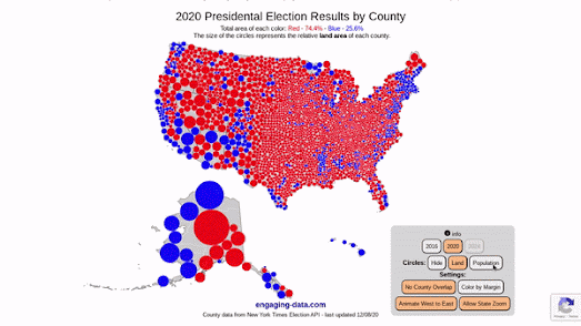
In U.S. elections, traditional choropleth maps - where regions are shaded to represent the winning or leading candidate - can often be misleading. These maps color each state or county based on the majority vote, creating expansive areas of a single color that distort the geographic distribution of voter support. This approach tends to exaggerate the dominance of one party in states with large but sparsely populated regions, while densely populated urban areas, which may vote differently, occupy smaller spaces and are visually minimized.

As a result, choropleth maps can misrepresent the actual balance of voter support, making it challenging for readers to accurately grasp election outcomes. Alternative visualizations, such as cartograms and dot-density maps, offer a more accurate reflection of the electorate by resizing regions or representing individual votes, providing a clearer and more informative view of the political landscape.

For instance the New York Times has used a proportional symbol margin map to illustrate the strength of support for each candidate across counties. In this map, colored circles are “proportional to the amount each county’s leading candidate is ahead,” effectively visualizing the size and distribution of margins.

Additionally, the Times includes a traditional choropleth map (with states colored by the leading candidate) and a "swing map," which visualizes the shift in the margin of votes cast for Democrats and Republicans in each county. On this swing map, if more voters have chosen the Democratic candidate compared to 2020 (in percentage terms), the arrow is colored blue - even if Trump is currently leading in the total percentage of votes (and vice versa for a Republican shift).

The “Shift from 2020” map perhaps provides the clearest picture yet of the 2024 election dynamics. As seen in the provided screenshot, there has been a significant swing toward Trump in a large number of counties that have already been called.

The Washington Post's Presidential Results 2024 offers a cartogram view as an alternative to its traditional choropleth map. In this cartogram, each state is represented by a number of squares, corresponding to its electoral votes. The squares are colored by the leading candidate, and hovering over a state reveals the vote count for each candidate and an estimate of the votes counted.

Guardian arrow swing map showing Trump gains across nearly all the United States

The Guardian's scrollytelling cartographical analysis of the 2020 Presidential Election was produced before all the results were in, however the map still provides a fantastic overview of where and how Trump won and the Democrats failed. As you scroll through The key swing states and counties that handed Trump the White House different map visualizations explore some of the key geographical and demographic areas which swung the election for the Republicans.

Using a series of arrow swing map views The Guardian shows how the Republicans made gains in both urban and rural areas; made gains in both majority-Black counties and heavily Latino counties, had strong support in areas with lower levels of educational attainment; and that there was little impact of the abortion issue on voting patterns.

Tuesday, November 05, 2024

Your Hour-By-Hour Guide to Election Night

map colored to show when polls close in each US county

Even though the results of the election may not be known for days, many people will still be glued to the news overnight. If you're one of those who will be tracking every rumor for clues about the outcome of the U.S. Presidential Election, you might want to bookmark these interactive maps from The New York Times and The Washington Post, which show when polls close and when to expect updates from the key battleground states.

The Washington Post's When will we know the election results? includes a helpful map displaying when polls close in every county across the country. The accompanying article also offers predictions on when you can expect results from the seven battleground states: Arizona, Georgia, Michigan, Nevada, North Carolina, Pennsylvania, and Wisconsin.

The New York Times' What Time Do the Polls Close? also provides a mapped visualization of poll closing times by state. The article is divided into half-hour intervals, with maps showing which states' polls will close in each block up to midnight (Central Time).

For the actual 2024 U.S. Presidential Election results maps, check back tomorrow!

Thursday, October 24, 2024

Who are Your Neighbors Donating to?

map of USA with zipcodes colored to show numbers donating to Trump or Harris

As you might expect the geographical patterns of political donations in the USA closely resemble the geographical patterns seen in actual elections. A new map from the Washington Post reveals that urban Americans tend to donate in larger numbers to the Democrats while the Republicans get most of their political donations from rural voters. 

The interactive map in See how your neighborhood is giving to Trump and Harris visualizes the number of donors to Biden/Harris and Trump in each zipcode area and the amount donated to each.The geographical divide between Democratic and Republican donors mirrors broader political and demographic trends in American politics. Urban areas, with their more diverse and younger populations, have long been strongholds for Democrats, and this pattern is clear in the distribution of political donations. 

The Washington Post's map shows that in nearly every major city, from New York to Los Angeles, donations overwhelmingly favored Vice President Kamala Harris and the Biden-Harris ticket. Conversely, rural areas show strong financial support for former President Donald Trump.

The Post's own analysis of the map explores in more detail the demographic patterns in political donations in the three battleground states of Pennsylvania, Arizona and Georgia.

Thursday, October 03, 2024

Mapping Every US Election Since 1840

map of the popular vote in the 2020 Presidential Election

The Republican Party has won the popular vote in only one Presidential Election in the last 35 years. Since 1989 only George W. Bush (in 2004) has won the popular vote for the Republicans - and in that election Bush benefited from being the incumbent.

A newly released visualization from the University of Richmond’s Digital Scholarship Lab highlights the dwindling appeal of the Republican Party to most Americans in the 21st Century. The DSL's Electing the President interactive map shows the results of every presidential election since 1840, offering a comprehensive look at the electoral landscape over time. Unlike many historical election maps, Electing the President uniquely integrates the results of the popular vote alongside the electoral college outcomes, providing a more nuanced understanding of voter preferences. This feature allows users to see not only who won the presidency but also how much support they garnered from the general electorate. 

Using the map you can navigate to any US Presidential election and explore both the electoral college winner and the winner of the popular vote. For instance, users can explore how presidential candidates like William Henry Harrison, who defeated Martin Van Buren in 1840 to become the 9th President of the United States (albeit for a tragically brief term of just one month), fared in terms of popular support. By navigating through the years, one can track shifts in political alignment and public sentiment, illustrating the evolving dynamics of American electoral politics and the challenges faced by parties in capturing the collective will of the populace.

Electing the President is the latest addition to the American Panorama project, an ever growing historical atlas of the United States. The project includes a number of popular interactive maps including Mapping Inequality (the history of redlining), and Photogrammar, mapping historical photographs taken between 1935 and 1944.

Wednesday, October 02, 2024

Mapping the Political Landscape

animated US map showing the search interest in immigration over time

Waves of Interest is a deep dive into Google search trends during election years. This beautiful data visualization maps out which political topics capture the attention of Americans during US election years. And where!

By using the clever visual metaphor of a topographic map Waves of Interest transforms political interest into an intuitive landscape. The visualization reveals the fall and rise in search interest of 50 different political topics - using isolines to show where in the United States each issue is being most and least searched for on Google. For example, you can watch how interest in immigration has shifted and evolved since 2004 in the animated map above.

Percentage numbers are displayed on the map to indicate the difference in search interest in an area compared to the national average. The homepage of Waves of Interest presents a small multiple visualization of 50 different political topics. On these maps arrow symbols are used to show how much interest in each subject has grown or shrunk since 2020. 

Perhaps unsurprisingly inflation is the issue that has shown the biggest surge in interest since the last U.S. Presidential election. Student loans is the political topic that has fallen the most in terms of search interest since 2020. 

Wednesday, September 11, 2024

The Map to the White House

NBC has launched the 2024 edition of its Road to 270 interactive electoral college map. The map visualizes the current likely, possible and fantastical outcomes of the 2024 U.S. Presidential race. Last night Kamala Harris and Donald Trump went head-to-head in their first presidential debate. The Philadelphia debate was a hugely significant opportunity for both Harris and Trump to present their case for the presidency.

Following the debate you can now use ABC's map to predict the result of November's election. You can click on individual states on the map to predict whether you think they will swing for either Harris or Trump. The map will then automatically assign that state's electors to the chosen candidate and tally the total number of votes of each candidate. A candidate needs at least 270 electoral votes to win the 2024 presidential election.

As well as allowing readers to predict their own electoral map NBC has also mapped out a number of possible outcomes. Steve Kornacki's 'electoral tie' map outlines a theoretical drawn outcome where both candidates receive 269 electoral votes (in which case the deadlock would be broken by the House of Representatives). Kornacki has also mapped out Trump and Harris' most likely direct path to the White House, while Kristen Welker has mapped out scenarios for 'Trump's Dream Path' and 'Harris' Dream Path' to the Presidency.

If you want to know how last night's debate has affected the possible results of the election then you can also refer to 538's Who Is Favored To Win The 2024 Presidential Election? (although at the time of writing 538 has yet to update with the results of the post-debate polls - but I am sure it will update soon). 

If you click on a state on the 538 map you can discover how many electoral votes are up for grabs in the state and which candidate is most likely to win those votes based on the polls and 538's election simulations. 538's simulations are based on extensive polling, economic and demographic data, 

Monday, September 02, 2024

Land doesn't vote, people do!

map of 2020 Presidential Election election results at county level

Engaging Data has updated its US County Electoral Map – Land Area vs Population map so that you can now zoom in and explore the election results in each state. The map allows you to see the 2020 Presidential Election election results at the county level based on land area or population size.

If you select the 'Population' button on the map then the colored proportional circles change size to represent the county population size. Switching between the Land and Population buttons provides a dramatic illustration of how the same data can be visualized in radically different ways.

As Kenneth Field recently explained to Wired "People see maps of any type, and particularly election maps, as the result, the outcome, but there are so many different types of maps available that can portray results in shades of the truth." The Wired article Is the US Leaning Red or Blue? It All Depends on Your Map explores a number of different mapped visualizations of the 2016 Presidential Election to help illustrate how different map methodologies can tell very different stories. You can explore most of these maps in closer detail at Thematic maps of the 2016 Presidential election.

2024 UK Election cartogram map
After the recent UK election nearly every election map I saw in the media included a cartogram view of the results. Similar to the US (and many, many other countries) in the UK sparsely populated rural areas tend to vote more right-wing, while more densely populated urban areas vote in greater numbers for parties of the left. 

To overcome the problem of showing most of the country dominated by the blue of the losing right-wing Conservative Party most maps of the 2024 UK General Election included a cartogram view which represented each electoral area as an equal-sized hexagon. As you can see in the example above an equal sized hexagon map does a very good job in reflecting the actual number of winning candidates for each of the UK's political parties. The compromise of course is that a cartogram is not as geographically accurate as many other methods of mapping election results.

Thursday, July 18, 2024

The 2024 European Election Map

2024 European Election Map colored

Zeit has created an interactive map which visualizes the results in the 2024 European Union elections in 83,000 municipalities. The map in Explore Europe's Most Detailed Electoral Map colors each electoral area in Europe based on the politics of the leading candidate in the election.

The map allows you to compare the 2024 European Union election results with the results from 2014 and 2019. By switching between the 2014 and 2024 results you can see that there has been a general shift across much of Europe to more right-wing parties. The far-right in particular have made huge gains in France, Austria, the Netherlands, the Czech Republic, Latvia and Germany.

Zeit's accompanying article (in German) explores some of the most interesting results to emerge in June's election. For example the article explores a pattern across much of Europe where inner-city areas tend to vote for more left-wing parties than those in rural areas, who tend to favor parties of the right. 

The newspaper also notes that Poland once again seems politically split along a 100 year old border. In August, 1772, Russia, Prussia, and Austria signed a treaty that partitioned Poland. Poland regained its independence and reunited as the Second Polish Republic in 1918 after World War I. However, the pre-1918 geographical divide seems to re-emerge in the results of every Polish election. Zeit notices that in this European election 'In the western and northern regions that were once German, people vote differently (usually more liberally) than in the former Russian regions.'

The German newspaper also points out the political differences between the Wallonia and Flemish regions in Belgium and the split in Germany along the old West and East German border.

Monday, July 08, 2024

France Defeats the Far-Right

two maps of France comparing winners in the first and second round votes
first round (left) and second round (right) election results


The left of center New Popular Front has emerged as the most popular party after France's second round of voting in its national parliamentary election. Le Pen's National Rally party has fallen from its first round triumph to a third placed position, behind both the New Popular Front and President Macron's center-right coalition. 

Comparing Le Monde's second round election map with the national picture after the first round of elections reveals the scale in the drop in support for Le Pen's National Rally party when the voters were given a clear choice between a far-right candidate and a candidate from the center-left or center-right. The brown of the National Rally (in the map's above) is far less prominent after the second and final round of voting, particularly when you consider that the scale of the National Rally's support is skewed on Le Monde's election map by its popularity in the geographically larger rural election areas.

map of France showing where the National Rally won seats

Le Parisien's second round results map includes controls which allow you to filter the results by party. The map of National Rally's winning seats (shown in blue in the map above) reveals that the far-right party swept nearly all of the seats on the Mediterranean coast and that the party also has a lot of regional support in the north-east of the country. 

Interestingly every UK election map I saw after Thursday's election included a hexmap cartogram view and none of the French election maps I've seen have offered anything over than a strict geographical view. Providing an equal representation view of electoral areas, for example by using a hexmap layer is one way of ensuring that every electoral district is given equal visual weight, regardless of its geographic size.

two maps of France's 2024 European election results, one geographical and the other a proportional symbol map

After the success of the National Rally in the French European elections in June Neocarto did create a map which used proportional symbols to try and give more of an equal visual weight to the different sized electoral areas. The comparison above of the geographical view of the results1 with a proportional symbol map shows how a strictly geographical electoral map can skew the visual picture. The proportional symbol map (on the right) shows in red the areas where the New Popular Front's combined votes could have won in the European elections. 

Not only did the Neocarto proportional symbol map show a more balanced picture it also hinted at how the unification of left-wing parties after the European elections in the New Popular Front (NFP) provided a clear challenge to the supremacy of the RN in many electoral constituencies. It will be interesting to see if Neocarto creates a similar proportional symbol map for France's parliamentary election results.

1. these maps don't show the actual European election results but how the results would have looked had the left-wing parties  already joined together into the New Popular Front. The New Popular Front was formed on the 10th June, in response to the electoral success of the National Rally in the European elections on the 9th June. 

Friday, July 05, 2024

2024 UK Election Maps

UK election map with seats colored by the party of the winning candidate

The Labour Party has swept to power in the UK and the ruling Conservative Party has lost over half of their seats. At the time of writing the new Prime Minister Keir Starmer has 410 seats in the new government (with 11 seats to declare). This means that he has won well over the 326 seats needed to form a majority government.

The BBC election map includes a cartogram view which does a very good job at visualizing the scale of the Conservative losses in this election.

UK election cartogram map
The map shows that the Conservative Party failed to win any seats in Wales, has won only three seats in Scotland. This cartogram view of the election reveals that the Tories have now become a regional party with a core base remaining mainly only in Southern and Eastern England. However even in the South of England the Conservative Party seems to have been all but wiped out in some previous Tory strongholds, such as Berkshire and Oxfordshire.

The BBC map does a very bad job at visualizing the surge in support for the extreme right in this election. The Reform Party won over 4 million votes. However one of the quirks of the UK's first past the post system is that even though Reform received more than a half a million more votes than the Liberal Party they won only 4 seats, compared to the Liberals 70 seats. Consequently while the Reform Party won 14.3% of the UK vote it has little representation in Parliament and little visual impact on the BBC map.

side by side UK election maps showing vote share gains for Labour and Conservatives.
This means that the BBC map does not provide a great picture of where support for the individual parties may truly lie. The Guardian election map does include a Labour Party and Conservative Party 'vote share gains' view. This view (shown above) reveals what a good job the Labour Party did in improving their vote across the whole country, but particularly in Scotland. Conversely the Conservative Party failed to improve their vote share in any seat in the whole of the UK.

UK election map showing seats which have changed hands, colored to show the winning party
The Financial Times map includes a 'Change' view which shows which seats have changed hands in this election. This map reveals how Labour managed to pick up seats from the SNP in Scotland and from the Conservative Party in the North. In the South both the Liberal Party and the Labour Party were able to win a number of seats from the Conservatives. The Conservative Party were able to win just one new seat - in Leicester East, where a couple of independent candidates split the previous Labour vote.

Again, however, the Guardian and FT maps do not include a simple vote share view for each political party. This means that it is therefore impossible to use any of the maps to see where in the country the individual parties won their most and least support. I've read that the Reform Party was the second placed party in 92 constituencies and so far none of the maps I've seen have attempted to visualize this surge in support for the extreme right in this election.

UK election map showing second placed parties
Update: Open Innovation's General Election 2024 map does include an option to view constituencies colored by the second placed party in Thursday's election. This reveals that Reform were in second place in 98 constituencies. 

In his typically ungracious acceptance speech Reform owner Nigel Farage warned that the party was 'coming for Labour'. The Open Innovation map shows that Reform is in second place in many constituencies in the Labour strongholds of the North and Wales. This should be a stark warning to the triumphant Labour Party that a failure to deliver in these regions could prove disastrous for the party and for the UK.

UK election map with seats colored by winning party
I was actually in the process of creating my own election map (because I wanted to view the second placed party in each constituency) when I stumbled on the Open Innovation map. This means that I now don't have to worry about that (if you want to view the second placed party you can now view the Open Innovation map).

However I will still post a link to my UK Election 2024 Map, as it includes a couple of features I haven't yet seen elsewhere. My map includes political party filters which allow you to select to only view the seats of individual parties (or any combination of parties). 

If you click on a constituency on my map you can also view data on the majority and the vote share of the winning candidate. This allows you to explore the margin by which a candidate won a seat. For example if you click on South Basildon and East Thurrock you can see that Reform won the seat by 98 votes and with a vote share of only 30.79%. This reveals that the seat is extremely marginal and Reform may well struggle to retain this seat at the next election.

Tuesday, July 02, 2024

Tory Candidates Violently Attacked

a black and white engraving entitled Election riot on 26 June 1865 in Nottingham
Election riot on 26 June 1865 in Nottingham

Disturbing reports of violence, carried out by supporters of the Liberal Party, have been reported across the whole of the UK. In Shoreham a gang of 300 Liberal supporters attacked poll clerks. In Grantham Liberals set polling booths on fire. In Alfreton a crowd of thousands attacked properties 'associated with Conservatives'.

These acts of electoral violence took place during UK elections in the 19th Century and are all documented on the Victorian Election Violence Map. The Victorian Election Violence Map visualizes nearly 3,000 incidences of violence which occurred in England and Wales during national elections held between 1832 and 1914. The map shows where violent election events took place, from minor incidents (such as the breaking of windows) to major political riots involving the deaths of many people.

There were 20 general elections in Britain between the Great Reform Act of 1832 and the Great War starting in 1914. These elections were often accompanied by extreme violence. This violence often included major riots involving thousands of people, leading to the deaths of many people and large scale property damage. For example on the first day of polling in the 1868 General Election, there were at least 18 different riots across England & Wales. 

Supporters of the Conservative Party were not averse to using violence themselves. For example in Worthing the Liberal candidate for Mid-Sussex, Mr Hubbard, was "showered with stones upon his arrival to an election" and a "member of his party, Major Gaisford, was reportedly badly cut in the face". In "Andover, the Conservative party brought in railway navigators from Salisbury and Bishopstoke and plied them with beer, then set them loose in the crowd."