Skip to main content
Search
Search This Blog
Maps Mania
Posts
Showing posts from September, 2023
Show all
September 30, 2023
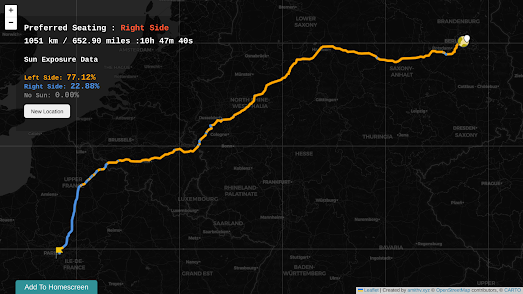
How Not to Stare at the Sun
September 29, 2023
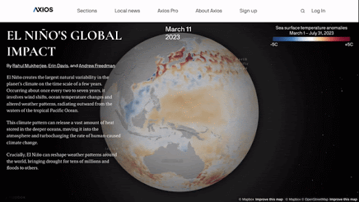
The Global Impact of El Niño
September 28, 2023
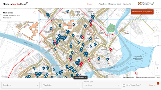
More Medieval Murder Maps!
September 27, 2023
The Same Size As
September 26, 2023
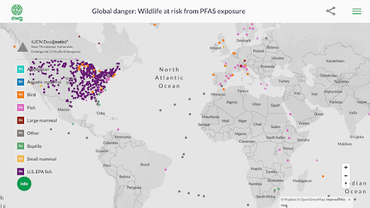
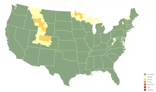
The Global Problem of Forever Chemicals
September 25, 2023
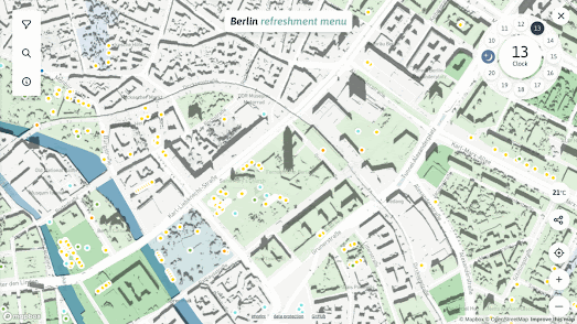
A Cool, Shady Spot with a Breeze
September 23, 2023
Restricting the Right to Protest
September 22, 2023
The Royal Parks of London
September 21, 2023
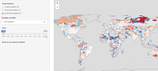
The Global Migration Explorer
September 20, 2023
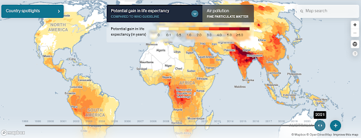
Live 2 Years Longer with Better Air Quality
September 19, 2023
Olympic Stadia Travel Times
September 18, 2023
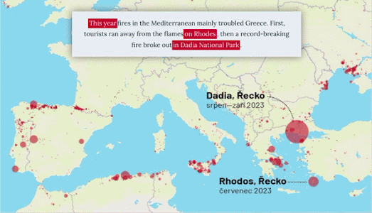
A Year of Wildfire in Europe
September 16, 2023
How Families Live Around the World.
September 15, 2023
The Unknown Pleasures of Population Density
September 14, 2023
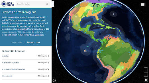
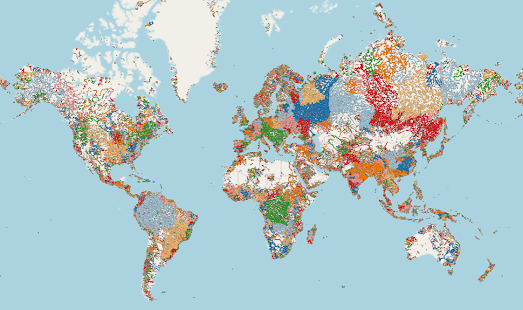
The World's Bioregions & Ecosystems Mapped
September 12, 2023
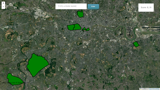
The City Map Game
September 12, 2023
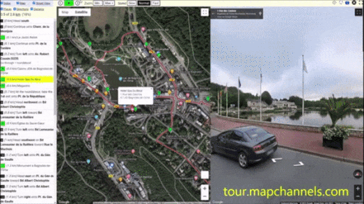
The Virtual Tour Maker
September 11, 2023
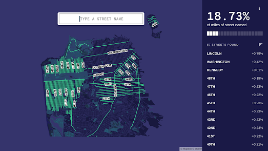
The Streets of San Francisco Game
September 09, 2023
Map of the Best Restaurants
September 08, 2023
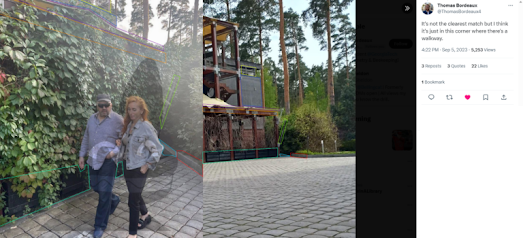
Geolocating General Surovikin
September 07, 2023
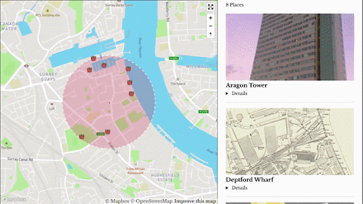
Finding History Nearby
September 06, 2023
How Near do You Live to a Mass Shooting?
September 05, 2023
The River Basins & Watersheds of the World
September 03, 2023
Mapping the Colors of Autumn
September 02, 2023
Mapping the Great Kantō Earthquake
September 01, 2023
The AI Satlas
Newer Posts
Older Posts
Home