Showing posts with label economy. Show all posts

Thursday, June 19, 2025

Insurers Retreating From Climate-Risk Zones

For many Americans, one of the consequences of climate change is higher insurance premiums. In Homeowners Insurance in an Era of Climate Change, the Brookings Institution maps U.S. Treasury Federal Insurance Office data to show where home insurance is becoming more costly and harder to obtain for millions of Americans.

One way this is happening is through non-renewals of homeowners insurance. A non-renewal occurs when an insurance company decides not to continue a policy once it expires - usually because the property is deemed too risky to insure. This leaves homeowners scrambling to find new coverage, often at much higher prices or through limited options like state-run insurers.

The image above shows, on the left, Fire Hazard Severity Zones in California, side-by-side with home insurance non-renewal rates in the state. The dark blue areas on the Brookings Institution map (on the right) indicate higher rates of home insurance non-renewals. These areas appear to follow the Sierra Nevada mountain range.

The Sierra Nevada is heavily forested and therefore highly prone to wildfires, especially during California’s dry summer and fall seasons. This is clearly reflected in the fire hazard severity zones shown on the left. These maps suggest that insurance companies are significantly less likely to renew policies in high-risk wildfire areas due to the increasing frequency and cost of wildfire-related claims.

The Brookings Institution map also highlights a high rate of home insurance non-renewals along the Atlantic coast. This is likely driven by increased risks from hurricanes and rising sea levels. Interestingly, Florida does not show a particularly high rate of non-renewals on this map. This is largely because many private home insurance policies in the state have already been non-renewed in recent years or shifted to state-run insurers, such as the Citizens Property Insurance Corporation.

Sunday, March 30, 2025

Federal Funding & Jobs Slashed

The White House has mandated deep cuts to federal funding for scientific research, threatening breakthroughs that save lives and fuel economic growth. The National Institutes of Health (NIH) - a cornerstone of medical progress - supports critical research on cancer, diabetes, dementia, heart disease, stroke, mental illness, and other pressing health challenges. These devastating cuts include a nationwide reduction in health research funding and the cancellation of numerous grants for life-saving projects.

These cuts won’t just stall scientific progress - they will also have a negative impact on local economies across the country. Research funding doesn’t just pay for labs and scientists; it supports businesses, universities, and jobs across the USA. You can view the economic impact of the NIH funding cuts on SCiMap. SCiMaP is an interactive map which shows how funding cuts reduce economic activity and employment nationwide. The map visualizes "the impact of proposed cuts to the NIH indirect cost rate" at the county or state level.'

CNN has mapped out the US House districts which have the highest share of federal employees. The map uses scaled markers to show the percentage of each district’s workforce made up of federal employees. Since federal workers live in all 50 states, the DOGE layoffs will harm local economies nationwide. The CNN article also includes an interactive feature that displays the top 10 federal professions in each state.

Thursday, January 30, 2025

The USA is Closing for Business

animated map with countries colored each year to show whether the USA or China was the larger trading partner. From 2000-2003 countries around the world turn red from blue as China becomes the world's dominant economic force

This animated map from the Lowy Institute shows whether the USA or China was the larger trading partner for countries around the world each year this century (up to 2023). The map provides a stark visualization of the economic shift away from the United States and toward China in the 21st century.

According to the Lowy Institute, around "70 per cent of economies trade more with China than they do with America, and more than half of all economies now trade twice as much with China compared to the United States." At the beginning of this century the situation was very different, when more than 80 percent of countries traded more with the USA than with China.

The map allows users to view the largest trading partner for each country (limited to China and the United States) in terms of two-way trade, imports, or exports. In terms of exports, the United States remains a larger export destination than China for more than half of all economies. However, given Donald Trump’s constant threats to impose tariffs on other countries, it is evident that he aims to weaken the United States' appeal as an export destination. What is less clear is how he plans to increase the United States' own exports.

Wednesday, May 01, 2024

The Global Inflation Tracker

an animated map showing inflation rates in countries around the world over the last three years

The Council on Foreign Relations new Global Inflation Tracker provides an intriguing guide to trends in prices across the world since the 1990s. On the map almost 200 countries around the world are colored to show their year-over-year rate of inflation (the darker the color the higher the rate of inflation).

If you animate through the data on the map it is striking how stable inflation rates in the Western economies were for a long twenty year period at the start of this century. During this period most western economies, including the US, achieved inflation rates consistently below 5%.

In 2020 the Covid pandemic started and in 2022 Russia invaded Ukraine. Both these factors have probably played a large part in ending this period of economic stability. Since 2021, inflation rates have risen globally, probably due to factors such as the supply chain disruptions caused by the pandemic and the escalating energy costs arising from Russia's invasion of Ukraine and the subsequent imposition of economic sanctions on Russia by Western nations.

The Global Inflation Tracker includes a drop-down menu which allows you to view the inflation rates for different sectors, eg for energy, food, clothing, housing etc. If you select to view the rate of inflation in energy you can view the huge rise in energy prices experienced since Russia's invasion of Ukraine. On a more optimistic note you can see how in recent quarters in most Western economies there has been a marked deflation in energy prices. This in turn seems to be contributing to an overall fall in inflation rates in many countries.

Thursday, March 07, 2024

The Distressed Communities of America

Map of the US showing the levels of well-being at zipcode level

The Distressed Community Index from the Economic Innovation Group reveals the levels of economic well-being in all US neighborhoods. The Index uses seven different metrics to give every zipcode area a score out of 100, ranging from the most prosperous (0) to the most distressed (100).

You can explore which neighborhoods in your city are the most and least distressed on the 2024 Distressed Community Index Interactive Map. On the map individual zipcode areas are colored by their DCI rank. If you select an individual zipcode area on the map then the information window updates to reveal how the area scores in each of the seven different DCI metrics. The information window also compares how the selected zipcode area compares with all the other zipcode areas in its state.

The 2024 DCI map is based on data from 2017 to 2021. According to Axios the data reveals that the "share of people living in prosperous communities has risen most in the mountainous states of the West, most notably Idaho, Montana and Utah. By contrast, Louisiana, Oklahoma and New York state showed significant growth in the share of the population living in distressed ZIP codes".

The DCI interactive map also includes a number of 'stories' which explore different aspects of well-being revealed by the data. These include an analysis of life expectancy in different areas of the US, and how inequality can be masked at the county level.

Saturday, November 11, 2023

The Spanish Wealth Divide

El Diario has released an interactive map which shows how much people earn across the whole of Spain. The map starkly reveals not only the huge income inequality between northern and southern Spain but also the inequality between many urban and rural communities. 

The map in Rich Neighborhood, Poor Neighborhood uses data from the National Statistics Institute to show the average gross income per household (i.e. before taxes). The data is derived from 2021 personal income tax returns. In the screenshot of the map above you can see that there is a clear income divide between southern Spain and the north of the country (particularly the north-east). 

Back in 2019 El Pais created a similar interactive map to visualize the average income of every neighborhood in Spain. This 2019 map also uses data from the National Institute of Statistics, using tax returns from 2017. 

El Pais' Map of Spanish Incomes, Street by Street also revealed a stark contrast between northern and southern Spain. However the less granular data used in this map means it is not as good at showing the local income inequalities in individual towns and cities as the new El Diario map.

The new map reveals that many southern Spanish cities include many neighborhoods in which the residents are in the top 10% of Spanish earners. However these rich city centers are surrounded by much poorer neighborhoods. According to El Diario the "historic centers of the cities have the highest incomes, which decrease as we move further away until we reach the peripheral neighborhoods".

The El Diario map includes an option to compare the 2021 data with the income returns from 2020. It is therefore possible to see which neighborhoods are becoming richer and which are becoming poorer. In fact if you hover over a neighborhood on the map you can view information on the average family income, how the neighborhood compares to the national average, and by what percent local average income levels have risen or fallen since 2020.

Saturday, September 16, 2023

How Families Live Around the World.

Gapminder's Dollar Street is an amazing project which has photographed and documented 264 family homes in 50 countries around the world. The resulting pictures provide a truly fascinating insight into the everyday lives of people around the world.

Around six years years ago Anna Rosling Rönnlund began sending photographers to visit families in all corners of the world. In each visit to a family home the photographer takes photos of up to 135 objects, like the family's bedrooms, toilet facilities and food. The resulting photographs have then been organized into a powerful data visualization which can help us to better understand the world and how the people of the world live.

The thousands of lifestyle photographs in Dollar Street can be explored in a number of different ways. The visualization includes a number of controls which allow you to explore the photos by country, by income level and by different topics (e.g. eating, sleeping, socializing etc). If you want to get the most out of Dollar Street however then I advise you to watch Anna Rosling Rönnlund's TED talk (embedded below), which explains some of the most insightful ways in which you can explore Dollar Street.


All the photographs in Dollar Street are licensed by Creative Commons license 4.0. This means that you are free to reuse, edit and share any of the images in your own projects and maps.

Thursday, June 08, 2023

The Privatisation of East Germany

After the reunification of Germany in 1990 the German Democratic Republic established an agency in order to privatise East German enterprises. The Treuhandanstalt (Trust Institution) was tasked with overseeing the sale of over 8,500 state-owned companies.

Under communism nearly half of all East Germans worked for the state or for state-run companies. Privatising all East German enterprises would obviously have huge consequences not only for the enterprises themselves but for the whole population of the former East Germany. 

The Federal Foundation for the Reappraisal of the SED Dictatorship is tasked by the German government to help assess the history of the German Democratic Republic and its impact on the now reunified Germany. Die Treuhand und die Folgen is an interactive created by the foundation which tells the story of the Trust Institution and the consequences of the rapid privatisation of East German enterprises on those enterprises and their employees.

An interactive map plays a large role in Die Treuhand und die Folgen. The map shows the locations of GDR enterprises pre-reunification. If you click on a company's marker on the map you can view the number of people it employed in 1990, and its current status. 

According to the foundation some of the consequences of the Treuhandstalt were "Mass unemployment, insecurity and a lack of prospects (for) several generations". The foundation claims that many East Germans view the mass privatisation of East German enterprises as a 'negative' experience which was badly managed by West Germany. 

Tuesday, August 02, 2022

Mapping the Social Inequality Gap

The Social Capital Gap is an interactive map which shows where in the United States people with low and high incomes are friends with each other and where in the country people with different incomes don't mix. The map is based on an analysis of 21 billion friendship relationships of American Facebook users.

To create the map the socioeconomic status of individual Facebook users was determined using factors such as educational achievement, language and location. The economic status of each individual was then compared to the economic status of their Facebook friends. 

As with many maps which visualize economic factors in the United States the black belt is particularly prominent on the Social Capital Gap map. In this case as an area where there are very few connections between people of low and high incomes. At the other end of the scale there appears to be far more social interaction between different income levels in the Midwest. 

One reason why social connections between different income levels is so important is that there is a lot of evidence that poor people are more likely to move up the economic ladder in areas where there are more friendships between high and low incomes than in areas where there is little social interaction between people of different income levels. Beneath the Social Capital Gap interactive map you can view a graph which shows this connection between economic connectedness and upward income mobility.

If you enter your zipcode or county into the map then you can view both the average level of social connectedness in your county and the local levels of upward income mobility. 

Friday, February 11, 2022

Redlined for Ever

FiveThirtyEight has released a new data visualization tool which allows you to see the lasting effects of redlining on American towns & cities. In the 1930s, under President Franklin D. Roosevelt's New Deal, black homeowners across the United States were discriminated against through the creation of redlining maps. These maps identified areas with significant black populations and labeled them as too high risk for mortgage support. Black homeowners living in these areas were therefore very unlikely to be successful when trying to refinance home mortgages from the government sponsored Home Owners' Loan Corporation.

It is now over eighty years since neighborhoods in American towns & cities were designated by the HOLC as 'best', 'desirable', 'declining' or 'hazardous'. Despite this long passage of time the effects of redlining are still apparent in the continuing segregation of American cities. In The Lasting Legacy of Redlining FiveThirtyEight allows you to explore maps which show the racial segregation of American cities based on data from the 2020 U.S. decennial census. 

For each city you can select to view maps of the HOLC zones ('best', 'desirable', 'declining' or 'hazardous') alongside a breakdown of the percentage of each racial group now living in each of these zones. For example the map of Cleveland shows that 59.5% of the population of the city's 'hazardous' designated zones is black. While the city's 'best' zones have a 68.7% white population. 


It is clear that the racial discriminatory mortgage assessments of the 1930s have had a lasting legacy on American cities. A legacy which can still be felt in the United States today. Neighborhoods which were redlined as too high risk for mortgage lending in the 1930s have suffered from decades of under-investment in critical infrastructure. This historical under-investment means that anyone living in a once redlined neighborhood today is still likely to have less access to health care, be more at risk from extreme summer heat and is even at more risk of flooding than people living in neighborhoods which weren't redlined under Roosevelt's New Deal.  

Bloomberg's Redlined, Now Flooding compares historical redlining maps with modern flood risk maps. This comparison reveals that in cities across the United States there is a greater risk of flooding in formerly redlined neighborhoods than in more affluent neighborhoods in the same city.

Redlined neighborhoods don't just face a greater risk of flooding. Since the New Deal's racially discriminated mortgage lending assessments of American cities redlined neighborhoods have continued to face under investment in infrastructure compared to their more wealthy greenlined neighborhoods. In How Decades of Racist Housing Policy Left Neighborhoods Sweltering the NYT shows how across the United States neighborhoods which were redlined are now more likely to suffer from the urban heat island effect than neighborhoods which weren't redlined.

The legacy of the Home Owners' Loan Corporation (HOLC) redlining maps can also still be seen in the health inequality in cities today. The Digital Scholarship Lab and the National Community Reinvestment Coalition has used maps to show how redlined neighborhoods suffer severe health disparities in the 21st Century compared to more wealthy neighborhoods.Not Even Past: Social Vulnerability and the Legacy of Redlining allows you to directly compare redlining maps with modern maps which visualize the modern health disparities in U.S. cities. 

Of course one of the biggest lasting legacies of redlining has been the continuing racial segregation seen in many American cities. Wenfei Xu's Redlining Mapvisualization (like FiveThirtyEight's) allows you to explore for yourself if the HOLC redlining maps have had a lasting impact on segregation in your city. Using modern census data alongside the HOLC redlining maps you can see for yourself which neighborhoods  have a high percentage of black, white or Hispanic people and see if these areas correlate with areas which were deemed at risk or safe for lending purposes in the 1930's.

Friday, July 09, 2021

The Global Poverty Map

The Data-Intensive Development Lab (DIDL) has developed a method of estimating micro-regional levels of poverty based on satellite imagery, and mobile phone and social network usage. The DIDL has then used this machine-learning derived data to create an interactive poverty map visualizing micro-regional poverty levels in Low and Middle-Income Countries (LMICs). The maps also use poverty and wealth data gathered from standardized and publicly-available Demographic and Health Surveys carried out in these LMICs.

To arrive at the micro-regional estimates of poverty levels the DIDL starts with the data derived from Demographic and Health Surveys. Then they analyze satellite imagery of the region, looking for indicators of local living conditions, such as the size of farm plots, the quality of roads and the quality of roofing materials. Night-time satellite imagery is also used to derive data on electricity use. Telecommunications infrastructure is derived from analyzing the density of mobile cellular towers, the number of WiFi access points and from the levels of customer use of mobile phone networks.

By combining the data from surveys with the machine learning derived data from satellite imagery and from telecommunications infrastructure DIDL are able to estimate wealth levels in every 2.4KM micro-region on Earth.

You can explore this data for yourself on the interactive Global Poverty Map, which shows these estimates of wealth and poverty in micro-regions around the world. The map visualizes population density using height and poverty levels are shown using color. The taller micro-regions have the highest population density and the brown colored squares have relatively higher wealth.

Sunday, June 06, 2021

Who Owns the World?

Gina Rinehart, a mining magnate, effectively 'owns' 1.2% of Australia. The Australian Agricultural Company is the biggest corporate landholder in Australia. The Australian government says that 17% of Australia is owned by indigenous communities. Although, when you take in other types of land ownership, the percentage of land owned by indigenous communities is probably much larger.

The main problem in deciding who owns Australia is that in Australia there is no consistent protocol for recording who owns land. There is isn't even a clearly established definition of what constitutes ownership or control of land.

The Guardian has therefore decided to try to uncover the truth of who really owns Australia. In Who Owns Australia? the newspaper has mapped out different types of land ownership. The newspaper reports that 44% of Australia has a pastoral lease. Pastoral leases are crown lands which are leased for the limited purpose of "grazing of stock and associated activities". The Guardian's map shows where land is privately owned, is under one of these pastoral leases, is publicly owned or belongs to indigenous communities. 

The newspaper has also mapped out the largest parcels of pastoral land and who these leases are owned by.


John Malone owns 2.2 million acres of the United States - an area of land which is bigger than the state of Delaware (1.5 million acres). Malone is the largest private landowner in the US. The Emmerson family are the second largest private landowners and Ted Turner is third. Both the Emmerson family and Ted Turner also own more land than the size of the state of Delaware.

You can discover how much land is owned by private landowners in Bloomberg's article The Largest Landowners in the US. The article includes a map which shows which land in America is owned privately and who owns it. The map shows that between them the 100 largest owners of private property own 2% of the USA, an area about the size of Florida. The 100 largest landowners are also buying up more land all the time. In fact ten years ago the top 100 landowners owned fewer than 30 million acres. They now own 40 million acres.

If you select a state on Bloomberg's map you can view an annotated overview of the land owned by the state's biggest private landowners. The map also provides a visualization of land owned by America's top 10 landowners. 

Who Owns England? has set itself the task of mapping who owns land in England. The Who Owns England? website includes an interactive map which plots the land that it has so far discovered the ownership of. On this interactive map land parcels are colored by type of land owner. 

Back in 2018 the BBC reported that 97,000 properties in England and Wales are owned by overseas companies. In Firms on Caribbean island chain own 23,000 UK properties the BBC mapped all the properties in England & Wales which are owned by these overseas companies.

The map reveals that in central London a huge percentage of properties are now owned by overseas firms. For example in Kensington and Chelsea more than 6,000 properties are owned by overseas companies. If you want to know who owns a property you can click on the map marker to reveal the name of the company and the country of the owner.

Monday, May 31, 2021

Mapping Dutch Inequality

Here are some essential tips which can help you succeed in life - if you are Dutch. First off make sure you have rich parents. In the Netherlands you are five times more likely to get a university degree if your parents are in the top 25% of wage earners. 

To succeed in life you should also make sure you are born male. Throughout the Netherlands women tend to earn less than men. For example in Urk women from low-income families earn on average €16,000, while men of a similar background earn on average €55,000. If you can then make sure that you are born to someone who was themselves born in the Netherlands. Children of migrant parents in the Netherlands on average have significantly worse educational and economic outcomes than children whose parents were born in the Netherlands.

Erasmus University's Kansenkaart is an interactive map which reveals the shocking levels of inequality of outcomes in the Netherlands. The map visualizes the disparities in outcomes for children born in different locations in the Netherlands and in different circumstances. The map allows users to explore the effect of gender, ethnicity, and family income on a child's economic and educational outcomes, wherever they were born in the country.

As well as revealing some of the class and racial inequalities in the Netherlands the map also reveals some of the geographical inequalities of outcome faced by Dutch children. For example, children of low-income families who grow up in a big city (particularly in the north of the country) on average have lower educational and economic outcomes than children of low-income children who are raised in the countryside. 

The Erasmus University map was partly inspired by Harvard University's Opportunity Atlas, which is now being used by the Biden government to help address inequality of outcomes in the United States.

Tuesday, May 25, 2021

Mapping Income Inequality in the UK

Last week the UK's Office of National Statistics released a map which explored income disparities at the regional level. The ONS' What are the regional differences in income and productivity? visualizes average incomes and productivity levels at the regional level in the UK. This week the ONS has released a new data visualization which looks more closely at income levels at the neighborhood level.

In Exploring local income deprivation the ONS has mapped average neighborhood income levels in all 316 local authorities in England. This map provides a detailed look at income disparities in every town and city in England. The ONS visualization makes excellent use of robot-journalism to personalize the data visualization to individual readers. At the beginning of the article you can select one of the 316 English local authorities and the rest of scrollytelling data visualization is then personalized to your selection, highlighting the income deprivation and disparities in your chosen area. 

The ONS uses a choropleth map to show the income levels at the neighborhood level in your chosen local authority area. As you progress through the data visualization the ONS go on to group local authority areas in England into one of four types of income-deprivation profile, according to the income levels in each area. These are: more income-deprived, less income-deprived, n-shaped profiles (where most neighborhoods in an area have close to average income levels), and flat profiles (where there is an even distribution across the different income levels).

Mapping these four types of income-deprivation profiles helps to reveal which areas of England have the most income-deprived areas and which areas have the least income-deprived. It also helps to reveal what types of areas of the country have the most n-shaped and flat patterns of income level distribution.

Tuesday, May 18, 2021

Mapping US Poverty

Todd County in South Dakota is the county with the most people living in poverty in the United States. According to the 2018 American Community Survey 5-year estimates over 55% of the population of Todd County are living in poverty. In fact five counties in South Dakota feature in the list of the top ten counties with the highest proportion of the population living below the poverty line.

You can explore the levels of poverty across the United States for yourself on Overflow Data's interactive map Which U.S. Counties Have the Most People Living in Poverty?. This choropleth map visualizes the proportion of the population living below the poverty line at the county level. On the map you can make out the Black Belt in the American South, which is traditionally an area with high levels of poverty. Outside of the Black Belt, as well as South Dakota, the state of New Mexico stands out as having a number of counties where large percentages of the local population live in poverty. 

The Overflow Data map also allows you to view the percentage of children in each state living in poverty and / or the percentage of adults below the poverty line


The Economic Innovation Group's High Poverty Map is another interactive map which uses 2018 American Community Survey data to explore poverty in the United States. This interactive map compares the metro neighborhoods in the United States which had high levels of poverty in 2018 with those which were in high poverty in 1980 but have since successfully turned around.

On the interactive map high-poverty census tracts are colored to show if they are newly poor, persistently poor, deepening poverty or turned around. If you select one of these colored neighborhoods you can view the poverty rate in that census tract for the years 1980, 1990, 2000, 2010 & 2018.

Alongside the interactive map the Economic Innovation Group has published a number of city profiles. These profiles provide a detailed analysis of poverty levels in some of America's largest cities. For example the city profile for New York notes that although the city still has a high number of neighborhoods in poverty the number of high-poverty neighborhoods has dropped sharply since 1980. In Los Angeles the number of high-poverty neighborhoods has increased a lot since 1980. Unlike New York it has seen very few neighborhoods transition from high-poverty to low-poverty.

Where are the Highest Incomes in the UK?

The Office for National Statistics (ONS) has mapped out the average income per person across the United Kingdom and has compared these average incomes with each area's level of productivity in 2018. How economically productive an area is should have a determining effect on local income levels. However the ONS's maps reveal that this is not always the case in the UK.

In What are the regional differences in income and productivity? the ONS has created a story map which visualizes both average incomes across the UK and regional productivity levels. As you scroll through the article the map is also used to highlight those areas of the UK which have low productivity & high incomes, and those areas which have high productivity but low incomes. 

London and the South East (respectively) top both the list of the highest income areas and the highest productivity. Perhaps the most interesting areas however are those areas with high productivity levels but low average incomes. The ONS highlights a number of inner city areas such as Manchester, Birmingham and Nottingham where this is the case. The ONS explains that this might be due to a 'commuter effect', where high earning individuals work in these cities but don't live there. 

There is a clear north-south divide when you look at the levels of income relative to the levels of productivity. In the East England region average incomes are higher than the national average but productivity is lower. The South East, South West and London also all have higher incomes relative to their levels of productivity. At the opposite end of the scale the North West and the North East have lower levels of income relative to the local levels of productivity.

Thursday, April 29, 2021

The True Cost of Living Map

HowMuch's True cost of living in the United States interactive map can tell you how much it costs to live in American neighborhoods based on your own personal needs. Using the map you can discover where you can (and cannot) afford to live in America's major towns and cities.

Enter a city into HowMuch's cost of living interactive and you can view a map visualizing how much it costs to live in each of the city's neighborhoods. Your personal cost of living will obviously depend on factors such as the size of your family, your income, occupation, and even your food preferences. The cost of living map therefore includes a number of filters which allows you to customize the neighborhood cost of living ratings to match your own circumstances. 

After you have entered your income (and other  cost of living factors) the map will color neighborhoods based on whether you can afford to live there are not. The areas colored red on the map are neighborhoods where you would have to increase your income in order to be able to afford to live there. You can hover over individual neighborhoods on the map to view exactly how much more you would have to earn to be able to afford to live there or (if you are lucky) how much money you will have left living in the neighborhood after your costs of living have been deducted.

Wednesday, March 24, 2021

The Continuing Legacy of Redlining

In the 1930s, under President Franklin D. Roosevelt's New Deal, black homeowners across the United States were discriminated against through the creation of redlining maps. These maps identified areas with significant black populations and labeled them as too high risk for mortgage support. Black homeowners living in these areas were therefore very unlikely to be successful when trying to refinance home mortgages from the government sponsored Home Owners' Loan Corporation. 

Unfortunately the racial discriminatory mortgage assessments of the 1930s have had a lasting legacy on American cities. A legacy which can still be felt in the United States today. Neighborhoods which were redlined as too high risk for mortgage lending in the 1930s have suffered from decades of under-investment in critical infrastructure. This historical under-investment means that anyone living in a once redlined neighborhood today is still likely to have less access to health care, be more at risk from extreme summer heat and is even at more risk of flooding than people living in neighborhoods which weren't redlined under Roosevelt's New Deal.

Flood Risk

One of the least obvious legacies of redlining is increased flood risk. It might not be immediately obvious that the denial of mortgage support in the 1930's would lead to a higher risk of flooding. However Bloomberg has released a convincing story map which shows that redlined neighborhoods in the U.S. have a much higher flood risk than their more affluent neighbors.

Bloomberg's Redlined, Now Flooding compares historical redlining maps with modern flood risk maps. This comparison reveals that in cities across the United States there is a greater risk of flooding in formerly redlined neighborhoods than in more affluent neighborhoods in the same city.

The reason why redlined neighborhoods have a higher flood is a direct result of "disparities in development compounded by decades of disinvestment". Since the 1930's more affluent neighborhoods have received greater investment in essential infrastructure compared to less affluent redlined neighborhoods. The result is that redlined neighborhoods are now at greater risk of flooding. And not just flooding ...

Urban Heat Islands

Redlined neighborhoods don't just face a greater risk of flooding. Since the New Deal's racially discriminated mortgage lending assessments of American cities redlined neighborhoods have continued to face under investment in infrastructure compared to the more wealthy greenlined neighborhoods. 

For example, last year the New York Times mapped out how racist housing segregation, dating back to the Home Owners' Loan Corporation's Redlining maps, is a major contributory factor to the location of urban heat islands in modern towns and cities across the United States. In How Decades of Racist Housing Policy Left Neighborhoods Sweltering the NYT uses a story map to show how across the United States neighborhoods which were redlined are now usually the hottest parts of towns and neighborhoods which weren't redlined tend to be the coolest. 

The reason for this is that redlined neighborhoods have largely remained areas of deprivation and tend to have fewer trees and a denser built environment than more affluent neighborhoods. Non-redlined neighborhoods are  more likely to have lots of parks, grass and far more trees. All factors which help to deter the build-up of urban heat.

Health Inequality

The legacy of the Home Owners' Loan Corporation (HOLC) redlining maps can also still be seen in the health inequality in cities today. The Digital Scholarship Lab and the National Community Reinvestment Coalition has used maps to show how redlined neighborhoods suffer severe health disparities in the 21st Century compared to more wealthy neighborhoods.

Not Even Past: Social Vulnerability and the Legacy of Redlining allows you to directly compare redlining maps with modern maps which visualize the modern health disparities in U.S. cities. Select a city on the Not Even Past website and you can view its HOLC redlining map placed side-by-side with a map which shows the CDC's current Social Vulnerability Index scores for the city's neighborhoods. This allows you to make a direct comparison between the two maps and see where the health disparities in your city today are a partial legacy of historical redlining.

Racial Segregation

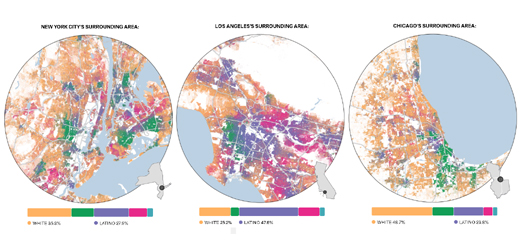
One of the biggest lasting legacies of redlining has been the continuing racial segregation seen in many American cities. Wenfei Xu's Redlining Map visualization allows you to explore for yourself if the HOLC redlining maps have had a lasting impact on segregation in your city. Using modern census data alongside the HOLC redlining maps you can see which neighborhoods  have a high percentage of black, white or Hispanic people and see if these areas correlate with areas which were deemed at risk or safe for lending purposes in the 1930's. 

You probably won't be surprised to discover that black Americans are far more likely to live in neighborhoods  which were redlined 90 years ago. The result of the continuing disinvestment of America's once redlined neighborhoods is that many black Americans today live in the neighborhoods which have the lowest average incomes, the poorest access to health services, the worst urban heat islands and are at greater risk of flooding.

Friday, February 26, 2021

The Affordable Housing Map

The average house price for all home types in the United States is now around $295,000. The days of being able to buy a five figure starter home are fast coming to an end. But they aren't over just yet.If you want to know where your can find a home for less than $100,000 then you can refer to Social Explorer's Housing Units Less Than $100,000 interactive map.

Housing Units Less Than $100,000 uses data from the 2015-19 American Community Survey to visualize the density of affordable starter homes in the United States. This choropleth map shows the number of homes valued under $100,000 at the census tract level.If you click on an individual census tract on the map you can view the exact percentage of homes in the tract valued under £100,000.

The map reveals that the lowest density of affordable starter homes are along the east and west coasts. Texas appears to have the highest percentage of homes valued under $100,000. Seven of the ten counties with the highest percentage of five-figure homes are at the edge of the South Plains in Texas. These include King County, where 96.2% of homes are valued under $100,000, Stonewall County (90.2%), and Hardeman County (86.6%).

Wednesday, January 27, 2021

The Privatization of East Germany

Before the reunification of Germany in 1990 there were over 8,000 state run enterprises in the GDR. The VEB (Volkseigener Betrieb) were publicly owned enterprises which were created after the second world war, during the period when there was a mass national nationalization of the private sector in the then Communist run half of Germany. 

Just before the fall of the Berlin Wall, in 1989 around 80% of East Germans were employed by a VEB. After the reunification of Germany the VEB enterprises were placed in the control of the Treuhandanstalt, an agency which was established to oversee the privatization of these thousands of state owned enterprises. The Treuhand broke up, sold and liquidated these enterprises bringing an end to many well known and established East German products.

What Became of the VEB is an interactive map which plots the fate of the thousands of VEBs in East Germany after the reunification of Germany and the establishment of the Treuhandanstalt. Individual enterprises are shown on the map using circular markers. The size of these markers represent the number of employees of the VEB. If you hover over a circle on the map you can view details of the company, including its name and what to the enterprise after reunification.

If you enter a town or city name into the map you can view an interactive satellite view of the town showing the location of all the local VEB enterprises during the era of the GDR.