Mapping the Social Inequality Gap

The Social Capital Gap is an interactive map which shows where in the United States people with low and high incomes are friends with each other and where in the country people with different incomes don't mix. The map is based on an analysis of 21 billion friendship relationships of American Facebook users.
To create the map the socioeconomic status of individual Facebook users was determined using factors such as educational achievement, language and location. The economic status of each individual was then compared to the economic status of their Facebook friends.As with many maps which visualize economic factors in the United States the black belt is particularly prominent on the Social Capital Gap map. In this case as an area where there are very few connections between people of low and high incomes. At the other end of the scale there appears to be far more social interaction between different income levels in the Midwest.
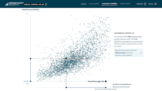
One reason why social connections between different income levels is so important is that there is a lot of evidence that poor people are more likely to move up the economic ladder in areas where there are more friendships between high and low incomes than in areas where there is little social interaction between people of different income levels. Beneath the Social Capital Gap interactive map you can view a graph which shows this connection between economic connectedness and upward income mobility.
If you enter your zipcode or county into the map then you can view both the average level of social connectedness in your county and the local levels of upward income mobility.


Comments