Showing posts with label sports. Show all posts

Tuesday, July 08, 2025

Tour de Street View

Stage 13 in the Pyrenees

Every summer, millions tune in to watch the world’s greatest cycling race snake its way through the heart of France. But watching from a helicopter shot or following time splits only tells part of the story. What if you could experience each stage for yourself - all from the comfort of your own home?

That’s exactly what Map Channels' new interactive Tour de France 2025 map delivers.

This Tour de France map isn’t just another route overview. It’s a fully immersive, animated map where each of the 21 stages of the 2025 Tour de France is brought to life through Google Street View animations. With one click of this map, you're no longer a spectator - you’re rolling through the same roads as the pros.

The official Tour de France website also includes maps of each stage of this year's race. Alongside each official route map you can view a stage profile, the time schedule for the stage and discover what points are on offer.

VisuGPX has also mapped out each stage of the Tour de France. The standout feature of this map is that you can view each stage route animated on a 3D terrain map. This is perfect for previewing those exciting mountain stages and discovering the locations of the biggest and most exciting climbs in each stage.

Monday, September 16, 2024

Every Basketball Court on Google Maps

The Pudding has mapped Every Outdoor Basketball Court in the U.S.A.. I'm not sure why The Pudding decided to collate satellite imagery of every basketball court visible in Google Maps' aerial imagery but it is quite fun to play with.

My guess is that Every Outdoor Basketball Court in the U.S.A. is an experiment by The Pudding in using computer vision to detect, recognize and classify objects in large-scale imagery datasets. The use of AI-powered object detection in satellite imagery has become a useful tool and The Pudding's Basketball visualization is an interesting experiment in how the results of a remote sensing search of an area can be sorted and organized.

The 'about' section of Every Outdoor Basketball Court in the U.S.A. declares 'Court Locations via Open Street Map. Satellite imagery via Google.' It is possible that the Pudding could have used something like Overpass to search for basketball courts on OSM instead of using AI object detection. However the presence of a number of false positive images of satellite images of shapes which closely resemble basketball courts leads me to suspect that some form of machine learning trained on Google's satellite imagery was used to collect this data.

Anyway, if you are looking for an outdoor court in your area, you can simply type your address into The Pudding's visualization to find all your nearby basketball courts. Or, if for some reason you only like playing basketball on a particular color of court, you can also sort all the outdoor basketball courts in the USA by color.

Friday, August 02, 2024

The Olympic Medals Map

world map showing birthplaces of Olympic medal winners

In the past seven days you've almost definitely seen numerous tables of Olympic medal winners. Now it is time to view the map.

Giorgio Comai creates interactive maps of Olympic Medal winners based on which NUTS region they were born in. This means that you can look past the traditional country led rankings used in most Olympic medal tables to explore the medals won by different regions. Alternatively you can just use the map to discover which Olympic medal winner was born closest to your address.

The 2024 Olympic Medalists Map is plotting the birthplaces of the Paris Olympic medal winners as the data becomes available on Wikipedia. On viewing the map my first thought was 'Oh, this is a population density map' but there are clearly some countries with high population densities (eg India) which don't have many medal winners. So my second thought was that the Olympics medal map more closely resembles a map of global inequality.

world map of global poverty headcounts
World Bank map of poverty headcounts

Giorgio Comai's Github page, Olympics medalists, not by country, but by NUTS region, has links to birthplace maps of Olympic medal winners for every Olympics since 1948. The page also includes links to the Wikipedia lists of all the medal winners in each Olympics since 1896 (the source data used in Giorgio's maps).

Tuesday, June 25, 2024

Who is Your Closest Team?

map of the contiguous United States colored to show the closest Baseball team to each zipcode area

If you have ever wondered which baseball team you should support then you need Maptitude's Closest Major or Minor League Baseball Stadium by Drive Time map. The map shows you which affiliated major or minor baseball stadium you can drive to in the quickest time in the contiguous United States.

The map is a sort of combination of a voronoi diagram and an isochrone map. However, because the map uses zip-code areas, it doesn't map the driving times from all locations in the contiguous US. Instead (I assume) it uses the drive times from the center of each zip-code area to the nearest baseball stadium. I believe the drive times were calculated at noon on Wednesdays (which seems like a strange time to have a baseball game to me).

Not a fan of baseball? Don't worry Maptitude have mapped other sports as well. For example the Closest 2023-24 Premier League Football Club by Drive Time shows the Premier League clubs which can be reached the quickest by car from any point in England & Wales. The Closest NHL Rink to Where You Live (2019-20) shows 'North America divided into territories based on the shortest drive-time to a National Hockey League rink.'

If you want to view a strict voronoi map of the UK divided into areas based on the nearest football teams then you can refer to Automatic Knowledge's three interactive Voronoi maps which show which football team people in the UK live nearest to: 

  • The Premier League map shows which EPL team you live closest to (2021-21 season)
  • The Top Four Leagues map shows which English top 4 tier football team you live closest to 
  • The Tiers 1-8 map shows which team in the top 8 tiers of the English football leagues you are nearest to

Alasdair Rae has written up an interesting blog post about these three maps. In Which Football Team is Nearest Me Alasdair looks a little more closely at the Voronoi catchment areas of English football teams. In particular he has worked out the total number of people living in each of the Premier League team's Voronoi polygons and in each polygon for the top 8 tiers of English football. 

Sunday, October 08, 2023

Mapping the Barassi Line

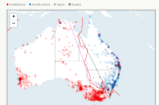
The Barassi Line is an imaginary line across Australia that approximately divides areas where Australian rules football or rugby league is the most popular football code. The line is named after Ron Barassi, a former player and coach in Australian Rules Football. The term the 'Barassi Line' was first used by historian Ian Turner in his 1978 Ron Barassi Memorial Lecture. 

The Barassi Line represents a cultural divide in Australia, with different regions showing a preference for one sport over the other. The line is generally accepted to run from Eden on the south coast of New South Wales, through Canberra and Broken Hill, and into the north-east of the Northern Territory. However like many borders around the world the exact location of the Barassi Line is a matter of some contention. Which is why The People's Republic of Couch has decided to settle the matter for good. 

An interactive map in The Barassi Line shows the location of Ian Turner's original border between Australian rules football & rugby league, and the Republic of Couch's new definitive Barassi Line. This new more accurate border was calculated by plotting the locations of all Aussie rules and rugby league football clubs in Australia. Then each suburb in the country was marked as either Aussie rules or rugby league depending on which code had the most clubs. Then by Voronoi mapping this data it was possible to plot a more detailed Barassi Line, showing the real divide between Aussie rules and rugby league supporting Australians.

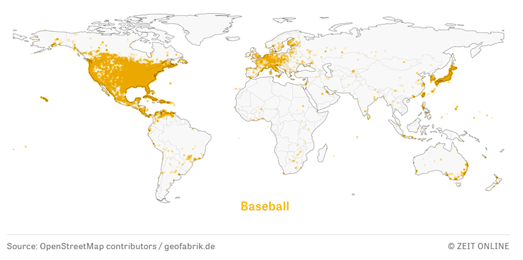
Back in 2019 Zeit attempted to map the popularity of a number of different sports around the globe. In the article Little Sports Atlas Zeit used OpenStreetMap data to plot where different types of sport are actually played across the globe. 

The popularity of many different sports has a geographical basis. For example ice hockey is most popular in a thin band of latitude in the northern hemisphere - a thin band of latitude which is often cold in the winter and where water often turns to ice. Cricket on the other hand is popular in a few different countries - countries which were all at one point part of the British Empire. 

The one true world sport in the Little Sport Atlas is football. In fact Zeit claims that the map of where football is played could almost double as a map of the world's population.

Saturday, August 12, 2023

Competing in the Tour de France

The New York Times has discovered a way for amateur cyclists to compete against the world's elite in the Tour de France. In Watch Amateurs Race Against the Tour de France's Top Climbers the newspaper has used Strava data to compare how amateur cyclists have performed on certain mountain stages in the Tour de France when compared to the fastest Tour de France cyclists (who posted their rides to Strava).

Using a number of animated maps the Times has created some lovely illustrations of the huge gap between amateur and elite cyclists. By comparing the progress of both amateur and professional cyclists on the same map (even though the rides were undertaken on different days) it is possible to make a direct comparison between the amateurs and professionals (although I don't imagine many people are going to be too surprised by the resulting maps).

Most of us don't have easy access to the locations used in the Tour de France. Instead you could use Strava (or any interactive map) to map out a cycle route of the same length as a Tour de France stage (the Times article gives the lengths of each stage that they have mapped). You could then compare the times you achieve cycling over the same distance to those achieved by the professionals in the Tour de France (you could even cheat a little by creating a route with hardly any climbs). 

Sepp Kuss completed the Puy de Dôme (Stage 9), which is 2.8 miles, in 16.40 minutes. According to this Average Speed Calculator that is an average of 10.08 mph. Apparently Google Maps estimates cycling journey times by using an average of 10 mph. So you might even be able to beat Sepp Kuss if you cycle on a flat or downhill route. Martin Catherineau, that amateur cyclist used in the Times article, completed the Puy de Dôme in 41 minutes, 58 seconds.

Tuesday, August 17, 2021

The Globalization of the Premier League

The image above compares the birthplaces of all the Arsenal football players of the 1980's with the birthplaces of all the Arsenal players of the 2010's. It is very noticeable that in the 1980's the majority of Arsenal players were born in the UK or Ireland. The only Arsenal players born outside the UK or Ireland in the whole of the 1980's were Vladimir Petrović (Serbia) and Sigurður Jónsson (Iceland). In the 2010's more Arsenal players were born outside the UK than were born in the UK.

All other English Premier League clubs show a similar pattern. In the 1980's the majority of players in the then English First Division were born in the UK. In fact many players were born very close to the clubs that they played for.

Probably the biggest factor in making the EPL more cosmopolitan was the rebranding of the First Division into the English Premier League and the subsequent influx of television money which resulted from that rebrand. 

I've made three visualizations comparing the birthplaces of EPL players in the 1980's with those of the 2010's, for Arsenal, Chelsea and Manchester City. You can easily make your own maps using Wikidata. 

Here is the Wikidata Query for mapping the birthplaces of Manchester United players. You can use this query for mapping the birthplaces of any sports club. You just need to edit the query to point to the team of your choice. You can do this by editing the Wikidata ID number for the team in line five of the query -

BIND ( wd:Q18656 AS ?team )

Where 'Q18656' is the Wikidata ID number for Manchester United.

For example here is a map showing the birthplaces of all Miami Dolphins players.


Hat-tip: Chris Groves

Wednesday, December 30, 2020

How Far Have I Walked?

After the excesses of Christmas many of us are now thinking about what New Year's resolutions we can make in order to lose a few lbs. Last week I wrote about the new Trail Router interactive map, which can help you generate new running, walking and cycling routes to help keep your exercise regime a little more interesting. 

One very useful feature of Trail Router is that it can generate routes for customized distances. For example if you want to walk five miles every day you can use Trail Router to generate a new 5 mile hiking route each morning.

I have been using Trail Router myself over the last week in order to generate new walking routes around my neighborhood. However I'm not always very good at sticking to a set route. While walking I often find myself diverting from the route suggested by Trail Router in order to explore, pop into a nearby shop, visit an ATM etc. The result is that when I get home from my walk I am often unsure about how far I have actually walked.

When this happens I refer to How Far Did I Run?. How Far Did I Run? is another handy route planning tool which can be used to generate walking, running or cycling routes. I, however, often uses How Far Did I Run? to work out how far I have actually already walked (I don't run!).

If you plot a walk that you have already taken on the How Far Did I Run? interactive map it will tell you the distance that you completed. The map comes with three handy 'snap-to' tools which will snap the drawn route to the nearest path, cycle path or road. This is very handy for quickly drawing a route that you have walked or cycled as the map snaps the route to follow the paths or roads that you are likely to have actually used (if the map won't snap to the route that you took you can switch to a more free-hand tool).

How Far Did I Run? is therefore a very useful tool for quickly working out how far you actually jogged, walked or cycled once you return from your daily exercise.

Saturday, October 03, 2020

Streets Named for Athletes


There are over 3,700 streets in the United States which have been given the names of athletes (if you include horses). ESPN has analyzed the names of 1 million roads in America to determine how many streets have been named in honor of individual athletes and which athletes have the most streets named after them (apparently ESPN does believe that horses are athletes).

In The United States of Athlete Streets ESPN has mapped out all the streets named for individual athletes. Using this ESPN story map you can explore all the roads named for athletes across the whole of the United States. The human athlete with the most streets named in his honor is Dale Earnhardt. Earnhardt was an auto racing driver who was known as one of the greatest drivers in NASCAR history. However Earnhardt doesn't have as many streets named in his honor as Secretariat. Secretariat is the athlete with the most streets named in his honor (if you include horses). In 1973 Secretariat became the first Triple Crown winner in 25 years.

It turns out that Americans really like horses. More streets in the USA are named in honor of individual horses than are named in honor for athletes from any other sport. There are 276 different horses with streets named in their honor in the USA. The next most popular sport is golf. 207 golfers have streets named in their honor. In total there are 1,835 different streets in the US named for horses and 777 streets named for golfers.

The most honored athlete still active in sport is Tom Watson, who has 19 streets named in his honor. Closely followed by Tiger Woods with 16 streets.

Saturday, October 12, 2019

Build it and They Will Come


From 1909 to 1970 Forbes Field was home to the Pittsburgh Pirates. This baseball park was also the first home of the Pittsburgh Steelers football team. In 1971 the park was demolished and cleared for use by the University of Pittsburgh.

At some point during the first few years after its construction the Detroit Publishing Company took 5 photographs of Forbes Field which, when stitched together, provide a panoramic view of the baseball stadium. You can zoom in and pan around this panorama on my interactive Forbes Field map.

I used Microsoft's Image Composite Editor to create the panorama. To turn the panorama into an interactive map I adapted the Non-geographical Maps example from the Leaflet tutorials. This allows you to easily create an interactive map from any image or photograph. You can also view the original 5 photographs taken by the Detroit Publishing Co. on the Library of Congress website.

If you like this interactive view of historical Pittsburgh you might also like the panoramic maps I created of a General View of Detroit 1908 and Indianapolis 1907.

Monday, January 21, 2019

The Little Sports Atlas


How the rest of the world loves to laugh at baseball's 'World Series'. A competition which is only played by teams in North America. However it turns out that the rest of the world is wrong. Baseball is in fact a sport that is played in lots of countries around the world, including Cuba, Japan and countries throughout Europe.

I know this because Zeit Online has been busy creating world maps for lots of different sports. In the Little Sports Atlas Zeit Online has used OpenStreetMap data to show where different types of sport are actually played across the globe.

The popularity of many different sports has a geographical basis. For example ice hockey is most popular in a thin band of latitude in the northern hemisphere. A thin band of latitude which is often cold in the winter and where water often turns to ice. Cricket on the other hand is popular in a few different countries. Countries which were all at one point part of the British Empire. The one true world sport in the Little Sport Atlas is football. In fact the map of where football is played could almost double as a map of the world's population.

Monday, October 12, 2015

The Cubs vs Cardinals Fan Map


The trend for mapping the number of Facebook 'likes' for sports teams shows no signs of abating. The New York Times kicked off this genre of Facebook sports fan maps with their maps of the Basketball Nation, the College Football Fan Map and the Baseball Nation. These maps each show the geographical support for sports teams across the United States based on their number of Facebook fans.

The Chicago Tribune is continuing this fine tradition of mapping the number of Facebook 'likes' for sports teams with two interactive maps; one showing where Cubs fans live and the other showing where Cardinal fans live. In The Cubs vs. Cardinals: The rivalry from coast-to-coast the Chicago Tribune has created two choropleth maps showing which counties in the USA have the most Cubs and Cardinals fans.


The two maps reveal something truly shocking. It appears that the nearer a county is to the Cubs or the Cardinal stadiums then the more fans it will have for that team. This is an amazing insight which also seems to be apparent in this Where Bears Fans Live map.

These maps really do reveal some amazing geographical insights. I'd say they were as truly revelatory as this How Far Away is Ohio map.

Friday, September 18, 2015

Replay the 2015 Red Bull X-Alps


You can now replay highlights of the 2015 Red Bull X-Alps on a 3d map. The Red Bull X-Alps is an adventure race in which competitors must hike or fly 1,000 km across the Alps. Every kilometer of the race must be covered either on foot or by paraglider.

For this year's race Red Bull have partnered with Doarama to provide 3d mapped highlights from the race. The interactive uses the Cesium 3d mapping platform to provide an animated playback of Day 10 of the race, showing the GPS tracks of the competitors on a 3d map of the Alps.

While you watch the Red Bull X-Alps Doarama of Day 10 of the race you can choose which athlete to follow by using the 'people/focus icon' in the top right corner of the map. You can control the speed of the replay using the tortoise and hare buttons. You can also pan around the 3d map and zoom in and out on any of the athletes.

Wednesday, July 29, 2015

The Street View Stadium Booking System


A couple of years ago a restaurant called GOSP introduced a Street View booking system. The system uses Google Business Photos (otherwise known as indoor Street View) to showcase the restaurant to potential customers.

Not only does GOSP use indoor Street View to provide a preview of the restaurant it also allows you to book a table. If you like the look of a particular table you can click on the overlaid marker in the Street View image and book that table for lunch or dinner. The Google Business Photos Booking System was developed by Big-e, an e-business online development team.


Back in 2013 I remarked that the system would be great for booking seats in sports stadiums. It's taken a while but the Dallas Mavericks now have a Street View seat booking system for the American Airlines Center.

Visit the Mavs website and you can tour the American Airlines Center on Google Maps Street View. Use the onscreen arena map to pick a seat in the stadium and you can preview the view with Google' panoramic imagery.

What's more if you like the view from the seat you can simply click-through to book your Mavs' season ticket.

Wednesday, February 11, 2015

Le Tour de Yorkshire Map


Last year the Tour de France started in the English county of Yorkshire. The race was such a success with the locals that they are asked the Tour de France organizers to help them set-up their own race, the Tour de Yorkshire.

My favorite map of the 2014 Tour de France was created by the official website of Yorkshire tourism. Thankfully they have also created route maps for the three stages of the inaugural Tour de Yorkshire, 1-3 May 2015.

Stage 1 is from Bridlington to Scarborough. Stage 2 travels from Selby to York and Stage 3 is Wakefield to Leeds. Each of the three maps shows the route which the cyclists will take and an elevation chart of the mapped stage. Each map also includes places of interest to visit along and around the route of the race. You can therefore use the maps to not only find a great location to watch the Tour de Yorkshire but also find interesting places to visit nearby.

Friday, December 19, 2014

Supercharging Sports Maps


One of the most popular posts on Maps Mania in 2014 looked at the heat maps generated by joggers and cyclists using wearable technology. One of these maps was Mapbox's '1.5 Million Walks, Runs, and Bike Rides', created using data from Runkeeper users.

Mapbox has now updated that map to include 150,000 additional routes and higher levels of zoom. Mapbox were able to achieve this extra detail by using Tippecanoe, a library developed by Eric Fischer for making vector tiles from large data sets. You might remember Eric's 6 Billion Tweets Map, from earliest this month, which also made great use of Tippecanoe.

The Superpowered 1.5 Million Walks, Runs, and Bike Rides map overlays Runkeeper routes on top of a Mapbox powered map of the world. The map includes some quick links to jump to the maps of a few major cities around the world and you can also pan and zoom the map to view the popular running routes at any location in the world.


If you zoom in on the map you can view the recorded tracks right down to sidewalk level. Zooming down to sidewalk level allows you to observe the inaccuracies in the GPS data. There are lots of tracks where people seem to be running through buildings or on top of rivers. However, despite the inaccurate data, roads and sidewalks still emerge from the data due to the huge number of tracks being mapped.

Thursday, December 04, 2014

3d Piste Maps


Piste,io is a new website (currently in beta) which allows you to view 3d maps of your favorite European skiing resorts. Piste.io uses real elevation data to generate impressive realistic interactive 3d maps of ski resorts with ski run data from OpenStreetMap.

Piste.io uses WebGL, so you will need a WebGL enabled browser. It also seems to need a good graphics card so may crash your browser on older computers. However, if you do have a fast computer with a WebGL enabled browser you'll enjoy whetting your skiing appetite with a few dry simulated ski runs on Piste.io.

Saturday, November 01, 2014

New York Marathon Map


This year spectators can track any individual runner in the New York Marathon. Using the New York Marathon Map you can enter the name or bib number of any participant in the race and view their position and times live on a map of the course.

Each runner in the race will be tracked as they pass each official timing point. You can then view estimated times for the runner to reach the next timing point, an estimated finish time and their real-time position on the map (estimated on their timing split pace). The map also shows the location of each official timing point, the mile markers and an elevation profile of the whole marathon course.

Tuesday, September 09, 2014

Extreme Sports Mapping


Beyond Close is a map of extreme sports videos shot around the world. The map is a collection of first person perspective videos shot by participants in a number of extreme sports and adventures all around the globe.

You can select to view a video by clicking on the markers on the map. You can also filter the videos by rating and by the number of views. The 'Explore' feature also allows you to search and filter the videos by location and category of sport.

Users can rate each video on the map. You can also add videos to the map by submitting a video URL and selecting its location on the map.

The German Soccer Supporters Map


Yesterday's Berliner Fußballkarte from the Berliner Morgenpost appears to have been just a teaser for a full-blown map of Bundesliga fandom. The Berliner Fußballkarte shows the registered supporters of Berlin's top two football clubs, Hertha Berlin and FC Union Berlin. The Berliner Morgenpost's new map shows where the registered supporters of 8 of the 18 Bundesliga clubs live.

The map uses data obtained from the eight German clubs showing where their registered supporters live. The Berliner Morgenpost is releasing the map in beta until a time when they have the data from all 18 Bundesliga clubs.

Fußballkarte (BETA) shades each neighborhood in Germany based on the club with the most registered supporters in that neighborhood. If you mouse-over a neighborhood you can view the number of registered supporters for each of the 8 clubs.

As well as the Berliner Fußballkarte there is also a localized Hamburg version of the map. Hamburger Fußballkarte is a map of Hamburg showing where HSV and St. Pauli have the most fans in the city.