Friday, March 31, 2017
Play Ms Pacman on Google Maps
Most years the Google Maps team manage to create something special for April Fools' Day. One of the team's best April Fools' jokes was turning Google Maps into a fully working game of Pacman in 2015.
Google Maps Pacman was so successful that this year Google has decided to bring it back - only this year Pacman is wearing a ribbon. That's right! If you open Google Maps on a desktop or on Android you can play Ms Pacman.
To play just click on the 'insert coin' button. If you don't see the button then zoom in on an area with lots of roads. In the game dots are added to the roads and that famous yellow pill and colored ghosts appear. All you have to do is to collect all the dots and avoid those chasing ghosts. Make sure to turn on the sound if you want to wacca, wacca, wacca across the map in style.
Labels:
game
How Does Your Commute Compare
The average commuting time for the residents of Liguori, Missouri is 1.2 minutes. This is quite a lot quicker than the national average commuting time of 25.5 minutes.
If you want to know what the average commuting time is in your zipcode area then you can use Auto Accessories Garage's interactive map of Average Commute Times. If you enter your commute time and zipcode into the map you find out how your commuting time compares with that of your neighbors. You can also discover how your commute compares to the average in your city, state and in the whole country.
The Average Commute Times map uses data from the U.S. Census Bureau.
Labels:
USA
Thursday, March 30, 2017
The Top 100 Cultural Landscapes in Spain
Narrating Landscapes is a new interactive map designed to highlight some of the most interesting and beautiful locations in Spain. The map shows the locations of 100 of the most astonishing 'cultural landscapes' in Spain - places where there has been extraordinary interactions between man and the natural environment.
Like the cultural landscapes being showcased here the map itself is beautiful. I especially like the round information windows and the animated map markers. If you click through on one of the cultural landscapes you can view photos and videos of the selected location. You are also shown other nearby cultural landscapes on a separate interactive map.
The cultural landscapes themselves have been organized into five different colored categories on the map. The categories of cultural landscape are: agricultural, urban, defense, historical and industrial.
Labels:
Spain
Wednesday, March 29, 2017
Mapping NSA Intercept Sites
It is possible to use interactive maps to visualize how internet traffic travels around the world. For example since 2010 the Visual Trace Route Tool has used the Google Maps API to show the path that internet packets take to reach specified destinations on the internet.
IXmaps has taken this concept a stage further. IXmaps not only shows you where your data travels around the world it also shows you where the NSA might be intercepting your personal data. The U.S. National Security Agency and other governments' agencies are known to intercept people's personal data as it travels around the world. The NSA does this by installing interception facilities at internet switching sites. IXmaps shows you where these facilities exist.
Share your IP address with IXmaps and you can view an interactive map showing the traceroutes your data takes around the world when you use the internet. The IXmaps interactive map also shows the location of known NSA internet interception sites. You can therefore use the map to see where the NSA are probably spying on your personal data.
Tuesday, March 28, 2017
Meander Maps of the Mississippi
In 1944 Harold Fisk published a series of beautiful looking maps of the Mississippi River. In his 'Geological Investigation of the Alluvial Valley of the Lower Mississippi River', commissioned by the Army Corp of Engineers, Fisk not only mapped the flow of the Mississippi but also tried to represent how the river's course has meandered and changed over time.
Fisk's maps use a number of different colors to show the different courses of the river over the centuries. You can view static images of all fifteen of Fisk's maps for the Army Corp of Engineers on this radicalcartography post.
Some of the Army Corp of Engineers' later meander maps of the Mississippi River can also be viewed on Meiotic's Meander Maps. Meiotic has geo-referenced a few of the Army Corp's maps and placed them on top of modern maps and aerial imagery of the river's course. These maps include a slider control which allow you to compare the Army Corp's original maps with a modern map of the river.
Luckily Somebits has also geo-referenced all 15 of Fisk's original maps. The 1944 Map Of Former Courses of the Mississippi stitches all 15 maps together. Unfortunately the modern aerial imagery seem to be broken on this interactive map. However you can still compare Fisk's map to a modern map of the Mississippi and you can use the interactive map controls to zoom-in and study Fisk's beautiful maps in loving detail.
Labels:
environment,
history maps,
USA
The Dot Density Map of Europe
The European Population Density map is a dot density map of Europe. Each dot on the map represents 50 people. In total there are are over 500 million people represented on the map by over 10 million dots.
You can clearly make out the densely populated capitals of Europe on the map. London, Paris, Madrid, Berlin and Rome are all clearly visible as densely populated urban centers. If you are looking to get away from the crowds in Europe then you'll probably have to look a little harder. You could try the Scottish Highlands or the far north of Sweden, Norway or Finland. The Alps can also be made out on the map as a slightly less densely populated area in the mostly densely populated countries of southern Europe.
If you want to know how the map was made then you should read the Spatial.ly article 10 Million Dots: Mapping European Population.
Other Dot Maps
- Educational Attainment in America - the level of education across the USA
- Racial Dot Map, the density of different U.S. racial groups
- Mapping Immigrant America - the U.S. immigrant population
- The Racial Dot Map of Brazil - the racial distribution of the Brazilian population
- Mapping South Africa with Dot Distribution - racial distribution across South Africa
- Toronto Visible Minorities - the visible minority status of the Toronto population
- Indigenous Dot Map of Australia - the indigenous population of Australia
- Finns on a Map - 5.5 million people in Finland
- The Chinese Population of Australia
- Rome - The Foreign Resident Population
- The Dot Density Map of Women in the U.S.
- The UK Ethnicity Dot Map
- Mapping the Young Adults of New Zealand
Monday, March 27, 2017
Mapping the History of Glasgow
In the 1860's the city of Glasgow commissioned the Scottish photographer Thomas Annan to photograph the city centre. In 1866 the decision was made to clear the slums in the centre of Glasgow. Annan was employed to photograph the Old Town of Glasgow before it was destroyed.
Thanks to the National Library of Scotland you can view Annan's wonderful collection of photos of Nineteenth Century Glasgow centre. Thomas Annan's Glasgow includes an interactive map which allows you to browse the collection of historical photos by location. The map even includes a vintage 1850's Ordnance Survey map of the city so that you can view how the city looked before the slum clearances.
A slightly different view of historical Glasgow is available in this Glasgow Aerial Photos map. This Leaflet map shows the location (and direction of view) of 159 historical aerial photographs of Glasgow.
The photos on this map were taken sometime in the 1950's to 1960's by the Glasgow Corporation Planning Department. They provide a great bird's eye view of mid-Twentieth Century Glasgow. If you click on the link on any of the historical photographs another Leaflet map will open showing just the selected photo. You can then zoom in and pan around the photo to inspect it in greater detail.
In the 19th Century the Govan area of Glasgow was one of the world's leading ship-building centers. Like many dockland areas Govan became an area popular with immigrants. The number of foreign ships coming into Govan coupled with the area's high employment meant that Govan became an attractive destination for many immigrants to Scotland.
Immigrants to Govan came from all around the world. There were Irish emigrants escaping the potato famine, there were Eastern Europeans fleeing the anti-Jewish pogroms in Russia and there were also English immigrants looking for work.
Govan Scotlands's Melting Pot is a fascinating Google Map visualizing the home addresses of foreign born individuals in Govan, using data from the 1881 census.The map shows where immigrants to Govan chose to live in the area. You can even filter the results by nationality so that you can find out where different nationalities grouped together in distinct immigrant communities.
If you select a marker on the map you can view information about the individuals living at an address, with details about their ages and occupations. It is fascinating exploring the map and discovering the types of employment favored by the different nationalities living in Govan in the late 19th Century.
Labels:
Glasgow,
history maps,
Scotland,
UK
Tropical Cyclone Debbie Tracking Map
Tropical Cyclone Debbie is expected to reach North Eastern Australia about 8:00 am Tuesday. The Australian Bureau of Meteorology (BOM) are warning that the storm will be the worst since Cyclone Yasi in 2011.
The BOM Tropical Cyclone Forecast Track Map shows the predicted path of Cyclone Debbie and the cyclone's predicted intensity along its path. The Bureau of Meteorology also maintains the Tropical Cyclone Advice service, which provides information on which areas are in the warning and watch zones for Tropical Cyclone Debbie. The advice page also provides information on the cyclone's position, strength and potential impact.
The Bureau of Meteorology's Satellite Viewer provides an animated view of nearly four hours worth of satellite imagery of Australia. At the moment Tropical Cyclone Debbie can clearly be seen to the north east of the country. The Satellite Viewer uses imagery from the Himawari-8 satellite operated by the Japan Meteorological Agency. You can also watch time-lapse animations of the latest Himawari-8 satellite imagery on Himawari-8 Real-time Web.
You can also track Tropical Cyclone Debbie on a number of different animated wind forecast maps. Windytv and earth both clearly show Tropical Cyclone Debbie closing in on Queensland.
Saturday, March 25, 2017
Alpine Ski Resorts in Danger
Climate scientists at the Institute for Snow and Avalanche Research in Switzerland estimate that the Alps are likely to see a huge drop in snow levels by the end of this century. They suggest that snowfall in the Alps could drop by between 30 and 70 percent by the year 2100. This could have serious consequences for many of Europe's most popular ski resorts.
Der Spiegel has mapped out the effect of global warming on European ski resorts based on the Institute's findings. Their interactive map Snow in Ski Resorts shows how 988 ski resorts in the Alpine region could be effected by falling levels of snowfall. The Institute for Snow and Avalanche Research predict that by the end of the century heights below 1200 meters will see very little snow. Under this scenario around one-fifth of Alpine ski resorts will have to survive with no natural snow in the very near future.
The Alpine resorts below 1200 meters are marked in red on Der Spiegel's map. The yellow markers on the map show ski resorts which have ski runs both above and below 1200 meters. This means that some parts of these resorts may still get some natural snowfall by the end of the century. The ski resorts shown in green are those which are entirely above 1200 meters. These are the resorts which should be least effected by falling levels of snowfall.
Labels:
climate
Friday, March 24, 2017
Mapping Global Warming
Every year the World Meteorological Organization (WMO) issues a report on the state of the global climate. The WMO Statement on the State of the Global Climate in 2016 (PDF) reports that 2016 was the warmest year on record. The statement also reports that globally averaged sea-surface temperatures were also the warmest on record; global sea levels continued to rise; and Arctic sea-ice extent was well below average for most of the year.
This year the WMO has released a summary of some of the annual statement's findings on the global climate in the form of an Esri Story Map. The Highlights of Global Climate 2016 map not only provides a summary of some of the annual statement's main findings it also visualizes global warming anomalies around the world using an interactive map.
If you click on the map you can view how much temperatures rose at that location in 2016. As you scroll through the Highlights of Global Climate 2016 the story map also takes you on a tour, providing a summary, of the temperature anomalies in each of the major regions of the world.
Labels:
climate,
environment
Thursday, March 23, 2017
A World Map Without Highways
During the 2012 London Olympics the streets around my home were closed to traffic. For over a month I got a wonderful glimpse of a world without noisy, polluting combustion engines. As I walked around the car free streets I would often imagine what the neighborhood would look like if all the tarmacked roads could be replaced with green grass and flower beds. Unfortunately once the Olympics were over the streets were reopened and I never got the chance to replace all those ugly roads.
If the idea of a world without highways appeals to you then you will probably like No Highways NYC. Jeff Sisson's new site allows you to see what your local map would look like without all those ugly highways. The name of the map is a bit of a misnomer as it actually works for any location in the world (not just New York!).
Use the map's search facility and you can view the map for any location in the world with the 'highway' layer removed. This is possible thanks to Mapzen's ability to add or remove different map elements. This allows No Highways NYC to provide a handy little button which allows you to view the map with or without highways.
If the thought of a world without cars and highways makes you uncontrollably angry then ignore Jeff's map and head over to the Connectivity Atlas instead. Here you can view a world map which consists only of roads.
Street View in the Year 2050
Select a location on the Earth 2050 3D globe and you can get a little glimpse into the future. Kaspersky Lab has brought together some of the world's top scientists and futurologists to provide an insight into how the world might look in the year 2050.
Using the Earth 2050 futuristic looking 3D globe you can explore how various locations around the world might look in the future. Many of the locations featured on the globe even have Street View scenes providing 360 degree panoramas predicting the location in the year 2050.
If you have your own prediction about the world in 2050 you can add it to the map. Kaspersky Lab even provide instructions on how you can create your own future Street View panoramas. If you don't have your own predictions about the future you can still contribute to Earth 2050 by voting on whether you agree or disagree with the individual predictions shown on the map.
Wednesday, March 22, 2017
The Noisy America Map
Nearly one in ten Americans live with road and aviation noise that is as loud as a noisy garbage disposal (80 decibels or more). You can find out what noise levels are like where you live on the Department of Transportation’s new National Transportation Noise Map.
Using the National Transportation Noise Map you can view a heat map of road and aviation noise levels for your town or city. The map essentially visualizes the likely exposure of locations to aviation and highway noise. Therefore the map clearly reveals the location of the busiest roads and the location of noisy airports.
I bet you can easily pinpoint the location of Los Angeles International Airport on the screenshot above. I bet you can even spot where the runways are and in what direction they run. If you want to check your guess you can turn off the noise layer on the National Transportation Noise Map and view the area on the map's satellite imagery layer.
Labels:
environment,
USA
The Building Age Story Map
I really like building age maps. Multi-colored building footprints nearly always make really beautiful looking maps. But building age maps don't just look good. They also have interesting stories to tell about where a city's oldest buildings still exist in the city's streets.
Most building age maps leave the users themselves to find these stories in the patterns of the colored building footprints on the city map. One way to improve a building age map therefore would be to pick out some of the implicit stories in the history of a city's buildings in the map itself. You could do this by creating a story map from a city's building age map.
This is exactly what CBC has done with their Montreal Building Age map. Using the Montreal is 375 years old, but how old are its buildings? interactive map you can view the age of all Montreal's buildings. However the map is also used to explore the architecture and history of thirty of Montreal's most emblematic buildings.
As you scroll through the Montreal Building Age story map CBC pick out some of Montreal's most interesting buildings on the city's map. The text panel is then used to show photos of the highlighted buildings and to explain each building's historical & architectural importance.
The result is that CBC's map is much more than just an aesthetically pleasing building age map of Montreal. It is also an interesting introduction to the history of Montreal itself and a guide to where you can still find that history on the city's streets.
Labels:
building age,
Canada,
history maps,
Montreal
Tuesday, March 21, 2017
The Geography of Murder
In 2015 there were over 13,000 gun murders in the United States. Those murders weren't distributed equally throughout the country (even if you normalize the data for population). In fact 26% of gun homicides in 2015 took place in just 1,200 neighborhood census tracts, home to just 1.5% of the population.
The Guardian has used data from the Gun Violence Archive (GVA) to plot the locations of 2015 gun homicides down to the census tract level. In the article Want to fix gun violence in America? Go local The Guardian uses a series of maps to show the neighborhoods in different cities where gun homicides most frequently occur. It then uses census data to determine factors which are common to many of the 1,200 census tracts where gun homicides are most common.
The Guardian's maps show the distribution of gun homicides within cities. The city maps also show the levels of educational attainment, poverty and the percentage of the population which is black in each census tract in the city. From mapping 2015 gun homicides The Guardian says that gun violence "falls heaviest on neighborhoods already struggling with poverty, unemployment, and failing schools. The unequal burden of violence is also marked by intense racial disparities".
You can read more about the data used in The Guardian's maps in Mapping US gun murders at a micro level: new data zooms in on violence. You can also download the data if you want to try visualizing 2015 U.S. gun homicides for yourself.
Comparing New York Neighborhoods
You can learn a lot about New York's neighborhoods on DATA2GO.NYC. The DATA2GO.NYC mapping and data tool allows you to access federal, state and local data concerning the economic well-being of all of the city's neighborhoods. Using the tool you can view information in many different areas, such as educational attainment and average incomes in each New York neighborhood.
Using the DATA2GO.NYC interactive map you can view information on over 300 different indicators, in areas such as education, demographics and the economy. If you select an indicator from the map's drop-down menu you can view a choropleth view of that data on the city map. If you select any of the neighborhood's on the map you can also view how it compares to all other New York neighborhoods for the selected indicator on an accompanying chart view.
The DATA2GO.NYC mapping tool can provide a real insight into individual neighborhoods across a range of different indicators. It also allows you to compare how individual neighborhoods compare to the rest of the city across these same indicators.
Monday, March 20, 2017
The Worldwide Waste Map
The University of Leeds and the International Solid Waste Association have created an interactive map which explores & visualizes issues around municipal waste management across the globe. The Waste Atlas includes information about landfills, dumpsites and waste management in 164 different countries and 1,779 different cities around the world. Using the map you can compare and contrast the amount of waste generated by different countries & cities and how well they manage that waste.
Using the atlas you can compare the waste management data of countries around the world. Select a country on the map and you can view details on its annual waste generation and data on waste collection & recycling rates. If you click on the City Data link in the map menu you can view the same data for 1,779 cities around the world. As well as the map view Waste Atlas includes a number of static maps and charts which also visualize data about waste management in countries & cities around the world.
Mapping the History of Latin America
HGIS de las Indias is a historical-geographical information system for Latin America. The map provides a way to explore and discover information about the historical geography of Latin America from 1701 to 1808.
HGIS de Las Indias includes a number of map layers which allow you to explore historical data on the interactive map. These layers include a collection of 19 georeferenced vintage maps of Latin America, which can be overlaid on top of the modern map of the area.
The map also includes a number of historical data layers. For example it includes data from historical censuses carried out in the region during this period. Other layers allow you to view historical shipping & mail routes in Latin America and information on eighteenth century universities and publishing companies.
Labels:
history maps
Mapping China's Polluting Factories
Air pollution is a huge problem in China. Last year the American Association for the Advancement of Science reported that in 2013 air pollution killed 1.6 million people in China. One of the major causes of air pollution in the country is the large number of coal burning factories throughout China.
You can now see who the major air polluting culprits are in China on a new map of air pollution. The Institute of Public & Environmental Affairs' National Air Emissions interactive map shows the average hourly polluting rates of enterprises across China. Using the map you can find out which factories are responsible for the worst air pollution.
4,637 enterprises are being monitored in total. Each enterprise's map marker shows the latest recorded average hourly polluting value (mg/M3). You can also select a business' marker on the map to view more details, such as historical readings and how those readings relate to regulatory standards. The map's search facility includes options to filter the results shown by type of pollutant and to show only those factories exceeding or meeting regulatory air pollution standards.
Labels:
China,
environment
Sunday, March 19, 2017
Safe Walking in Melbourne
In the USA a number of cities have introduced Vision Zero projects. Vision Zero initiatives look at the causes of traffic accidents and where they most happen. They then implement policies to try to make those streets safer for pedestrians, cyclists and other road users.
In Australia the city of Melbourne has WalkSpot. In this project Victoria Walks and CrowdSpot are working together to discover where pedestrians feel safe and unsafe when walking in Melbourne. Using the WalkSpot interactive map anyone can 'Add a Spot' at any location in Melbourne where they think there are road safety issues affecting pedestrians.
The WalkSpot interactive map can then be used by local and state government to identify trouble spots and to help road management agencies improve the streets for pedestrians.
In the USA you can view examples of the Vision Zero initiatives at Vision Zero Boston, Vision Zero New York and Vision Zero San Francisco.
Saturday, March 18, 2017
City Journeys with Scrolling Street Views
A few year's ago the Swiss broadcasting company SRF created a great web documentary about the Langstrasse district in Zurich. A similar web documentary has now been created for the Bloorcourt neighborhood in Toronto. Both these web documentaries provide seamless journeys through the city streets using connected 'Street Views' and video interviews with the inhabitants of both districts.
360 Langstrasse is a truly impressive website which allows you to move up and down Langstrasse, Zurich by simply scrolling up & down within your browser. 360 Langstrasse doesn't use connected still photos of Langstrasse to achieve this scrolling presentation. The effect is actually achieved by using a video. As you scroll up and down the page you are in fact just moving between the different frames in a video of the street and surrounding district.
A similar effect is used in The World in Ten Blocks. Images and sound from the Toronto district are explored in a stop-motion like manner as you scroll up & down in your browser. As in 360 Langstrasse a number of interactive elements can be accessed from the scrolling street views, These include videos of Bloorcourt inhabitants, text introductions to the area and old & new photographs of this Toronto neighborhood.
Pregoneros de MedellÃn is another wonderfully immersive virtual journey. This scrolling web documentary introduces you to the colorful streets of MedellÃn in Colombia.
While you stroll around Medellin you can listen to the sounds of the streets and the street vendors. You can also interact with some of the characters you find on your journey. The interactive characters are indicated on screen with map markers positioned above their heads. Click on the markers and you can view short documentary type videos about the selected individual's lives.
Obviously creating these kinds of immersive journeys around city neighborhoods can be a bit of a technical challenge. You can read about how the Medellin video was captured (using a GoPro camera attached to a gimbal and fixed to a bike), how the immersive sound was added (customizing Sounds of Street View) and how the video interface was created, in this blog post.
Labels:
Canada,
Custom Street View
Friday, March 17, 2017
The 3D Building Age Map
A new map of the Morningside Heights neighborhood in Manhattan shows the age of every building in the historic district. A building age map of New York isn't exactly new. In fact you can view the age of every New York City building on the New York Building Age map. However the Morningside Heights Historic District Explorer not only shows building age but also allows you to view historic photographs of the featured buildings.
The Morningside Heights Historic District Explorer interactive map provides a 3D view of New York's buildings. The actual buildings within the Morningside Heights historic district have also been colored according to the period of their construction. You can click on the individual colored buildings to find out the exact year of construction. If you select a building on the map you can also view details on the building's architect, owner and height. You can also view historic photos of the building from the tax office.
Labels:
history maps,
New York,
USA
Thursday, March 16, 2017
Eucalyptus, Sheep & Desert
Most of Australia is desert. The bits that aren't desert are populated by sheep and eucalyptus forests.
I discovered these interesting facts from some old Australian maps featured on ABC's But where is the green sheep? Old maps put the art in cartography. The ABC article features some great examples of vintage maps from the National Library of Australia's collection. The static maps include a number of cartographic illustrations of Australia's vegetation, livestock and climatic conditions.
Towards the bottom of the ABC article are a number of interactive versions of vintage maps from the NLA collection. These interactive maps include a 1940 map of Aboriginal tribes and a map showing the routes taken by some of the earliest European explorations of the Australia.
Labels:
Australia,
history maps
The Rise of American Anti-Semitism
ProPublica has logged more than 330 incidents of anti-Semitism, which took place in just three months, from early November to early February. Even more worrying is the fact that in 2017 there has already been 145 bomb threats made against Jewish organizations in the USA. ProPublica has mapped both Reports of Swastika Graffiti and Bomb Threats to Jewish Community Centers and Organizations.
The Bomb Threats visualization uses a static map to show the locations of all 145 bomb threats. Beneath the large map is a timeline of each of the incidents (with the most recent first). Each date in the timeline also includes a smaller static map showing the locations of the bomb threats made on that date.
The Reports of Swastika Graffiti map uses a simple story map template. You can read about some of the mapped reports by using the 'back' and 'next' buttons. Unfortunately the map itself has had all its interactivity turned off. This means that you can't zoom and pan the map or click on the markers to learn more about each of the mapped incidents. However you can learn more about some of the incidents and the rise of anti-Semitism in the United States in ProPublica's article In an Angry and Fearful Nation, an Outbreak of Anti-Semitism.
Wednesday, March 15, 2017
Satellite Image Explorer
There are now a number of different web services which allow you to browse and search for satellite imagery of the Earth. Websites such as Planet Explorer, Landsat Lens and Google's Timelapse permit you to search for satellite imagery both by location and by date. You can now also use ESO's Land Viewer service. The Earth Observing System's Land Viewer application allows you to browse and download historical satellite imagery from the Sentinel-2 and Landsat 8 satellites.
The Land Viewer search facility includes options to search for satellite imagery of the Earth by location and by date. It also includes filters which permit you to search for day or night-time satellite images and the level of cloud cover and the degree of sun elevation in the returned satellite images.
Land Viewer includes a number of band combinations which permit you to view the imagery using 18 different filters. These include natural & false color, infrared and panchromatic filters. There is also the option to apply your own custom filters to the satellite imagery.
Labels:
Landsat
Tuesday, March 14, 2017
Safer Cycling with Mapzen
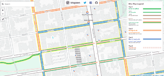
Mapzen's new Bike Map can help you navigate a safer way to cycle. The Bike Map colors roads and bike paths based on three different tiers of safety, allowing you to tell at a glance which roads are the safest for cyclists.
The three tiers are:
- Green (safest) - off road bike paths
- Orange (less safe) - on road bike lanes
- Blue (least safe) - no bike lanes
The Bike Map uses data from Open Street Map. This means that the map works for anywhere in the world. It also means that if you don't think the map is accurate enough in your area you can improve the map by contributing to Open Street Map.
If you want to use the Bike Map in your own maps you can! You just need to add the Walkabout basemap style to a Tangram map and turn on the bike tier data. The Mapzen Blog has more details on how to add the Bike Map to your own maps. It also has more details on how the map was designed and the other biking features that you can find on the Bike Map basemap.
Labels:
Bike Routes
3D Tube Times
3D mapping library eeGeo uses WebGL to provide stunning 3D interactive maps. The eegeo.js API is based on Leaflet.js so it is very easy to use for anyone familiar with any of the most popular mapping platforms.
If you want to get started using eeGeo then you will want to check out the eeGeo API documentation. You might also want to have a look at this tutorial on Building Gorgeous 3D Maps with eeGeo.js. The tutorial provides a step by step guide to creating a 3D map. It also shows you how to add polylines to show the London Underground network on the map. Finally it uses the Transport for London API to add live underground train times to the London Underground stations on the map.
The completed map allows you to hover over any London Underground station to view live train times. It also shows all the London Underground network lines using colored polylines (using the TfL color scheme).
Monday, March 13, 2017
Drive Time with Iscoscope
This year Maps Mania has already featured a number of interactive maps which help you visualize how far you can travel for a specific period of time. These isochrone maps include farfrom.io, walkshed.js and TravelTime.
Of course how far you can travel can be constrained by the time of day when you travel. When traveling by public transit you might be able to travel further during busy commuting times if your transit network runs a more frequent service during these times. Conversely you probably can't drive as far during the rush hour due to the increased amount of traffic on the roads.
Isoscope is a driving time map which takes into account the time of day when you travel to visualize how far you can drive in a defined period of time. Enter your location into Isoscope and it will present you with an isochrone map showing how far you can drive for every hour of the day. The map features 24 layered polygons, each of which represents a different hour of the day. You can use the control panel to highlight the isochrone layer for any particular hour of the day. You can also adjust the map to take into account the different days of the week.
Labels:
isochrone
How Satellites Document Our Changing World
The satellite constellation of Earth-imaging company Planet Labs is able to provide a regular complete view of Earth at 3-5 m optical resolution. You can now explore these satellite images on their new Planet Explorer map.
Planet Explorer allows you to observe how the world has changed over the last year. Using the map's timeline you can zoom-in on any location on Earth and view the satellite imagery for any month, going back to January 2016. If you register with Planet Labs you can even view the daily updates to the satellite imagery in California.
Currently Planet Explorer has global satellite imagery at a resolution of 30 to 40 meters. The United States however is available at 3 to 5 meter resolution.
The Landsat program has been capturing satellite imagery of the Earth since the early 1970's. This means they now have access to over 40 years of satellite imagery, which is a wonderful resource for documenting changes to our planet.
Landsat Lens allows you to explore how the Earth has changed by comparing Lansat satellite imagery from six different years. The map allows you to search for any location on Earth and then overlay satellite imagery of your selected location from 1975, 1990, 2000, 2005, 2010 & 2015.
For example the screenshot above shows a map of the Aral Sea with four different satellite images from four different decades. Being able to directly compare the satellite images from different decades really helps to highlight the scale of how quickly the Aral Sea is disappearing.
You can also explore our ever changing world on Google's Timelapse map. Timelapse allows you to create a timelapse sequence from satellite images (from 1984 to 2012) for anywhere on Earth.The application comes with a number of default views that allow you to view timelapse animations of satellite images showing the sprawling growth of Las Vegas, the building of Dubai, the shrinking of the Mendenhall Glacier and the drying-up of Lake Urmia.
Where Can You Afford to Live?
The UK government's Living Wage is £9.75 an hour in London. This is the lowest amount that an employer in the capital is allowed to pay an employee. Unfortunately if you need to rent a property in the capital you need to earn at least £54.54 an hour.
In the rest of the UK the Living Wage is £8.25. This is almost enough to afford to rent a property in the cheapest city in the UK. In Bradford you need to only earn £8.98 to rent. This is almost affordable.
You can view how much you need to earn an hour to rent in any UK postcode area on Web-Blinds new interactive map. The Earnings vs Postcodes map allows you to enter any UK postcode to view the hourly rate that you need to earn to afford to rent in that postcode & surrounding postcode areas. The hourly rate is based on a single person working a 37.5 hour week with the rent being 35% of the total income.
If you want to buy a property rather than rent then you can check out the Guardian's Unaffordable Country interactive map. This map shows you where you can afford to buy a property in England and Wales based on your annual income.
If you earn the national average wage in England or Wales then you can not afford to buy a house in 93% of the country. That's right you can't afford to a buy even the smallest, worst kept properties, almost anywhere in the entire country. Don't worry though, if you do well and manage to raise you income to twice the national average salary then you just might be able to afford a house in one of the country's poorest neighborhoods
Unaffordable Country is a choropleth map which colours postcode areas based on the affordability of properties in the area. Type in your average salary and the map will show you all the areas where you can afford to live - or, as is more likely, all the places in the country where you can't afford to live.
Labels:
real estate,
UK
Friday, March 10, 2017
The Dot Map of Education
Educational Attainment in America is a dot map showing the level of education of people across the USA. Using the map you can zoom in on any town or city and see the local distribution of educational attainment.
The map shows five levels of educational attainment; Less than High School, High School, Some College, Bachelor Degree and Graduate Degree. Each dot represents 25 people. The map doesn't have any information attached about the data used but, based on the cartographer's previous Mapping Immigrant America dot map, I'm guessing that the data is randomized within each census tract.
It is interesting to compare the density of the different levels of educational attainment with the density of different immigrant populations using the two different dot maps. You might also be interested in comparing the Educational Attainment map with the University of Virginia's Racial Dot Map, which shows the density of different racial groups across the USA.
Thursday, March 09, 2017
Searching Satellite Imagery
Last year Terrapattern released a visual search engine for satellite imagery. Terrapattern uses machine learning to find locations around the world which look very similar. This means that you can use Terrapattern to find other locations which share a visual resemblance to a chosen location. For example, if you click on a baseball field on the Terrapattern map you can find other locations which also have a baseball field.
Descartes Labs has now released their own visual satellite search engine which allows you to search for objects around the world. Geovisual Search works in a similar fashion to Terrapattern. To search for similar looking locations around the world you just need to click on an interactive map and the search engine almost instantly finds other locations around the world which look the same.
You can learn more about how Geovisual Search uses artificial intelligence to search satellite imagery on this Descartes Labs about page. In this initial launch Geovisual Search searches three different sets of satellite imagery; Landsat 8 (global), NAIP Aerial Imagery (USA) and PlanetScope (China).
Via: Google Earth Blog
Precog Crime Prediction for London
A new interactive map claims to be able to predict the number of crimes that will be committed in London neighborhoods in 2017. Dataiku's London Crime Prediction Map 2017 shows the predicted number of crimes and whether the number of crimes is expected to rise or fall in 2017 in each London neighborhood.
The circles on the map represent the predicted number of crimes in each Lower Layer Super Output Area (LSOA). The size of the circles represent the number of crimes and the color shows the percentage change in the number of crimes compared to 2016. You can click on a neighborhood's circle to view the number of predicted crimes in the area for each month in 2017.
You can learn more about how Dataiku built their predictive model for London crime in their Predicting London Crime Rates Using Machine Learning article. A very basic summary of the model is that it uses historic London crime data, census data, information about the number of points of interests in an area (such as shops and pubs) and the location of police stations.
Wednesday, March 08, 2017
Live Talks for International Women's Day
For International Women's Day Facebook is hosting live broadcasts from across the globe. The event features live videos from "influential leaders, public figures and NGOs".
The best way to find out which events are being broadcast right now is on Facebook's #SheMeansBusiness website. The site features an interactive map showing the locations of the live broadcasts happening today. Any broadcasts that are happening at this moment are shown on the map with an animated flashing map marker. If you click on a flashing marker you can watch the live broadcast directly from the interactive map.
If you've missed a scheduled broadcast or it isn't yet live the map marker provides a link to visit the selected organization's Facebook page.
LEGO Maps of the World
The LEGO-IFER is a simple but essential tool for turning the world into a Lego-ified map, a map consisting entirely of colored plastic bricks.
To create your own LEGO map just use the LEGO-IFER's Esri map to zoom-in on your location and press the 'LEGO-IFY it' button. That's it. You now have your very own LEGO map. You can adjust the size of the map using the three yellow brick buttons beneath the Esri map. You also have the option to switch between a map and satellite view of your chosen location.
If you can turn LEGO into a map then why not turn Street View into LEGO. Brick Street View does just that, re-imagining Google Maps and Google Street View as they might appear in Legoland.,
Type your address into this Legoized Google Map and then drop the LEGO Pegman onto your street and you can actually view your house as it might look if it was built with little plastic bricks.
Brick Street View is the work of Einar Öberg, the creator of the awesome Urban Jungle Street View, which allows you to see your street transformed into a jungle. Brick Street View makes use of the same undocumented depth data stored in Street View. Both apps use that data to create a depth map which can be used to plot geometry and sprites in the 3d space of the Street View panorama.
Mapzen's free Vector Tile Service, which complements their Tangram WebGL map renderer, has also been used to create a LEGO map.
This LEGO Style map is made out of colored plastic brick textures, creating a LEGO map of the world. When panning around on the map notice how the perspective on the 3d buildings changes depending on your point of view.
Labels:
game
Tuesday, March 07, 2017
The Breath of the Wild Map
If you are struggling to lead Link around the vast Kingdom of Hyrule in the latest incarnation of The Legend of Zelda then you might want to use these interactive maps. In the Breath of the Wild the world of Hyrule is reportedly twelve times as large as the game world in The Legend of Zelda: Twilight Princess. Sp you just might need to consult these maps.
Zelda Dungeon's interactive map of Breath of the Wild uses the Google Maps API to help you find your way around Hyrule. The map includes categorized map markers showing you the locations of important places and collectibles in the game. It also includes map labels and a handy search facility which can help you navigate around the map.
IGN's interactive Breath of the Wild map is similar to the map from Zelda Dungeon. It also includes categorized markers, map labels and a search facility. IGN's map of Hyrule appears to have been created using the Leaflet.js mapping library.
Labels:
game
Visually Impaired Street View
Do you know how it feels to be visually impaired? See Now can't tell you how it feels but they can give you an insight into how the visually impaired see the world with their Sight Loss Simulator.
See Now's Sight Loss Simulator uses Google Maps Street View to show you how the places you are familiar with might appear if you suffered from cataracts, glaucoma or retinopathy. Enter an address into the Sight Loss Simulator and you will be shown the Google Maps Street View for that address. However the image will be obscured to show you how the scene might look to someone who suffers from a visual impairment.
Each Street View scene is displayed with three options. These options allow you to view the Street View as the location might look to someone suffering from cataracts, glaucoma or retinopathy. Each scene also includes a 'Take Action' button which leads you to more information about visual impairments and a request to sign a See Now petition.
See Now is an international development organization dedicated to ending avoidable blindness.
Labels:
Street View
Monday, March 06, 2017
How Healthy Are Your Neighbors?
The people of Gary, Indiana like to play Russian roulette with their health. According to a new interactive map from the CDC Gary has the worst problems with smoking and physical activity of the largest 500 cities in America.
The Center for Disease Control and Prevention has mapped the health of 500 of the largest cities in the USA. Using the CDC map you can view the prevalence of health and unhealthy behavior down to neighborhood level. The purpose of the 500 Cities project is to "help develop and implement effective and targeted prevention activities (and) identify emerging health problems".
Using the 500 Cities interactive map you can view model based health estimates of neighborhoods at census tract level. The map allows you to view the prevalence of a number of behaviors effecting health at neighborhood level, such as binge drinking, smoking, obesity and physical activity. You can also use the map to view the prevalence in neighborhoods of a number of different health issues and diseases.
Slavery and the Modern Jail Population
The United States likes locking people up. According to the Prison Policy Initiative's report States of Incarceration: The Global Context 2016 "every state (in the USA) is more likely to incarcerate its residents than almost every other nation on the planet". The NAACP reports that 25% of the entire world's prison population is living in American jails. This propensity to lock up its citizens affects African Americans more than most other Americans. The NAACP says that "African Americans are incarcerated at nearly six times the rate of whites" in the USA.
There is also a geographical factor at play in the incarceration rates of the different states in the USA. The Prison Policy Initiative states that "the South has consistently had a higher rate of incarceration than the other regions of the United States". The Pudding decided to explore if there was any connection between the high rate of incarceration in Southern states and the legacy of slavery. By mapping 150 years of census and incarceration data they wanted to see if historic incarceration rates differ between the former slave states and the non-slave states of the North.
In the Shape of Slavery The Pudding examines the number of slaves in Southern states before the Civil War, the black population across the United States over time and the number of prisoners in each state over time. Using these different map views it is possible to compare the rate of incarceration between Southern and Northern states.
Subscribe to:
Posts (Atom)