Showing posts with label Sweden. Show all posts

Wednesday, March 30, 2022

The Fantastical Streetnames of Gothenburg

After World War II the UK government decided to develop a number of new towns in order to help relocate people away from the country's most congested cities. I spent most of my childhood growing up in Crawley, one of these new towns which was built in southern England.

When the town planners of Crawley mapped out their future town they decided to create clusters of streets with thematically named roads. For example in Tilgate (the neighborhood where I lived) there was a small cluster of streets where the roads were all named after painters (Constable Rd, Hogarth Rd, Gainsborough Rd, Whistler Close). There was also a cluster of roads all named for explorers (Drake Rd, Shackleton Rd, Cook Rd). In one area of Tilgate all the roads were given the names of 18th & 19th Century writers (Dickens Rd, Boswell Rd, Johnson Walk). In another area the roads were all named for English cathedral cities (Canterbury Rd, Oxford Rd, Winchester Rd). 

Each neighborhood of Crawley has distinct areas where the streets all have thematically linked roads. One, probably unintended, consequence of this is that you can use these themes when giving directions. So, for example, estate agents will often refer to houses as being in the 'Poets Area' or in the 'Painters Area'. 

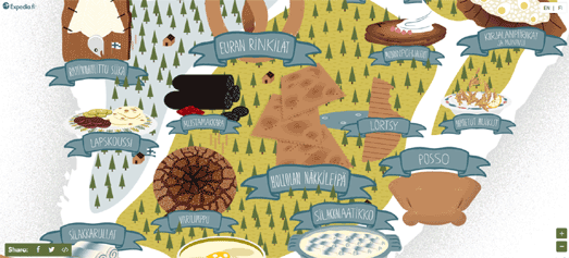
Of course many other towns and cities around the world have areas with thematically similar street names. For example the Swedish city of Gothenburg has clusters of streets named after musical instruments, dances, herbs & spices, and even astronomical entities (Planet St, Big Dipper St, North Star St). 

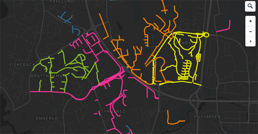
You can explore Gothenburg's street name clusters in more detail on a new interactive map.Silvia Hüttner's Lightyears, Mustard and Diamonds: The Fantastical Streetnames of Gothenburg is a lovely story map which takes you on a guided tour of the thematically named streets of Sweden's second largest city. This tour starts in the area around the city's biggest hospital, where appropriately the streets are named after famous doctors (Doktor Allard Gata, Doktor Salens Gata). Further south in the city is an area where the streets all have a radio theme (Shortwave St, Longwave St, Transistor St). Immediately next to the 'Radio Area is the 'Musical Instrument Area' where (you guessed it) all the streets are named after musical instruments (Piano St, Mandolin St). 

If Silvia's map has inspired you to create a similar map exploring thematically clustered streets in your town or city then you can explore the code for her map on GitHub.

Monday, June 15, 2020

How Far Can Your Drive in Two Hours?


Sweden's Public Health Authority is advising Swedes not to travel. However if traveling is essential it says that short trips of up to a two hour drive from your place of residence are permitted. To help people visualize how far they can drive in two hours the national public television broadcaster SVT has released an interactive isochrone map.

Så långt kommer du på två timmar (So how far can you get in two hours) uses OpenStreetMap data to work out how far Swedes can drive from any postcode address in the country. If you click on the map of Sweden a beautiful iscohrone visualization snakes out from your selected location showing how far you can drive in two hours time. Different colors are used to show the driving time to each location. The map also includes a driving time slider which allows you to adjust the driving time from a 10 minute drive to the full two hours.

Monday, November 12, 2018

Mapping the Norse World


The Norse World is an interactive map showing the locations mentioned in medieval Norse literature. The map is intended to be a resource for students of medieval Swedish and Danish literature and history. It provides an invaluable insight into what places were written about and how places & countries were perceived and visualized in Old Swedish and Old Danish in the Middle Ages.

If you select a marker on the map an information window opens listing all the known appearances of the selected location in medieval Norse literature. You can select the place-name itself in this list to learn more about the location and what type of locality it is. You can also select from any of the medieval texts in which the place-name appears. This will load a brief introduction to the selected medieval Norse text.

You can also use the search function to map individual works of Norse literature. For example if you search 'Ivan Løveridder' you can view all the locations around the world which appear in this medieval verse romance on the Norse World interactive map.


The medieval Icelandic family sagas are prose histories describing the lives of the first few generations of settlers in Iceland in the late 9th, 10th, and 11th centuries. The Icelandic Saga Map allows you to read each of the Icelandic Sagas alongside an interactive map showing the locations of all the places mentioned in these historic tales.

When you select an individual saga from the Icelandic Saga Map homepage you are presented with the text of the story alongside an interactive map. Locations in the saga are hyperlinked to the map. Therefore as you read the saga you can select place-names mentioned in the text to view its location on the interactive map. Alternatively you can click on the locations tagged on the map to jump to the parts in the texts where they are mentioned in the Sagas.

When reading an individual saga you can use the Sagas menu (top right) to also overlay the locations mentioned in any of the other Sagas on the interactive map.

Thursday, September 13, 2018

How Sweden's Election Changed the Map


Sweden's national public television broadcaster Sveriges Television has created an interesting data visualization of the votes cast in this week's Swedish election. It has mapped the overall winner in each election constituency to show where each political party won the most votes.

In the Swedish Vote each constituency is shown as a colored dot. The color of each dot represents the political party that received the most votes in that constituency. Using a dot to represent each constituency means that SVT quickly encounter a familiar problem when creating election maps. Sweden’s population is concentrated in the biggest cities. It is therefore harder to see all of the dots representing the constituencies in the tightly packed urban areas than it is to see the more spread apart dots representing the more rural constituencies.


SVT overcome this problem by changing the shape of the map. In order to make the election results more legible the broadcaster reshapes the country so that all the dots are easier to see. In other words data literacy has been improved at the expense of geographical accuracy. The resulting unfamiliar geography is partly overcome by animating between the more geographically correct map and the new cartogram.

This animating of the dots representing each constituency continues as you progress through the Swedish Vote. Later the dots are rearranged into a grid to show more clearly the number of constituencies won by each party. This grid and the cartogram are also repeated for the results of the 2014 election so that readers can compare the result of this year's election with Sweden's previous election.

Monday, September 10, 2018

Swedish Election Maps


Despite some nearly hysterical reporting on the Swedish Election (outside of Sweden) the far-right Sweden Democrats party failed to pick-up much support in yesterday's national election. The party achieved around 17.6% of the vote, far short of the 25% that many were predicting. The governing Social Democrats were the leading party with 28.4% of the vote. The largest center-right Moderate party picked-up 19.8%.

The election results mean that both the left and the right will struggle to put together a working coalition government. The result of this could be that the Sweden Democrats might have some influence, especially if the Moderate party of the center-right, decide to push anti-immigrant legislation in tacit agreement for parliamentary support from the Sweden Democrats.

You can view the results in more detail on the Aftonbladet interactive map of the election results. The map is colored to show the political party which won the most votes in each electoral district. The Aftonbladet election map shows that the Social Democrats were the biggest party in every region of Sweden, except for Stockholm, where the Moderates picked up the most votes.

If you want to know how an individual party polled throughout Sweden then you can select an individual political party to view a breakdown of their results across the country. Select an individual party and a choropleth view will show the party's support in all the different electoral regions. You can select individual regions on the map to view a more detailed local map showing the results in individual electoral wards.


The Daghens Nyheter interactive election map has exactly the same functionality as the Aftonbladet map. It allows you to see which political party won the most votes in each electoral district. You can also select individual political parties to see where they polled best throughout Sweden.

The far-right Sweden Democrats picked up their most votes in Sjöbo, Bjuv and Bromölla. Sjöbo is a town which has a long history of voting against immigration. Thirty years ago the town voted not to take any refugees. The Sweden Democrats party formed later that same year with the slogan "Sjöbo shows the way". The Sweden Democrats picked up 39.4% of the votes in Sjöbo.

Friday, April 13, 2018

Interactive Theme Park Maps


Kolmården Wildlife Park is Sweden's largest zoo. The park includes a dolphinarium, a cable car safari and two roller coasters. The Kolmården Wildlife Park website also includes a wonderful interactive park map.

The Kolmården Wildlife Park Karta shows the location of all the park's themed areas using an oblique stylized bird's eye view of the park. If you select any of the markers on the map you can drill down to view images of each of the park's separate areas. These close-up views include information about the animals that can be seen in each area and the facilities available to the park's visitors.

Each of these smaller area maps provide beautifully designed bird's eye views of the park. These images include little animations, often involving the animals themselves. You can click on most of the animals to learn more about these species in the park.


If you like park maps then you might also enjoy Disney's Walt Disney World map. Walt Disney's map uses the Google Maps API's Ground Overlay feature to overlay a custom made static map on top of the Google Maps base layer. This is a great way to create an impressive looking, distinctive map.

Of course to create such good looking park maps you need to start with a good custom designed static map. Luckily many theme parks already have beautifully designed static maps. It doesn't take too much effort to use these static maps as the basis for great interactive maps to help showcase a theme park on the Internet.

Wednesday, July 20, 2016

Explore a 5th Century Ring Fort in 3D


You can now explore a 3d model of an Iron Age ring fort discovered in Öland, Sweden on an Esri map. The Sandby borg ring fort was the site of a violent massacre in the 5th century and is currently being investigated by Swedish archaeologists.

The Esri Insider has a really interesting article on how archaeologists have been using drones (and a dog) to help map the fort, the houses it contained, as well as the violent end of the people who lived there. However if you visit the Sandy borg website you can step back into the past yourself and explore the ring fort on a wonderful 3d map.

The 3d map of the ring fort includes overlays which allow you to view the locations of some of the archaeological discoveries found in the fort and the fort's houses. If you use the links along the bottom of the 3d map you can view where objects have been discovered in 'house 4' and 'house 40'.

The Sandy borg website also has a map showing an aerial view of the whole archaeological site. This map uses categorized markers to show where various types of archaeological artifacts have been found during the team's investigation of the site.

Wednesday, June 22, 2016

Mapzen Captures Copenhagen for Sweden


In April Mapzen's Pelias geocoder accidentally started suggesting that Denmark's Copenhagen was in Sweden. Mapzen of course quickly rectified the mistake. However to atone for this error Mapzen has published an interesting article which explains how the mistake was made, how Pelias has been fixed and why Copenhagen is not in Sweden.

The Assault on Copenhagen is not only an interesting read in terms of how Pelias mistakenly placed Copenhagen in Sweden (damn those pesky centroids) but also a really interesting account of the Second Northern War, 1655-1660. In this little history lesson Mapzen explains how Denmark was able to hold on to Copenhagen despite a series of assaults on the city by Sweden.

The article is accompanied by an interactive map which illustrates how King Charles X advanced on Copenhagen in his attempt to capture the city for Sweden.

Monday, May 09, 2016

The Mapped Wonders of Nordic Food


Expedia has created two interactive maps which allow you to explore the wonderful delights of regional food in Sweden and Finland.

The Taste of Sweden uses Leaflet.js to create a gastronomic tour of some of Sweden's regional dishes. Thankfully the map also includes the recipes for each of the featured meals. This means that if you are tempted by the thought of Lappland's smoked reindeer stew or Medelpad's hare burgers you can simply click on the map to view each dish's recipe.


Blood Pancakes made with blood and flour are a popular dish in Southern Ostrobothnian in Finland. The people of Pori, Finland, however prefer a dish of Crucified Whitebait, consisting of a whitefish nailed to a wooden board.

If these dishes are beginning to make your mouth water then you might want to take a closer look at this map of dishes popular in different regions of Finland. The Flavours of Finland is a custom made map exploring the wonders of Finnish food. The map presents regional dishes and recipes which are popular, traditional or characteristic in different parts of the country. Select one of the regional dishes from the map and you can view the ingredients and a recipe for the dish.

Wednesday, April 06, 2016

The Illegal Map of Swedish Art


A Swedish map which does nothing but encourage and help people to find and view public works of art has been sued for violating copyright laws. Offentlig Konst is a Swedish interactive map of public art. It has just lost a case in Sweden's Supreme Court for copyright infringement.

Offentlig is a handy little map which can help you find nearby public statues and other public works of art. The map includes the name of each work of art, the name of the artist and a link to the artwork's Wikipedia entry.

It also used to include useful photos of each statue. Not any more. The Supreme Court of Sweden has ruled that it is illegal to provide free access to a database of art photographs without the artists' consent. Therefore Offentlig Konst can no longer show you a picture of a work of art, even when the artwork is in public ownership, on public display and sited in a public area,

Who said copyright laws were crazy?

Offtenling Konst is a project of Wikimedia Sweden. Wikimedia Sweden were sued by the Visual Copyright Society in Sweden. Apparently it is the job of the Visual Copyright Society in Sweden to make it more difficult to find works of art by Swedish artists.

The Wikimedia Blog has published an article looking at the Swedish court's judgement in more detail and Wikimedia's disagreement with the ruling.

Wednesday, March 16, 2016

The Street View Castle Tour


Expedia has created a really nice Street View tour of Malmö Castle in Sweden. The present castle was built in the 1530's by King Christian III of Denmark.

The Malmöhus Castle - Virtual Tour seems to have been made from custom Street View imagery captured by Expedia themselves. As you explore the castle in Street View you can click on the map markers to learn more about the castle and the historic paintings and objects it holds.

As you travel around the castle you can also listen to some audio recordings explaining the function of some of the castle's historic rooms.

If you feel inspired by Expedia's custom Street View tour then you might want to explore the Custom Street View section of the Google Maps API and the Street View Publish guide to submitting Street View imagery to Google Maps.

Thursday, February 04, 2016

Mapping the Changing Landscape


Tidskikaren is a fascinating interactive map which allows you to explore the dramatic changes in the landscape around the Julita Museum, in Södermanland Sweden, over the last four centuries.

The map includes a timeline which allows you to view the changing landscape over the centuries and a number of layers which allow you to view the changes to arable land, forests, meadows and pastures (or all four layers at once).

Once you select one of the different land types you can click on the information button to learn about the landscape changes for that type of land over the centuries (in Swedish). The map also includes a number of markers which you can select to learn more about the landscape changes in that region.


The Welikia Project is a similar map which allows you to explore a map of Manhattan, New York in 1609.

Before there was Manhattan there was Mannahatta. You can explore Mannahatta as it once was with the Welikia Project. The map provides an imagined satellite view of how Manhattan Island looked before New Amsterdam was established.

The project maps the natural landscape of New York's valleys, forests, fields, freshwater wetlands and salt marshes. If you click on any New York neighborhood on the Welikia Google Map you can discover a wealth of information about the area's ecology as it existed in 1609.

Wednesday, January 21, 2015

Mapping the Journeys of Syrian Refugees


Swedish radio station Sveige Radio has mapped the journeys of a number of Syrian refugees. Reporters from the station have been following the progress of over 70 Syrians over the past year, as they try to escape the crisis in Syria and enter 'Fortress Europe'.

At the heart of Sverige Radio's report on Fortress Europe is a CartoDB powered map. You can access the journeys and stories of the individual refugees (and their families) from the map menu. If you select a name from the menu you can view their path to Europe on the map and read details about their journey beneath the map.

The report on each individual or family includes details on their decision to leave Syria and the difficulties they faced in entering Europe. Many of the reports include an audio interview with the refugee.

Sunday, August 03, 2014

A New Type of Tourist Map


Taxi Stockholm has created a new kind of tourist map. A map which uses data from millions of taxi trips taken in Stockholm to identify the city's favorite destinations.

Taxi Trails has taken the data from all of Stockholm's GPS enabled cabs and used the Google Maps API to create a heat-map of taxi destinations in the Swedish capital. Taxi Stockholm believe that this heat-map is not only a beautiful data visualization but it can also be useful for tourists visiting the city.

The idea of visualizing taxi destinations on a map isn't new. For example we've recently seen a number of mapped visualizations of New York taxi data. For example, Hubcab is is a great map of New York taxi data, visualizing the destinations and pick-up points of 170 million taxi trips.

Taxi Stockholm's differs from Hubcab however in that it uses the taxi data as a starting point to discover the secrets of the city. If you are visiting Stockholm for the first time you can use the map to find popular hot-spots in the city.

For example, if you are looking for somewhere to go on a Saturday night, you can refine the map to show the most popular destinations for Stockholm cabs in the evening at the weekend. You can then zoom in on a hot-spot on the map and select the 'Explore this area' option. This will then drop markers on the map showing you bars and restaurants in the area. You can even scope out the area for yourself using Street View to see if look likes a good place to visit.

Saturday, July 19, 2014

All Aboard the Mapillary Train


Mapillary, the crowd-sourced alternative to Street View, is going off-road. Anyone can contribute to the Mapillary mission by uploading photos using the Mapillary smartphone apps. This has resulted in people adding sequences of photos to Mapillary mainly along roads but also along footpaths, ski slopes, from boats and from trains.

Yesterday I noticed that someone had added a great sequence of photos taken from the front of a train in Sweden. This means that you can now ride the Ystad to Malmo train on Mapillary. Here's a little user tip - click and drag up & down on the photos to quickly move forwards or back through the sequence of images. This helps to create an animated journey effect as you quickly move through the uploaded photos.

Check out the Mapillary homepage for the latest picture uploads and to view a map of the current coverage around the world.

Thursday, July 03, 2014

Bike Routing in Sweden


Trafiken.nu is a well thought out new bike route planning map for western Sweden. Enter a starting point and destination into the map and Trafiken will return a suggested bike route and an elevation chart of the route.

The map includes the locations of bike sharing stations with live bike availability data, bike stands, bike shops and pumping stations. The routing of the bike directions is built upon the Leaflet Routing Machine, an open source routing plug-in for the Leaflet mapping library. The plug-in itself includes geocoding support, the editing of start, waypoints and end points and the displaying of routes.

Saturday, March 22, 2014

The Best Mortgage Rates on Google Maps


We do like a first on Google Maps Mania and this is definitely the first map of mortgage interest rates that we have seen. SvD Näringsliv has released a Google Map that allows its readers to add the location of their bank to the map and indicate how much their mortgage interest rate is.

Other users can then use the map to research banks in their area to discover which ones are offering the best mortgage interest rates. They might even discover that their own bank has offered someone else a lower deal and can then use the information to try and renegotiate their own interest rate.

The SvD's Räntekarta includes a number of useful controls that allow the user to filter the banks displayed on the map. The slide control at the bottom of the map allows you to filter the results by the interest rates charged. If you only want to view banks offering rates between 4-6% you simply adjust the sliders to filter the results shown on the map.

The menu in the map sidebar allows you to filter the results by bank name or by location.

Friday, March 08, 2013

The Real Heat Map of Sweden


Temperatur.nu is a real heat map of Sweden. The map displays current temperatures in the country and a handy heat map overlay provides an overview of current temperatures across the country.

The heat map uses darker shades of blue to show colder temperatures. At the moment Sweden is looking very cold indeed so the colour blue dominates the map. I guess we will have to visit the map again in the summer to find out how the heat map represents warmer temperatures.

Monday, February 11, 2013

Environmental Toxins on Google Maps


The Swedish Newspaper Aftonbladet has used Google Maps and CartoDB to create a map of the locations of environmental toxins in Sweden.

On the map are over 7,000 areas where there may be environmental toxins and the newspaper's readers can enter any address to find out which toxic areas are nearby. Readers can then click on the individual map markers to find out details about the polluted location and the level of risk.

Wednesday, October 10, 2012

Indian Railways Live on Google Maps


There are a lot of real-time Google Maps of train systems around the world. Now we have one for the largest democracy in the world.

RailRadar allows users to view the entire Indian rail network on a Google Map. The map shows the live locations of all trains on the Indian railways in real-time. The map updates about every five minutes so the exact position of the trains may be a little out.

If users click on an individual train map marker they can view the train's starting point and destination and also the train's next scheduled stop. The map also displays the overall status of the network, showing the percentage of trains on the network running on time and the percentage that are currently delayed.


Tagkarten is a real-time animated map of the Swedish rail network.

Green map markers show trains that are currently running on time and red markers indicate trains that are running late. If you click on a train's marker you can also view its starting point and destination.


Stops.lt is a real-time animated map of buses in Vilnius, Lithuania.

This map uses numbered map markers so users can tell at a glance the location of any bus. Users can also click on bus-stop markers to view which buses they can catch from a stop and find out when the next buses are scheduled to arrive.