Showing posts with label weather. Show all posts

Friday, September 05, 2025

The 2025 Fall Foliage Map

The nights are beginning to draw in which can only mean one thing: autumn is nearly upon us! And for "leaf-peepers" everywhere, that means it's time to consult the annual Smoky Mountain 2025 Fall Foliage Map. This incredibly popular interactive map is back to help you predict the best time to see the vibrant reds, oranges, and yellows of fall across the United States.

Every year, Smoky Mountain releases this map, which plots the predicted progression of fall colors across the contiguous United States. Using a sophisticated data model that incorporates historical and forecasted temperature and precipitation, as well as tree types, the map provides a county-by-county forecast.

The map's interface is straightforward and user-friendly. A date control at the bottom allows you to slide through the weeks, from early September to late November, to see the expected leaf color progression. It's a fantastic tool for planning a scenic drive or a hiking trip to catch the leaves at their peak.

Also See:

  • Explore Fall's Fall Foliage Map 2025 - this is a great alternative fall foliage map that provides a real-time, frequently updated map based on 'the latest reports gathered from hundreds of sources throughout the country'.
  • New England Fall Foliage Map - if your interest is more regional, this map focuses specifically on the progression of colors throughout New England.

Wednesday, September 03, 2025

Fall is Warmer Now

Meteorological fall started on September 1, but if you live in the contiguous U.S., you may not have noticed the typical crisp, cool air. That's because the season has been steadily warming for decades. Since 1970, average fall temperatures have risen in every single county in the country.

On average, fall temperatures are now a remarkable 2.8°F warmer than they were in the early 1970s. This might seem like a small number, but it has significant impacts on our environment, from delayed leaf changes to extended allergy seasons. It's a clear signal of our changing climate, right in the middle of a season we often associate with cooling down.

You can explore how much warmer autumnal temperatures are where you live on Climate Central's Fall Warming. The map reveals that the Southwest is experiencing some of the fastest-rising fall temperatures, with many counties in New Mexico and Arizona seeing rises of over 4°F.

You can click on individual counties on the interactive map to see the change in average fall temperature (°F) since 1970. For a deeper dive, you can download a static image of the map and line charts showing the average rise in fall temperatures from Climate Central's 2025 2025 Fall Package.

Saturday, June 21, 2025

Google's AI Hurricane Predictor

Google has launched a new interactive map, Weather Lab: Cyclones, which shows AI-generated tropical cyclone forecasts and allows you to compare how different AI forecast models perform in comparison to  traditional physics-based models.

If you’ve ever wondered how different forecasting models "see" a storm before it hits, or how accurate those predictions really are, Weather Lab: Cyclones provides a powerful new way to explore just that. 

The centerpiece of Weather Lab: Cyclones is an interactive map that visualizes tropical cyclone tracks from both AI models and traditional physics-based models. It lets users explore the evolution of storms across time and across different predictive models.

Using the map you can select to view the historical tracks of hurricanes and toggle between different models to see how each predicted the path of a tropical cyclone. These comparisons allow you to evaluate how closely the AI models align with actual storm behavior and with more established forecasting systems.

Google is keen to point out that Weather Lab: Cyclones is experimental and it is not intended for public weather alerts or emergency planning. For official forecasts, you should always refer to national meteorological agencies.

Via: Webcurios

Monday, June 02, 2025

The Start of Hurricane Season

Hurricane season in the Atlantic Ocean officially begins on June 1 and ends on November 30 each year. The peak of hurricane activity typically occurs from mid-August to late October, with September 10 often cited as the statistical peak of the season. During this time, meteorologists and emergency planners closely monitor tropical systems and prepare for potential impacts to the U.S., Central America, the Caribbean, and parts of Canada.

To coincide with the start of the 2025 hurricane season, 157mph.com has released a new series of annual and decade-based hurricane maps. The Season Data maps allow users to view all hurricane tracks for each year since 2000, while the Decade maps provide historical context with storm data going back to the 1850s. For example, the animated GIF at the top of this post cycles through the hurricane tracks from each year in the 1990s.

On the yearly maps, users can explore all hurricane tracks for a specific year, with the ability to filter by storm type (hurricanes, tropical storms, or tropical depressions), landfall status, or individual storm name. Each track includes circular timestamps that can be clicked to reveal wind speed and atmospheric pressure at that specific point. These circles are color-coded to indicate the storm category at each timestamp.

You can discover how many hurricanes have passed near your home over the decades using StarNews’s Hurricanes that passed near me map. Simply enter your address to view the tracks of all hurricanes and tropical storms that have occurred near your location since the mid-19th century.

NOAA’s Historical Hurricane Tracks map also provides access to global hurricane data dating back as far as 1842. Using this interactive tool, you can search and visualize hurricane tracks by storm name, location, or date. For example, entering a storm like Hurricane Sandy (2012) displays its full track on the map. Data points along the track allow you to explore daily details such as wind speed and atmospheric pressure.

NOAA’s database includes records for more than 13,000 storms.

Saturday, May 31, 2025

Is it Hot Right Now?

Is the UK hot right now? is a new interactive map that displays live, hour-by-hour temperatures across the country and shows how these temperatures compare to the historical average.

On the map, colored numbered markers indicate how much the current temperature is above or below the average at various locations. Clicking on a location’s marker opens a chart showing all recorded temperatures at that site since 2000. This chart includes a line representing the mean temperature, along with an evaluation of how the current temperature compares to the long-term average.


The UK version of the temperature comparison map was inspired by the Australian website Is it hot right now?. The concept offers a powerful visualization of climate data, and by comparing current temperatures with historical norms, it succeeds in making global warming feel far more tangible and relatable.

Is it hot right now? has proven to be a compelling, data-driven communication tool in the climate change conversation, prompting versions to emerge in other countries. In addition to the Australian and UK versions, there is a Spanish version - Es hoy un extremo? - and a German version - Ist es heiss? - (limited to the city of Bochum).

Friday, May 23, 2025

Underwater Weather Forecasts

Current Map by Current Map is a powerful tool for visualizing ocean dynamics. This interactive map uses animated streamlines to depict tidal currents in coastal areas of the United States, offering high-resolution, real-time, and forecasted ocean current data. It's a practical, visually striking resource for sailors, scientists, and anyone with an interest in the ocean’s ever-changing tidal forces.

Animated streamlines are often used on interactive maps to visualize real-time and forecast wind currents. This is the first time I've seen them used for actual water currents. The use of animated streamlines on a map was I believe first demonstrated on Fernanda ViƩgas and Martin Wattenberg's Wind Map. Cameron Beccario further developed the concept by utilizing animated streamlines on a fully interactive map in his popular Earth Nullschool visualization of global weather conditions.

Behind the scenes of Current Map, sophisticated physics models simulate real-world ocean conditions, taking into account factors like tides and wind forcing to produce accurate short-term forecasts. Users of the map can explore these tidal forecasts directly in their browser, or download GRIB files for use with navigation software, making the data accessible even when offline. 

Wednesday, May 14, 2025

Europe in Drought

Spring 2025 has been exceptionally dry in Europe, with nearly every country affected by drought. To help monitor the increasing threat of drought due to global heating, the European Environment Agency (EEA) has launched a new interactive drought map. Updated monthly, the tool provides near real-time insights into drought conditions across the EEA’s 38 member and cooperating countries.

The Drought Conditions Map currently shows that around 38% of the mapped area experienced drought between 11–20 April 2025. It highlights severe impacts across much of northern and eastern Europe during April. An accompanying pie chart reveals that 15% of European cropland was exposed to drought in the same period.

The map features multiple data layers, allowing users to track drought effects across different ecosystem types, including cropland, grassland, heathland, wetland, and urban areas in the 38 countries covered.

The European Drought Observatory (EDO) map includes the UK in its assessment of European drought conditions, where extremely dry weather is also being observed. The latest data reflects conditions from the last ten days of April 2025.

Currently, 31.3% of the monitored area is under ‘Warning’ status. The EDO cautions that if these conditions continue, impacts on vegetation are likely to become apparent in the coming months. Many European rivers are already reporting abnormally low water levels, raising concerns for ecosystems and water supplies.

Tuesday, February 04, 2025

It's Groundhog Day (Again & Again & Again)

It was Groundhog Day on Sunday. Punxsutawney Phil of Gobbler’s Knob saw his shadow, and according to tradition, this means there will be six more weeks of winter.

However, Punxsutawney Phil's prognosis of an extended winter was not universally accepted by all the groundhogs of North America. This is why you need the Groundhog Map.

If you don’t trust Punxsutawney Phil’s forecast, the Groundhog Map offers 84 other groundhog predictions to consider. The map compiles the annual weather predictions of groundhogs across the United States and Canada, harnessing the collective wisdom of the burrow to provide a crowd-sourced critter climatological forecast.

This year, 55% of all groundhog predictions actually forecast an early spring. So, at least for this year, Punxsutawney Phil is in the minority with his prediction of a long winter.

The Groundhog Map also features an API. The Groundhog Day API allows users to access data on past predictions from individual groundhogs, as well as aggregate yearly data comparing the number of early spring forecasts to predictions of longer winters.

Of course, whether you trust a single seasoned marmot or the wisdom of the burrow, one thing is certain - spring is coming. Until then, you can either embrace Phil’s prophecy and dust off your snow shovel, or side with the majority of groundhogs and start shopping for sunglasses. Either way, at least now you have data-driven rodent meteorology to back up your decision.

Friday, January 31, 2025

Rain and Snow Effects for Mapbox

3d map of Grand Army Plaza in New York with animated wind and rain visuals

Mapbox GL now offers the option to add dynamic rain and snow effects to your maps. These new visual weather effects use particle animations to create realistic precipitation on any Mapbox GL map.

You can easily add these effects to your maps using the following functions in your JavaScript code:

map.setRain or map.setSnow

Both the rain and snow effects come with several customizable parameters that allow you to fine-tune their appearance. These include:

  • Density: Controls the number of particles.
  • Opacity: Adjusts the transparency of the effect.
  • Speed: Defines how fast the particles move.
  • Color: Modifies the color of raindrops and snowflakes.
  • Size: Changes the size of the particles.
  • Direction: Determines the movement direction of the precipitation.

You can experiment with these parameters in the Rain and Snow Playground. Once you’ve created an effect you like, you can copy and paste the corresponding JavaScript code into your project. Additionally, these parameters can be adjusted dynamically. For example, you can modify the particle animations in real-time based on live wind direction data for a given location.

Maplibre Snow Effect

With a little help from ChatGPT I was able to create a snowflake effect for Maplibre in under five minutes. If you want to use this effect yourself then you can clone the code my map's Glitch page.

Thursday, December 19, 2024

The Coldest Day of the Year

map of the USA, showing the date of the average coldest day across the country

Did you know the coldest day of the year doesn’t arrive at the same time for everyone in the U.S.? While Groveland, California, is shivering through its chilliest day today, parts of the East Coast are still weeks away from their coldest temperatures. This is because the coldest day of the year, on average, occurs at least a month earlier on the western seaboard than on the eastern seaboard of the United States.

According to NOAA's Coldest Day of the Year interactive map, the farther west you are in the United States, the more likely it is that you have already experienced the coldest day of the year. The map is based on 30 years of temperature data and shows the average coldest day of the year at thousands of weather stations across the country. 

NOAA explains that in the eastern part of the United States, the "coldest day of the year is typically later ... thanks to cold air from snow-covered parts of Canada dipping down into the area."

Thanks, Canada!

If you want to know when the first snow of the year is most likely to fall, you can refer to NOAA's handy interactive First Snow Map. This map provides a nationwide guide to when you can expect the first snow of winter. It displays the date at your location when the chance of snow is at least 50%, based on historical weather records from 1981 to 2010.

Latitude and altitude play the biggest roles in determining when you are most likely to experience snow. On average, the farther north you are and the higher your altitude, the earlier you are likely to see snow.

Thursday, October 10, 2024

Real-Time Animated Wind Maps

animated visualization of Hurricane Milton over a map of Florida

In recent weeks, ferocious winds have dominated the headlines. The devastating impact of Hurricane Milton, arriving so soon after Hurricane Helene rampaged through Florida, has left many communities reeling from the destructive power of these tropical storm-force winds. 

In the last fortnight, I've often found myself drawn to Earth Nullschool's real-time map of global wind conditions. At the time of writing, Earth Nullschool shows the eye of Hurricane Milton centered northwest of Orlando (animated map above).

Earth Nullschool is just one of several interactive maps providing near real-time maps of current wind conditions. Windfinder uses data from over 20,000 weather stations worldwide, along with the National Oceanic and Atmospheric Administration (NOAA), to provide real-time wind reports. The map offers real-time and forecasted wind speeds, wind direction, air temperature, and other meteorological data, with global wind forecasts available up to 10 days in advance.

Windy.com also offers a real-time map of global weather conditions. Windy.com includes a timeline feature that allows users to view an animated forecast of the upcoming week's wind patterns. This feature can help you track Hurricane Milton as it follows its predicted path out into the Atlantic Ocean.

Tuesday, July 16, 2024

Your Urban Heat Island Score

Climate Central has mapped out the urban heat island hot-spots in 65 major U.S. cities. Each city map on Climate Central's Urban Heat Hot Spots shows an Urban Heat Island (UHI) Index score for each census tract, revealing where UHI boosts temperatures the most and least in each city.

As well as providing individual UHI maps for 65 cities Climate Central has also released a national interactive map which shows how much additional heat communities across the country face due to living in a built environment. The UHI Index score for each city census tract is based on an estimate of how much the urban environment increases temperatures. The estimate is based on local factors such as land cover types (green spaces, paved etc), building height and population density. 
 

Urban heat islands are areas of towns and cities which can become unbearably hot, especially on days with extreme heat. These areas can often become 10-20 degrees warmer than other areas in the very same city. A lack of trees and tree cover in cities is one of the biggest causes of urban heat islands. Urban heat islands tend to occur in areas with the densest built environments and with very little shade provided by tree canopy cover.

The US Tree Equity Score map can help you to quickly determine those neighborhoods in your city that are most in need of increased tree canopy cover. If you click on a neighborhood on the Tree Equity Score map you can discover its 'tree equity score', the current percentage of tree canopy cover, and the local levels of air pollution. The 'tree equity score' uses a range of factors to calculate "how well the benefits of trees are reaching communities living on low incomes and others disproportionately impacted by extreme heat, pollution and other environmental hazards."

Monday, June 03, 2024

Find Your Nearest Hurricane

map showing historical hurricane tracks over Miami, Florida

As this year's hurricane season gets underway StarNews has released an interactive map which allows you to see how many tropical storms have passed near your home since 1851. Enter your address into the Hurricanes that passed near me map and you can view the tracks of all the hurricanes and tropical storms that have occurred near your home since the middle of the 19th Century. 

The StarNews map uses data from the National Oceanic and Atmospheric Administration (NOAA) to show historical storm paths over your entered address. If you click on any of the red tracks shown on the map you can learn the name of the storm. Click on the radius points along a storm path and you can view data about the recorded strength of the storm at the selected location.

NOAA's interactive map also showing historical hurricane tracks over Miami, Florida

NOAA's Historical Hurricane Tracks map also allows you to view global hurricane data dating back as far as 1842. Using the map you can search and visualize hurricane data by storm name, location and by date. If you enter the name of a hurricane (for example 2012's Hurricane Sandy) you can view the hurricane's track on the map. Points along each hurricane's track allow you to view details about the wind speed and pressure for each day.

The NOAA database has over 13,000 storm tracks on record. If you click on the track of an individual storm on the map you can view more details about that storm. This information includes data on the storm’s maximum wind speed and minimum pressure. The storm's track will now also be colored on the map to show the storm's recorded wind speed along its complete path.

Saturday, May 04, 2024

540 Million Years of Planet Earth

an animated 3D globe showing how the world's climate has changed over the last 540 years

540 million years ago the Earth's climate was very different from how it is today. During the Cambrian period global temperatures were warmer than they are now. It is believed there were no polar icecaps and there was likely to have been high levels of precipitation and humidity over much of the planet. Of course our world hasn't always been so warm. The last Ice Age was during the Pleistocene Epoch, around 20,000 years ago. During this period around 30% of the Earth's surface was covered by ice.

You can explore the history of the world's climate for yourself at the Climate Archive. The Climate Archive is an amazing interactive map which allows you to view animated simulations of the Earth's climate for the last 500 million years. Select an era of Earth's history from the map's timeline and you can view animated layers showing precipitation, wind and temperature conditions around the globe during your selected period.

animated map showing the development of the Earth's continents over the last 540 million years

If you aren't interested in the climate then you can instead use Climate Archive to view the evolution of the Earth's continents over its long history. Just turn off all the animated climate layers (listed under 'Layers in the left-hand sidebar). You can then use the timeline below the map to view the development of the Earth's continents over the duration of the last 540 million years, from the Cambrian period right-up until the Cenozoic (Earth's current geological era).

But forget about the past. I;m sure you are more interested in discovering how the Earth's climate might change over the next 1 million years. Select Next Million Years from the map sidebar and you can view an animated globe showing the Earth's climate "over the next one million years following a brief but strong anthropogenic warming".

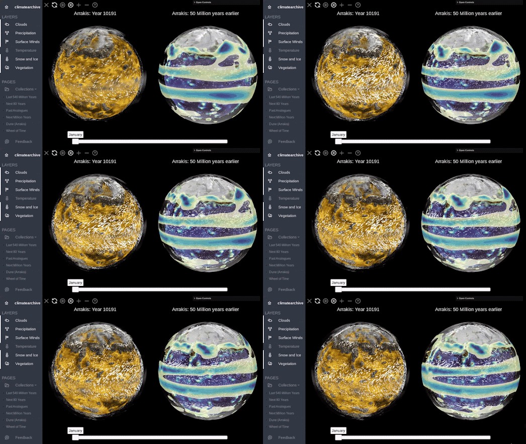
two animated globes comparing the Arrakis of now with the Arrakis of 50 million years ago

Having mapped out the Earth's climate for the past 540 million years Climate Archive decided to move on to also map out 50 million years of climate change on the fictional planet of Arrakis. Fans of Frank Herbert's Dune series of novels (or the recent movies) will be aware of the tough desert conditions on the planet Arrakis. But did you know that 50 million years ago Arrakis was covered in water?

Select the Dune link in the left-hand menu and you can view a 3D globe of the fictional dry desert planet of Arrakis, as it appears in the novels and the films. You can also view a 3D globe showing the climate on Arrakis 50 million years ago, when 91% of the planet was covered by oceans.

a globe of Radland

After mapping 540 million years of Earth's climate history and 50 million years of the climate on Arrakis Climate Archive also decided to map the climate on Randland (the world which features in The Wheel of Time novels by author Robert Jordan - dubbed 'Randland' by some readers).

The Randland 3D globe features an animated layer simulating the yearly climate on the planet. Having never read the novels myself I cannot testify to the accuracy of this climate model. If you don't think the climate is accurate then you can always use the layers menu to turn off all the climate layers, and just peruse the 3D globe of Randland on its own.

Monday, April 29, 2024

Weather or Not

Weather or Not's temperature map of the US

Do you dream of the perfect vacation weather? Sunshine on the beach, crisp mountain air, or vibrant fall foliage?  Imagine a tool that helps you find the ideal destination for your desired climate, anywhere in the country and for any month of the year.  This is the promise of Weather or Not, a new interactive map that leverages average weather data to recommend the best time to travel to any location. 

Weather or Not promises to help you discover the best time of the year to travel to different parts of the US if you want to experience your ideal temperature conditions. Enter your ideal temperature range (eg 60-80 Fahrenheit) into Weather or Not and the map will color every US county based on the time of year when you are most likely to encounter your ideal weather conditions in that county.

If you are planning a vacation then you can use the map to find which counties will most likely fall within your perfect temperature range in the month that you wish to travel. Select a month from the drop-down menu and change the view option to 'Yes/No'. The map will then color each US county based on whether it is likely to fall within your ideal temperature range in the month that you wish to travel. 

animated map showing average daily temperatures across the US over the counrse of one year

We all have our own ideas about what the ideal weather conditions actually are. myPefectWeather is another interactive map which can help you find the locations in the United States which most closely match your own preferred temperatures, precipitation levels and /or amount of snowfall.

If you select the 'options' button on the myPerfectWeather map menu you can begin to discover the locations across America which most resemble your ideal climate zone. For example - if you select 'the average high temperature' filter then you can enter your desired range of maximum temperatures. The map will then adjust to visualize the places that most closely match your preferred temperature range. 

You can also filter the map by average daily precipitation, average daily snowfall and comfortable weather days. You can also view a detailed breakdown of the annual weather conditions in any city by using the map's search box.

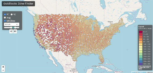
US map colored to show the number of days in the year that each location is likely to experience temperatures between 40 & 80 degrees

The Goldilocks Zone Finder is an interactive map which can also help you find the location in the United States which has your perfect year-round temperatures. Just tell the map the hottest and coldest temperatures that you are happy to live with it and it will show you a map displaying the number of days per year which fall within your own personal Goldilocks temperature zone, for all locations across the United States.

The Goldilocks Zone Finder was created by Luke Champine who wanted to find a place to live which fell within his own personal temperature preferences. The map uses data from NOAA's 30 Year Climate Normals, which uses 30 years of weather measurements taken across the United States to calculate daily temperature averages. The NOAA Climate Normals also includes averages for precipitation and other climate variables but these are not included on the Goldilocks Zone Finder.

Saturday, April 27, 2024

The US Heat Risk Map

map of the USA showing areas with possible extreme heat

A new interactive map has been released to help warn Americans of extreme temperatures. The new HeatRisk map provides a weekly forecast of the lower 48 states showing where temperatures may be high enough to harm people's health.

On the HeatRisk map areas are colored to show the forecast risks of extreme heat, using a color ramp that proceeds from green (little or no risk) to magenta (rare and/or long-duration of extreme heat). If you click on the map you can also view the forecast high and low temperatures for each day of the next week at that location.

You can also access the HeatRisk map on the CDC website. The CDC map includes a search option to get a weekly HeatRisk forecast for your zip-code area. The CDC’s map also includes links to guidelines on preparing for extreme heat and how to stay safe in high temperatures. The CDC's Heat and Health Tracker is another useful resource. This tracker includes a map showing the current rate of emergency department (ED) visits associated with heat-related illness across the US.

If you are affected by extreme temperatures then you might also want to bookmark the US government's National Integrated Heat Health Information System. This agency also provides a map of current heat forecasts as well as an EMS HeatTracker Map (showing where Emergency Medical Services are currently seeing an increase in heat related emergencies).

Thursday, January 25, 2024

When is the Coldest Day of the Year?

The coldest day of the year on average occurs at least a month earlier on the western seaboard than it does on the eastern seaboard of the United States.According to NOAA's Coldest Day of the Year interactive map the further west you are in the United States then the more likely you are to have already experienced the coldest day of the year.

NOAA's Coldest Day of the Year map uses 30 years of temperature data to show the average coldest day of the year at thousands of weather stations across the United States. NOAA explains that in the East of the country the "coldest day of the year is typically later ... thanks to cold air from snow-covered parts of Canada dipping down into the area". Thanks Canada.

If you click on a marker on the map you can view the exact date of the average coldest day of the year at that station. The map includes a static key for the colors used on the map. Ideally this scale would also be a filter to control the results shown on the map by date. This would enable the user to more clearly see which areas of the country experienced their coldest temperatures on specific days.

If you have already passed your coldest day of the year then you might want to look forward to your last spring freeze. NOAA's Average Date of Last Spring Freeze interactive map visualizes the last day (on average) when there is a chance for freezing temperatures where you live.

NOAA's last spring freeze map uses temperature data from 1991-2020 captured from weather stations across the United States. The colored dots on the map indicate the average date on which the chance of freezing temperatures drops below 50 percent at each location. 

If you click on a dot on the map you can view the actual date of the average last frost for the selected weather station. Shades of purple are used for locations where the last frost normally occurs before the first day of spring (in mid-March). Weather stations colored with a shade of green indicate locations where the last frost usually comes after the first day of spring. 

If all this talk of freezing temperatures leaves you feeling a little cold then you might want to look forward to the hottest day of the year. NOAA's Warmest Day of the Year map shows the warmest day of the year on average across the United States In most of the United States the hottest day normally occurs between mid-July and mid-August - so you've still got a little time left to order in some sun cream.

Wednesday, October 11, 2023

Mapping the Causes of Haze

The Straits Times has published a fantastic visualization of how burning peatlands in Indonesia can lead to hazy conditions and dangerous air pollution in Singapore.

In Why the Haze has Reached Singapore's Shores Again the Straits Times has created a stunning computer simulation of the 2019 haze which affected Singapore. The simulation uses an animated smoke layer to illustrate how burning peatlands in Indonesia creates smoke which is then blown by the wind over Singapore. Further mapped simulations in the article explain how Indonesia's burning peatlands are a result of deforestation by palm oil plantations and of climactic events such as El Nino.

Why the Haze has Reached Singapore's Shores Again is just the latest in a number of truly outstanding mapped data visualizations produced by the Straits Times. These include Singapore 2030 - an interactive 3D mapped tour of some of Singapore's development plans, Singapore Underwater - a VR simulation of rising sea levels, and The Colourful History of Singapore's Street Names - a mapped analysis of the historical and cultural influences on Singapore's road names.

Via: Datawrapper's Data Vis Dispatch

Thursday, October 05, 2023

Your Perfect Weather Map

We all have our own ideas about what the ideal weather conditions actually are. myPefectWeather is an interactive map which can help you find the locations in the United States which most closely match your own preferred temperatures, precipitation levels and /or amount of snowfall.

If you select the 'options' button on the myPerfectWeather map menu you can begin to discover the locations across America which most resemble your ideal climate zone. For example - if you select 'the average high temperature' filter then you can enter your desired range of maximum temperatures. The map will then adjust to visualize the places that most closely match your preferred temperature range. 

You can also filter the map by average daily precipitation, average daily snowfall and comfortable weather days. You can also view a detailed breakdown of the annual weather conditions in any city by using the map's search box.

The Goldilocks Zone Finder is an interactive map which can help you find the location in the United States which has your perfect year-round temperatures. Just tell the map the hottest and coldest temperatures that you are happy to live with it and it will show you a map displaying the number of days per year which fall within your own personal Goldilocks temperature zone, for all locations across the United States.

The Goldilocks Zone Finder was created by Luke Champine who wanted to find a place to live which fell within his own personal temperature preferences. The map uses data from NOAA's 30 Year Climate Normals, which uses 30 years of weather measurements taken across the United States to calculate daily temperature averages. The NOAA Climate Normals also includes averages for precipitation and other climate variables but these are not included on the Goldilocks Zone Finder.

The Goldilocks Zone Finder currently only works for the United States but if you are interested in building a similar map for another country the code for the project is available on GitHub.

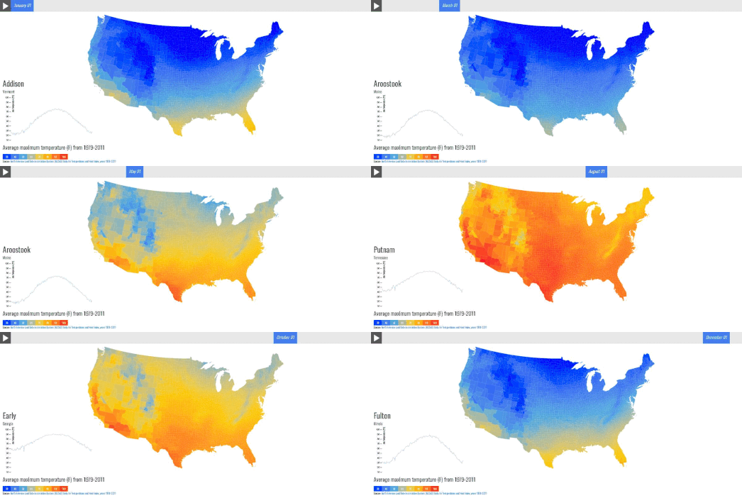
If you want to explore local average temperatures by day of the year in a little more detail then you might also like the County Climate interactive map. This map shows the average maximum temperature in every county for every day of the year. 

If you select a date from the slider at the top of the map you can view the average temperatures on that day across the whole country. If you select a county on the map you can also view a graph showing the average maximum temperature in that county for each month of the year (based on temperature data from 1979-2011). 


The temperature may not be the only data that you want to consider in your attempts to find a location which has your perfect weather. In that case you could use Peter Kerpedjiev's map of annual worldwide weather data. The map uses historical climate data from Wikipedia's city 'weather boxes' to visualize how weather changes during the year around the world.

Using the Sunshine Map it is possible to view the number of hours of sunshine across the globe for every month of the year. The map also allows you to view the changing rates of precipitation, the highest & lowest temperatures, and the amount of snowfall. 

The Sunshine Map uses Jason Davies' D3 voronoi library to divide the world up into regions based on the closest city with Wikipedia climate data. This does mean that where Wikipedia only has a few cities with climate data.the Voronoi areas can be quite large.

Wednesday, October 04, 2023

The 10 Day Fall Color Forecast

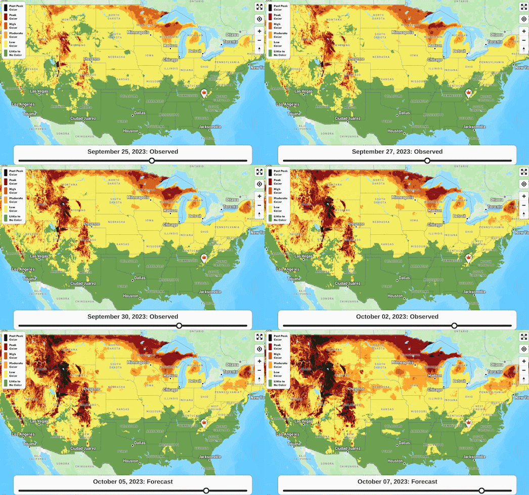
The Fall Foliage Map 2023 is an interactive fall foliage map which is updated daily to provide you with both an accurate progress report of fall colors and a forecast of how fall colors in the United States are likely to change over the next ten days.

According to Explore Fall the main factors influencing fall colors are the temperature and daylight. The Explore Fall predictive fall color model uses real-time weather conditions and user submitted fall foliage reports to forecast fall foliage colors throughout the Lower 48.

The Fall Foliage Map shows the observed fall foliage colors for every day since September 1st. You can use the map's date control to view the observed fall colors for any day. You can also use this control to explore Explore Fall's ten day forecast of how fall colors are predicted to progress in the next few days.

Every year Smoky Mountain releases their own interactive Fall Foliage Map, which plots the annual progress of when and where leaves change their colors across the United States. The Fall Foliage Map uses historical weather records from all 48 continental states to predict the arrival of fall at the county level across the contiguous United States. This map also includes a date control which allows you to view the leaf color you can expect for any date from the beginning of September through to the end of November.