Showing posts with label News Maps. Show all posts

Tuesday, September 02, 2025

Humanizing a Sea of Dots

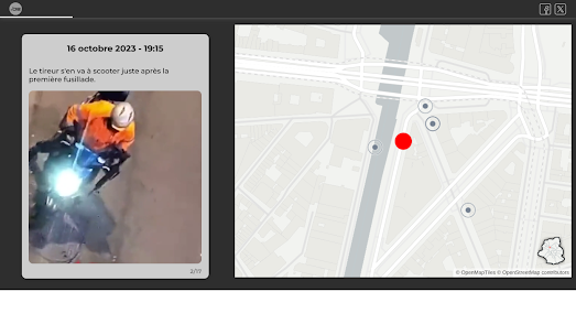
Dot maps can be a powerful way to convey the scale of large numbers. But when each dot represents a human life, there’s a risk that the individual stories behind those numbers will be lost. Reuters’ latest visualization of European migration tackles this challenge head-on: instead of starting with statistics, it begins with a close-up of a single overcrowded boat, allowing viewers to see the people on board before zooming out to reveal the thousands who have died or disappeared while attempting to cross the Mediterranean Sea.

Reuters’ latest story on migration routes to Europe features a striking 3D visualization of a boat full of migrants. This close-up view of a 3D model then seamlessly transitions to an overhead map view, showing the boat adrift in the Mediterranean Sea. By beginning with a realistic depiction of people precariously packed into a small vessel, the piece powerfully humanizes the thousands of yellow dots on the map - each representing a migrant who has died or disappeared while attempting to cross the Mediterranean since 2015.

Last year, at least 3,812 people died while trying to reach Europe. In Stranded at Sea, Reuters explains how Europe’s renewed focus on deterring migrant crossings has left distress calls unanswered by government agencies. At the same time, Italy has introduced policies aimed at limiting the number of NGO rescues in the Mediterranean.

Towards the end of the article, Reuters returns to its 3D model to show how the overloaded boat set off from Libya with an engine too small for the number of passengers on board and with insufficient fuel to reach its intended destination. Illustrations of the boat also highlight how, because the vessel was so overcrowded, it sat lower in the water and was therefore more easily overwhelmed by waves that at this time of year “can be up to around two metres high.”

Saturday, July 19, 2025

The Global News Map

Over the years, there have been many attempts to map the news. With the advent of AI and its ability to automatically detect locations mentioned in news articles, we're now seeing a resurgence in News Maps.

The latest of these is Needle, which uses a large language model (LLM) to "best estimate general locations of stories posted in the past day, and pin them on the map." Using the map, you can zoom in on any location in the world to explore the latest news. According to Needle's 'About' page each story location is determined based on a hierarchy: if a specific place is mentioned, the story is pinned there; if only a city is named, the pin is placed randomly within city limits; and if only a country or region is referenced, it's placed somewhere within that broader area. However, as the creators note, AI isn't perfect - so a story’s location on the map doesn’t always mean it’s truly tied to that place.

One major drawback of Needle at the moment is its limited range of news sources. The creator notes that the map is currently "limited to mostly Canadian sources of news." This is especially apparent in places like London, where today's top stories include how King Charles misses Canada and how a Canadian female soccer player has signed with a London team.

However, there is a filter option to select news sources by the "United States" - so if you're American, you may be able to sidestep the map’s Canadian bias. Needle is also looking to expand its news source database and anyone can suggest new sources by emailing Needle.

Other filter options allow users to refine the stories shown on Needle by category, including Politics, Sports, Business & Economy, Technology, and Environment & Climate.

Monday, July 14, 2025

The Death of Local News

One in three U.S. counties now has no full-time local journalist - a staggering 75% decline over the past 23 years. This collapse means communities across the country lack "even one full-time reporter to cover all of the schools, the town councils, the economic development projects, basketball games, environmental decisions, local businesses, and local events."

To document this crisis, Rebuild Local News and Muck Rack partnered to create the Local Journalist Index 2025, which maps journalist staffing in every U.S. county. The report analyzes data from over 100,000 journalists and 3.5 million daily articles tracked by Muck Rack’s platform, using a metric called "local journalist equivalents" (LJEs) to account for part-time and freelance work.

An interactive map in the report reveals the stark, nationwide scale of the decline. The erosion of local news isn’t confined to specific regions - it’s a universal crisis. As the report notes, the "evaporation of local news coverage has hit small towns and big cities, suburbs and rural areas alike."

You can explore which counties are most likely to become local news deserts on an interactive map developed by the Medill Local News Initiative. The Local News Barometer and Watch List maps the US counties which have a more than 40% chance of becoming news deserts within the next five years. 

These at-risk counties are not just underserved - they are, on average, poorer, older, and less educated than even existing news deserts. If you select a state from the map sidebar then the Watchlist will update to show all the counties in the selected state in the most danger of becoming news deserts. 

This map’s most sobering takeaway is that America is increasingly becoming two nations when it comes to local news: one with abundant access in affluent, urbanized regions, and another without. The consequences are profound. Research shows that communities without local news experience lower civic engagement, less voter participation, and weaker accountability in public institutions.

Saturday, June 28, 2025

A City's Grief in One Street

Unless it has happened to you, I guess it is impossible to truly understand what it’s like to have your home destroyed. How, then, can news organizations convey the tragedy of such loss to a public that seems increasingly immune to the horrors of Israel’s atrocities in Gaza?

In 2023, the International Committee of the Red Cross (ICRC) created an interactive 3D model of an apartment block in Gaza that was destroyed by an Israeli airstrike in 2021. Using photogrammetry, the ICRC allows users to virtually experience the civilian cost of the Israeli attacks on Gaza through a detailed digital reconstruction.

The ability to explore in detail 3D models of the wreckage caused to people’s homes and lives by military attacks provides a shocking insight into the consequences of war - an insight that, hopefully, most readers will never have to experience firsthand.

 
The Islamic University of Gaza - in 2023 and now

Eighteen months later, The Guardian has published a powerful report on the devastation to buildings and lives along a single street in Gaza. 'A street in Gaza, a map of dreams, and the people desperate to live' takes a close-up look at Gaza City’s main thoroughfare, Omar al-Mukhtar Street, aiming to show the universal through the particular.

The Guardian’s report begins with a story map, using satellite imagery to reveal the rubble surrounding the street. As you scroll, the map pans and zooms to various locations in the neighborhood. Before-and-after videos and imagery help explore the damage at key sites and communicate the profound sense of loss felt by the street’s residents.

By focusing on a single street, The Guardian’s report makes the vast and often overwhelming devastation in Gaza more tangible and intimate. Omar al-Mukhtar street becomes a microcosm of the wider destruction, allowing readers to connect personally with individual stories, shattered homes, and interrupted lives. This granular approach transforms data and statistics into human experiences, making the emotional cost of war harder to ignore. 

Tuesday, May 27, 2025

The Largest Gathering in Human History

The Maha Kumbh Mela is one of the largest religious gatherings on Earth. It is a Hindu pilgrimage festival that occurs every 12 years. The 2025 Maha Kumbh Mela, held in Prayagraj, was particularly significant because it was a “Maha Kumbh”, an event that takes place only once every 144 years, due to a rare celestial alignment.

During the 2025 Maha Kumbh Mela, an estimated 663 million pilgrimages were made over a 45-day period. That’s equivalent to the combined populations of Russia, Japan, Vietnam, Brazil, Italy, and Australia. In fact, according to Reuters, “If this amount of people formed their own country, they would be the third largest behind China and India.”

It’s hard to envision the sheer number of people who attended this year’s Kumbh Mela in Prayagraj. However, Reuters attempted to visualize it. In their feature Faith in numbers: The unprecedented scale of India’s Maha Kumbh festival, the news agency used satellite imagery to explore the vast site of the gathering. The imagery takes viewers on a visual tour of the Ganges River and several key pilgrimage locations - including the site where 30 pilgrims tragically lost their lives in a stampede on January 29.

Reuters also uses flower petals as a creative way to illustrate the massive scale of attendance. During the festival, flower petals are traditionally showered on devotees and used to welcome spiritual leaders. In Reuters’ visualization, one petal represents 10,000 people. These petals are grouped into squares, each symbolizing 1 million people, to represent the 663 million pilgrimages. Let’s just say - it takes quite a bit of scrolling to see the full 663 million in the Reuters' visualization.

Friday, May 16, 2025

The Anti-MAGA Protest Mapper

The Protest Mapper is a digital mapping tool designed to help journalists and community members contextualize local protests by visualizing them alongside broader regional or national trends. Using the tool, anyone can quickly create an embeddable, interactive map that displays all local protests occurring within a defined time period.

Created by Rahul Bhargava, a journalism professor at Northeastern University, this tool serves as a practical resource for embedding updated, interactive protest maps into news stories, blog posts, and community websites.

What It Is

Protest Mapper is a free, embeddable, browser-based tool that allows users to generate maps of recent protests within customizable geographic ranges (from 5 to 100 miles). The tool relies on two well-respected data sources: the Armed Conflict Location & Event Data Project (ACLED), which updates weekly, and the Crowd Counting Consortium (CCC), updated monthly. Users can choose between these datasets when generating their maps. Each protest event is marked by a pin that, when clicked, reveals a short summary of the demonstration.

How It Works

The Protest Mapper is designed to be simple and journalist-friendly and modeled after the workflow used in the popular DataWrapper. Users can input a location and select a time range to generate a map of protests, which is then exportable as either an embeddable iframe or a static image (.png). The map itself is lightweight - built with Svelte and hosted on GitHub Pages to keep it sustainable and low-cost. 

Thursday, May 08, 2025

No News is Bad News

Over 200 counties across the United States now lack a single source of local news. Another 1,500 have only one. As a result, more than 50 million Americans live in what researchers call “news deserts”, areas with little to no access to reliable local reporting.

A new interactive map, developed by the Medill Local News Initiative, provides the most detailed view yet of this crisis. Their Local News Barometer and Watch List, updated in 2025 with new demographic and media data, serves as both a diagnostic tool and a forecast, helping journalists, lawmakers, funders, and citizens understand where local news is dying, and where it might disappear next.

The map includes a Local News Watchlist - a collection of counties identified as having more than a 40% chance of becoming news deserts within the next five years. The latest version, highlights 249 such counties. These at-risk areas are not just underserved - they are, on average, poorer, older, and less educated than even existing news deserts. If you select a state from the map sidebar then the Watchlist will update to show all the counties in the selected state in the most danger of becoming news deserts.

The map’s most sobering takeaway is that America is increasingly becoming two nations when it comes to local news: one with abundant access in affluent, urbanized regions, and another without. The consequences are profound. Research shows that communities without local news experience lower civic engagement, less voter participation, and weaker accountability in public institutions.

Saturday, April 19, 2025

Russia's Disinformation Network Mapped

The Pravda Dashboard

The Pravda Network is a coordinated Russian disinformation campaign designed to disseminate pro-Kremlin content across the globe. At its core, the network launders news from sanctioned Russian media outlets and questionable Telegram channels, distributing it through a constellation of country-specific websites. In each country the news is recycled to fit local narratives and most likely distributed through AI-driven systems: 

In the last two years this disinformation network has published over 3.7 million articles, with an alarming focus on influencing audiences in countries like France, Germany, Ukraine, Moldova, and Serbia. To help researchers, journalists, and open-source investigators make sense of this complex ecosystem, the DFRLab has released a public interactive map. This map is part of a broader Pravda Dashboard, designed to provide near-real-time visibility into how specific countries are being targeted.

The map allows users to click or search for any country and immediately see how it is being influenced: the volume of articles, the most commonly cited sources, and notable surges in activity over time. The map is a powerful reminder of how Russian propaganda is not just local - it’s multilingual, multi-platform, and meticulously engineered for impact. The map reveals a sprawling operation pushing coordinated disinformation across over 80 countries, fueled by bots & AI.

Monday, March 24, 2025

The Russian Sabotage Map

During 2024, a number of undersea cables around Europe were sabotaged by Russia. These attacks were only a small part of a larger Russian campaign to disrupt European democracy and undermine its support for Ukraine. Alongside the destruction of undersea cables, Russia has been involved in cyberattacks, social media misinformation, attempted murders, arson, sabotage, and coordinated espionage against countries across Europe.

In Western officials say Russia is behind a campaign of sabotage across Europe the Associated Press has mapped out 59 acts of Russian espionage against European countries since the invasion of Ukraine. These attacks include plots to plant bombs on cargo planes, explosions at shipping facilities, and an attempt to assassinate a major German arms manufacturer. Only incidents with "a clear link to Russia, pro-Russian groups, or ally Belarus" have been included in the map.

GPS jamming is another form of active sabotage against the West, orchestrated by Russia. In 2022, Space reported that Russia was jamming GPS signals during its invasion of Ukraine. In addition to GPS jamming in Ukraine, the Baltic region has experienced a marked increase in GPS interference since Finland and Norway joined NATO - an escalation widely attributed to Russian activity.

SkAI Data Services' Live GPS Spoofing and Jamming Tracker Map is an interactive map that uses live ADS-B data from the OpenSky Network to detect spoofed aircraft positions and GPS jamming in real-time across the globe. As shown in the screenshot above, the map consistently displays high levels of GPS spoofing and jamming activity in the Eastern Mediterranean, Eastern Europe, and the Baltics.

Wednesday, November 13, 2024

No Local News

U.S. map showing the number of local news outlets in each county

"There are 206 counties in the United States with no news outlets. There are 1,561 counties with only one. More than two newspapers a week are closing, and print frequency is shrinking. Some 7,000 newspaper jobs were eliminated in the past year, almost 2,000 of them in newsroom positions." - The 2024 State of Local News Report

The Medill School of Journalism at Northwestern University has released its 2024 State of Local News Report. Every year, the report provides a comprehensive analysis of the evolving local news landscape in the United States. This year's edition highlights the growing challenges faced by local news outlets, including the continued decline of local newspapers, the spread of news deserts across communities, and the rapid rise of mergers and acquisitions as regional chains dominate the market. 

The Maps and Data section of the report features an interactive map that visualizes the number of news outlets in each county, including newspapers, digital sites, network sites, ethnic outlets, and public broadcasting. In counties that are not complete news deserts, users can click through to view the names of all local news outlets.

The report is not entirely focused on bad news. The Bright Spots in the Local News Landscape section includes a map highlighting some local news startups that are successfully navigating the challenges faced by traditional newspapers, websites, and broadcasters.

Thursday, June 20, 2024

The Worldwide Breaking News Map

a map of the world with labels highlighting breaking news stories

You can now explore breaking global news stories in real-time on a new interactive map. The Global Alerts Map highlights breaking news stories around the world. Using the map you can filter stories by category, and read the latest news updates. From major political developments to natural disasters, with just a few clicks, you can zoom into any region or country of the world, and read the latest news updates as they unfold.

The map works by taking news from the GDELT Project. The "GDELT Project monitors the world's broadcast, print, and web news from nearly every corner of every country in over 100 languages". The Global Alerts Map downloads the latest data from the GDELT Project, translates the stories with Python and then geo-locates each breaking news story. 

On the map breaking news stories are shown using headline text labels. If you click on any of these text headlines an information window will open with media links. Click on these links and you can read more about a story as originally reported in the sourced news outlet. 

From my brief browsing of the map this morning I found links to coverage of yesterday's severe storms in France and Germany and Just Stop Oil's spray painting of Stonehenge. On the negative side the map doesn't seem to report on the extreme heat in the U.S. Midwest and Northeast. The heat map overlay on the map reflects the total number of articles emanating from a location. As you might expect the Global Alerts Map is pretty hot right now in Israel & the Palestinian territories. 

Friday, May 03, 2024

The 2024 World Press Freedom Rankings

global map showing countries colored based on their press freedom rankings

Reporters Without Borders (RSF) has released its annual World Press Freedom Index report. The 2024 report analyses and maps the levels of press freedom in countries around the world. The map ranks the level of press freedom in countries based on five different indicators. Norway, Denmark and Sweden respectively lead the 2024 rankings.

The United States has fallen to 55th overall. Once seen as a model of freedom of expression the United States continues to fall down the world rankings for press freedom. The RSF reports that in America, 'a growing interest in partisan media threatens objectivity, while public confidence in the media has fallen dangerously'. The RSF also notes that President Biden has personally been criticized for "failing to press US partners like Israel and Saudi Arabia on press freedom".

According to RSF the biggest threat to press freedom in the last year were politicians and political authorities. The organization uses five indicators to compile its country press freedom rankings. Of these five indicators the political indicator has fallen the most, reflecting a trend where many political authorities are in fact trying to control the media and suppress news and information instead of protecting and guaranteeing press freedoms.

The RSF points to a "clear lack of political will on the part of the international community to enforce the principles of protection of journalists" linking this directly to the more than 100 Palestinian reporters who have been killed by the Israel Defence Forces in the last year.

global map with countires colored to show the numbers of journalists imprisoned in 2023

According to the Committee to Protect Journalists' annual report, Attacks on the Press, nearly 75% of journalists killed around the world in 2023 died in Israel’s war on Gaza. You can explore the results of the CPJ's report for yourself on the Attacks on the Press 2023 interactive map. This story map takes you on a guided tour of the report's findings into the continuing attacks on the liberties and lives of journalists around the world last year.  

Israel and the Occupied Palestinian Territory saw by far the largest number of journalist killings last year. Of the 99 journalists killed around the world in 2023, 72 were Palestinians. China, Myanmar, Belarus, Russia, and Vietnam were responsible for jailing the most journalists, many of them without trial.

screenshot of Mapping Media Freedom's European map of alerts of threats to the media

Mapping Media Freedom is another organization which is dedicated to tracking attacks on the free press. Mapping Media Freedom maps threats to the media throughout the European Union and neighboring countries. It is a joint initiative from the Index on Censorship, the European Federation of Journalists and Reporters Without Borders. The map uses clustered markers to show the locations of crowd-sourced reports of threats, violations or limitations faced by journalists, newspapers or other media.

You can filter the reports shown on the map by location, date range or category. The categories include different types of censorship and limits to press freedom. They also include the option to filter by gender, type of journalist and the source of the threat to media freedom.  

Tuesday, March 05, 2024

Attacks on the Press Map 2023

world choropleth map showing journalist imprisonments by country

More journalists have been killed in the Israel-Gaza war zone in the last three months than have ever been killed in a single country over the course of an entire year. In fact according to the Committee to Protect Journalists' annual report, Attacks on the Press, nearly 75% of journalists killed around the world in 2023 died in Israel’s war on Gaza.

You can explore the results of the CPJ's report for yourself on the Attacks on the Press 2023 interactive map. This story map takes you on a guided tour of the report's findings into the continuing attacks on the liberties and lives of journalists around the world last year.  

Israel and the Occupied Palestinian Territory saw by far the largest number of journalist killings last year. Of the 99 journalists killed around the world last year, 72 were Palestinians. China, Myanmar, Belarus, Russia, and Vietnam were responsible for jailing the most journalists, many of them without trial.

As you scroll through the CPJ report the map zooms into a number of individual countries to highlight some of the global regions with the worst records of imprisoning or killing journalists. You can also select to explore the map for yourself. 

A choropleth layer on the map shows the number of journalists in state custody in each country and scaled circular markers show the number of journalists killed in each country. You can hover over the choropleth layers or scaled markers to reveal the number of journalists imprisoned or killed in a country and you can click on the choropleth layer or circular markers to reveal the names of the journalists imprisoned or killed in each country.

map using clustered markers to show the threats to journalists in European countries

Mapping Media Freedom is another organization which is dedicated to tracking attacks on the free press. Mapping Media Freedom maps threats to the media throughout the European Union and neighboring countries. It is a joint initiative from the Index on Censorship, the European Federation of Journalists and Reporters Without Borders. The map uses clustered markers to show the locations of crowdsourced reports of threats, violations or limitations faced by journalists, newspapers or other media.

You can filter the reports shown on the map by location, date range or category. The categories include different types of censorship and limits to press freedom. They also include the option to filter by gender, type of journalist and the source of the threat to media freedom.  Israel's attacks on Palestinian journalists appears to fall outside the scope of Mapping Media Freedom's European focus

Wednesday, February 14, 2024

The Sad State of Local News 2023

Northwestern University's The State of Local News Outlook is an interactive map which visualizes the number of surviving local newspapers in every county in the United States. On this local news map individual counties are clored to show whether the county has 0, 1 or 2 or more news outlets. The data shown on the map can also be filtered to show the number of local number of newspapers, the number of digital sites, ethnic outlets or public broadcasters.

The map is based on Northwestern University's latest annual census and report on the local news ecosystem, The State of Local News 2023. The report and the resulting map reveal that in 2023 there are now 204 counties in the US which have no newspapers, local digital sites, public radio newsrooms or ethnic publications. Another 228 counties are on the “Watch List”. These are counties that the report suggests are in danger of losing their one remaining local news source. The report also warns that "On the current trajectory, by the end of next year, the country will have lost a third of its newspapers since 2005".

According to the report geography appears to play a large role in determining where local news is thriving and where it is dying. In 'affluent cities and suburban areas' alternative news sources are emerging to fill some of the gaps left by closing local newspapers. Whereas those living in poorer, rural communities are more and more living in local news deserts. 

Wikipedia's List of Defunct Newspapers of the United States includes the names of over 1,000 newspapers which are no longer in print. Many of these papers collapsed decades ago. However a large proportion of these newspapers are victims of the accelerating loss of print newspapers over the last 20 years. The list only contains the most "notable names" of the thousands of newspapers that have closed in the US.

If you are interested in discovering which local newspapers are still active in your area then you can refer to the Newspaper Map. The map provides links to the websites of thousands of local newspapers around the world (although I'm not sure how well maintained the map is as some of the links appear to be broken). 

Friday, November 24, 2023

Global Sentiment Towards Israel & Palestine

The interactive map Israel-Palestine Media Bias visualizes the results of a sentiment analysis of mostly English language media and social media websites to determine whether they have a predominately Israeli or Palestinian bias.

Using the map you can explore the Israel/Palestine sentiment bias expressed by the media in individual countries, on different platforms and by the percentage of a country's population being Muslim.

On the map individual countries are colored to reflect the extent the analysis detected pro-Palestinian or pro-Israeli sentiments in that country's media and social media. Blue countries are those with a pro-Israeli sentiment and red indicates a pro-Palestinian sentiment score.

I think the map is a really interesting attempt to explore global sentiments to Israel and Palestine in media and social media. However it is important to be aware that it was created with the help of the Israeli Civilian Intelligence Center, which is made up of Israel's Aman (military intelligence), Mossad (overseas intelligence) and Shabak (internal security). Agencies which themselves presumably have very pro-Israeli sentiments.

The creator of the map acknowledged in a Reddit comment that the visualization should be titled 'Media Sentiment' rather than 'Media Bias'. The use of a negative '-' to indicate a pro-Palestine sentiment score and positive scores to indicate pro-Israel sentiment is also I think particularly ill considered.

Also See

Gaza Damage Proxy Map - assessing the damage to buildings in Gaza

Mapping the Massacres - a comprehensive map of all the atrocities committed by Hamas on the 7th October.

Monday, October 23, 2023

Mapping the Brussels Terrorist Attack

On the evening of Monday October 16, a man drew a gun and opened fire on Swedish football fans in the streets of Brussels. The terrorist attack left two people dead and one injured. The suspect, Abdesalem Lassoued, fled the scene. Soon after the shooting a video was posted on social media in which Abdesalem claimed responsibility for the attack. The next morning the terrorist was tracked down, shot and killed by the police.

The broadcaster RTBF has created a storytelling map which uses photographs, video footage and an interactive map to retrace Abdesalem Lassoued's movements on the night of October 16th-17th. As you scroll through Here is the path taken by the October 16 terrorist minute by minute you can follow the movements of the murderous Abdesalem as he drives around Brussels on a scooter shooting at cars and people. You can then follow the murderer's movements after these attacks, based on the discovery of his vehicle and the police's interception of Abdesalem near his Brussels apartment.

RTBF were able to retrace the terrorist's movements on the evening of October 16th mainly using location data detected from photographs and videos. This location analysis was the result of a collaboration between the RTBF Décrypte team, Knack and on-line volunteers specializing in Open Source Intelligence

Tuesday, October 03, 2023

Shilling for Putin

The Insider ('fully committed to investigative journalism and to debunking fake news') has created a new interactive map which exposes the 'fake experts' around the world that are spreading pro-Kremlin fake narratives and Russian propaganda. The Insider claims that what "unites the individuals featured on this map is their attempt to portray Putin's policies positively while disseminating outright misinformation."

If you click on a country on the Fakesperts map you can view a list of the individuals in that country who are used by Russia to spread fake news. In the United States one of the pro-Kremlin fake experts exposed by the map is the disgraced Tucker Carlson. Carlson is a well-known Putin fanboy, who frequently espouses lies about Ukraine and has bent over backwards to support the Russian invasion of Ukraine. 

In the UK ex-goalkeeper and self-proclaimed 'son of God' David Icke appears on the map. Although seen as a figure of ridicule in the UK he often appears on Russian television venting anti-Semitic conspiracy theories centered on George Soros.

Often the individuals identified by the map are little known in their own countries. For example the map identifies Daniel Patrick Welch in the United States as a 'fakespert'. Welch is the manager of a small daycare center in Boston, who is often used by Russian television as a political analyst. This is probably because he will say anything he is paymasters wish, for example that Ukraine sold weapons to ISIS and that the war in Ukraine will lead to the end of the European Union and NATO.

Thursday, July 06, 2023

Mapping the Route of the Adriana Disaster

In the very early hours of June 14th the Adriana, a fishing boat overcrowded with migrants, capsized in international waters off the coast of Pylos, Messenia, Greece. It is believed that the boat was carrying 400 to 750 migrants. 104 people were rescued by the Greek coastguard but hundreds died.

The Washington Post has created an animated map which tracks the last journey of the Adriana and its interactions with other vessels and the Greek coastguard before it sank killing over 600 people. As you scroll through the Post's story Tracing a Tragedy: How Hundreds of Migrants Died on Greece's Watch you follow the Adriana's journey from Libya across the Mediterranean to its sinking off the coast of Greece. 

The Post has used satellite imagery, ship tracking data, and the coordinates recorded in distress calls and official reports & testimony to reconstruct the route of the Adriana and the events that led up to its sinking on the 14th June. The Post claims that its reconstruction of the Adriana's last hours "casts doubt on the .., main claims by Greek officials and suggests that the deadliest Mediterranean shipwreck in years was a preventable tragedy". After the reconstructed timeline of the Adriana's last hours the Post deconstructs four of these claims in some detail.

Sunday, February 05, 2023

Ten Conflicts to Watch in 2023

The ACLED Conflict Severity Index uses four different indicators to assess and rank the complexity and severity of conflicts in countries across the world. Based on violence measured in countries around the globe in 2022 the Index has identified 46 countries and territories which are experiencing severe levels of conflict.

You can explore Conflict Severity Index rankings for individual countries and the 46 countries identified with severe levels of conflict on ACLED's new interactive map. The map includes a choropleth layer which shows the number of incidents of political violence in each country. In 2022 political violence was seen in nearly every country but in some countries the incidents and number of incidents were more severe.

Ukraine witnessed the highest number of political violent events and the most fatalities from political violence in 2022. Myanmar saw the second highest number of fatalities from political violence. ACLED's Index uses four indicators to measure the severity of conflict within countries: deadliness, danger, diffusion, and fragmentation. Countries such as Syria, Haiti and Yemen measured severely on all four indicators during 2022.

The International Crisis Group has released an interactive storymap which highlights ten locations around the world where conflict crises could become apparent (or continue) in 2023. As you scroll through the Ten Conflicts to Watch in 2023 you are taken on a guided tour of the world visiting ten locations that Crisis Group believes may experience conflict during the coming year.

The Crisis Group list of the ten countries to watch includes countries, such as Ukraine, where conflict is already ongoing. The list also features Taiwan where tensions continue to grow as China maintains its claim over the country and continues its frequent incursions into Taiwan's air space.

Elsewhere in the world conflict in Pakistan may be evident as the country enters an election year (with 'a deeply divided body politic'), while struggling to recover from last year's catastrophic flooding. The rampant gang violence in Haiti continues to have a devastating effect on that South American country. While in Africa tensions continue to mount in the Sahel region in the north of the continent and in the Democratic Republic of the Congo.

Thursday, June 30, 2022

Mapping Vintage Newspapers

The Library of Congress' Chronicaling America project digitizes historic newspapers from across the United States. Using the site anyone can search and read historic newspaper stories published at any time from 1777-1963. A new interactive map now allows you to search these vintage newspapers by location.

The new Exploring Chronicaling America Newspapers interactive map allows you to browse the LOC's collection of digitized newspapers by the location of their publication. Each dot on the map represents a location with one or more digitized newspapers. Click on a dot on the map and you can learn more about the local newspapers at that location, including information on how many issues have been digitized. You can then click through to view the digitized editions of the selected newspaper.

The LOC map includes a timeline control which allows you to filter the newspapers shown on the map by date. 


You can also find and read historical newspaper articles using Ancestry's Newspapers.com. Ancestry's Newspaper.com claims to be the largest online archive of newspapers. The archive includes searchable articles from over 21,000 newspapers dating back to the 1700's (although there seems to be a distinct bias towards English language newspapers).

A similar service exists in the UK at the British Newspaper Archive, which allows you to search archived British newspapers for free but only allows registered users to read actual digitized content from the archived papers.

You can search and read through 129 years of New York Times' back editions on the newspaper's TimesMachine website (again a subscription is needed). Using the TimesMachine's interactive interface you can read the Time's contemporary accounts of historical events, including the shooting of President Lincoln, the sinking of the Titanic and the landing of the first men on the moon. 

Wikipedia also maintains a list of online newspaper archives. This list includes links to both free and paid archives of newspapers around the world. The Wikipedia introduction to its list includes the handy advice that your local library may have subscriptions to newspaper archives which you can access for free if you have a library card.

One other option is to explore the archives of still operating newspapers. The Newspaper Map provides direct links to thousands of newspapers currently operating all around the world.