Showing posts with label science. Show all posts

Sunday, March 30, 2025

Federal Funding & Jobs Slashed

The White House has mandated deep cuts to federal funding for scientific research, threatening breakthroughs that save lives and fuel economic growth. The National Institutes of Health (NIH) - a cornerstone of medical progress - supports critical research on cancer, diabetes, dementia, heart disease, stroke, mental illness, and other pressing health challenges. These devastating cuts include a nationwide reduction in health research funding and the cancellation of numerous grants for life-saving projects.

These cuts won’t just stall scientific progress - they will also have a negative impact on local economies across the country. Research funding doesn’t just pay for labs and scientists; it supports businesses, universities, and jobs across the USA. You can view the economic impact of the NIH funding cuts on SCiMap. SCiMaP is an interactive map which shows how funding cuts reduce economic activity and employment nationwide. The map visualizes "the impact of proposed cuts to the NIH indirect cost rate" at the county or state level.'

CNN has mapped out the US House districts which have the highest share of federal employees. The map uses scaled markers to show the percentage of each district’s workforce made up of federal employees. Since federal workers live in all 50 states, the DOGE layoffs will harm local economies nationwide. The CNN article also includes an interactive feature that displays the top 10 federal professions in each state.

Thursday, August 24, 2023

A New Google Map of the Brain

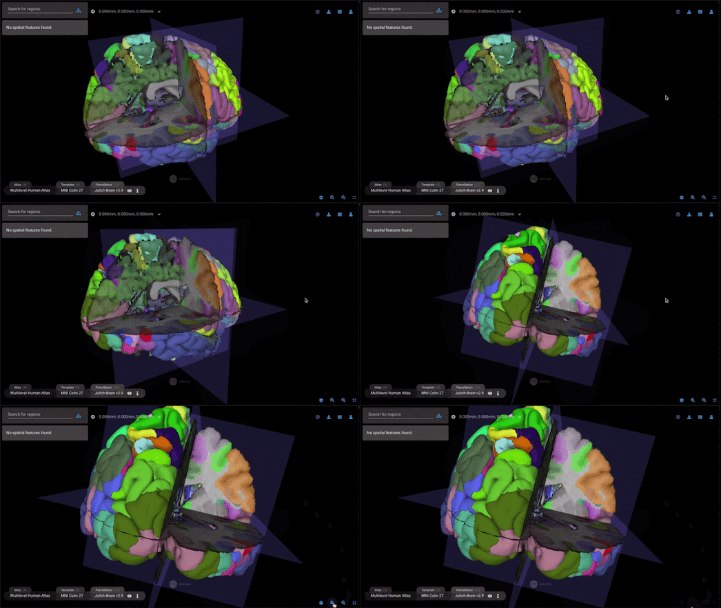
If you've ever wanted to look inside someone's brain then you might like the European Commission's new 'Google Map' of the human brain. This new 3D map allows you to take a look inside a human skull and explore atlases of the brain's regions and neural connections.

The European Brain Research Infrastructure (EBRAINS) is funded by the European Commission to accelerate brain research and innovation in Europe. It aims to provide a collaborative platform for researchers, clinicians, and technology developers working in the field of neuroscience and brain-related disciplines. One of the project's outcomes is the Siibra Explorer, an interactive atlas of a human, monkey, rat and mouse brain.

The Siibra Explorer is a 'Google Map' of the brain. It is an online interactive tool for exploring maps of the brain and for visualizing brain data. The varied brain atlases provided by the Siibra Explorer provide detailed anatomical information and labels of the brain regions, allowing researchers to understand the organization and connectivity of different brain structures. Different brain data (such as MRI and other types of neuroscientific data) can be overlaid on top of the 3D brain model. Users can even use their own data with the Siibra Explorer, enabling them to analyze and visualize their data on a 3D model of the brain.

The Siibra Explorer maps includes its own coordinate system. This means that researchers and scientists can easily share and collaborate brain data and share information with other users, simply by sharing the URL of their current map view.

Monday, August 01, 2022

The Map of Life

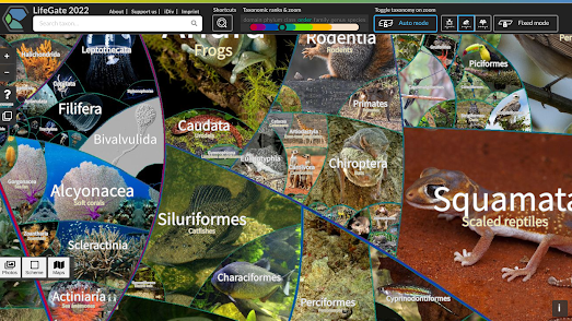
LifeGate2022 is a Google Map of life on Earth. It presents a taxonomic map of the 2.6 million known species of life. On the map different species of animals, plants and micro-organisms are organized based on their degree of evolutionary kinship.

LifeGate2022 is the creation of Dr. Martin Freiberg, who is curator of the Botanical Garden at the University of Leipzig. On his map different degrees of taxa are represented as territories separated by colored lines. 

What makes Dr. Freiberg's map different from previous taxonomic maps of life on Earth is that it actually uses photographs to illustrate the diversity of life on Earth. The map currently includes over 400,000 photos of different species of life. More photos are being added to the map all the time. Already over 6,000 photos have been added of different organisms by users of the map.  


Lifemap is another interactive map which allows you to explore the tree of life. Using this map you can explore the taxonomic classification of over 800,000 different species. 

Like LifeGate2022 this map works like other interactive maps - allowing you to explore different taxa by panning and zooming. With Lifemap this means that as you zoom in on a taxa the groups within that classification are revealed. In this way you can carry on zooming into the map and the tree of life until individual species are revealed. 

Each node in Lifemap is clickable, so as you zoom into the different taxonomic groups on the map you can click on a node to read its definition and to learn more about the taxa from its Wikipedia entry.


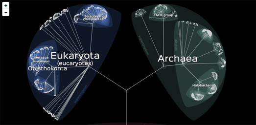
You can also use OneZoom to explore the complete tree of life on Earth. This application uses an interactive map interface to visualize the evolutionary relationships between all the species living on our planet. 

Each leaf on the OneZoom tree of life represents an individual species. The branches represent the lineage of these individual species. The points where the different branches diverge on the tree of life show where different groups have split from one another. At each divergence point you can see the geologic time of when it is believed this divergence took place. 

Red leaves on the OneZoom tree of life are those that are currently under the threat of extinction. When you zoom down to the individual leaf of a species you can click on that leaf to learn more about the selected animal from its Wikipedia entry.

Monday, November 26, 2018

The Map of Scientific Collaboration


Olivier H. Beauchesne has created an interactive map which shows the international collaboration of scientists around the world. The map plots the connections between scientists and researchers in different cities as seen in scientific journals and papers ("for example, if a UCLA researcher published a paper with a colleague at the University of Tokyo, this would create an instance of collaboration between Los Angeles and Tokyo").

The Map of Scientific Collaboration reveals how scientists collaborate across borders around the world. As Beauchesne notes it also reveals some interesting patterns within individual countries. For example Paris seems to play a central role in French science. No matter where scientists live or work in France they all seem to collaborate with another scientist in Paris. In comparison the UK seems to have a less centralized scientific network. This is perhaps a result of the major Oxbridge universities being located outside of London.


Ironically, despite the global collaboration of scientists demonstrated in the Map of Scientific Collaboration, most people around the world won't actually be able to read the scientific papers from which the map was created. Unless they know about Sci-Hub.

Sci-Hub is an online repository of pirated scientific academic papers and articles. It allows researchers and students to access expensive pay-walled academic content. Content that is usually only available from expensive academic journal publishers. This pay-walled system can be prohibitively expensive, especially for struggling students and researchers from developing countries. It has been claimed that the popularity of Sci-Hub in countries such as India, Indonesia, Pakistan and Iran proves that Sci-Hub is providing access to scientific research to those who wouldn't otherwise be able to afford it.

In an article on the Science website, Who's Downloading Pirated Papers?, John Bohannon has created an interactive map showing where pirated scientific academic papers and articles have been downloaded from Sci-Hub around the world. In order to make the map Bohannon contacted Alexandra Elbakyan, the Sci-Hub creator, to request the geographic location of every user who has downloaded an academic paper from Sci-Hub. In order to protect the privacy of Sci-Hub users the data was aggregated to the nearest city.

Wednesday, September 26, 2018

Tracking Nobel Scientists


Physics Today has tracked out the lifetime movements of every Nobel Prize winning physicist. Nobel Physicists on the Move allows you to watch an animated track showing the significant movements of any of the 206 Nobel physics laureate on an interactive map of the world. Select a Nobel physics laureate from the map's drop-down menu and you can view an animated map which shows where they were born, where they were educated, the places they lived & worked, and, ultimately, where they died.

The map only shows the movements of the selected physicist so it won't show you their entire career. For example if a physicist studied and then worked in the same city the map will only show when they moved to and from the city, not when they moved between institutions within the city. The only exception to this rule is that the map does mark Nobel-related milestones and the scientist's death, if they happen in the same city.

Below the map Physics Today notes that the locations that appear to have been most visited during the lives of all 206 Nobel Prize winning physicists are Cambridge, Massachusetts; New York City; Princeton, New Jersey; Cambridge, UK; and Berkeley, California.


If you want to know where every scientist ever nominated for a physics laureate was working when they were nominated then you might also like Physics Today's map The International Aspirations of the Nobel Prize. This map depicts the place of work of every nominated scientist at the time that they were nominated for the physics Nobel.

Select a year on the map and a map marker shows you where every scientist nominated for the physics Nobel Prize that year was working at the time. If you hover over a year in the timeline you can view how many scientists were nominated for the prize in that year.

Friday, July 07, 2017

Geographical Psychology


A new interactive map claims to show the psychological well-being of Americans. Using the map you can explore how individual county's rank in terms of their psychological well-being and in terms of a number of different personality traits.

The Well-Being Map is based on the language analysis of geo-located Twitter messages. The University of Pennsylvania’s World Well-Being Project presumably believe that this small subset of Twitter users in each US county is reliably representative of the county population as a whole. They also believe that they have a language model which can accurately assess psychological states and traits of individuals from the words that they use in Tweets.

Obviously the Well-Being Project used some controls to validate their model. You can read more about the methodology used in the project in the paper Characterizing Geographic Variation in Well-Being Using Tweets. If you trust the methodology and the results then you might find the top ten lists interesting. For example - the most depressed Americans, according to the Well-Being Project, can be found in Jim Wells and Wilson Counties in Texas.

Sunday, December 11, 2016

How the Environment Affects the Brain


UK geographer Daniel Raven-Ellison has been exploring how the environment affects the human brain. Daniel has been walking across the UK while wearing an Emotiv sensor which records his brain activity. The sensor is able to record Daniel's stress levels and provide insights into how the environment affects his mood and happiness.

National Geographic has been reporting on Daniel's progress in an on-going report called There’s Never Been A Better Time To Make Our Cities Wild. The report so far includes three interactive maps which allow you to explore the results of Daniel's walks in Edinburgh, the Lake District and London.

The Google Map for each of these walks show the route of Daniel's walk and an interactive graph of the brain sensor readings captured on the walk. The graph shows Daniel's stress and relaxation readings during each walk. The map and the graph are synchronized so it is possible to see which areas on the walk caused the most stress or induced a more relaxed mood. The map also includes photos and Tweets to provide more of an insight into the actual environments that Daniel was walking through at the time of the different brain sensor readings.

Monday, July 04, 2016

The Complete Map of Life


Lifemap is an interactive map which allows you to explore the tree of life. Using the map you can explore the taxonomic classification of over 800,000 different species.

The map works like other interactive maps - as you zoom in on the map more detail is revealed. With Lifemap this means that as you zoom in on a taxa the groups within that classification are revealed. In this way you can carry on zooming into the map and the tree of life until individual species are revealed.

Each node in Lifemap is clickable. As you zoom into the different taxonomic groups on the map you can click on a node to read its definition and to learn more about the taxa on Wikipedia.

The 'pro' version of Lifemap, provides an exhaustive National Center for Biotechnology Information taxonomy (more than 1.1 million taxa) and links to the NCBI webpage for each taxa.

Saturday, May 07, 2016

The Illustrated Map of Johannesburg


Mapping iThemba is an interactive map which explores issues around post-colonial science and drug discovery in South Africa. The map tells the story of iThemba Pharmaceuticals, a pharmaceutical company striving to create 'African solutions for African problems'.

At the center of this interactive is an illustrated map, providing an oblique view of Johannesburg, Pretoria, and the surrounding area. Using the map you can explore the infrastructure and the contextual environment within which iThemba operates. The markers on the map highlight some of these important locations around the iThemba campus and Johannesburg.

At the heart of the map is Joel Russell Huffman's panoramic illustration of Johannesburg. This illustrated map is not drawn to scale and obviously sacrifices geographical accuracy in favor of foregrounding the issues and locations which are most important to the story of iThemba and post-colonial science in South Africa.

Friday, April 29, 2016

Mapping the Science Paper Pirates


Sci-Hub is an online repository of pirated scientific academic papers and articles. It allows researchers and students to access expensive pay-walled academic content. Content that is usually only available from expensive academic journal publishers.

Perhaps one of the strongest arguments in support of the illegal pirating of scientific papers is that the present system is prohibitively expensive, especially for struggling students and researchers from developing countries. It has been claimed that the popularity of Sci-Hub in countries such as India, Indonesia, Pakistan and Iran proves that Sci-Hub is providing access to scientific research to those who wouldn't otherwise be able to afford it.

In an article on the Science website, Who's Downloading Pirated Papers?, John Bohannon has created an interactive map showing where pirated scientific academic papers and articles have been downloaded from Sci-Hub around the world. In order to make the map Bohannon contacted Alexandra Elbakyan, the Sci-Hub creator, to request the geographic location of every user who has downloaded an academic paper from Sci-Hub. In order to protect the privacy of Sci-Hub users the data was aggregated to the nearest city.

Bohannon's article on Science also includes a link to the open data behind the map. The data includes '28 million download request events from the server logs of Sci-Hub from 1 September 2015 through 29 February 2016'.

Wednesday, May 28, 2014

Mapping London's Inventions


I wonder how many Londoners have had a coffee in Bar Italia without realizing that they were sitting in the very spot where John Logie Baird invented television?

From Charles Babbage's Difference Engine, to John Logie Baird's television it is fair to say that London has seen it's fair share of inventions. London's Greatest Scientific Experiments is a StoryMaps tour of some of London's 'most radical' experiments.

The map provides an interesting tour through some of the scientific discoveries which have been made in the capital. The map itself however is never really going to serve as a mapped guide to anyone wanting to visit the locations highlighted on the map. The styled map does not include road labels so it would be hard to actually use it as a guide to tour the locations in person.

By using Knight Lab's StoryMap library however the application is able to provide a sequenced tour through the mapped experiments. You can use the forward and back arrows to navigate through the experiments or you can click on the markers on the map to navigate the experiments by location.

Sunday, February 16, 2014

The Genetic Map of the World


Geneticists at Oxford University have been studying 95 populations around the world and examining the effect of historical events on genetic makeup. The results of this study are now being visualized on a fascinating Google Map, called A Genetic Atlas of Human Admixture History.

The map allows you to select populations and view inferred admixing in the population's DNA and the date that the admixing took place. For example, the Silk Road appears to have brought Europeans to 1200 CE China. The DNA of the Tu people in modern China suggests that around this time the Tu were in contact with Europeans similar to modern Greeks.

If you select a labelled population on the Google Map you can view details of past admixture events which have been inferred, from the population's DNA. Colored circles or pie charts on the map depict the inferred genetic make-up of admixing sources in the population and a timeline indicates the period when the admixing is likely to have happened.

The map is a fascinating insight into the effects of historical events on distinct populations. Using the map it becomes clear how historical events like the Arab Slave Trade or the Mongol invasions led to changes in the genetic makeup of other populations.

Wednesday, November 20, 2013

Research Paywalls Around the World


Information wants to be free and public funded research should be free. However around the world research is often hidden behind paywalls. In reponse to this situation Open Access has released the Open Access button.

The Open Access Button is a browser bookmarklet that you can use to report and map paywalls blocking access to research that you find while browsing the internet. After you bookmark the offending paywall you just need to complete a short form and the site is added to the Open Access map of research paywalls.

Thursday, September 26, 2013

Reporting the Invasion of the Triffids


iMapInvasives has created a series of state maps designed to protect natural resources from the threat of invasive species.

The maps are designed to report and share information about invasive animal, plant and insect species in each state. The data for the maps come from a variety of sources, including citizen scientists who can use the map to report invasive species. Maps are currently available in Arizona, Florida, New York, Oregon, Pennsylvania, Vermont and Virginia.

Each of the maps allows the user to select from distinct animal, plant and insect species and view a heat map of the distribution of the selected species.

Tuesday, September 17, 2013

Citizen Science on Google Maps


Recently Google Maps Mania looked at two pairwise surveys that use Google Maps Street View to explore people's Perceptions of Place. Both of the pairwise surveys mentioned in the post are great examples of crowd-sourced or citizen science.

Citizen science is a very effective method by which scientists can exploit the power of the crowd to collect and analyse data. Zooniverse has been pioneering the use of citizen science on-line for a number of years now and have developed a number of citizen science projects. Two of these, Old Weather and Cyclone Center, have used the Google Maps API to help crowd-source the gathering of data from historical weather records.

Two more examples of the Google Maps API being used in citizen science projects are OakMapper and the Big Norwich Bat Project.


In California OakMapper is using the Google Maps API to monitor Sudden Oak Death. Sudden Oak Death is a disease that is killing oak and other trees, which is having a particularly devastating effect on trees in California.

The OakMapper Google Map shows the location of officially confirmed Sudden Oak Death occurrences in the state. The map also functions as a portal for anyone to submit the location of suspected instances of Sudden Oak Death. The official cases are displayed in red on the map and community submissions are displayed with yellow map markers.


In the UK the Big Norwich Bat Project utilized the power of citizen science to monitor the health of the town's bat population. This year the Big Norwich Bat Project used Google Maps to allow interested volunteers to sign-up to be involved in the town's bat survey.

The map divided the town into a number of 1 km squares. To claim a location users simply had to click on a square to volunteer for the survey in that area. Already claimed squares were displayed in red to clearly indicate to potential volunteers which areas were still free to claim.

Wednesday, June 19, 2013

Science Institutions on Google Maps


PlazaScience is a Spanish website that is trying to build a world map of scientific institutions. The project is being developed by Fundación madri + d and is funded by the Spanish Foundation for Science and Technology, Ministry of Economy and Competitiveness.

The map uses thumbnail photographs of each institution as the map markers. Users can click on the individual photographs to be taken to a dedicated page about the institution, where they can favourite and comment on the selected scientific institution.

Tuesday, February 01, 2011

HTML5 Fractals in Google Maps

Julia Map

How can you not love Google when they continue to release amazing stuff like this Google Maps HTML5 Fractal Renderer?

Julia Map uses the HTML5 canvas with the Google Maps API to create Julia and Mandelbrot set fractals which you can pan and zoom into. When you zoom into the fractal the image is drawn on the fly in canvas.

In your exploring, when you come across images that blow your mind, you can grab the unique URL and share them with the world.

Via: Official Google Research Blog

______________

Wednesday, June 09, 2010

Google Maps Nanobots

Synthetic Biology Project - Maps Inventory

Synthetic Biology is the "convergence of molecular biology, information technology and nanotechnology, leading to the systematic design of biological systems."

The Synthetic Biology Project aims to foster informed public and policy discourse concerning the advancement of synthetic biology. One way in which they hope to achieve this aim is by providing a Google Maps based inventory of the world's research into synthetic biology.

The map shows the locations of companies, government laboratories, research institutions, and universities conducting synthetic biology research and policy centers examining issues surrounding synthetic biology. You can refine the map to show markers for only universities, companies or research institutions.

Beneath the map you can view some of the findings made by the Synthetic Biology Project whilst producing this map inventory.

________________

Monday, June 15, 2009

Using the Google Maps API in Science

Genome Projector

The Genome Projector is a searchable database browser that uses the Google Maps API to provide a zoomable user interface for molecular biology. The Genome Projector currently contains four views, the Genome map, the Plasmid map, the Pathway map, and DNA walk.

I'll admit I'm out of my depth here, so here's how the Genome Projector introduce the map interface,

"In molecular biology, looking at reactions and behaviors of specific molecular components in microscopic levels is important as with looking at the systematic behavior of the whole. Therefore, researchers need a scalable point of view, having access to all of the microscopic, macroscopic, and mesoscopic levels of biological knowledge. Moreover, biological data is highly multi-dimensional by nature, and understanding of the data requires multiple views, layers, or projections, for example, in the levels of genome, transcriptome, proteome, and metabolome."

NYU School of Medicine Virtual Microscope

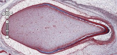
Created by the NYU School of Medicine the Virtual Microscope uses the Google Maps API to display and navigate scanned slides of microscopic images. Students and faculty members who are logged into the school's Learning Management System can even add markers to the slides to annotate and comment on slide features.

The site even comes with its own 'hot or not' feature which allows students to rate the slides (at the moment the most popular is a slide of the intestinal helminthic infection Trichuris trichiura - as if you hadn't guessed). The slides also come with a 'link-to-view' button which allows students to save or share links to a specific image, location within the slide and zoom level.

_____________