Showing posts with label Esri. Show all posts

Friday, June 09, 2017

Children's Maps


Esri has a new basemap designed for the young at heart. The Children's Map is a fun global map full of illustrations of famous man-made & natural landmarks and pictures of some of the world's most loved wildlife.

The Children's Map can be used to explore the locations of the countries of the world, their capitals and major cities. As you explore the world on the Children's Map you will also discover kangaroos, moose, alligators and camels. You can also find steam trains, container ships, hot air balloons and helicopters.


If you want more ways of encouraging kids to explore the world then you might also like Mission Explore. Mission Explore has created loads of missions that challenge kids to rediscover the world.

Kids of any age can become guerrilla explorers and extreme missioners with missions that defy gravity, see the invisible and test mental agility. Completing each mission will help kids develop new skills, resourcefulness and discover how their natural curiosity and initiative can lead to exciting experiences. The Mission Explore website inspires young people to engage with their world in the most direct way possible – by going out and having adventures.


The Metropolitan Museum of Art has its own interactive map designed especially for young visitors. The MetKids Map allows children to discover some of the fun and interesting things that they can find when they visit the museum. It also includes lots of inspiring and creative activities for kids to do during and after their trip to the MET.

The hand-drawn map of the MET has been made interactive using the OpenLayers mapping platform. It contains a number of map markers. The yellow markers indicate some of the main important locations around the museum. The red markers show the locations of some of the exhibits which you can see when you visit the museum.

If you select a marker on the map you can read more about the selected exhibit or room. These descriptions include photos, audio, video clips and suggestions of fun activities that children can do in response to the museum's exhibits.

Friday, September 30, 2016

Misty Mountain Mapping


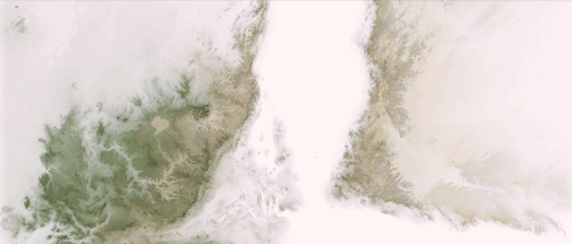
Misty Mountains is an interesting Esri Story map explaining how a nice mist effect can be created on digital maps by adjusting the opacity levels of elevation data.

To achieve this mist effect lower elevated areas on a Digital Elevation Model are made more opaque and higher elevated areas are made more transparent. The result is that fog or mist appears to be rolling along the valley floors of your map.

The Misty Mountains Story Map goes into more detail about how you can achieve this effect by using a gradient opacity level on your elevation data in ArcGIS Pro. It also include a number of example maps of the effect applied to different mountain ranges around the world.

The Story Map also includes an animated example of a Norwegian mountain range where the mist appears to start on the valley floor and roll upwards to cover the whole of the mountains.

You could use a similar technique to give the appearance of snow levels creeping down a mountain range as winter progresses. To do this you would just need to reverse your opacity / transparency gradient, so that higher elevations are made more opaque and lower lever are made more transparent on the map. You could then increase the transparency of the lower elevated areas on your DEM over time to give the appearance of snow cover creeping lower down mountains over the winter.

Tuesday, January 05, 2016

The Subtle Art of Hillshading


Esri has released a really informative Story Map promoting the use of its next generation hillshade layer. The map provides a great introduction to Esri's multi-directional hillshade layer (available in ArcGIS Online, ArcGIS for Desktop and web apps created with an ArcGIS Online organizational account). It is also a great general introduction to the art of hillshading and how hillshade layers can enhance your maps.


A Hillshade Everyone Can Use compares the new multi-directional hillshading to traditional hillshading (swipe left & right on the map to compare old with new). It also provides some great examples of how a hillshade layer can provide a clearer context to topographical map features and other mapped data. In particular there is a great example map showing how a hillshade layer reveals some of the effects the landscape can have on wind turbine placement.

Thursday, December 17, 2015

Mapping 2000 Years of Population Change


Two Thousand Years of Urban Growth is a 3D globe visualizing population change around the world over the last 2,000 years. The map was made by Esri using their new ArcGIS API for JavaScript with D3.js.

City populations around the world are shown on the globe with 3d bar charts placed over each city. The timeline slide control allows you to adjust the date in order to view the city populations for different dates throughout history. If you select a city's bar on the globe you can also view a line chart showing the city's population over the last 2,000 years.

The globe is an impressive demonstration of Esri's ArcGIS API for JavaScript. However this is one case where I think the data doesn't need to be mapped. Using a 3D globe is probably not the best way to visualize historical population growth. I think the information could be more easily conveyed with just a simple dynamic bar chart and timeline control.

Wednesday, December 16, 2015

Esri Has Joined the Dark Side


I can only assume that Esri has joined forces with the dark side. Why else would Esri release a map showing where every Jedi Knight lives?

In the last census over 170,000 people in England & Wales said that their religion was Jedi Knight. Esri UK's Jedi Knights in England & Wales is a choropleth map showing where all those Jedi Knights live.

According to the map the highest concentration of Jedi Knights seems to be in the south of the country. If you click on an area of the map you can find out exactly how many Jedi Knights are living there and what proportion they are of the total population. Thanks to Esri Darth Vader has never had it so easy.

Tuesday, November 24, 2015

Mapping Global Migration Data


Global Migration Data maps migration patterns around the world on a 3D globe. The map shows the number of migrants to and from each country and which countries they traveled to or from. The data comes from the UN Dept of Economic & Social Affairs for the years 1990, 2000, 2010 and 2013.

Global Migration Data is very easy to use. Simply select a country from the drop-down menu. You can then select to view either inbound or outbound migration for your chosen country. The time-line at the bottom of the map allows you to select which year's migration data you wish to visualize on the globe.

The 3D globe shows the spatial patterns of migration, visualizing which countries around the world migrants traveled to or from for your selected country. The dashboard below the map shows the total number of migrants (inbound or outbound depending on your current choice) and the number of countries migrants are from or the number of countries migrants moved to.

Thursday, September 17, 2015

The 3D Map Physics Engine


You can drop balls, barrels and boxes into the Grand Canyon with this new 3d map. Balls, Barrels and Boxes is an impressive demonstration of a physics engine running on a 3d Esri map.

Using the map you can drop balls, barrels or boxes on any location in the world and see how the objects react to the natural terrain. The map includes a number of interesting preset locations, with suitably hilly terrain for your balls, barrels and boxes to be able to roll downhill.

The map also includes a number of options to adjust the number of objects you wish to drop and apply different planetary gravity forces on your dropped objects.

The map was created using the cannon.js physics engine with Esri JS 4.0. You can explore the code behind the map in more detail on this GitHub page.

Thursday, September 10, 2015

The Living Wage Map


Esri's Living Wage Map shows the gap between the minimum wage and the actual real cost of living in every county and major metropolitan area in the United States. The map uses MIT’s Living Wage Calculator to estimate between each area's minimum wage and the real cost of living in that area.

You can use the map to compare the minimum wage to the living wage for three different types of family; a couple with two children, a single parent with one child and a single adult. Once you choose a household family type you can view a choropleth map showing the difference between the minimum and living wage across the United States.

The darker the color on the choropleth layer then the higher the gap between the area's minimum wage and the living wage. If you select a county on the map you can view the minimum wage in that county, the living wage in the county and the difference between the two.

Saturday, July 18, 2015

The Oscar for Best Story Map


Esri's Story Map library is an increasingly popular way to harness the power of maps to help tell a story. The Esri Storytelling with Maps Contest 2015 celebrates and rewards some of the best maps of the last year which have used the Story Maps library to raise awareness, inform or entertain the public through interactive maps.

The Grand Prize Winner of the 2015 competition is Snow Journal, a Story Map from the City of Boston. The map explores how the City of Boston helped keep the city running and responded to this year's record levels of snow.

There are a lot of other interactive narrative maps to explore on the Esri Storytelling with Maps Contest 2015 winners page. You can view the top three maps in five different categories (Travel / Destinations / Recreation, Infrastructure / Planning / Government, Science / Technology / Education, Culture / History / Events and Conservation / Environment / Sustainability).

Wednesday, July 01, 2015

O Canada


On July 1, 1867, the Constitution Act united three colonies into a single country called Canada. You can learn more about the formation of Canada and about some of the key figures in Canadian history in this Esri map of Canada's Nation Builders.

The map includes 41 pen portraits of significant individuals important to Canada's early history. The individuals are all mapped by their place of birth. The map itself is a vintage Mercator map of the world.

Each of the pen portraits on Canada's nation builders includes a link to learn more about the individual on Wikipedia.

Tuesday, June 23, 2015

A World with Wide Borders


We are all used to choropleth maps being employed as a way to visualize the socio-economic performance of countries around the world. Choropleth maps are a great way to provide a global picture of different socio-economic indicators. They can effectively provide an overview of which countries are performing better and which countries are struggling within a particular socio-economic indicator.

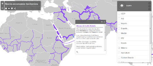
Socio-Economic Tectonics however employs a different method to visualize socio-economic indicators which, instead of providing an overview, highlights the areas of the world where there are glaring dissimilarities in socio-economic performance between neighboring countries.

Country borders are used on the map to show socio-economic differences between adjoining countries. These differences are represented graphically on the map by the width of country borders. The wider the border between two countries then the bigger the difference in the selected socio-economic indicator.

Twenty different indicators in all can be viewed on the map, organized into five categories: economy, disease and death, people and environment, technology and health. If you click on a country border you can discover the actual dissimilarity ratio between the two neighboring countries for the selected indicator.

Obviously if you want to provide a global overview of a geographical dataset you would probably decide to use a choropleth map. However socio-economic tectonics is a great way to visualize the differences between neighboring countries. Of course, there is no reason why you couldn't employ both visualization methods on the same map.

Tuesday, June 16, 2015

The Poles of Inaccessibility


A Pole of Inaccessibility is the most distant point from the coastline. This Esri Story Map has mapped out the exact locations of the Poles of Inaccessibility on every continental landmass.

The map of each continent includes contour lines showing various distances from the coast, the continental centroid and the pole of inaccessibility. The point of inaccessibility for each continent was calculated as the center of the Largest Inscribed Circle. The radius of the Largest Inscribed Circle represents the distance to the sea.

Friday, June 12, 2015

Top 10 Accessible Cities


The Top 10 Most Job Accessible Cities in the U.S. is an Esri map showing the U.S. cities with the most jobs accessible within 30 minutes of walking or public transit.

New York wins the prize for the most accessible jobs. If you use the thumbnail scroller running along the bottom of the map you can view the other top nine accessible cities. Each city includes a heat map layer showing where the most jobs are in the city. The map also shows heat maps for a number of other cities, outside of the top ten.

The map doesn't include an explanation of the data used. I'm assuming the heat maps are based on the number of jobs within walking distance times from the nearest transit stop.

Friday, May 01, 2015

Post-Earthquake Imagery from Nepal


Esri has released a map which allows you to compare pre- and post-earthquake imagery from Nepal. The post-earthquake imagery has been provided by Airbus Defense and Space.

The Nepal Earthquake Swipe Map includes some links in the sidebar to zoom to some of the important areas in Kathmandu, including Dharahara Tower, Kathmandu Durbar Square and the Garden of Dreams. You can also explore the imagery yourself. Just panning the map around you can't help but notice all the parks filled with temporary shelters.

If you want to help the disaster response teams on the ground by improving the map of Nepal you can join thousands of other mapping volunteers, organized by the Humanitarian Open Street Map Team (HOT).

Saturday, March 28, 2015

Mapping the Ocean Floor


NOAA has created an Esri map of Gloucester Harbor which allows you to explore the ocean floor. Peer Beneath the Waves uses the Esri Story Map Spyglass feature to allow you to peak beneath NOAA's nautical chart of the harbor and view the seabed beneath the waves.

You can drag the Spyglass around on the map to explore NOAA's hydrographic survey data from Gloucester Harbor. The map also includes a number of markers to help you learn more about the seabed in the harbor.

Friday, March 13, 2015

The Cool Maps Showcase from Esri


Esri has put together a nice showcase of maps which use the Esri mapping platform. Cool Maps includes maps of San Francisco crime data, the New York CitiBike network and #Ferguson Tweets.

The maps have obviously been picked to showcase the range of map styles, visualization techniques and capabilities of the Esri platform. There are fifteen maps in total, covering a range of subjects. The World's Happiest Countries map is one of my favorites. The map provides a slideshow of the world's happiest countries (based on the 2013 World Happiness Report). As the map moves from country to country an outline polygon morphs and animates around the map to highlight the currently featured country.

Wednesday, March 11, 2015

Mapping the Earth's Tectonic Plates


The Motion of Tectonic Plates provides a great introduction to the subject of the Earth's outer crust. This Story Map explores the forces that cause the tectonic plates to move, the seismic cycle and the causes of earthquakes and volcanic eruptions.

As you progress through the Story Map you can view the tectonic plate boundaries on a map of the Earth, explore oceanic ridges and take a closer look at plate tectonics in the Western North American Continent.


Mountains of Fire is an Esri Story Map which takes you on a tour of some of the world's biggest volcanoes. The tour uses Esri's 3D Scene Viewer, which means you can explore each of the featured volcanoes from all angles.

The tour begins with a brief introduction into how volcanoes are formed and what causes them to erupt. You are then taken on a tour of some of the world's most active volcanoes. You can investigate each of the featured volcanoes in 3d on the map, zooming in and out and rotating the map as you wish.

The map side-panel features YouTube videos and /or images of each volcano and gives a brief overview of the featured volcano's historical activity.

Sunday, March 08, 2015

The Victoria Cross Map


The UK are honoring First World War winners of the Victoria Cross with commemorative paving stones. The pavings stone are being laid outside the birth places of soldiers who won Britain's highest military honor during WWI.

The Department for Communities and Local Government has released an Esri Story Map showing the locations of the commemorative paving stones laid so far (the map will be updates as new stones are laid). If you select a marker on the Victoria Cross Commemorative Paving Stones Map you can read a pen portrait of the honored soldier.

The map sidebar provides more detailed information about a number of the soldiers featured on the map. Most of the marker portraits also include links to other sites, providing more details of the selected soldier and their acts of individual bravery.

Friday, March 06, 2015

Volcanoes in 3D


Mountains of Fire is an Esri Story Map which takes you on a tour of some of the world's biggest volcanoes. The tour uses Esri's 3D Scene Viewer, which means you can explore each of the featured volcanoes from all angles.

The tour begins with a brief introduction into how volcanoes are formed and what causes them to erupt. You are then taken on a tour of some of the world's most active volcanoes. You can investigate each of the featured volcanoes in 3d on the map, zooming in and out and rotating the map as you wish.

The map side-panel features YouTube videos and /or images of each volcano and gives a brief overview of the featured volcano's historical activity.

Thursday, March 05, 2015

The Ice Cold Gold Map


Tonight Animal Planet's Ice Cold Gold begin its third season. You can explore some of the stunning locations featured in the new season in this Esri Story Map.

Ice Cold Gold is a reality television program about a mining team trying to exploit the natural resources of Greenland. As you scroll through the Ice Cold Gold - Digging Deeper Story Map you can view video clips from the series, including some great time-lapse footage of Greenland's scenery and landscapes.

Currently you can select two journey maps, a 'Prelude' and 'Episode One' from a drop-down menu. In truth this Esri Story Map hardly features any maps at all. Animal Planet are using Esri's Story Map library as more of a video gallery than a mapping platform. It is a shame that there aren't at least more detailed satellite maps of the locations featured in the program. However Ice Cold Gold - Digging Deeper does demonstrate how Esri's Story Map platform can also be used without maps.