Showing posts with label Los Angeles. Show all posts

Tuesday, November 05, 2024

Vintage Street View Imagery

screenshot of Sunset Over Sunset

Imagine if Google Maps offered a way to view Street View panoramas of cities as they looked in the past. Unfortunately Google only began capturing Street View images in 2006 and 2007. Photography itself, however, was invented in the 19th century, which means we can explore vintage photographs to glimpse our cities as they used to exist.

In fact, one American photographer, Ed Ruscha, practically pioneered Street View photography. In the 1960s he mounted a motorized 35mm camera on top of a pickup truck and drove up and down Sunset Boulevard in Los Angeles, capturing a unique photographic record of this iconic street. He repeated this project in the 1970s, 1980s, 1990s, and 2000s. The result is an incredible time capsule, documenting the evolution of Sunset Boulevard across five decades.

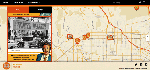
Sunset over Sunset presents Ed Ruscha’s photographs of Sunset Boulevard across five decades, stitched into continuous photostrips that capture the changing landscape between Doheny Road and North Alameda Street. Using a strip map of Sunset Boulevard you can browse all five complete historical photostrips of the street from each of the five decades. 

Sunset Over Sunset integrates Ruscha’s images with historical data, such as city directories, census records, and local newspapers. Using the strip map, users can explore specific addresses, and uncover their history through their associated historical data. A 'Stories' section also picks out and explores some of the most interesting urban developments which have taken place on the 'Strip' since the 1960s.

The 12 Sunsets website also allows users to explore Ed Ruscha's photographs of the Sunset Strip overlaid on an interactive map. In this presentation, an interactive map is flanked by Ruscha's vintage photos of each side of Sunset Boulevard. Simply click on a year to change the date of the street-view photos shown on the map, and use the "Flip" button to rotate the page 180 degrees.

Los Angeles isn’t the only city that can be explored through vintage street-view photography; New York City also boasts extensive collections of historical street imagery.

1940s NYC and 80s.NYC are two fantastic interactive maps that let you explore vintage photographs of New York City street scenes. These photos, captured by the New York City Finance Department in the early 1940s and again in the early 1980s, document every building across the city’s five boroughs. Originally taken to assess property values, these images now serve as invaluable time capsules of New York’s urban landscape.

These interactive maps allow you to explore New York’s streets as they appeared in the 1940s and 1980s, giving you the chance to see how your favorite neighborhoods have transformed (or perhaps remained the same) over the past eighty years.

Thursday, August 29, 2024

The Money Mountains of Los Angeles

Map of L.A. with average household income represented by height

Nick Underwood has visualized the average median household income in each Los Angeles neighborhood using the analogy of elevation. On his The Topography of Wealth in L.A. map city each neighborhood is displaced 'vertically based on median annual household income'. 

The map uses census data to show the average household income in each Los Angeles neighborhood as a 3D tower. Sea level on the map is set at the median US income of $59,000 per year. The map reveals that a number of L.A. neighborhoods, particularly in Beverley Hills and East Pasadena, soar above the median US income. However many of these wealthy neighborhoods ' lie immediately adjacent to others with income well below the poverty line.'

According to Nick the map actually underestimates the huge disparities in income between many neighborhoods in Los Angeles. The U.S. census caps household income at $250,000+ so it is probable that some L.A. neighborhood towers should actually be a lot taller.

map of L.A. using 3d towers to show the popolation levels in each neighborhood

Using the analogy of elevation to visualize economic and demographic data can be an effective way to present a dataset geographically. For example The Pudding's Human Terrain interactive map shows the world's population density using 3D population towers. On this map the taller a block then the larger the population. 

As you might expect the Human Terrain map shows that some of the most densely populated neighborhoods in LA are in Central Los Angeles, such as Pico-Union and Angeling Heights. These areas seem to be among the 'valleys' of the Topography of Wealth map, suggesting that the most densely populated areas of Los Angeles are also among some of the poorest neighborhoods in the city.

Thursday, November 19, 2020

Growing on Urban Heat Islands

Urban heat islands are areas of towns and cities which can become unbearably hot, especially on days with extreme heat. These areas can often become 10-20 degrees warmer than other areas in the very same city. These urban heat islands tend to occur in areas with the densest built environments and with the most roads. 

Urban heat islands are largely a result of un-shaded roads and buildings absorbing heat and then radiating it out to their surroundings. The dark surfaces of roads and built materials, such as bricks and concrete, absorb more heat than grass and vegetation. The coolest places are usually is parks and on streets with lots of tree cover. Which is why the densest built areas tend to be significantly warmer than areas which have lots of tree cover or parks.

One of the best ways to prevent urban heat islands is to provide more tree canopy cover - to create natural shade. Planting more trees in urban environments not only helps to reduce street-level temperatures, they can contribute to a better quality of life and can make neighborhoods more attractive places to live.

Google's new Tree Canopy Lab is an interactive map which visualizes tree canopy cover in the city of Los Angeles. The map is designed to show the current tree canopy coverage in the city and to help identify where new tree planting efforts are most needed. The map allows you to see the level of tree canopy coverage in different neighborhoods in the city alongside demographic data, such as population density. Using the map it is therefore possible to quickly identify where the most people are likely to be living in urban heat islands and where new tree canopy cover is most needed. 


The New York Times has mapped out how racist housing segregation in the United States, dating back to the Home Owners' Loan Corporation's Redlining maps, is a major contributory factor to the location of urban heat islands in towns and cities across the country. 

In How Decades of Racist Housing Policy Left Neighborhoods Sweltering the New York Times has created a story map which shows how across the United States neighborhoods which were redlined are usually the hottest parts of towns. Conversely neighborhoods which weren't redlined tend to be the coolest areas. The reason for this is that redlined neighborhoods have largely remained areas of deprivation and tend to have fewer trees and a  more densely built urban environment. Non-redlined neighborhoods have remained mostly more affluent and are therefore more likely to have lots of parks and lots of tree cover.


In August 2018 NOAA ran a citizen science project in Washington D.C. and in Baltimore to discover which part of those cities were effected by urban heat islands. You can see the results of this study on NOAA's Detailed maps of urban heat island effects in Washington, DC, and Baltimore.

The detailed maps produced by NOAA show that the hottest areas in both cities are the areas with the densest built environment and the most roads. The coolest places in both cities are in parks or in other areas with lots of tree cover. 

Guess who lives in areas with parks and trees and guess who lives in densely built areas with lots of bricks and concrete. That's right the hottest areas in cities tend to be the areas where the poorest residents live, while the richest residents can afford to live in the coolest areas with lots of parks and trees. You can observe this pattern in cities across the USA using NPR's interactive heat island maps.

In As Rising Heat Bakes U.S. Cities, The Poor Often Feel It Most NPR has published an interactive tool which allows you to view heat island maps of US cities side-by-side with a map of income levels. Using this comparative tool you can directly see if there is any correlation between high surface temperatures in a city and the level of income. When you select a city the tool even tells you directly if there is a strong, moderate or weak link between surface temperatures in the city and where different income groups live.

Friday, March 06, 2020

The California Primaries


Nationwide maps of the Super Tuesday primary results are great for visualizing how the main Democratic presidential hopefuls performed across the the United States. However more detailed maps can help pick out some of the more local trends and inform you about how your local neighborhoods voted. Here are two interactive maps which can tell you how neighborhoods voted in California.

Chris Arvin has mapped out the results of the Democratic Primary in San Francisco. His SF Election Map reveals that Warren was the most popular candidate in the Castro and in District 8. Biden proved to be the most voted for candidate in much of Twin Peaks and the Marina District. Bernie Sanders appeared to be very popular across most of the city. If you select a neighborhood on the map you can view the percentage of votes won by each candidate.


You can also view the Democratic Primary results in San Francisco and the rest of California on the Los Angeles Times' California Primaries interactive map. The LA Times map reveals that much of central Los Angeles voted for Bernie Sanders. If you hover over a neighborhood on the map you can see how many votes were cast for each of the candidates.

Bernie Sanders has clearly won the California primary but the LA Times reports that the final tally will take weeks to complete.

Monday, November 11, 2019

L.A.'s Wealth Mountains


The Topography of Wealth in L.A. - Visualizing Income Inequality as Terrain is an impressive story map which explores the city's vast income disparities using elevation as a metaphor for wealth. As you scroll through the story the map highlights areas of the city where there is a huge disparity between the median incomes of people living in adjacent neighborhoods.

On the Topography of Wealth map areas of Los Angeles are shown at different heights depending on the area's median annual household income. Neighborhoods with a high median annual household income are shown as tall towers while neighborhoods with a low median income are shown as smaller towers.

The map provides a striking visualization of the distribution of household incomes in the city. Many places in the city have neighborhoods with extremely high median incomes right next door to neighborhoods with very low median incomes.

The map was made with QGIS, Blender, GSAP and D3.js.

Tuesday, September 10, 2019

The Homeless Should Sleep at Home


Mahatma Gandhi once noted that "the true measure of any society can be found in how it treats its most vulnerable members." Let's explore a little how the United States treats its most vulnerable citizens.

The City of Los Angeles is currently considering plans to ban homeless people from sleeping on many of the city's streets. These plans will make it illegal to sleep rough within 500 feet of schools, parks, day-care facilities and some popular venues. According to the Los Angeles Times this will mean at least a quarter of Los Angeles will be out-of-bounds to the city's most vulnerable people.

In Could Homeless People Sleep in Your Neighborhood? the LA Times has created an interactive map which shows all the areas of Los Angeles which could be restricted to the homeless under the new plans. The map shows the exclusion zones around every school, park and day-care facility. Enter an address into the map and you can find out what percentage of your neighborhood's streets will be restricted to the homeless under the new plans.


Another way that American cities tries to deal with vulnerable people is by dumping them on other cities. Thousands of one-way bus tickets are given to the homeless every year in the United States. In Bussed out: How America moves its homeless the Guardian newspaper explores the reasoning behind homeless bus relocation programs, their effect on the homeless and the impact on the cities where the bussed out homeless eventually end up.

As you scroll through the Guardian's article an interactive map automatically updates to visualize the results of the homeless relocation programs run by cities across America. This map shows the homeless rate in each state and the number of homeless arriving in cities across the country.

New York city spends the most money of any city on their homeless relocation programs. In fact New York doesn't just bus its homeless problem on to other cities it also give homeless citizens free flights to other cities. As with the bus relocation programs most of the people moved on by plane end up in locations where the residents have a lower than average median income.

Forget Gandhi's words, Americans prefer the saying 'out of sight, out of mind.' In the United States the most vulnerable citizens are treated as a problem which should be passed on to somebody and someplace else. In fact the vulnerable in America are dumped on those who are least able to help solve their problems.

Friday, August 09, 2019

LA Donations to the Democrats


Last week the New York Times published Detailed Maps of the Donors Powering the 2020 Democratic Campaigns. These maps reveal where in the country each of the Democratic hopefuls have raised the most money. The Los Angeles Times has now taken a more detailed look at where the $13 million donated to Democratic challengers in Los Angeles County has come from and where it is going.

Which Democrat is Your LA Bloc Backing includes an interactive map which colors individual blocs in Los Angeles County to show which Democratic challenger has received the most in donations in each bloc. If you hover over individual blocs on the map you can view how much money was donated to each of the candidates. Overall Kamala Harris has raised the most money in the county. She has raised more than twice the amount raised by Bernie Sanders. Joe Biden has received just over a third of the total received by Kamala Harris.

The LA Times has also created individual maps for each of the Democratic challengers showing how much money they received in each bloc in Los Angeles County. These individual maps show that Kamala Harris has received a lot of her donations from wealthy Westside areas. Bernie Sanders on the other hand is less reliant on wealthy backers and has received lots of smaller donations more evenly spread across the whole county.

Last week the LA Times also published a national interactive map showing Where the 2020 Democrats raised the most money. This map got a little ignored in the very popular response to the NYT's similar national map of donations to the Democratic challengers. These national maps reveal that Bernie Sanders has received the most in political donations across the whole of the country.

Monday, May 13, 2019

The Native Villages of Los Angeles


The Tongva were the original people of Los Angeles. They lived in Tovaangar, a land which reached from Palos Verdes to San Bernardino and from Saddleback Mountain to the San Fernando Valley. You can learn more about the Tongva people on a new L.A. Times story map which explores the locations of Tongva's native villages.

Mapping the Tongva Villages of L.A. begins with a map of modern Los Angeles. As you scroll through the L.A. Times story map the first thing that happens is that all the modern place-names and thousands of L.A. roads are removed from the map, leaving a simple relief map of the Los Angeles Basin. Scaled markers are then added to this map to show the locations and relative sizes of the original Tongva villages. As you continue scrolling the story map takes you on a small tour of some of the Tongva villages which existed long before the Spanish arrived. During this brief tour modern place-names are added back to the map to help you understand where modern L.A. sits on top of native Tongva settlements.

The interactive Tongva story map is part of the L.A. Times' series Saving Tonga, which explores Los Angeles' native language. As well as the interactive story map this series includes an audio tour of the Tongva language, as spoken by its students and teachers, and a study guide for teachers who are interested in teaching their students about the native people of Los Angeles.

You might also like Native Land, an interactive map documenting the territories and languages of the indigenous peoples of the Americas and Australasia.

Tuesday, March 26, 2019

The SB-50 Impact Map


In an attempt to address California's housing supply crisis Senator Scott Wiener has introduced a bill which is designed to encourage the building of apartment buildings in areas with good transit, at the expense of single family homes. If passed the bill will prevent cities and towns from stopping the construction of apartment buildings in certain areas.

Of course not all single family home owners are happy at the prospect of new tall apartment buildings being constructed in their neighborhoods. If you want to know if your California neighborhood could be affected by SB-50 then you can refer to a new interactive map which attempts to map out the areas of California where new apartment buildings will be welcomed.

The creators of the Will SB 50 Wipe Out Your Neighborhood? are definitely opposed to State Senator Scott Wiener's SB-50 bill. The site claims that "SB 50 is an unprecedented law that will destroy thousands of homes & apartments to build luxury housing up to 8 stories high". That opposition to the bill shouldn't make much difference to the map as long as it is accurate. However at the moment the final definition of the areas affected by SB-50 has yet to be decided. Will SB 50 Wipe Out Your Neighborhood? claims that in this "map, we roughly approximate the San Francisco Planning Department's approach".

On the interactive map three colors are used to show areas where 'Buildings up to 85' feet could be allowed, where 'Buildings up to 75' feet could be built and where 'Buildings up to 75 feet (in jobs rich/good school areas)' will be permitted. The creators of the map say themselves that the zones are 'purely projections' at this time and "will be updated once the California legislature decides on a definition". If you are worried about SB-50 it might be worth bookmarking this map and returning to it once this definition has actually been decided.

Thursday, December 06, 2018

Dangerous Biking in LA


An interactive map by the LAist reveals that there is almost no section of road in Los Angeles where a cyclist hasn't been injured. The L.A.-Long Beach Bike Crashes interactive map shows the location of every collision within Los Angeles and Long Beach involving bicycles from 2010-2015.

The LAist argues that with its wide, flat roads and sunny weather LA should be a wonderful place to cycle. However Bicycling Magazine has named Los Angeles America's worst city for bikes. Looking at the LAist interactive map it isn't hard to see why. The map shows that from 2010-2015 70 bicyclists were killed and 13,606 were injured while cycling on the city's roads.

The LAist point out that the city's Three Feet for Safety Act is very rarely enforced. This law requires drivers to leave at least a three foot gap when passing a cyclist. However the police have issued only 13 citations in the four years since the act became law. The LAist's conclusion is that the city needs to invest in cycling infrastructure. The best way to ensure the safety of cyclists is to create separated bike lanes so that car drivers actually are incapable of driving within three feet of a cyclist.

Thursday, May 17, 2018

Mapping LA by Night


Just Downtonw's LA Streetlights is an interactive map of street-lighting in Los Angeles. The map features dark extruded building footprints lit up by models of all the city's streetlights.

I don't think that the map was created for any other purpose than it looks really striking and provides an interesting map of the city at night. You can see, however, how the map could be useful to city planning departments, especially for reporting faults, scheduling repairs and maintaining the city's streetlights.

The map itself uses Mapbox GL's extrusion property both to show the city's buildings in 3d and for the streetlight models themselves. The data for the maps comes from Los Angeles GeoHub, the city's new public website for location-based open data.

Friday, March 02, 2018

The SB 827 Interactive Los Angeles Map


Buying a home in California is very expensive. Particularly in the state's biggest cities. One solution would be to build more affordable housing. However California has a lot of building and zoning regulations which make building new homes difficult.

SB 827 is a new bill that is designed to encourage the building of high density housing near public transportation. The bill, if passed, would require that all areas within a half-mile of a high-frequency transit stop, or within a quarter-mile of a bus or transit corridor, allow buildings of 4 to 5 stories. It would also exempt these new buildings from minimum car parking requirements.

The Policy Club has released an interactive map which shows the potential impact of the bill on Los Angeles. The SB 827 Interactive Los Angeles Map shows the building parcels in LA which would become exempt from residential density restrictions, minimum parking requirements and building height limits if the California Senate passes SB 827.

The map clearly demonstrates that SB 827 has the potential to have a huge impact on the building of new homes in Los Angeles. Whether you think that is a good idea or not obviously depends on your point of view.

Wednesday, December 06, 2017

Mapping Rent in L.A.


The Los Angeles Times has mapped out Where You Can Afford to Rent in California. Using the newspaper's new interactive map you can view all the zip-codes in the state where you can afford to live based on your annual salary.

The L.A. Times' affordable rent map includes a slide tool which allows you to enter the amount of money you can spend on rent a month. After you have entered how much rent you wish to pay the map automatically updates to show where you can afford to rent. Each zip-code area is colored by affordability, based on the rental listings on Zillow.

You can also enter your salary into the tool. If you enter your salary then the map also tells you what percentage of your wage is being spent on rent. The L.A. Times suggests that "you spend no more than 30% of your gross income on rent and utilities".

Tuesday, October 17, 2017

Do You Live Near a Freeway?


The Los Angeles Times can tell you how close you live to a freeway. Just enter your address and the LA Times will show you your house and the nearest freeway on an interactive map. It will also tell you if you are within the 500 foot zone where air pollution is highest or if you are within the 1,000 foot zone (where scientists advise that you shouldn't live).

The map is part of the newspaper's report into why L.A. keeps building homes within 500 feet of freeways. If you zoom in on a freeway on the interactive map you can see the most polluted 500 and 1,000 feet zones - shown in red and yellow respectively on the map. If you zoom out a little the zones will disappear and instead dots will show you how many people live within 1,000 feet of the freeway.

Later on in the LA Times report another interactive map shows you how many building permits the city has issued within 1,000 feet of a freeway since 2005. This map includes a slider control which allow you to change the year to see how these permits have accumulated over the years.

Friday, April 21, 2017

Making L.A. Safer for Pedestrians


If there is one city in the USA that really needs a Vision Zero initiative it is Los Angeles. Over 2,800 people have lost their lives on the streets of Los Angeles since 2003. Nearly half of the victims were pedestrians or cyclists.

Thankfully Vision Zero Los Angeles is here and it wants to eliminate all traffic deaths by 2025, To kick-start the initiative the city has released an interactive map of traffic fatalities. The map shows the location of all traffic fatalities in Los Angeles from 2003 to 2016. The map also shows the location of planned safety projects under the Vision Zero scheme.

One reason for mapping traffic fatalities is to identify traffic black spots. The Los Angeles Department of Transportation has identified the Los Angeles streets with the highest concentration of fatal accidents, which they have dubbed the High Injury Network (HIN). Despite contributing only six percent to the city's road network the roads in the HIN have seen nearly two-thirds of all deaths and severe injuries to pedestrians.

You can view the location of the streets in the HIN on the High Injury Network Map. This interactive map identifies Los Angeles most dangerous roads. The map also shows the locations of schools which are on or near the HIN and links to the city's Safe Routes to School Strategic Plan.

You can view other examples of Vision Zero initiatives at Vision Zero Boston, Vision Zero New York and Vision Zero San Francisco.

L.A.'s Elevated Levels of Lead


Children in 323 neighborhood areas in Los Angeles County have lead levels at least as high as found in Flint, Michigan. Some have levels at least twice as high. Reuters has examined the results of more more than 15,000 tests on child lead levels taken between 2011 and 2015 by the Los Angeles County Department of Public Health. The results of that analysis are worrying for L.A.'s children and parents.

In Lead's Hidden Toll Reuters examines the areas of Los Angeles with the highest levels of lead and explores some of the reasons why these levels might be high. The article is illustrated by an interactive map which shows the levels of lead found in children in each census tract area. You can click on each neighborhood on the map to view the number of tested children and the percentage found with elevated levels of lead.

Lead's Hidden Toll and the interactive map are part of Reuters' nationwide investigation, Off the Charts. The map not only show the levels of lead found in L.A.'s children, it also allows you to view the results of childhood blood lead tests in 21 different U.S. states.

Thursday, November 24, 2016

The Homeless of LA


In January the Los Angeles Homeless Services Authority carried out a survey of the homeless in Los Angeles County. The survey estimated that there were 44,359 homeless living in the county, which is an increase of 12% since 2013.

The Los Angeles Times has released a dot map from the survey, revealing the distribution of homeless people throughout the county. Each dot on the Where are L.A. County’s Homeless? map represents one homeless person or a makeshift shelter or vehicle occupied by the homeless.

The dots do not represent the exact location of homeless people in the county but are randomized throughout each census tract. If you select a census tract on the map you can view a breakdown of the number of homeless counted in the neighborhood.

You can read more about the census and its results in an accompanying LA Times' article L.A. County has its most accurate count yet of its homeless population.

Thursday, September 01, 2016

Mapping Gentrification in L.A.


A joint project from the UCLA and UC Berkeley is mapping gentrification and displacement in L.A.'s neighborhoods. The Urban Displacement project monitors where gentrification has happened or is currently happening in Los Angeles County.

You can explore the project's findings on an interactive map which shows which neighborhoods have gentrified over the last twenty years. The map also allows you to view other demographic and economic data about Los Angeles' neighborhoods side-by-side with the gentrification data.

Among the key findings of the project is that neighborhoods around public transit stations are the most likely to be affected by gentrification and displacement.

The Urban Displacement project is also mapping displacement and gentrification in the San Francisco Bay Area.

Tuesday, May 24, 2016

The Nice Guys Maps of 1970's LA


The Nice Guys, starring Russell Crowe and Ryan Gosling, is set in 1970's Los Angeles. If you want to re-familiarize yourself with LA in the '70's before seeing the movie then you should take a look at The Nice Guys Map.

This Google Map takes you on a little tour of some of LA's most famous locations, including the Sunset Strip, the Hollywood Sign and Venice Beach. Each of the featured locations is accompanied by photos from 1977 and 2015. This allows you to directly compare the LA of today with the LA of the 1970's and assess how Los Angeles has changed over the last thirty odd years.

The Google Map itself has been given an appropriate 1970's orange tinge using the Styled Maps feature of the JavaScript Maps API.

Thursday, April 14, 2016

Cleaning LA's Streets


Last week the Los Angeles Time created an interactive map showing the cleanliness of LA's streets. The Where are L.A.'s Dirtiest Streets? map shows the levels of litter, illegal dumping and weeds on all of Los Angeles' roads using data from the mayor's Clean Streets initiative.

At the time I thought that the LA Times map had potential to be a useful tool for the city's sanitation department. However it turns out that the LA Bureau of Sanitation has created its own maps from the data. The Clean Streets Index allows you to explore the data used in the LA Times map in more detail and also explains how that data is used by the City to help clean the city's streets.

Where the LA Times map only provides a visualization of each street's overall cleanliness score the Clean Streets Index has mapped visualizations of the cleanest and dirtiest areas, areas of persistent littering and areas with regular illegal dumping. By using the data to highlight hot-spots of illegal dumping and persistent littering the Bureau of Sanitation is better able to deploy enforcement tactics and target resources in the city.